As of 21st May 2017…
We’ve updated our Branding
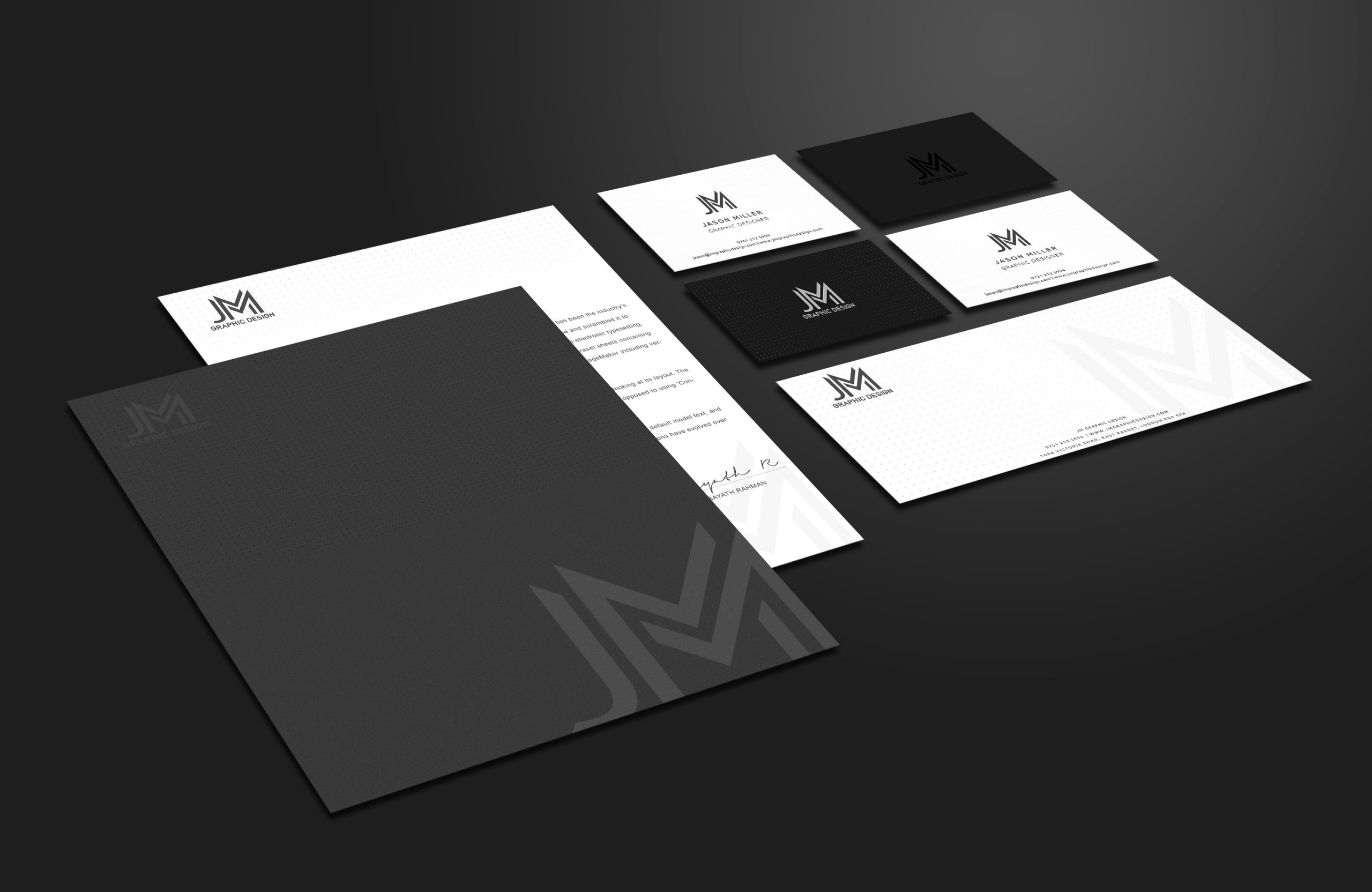
Gone is the Red & Black colour scheme & thumbprint logo – replaced by a more refined Monogram logo along with a black and white colour palette.
Why? To better reflect my approach; simple, clear design which attracts the right kind of attention. The Red logo had been used since 2013, and utilised a subtle thumbprint behind the “JM”; a fingerprint being the perfect symbol of unique identity.
However the new Monogram better reflects diversity. It is more subtle, less heavily stylised than the previous logo; fitting, as I must appeal to a wide range of clients, creating their brands in widely ranging styles.
It also better represents the high level of service I provide to corporate businesses; my design solutions are based on sound strategy as much as artistic flair.
Don’t worry; it’s still me! The changes are only cosmetic…
There will be a few changes you might notice in future:
- Any future invoices, contracts or quotations will display the new branding, regardless of the original date they were created.
- My new branding has changed across our website & social media accounts.
So that’s it… just thought I’d let you know! I look forward to working with you all over the coming year.