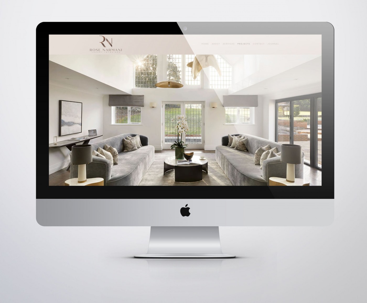
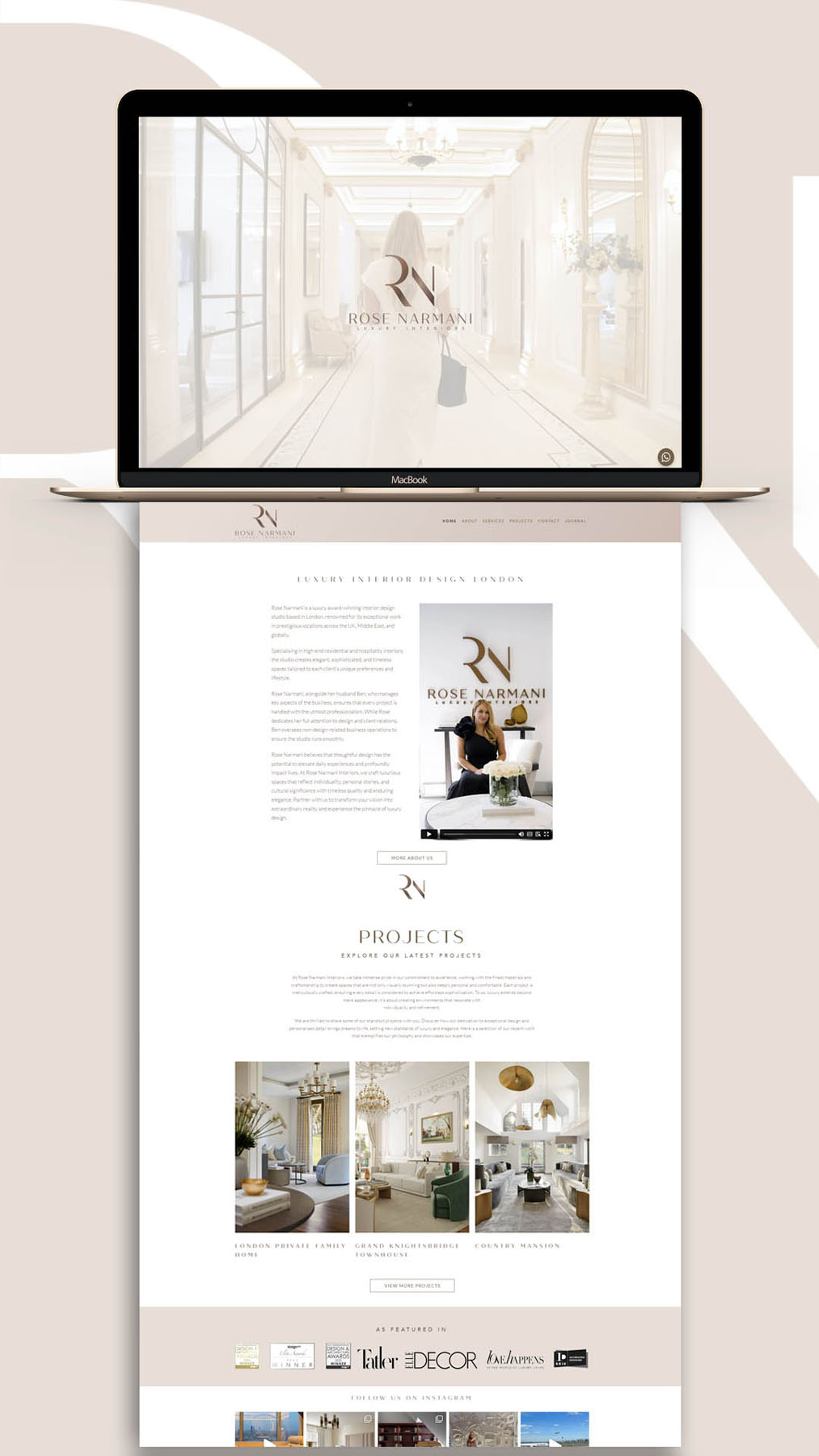
Following the new brand identity I was commissioned to create for Rose Narmani Luxury Interiors, we designed and developed a new WordPress website. It needed to look elegant and luxurious, to reflect their high standard of interior design work and exclusive client list. The website features fullscreen ‘hero videos’ to showcase a range of the incredible award winning projects Rose and her team have worked on, along with behind the scenes footage.
The real beauty lies in the small details; a subtle rose gold gradient behind the navigation menu; the careful balance of negative space across all screen sizes; gentle variation in the backgrounds of page sections, alternating between white, rose gold and imagery. The result is a visually attractive and impactful website which allows the interior design work to take center stage, while providing an elegant backdrop.
Case Study
Opportunity
Ultra-high-end interiors clients decide in seconds. Typical portfolio sites in the category lean on heavy visuals but feel templated. There was space for an editorial, quiet-luxury web experience that conveys discernment and discretion while guiding visitors to enquire.
Objectives (Business + User)
-
Signal rarity, taste and senior-level oversight at first glance.
-
Showcase projects with gallery-grade clarity and calm.
-
Make enquiries effortless, with clear pathways for high-intent visitors.
-
Maintain design integrity across devices and future content updates.
UX Insight & Strategy
Design-literate users skim first, then deep-dive into details. The site structure creates a guided reveal: unmistakable positioning → selected work → depth pages for signature projects → clear contact options. Navigation remains minimal and predictable to keep attention on spaces, light and materials.
Design System & Content
An editorial grid, generous negative space and precision typography establish poise and confidence. Project pages prioritise full-bleed imagery, restrained captions and consistent storytelling blocks (brief → approach → highlights), allowing craftsmanship to lead. Copy is concise and assured; imagery direction favours texture, materials and light over staging.
Interaction & Performance
Motion is subtle and purposeful—micro-interactions that cue progression without showiness. Images are optimised for fast loading; layout components are modular so new case studies can be added without breaking the aesthetic. Accessibility and contrast are considered throughout to protect legibility on all screens.
Competitive Edge Now
Compared with typical interiors sites, the experience feels considered and exclusive. Editorial presentation elevates perceived value, the restrained system improves readability, and the clear enquiry paths reduce friction for serious prospects.
What This Enables
The site is ideally positioned to attract design-literate, high-net-worth clients; to support press features and award submissions; and to scale with new projects while preserving the brand’s unmistakably high-luxury tone.


