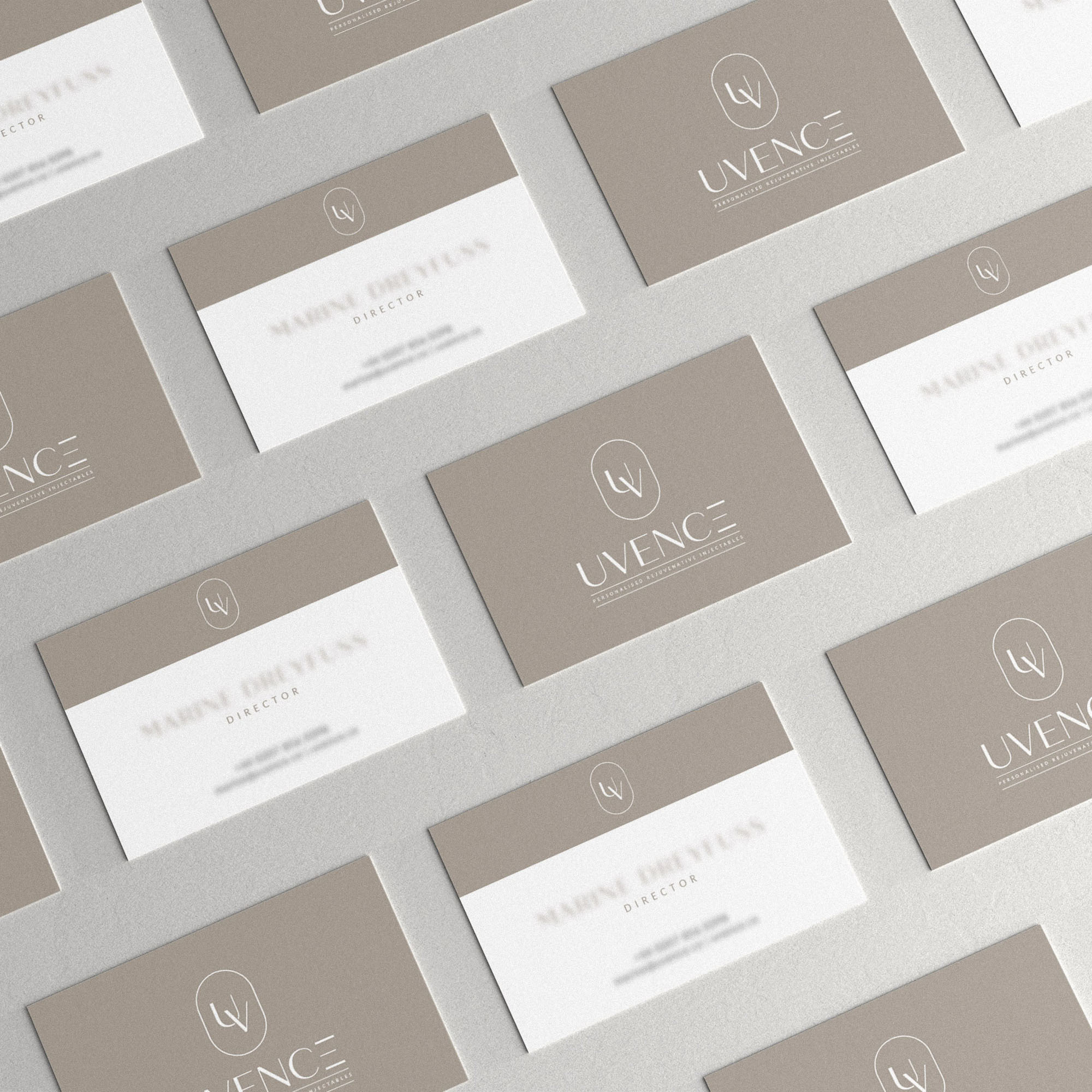
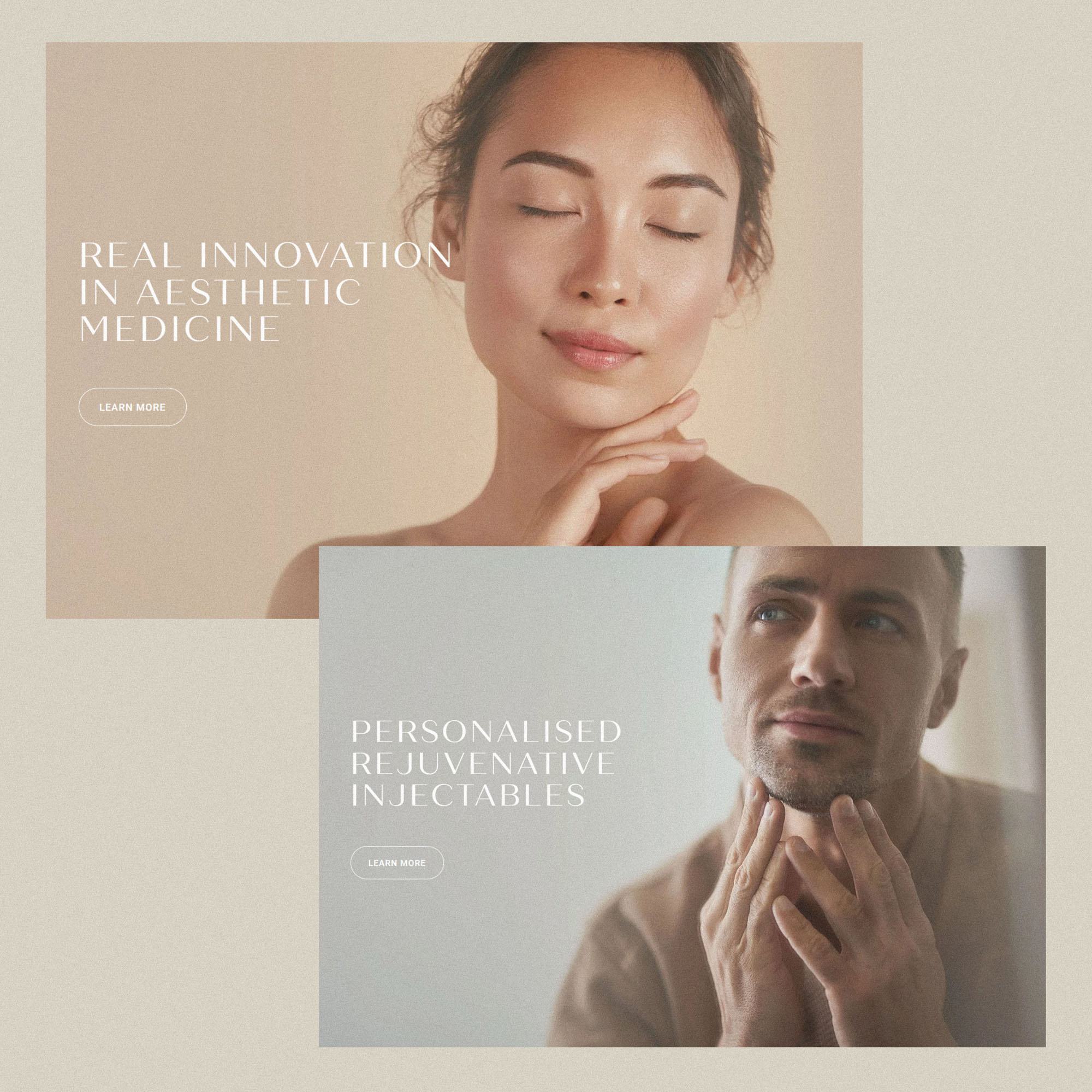
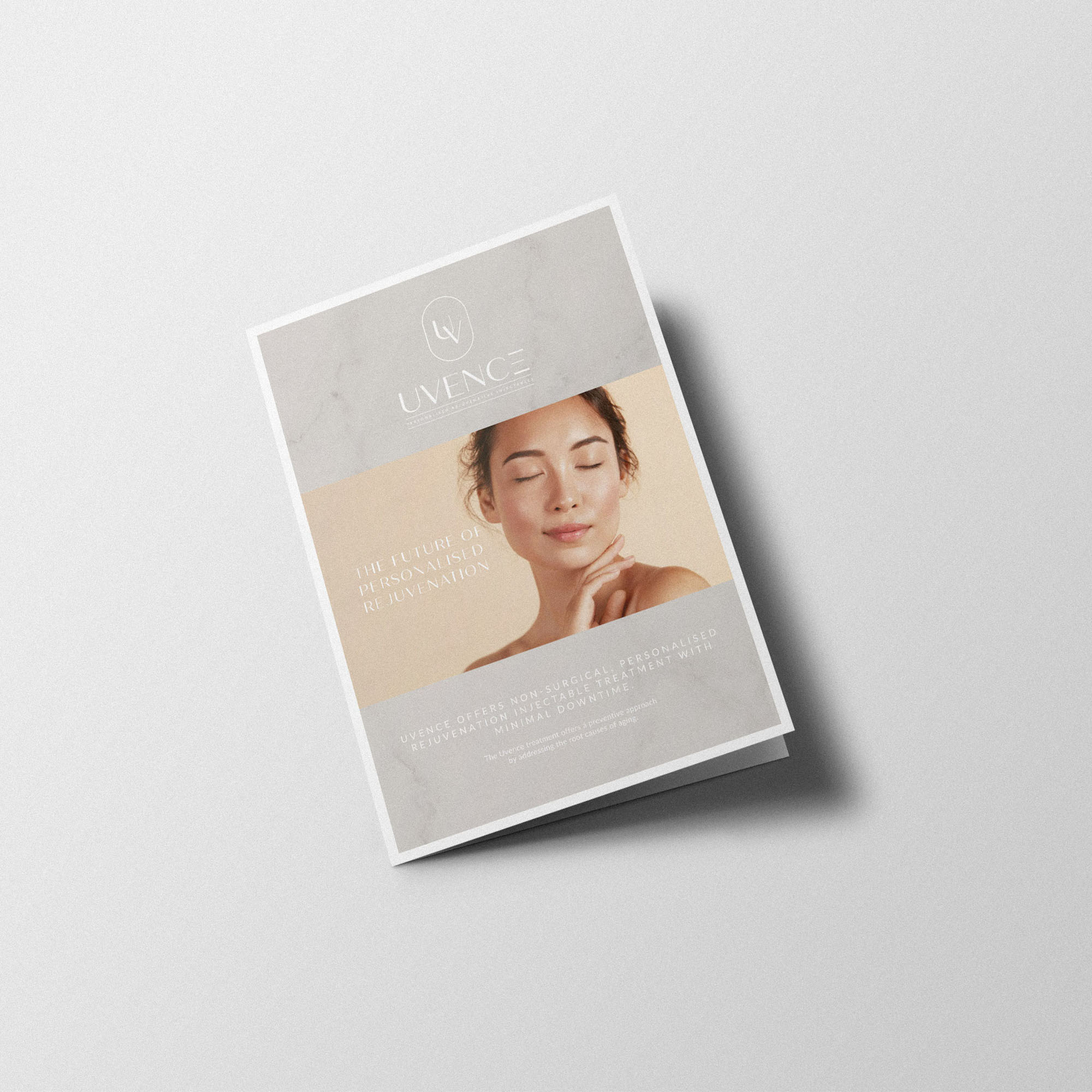
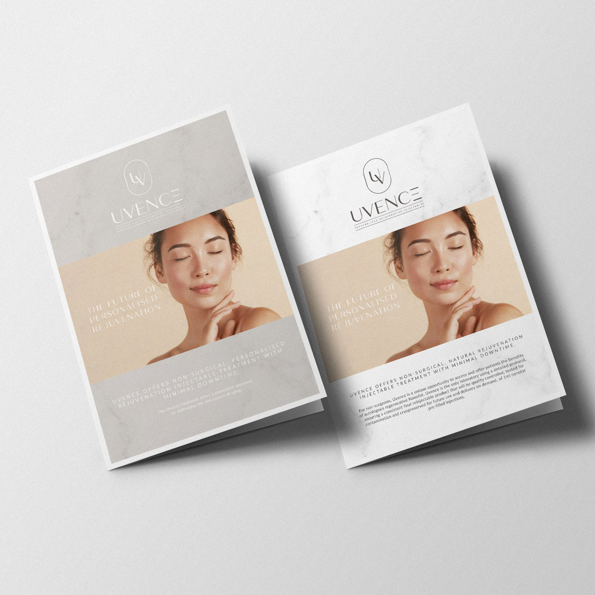
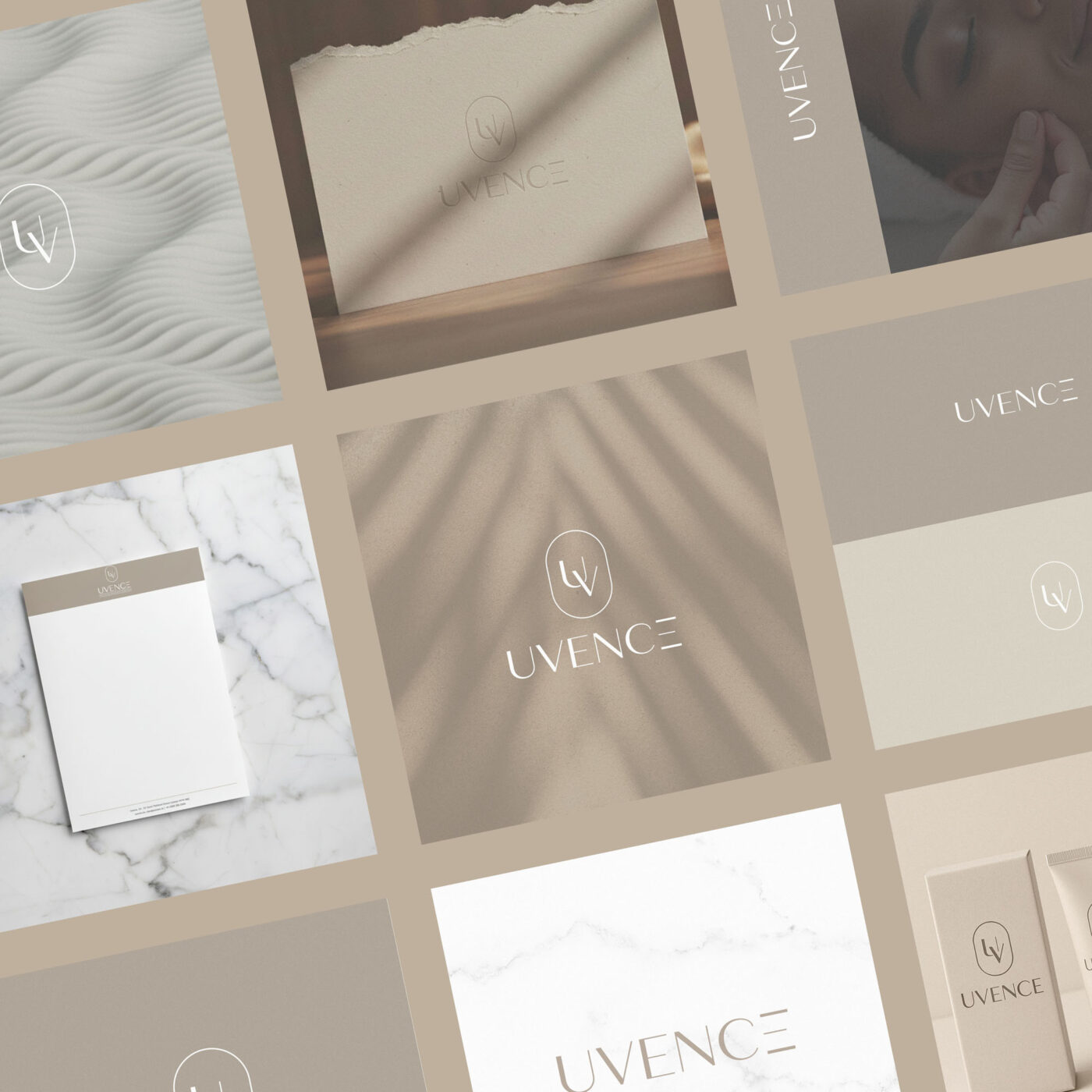
Uvence was an exciting brand to work with; they offer non-surgical, natural skin rejuvenation using Nanofat. Their clients are a mixture of Doctors who wish to offer the treatment, and patients who are interested in the cosmetic benefits.
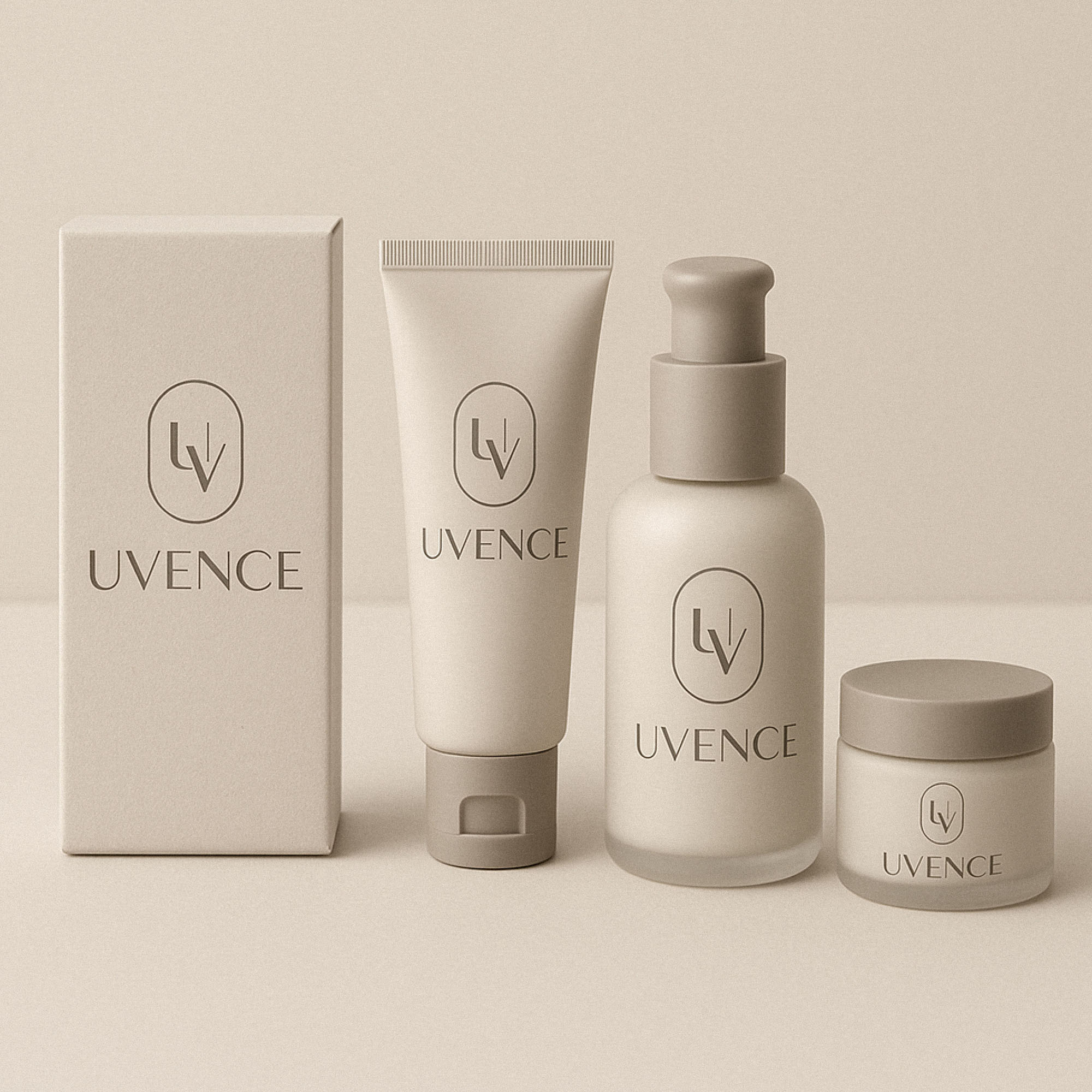
This required a delicately balanced identity; soft and attractive enough to appeal to patients, with a nod toward the aesthetic of cosmetic and skincare brands – while it needed to feel modern, credible & serious as appropriate for the Doctors who would be interested in the science and data.
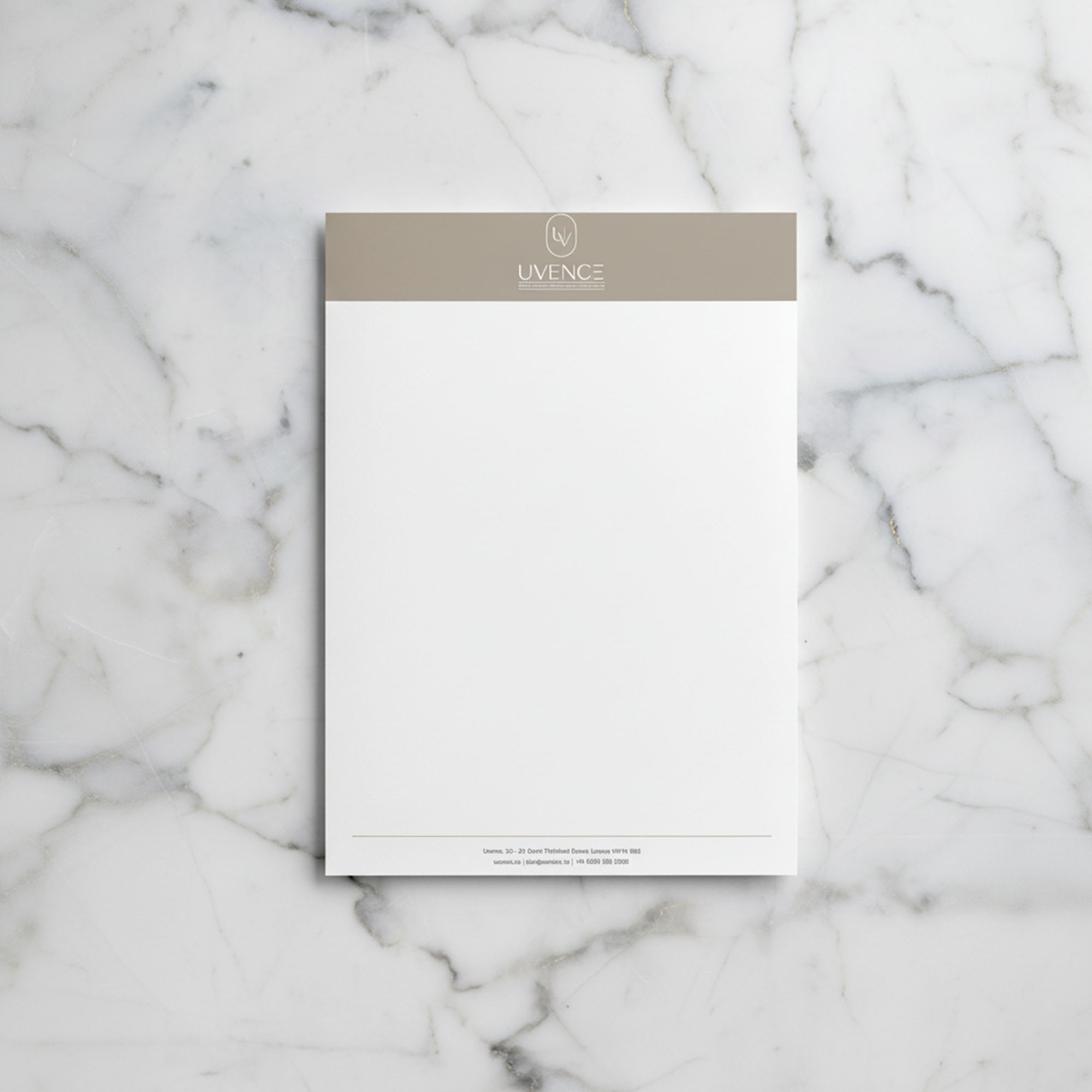
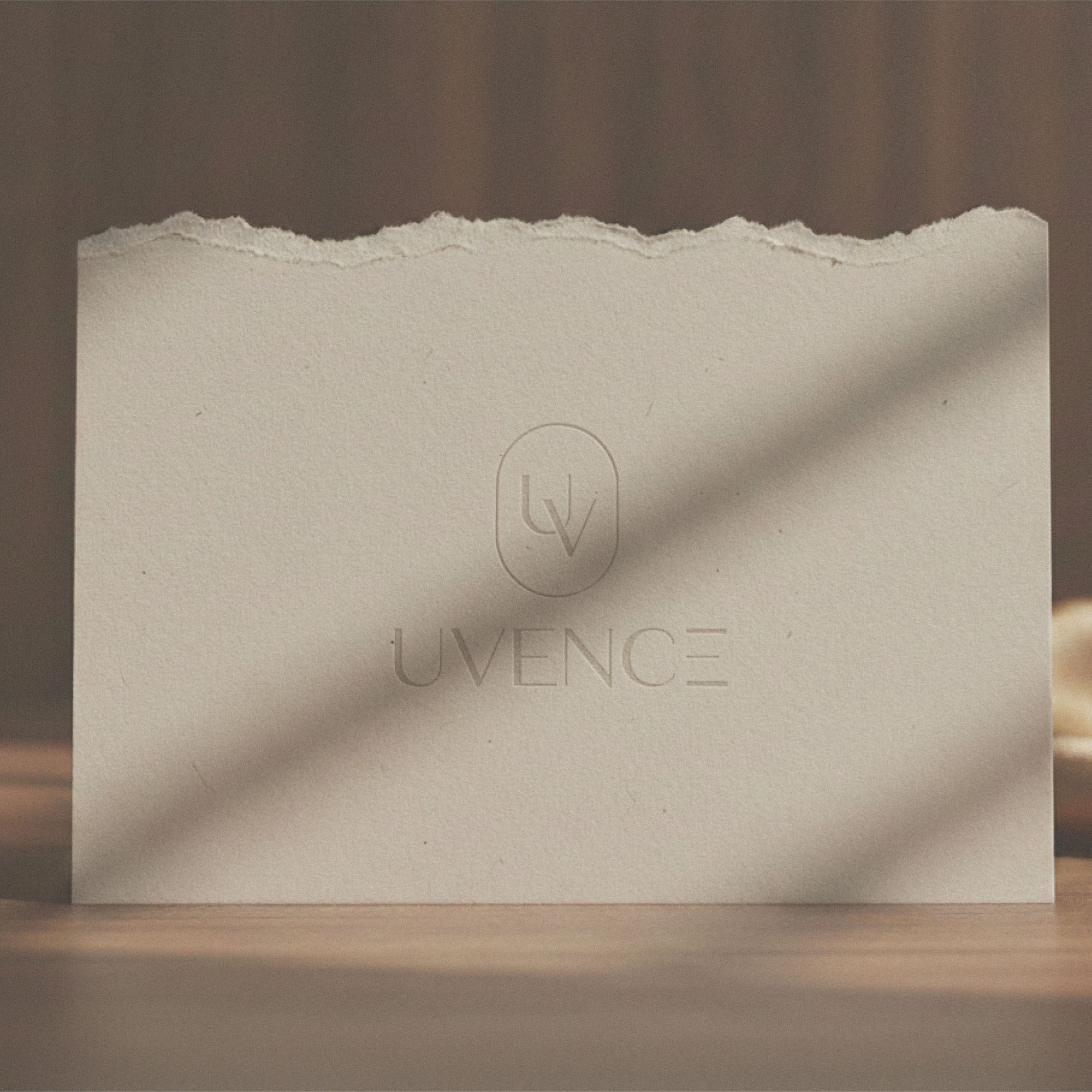
We achieved this goal, creating branding which feels at home on luxury cosmetics, but credible enough to present research papers and scientific data.
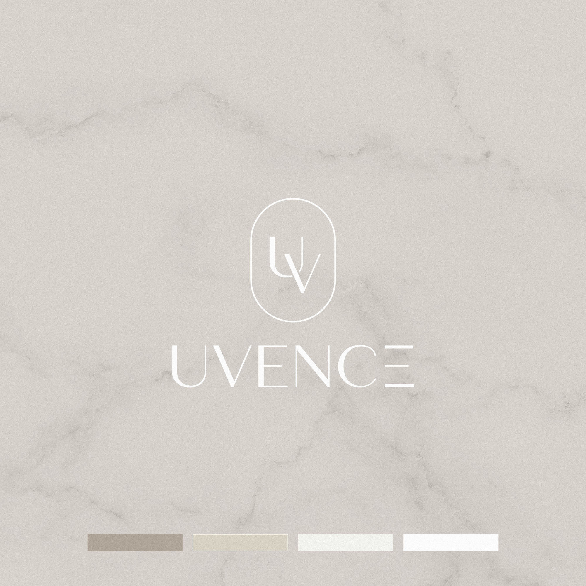
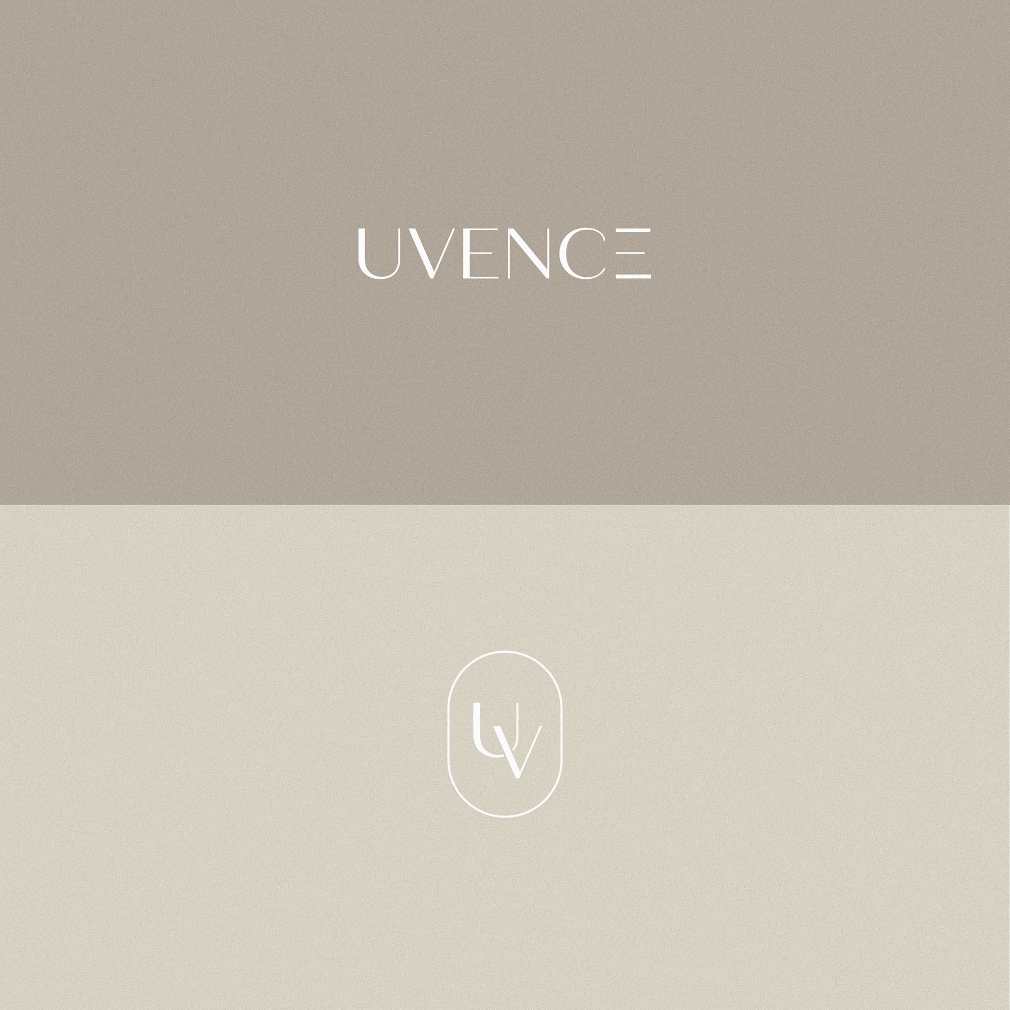
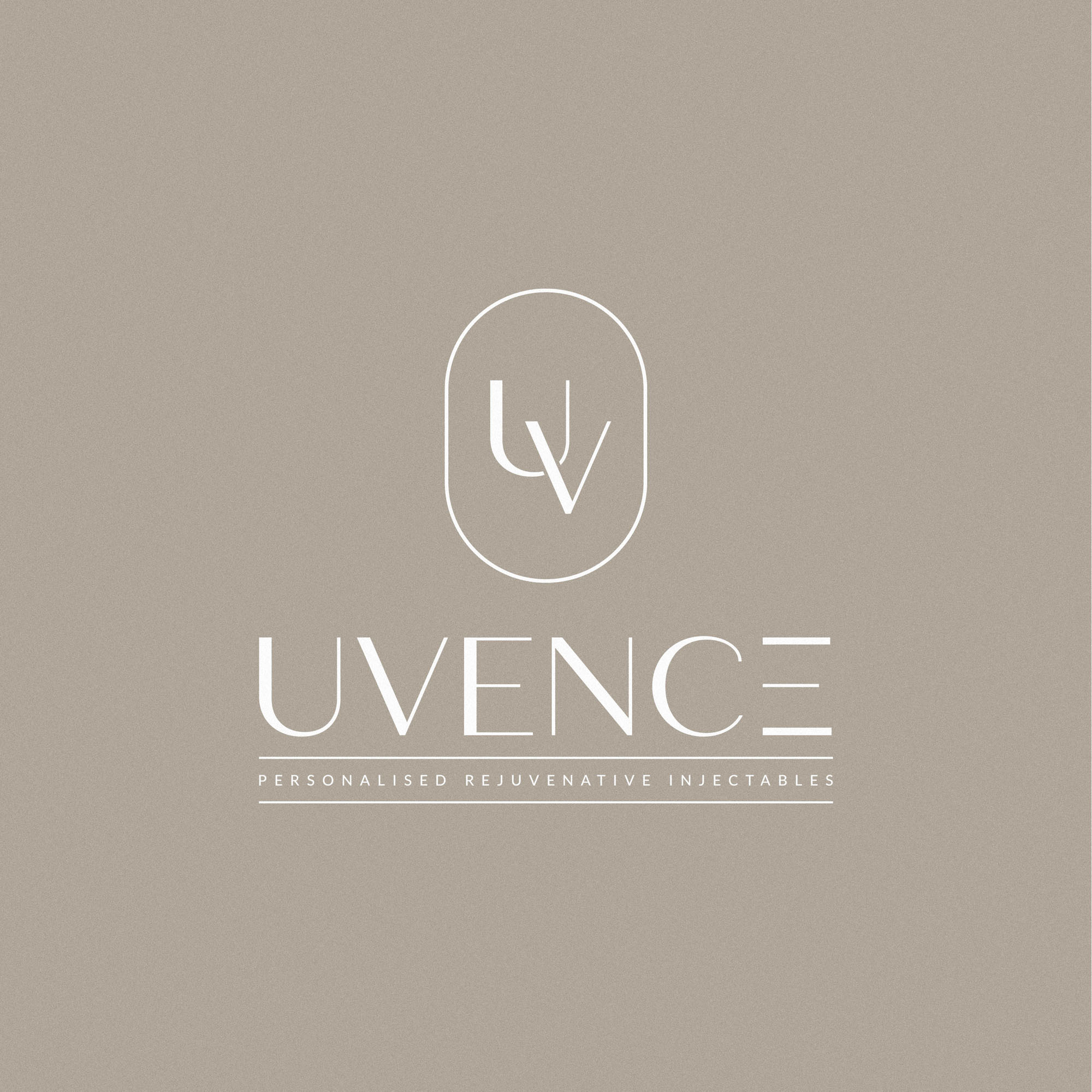
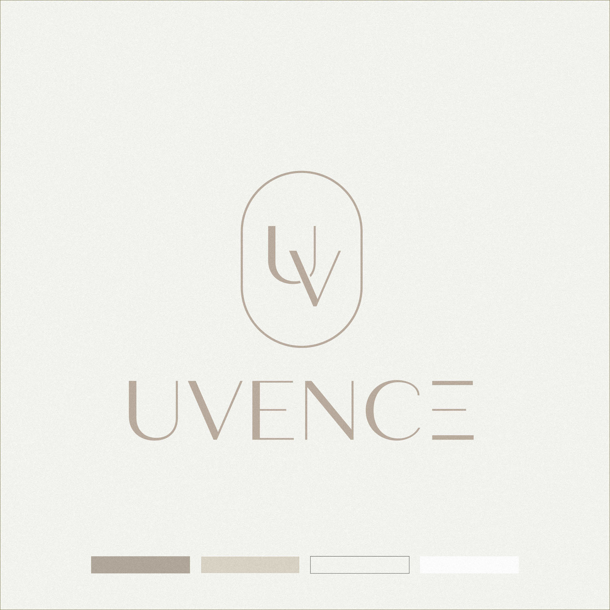
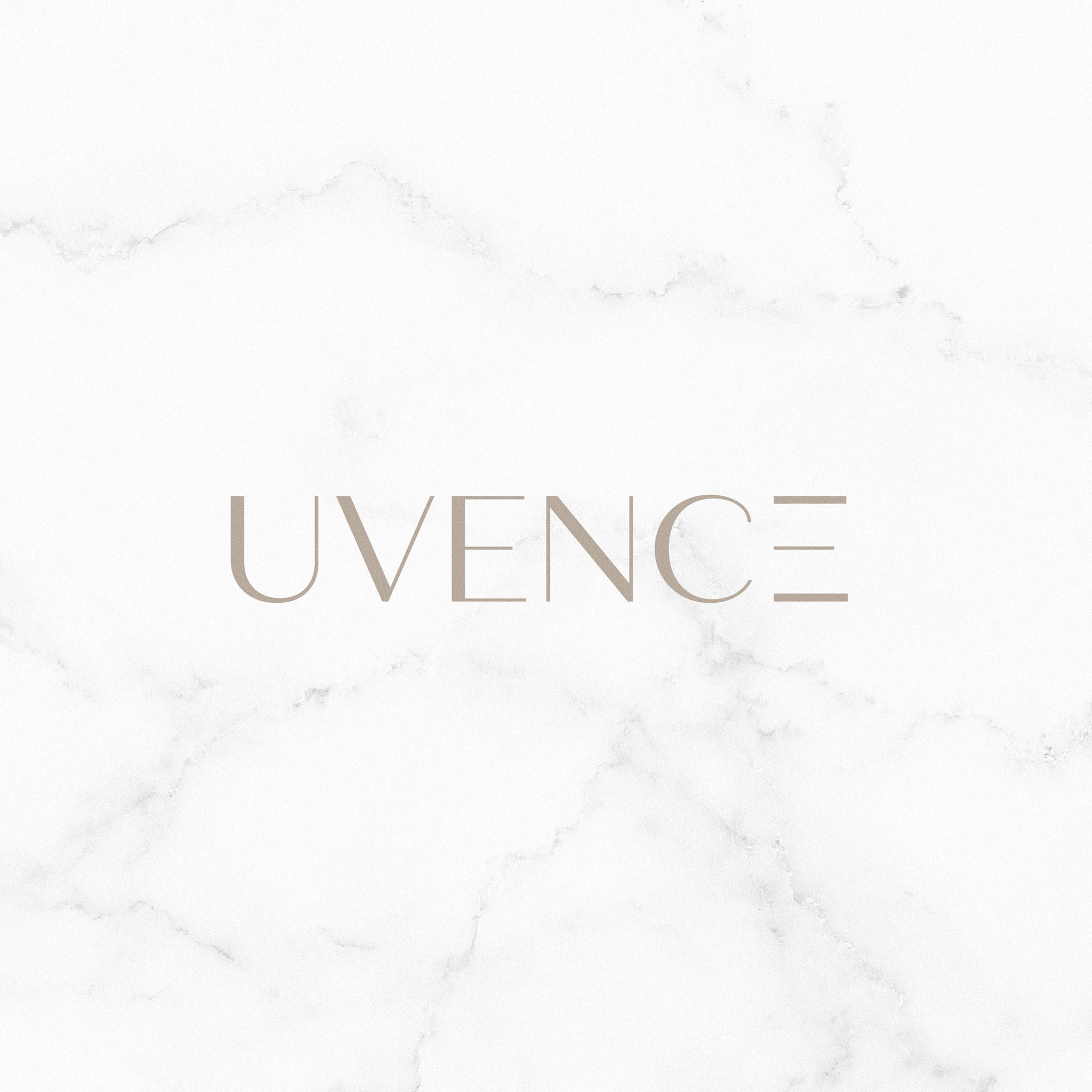
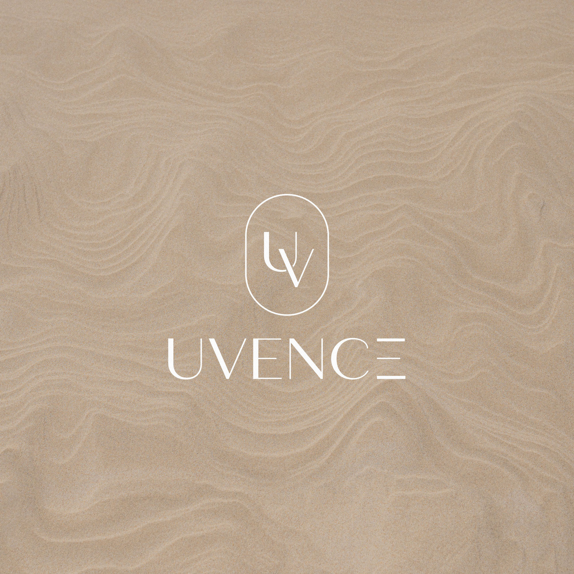
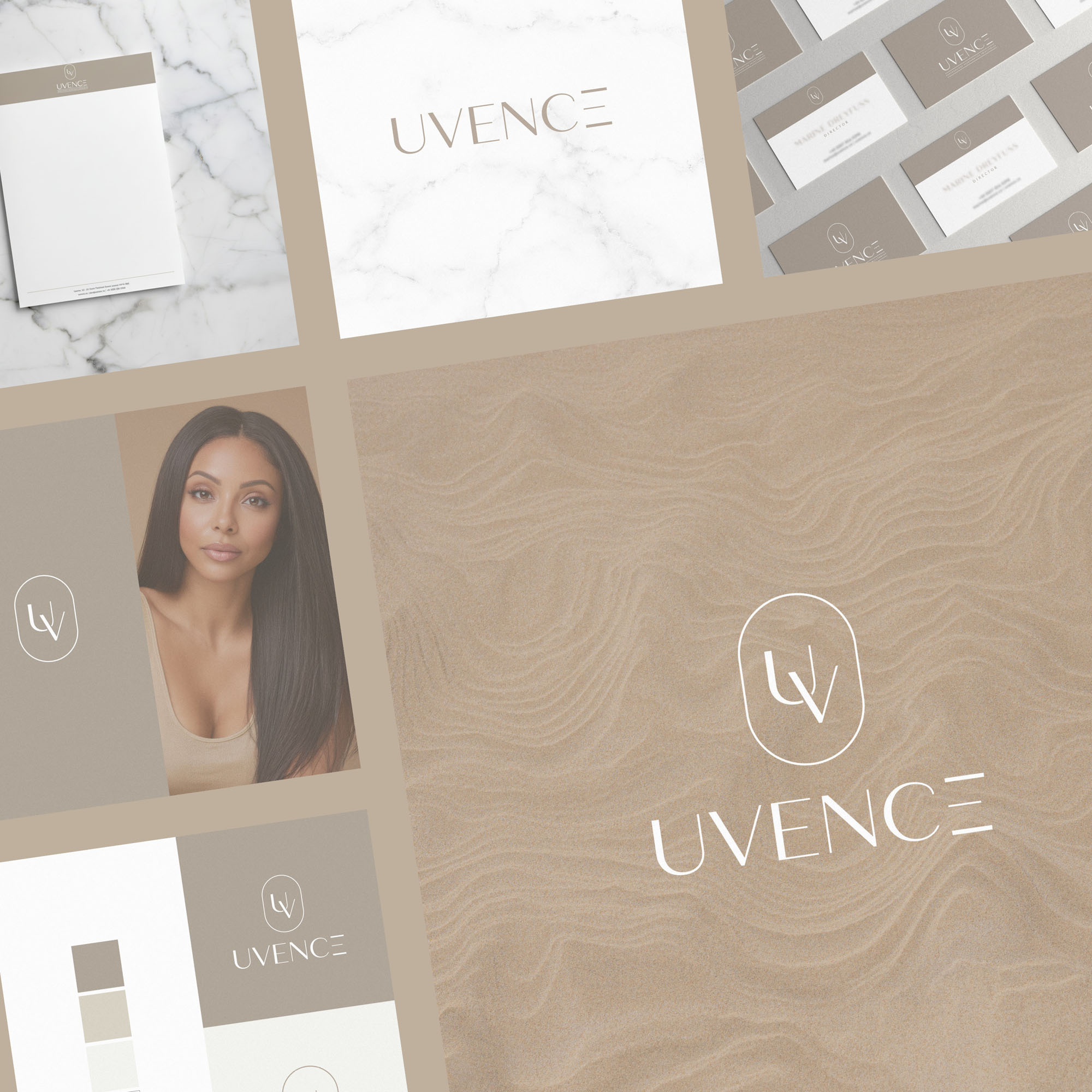
A monogram ‘UV’ brandmark provides a standalone, versatile option for certain situations – while the logotype feels modern, elegant and understated.
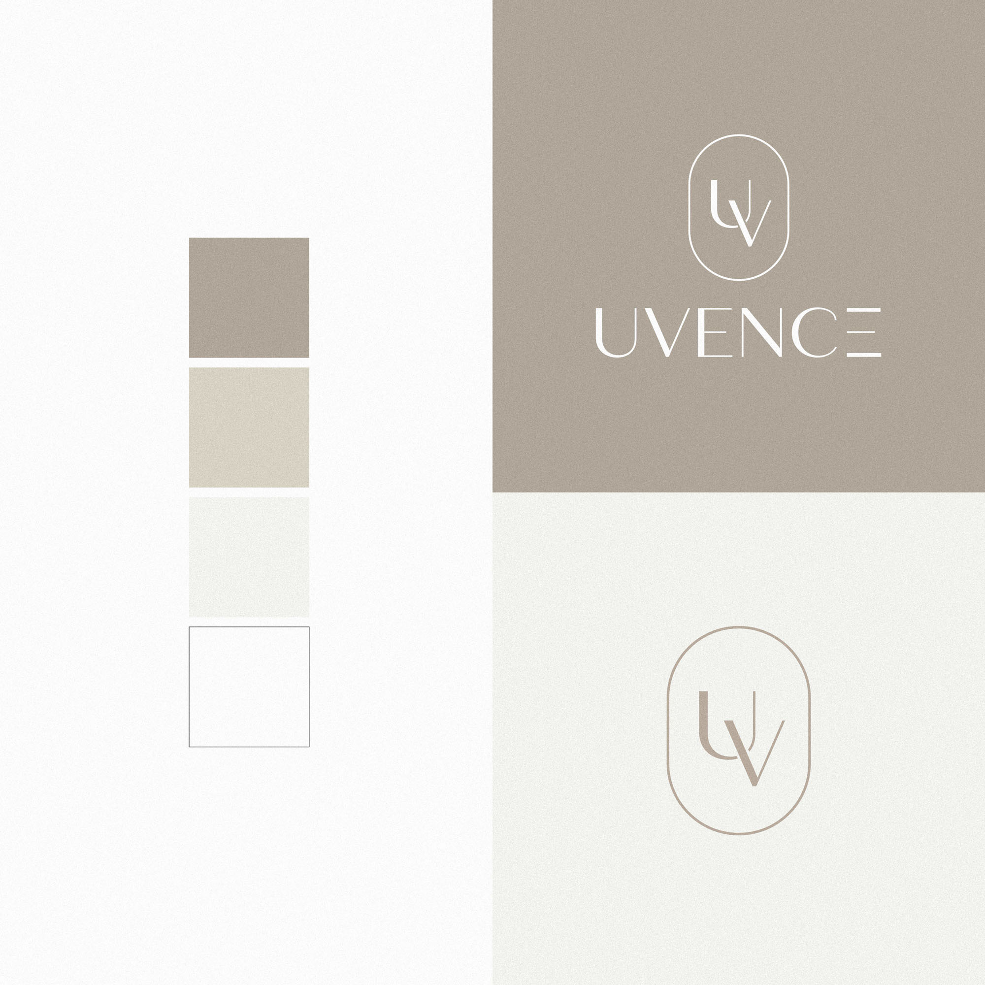
The colour palette uses soft neutrals to align with cosmetics & luxury.

Case Study
Opportunity
Uvence set out to express natural, science-led rejuvenation with an identity that feels at home beside luxury skincare while communicating medical credibility to clinicians and partners.
Objectives
- Unify a brand voice that reassures patients and reads professionally to doctors.
- Provide a versatile mark for small spaces alongside a confident primary logotype.
- Adopt a palette and typographic rhythm that project calm, care and precision.
- Ensure the system performs cleanly across print, packaging, presentations and digital.
Insight & Strategy
For a treatment rooted in science yet sought for its aesthetic benefits, the brand needed equal parts warmth and rigour. The strategy pairs a cosmetics-grade elegance with clinical clarity: succinct messaging, generous spacing and a flexible mark architecture that scales from social avatars to research decks.
Identity Solution
- Monogram: A refined “UV” brandmark designed for compact applications and quick recognition.
- Logotype: A modern, understated wordmark with measured letterspacing to convey composure and trust.
- Palette: Soft, luxurious neutrals that align with high-end skincare while supporting legibility for data and documentation.
- System Rules: Clear spacing, minimum sizes and layout guidance so presentations, brochures and on-screen uses remain consistent and readable.
Competitive Edge Now
The identity delivers immediate polish for patient-facing touchpoints and dependable clarity for clinician materials. The monogram/logotype pairing creates a memorable signature that adapts gracefully across formats without losing character.
What This Enables
A cohesive platform for clinic communications, research presentations and lifestyle content—positioning Uvence to expand touchpoints confidently while maintaining a calm, premium presence across every channel.
