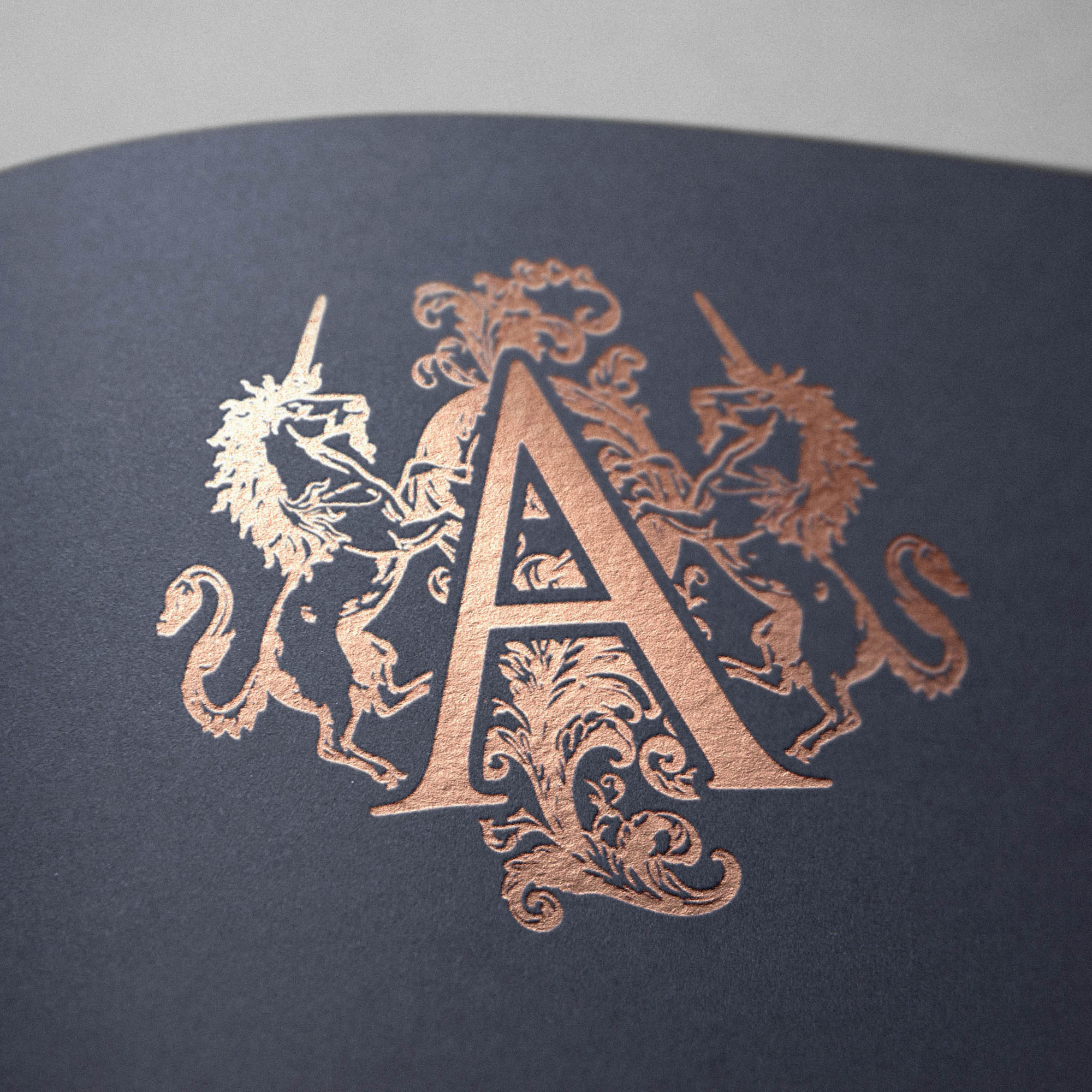
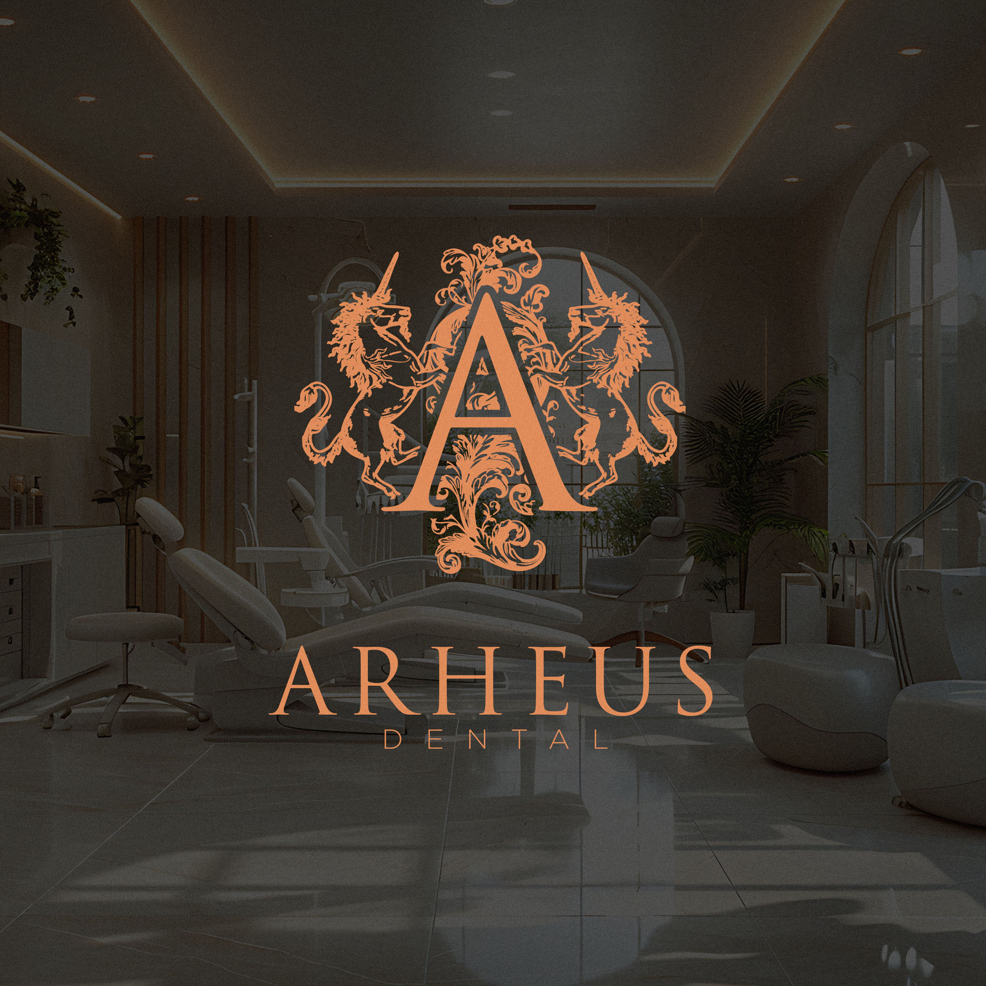
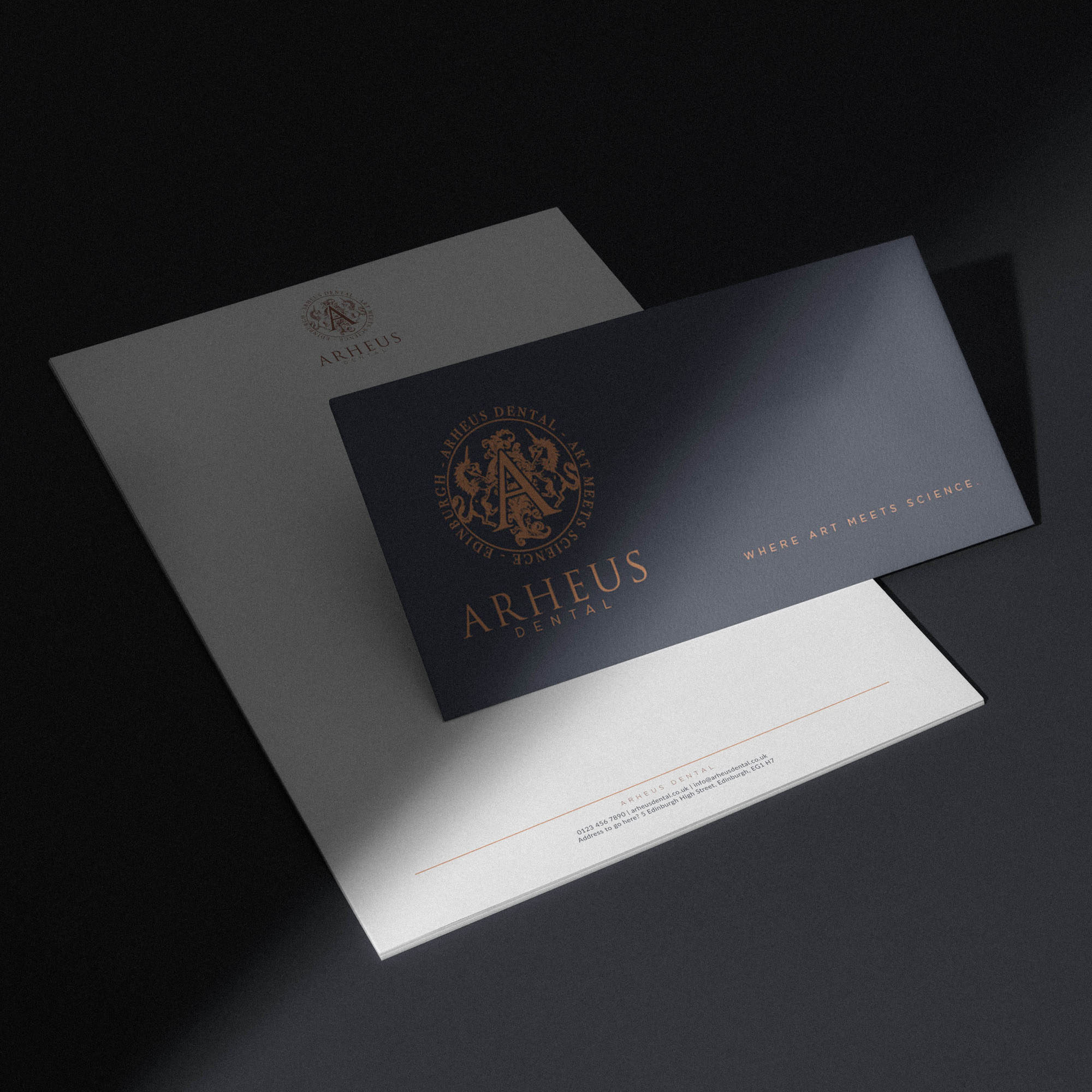
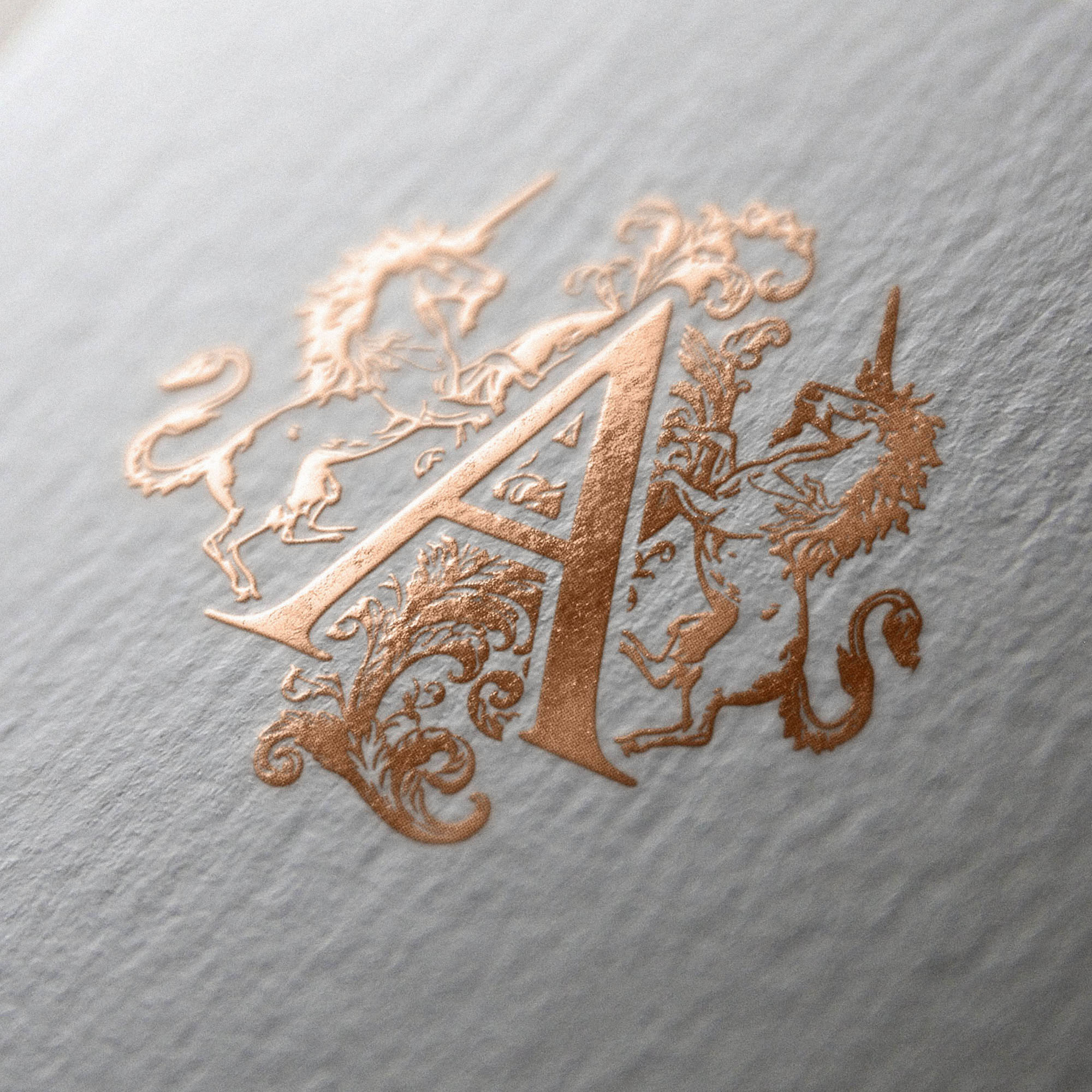
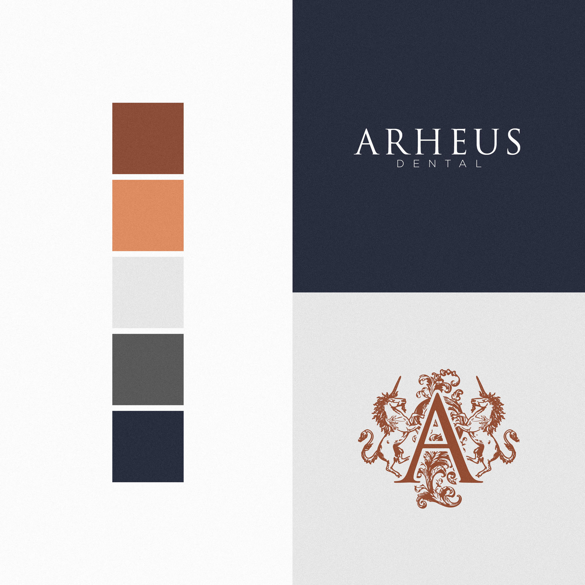
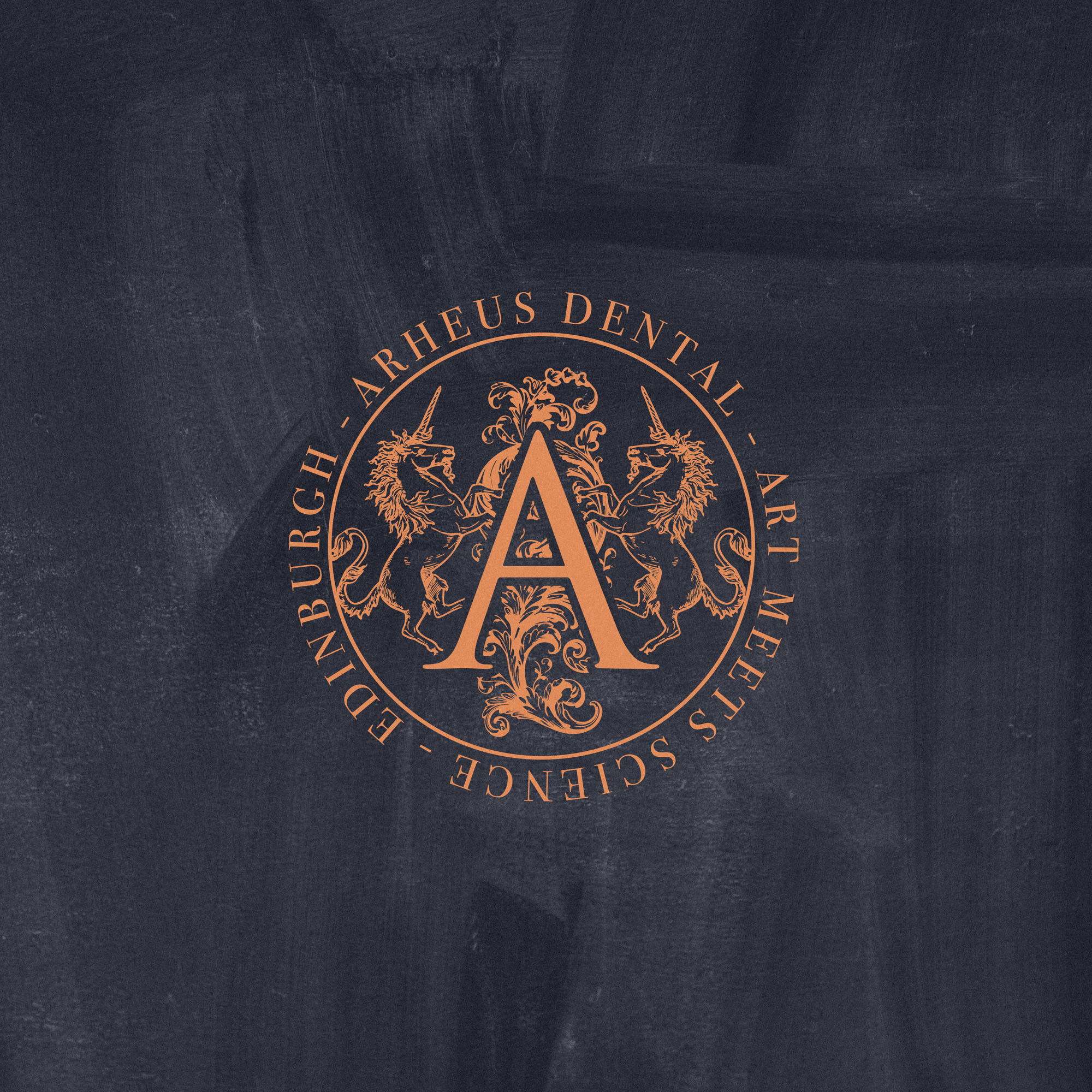
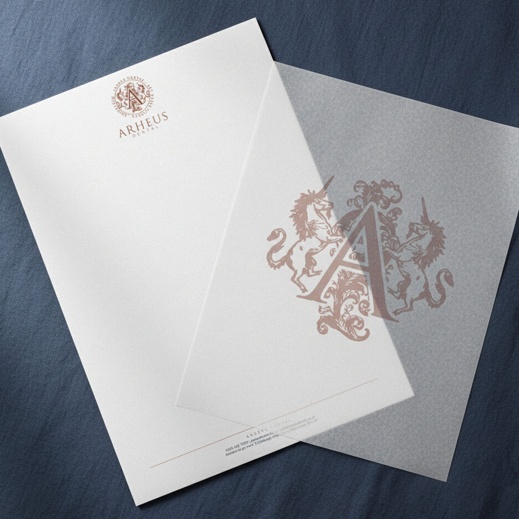
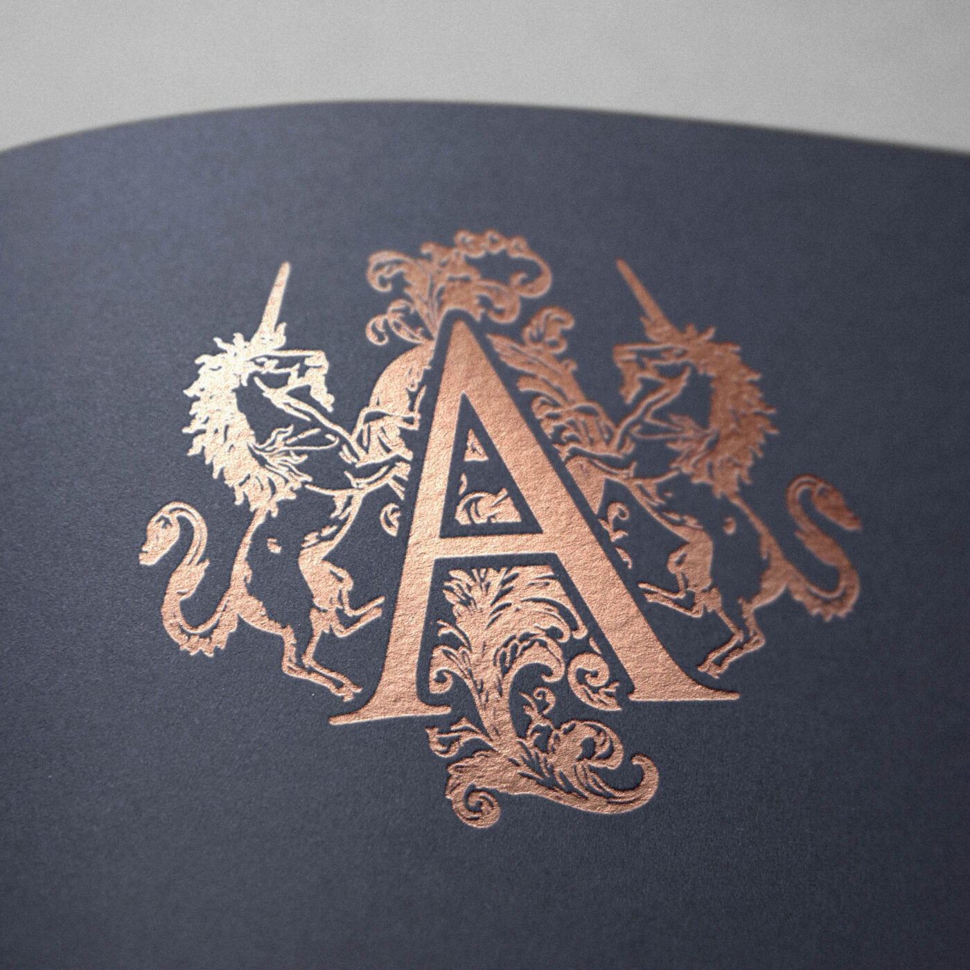
We wanted the new Brand Identity for Arheus Dental to celebrate the it’s physical location in Edinburgh; a Scotish city with a rich heritage and history. The brandmark identifies Arheus as a Heritage brand at a glance, with two unicorns (the national animal of Scotland) along with decorative flourishes framing a lettermark A in a style similar to royal crests, coats of arms… all playing into the rich history of the city. This was also a fitting representation of the many years of experience between Dentists at the practice, and the high end, luxurious experience they provide patients.
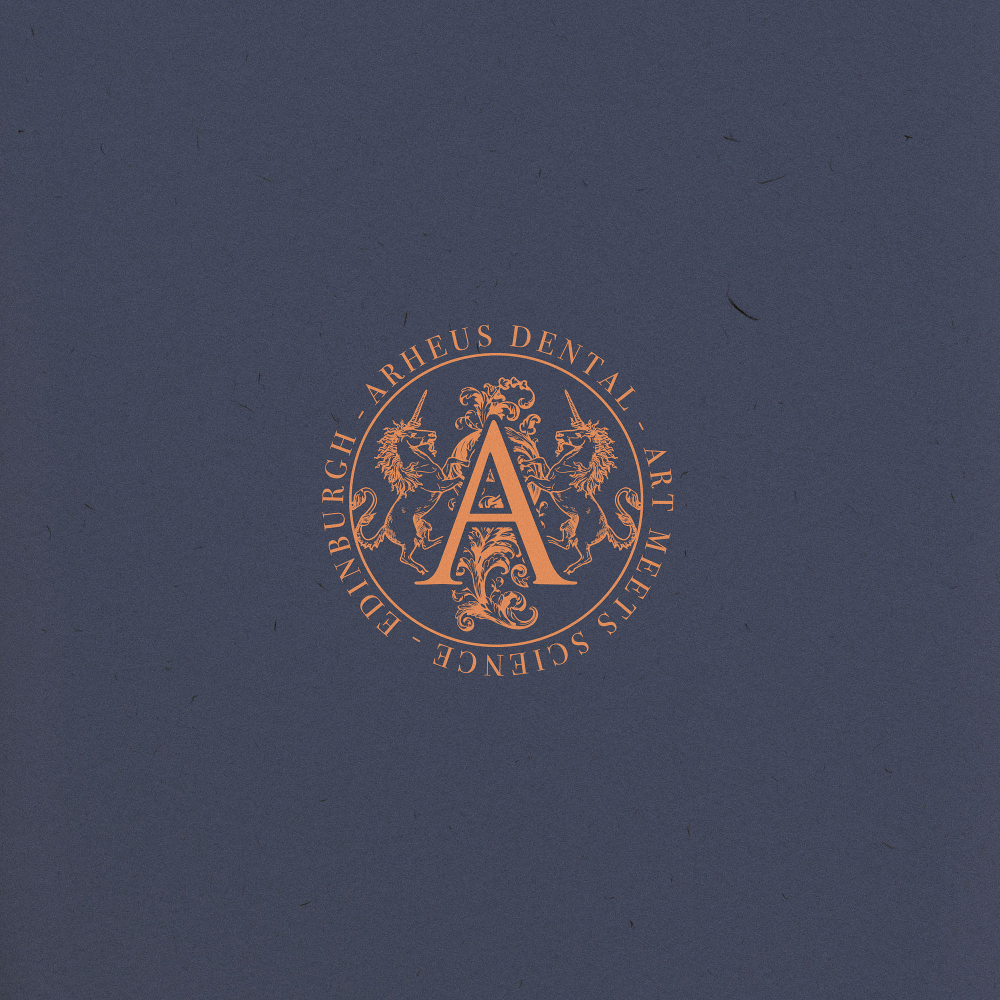
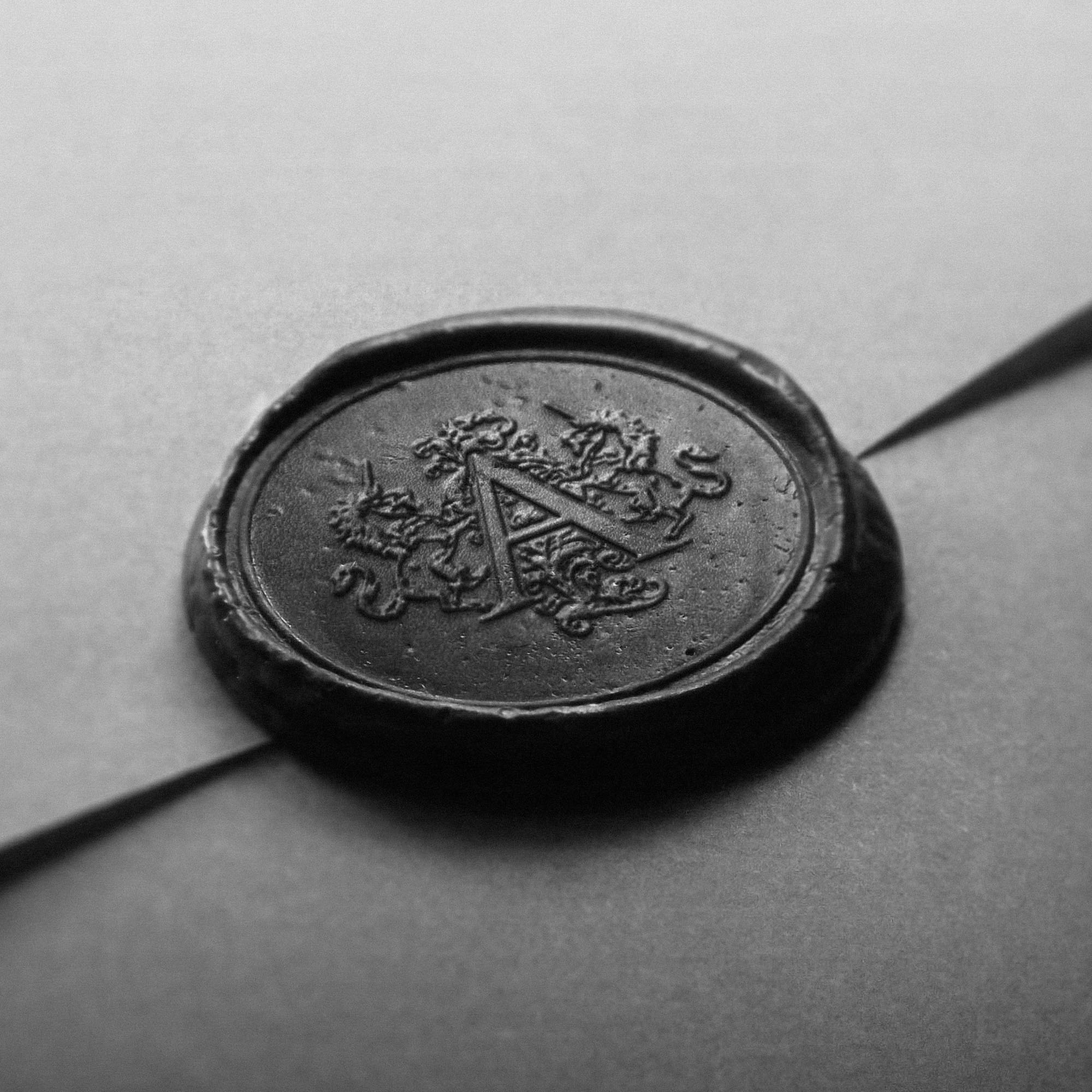
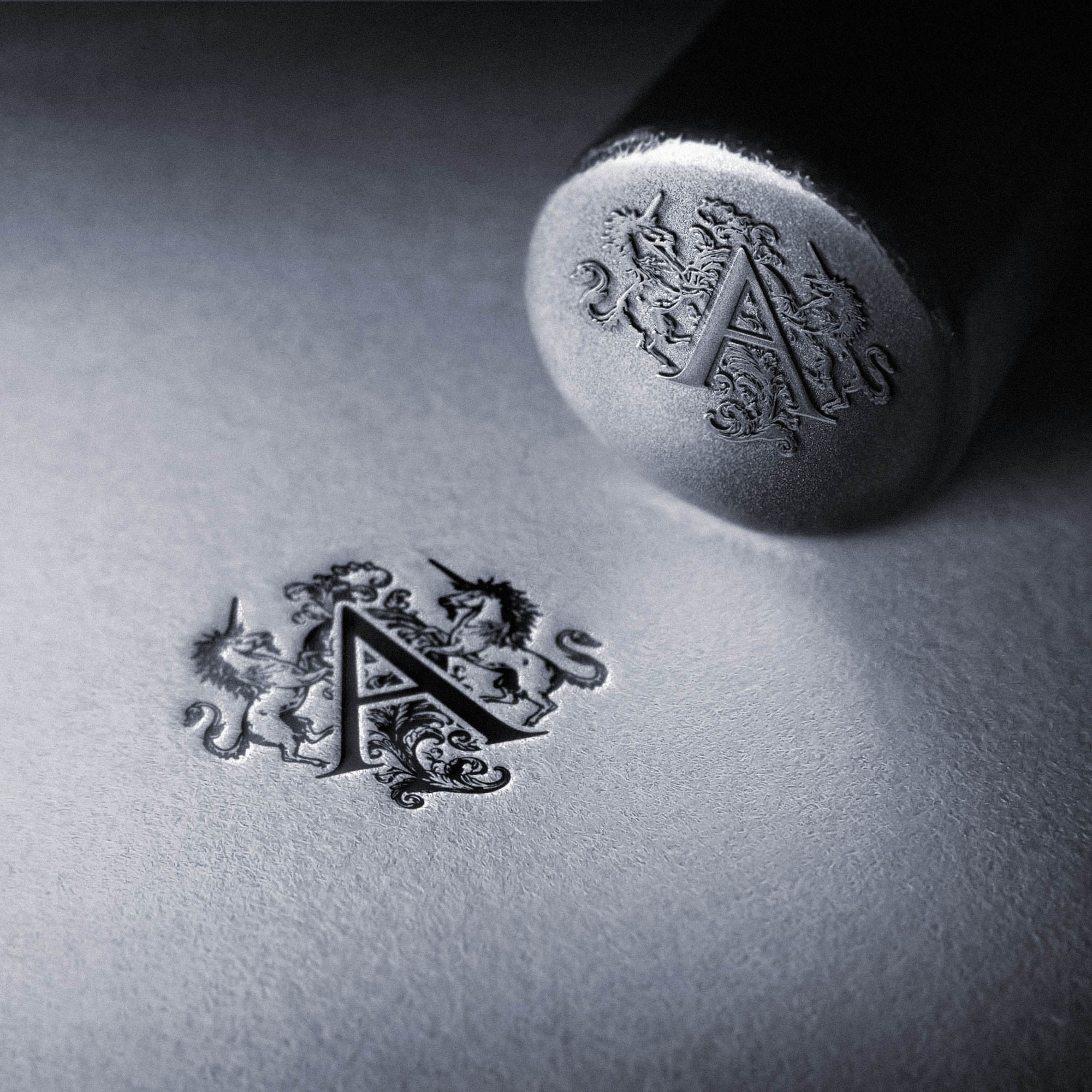
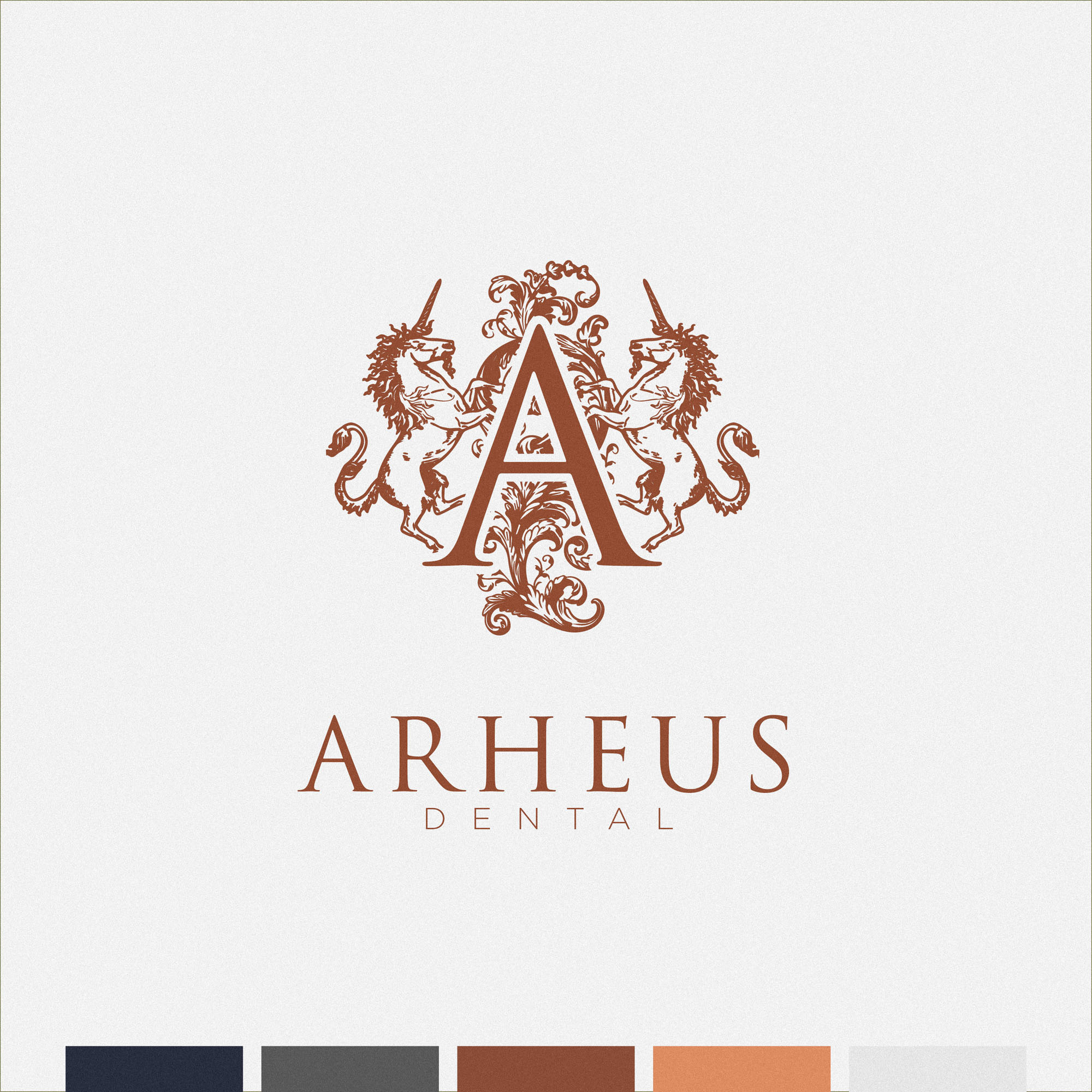
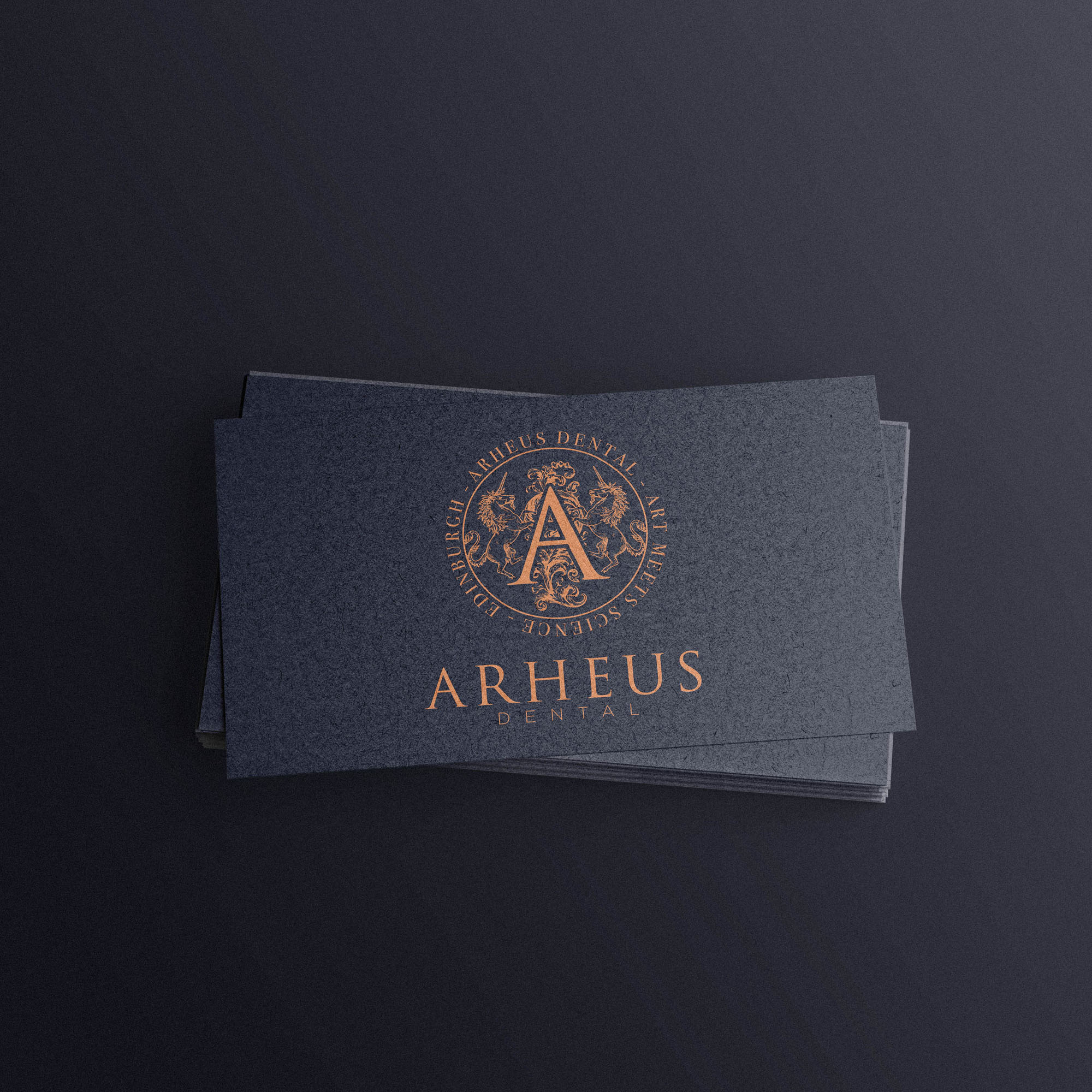
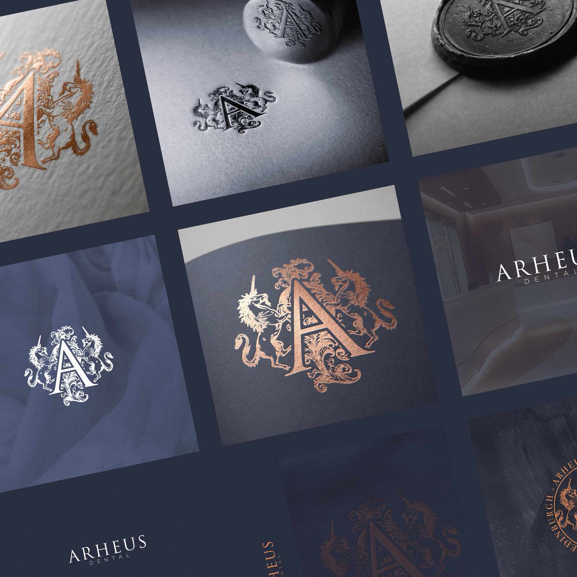
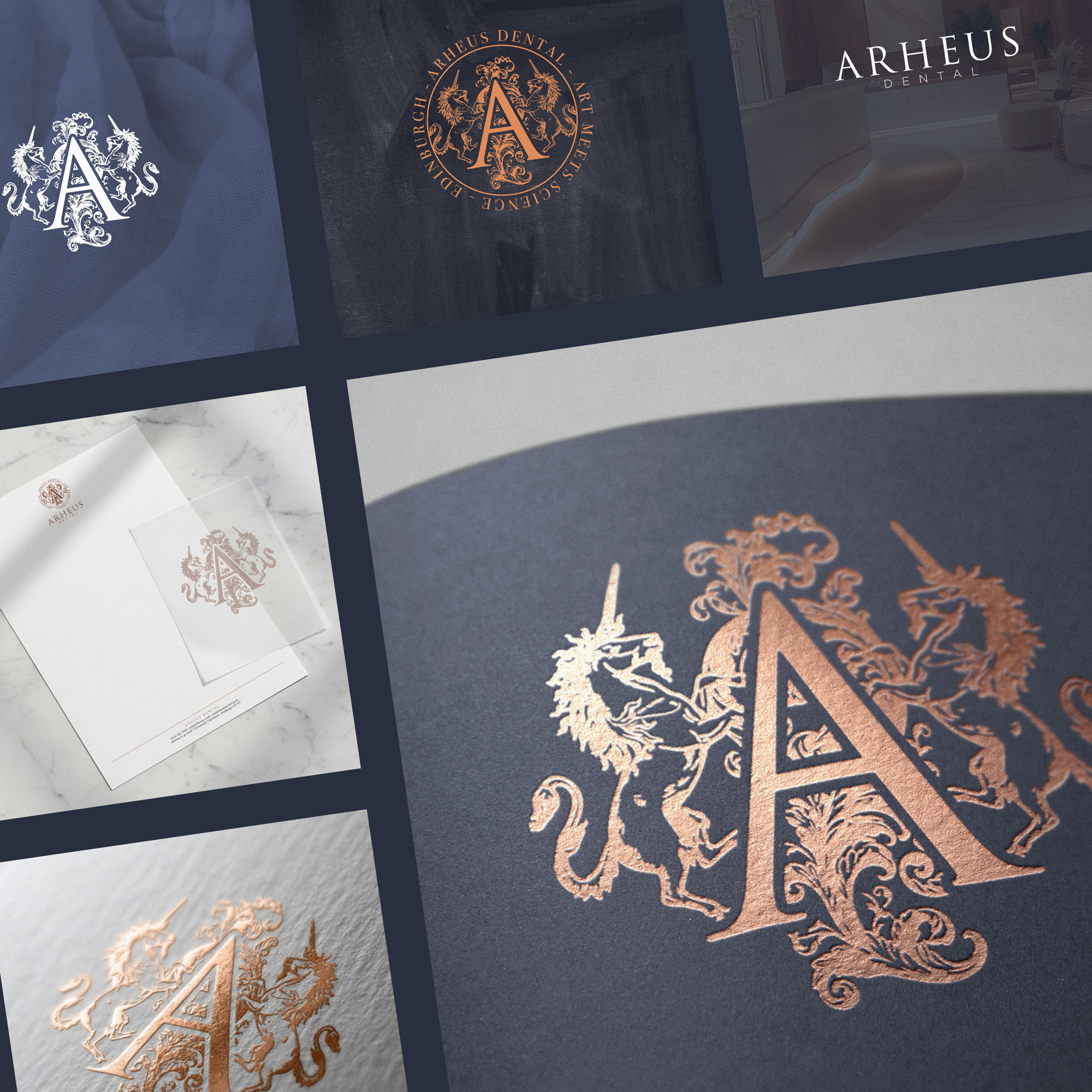
The navy-blue/copper colour palette aligned wonderfully, again ensuring an elevated feel and sophistication at a glance. Multiple variations of the brandmark, seal, and logotype ensure the brand is versatile enough to work beautifully across wax stamps, business cards, websites, and even foil embossed on brochures.
Case Study
Opportunity
Arheus Dental sought an identity that proudly reflects its Edinburgh home—bringing the city’s heritage and craftsmanship into a premium, modern practice experience.
Objectives
- Introduce a heritage brandmark that signals provenance, expertise and luxury at a glance.
- Create a versatile system with brandmark, seal and logotype variations for small and large applications.
- Establish a refined navy–blue and copper palette that reproduces beautifully in print and digital.
- Ensure production-ready assets for specialist finishes (foil, emboss, wax) without sacrificing clarity.
Insight & Strategy
Edinburgh’s rich visual language—royal crests, coats of arms and architectural ornament—offers a timeless foundation for trust. We centred the identity on a heraldic composition: two Scottish unicorns (the national animal) and decorative flourishes framing a lettermark “A,” expressing heritage, longevity and an elevated standard of care. The colour story—deep navy with copper accents—adds modern sophistication and warmth.
Identity Solution
- Heritage Brandmark: A crest-style emblem featuring twin unicorns and ornamental detailing around a dignified “A,” crafted to read confidently from reception signage to digital headers.
- Seal & Lettermark Variants: Simplified roundels and a focused lettermark for compact uses—ideal for wax stamps, appointment cards, and small-format digital placements.
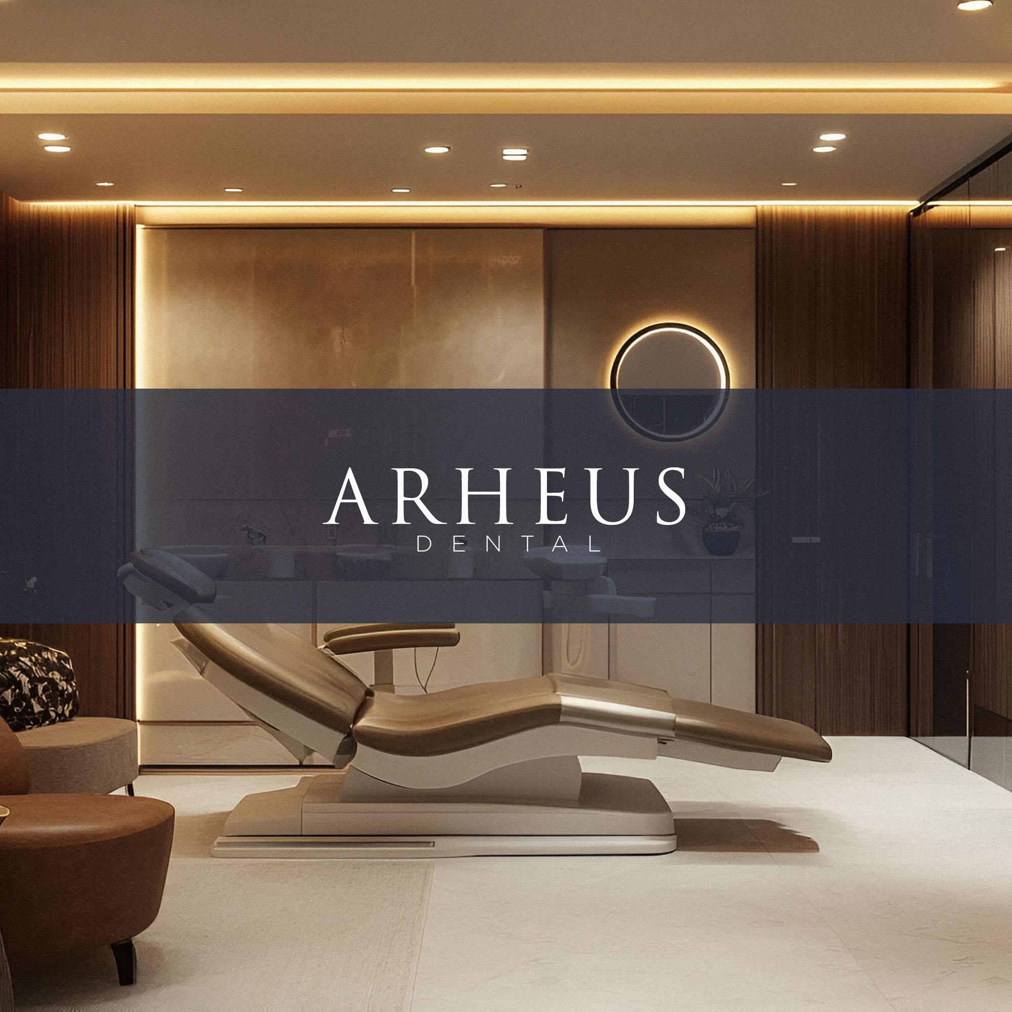
- Logotype & Lockups: A composed wordmark paired with the emblem in flexible arrangements to suit fascia, stationery and on-screen layouts.
- Palette & Materiality: Navy blue and copper specified for reliable foil and emboss applications; guidance provided for print, screen and specialty finishes.
- System Rules: Clear-space, minimum sizes and finish-specific recommendations ensure precision across brochures, business cards, website headers and practice forms.
Competitive Edge Now
The heraldic brandmark delivers immediate place-based authenticity and quiet prestige. Combined with the navy–copper palette and disciplined typography, Arheus presents a distinctive, trustworthy presence that feels both classic and impeccably current.
What This Enables
A cohesive platform for premium patient materials, referral packs, signage and digital communication—ready for foil-embossed brochures, wax-sealed documents and day-to-day applications—so Arheus Dental can expand touchpoints while maintaining a richly crafted, Edinburgh-rooted identity.
