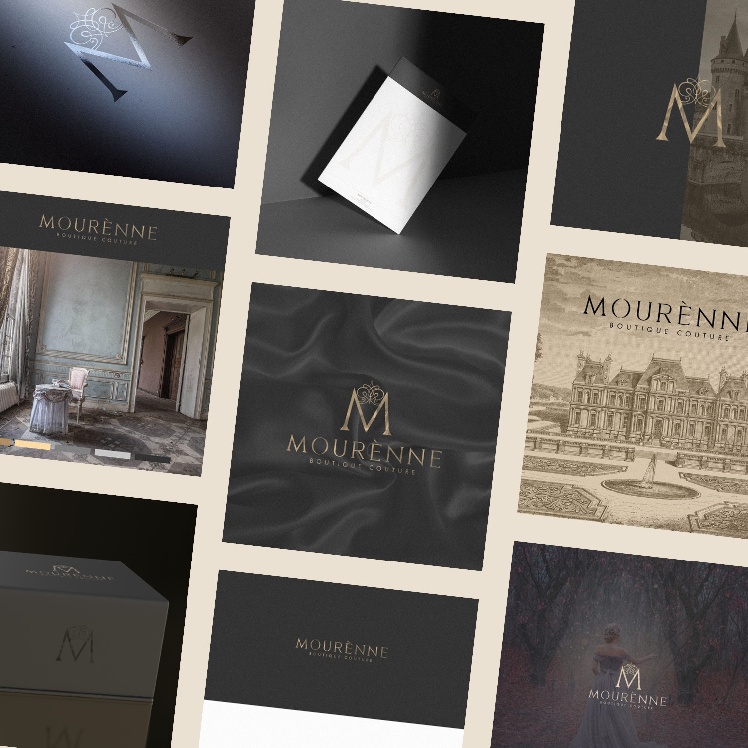
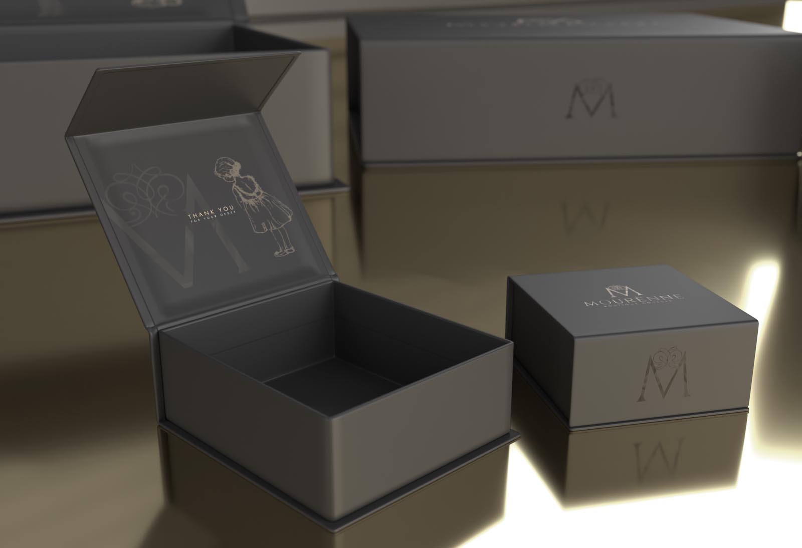
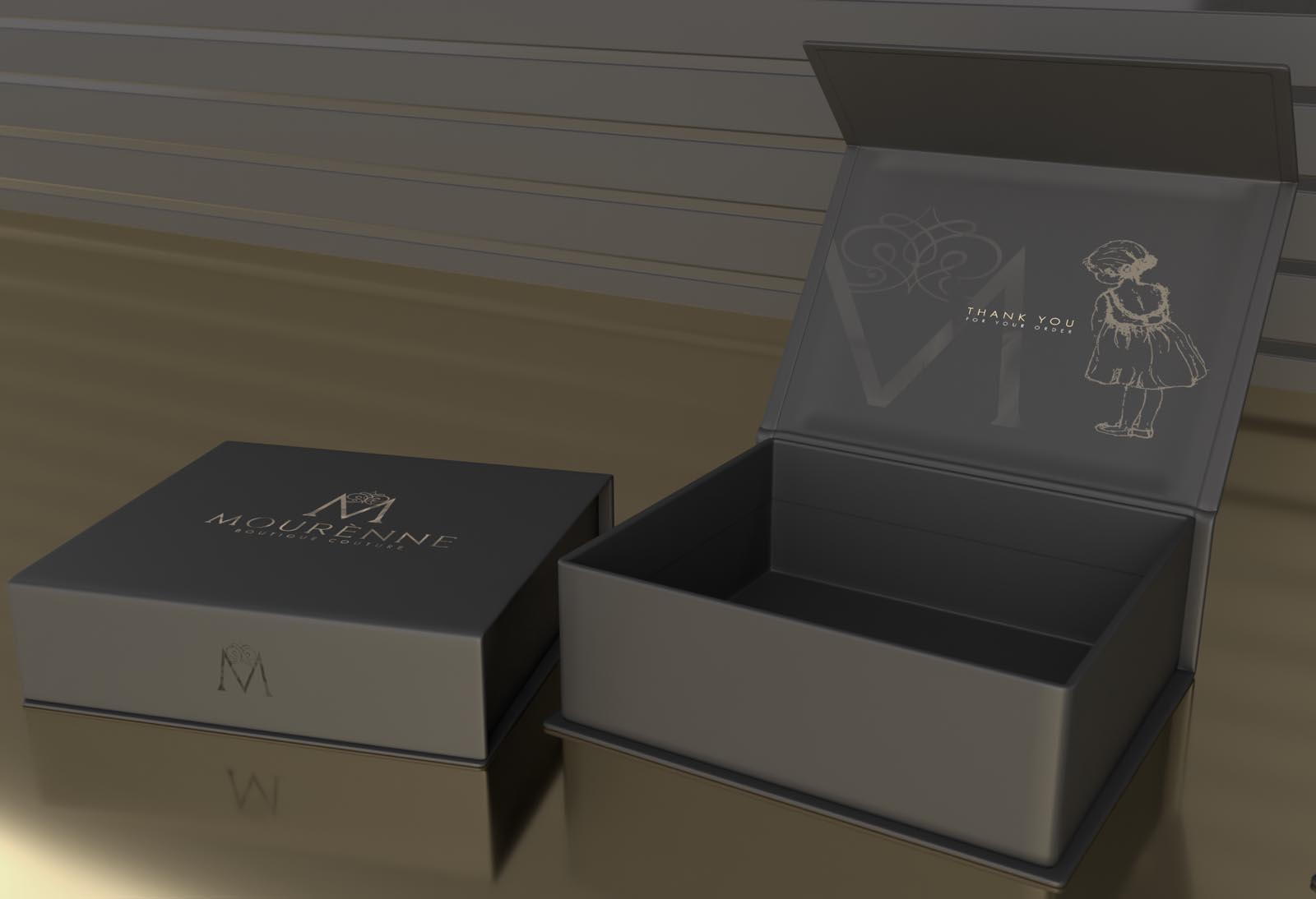
Mourenne is a high end Boutique Couture (high end, bespoke fashion) brand based in the US. The brand identity we developed is elegant and luxurious, hinting at the exclusive with subtle but indulgant elements such as a silk texture flowing over a version of the antique gold logo.
The story behind the brand is incredible; an extremely talented mother creating the most amazing dresses for her little girl, then friends, and now due to popular demand a fast growing and exclusive list of paterons internationally. There is a dreamlike element to the brand, with the dresses often compared to something a princess might wear in a fairytale… However far from cosplay, these eleborate dresses are fitting for balls, weddings and other formal occasions.
The tiara resting on the M was handdrawn in Adobe Fresco, then digitally refined – and hints at the brand story. Make your little girl look and feel like a princess, with these incredible and unique dresses.
Overall, the style and influence of the dresses is Classic French, and so we worked in some appropriate elements in terms of both the photography selected and tones present in the branding.
The packaging was designed to work fluidly with a range of box dimensions, it features a stunning spot varnished version of the M brandmark on the front face; invisible until it catches the light, resulting in a beautifully subtle hidden detail.
Case Study
Opportunity
For a US boutique couture house creating heirloom-worthy gowns, there was space for an identity that feels genuinely couture: regal, intimate and story-led—avoiding generic “kids fashion” tropes while capturing the fairytale aura clients respond to.
Objectives
-
Express ultra-high-end luxury with a composed, classical tone.
-
Create a signature M mark that carries the brand’s origin story without feeling whimsical.
-
Establish a restrained, indulgent palette (antique gold with deep neutrals) and tactile finishes that reward close attention.
-
Design packaging that adapts to multiple box sizes while keeping the experience elevated.
Insight & Strategy
The narrative is powerful: a mother’s craft becoming a sought-after label. We translated that into quiet opulence: a calm, French-influenced voice; generous negative space; and materials that feel precious. “Princess” is interpreted as ballroom-ready sophistication, not costume—so the identity shows restraint and lets craftsmanship speak.
Identity Solution
-
Monogram with Crown: A hand-drawn tiara rests on a sculpted M, refined digitally to read with poise at both hero and micro sizes. The crown cues the brand story while the letterform anchors recognition.
-
Wordmark & Lockups: Primary horizontal and compact treatments with disciplined spacing and minimum sizes for print, labels and digital avatars.
-
Palette & Texture: Antique gold paired with deep black/neutral grounds; a subtle silk-flow texture used sparingly to add movement and indulgence without clutter.
-
Packaging: A flexible kit for varied box dimensions, featuring a spot-varnished M on the lid—a “hidden” reveal that appears when it catches the light, reinforcing exclusivity.
Competitive Edge Now
The system balances romance with rigour: a memorable, story-encoded mark; couture-grade colour and materials; and applications that feel ceremonial, not showy. It positions Mourenne as an invitation-only atelier rather than a trend-led label.
What This Enables
A cohesive presence from lookbooks to boxes to digital; the confidence to court international patrons; and room for limited editions and collaborations—while preserving the house’s composed, high-luxury character.

