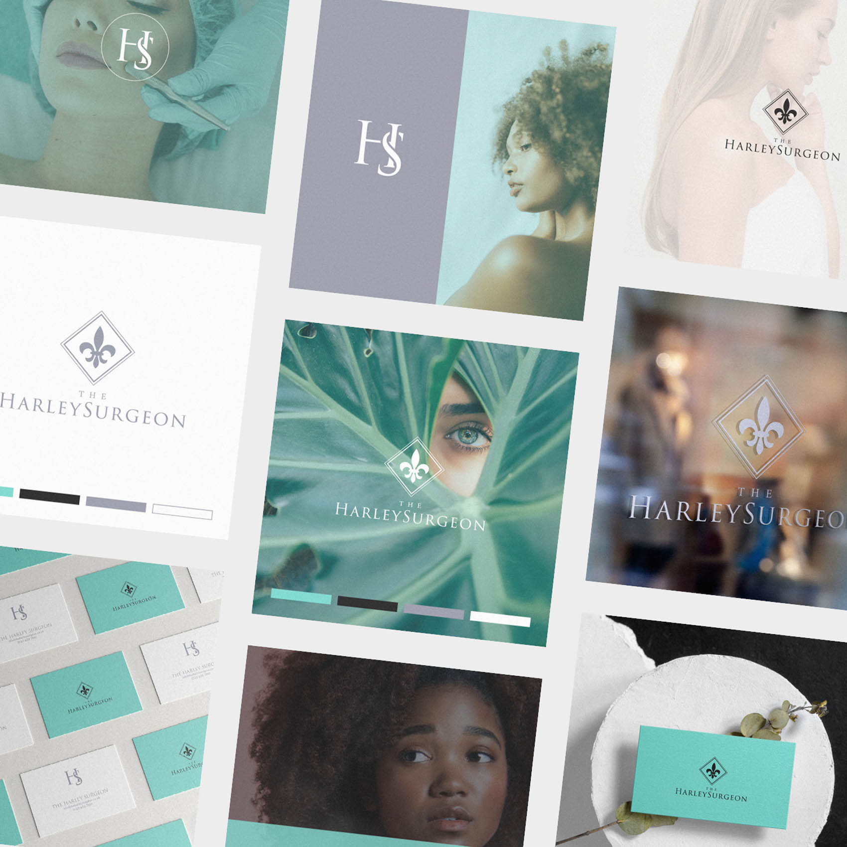
I was approached to create Brand Identity for The Harley Surgeon; a facial plastics and aesthetics clinic based in London. It features a hollistic approach, encouraging patients to accentuate their natural beauty and strongest facial features by both non surgical and surgical techniques. They focus on skincare, facial plastics and aesthetics but also nutrition and well being.
The brand needed to be positioned as very upmarket and high end, while feeling professional and trustworthy – which is essential for any brand within the medical or healthcare industry.
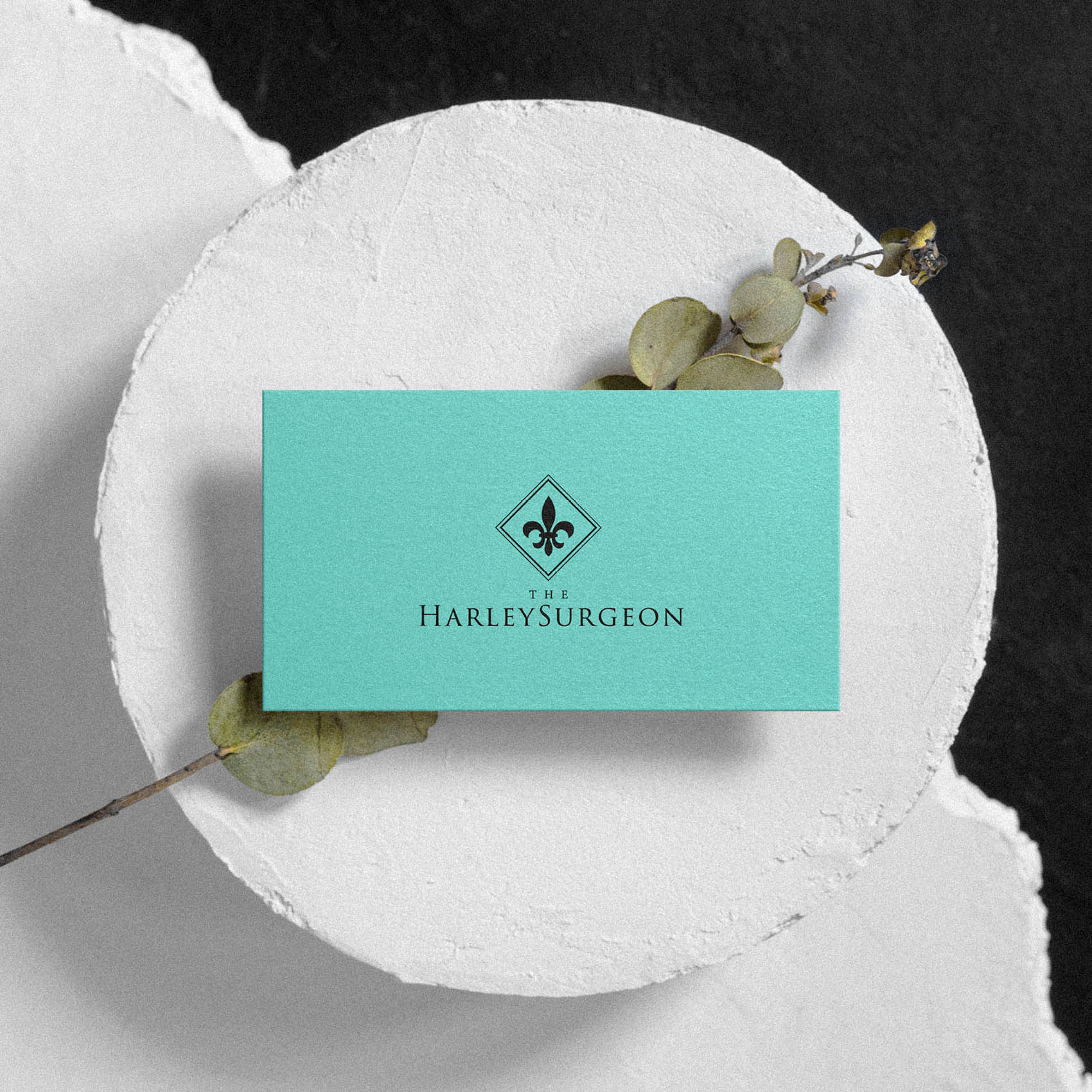
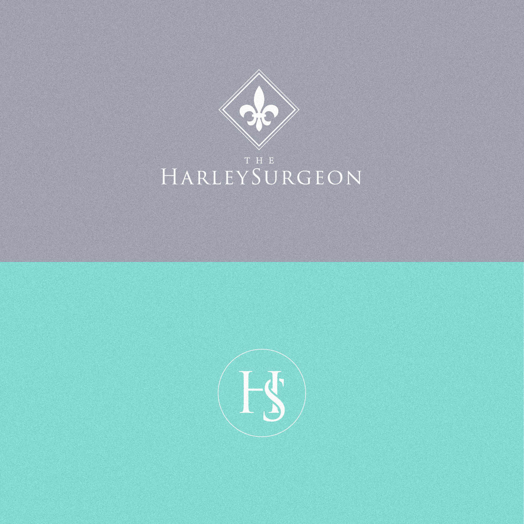
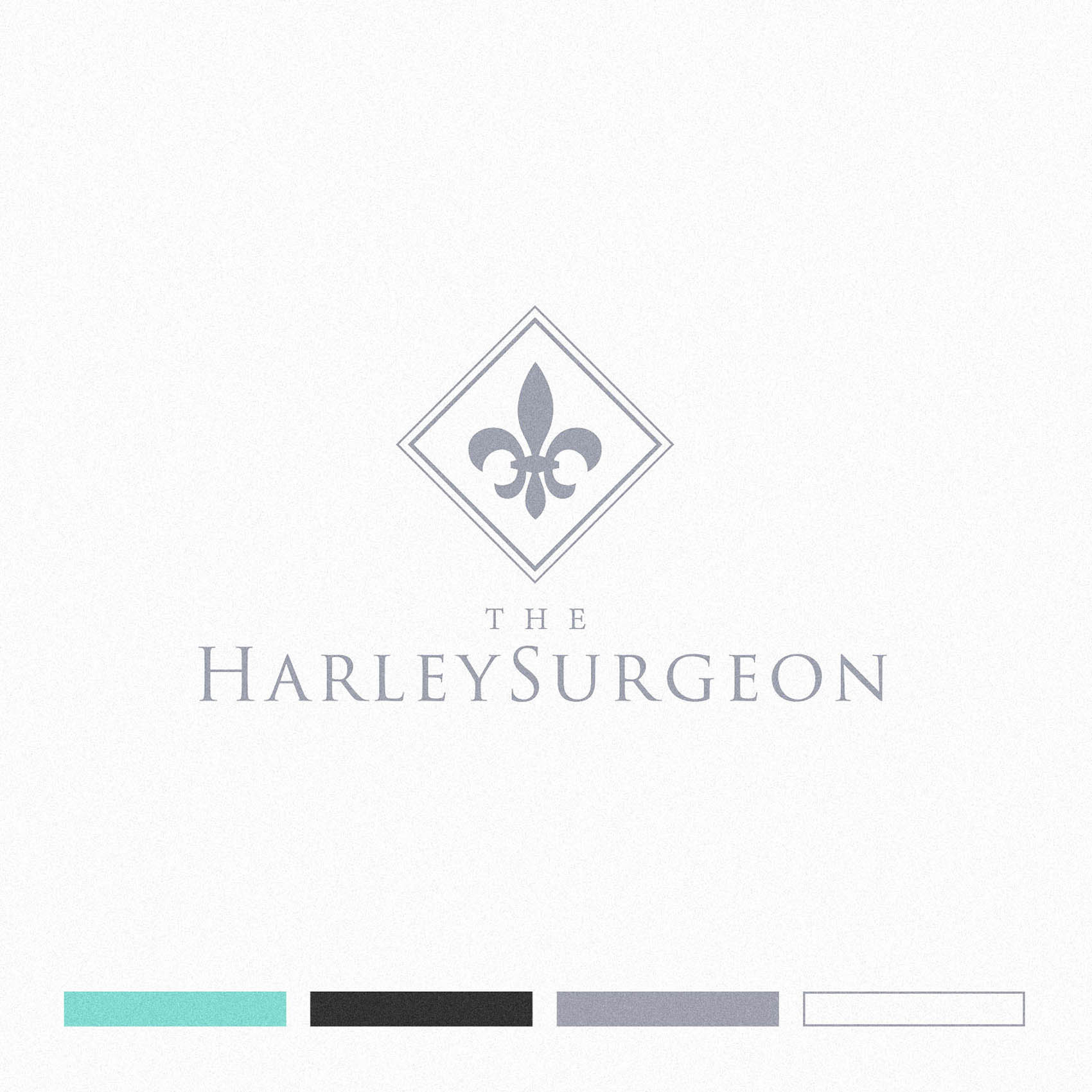
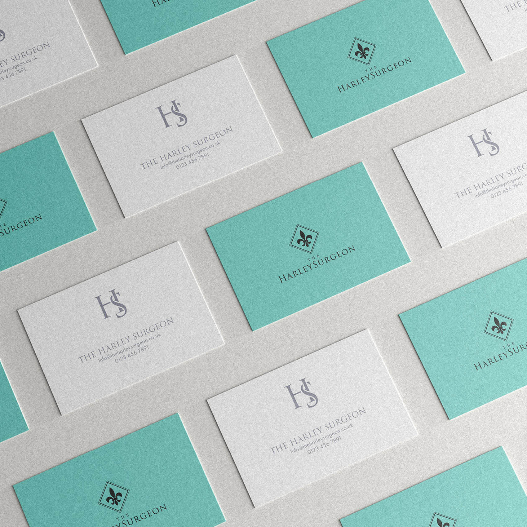
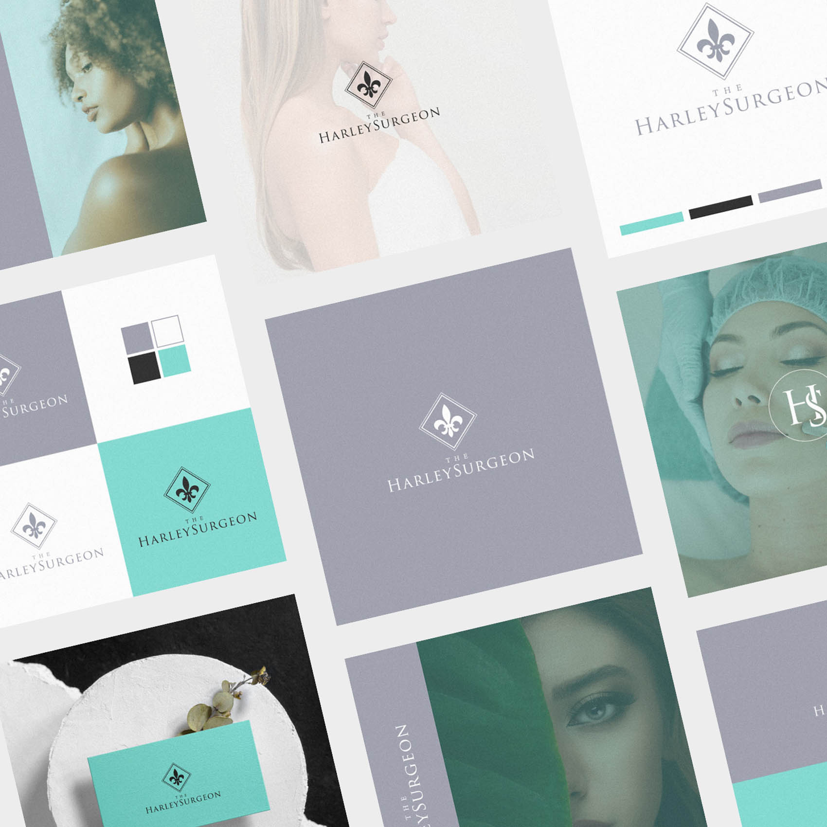
We feel in love with the idea of a customised Fluer De Lis as the symbol alongside the logotype, with a custom monogram to serve as a submark. (The Fluer De Lis alone, even in a customised form, is just too generate to serve as an effective submark in the absence of any accompanying logotype, although it works wonderfully alongside it.)
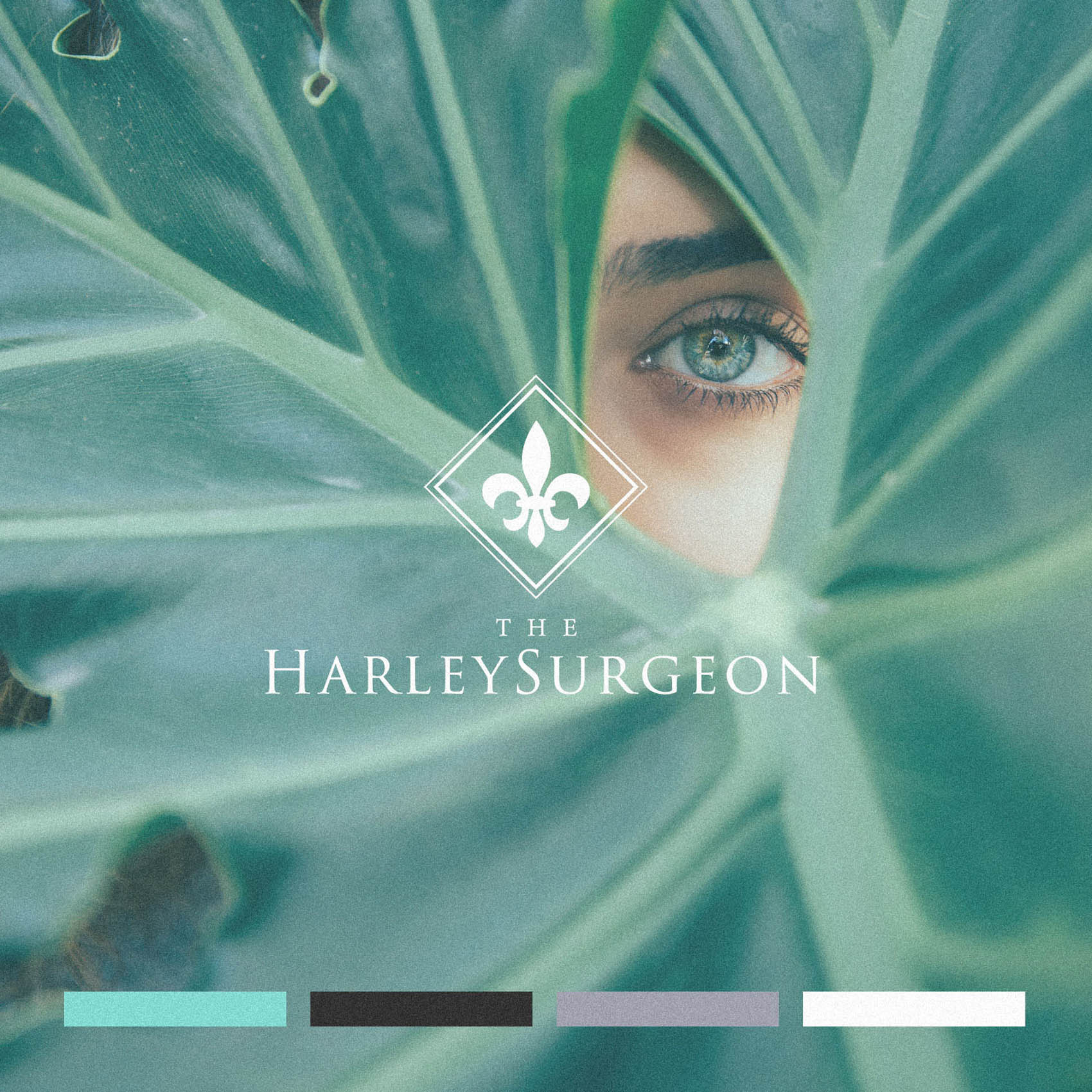
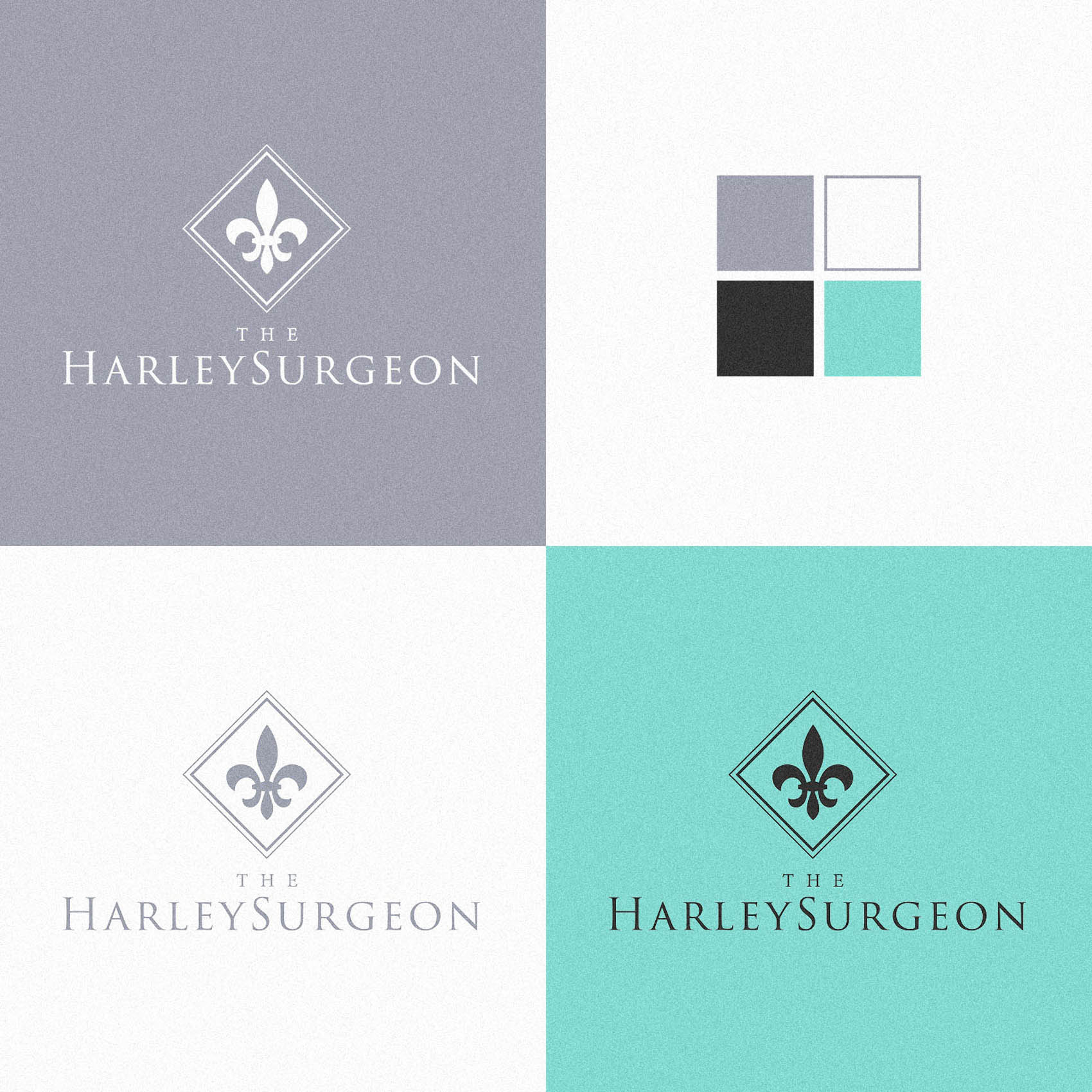
The colour palette features a refreshing turquoise, along with a cool medium grey and black accent.
Case Study
Opportunity
Harley Street clients expect two things at once: absolute professionalism and an elevated, luxury experience. The brand needed to signal surgical credibility and aesthetics-led taste—reassuring patients who favour natural enhancement over theatrics.
Objectives
-
Present a high-end, trustworthy clinic identity from the first glance.
-
Use symbolism with heritage gravitas while keeping it fresh and ownable.
-
Provide a compact submark for micro contexts where the full logo won’t hold.
-
Establish a refined palette that feels clinical, modern and premium.
Insight & Strategy
Patients are choosing a guardian of their appearance; the identity should communicate composure and exacting standards. We framed the brand around clinical poise: heritage cues handled with restraint, precise typography, and a colour world that feels clean, calming and exclusive.
Identity Solution
-
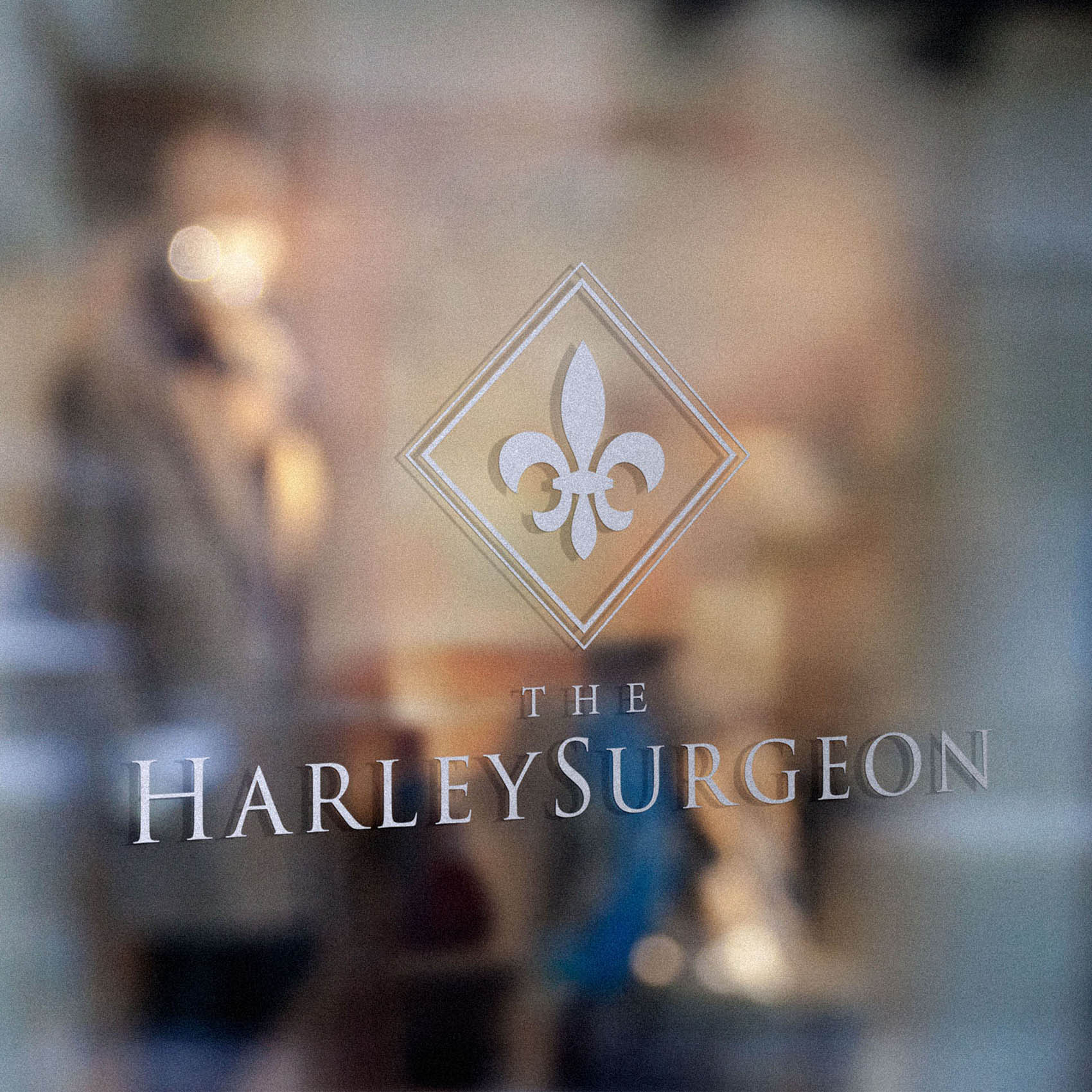
Symbol + Wordmark: A customised fleur-de-lis—redrawn to feel contemporary—sits with a refined logotype to convey heritage and care. The fleur-de-lis is intentionally used alongside the wordmark where it adds ceremony and recognition.
-
Submark: A bespoke monogram serves as the small-scale signature (social avatar, favicon, seals), ensuring clarity where the fleur-de-lis alone would feel too generic or fine at size.
-
Palette: A refreshing turquoise paired with cool mid-grey and black delivers a clean, modern clinical tone with a premium lift.
-
System: Primary horizontal and compact lockups, clear-space and minimum-size rules to protect legibility across signage, stationery and digital headers.
Competitive Edge Now
The identity combines Harley Street seriousness with a composed, luxury finish. The customised symbol adds heritage without cliché; the monogram safeguards recognition at micro sizes; and the palette balances medical clarity with an upscale, contemporary feel.
What This Enables
A coherent presence across consultation materials, site headers and social; confidence to extend into aftercare guides and packaging; and a disciplined visual language that sustains trust and a high-end aura as the clinic’s services evolve.

