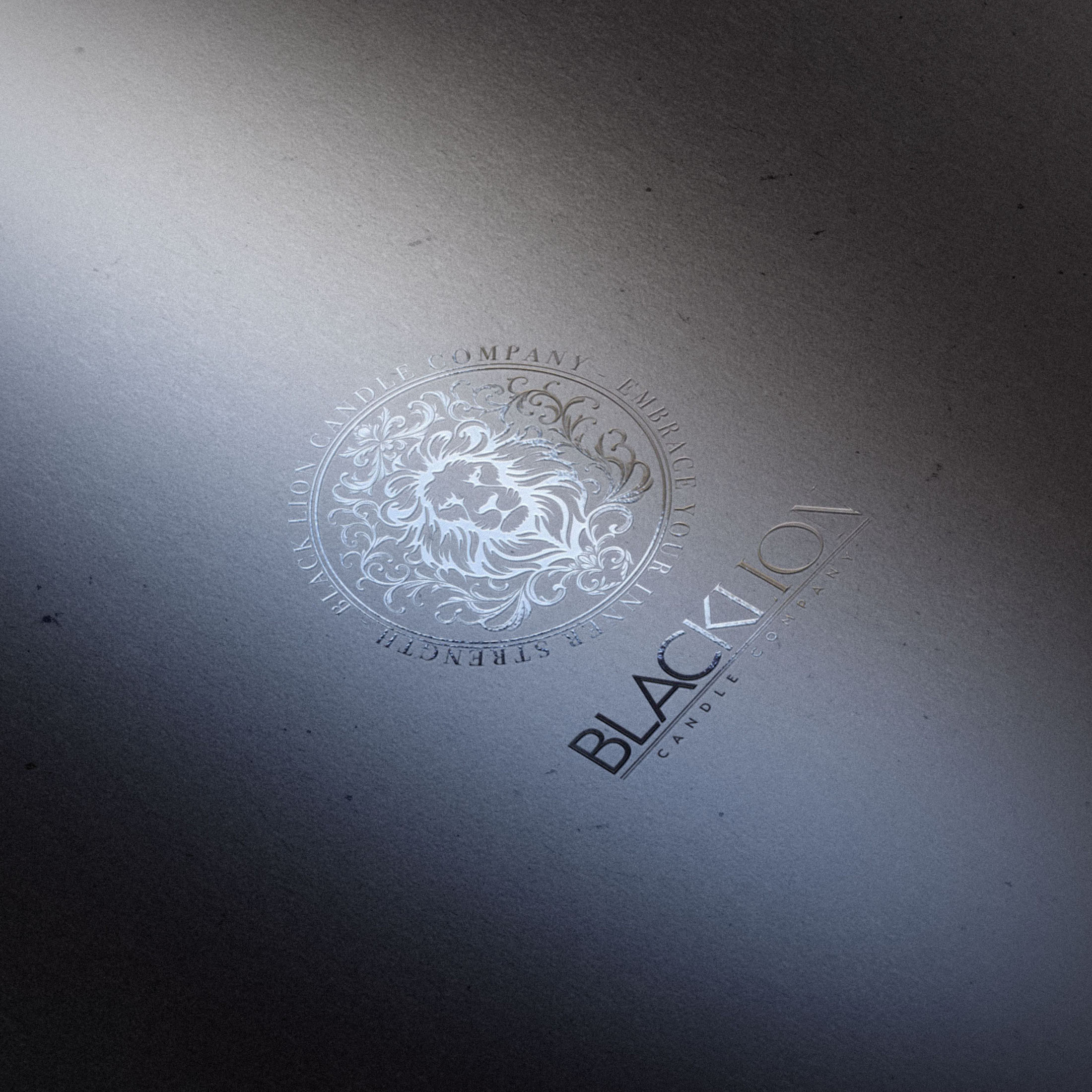
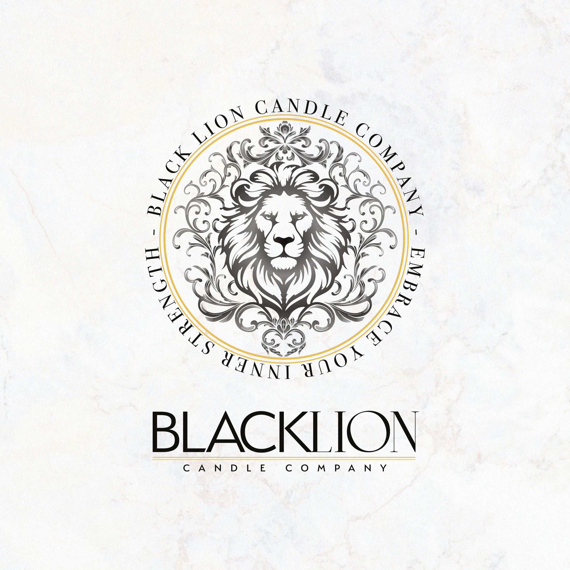
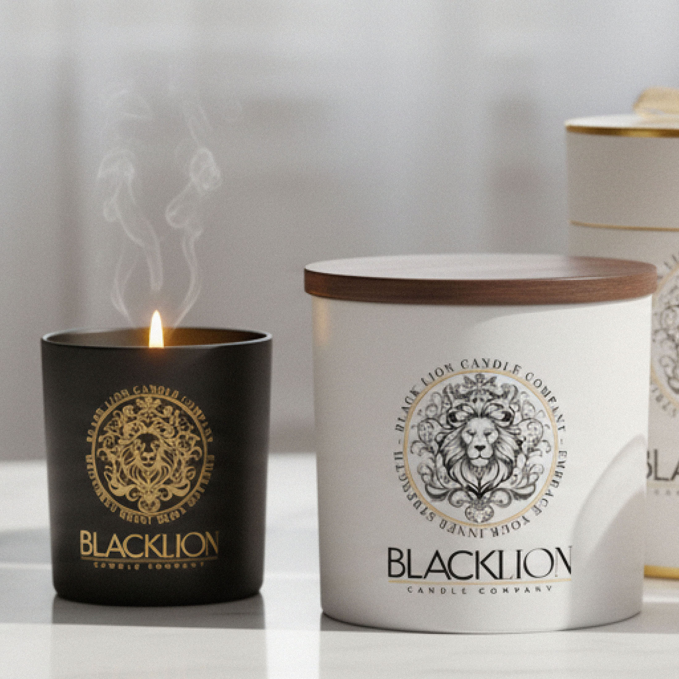
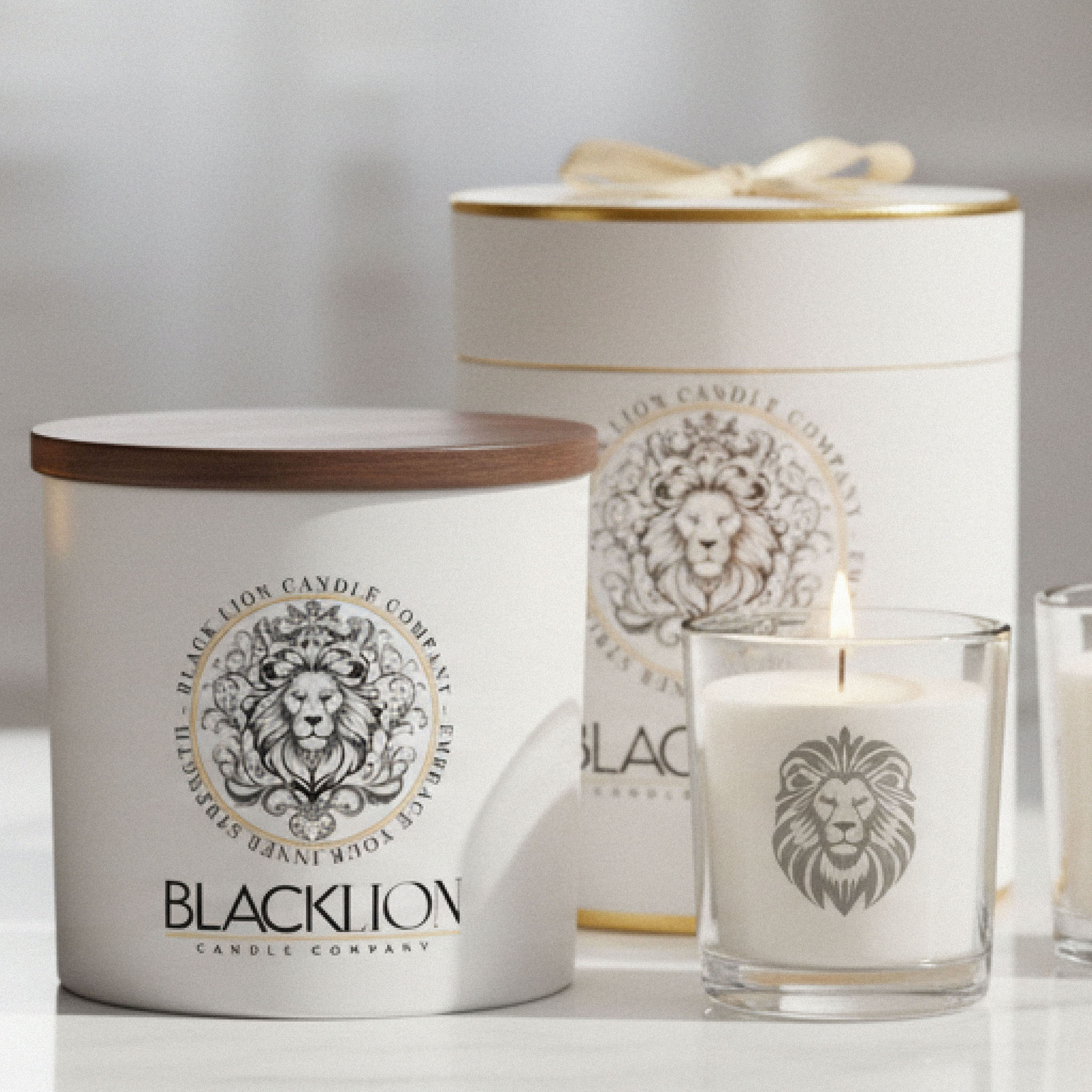
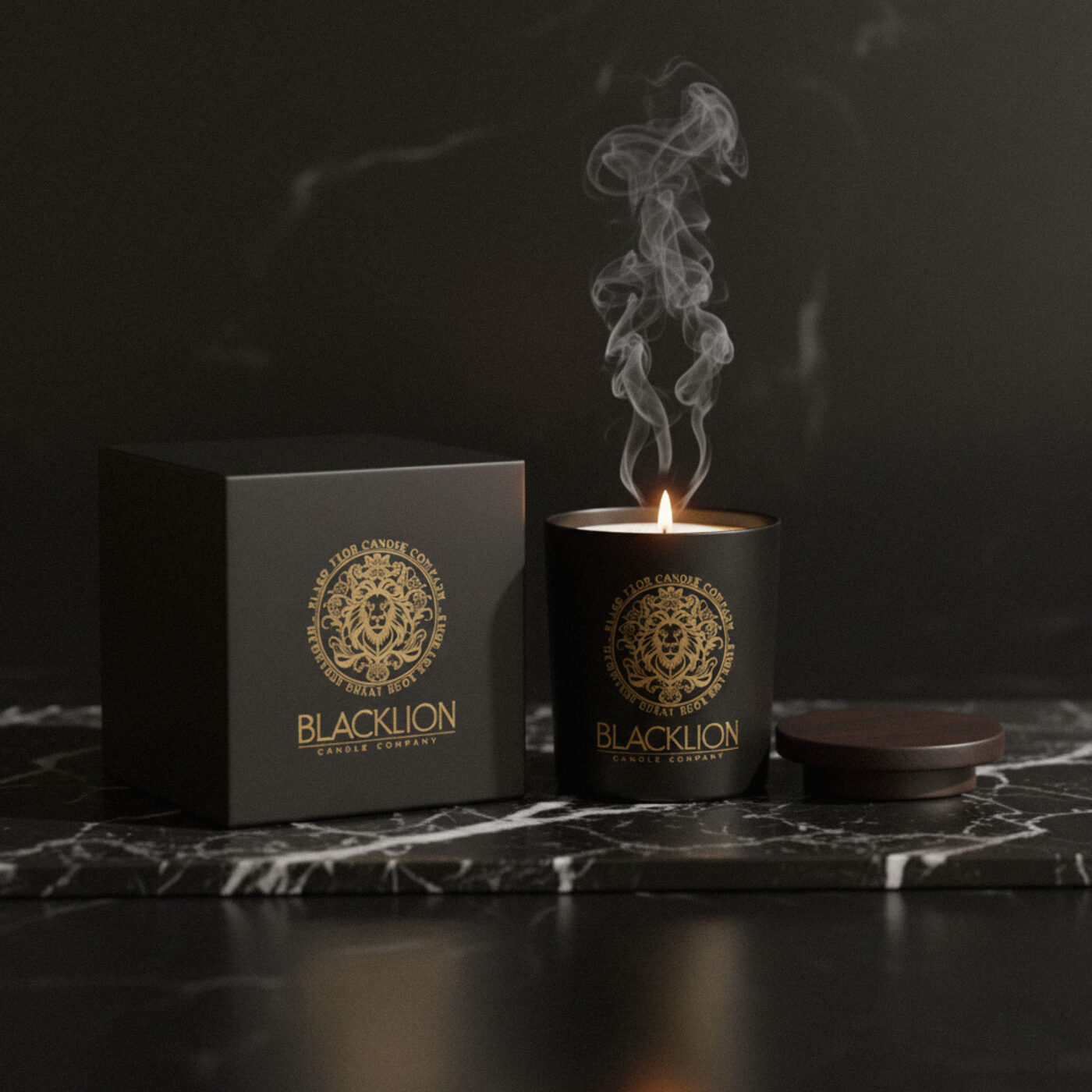
I was commissioned to create new brand identity for the Black Lion Candle Co; a brand offering an exclusive range of exceptionally well crafted luxury candles, using the finest ingredients. The brand was to feel rich and indulgant, epitomising modern luxury. Each Black Lion Candle is crafted to inspire identity, evoke emotion, and enhance personal rituals. The Black Lion Candle Company stands distinctively at the crossroads of tradition and innovation, capturing an exclusive niche between established luxury brands and the next generation of contemporary luxury seekers.
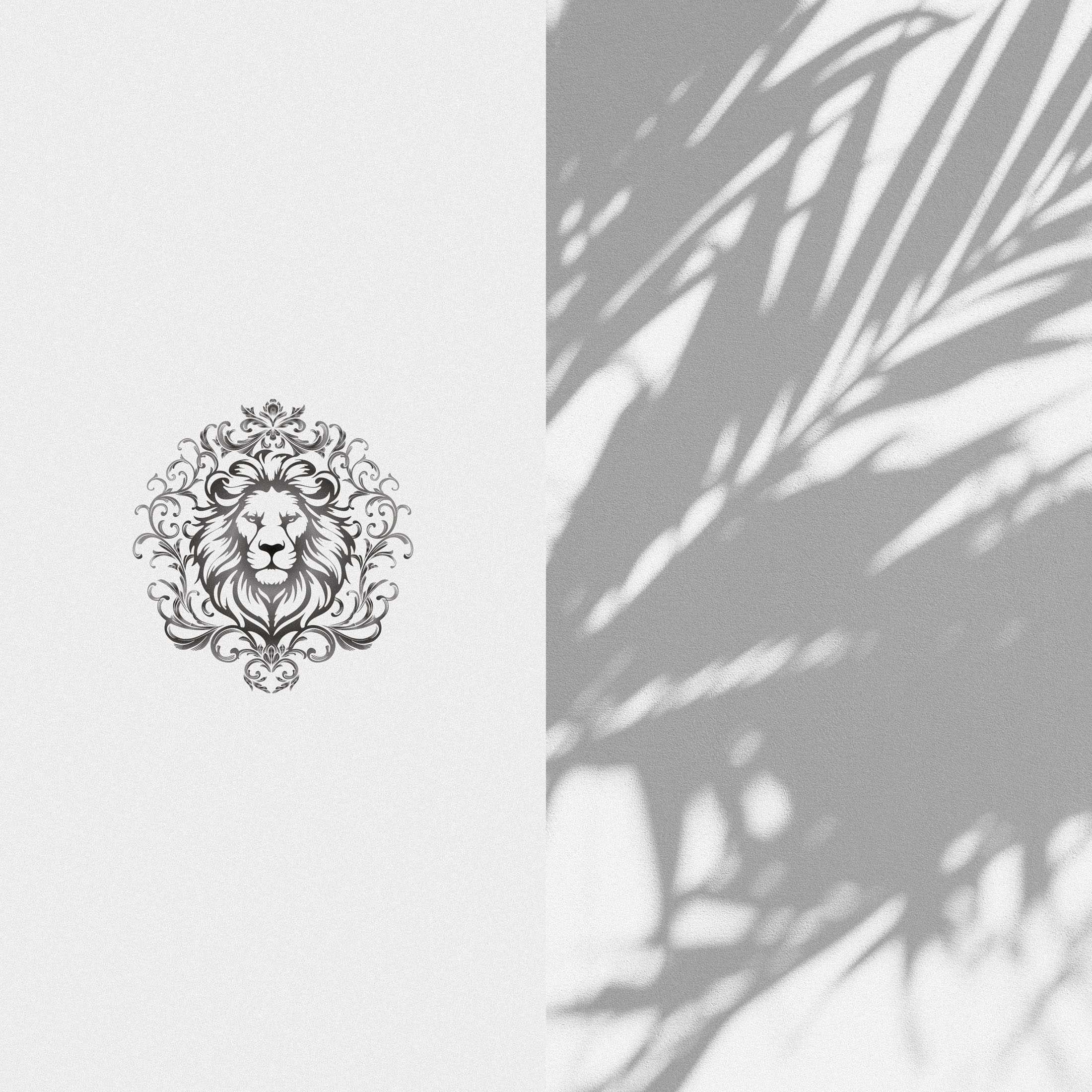
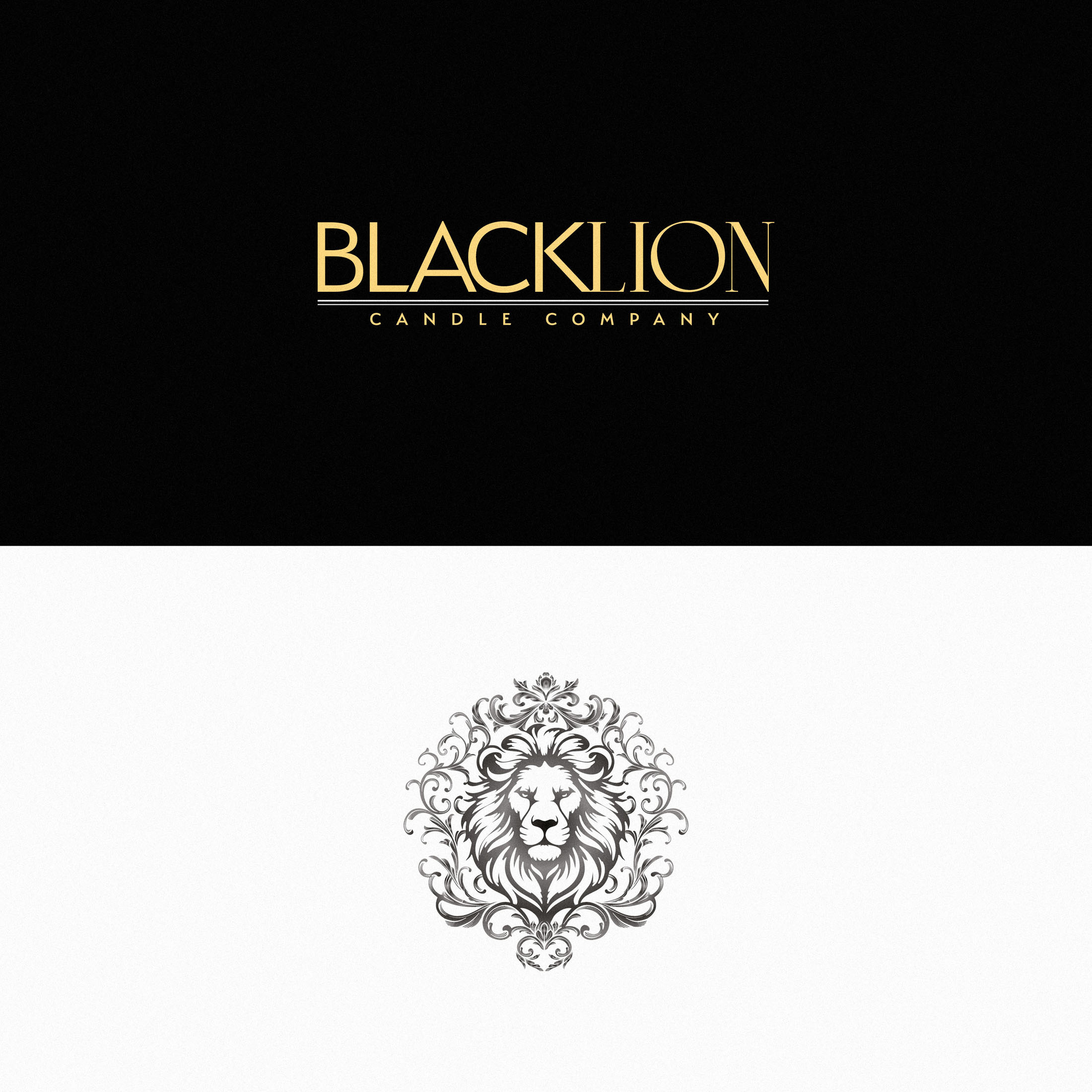
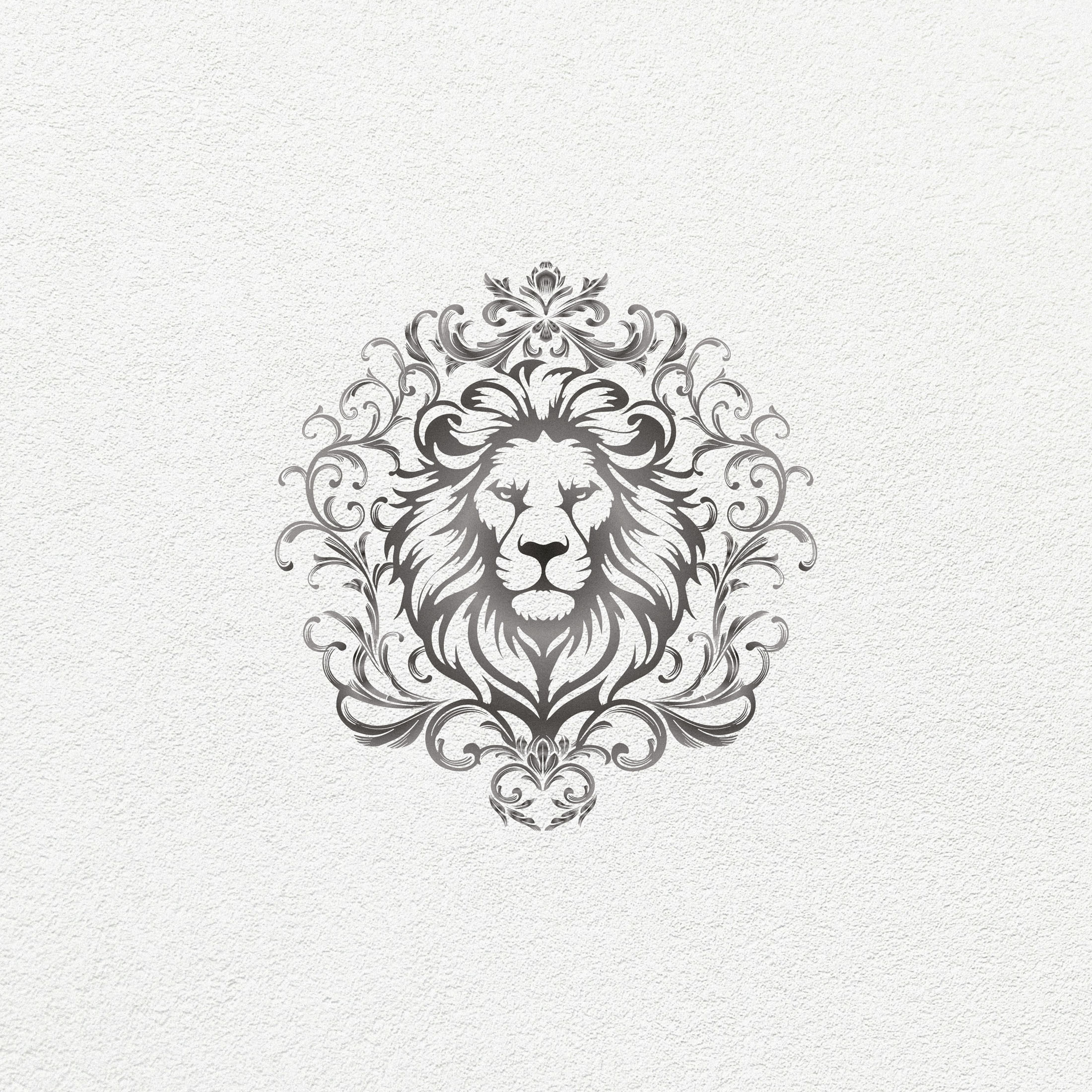
One of the key challenges was to craft a Lion symbol which felt regal, powerful; but not aggresive or overly cartoonish in style. After considering many iterations, we arrived at a version which hits just the right balance. Combining the mane of the Lion with decorative flourishes added an aesthetically pleasing and unique touch, while further indicating a high standard of luxury and quality.
Case Study
Opportunity
Black Lion Candle Co set out to express modern luxury with depth and warmth—an identity for exceptionally crafted candles that inspires identity, evokes emotion, and elevates personal rituals while standing confidently between heritage and contemporary taste.
Objectives
- Develop a regal, memorable lion emblem that feels powerful and poised—never aggressive or cartoonish.
- Craft a typographic and layout system that reads indulgent yet disciplined across packaging and digital touchpoints.
- Create a lockup that scales cleanly from product labels to larger brand applications.
- Establish straightforward usage rules so consistency is effortless as the range grows.
Insight & Strategy
Luxury candle buyers connect with brands that combine ceremony with contemporary clarity. The strategy fused tradition and innovation: a timeless central emblem (the lion) drawn with modern control, complemented by refined typography and generous spacing to communicate craft, exclusivity, and calm authority.
Identity Solution
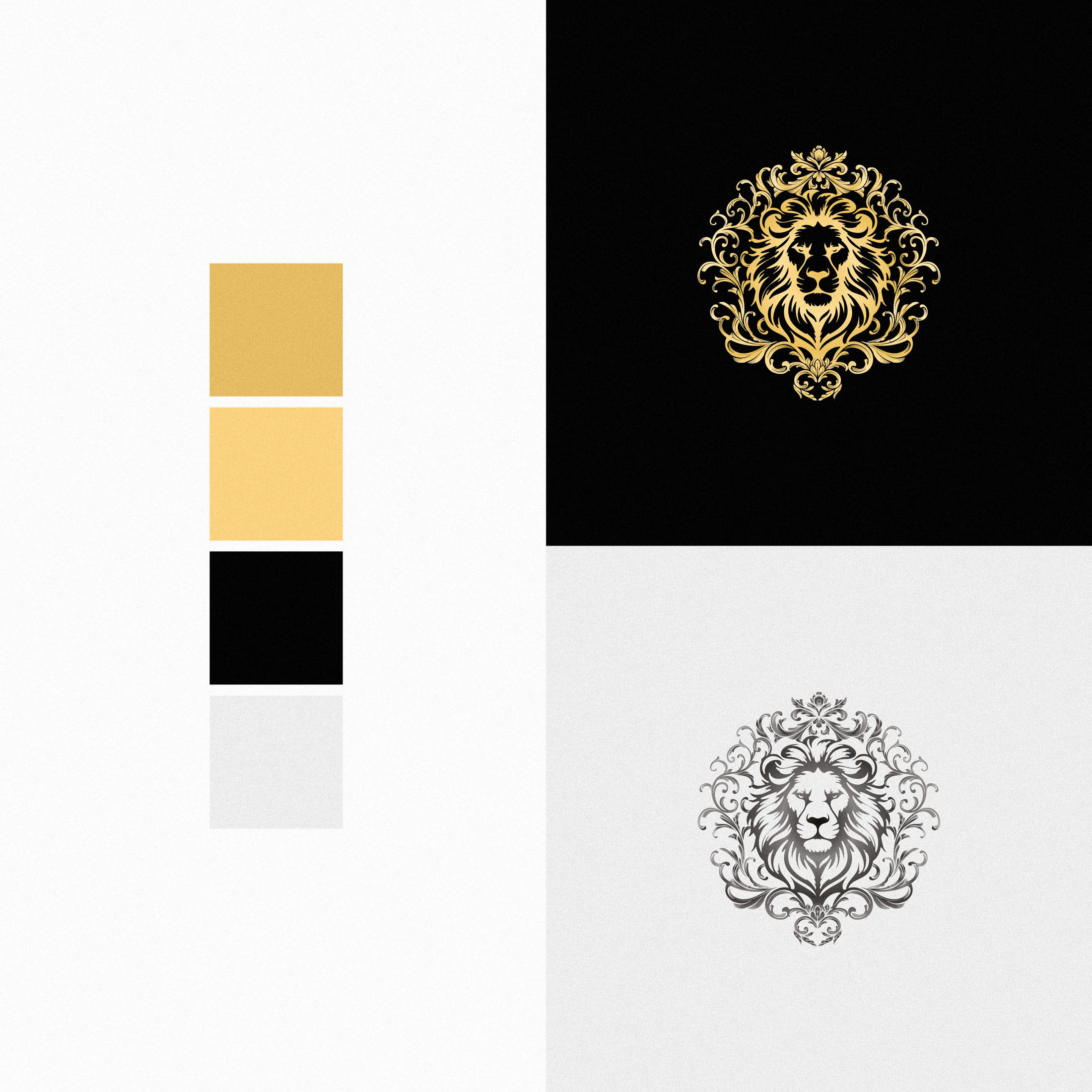
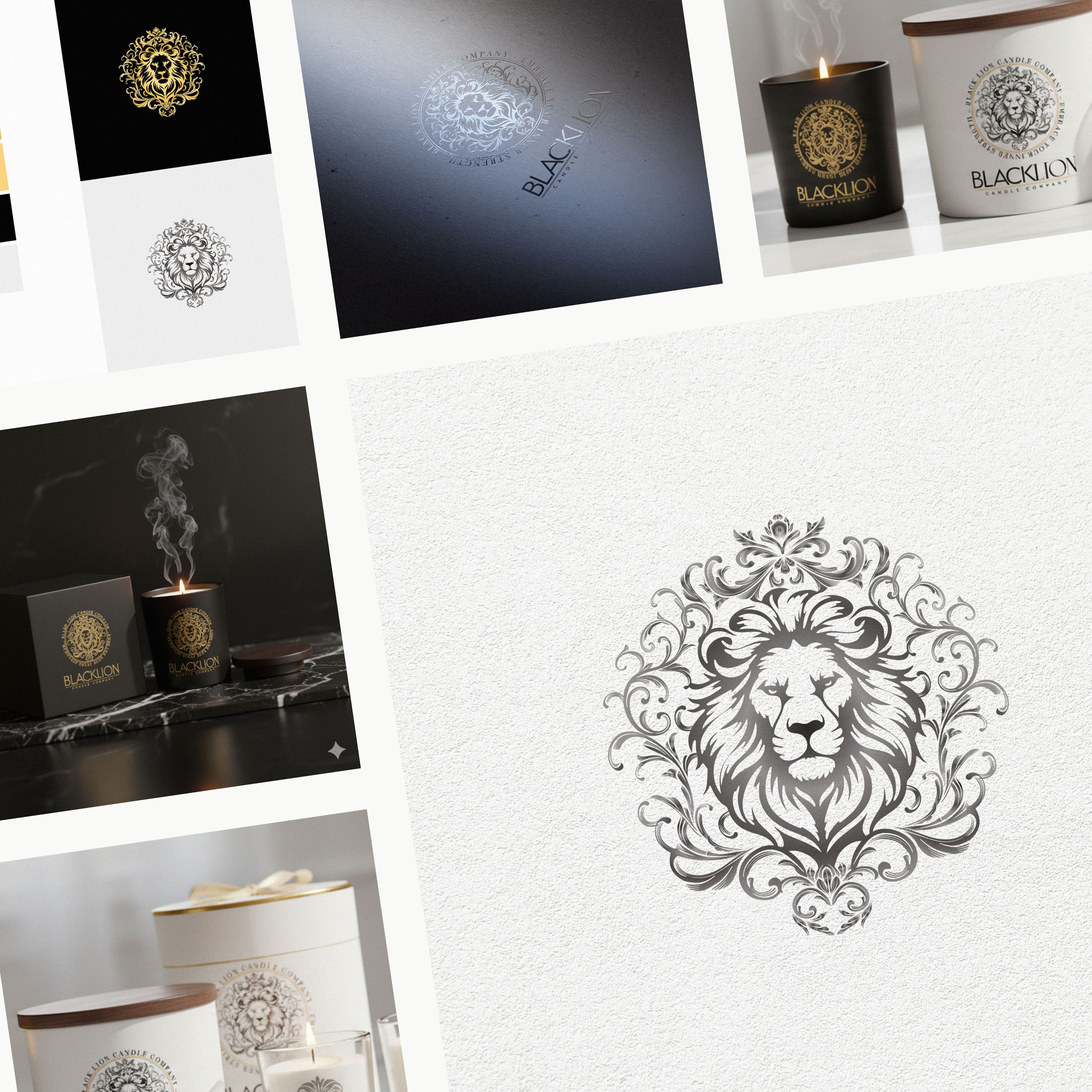
- Lion Emblem: A custom mark that balances strength with elegance. The mane integrates subtle decorative flourishes—signalling high standards and a uniquely luxurious character without tipping into ornament for ornament’s sake.
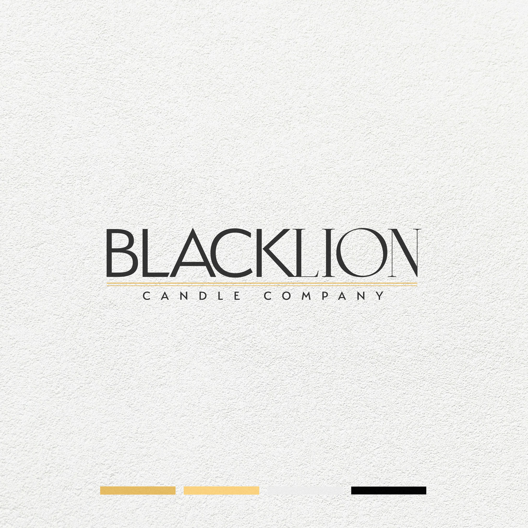
- Wordmark & Lockups: A refined typographic signature paired with the emblem in flexible arrangements for primary branding, product fronts, and small-format uses.
- Tone & Hierarchy: A restrained, high-contrast presentation and clear typographic hierarchy that foregrounds fragrance names, notes, and collection details with ease.
- System Rules: Guidance for spacing, minimum sizes, and emblem-to-type ratios ensures the identity remains precise on labels, packs, and digital headers.
Competitive Edge Now
The emblem’s poised energy and distinctive mane detailing deliver instant recognition and a rich, indulgent feel. Paired with disciplined typography, the brand communicates exclusivity and craft at every touchpoint—supporting premium positioning without noise.
What This Enables
A coherent platform for flagship candles, seasonal editions, and future fragrance lines—ready for elegant packaging, photography, and digital storytelling—so Black Lion Candle Co can expand confidently while keeping a strong, unmistakable signature.

