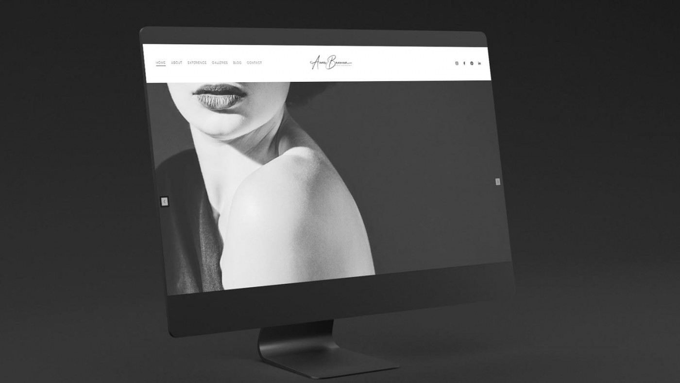
It was an absolute pleasure to design the new website for Anna Bauman, a Pittsburgh based portrait photographer who creates stunning, minimalistic portraits with beautiful use of light and negative space.
This is a style I reflected in the aesthetic of the website; it has a simple elegance, drawing attention to the images, using a combination of classic block-cap serif headings and light sans-serif body text to position the brand with high end fashion. (Think Vogue!)
As you scroll through the website, information is presented slowly and carefully; there is only ever one focal point or subject on the screen at a time, and galleries use slideshows to ensure the images are enjoyed one at a time. This, plus an alternating contrast for each section on the homepage, ensure the site feels confident and truly elegant; there is no unneccessary clutter, no battle for the visitors attention.
To me, this mimics the calm and deliberate approach of a high end fashion store, vs a crowded discount clothing outlet, with sale signs everywhere and clothing almost falling off the shelves! It’s just as important to set the correct tone with a ‘digital storefront’ as it would be with a physical one.

Case Study
Opportunity
For a Pittsburgh-based portrait photographer known for minimal compositions and exquisite use of light and negative space, there was room to create a web experience that feels editorial and calm—letting the work breathe rather than competing with it.
Objectives (Business + User)
-
Convey a high-fashion, gallery-grade tone within the first scroll.
-
Showcase portraits in a way that encourages slow, attentive viewing.
-
Keep reading effortless, with clear pathways to learn more and enquire.
-
Maintain visual integrity across future project additions.
UX Insight & Strategy
Viewers of fine portraiture want to savour images. We shaped a guided reveal where there’s only ever one focal point on screen at a time. Galleries present images via slideshows to encourage single-image attention, while the homepage alternates contrast between sections to keep rhythm without visual noise.
Design System & Content
A simple, elegant typographic pairing—classic block-cap serif headings with light sans-serif body copy—creates an immediate fashion-editorial cue. Generous spacing and restrained copy ensure the photography leads. The aesthetic mirrors Anna’s style: minimal, confident, and emotionally quiet.
Interaction & Performance
Motion is subtle and purposeful—transitions that support progression rather than distract. Image handling prioritises fidelity while keeping pages responsive; components are modular so new galleries can be added without breaking the look and feel. Accessibility (contrast, legibility) is considered to protect clarity across devices.
Competitive Edge Now
Compared with template-heavy photography sites, this experience feels edited and intentional. The single-focus presentation raises perceived value, the typographic system signals high fashion without cliché, and the structure encourages deeper engagement with the work.
What This Enables
A platform that attracts design-literate clients and art directors; supports thoughtful viewing and enquiry; and scales gracefully as new series are published—preserving the brand’s calm, editorial tone.


