Brand Identity for an Exclusive Cervinia Ski Chalet
Chalet Chiarina is an exclusive private residence in Cervinia, commissioned by an English-Italian family and available for fully catered, exclusive hire, with hospitality curated by The M Legacy Group to ensure an experience of the highest order.
I came onboard to elevate an existing set of ideas for the brand identity, and what began as refinement evolved, after initial discussion, into a rebrand from the ground up. I find this is usually the way. It is almost always best to work the whole process through, from research and strategy to execution, because that is where the strongest ideas quietly present themselves, and where design becomes an exercise in creating something beautiful, but fit for purpose.
A dual heritage
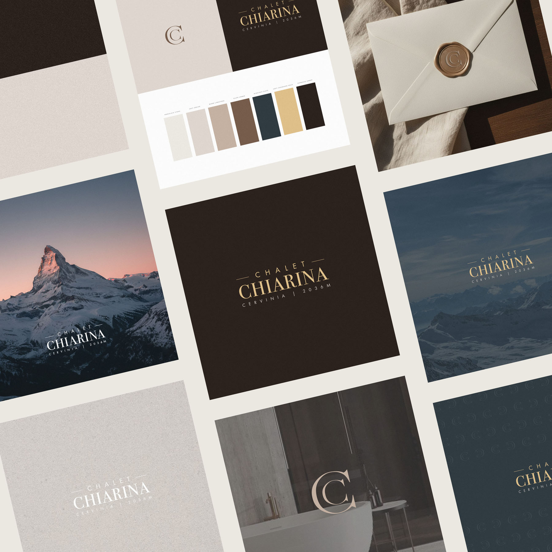
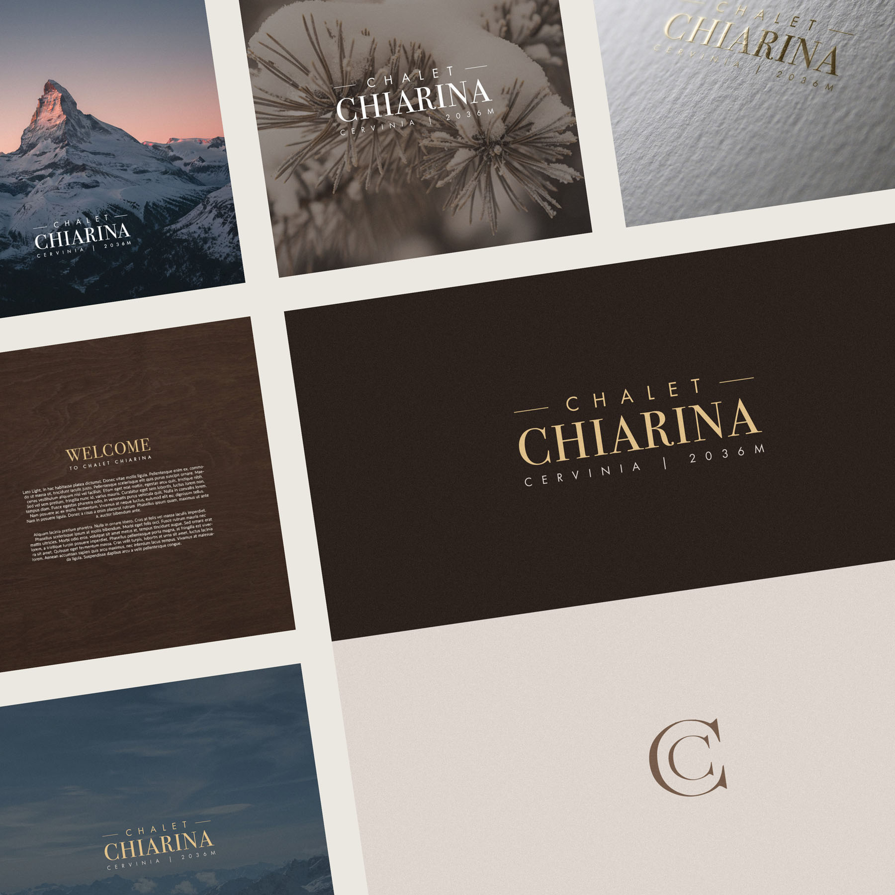
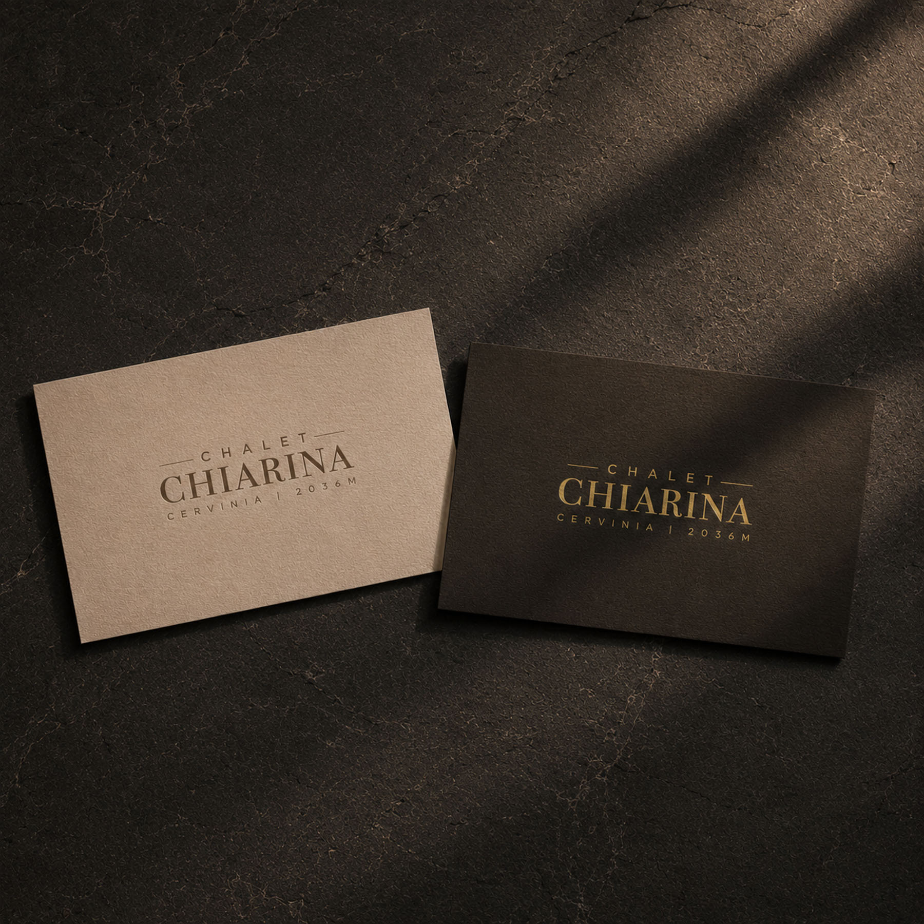
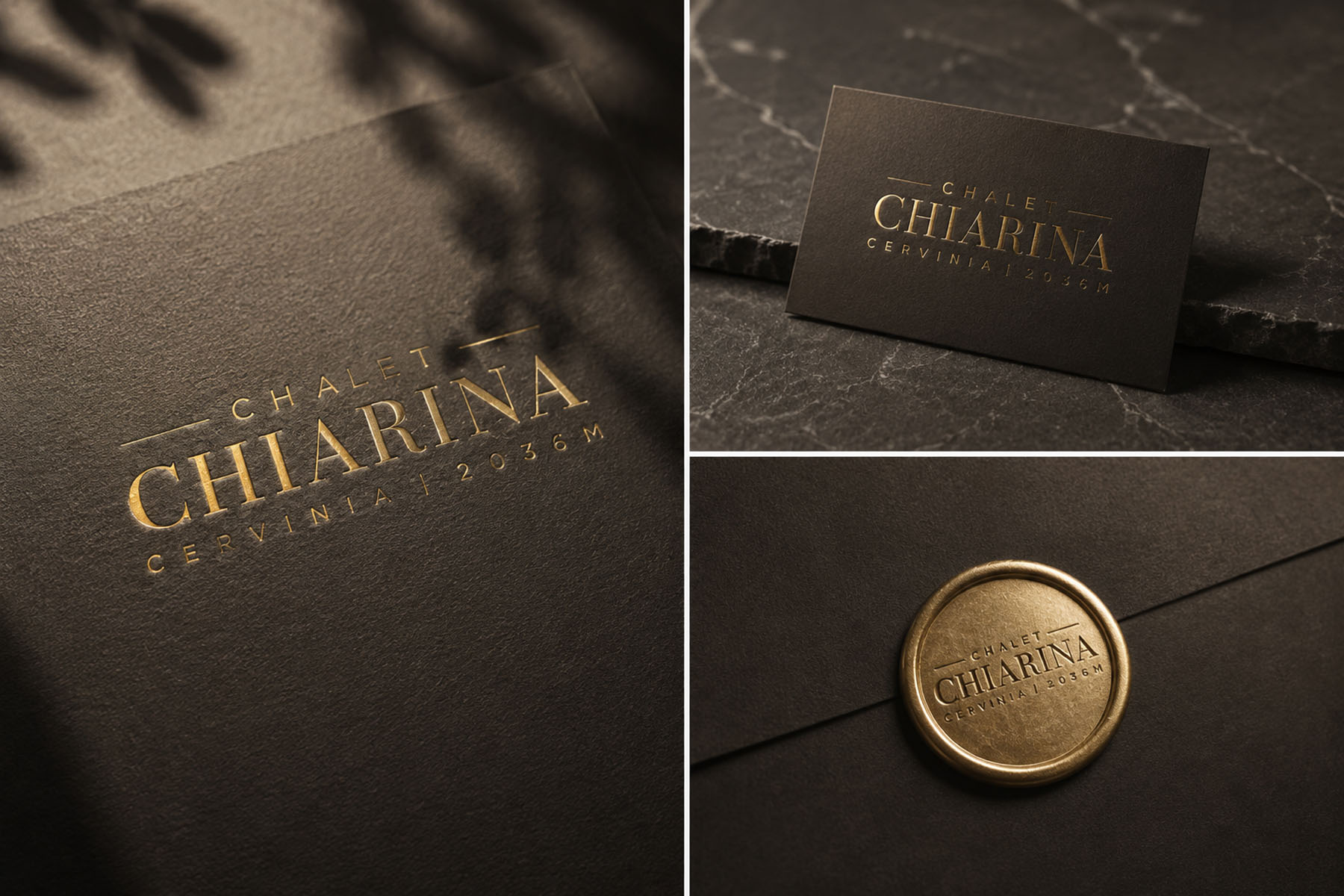
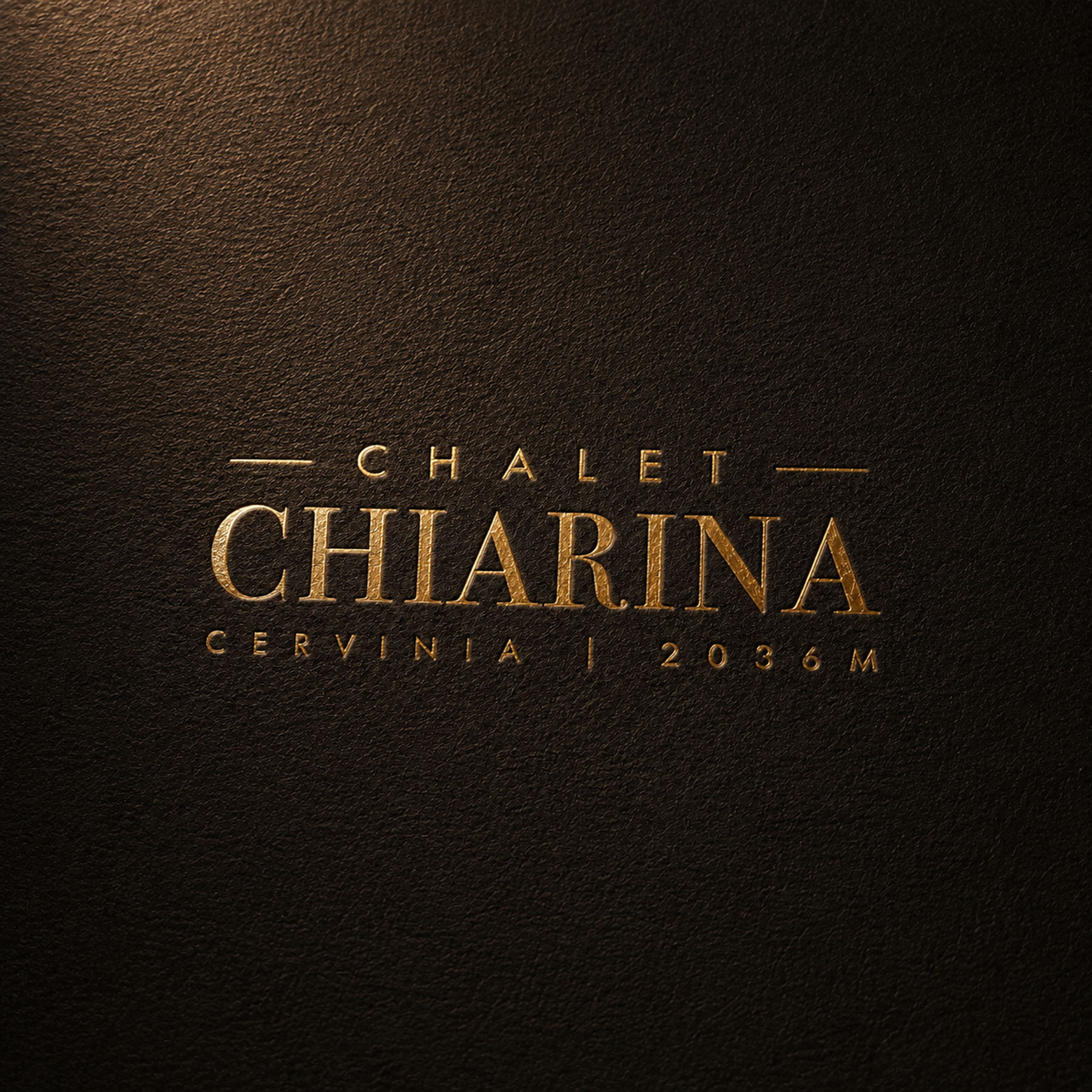
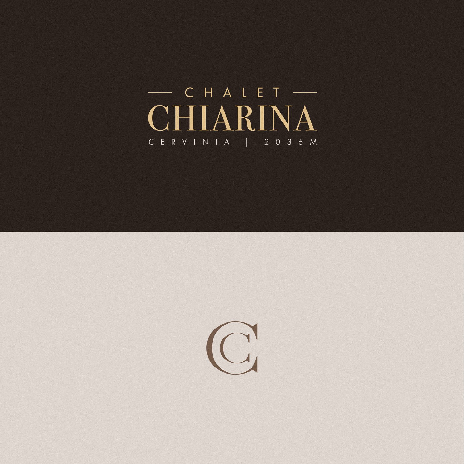
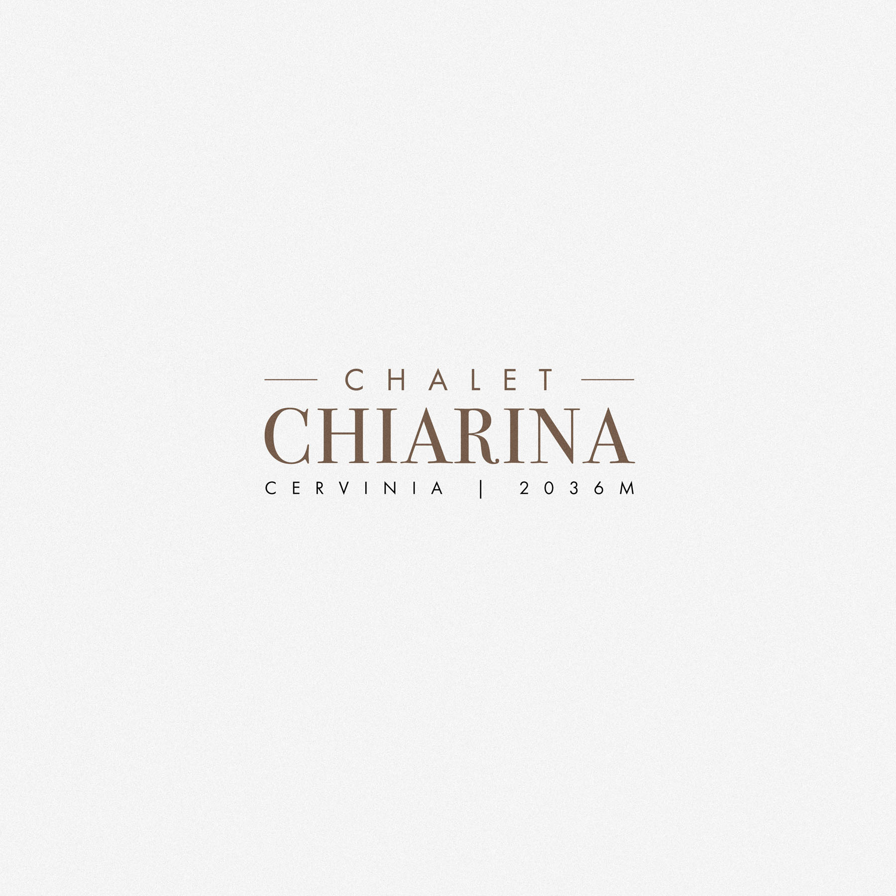
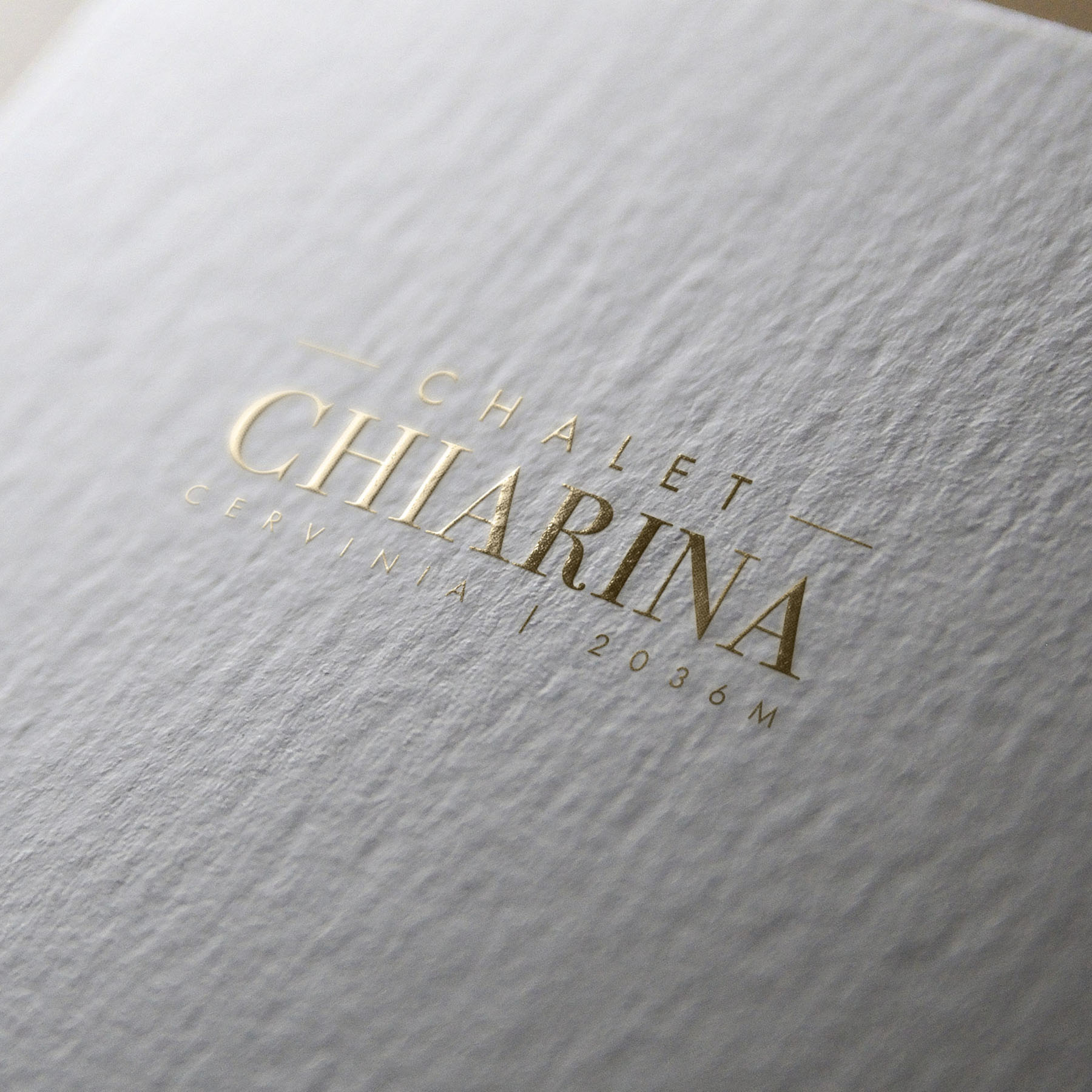
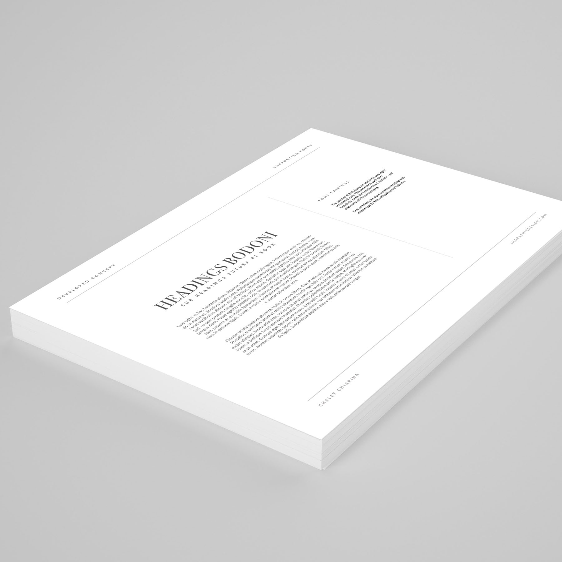
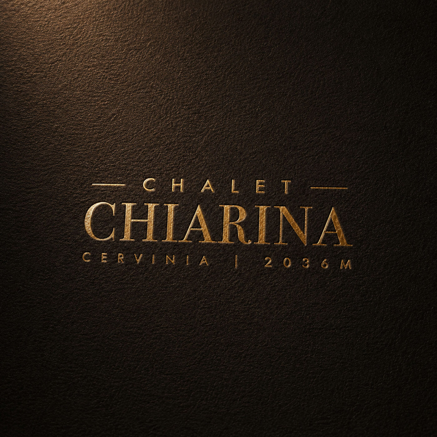
The logotype tells a dual story, drawn from the heritage of both the region and the family behind the Chalet. The Italian voice speaks through a Bodoni, a typeface with all the period elegance the name deserves, while the English voice answers in something clean and modern, a restrained counterpoint that keeps the whole feeling contemporary rather than nostalgic. Absolutely no obvious clichés were reached for here; subtlety is the point, the dual heritage felt rather than announced.
The monogram, reconsidered
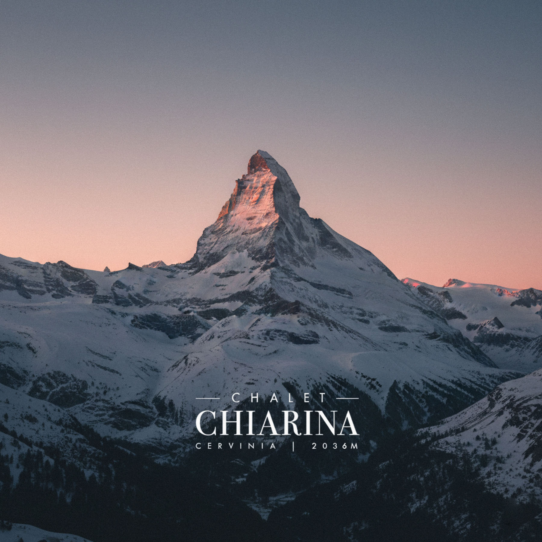
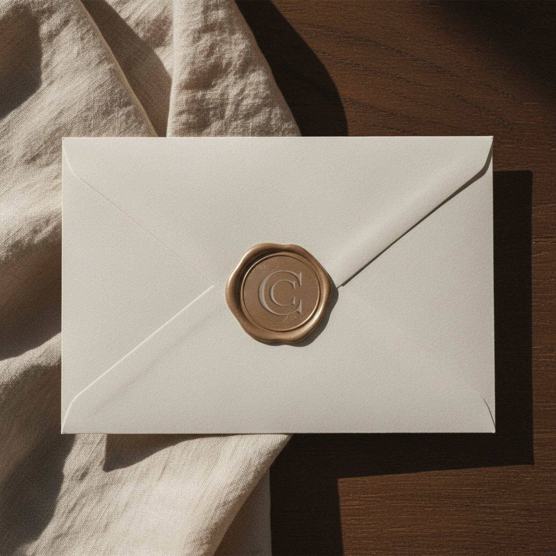
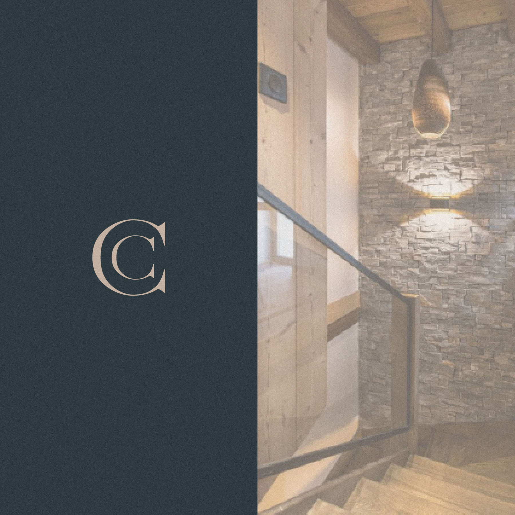
An early idea placed a monogram alongside the logotype, but at a similar size to the characters already present it felt somewhat redundant, saying twice what only needed saying once. So the monogram stepped back to become a submark, and in doing so it elevated the logotype, which now felt confident enough to stand alone. A single line of subtext beneath (the Chalet’s altitude, 2036m) became the finishing touch, grounding the mark in its place on the mountain.
Branding drawn from the building
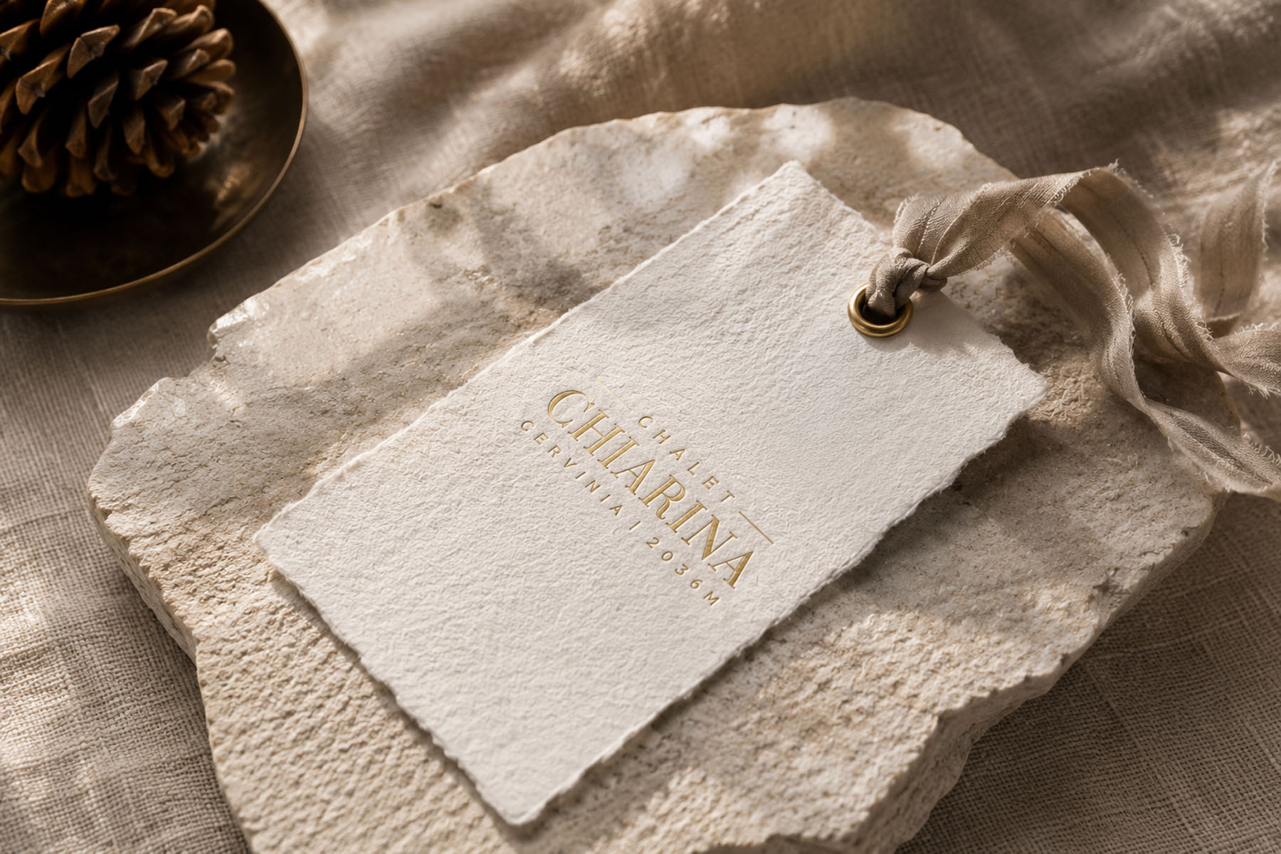
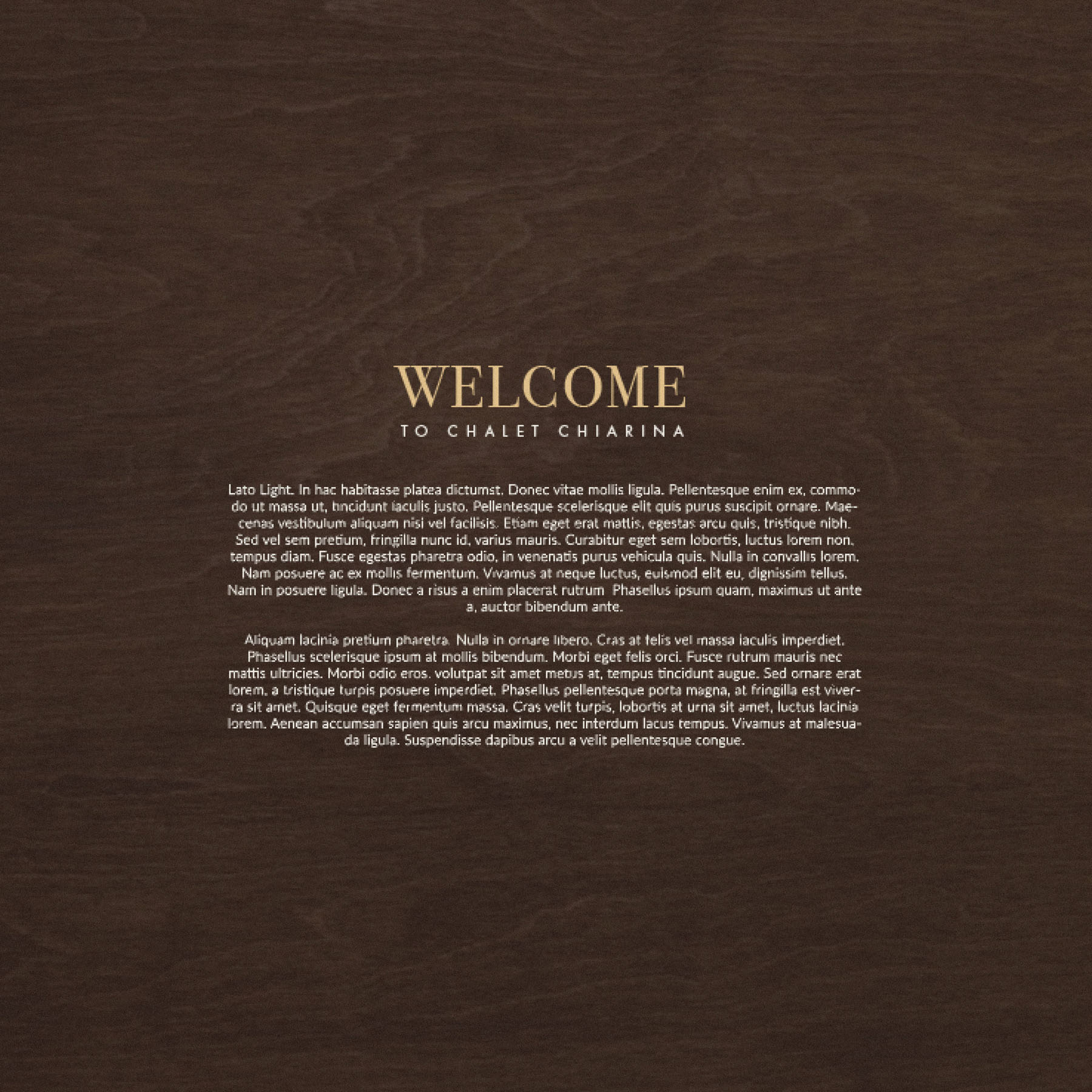
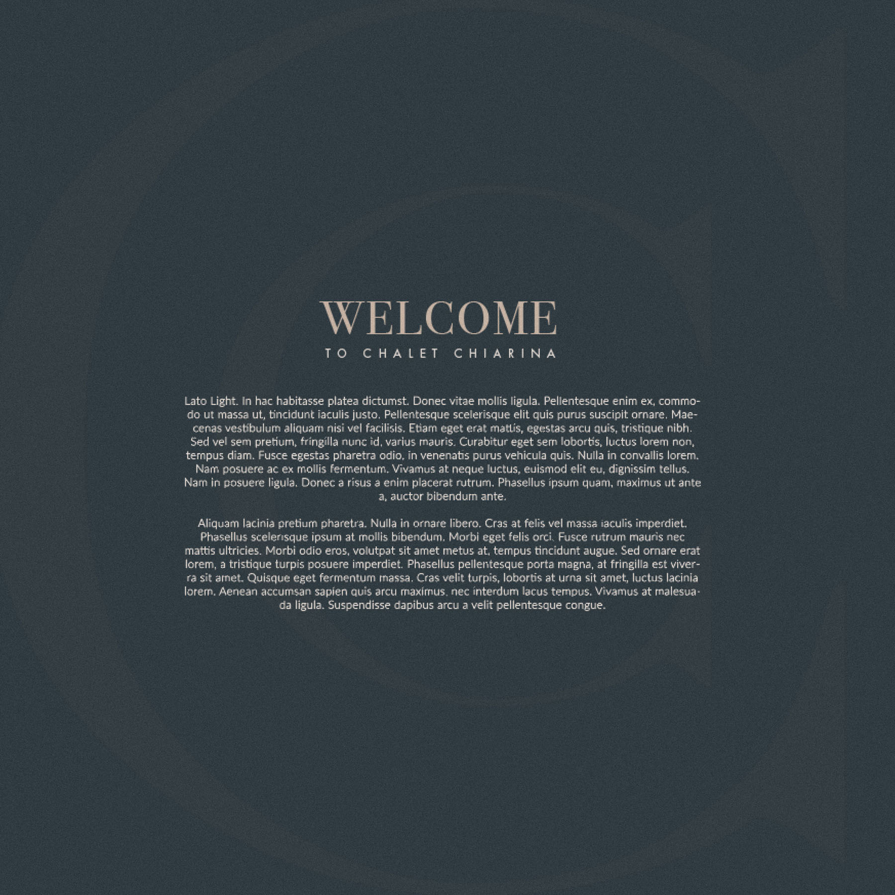
I drew further inspiration from the interiors and architecture by Laughland Jones, whose work gave the Chalet its material soul. Several of the textures and materials used within the building found their way into the identity as subtle digital textures, so that the branding offered a quiet taste of the environment itself. Beyond the obvious appeal, this meant the two felt cohesive on a deeper level, the identity and the interior speaking the same language before a guest had even arrived.
One of my favourite visuals came from exactly this thinking: type set over a soft wooden texture tinted with Espresso Umber, a gold Bodoni headline drawing the eye, the supporting type below held in generous negative space, calm and inviting. A small, perfect moment.
The palette
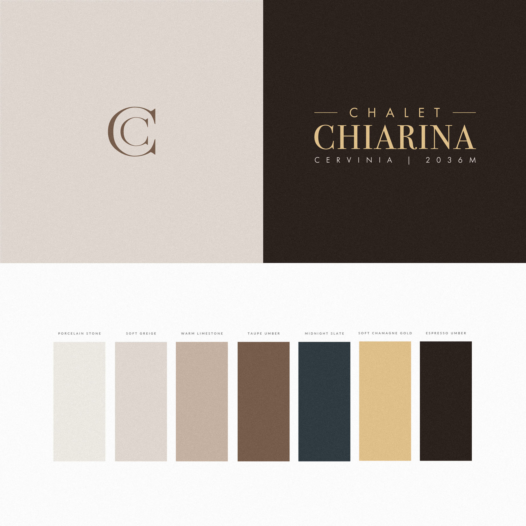
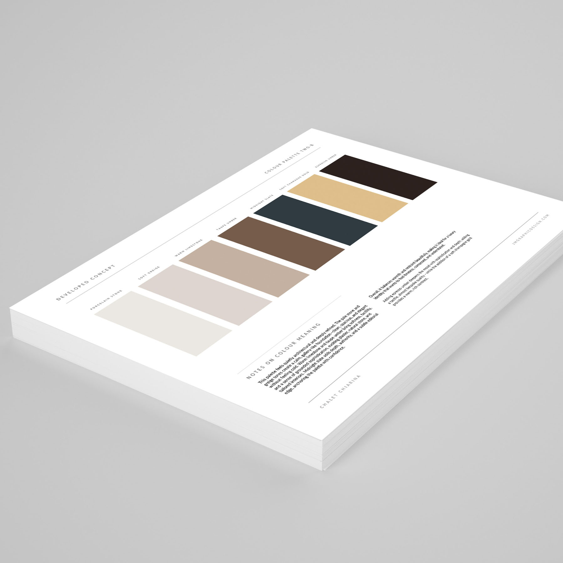
The palette is quietly architectural and deeply refined. Porcelain Stone and Soft Greige form a gallery-like foundation, clean and spacious without ever feeling cold, while Warm Limestone and Taupe Umber bring softness and tactility, evoking plaster, natural stone and tailored interiors. Midnight Slate anchors the whole with depth and a subtle editorial authority, Espresso Umber lends an almost bespoke richness, and Soft Champagne Gold provides a warm, considered contrast. Together they balance warmth and restraint, timeless and composed.
The result
A brand identity I am genuinely proud of, one we then drew upon to shape an indulgent website (you can view the case study for that here) so that a guest’s experience of Chalet Chiarina begins the very moment they first peruse its branded materials. A real pleasure to work on this one.