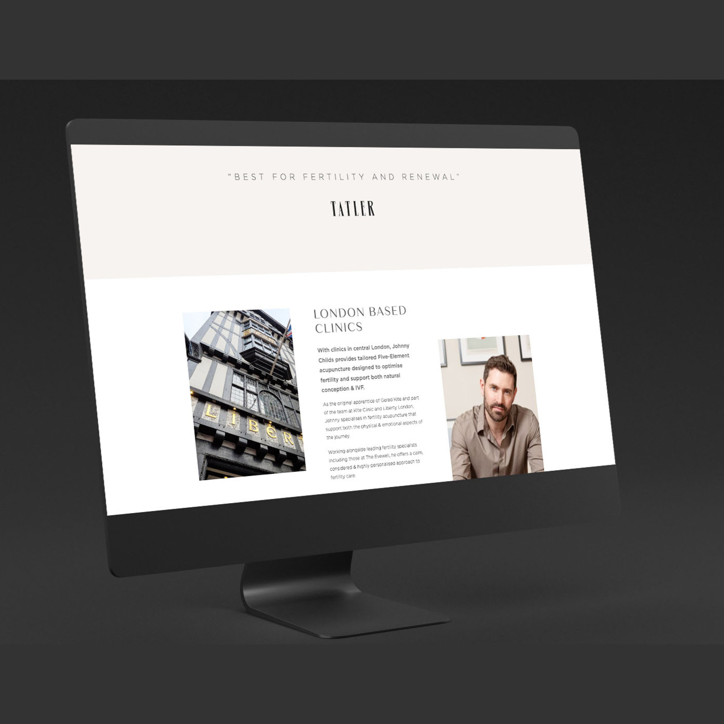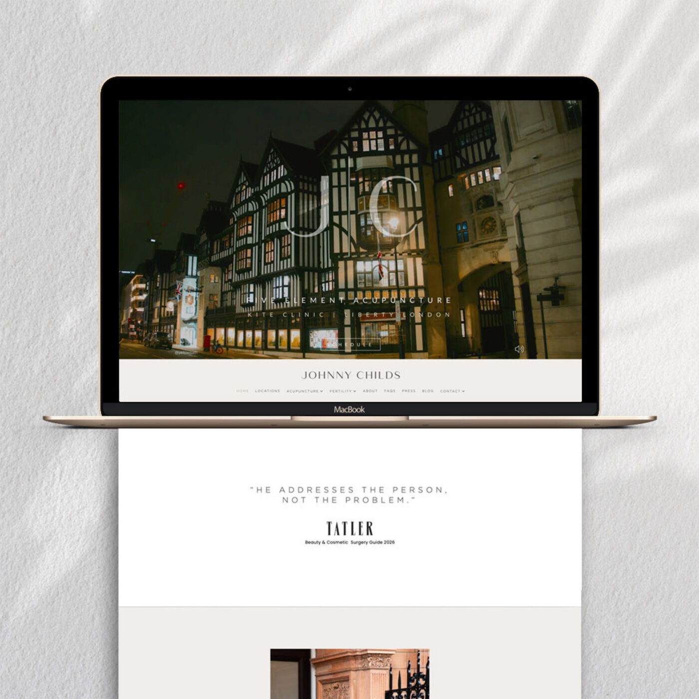
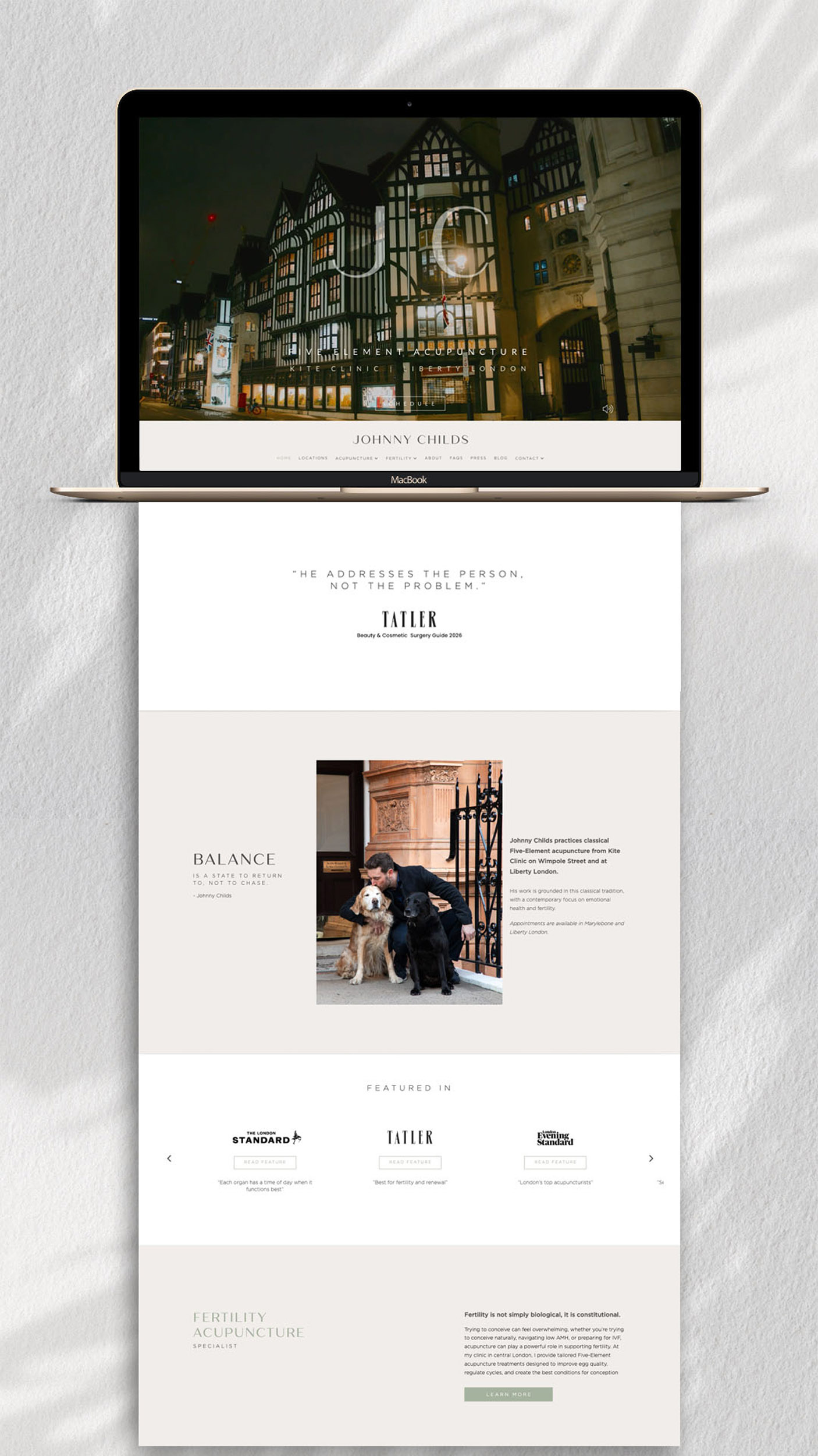
Following the creation of the new brand identity, I was also commissioned to design and develop a new WordPress website for Johnny Childs Acupuncture. Johnny has been featured in numerous publications, from Tatler to Women’s Health, so as with the identity refresh, a key objective was to create something that better reflects this level of recognition and acclaim — elevating the website accordingly.
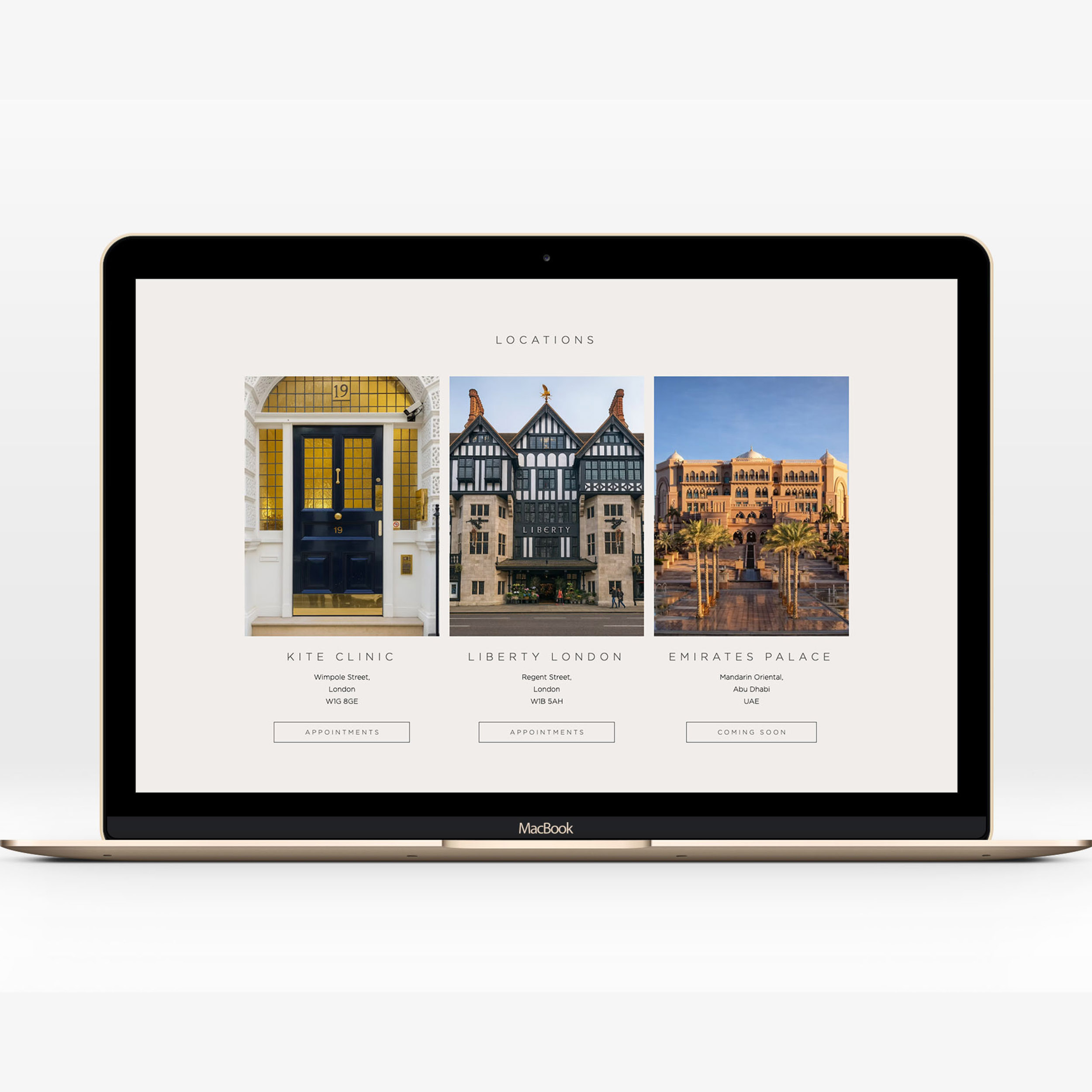
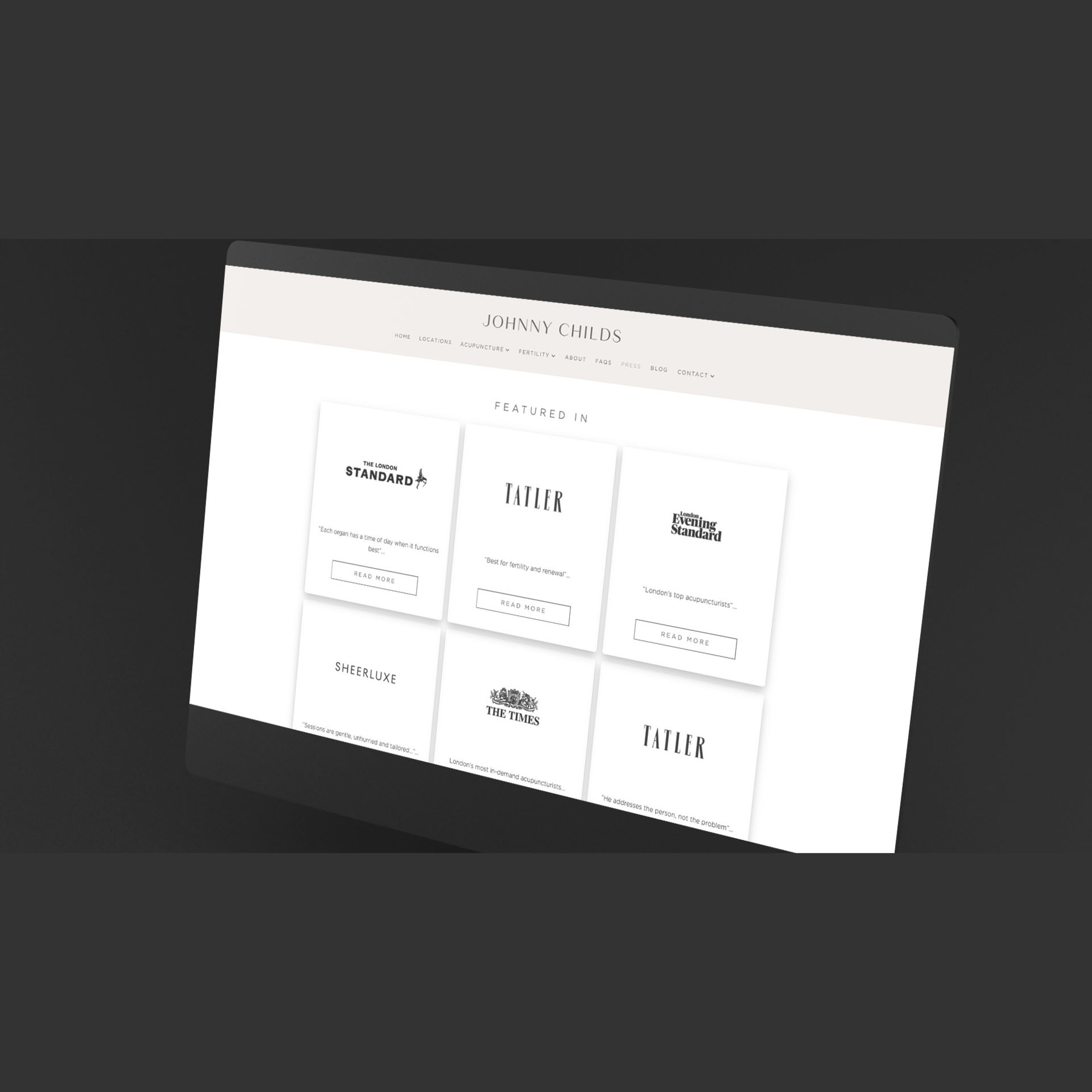
The website carries forward the same sense of quiet luxury and clean, editorial style established in the brand identity, using generous negative space and a considered, intentional flow to both the layouts and content. As the site features a large number of subpages focused on common conditions treated, a layered system was developed to organise these clearly, with each key page featuring a visually rich internal navigation grid that leads visitors deeper into more specific content. Anticipating the user journey — and the way visitors will move through the site — is just as important to the overall experience as the visuals and aesthetic themselves.
Be sure to visit the live website at johnnychilds.co.uk
Case Study
Opportunity
Following the brand identity refresh, Johnny Childs Acupuncture required a website that fully reflects the level of recognition and acclaim he has achieved — from features in Tatler to Women’s Health — while presenting his services with greater clarity, confidence and sophistication.
Objectives (Business + User)
- Create a more elevated digital presence in line with the premium feel of the new identity.
- Present a large volume of treatment-related content in a way that feels clear, structured and easy to navigate.
- Guide visitors smoothly from broad service pages into more specific condition-based content.
- Build the site on WordPress so the platform remains practical, editable and scalable over time.
UX Insight & Strategy
The website needed to balance two priorities: projecting a calm, high-end first impression, while also making a deep content structure feel intuitive. A layered navigation approach was developed, with each key page acting as a visual hub that leads visitors deeper into the site through rich internal navigation grids. This allows users to move naturally from broader concerns to more specific information, creating a journey that feels both elegant and purposeful.
Design System & Content
- Visual Tone: Quiet luxury, generous negative space and a clean editorial style create an immediate sense of calm, quality and trust.
- Typography & Layout: Refined typography and carefully paced sections ensure content remains inviting and digestible, even across longer pages.
- Content Structure: Key pages are designed as visually engaging gateways, helping organise the site’s wider body of information without overwhelming the visitor.
- Brand Continuity: The site draws directly from the refreshed identity, ensuring a consistent premium aesthetic across digital touchpoints.
Interaction & Performance
- User Flow: Internal navigation grids create a clear sense of progression, helping visitors quickly find relevant subtopics and supporting a more intuitive browsing experience.
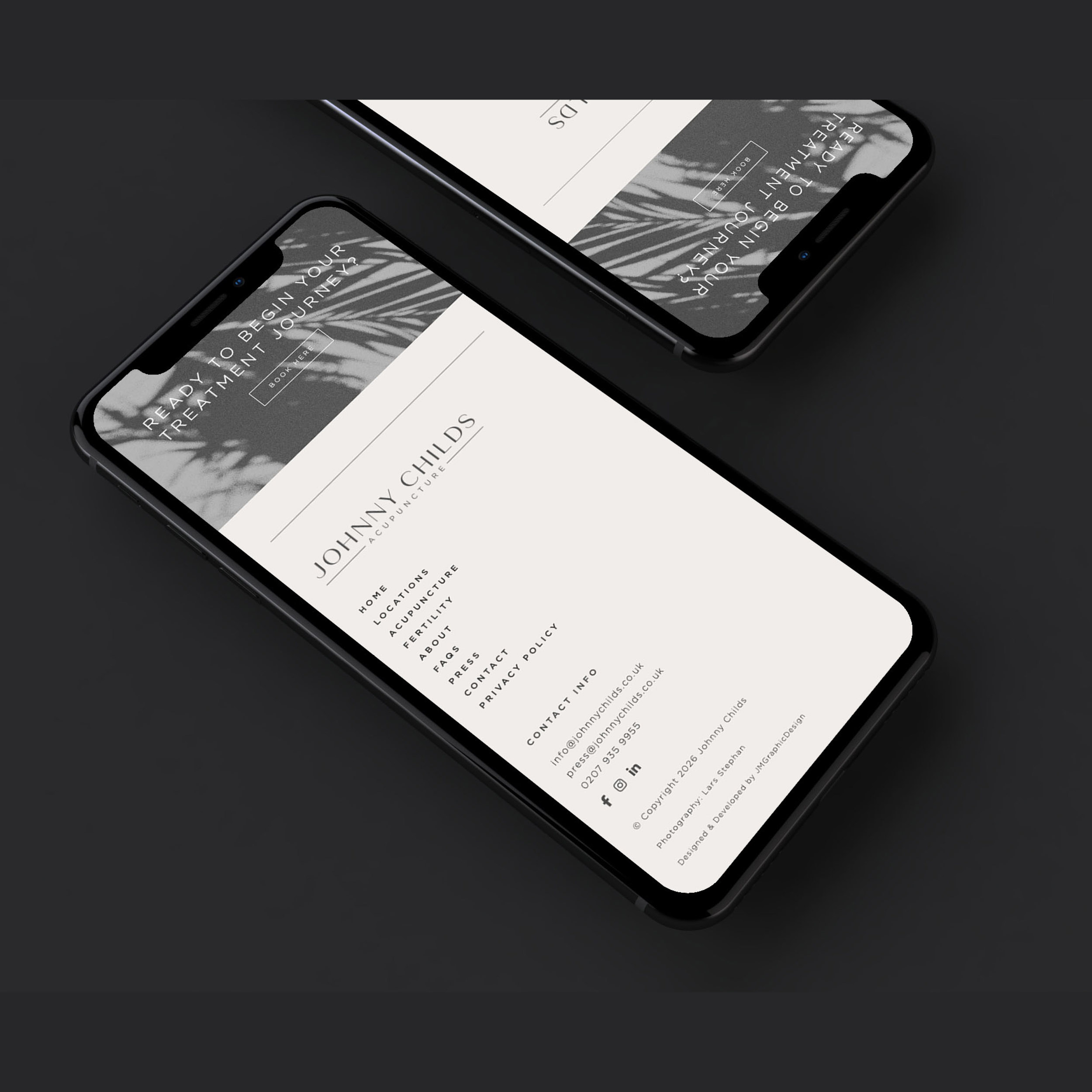
- Responsiveness: Layouts and content hierarchy were carefully considered across devices to maintain clarity and elegance on desktop and mobile alike.
- CMS Practicality: Built on WordPress, the site combines bespoke design with the flexibility needed for future updates and content growth.
Competitive Edge Now
The new website pairs a high-calibre editorial presentation with a thoughtful content structure, allowing Johnny’s expertise, media recognition and premium positioning to come through far more clearly. The result feels polished, immersive and easy to explore — helping visitors engage more deeply with the content while building trust from the first scroll.
What This Enables
A stronger digital platform for ongoing visibility, deeper educational content and continued growth — positioning Johnny Childs Acupuncture to present his expertise with the same clarity and refinement as the care he provides.