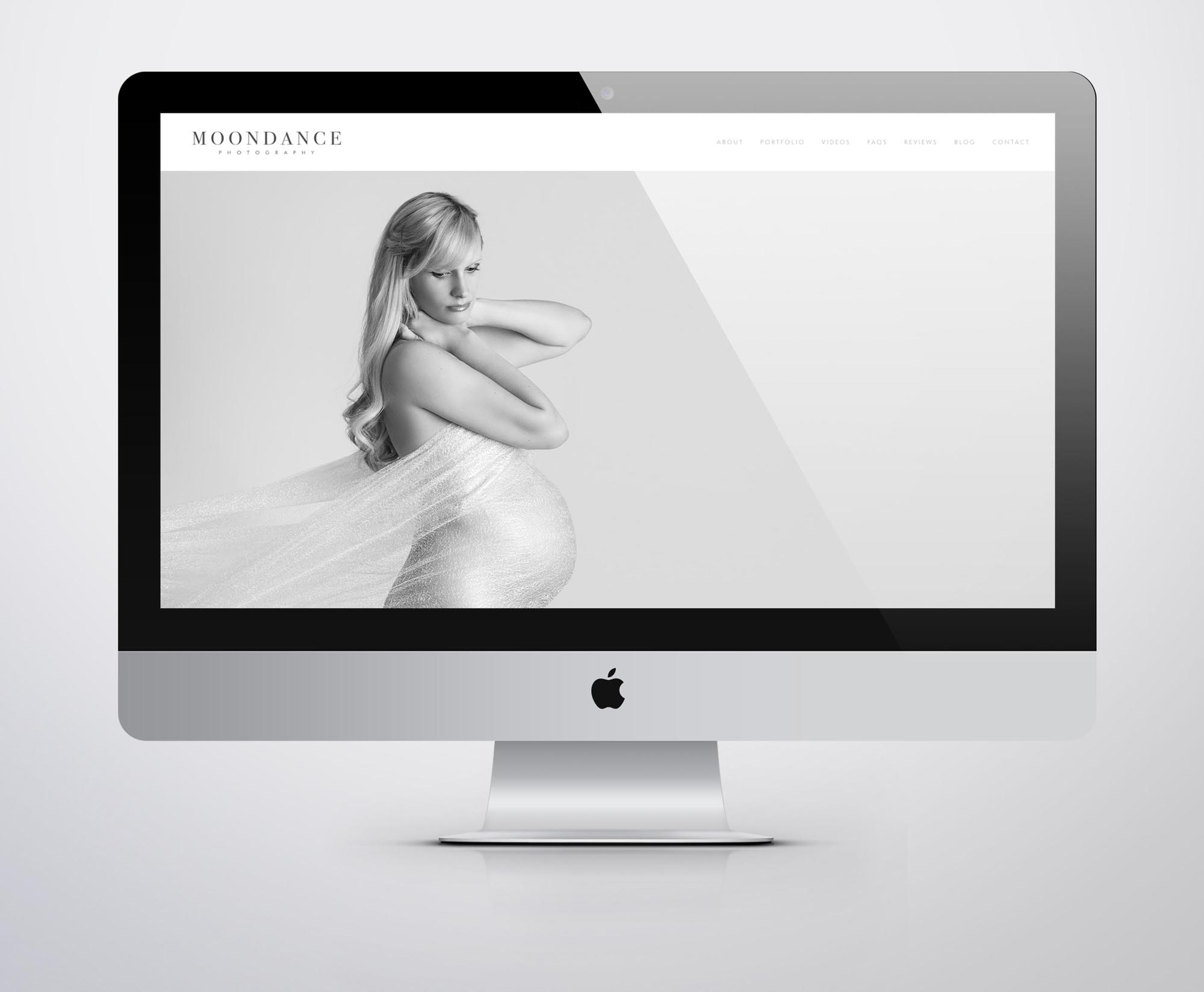
Nemi is a multi-awarded portrait photographer, with two studios dedicated entirely to maternity portraits. One is located in Richmond, West London.
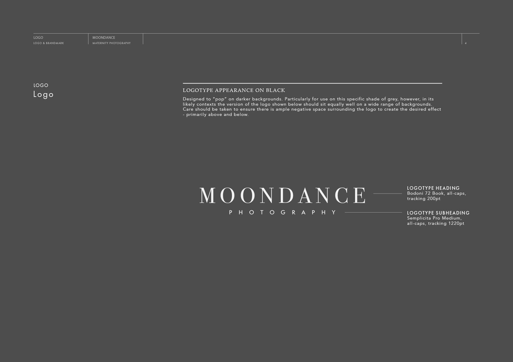
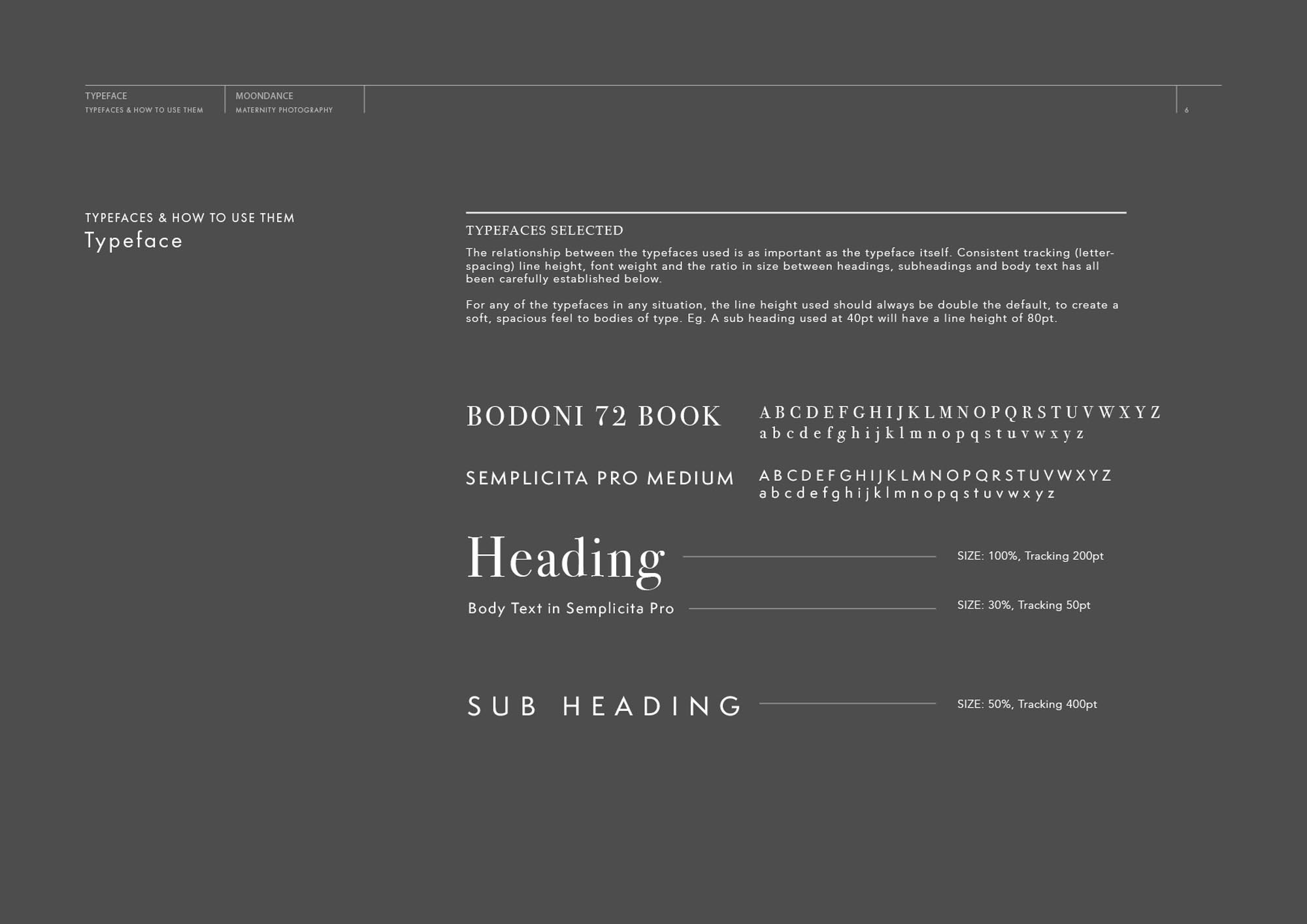
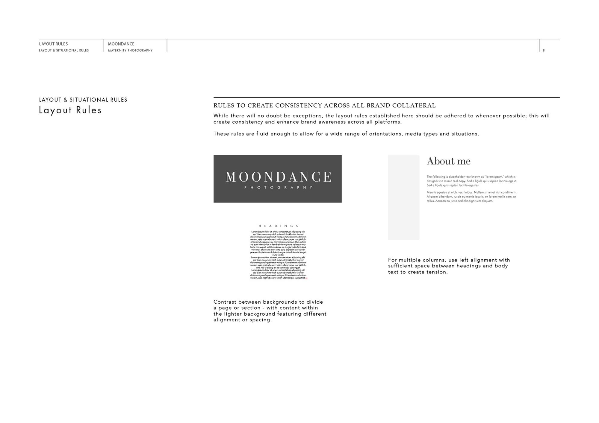
When Nemi approached me to discuss the creation of a new website, we soon realised that for best results the brand identity as a whole needed to be revised… The high standard of work Nemi was producing led to a constant stream of business, but the previous branding was at odds with the elegant, beautiful images. We set about creating a new brand identity that would hint at and complement the artistic style of Nemi’s work.
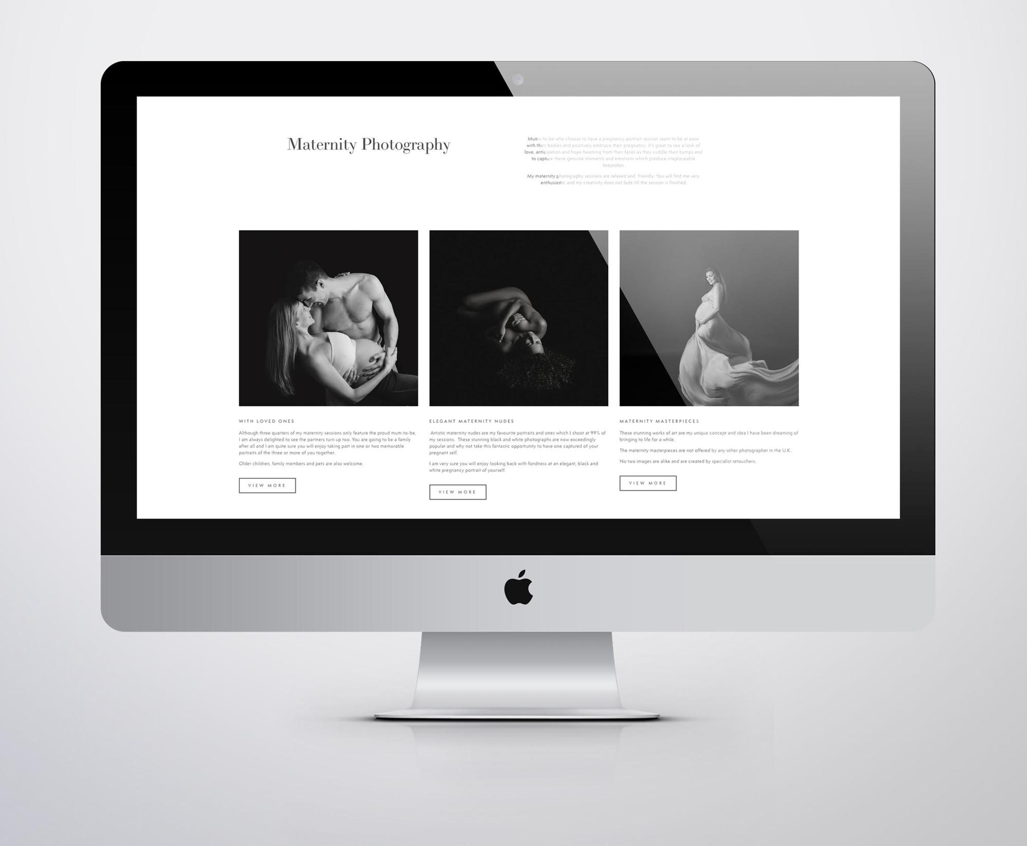
Once the branding was developed, we began applying these design principles to a new website – showcasing the stunning images with minimalism and elegance.
SquareSpace is a brilliant choice if you require a website that needs to showcase work beautifully, with the ability to update it yourself regularly. Nemi has enjoyed customising the images, text and even a few of the layouts since the site has been handed over. For me – creating something that’s going to be easy to maintain and fit for purpose in the long term is just as important as ensuring it looks good on launch day! If you have similar requirements, it might be worth considering SquareSpace as a platform for your site? A professional web designer can create stunning results by heavily customising one of their many templates, then hand it over for you to easily maintain.
Case Study
Opportunity
Brand and website needed to work as one story. Rather than a logo on a template, Moondance called for a cohesive identity and a bespoke site that could express character at a glance and guide visitors smoothly to enquiry.
Objectives (Business + User)
- Unify brand presence across print and digital with a recognisable, scalable identity.
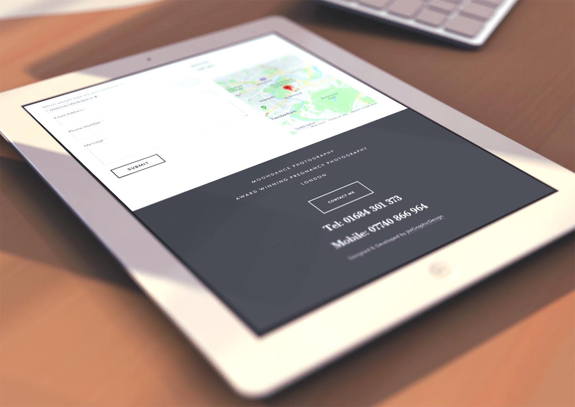
- Create a website that showcases the offering beautifully while keeping pathways to contact and enquiry obvious.
- Establish clear content structure so new pages and updates can be added without diluting the look and feel.
- Ensure strong legibility and performance on mobile as well as desktop.
UX Insight & Strategy
Visitors scan first, then commit. The experience is shaped as a guided reveal: a clear value proposition, selected highlights, and concise proof points, with persistent routes to get in touch. Information architecture keeps navigation simple, grouping content into intuitive sections that shorten the path from interest to action.
Design System & Content
- Identity: A refined, typography-led logo with a compact submark for small spaces ensures recognition across touchpoints.
- Palette & Tone: A restrained, premium colour system and generous spacing create a distinctive yet understated brand presence.
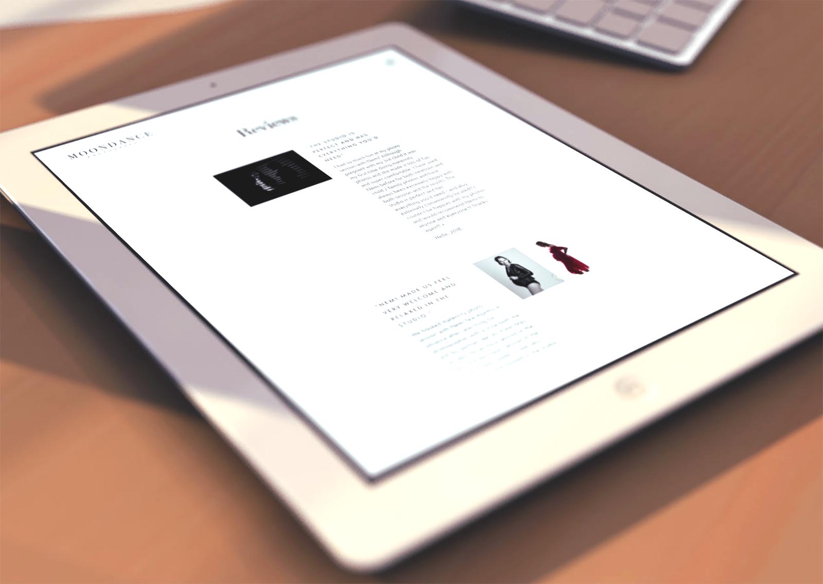
- Website UI: Modular components (hero, feature blocks, image-led showcases, testimonials, CTAs) maintain consistency while allowing the site to scale.
- Content Framing: Short, benefits-orientated copy supports the visuals and clarifies the offer without clutter.
Interaction & Performance
- Motion: Subtle micro-interactions provide polish and guide attention without distracting from the message.
- Speed & Accessibility: Optimised assets, sensible contrast, descriptive alt text, and keyboard-friendly focus states.
- CMS Practicality: A block-based editor and reusable patterns make updates straightforward while preserving design fidelity.
Competitive Edge Now
By pairing a disciplined identity with a custom, component-driven site, Moondance avoids the “logo-on-a-theme” trap. The result is a branded experience that feels considered, distinctive, and trustworthy — reducing friction and elevating perceived value from the first scroll.
What This Enables
This foundation is ready for content growth (news, features, launches), targeted landing pages, and future brand extensions, keeping presentation coherent as Moondance evolves — without resorting to generic templates or sacrificing clarity.


