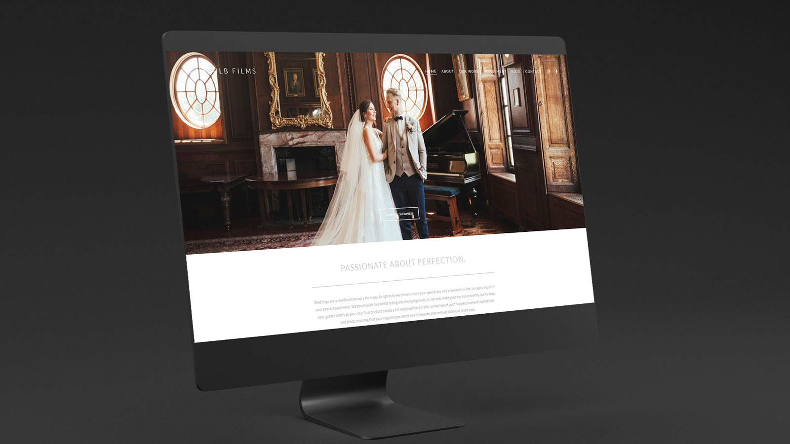
It was an absolute pleasure to design and develop the new website for the extremely talented Lightbulb Films, wedding videographers based in London. Their impressive portfolio includes show-stopping weddings at some of the UKs most exclusive hotels and venues. Accordingly, we designed the website to feel elegant, luxurious – and to complement rather than distract from their work in any way.
We used neutral tones (otherwise you can create an optical illusion where video/images feel warmer/colder than they really are, all due to the background!) with light, crisp text and responsive layouts.
Thank you Lewis and the team for bringing me onboard to develop this for you!

Case Study
Opportunity
Premium wedding and event filmmakers win trust when the work takes centre stage. The brief was to create a site that feels editorial and timeless—an interface that flatters colour-critical footage rather than competing with it.
Objectives (Business + User)
-
Showcase films with immediate, gallery-grade clarity.
-
Communicate luxury positioning within the first scroll.
-
Give private clients and event planners a simple, confident route to enquire.
-
Maintain the brand’s neutral, typographic tone from identity through to web.
UX Insight & Strategy
Viewers make decisions in seconds, often on mobile. The journey leads with proof—hero reel and selected highlights—then offers concise context, testimonials, and clear next steps. Navigation stays minimal and predictable; microcopy is calm and professional.
Design System & Content
The interface extends the brand’s cinematography-first ethos: restrained greyscale, generous spacing, and a high-contrast serif/sans pairing that echoes the logo. Project pages prioritise large video players, stills extracted as supporting frames, and short, well-edited descriptions. The identity’s neutral palette ensures overlays and UI elements don’t skew the perceived colour of the footage.
Interaction & Performance
Motion is subtle and purposeful—gentle cues that aid progression without drawing attention away from the films. Media handling is optimised for fidelity and speed; components are modular so new projects can be added without breaking layout rhythm. Accessibility and contrast standards are observed throughout for legibility on all devices.
Competitive Edge Now
Compared with template-heavy portfolio sites, this experience feels intentionally edited and brand-true. Films load cleanly, the interface reads quietly confident, and enquiry pathways for both private and corporate work are unambiguous.
What This Enables
A platform that elevates perceived value, supports reels and project-based storytelling, and scales gracefully as new work is published—preserving a consistent, high-calibre voice across identity, web and client communications.


