Brand Identity for a Prime Off-Market Property Specialist
ROC Invest are property specialists who source off-market opportunities for HNW clients, family offices and overseas investors, with a global network across prime and super-prime real estate and a particular focus on London and the UK.
The brand identity needed to feel appropriate at a glance. It had to convey trust and credibility, signal a high level of positioning, and subtly align with a British visual register that would resonate with international investors buying into UK property.
Research first
Before drawing anything, I reviewed the wider category: off-market sourcing firms, prime buying agents and super-prime agencies across London and the UK, alongside a set of aspirational brands operating at the standard ROC wanted to reach.
One conclusion shaped everything that followed. In this market, discretion and off-market access are claimed by almost everyone. The language is close to interchangeable. What actually separates the strongest firms is the mark itself, because at this level the logo positions the business before a single word is read. That made the identity the priority rather than a finishing touch.
The logo
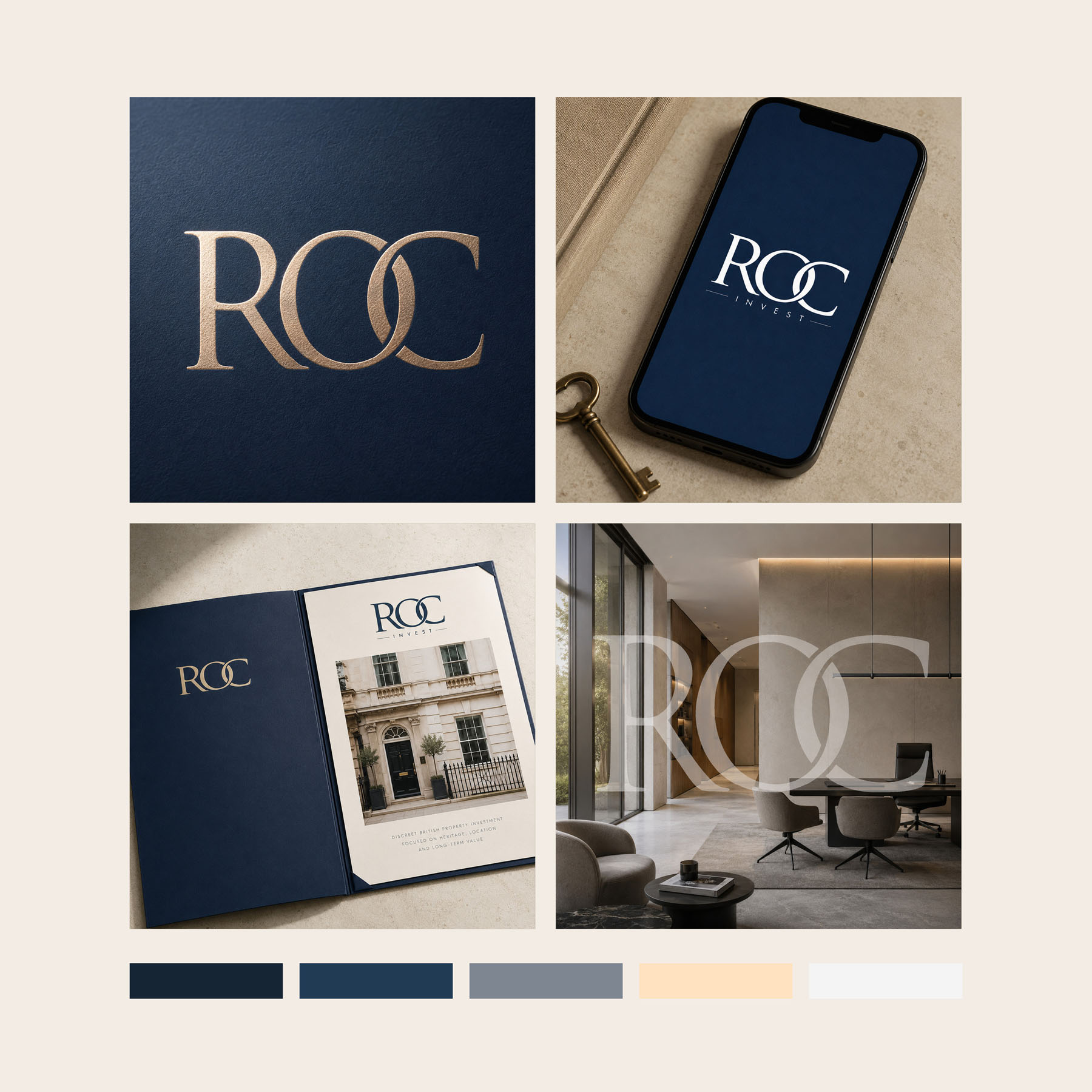
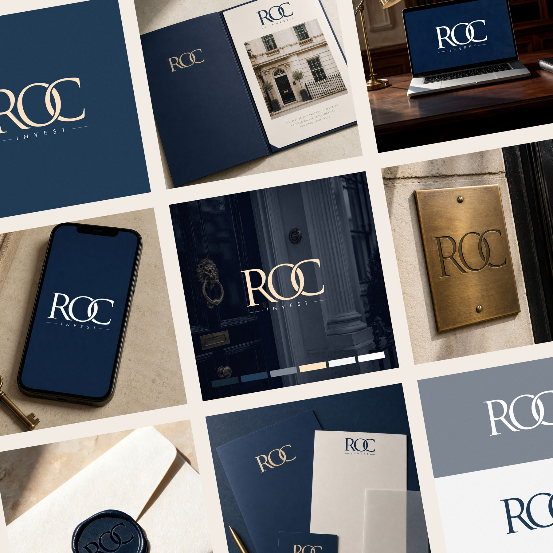
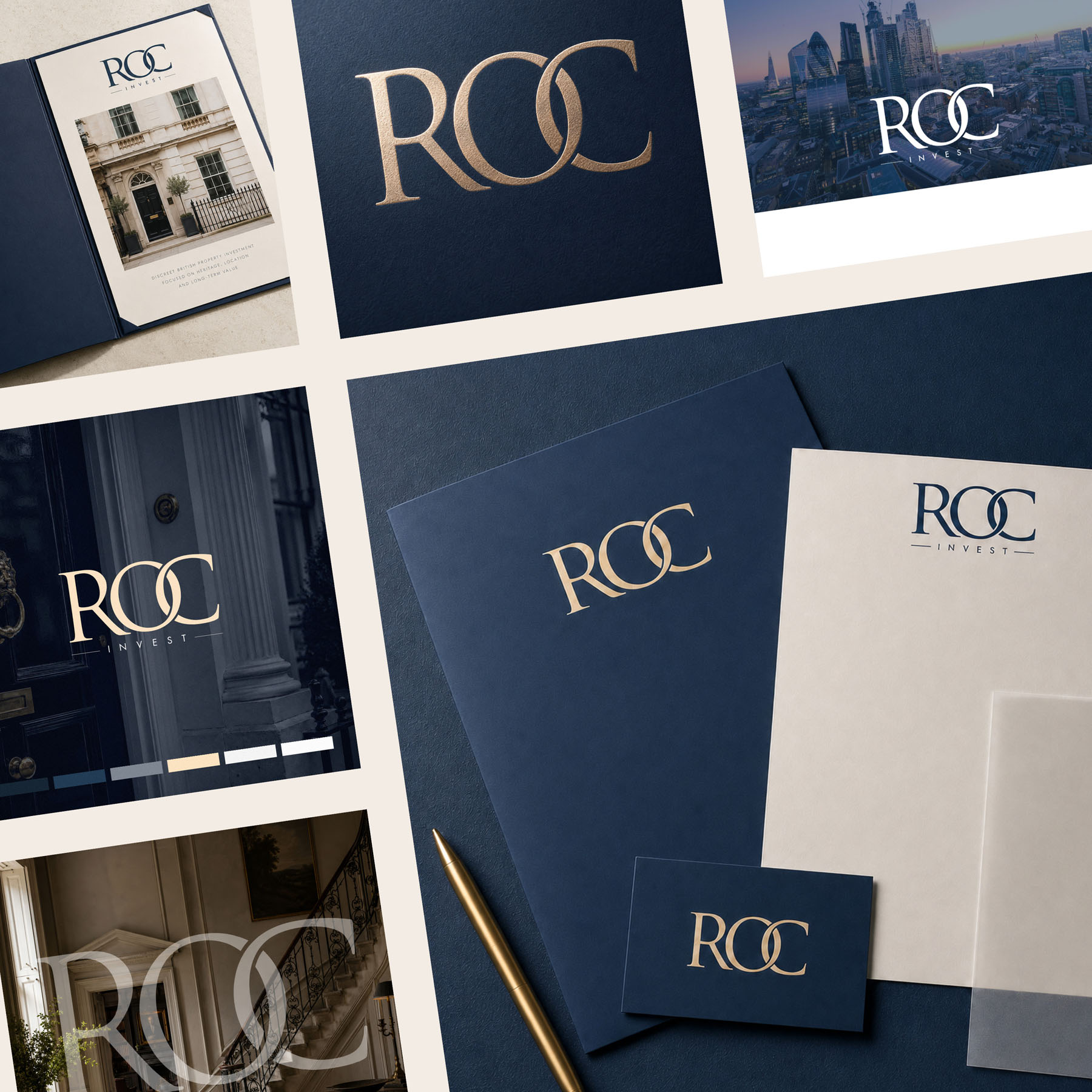
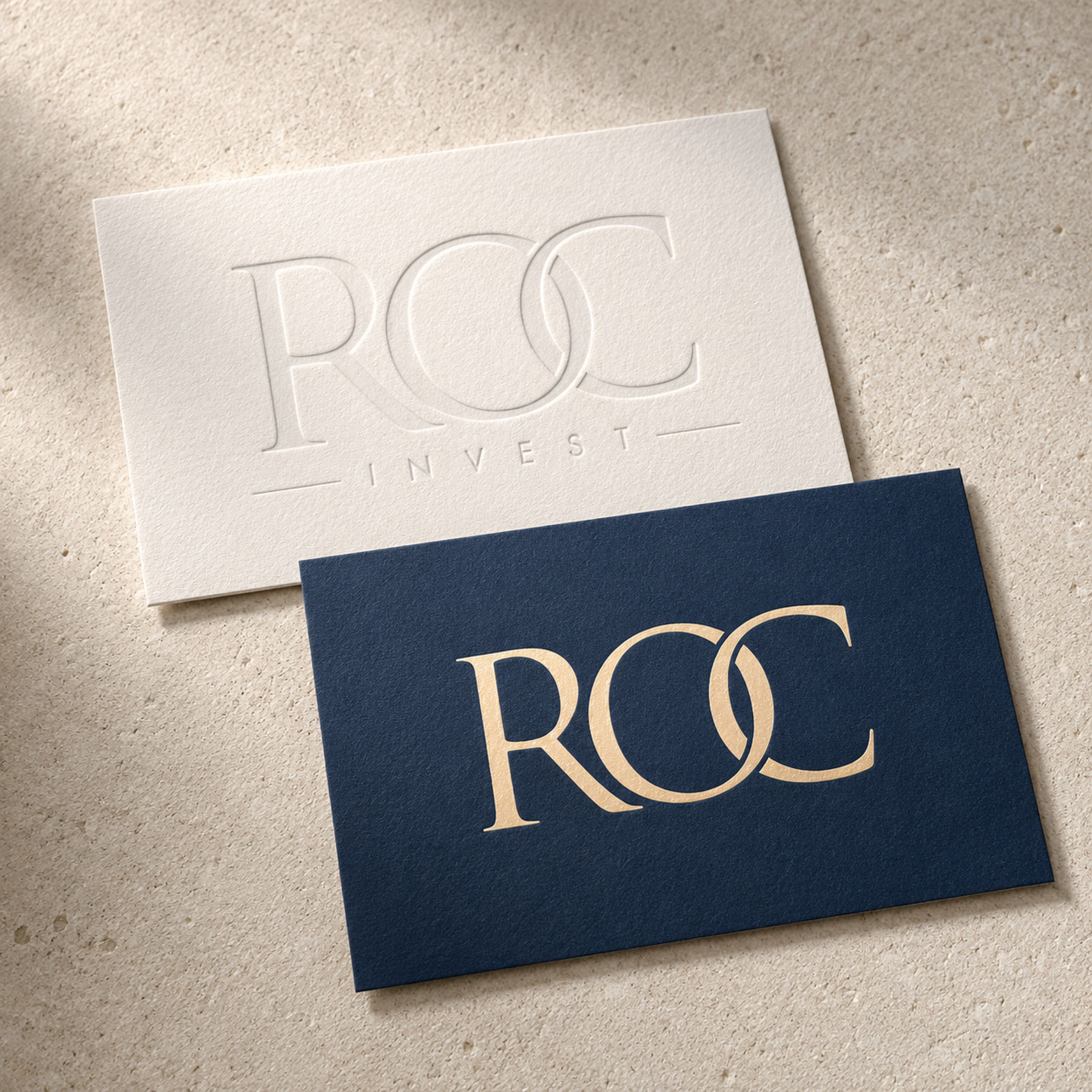
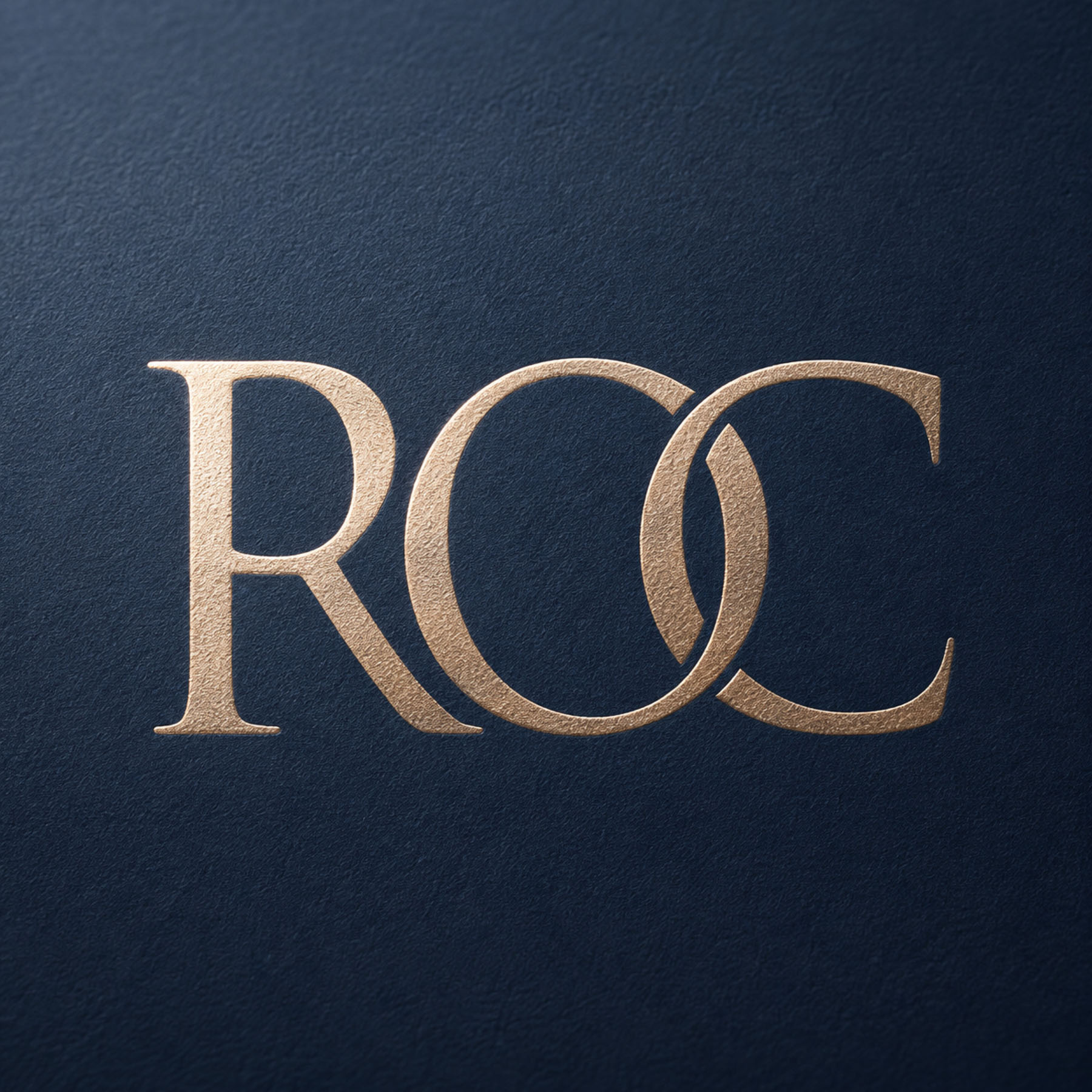
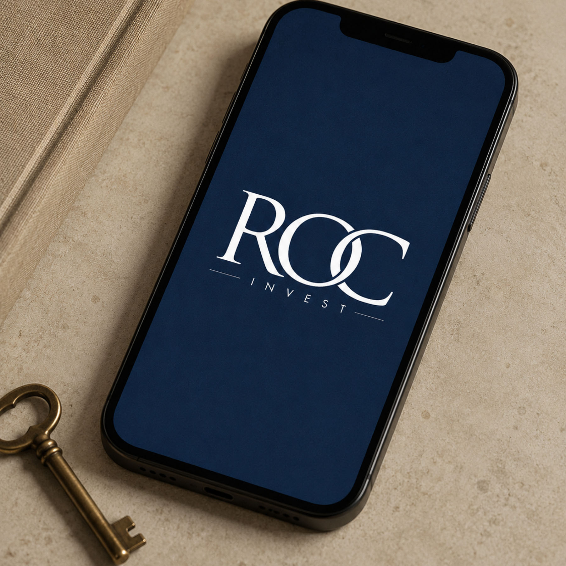
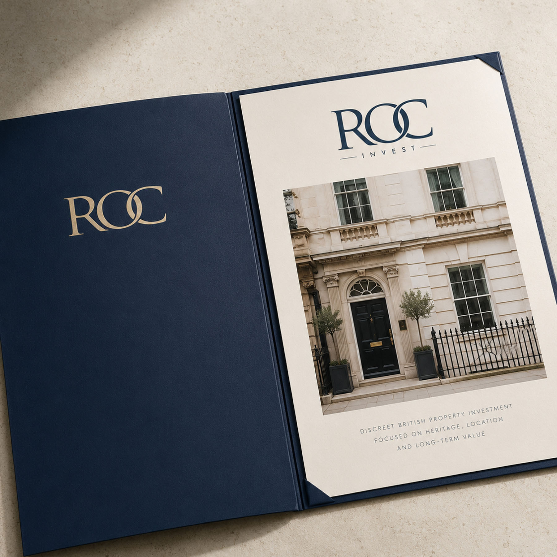
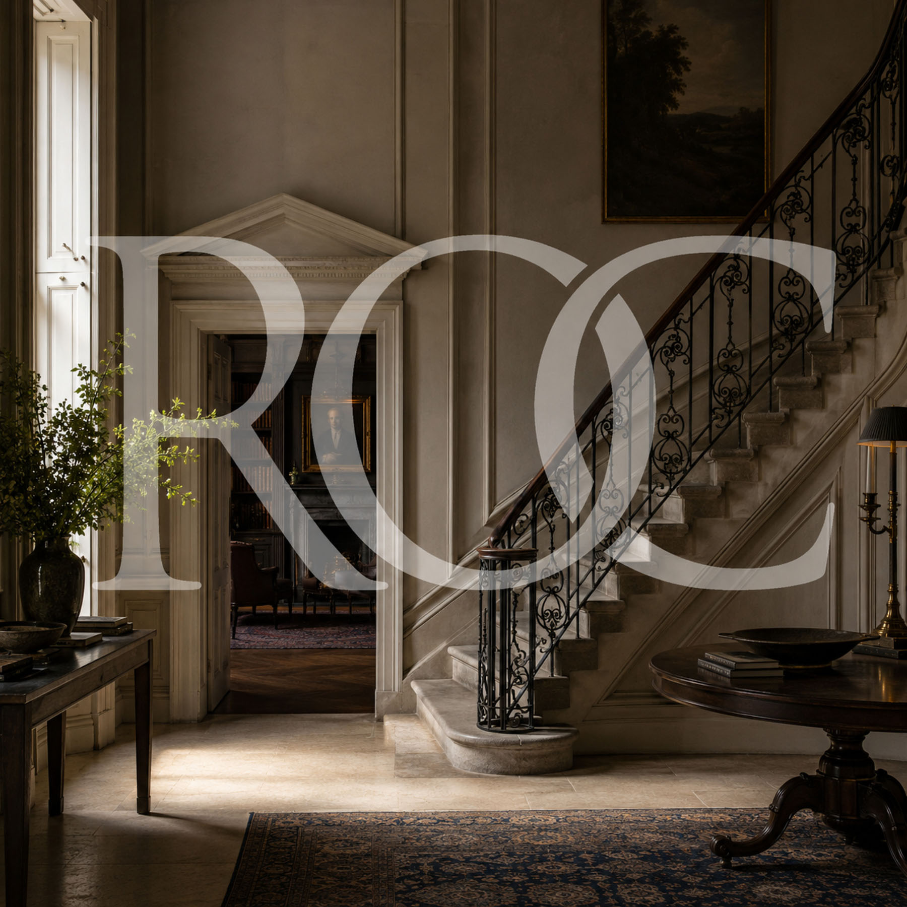
The logo, deceptively simple, carries layers of meaning.
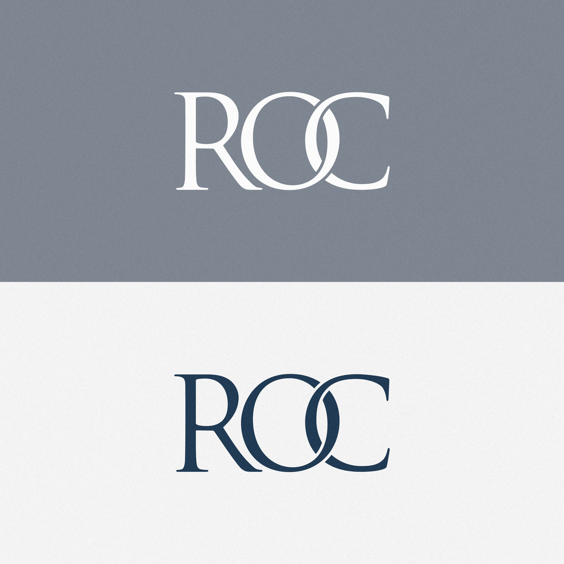
The OC letterforms interlock in a way that indicates connection, which was part of the key brand message our strategy process highlighted: connecting discerning investors and vendors. ROC sits on both sides of a transaction, sourcing property for investors and finding investors for vendors, and the mark needed to express that.
This had to be represented visually with the correct balance. A weak or frail looking link would send entirely the wrong message, so the letterforms and the interlock are deliberately strong and confident.
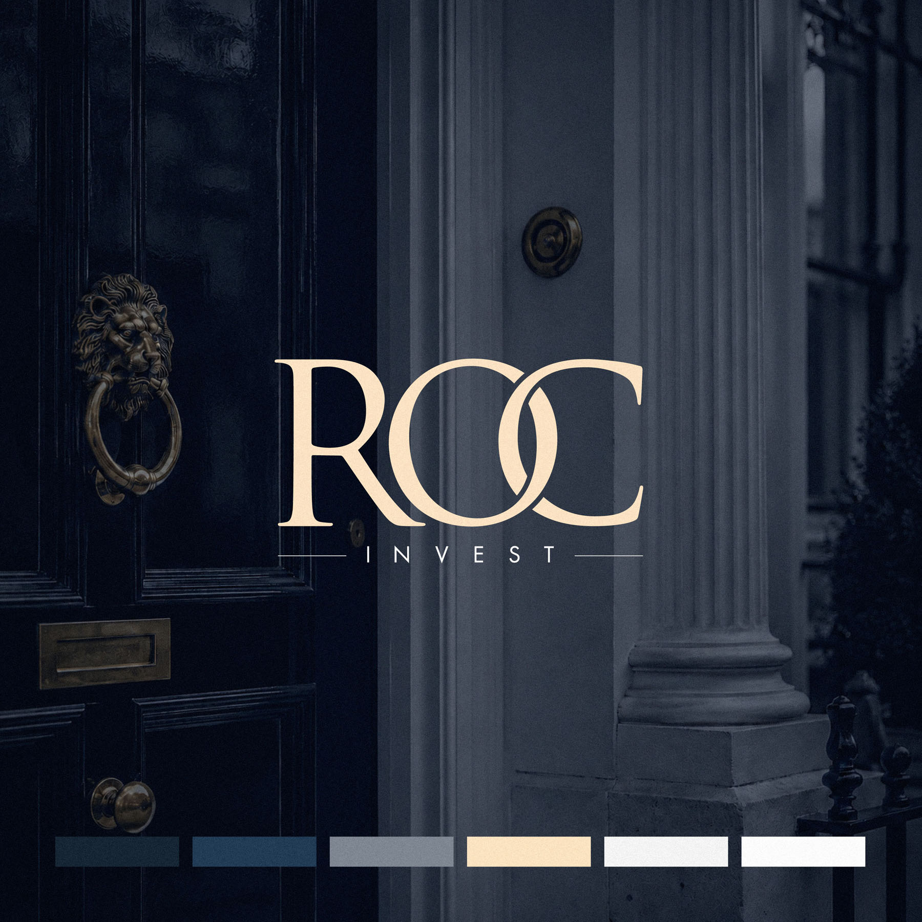
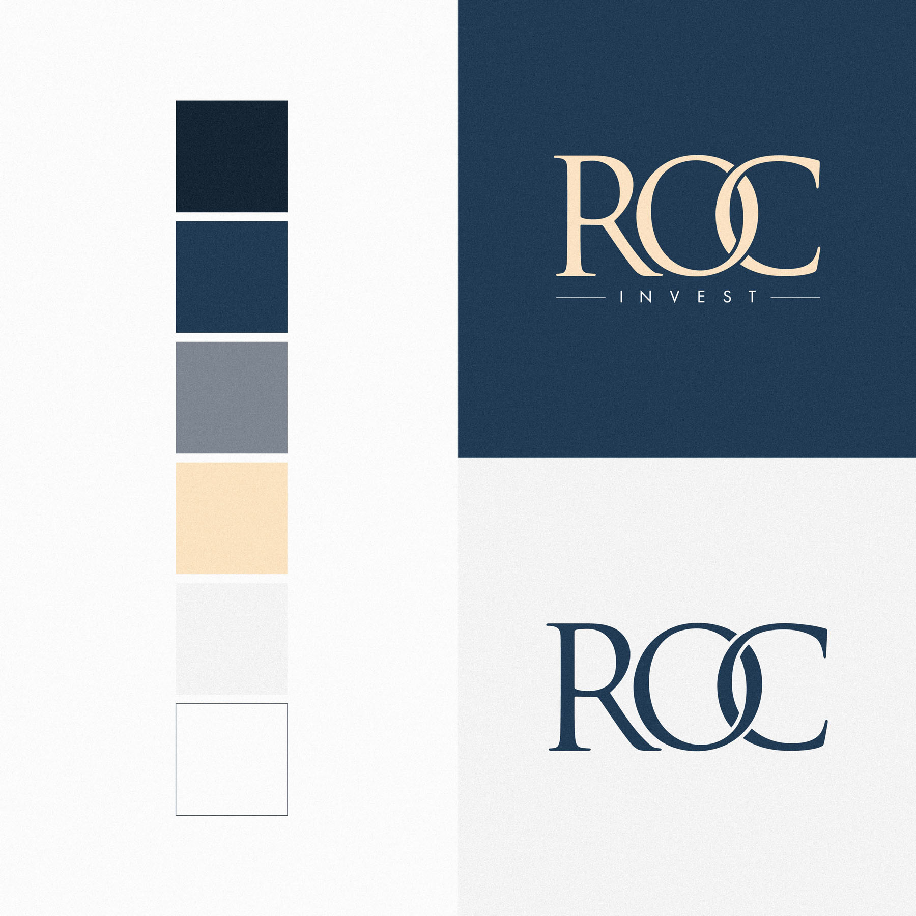
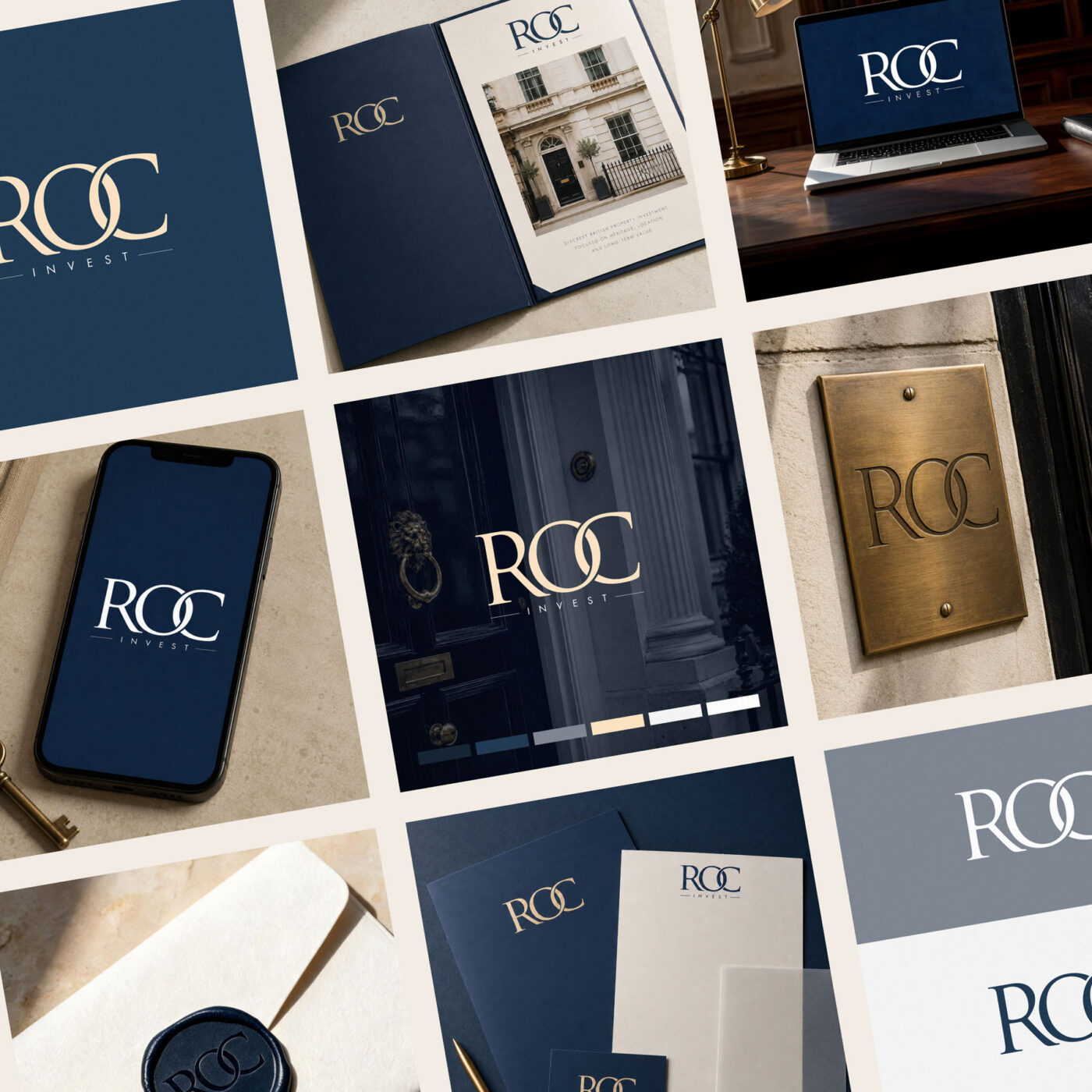
ROC, with its custom treatment, is the focal point, while INVEST sits below in an intentional contrast of weight and size. Keylines either side of INVEST allow it to be deployed at the optimal size while ensuring the entire lockup feels perfectly balanced, and that ROC rests comfortably on INVEST without creating a visual see-saw, which would be an unhelpful connotation for an investment business.
The palette
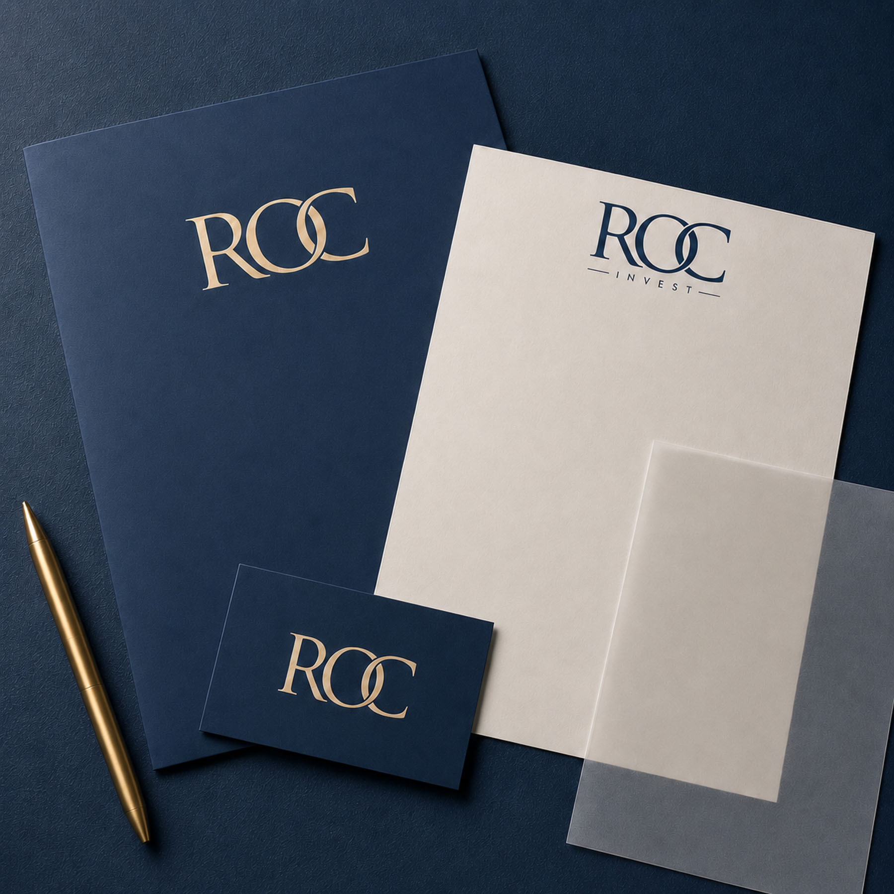
Midnight and Royal Navy ground the tone of the brand in competence and discretion, while muted champagne accents lend a touch of heritage credibility. Harbour Grey is the neutral diplomat of the palette: composed, impartial and quietly expensive.
Used together, the palette does the job the audience requires. Property transactions at this level are significant and potentially stressful, so the visual language needed to reassure before it impressed. Navy carries the authority, champagne supplies the warmth and the signal of quality, and the restraint throughout keeps the whole thing feeling considered rather than decorative.
The result
An identity that reads as premium at a glance, holds a genuine idea inside the mark, and gives ROC Invest something the category rarely offers: a story worth telling, in a business that runs largely on personal recommendation.
In addition to the brand identity design, I was commissioned to design and develop the new website for ROC Invest here.