A Website Design for an Exclusive Alpine Ski Chalet
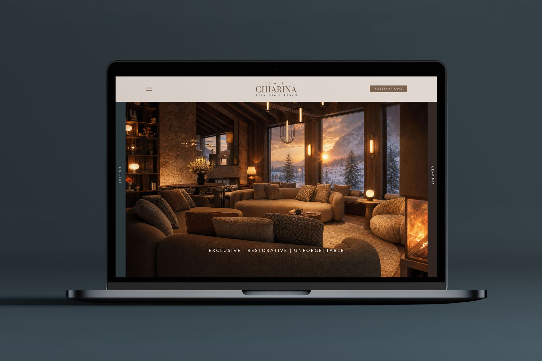
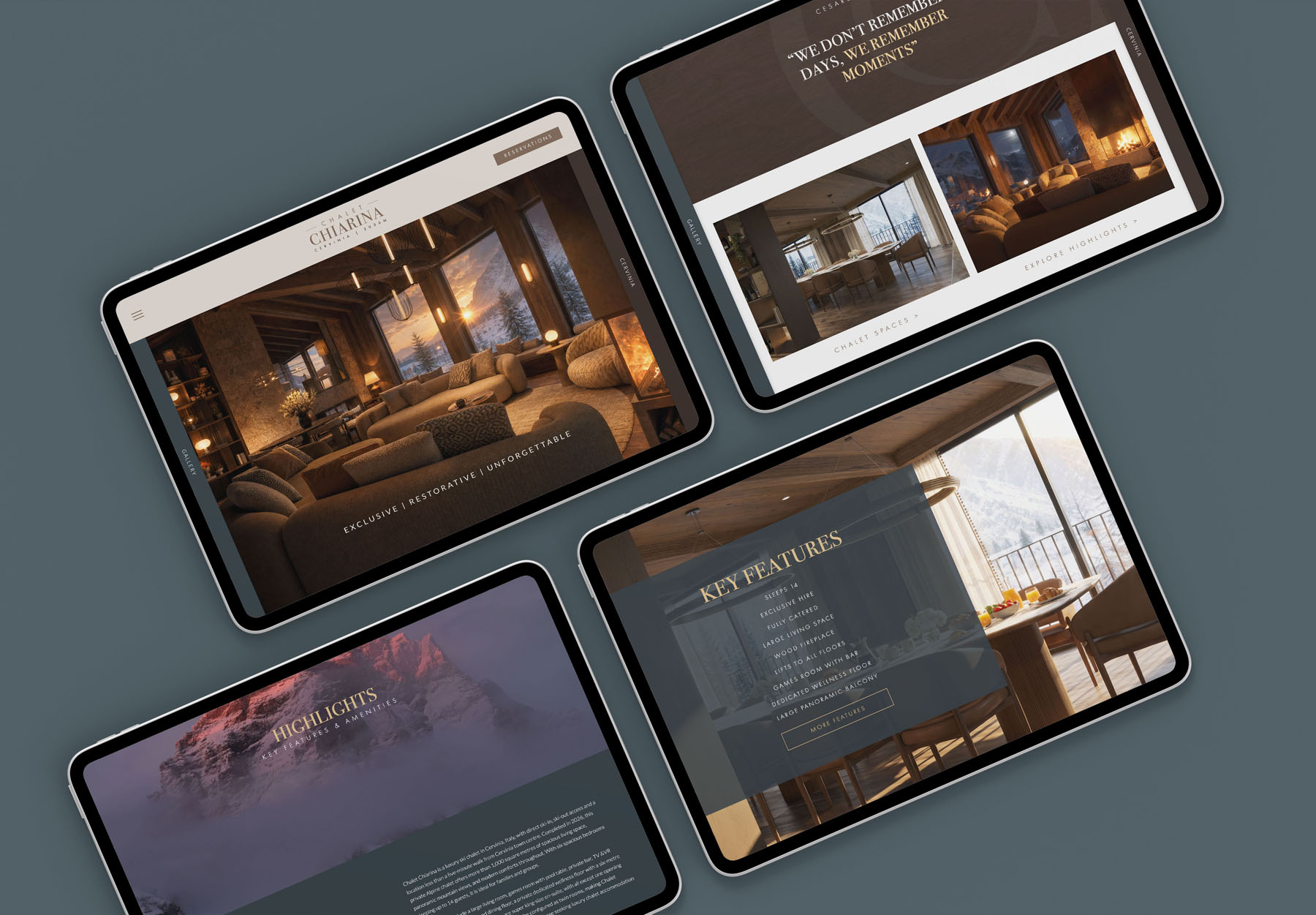
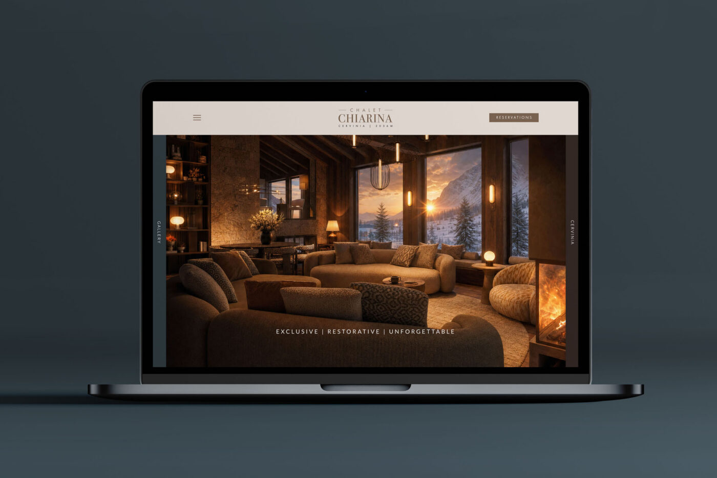
Following on from the Chalet Chiarina brand identity, I was commissioned to design and build the website: an immersive, visually indulgent digital brochure that carries the calm of the identity into a living, breathing experience.
The brief, in spirit, was to create the feeling of arrival before arrival. A guest should sense the Chalet the moment they begin to explore, so that the website becomes the first act of hospitality rather than a catalogue of facts.
A tour, not a directory
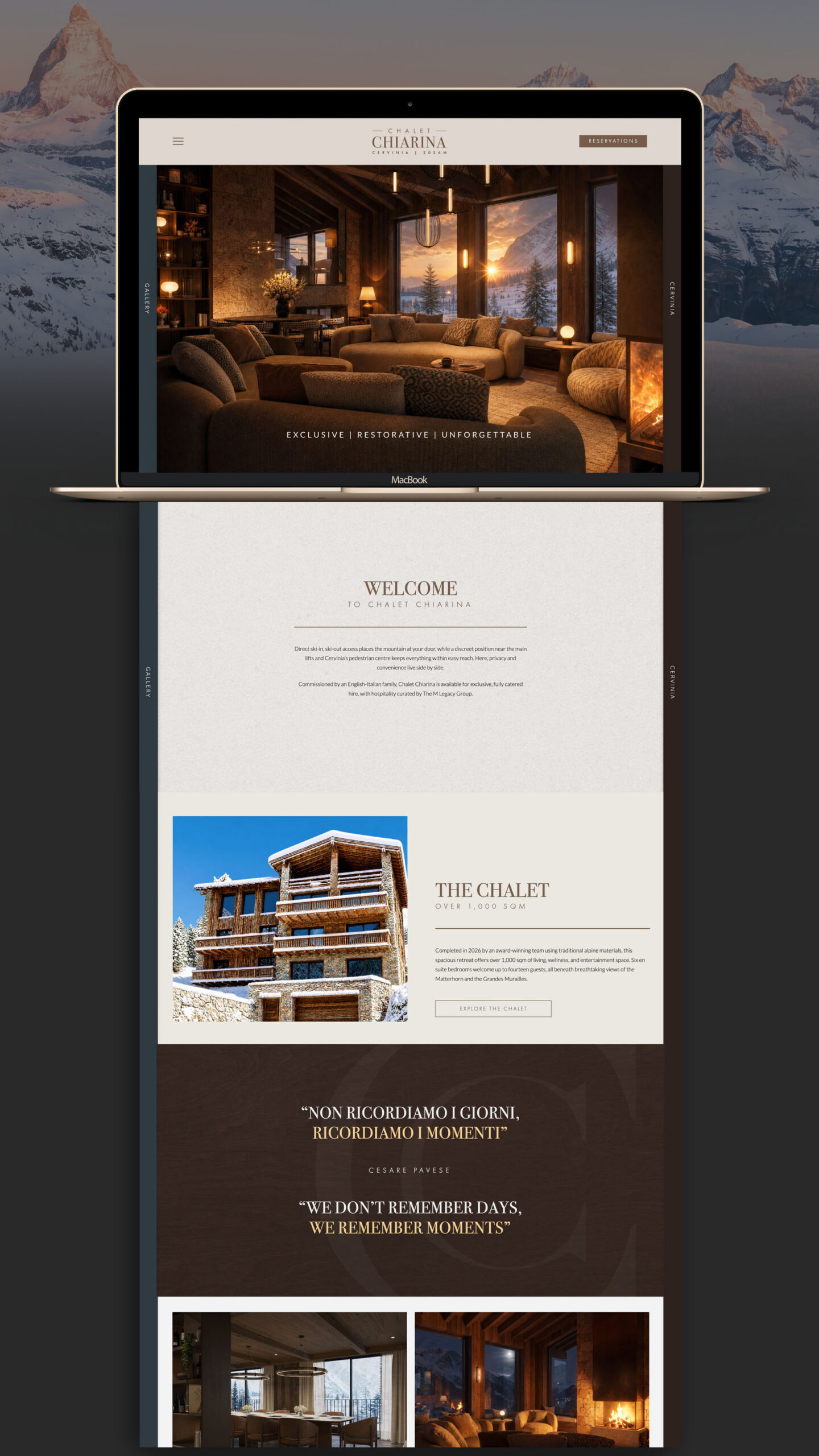
The site conducts a confident tour of the Chalet. It answers the questions a potential guest might have, but it does so with the ease of a good concierge, never rushing, never reciting. It does not info-dump. It does not present a wall of images in a grid, nor stack heading upon subheading upon column of text. Instead it moves at a considered pace, pausing where something deserves attention, suggesting a subpage here or a deeper dive there, always leaving the visitor feeling guided rather than processed. (A mistake I observe many modern websites make all too often!)
An onion-skin approach to information
Underpinning the whole is a layered structure I think of as onion-skin. The initial experience is calm, curated and visually impactful, offering just enough to draw a guest in. Beneath it sit deeper layers, there to be peeled back by those who want them, so the detail is always available but never imposed. It respects the reader’s attention, letting them choose their own depth.
Movement, used like an orchestra
Micro animation brings content into play like instruments in an orchestra, each element arriving in its own moment rather than all at once. The intent is restraint. So many sites at the moment reach for effect for its own sake, drawing the eye with movement that serves nothing and quickly overwhelms. Here, motion is used only to guide and to reveal, subtle and tasteful, in service of the content rather than competing with it.
A bespoke touch at the edges
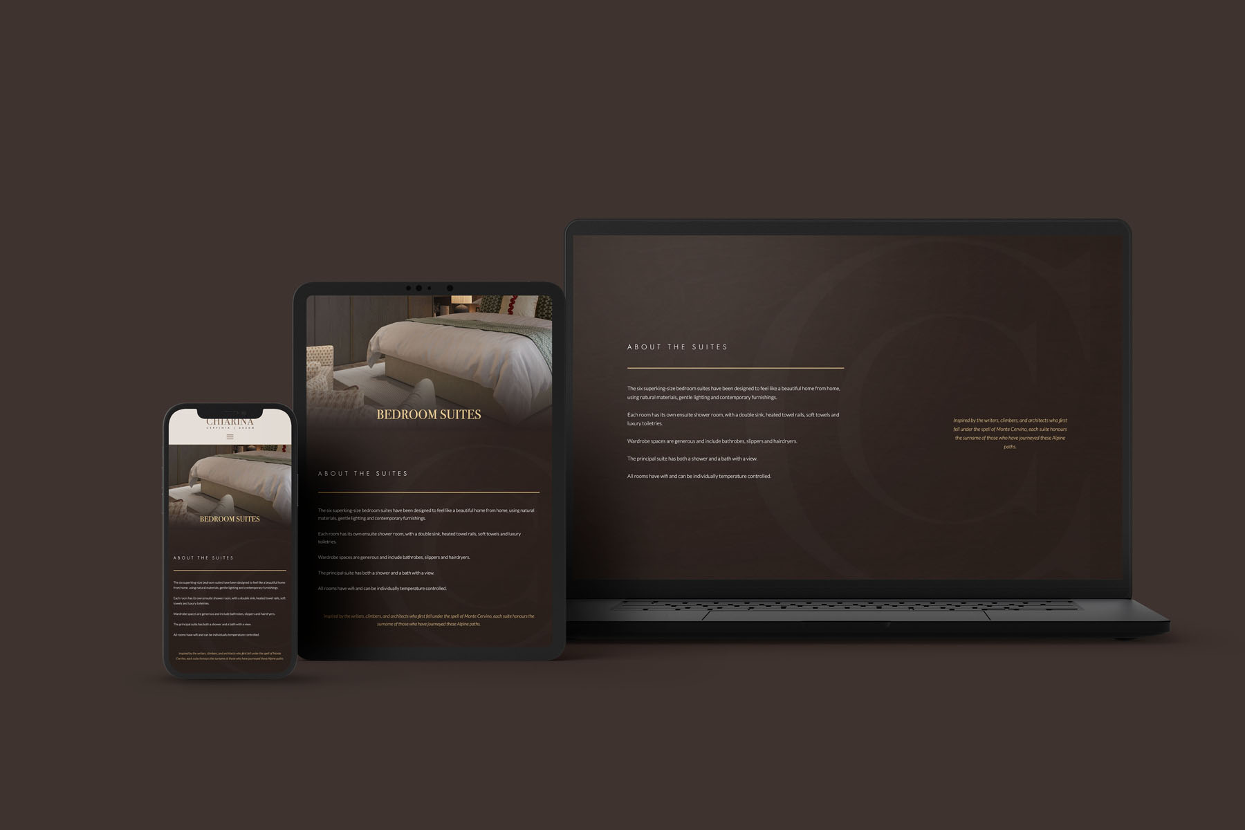
One custom feature I am particularly fond of lives along the edges of the desktop view. Discreet side tabs, hidden on smaller screens, draw in concealed layers: one bringing key details about the region, the other opening into gallery imagery. It is exactly the kind of considered, bespoke detail that lifts a site above the templated, and it speaks to a wider point I believe in strongly, that thoughtful use of AI, even within a WordPress build, allows these bespoke touches to be realised flawlessly and affordably. The technology stays quietly behind the experience, where it belongs.
A preview of what is to come
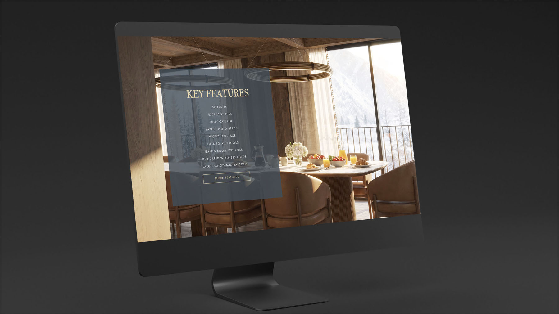
A note on the imagery. As the Chalet was still in construction at the time of launch, the visuals were created using CGI. This is a deliberate and well-established approach, often used by developers whose finished photography will not be available until a building completes, yet whose interest is already building. The CGI offers an accurate preview of the intended furnishings, finishes and spaces, faithful enough to let a guest genuinely understand what awaits them, and it allowed Chalet Chiarina to open for booking for the coming season rather than waiting on the final build. The imagery will be replaced with finished photography once it is ready in the months ahead, but the preview does its job beautifully in the meantime: it lets the story begin exactly when the interest is there to receive it.