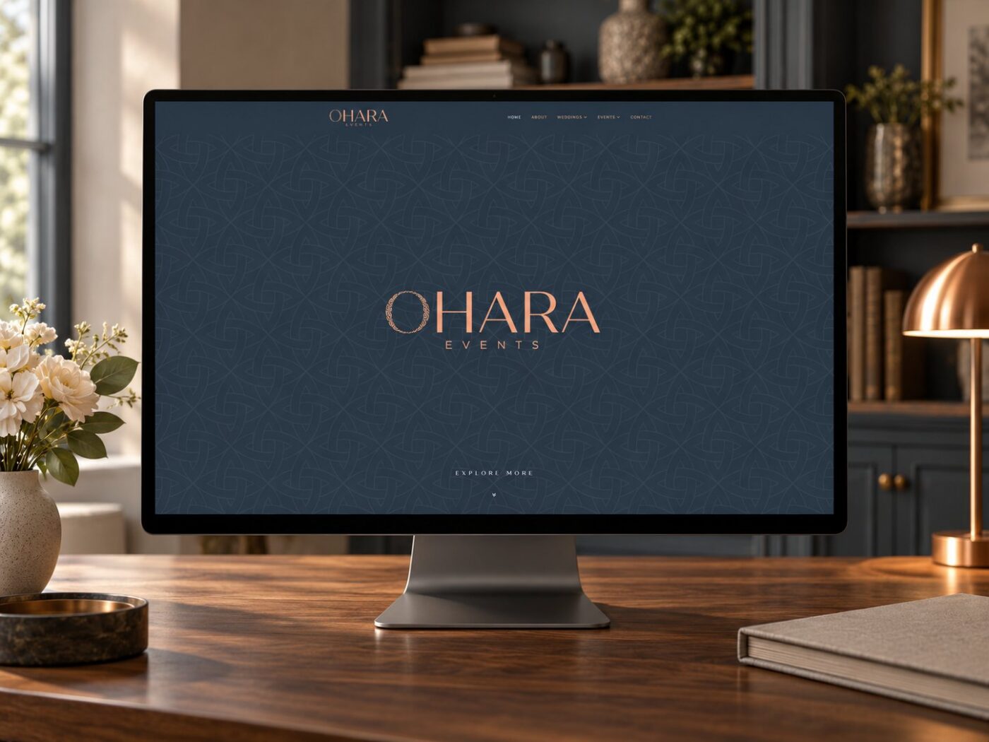
A Website Design for a Boutique Irish Wedding and Events Studio
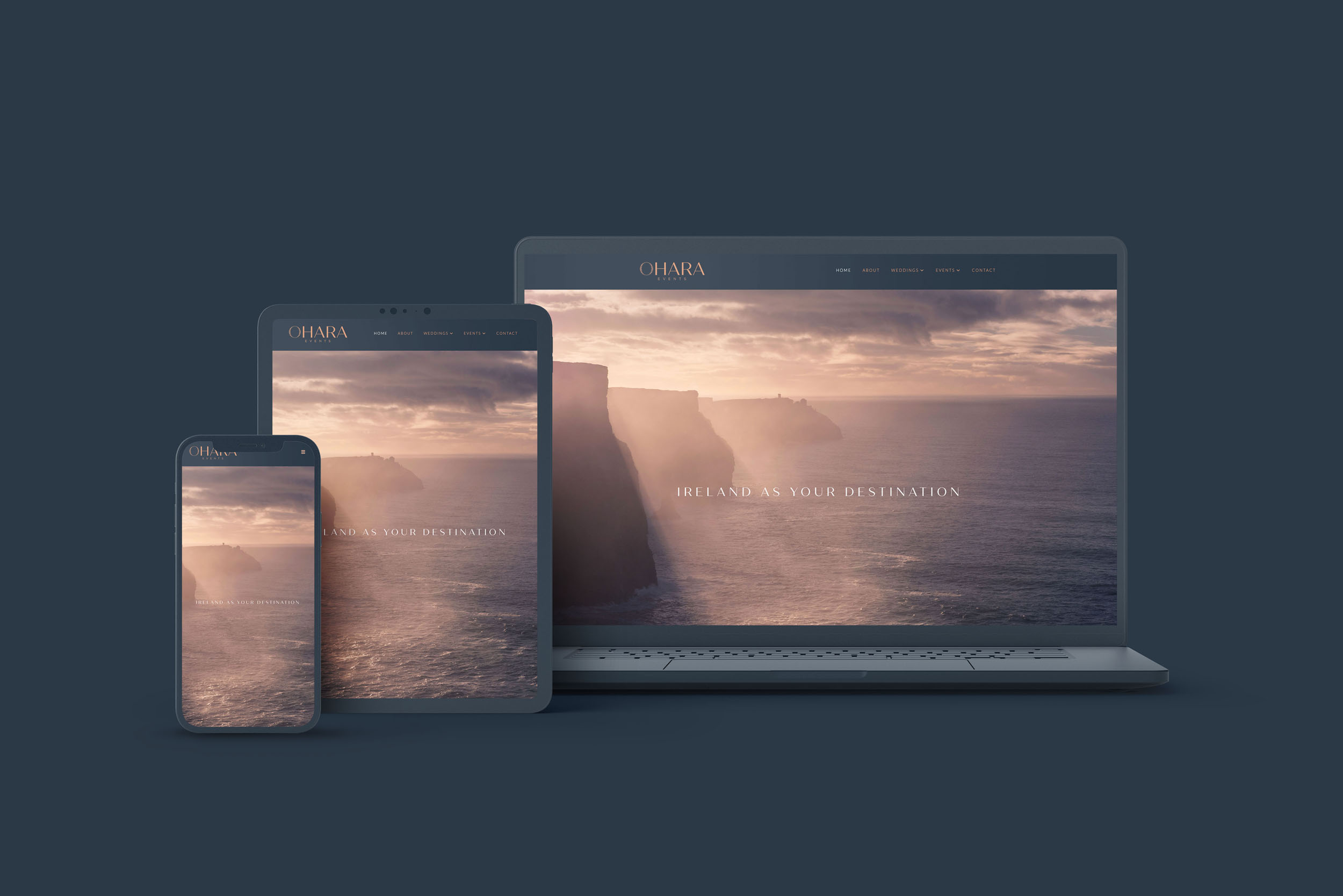
Following on from the OHARA Events brand identity, I was commissioned to design and build the website: a place where the identity could be experienced rather than simply seen, and where a visitor’s first impression of OHARA would be as considered as the events Ciara creates.
Design first
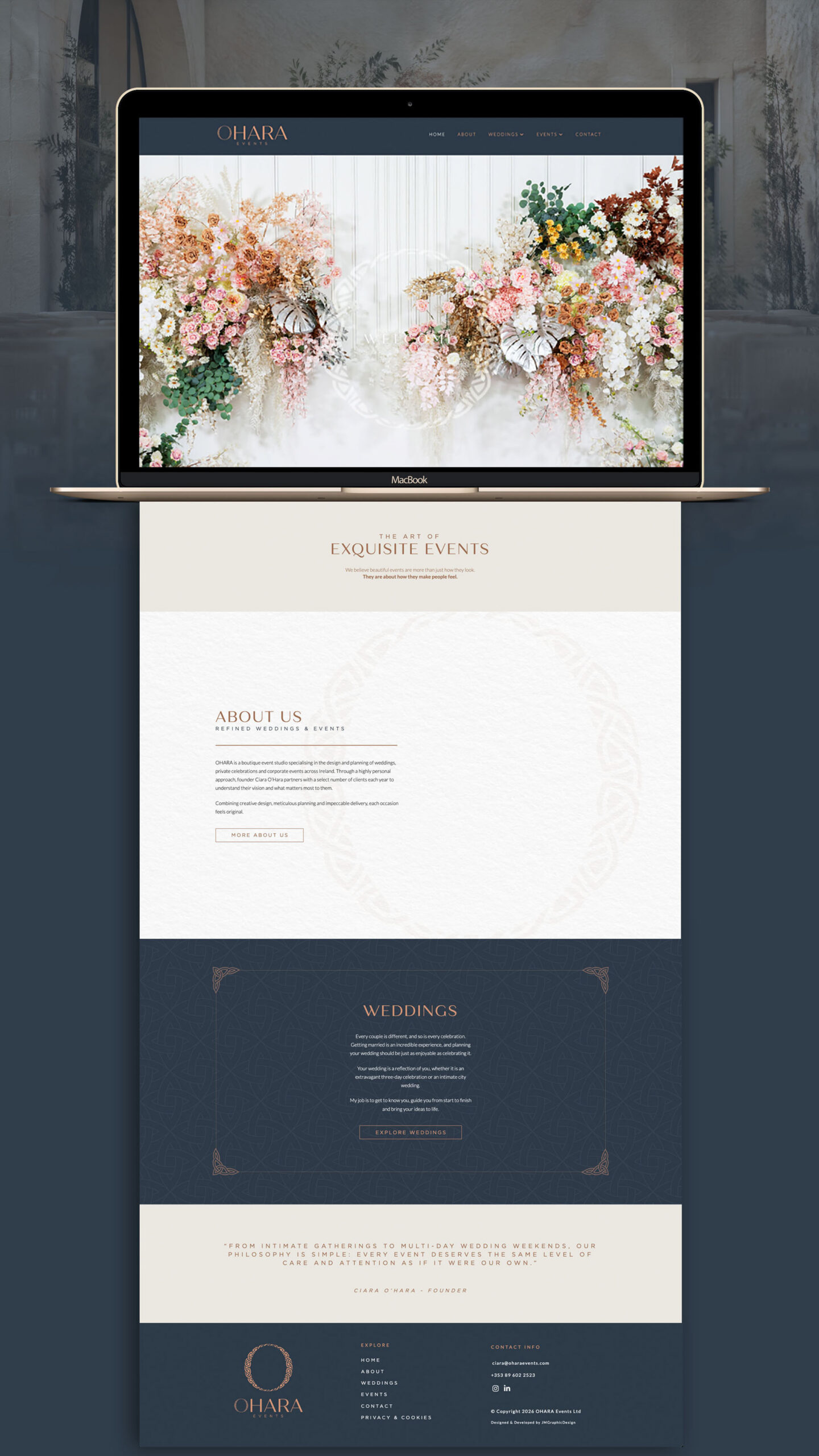
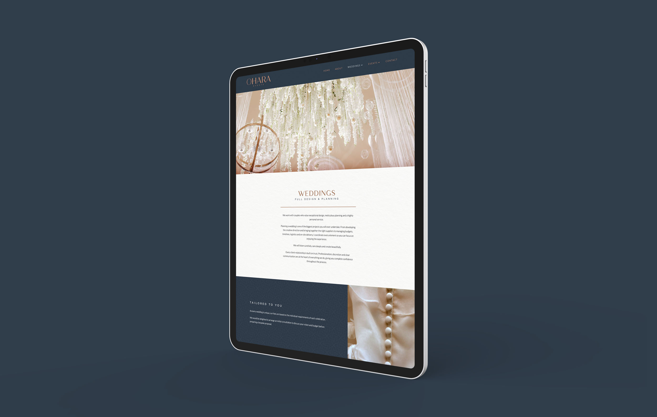
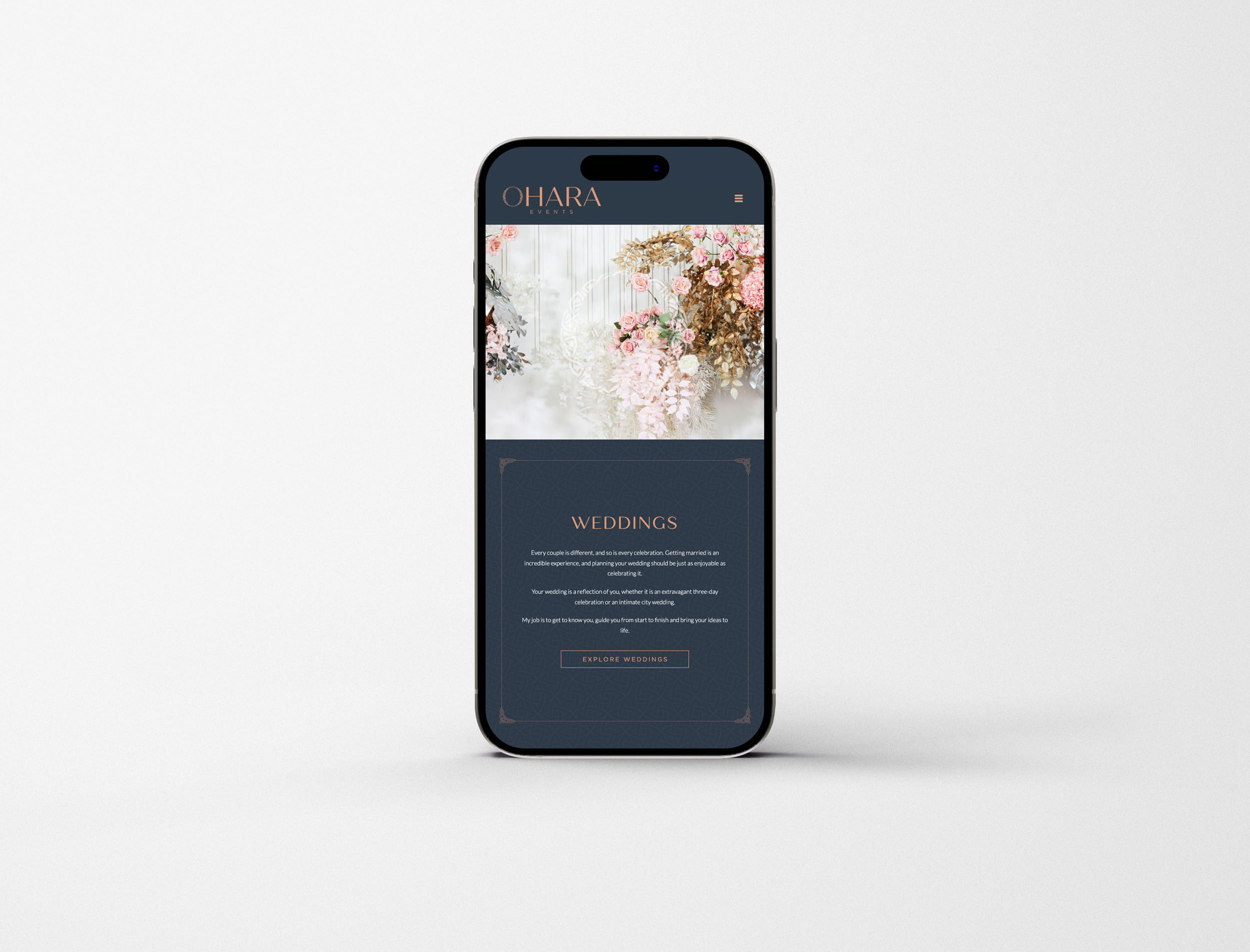
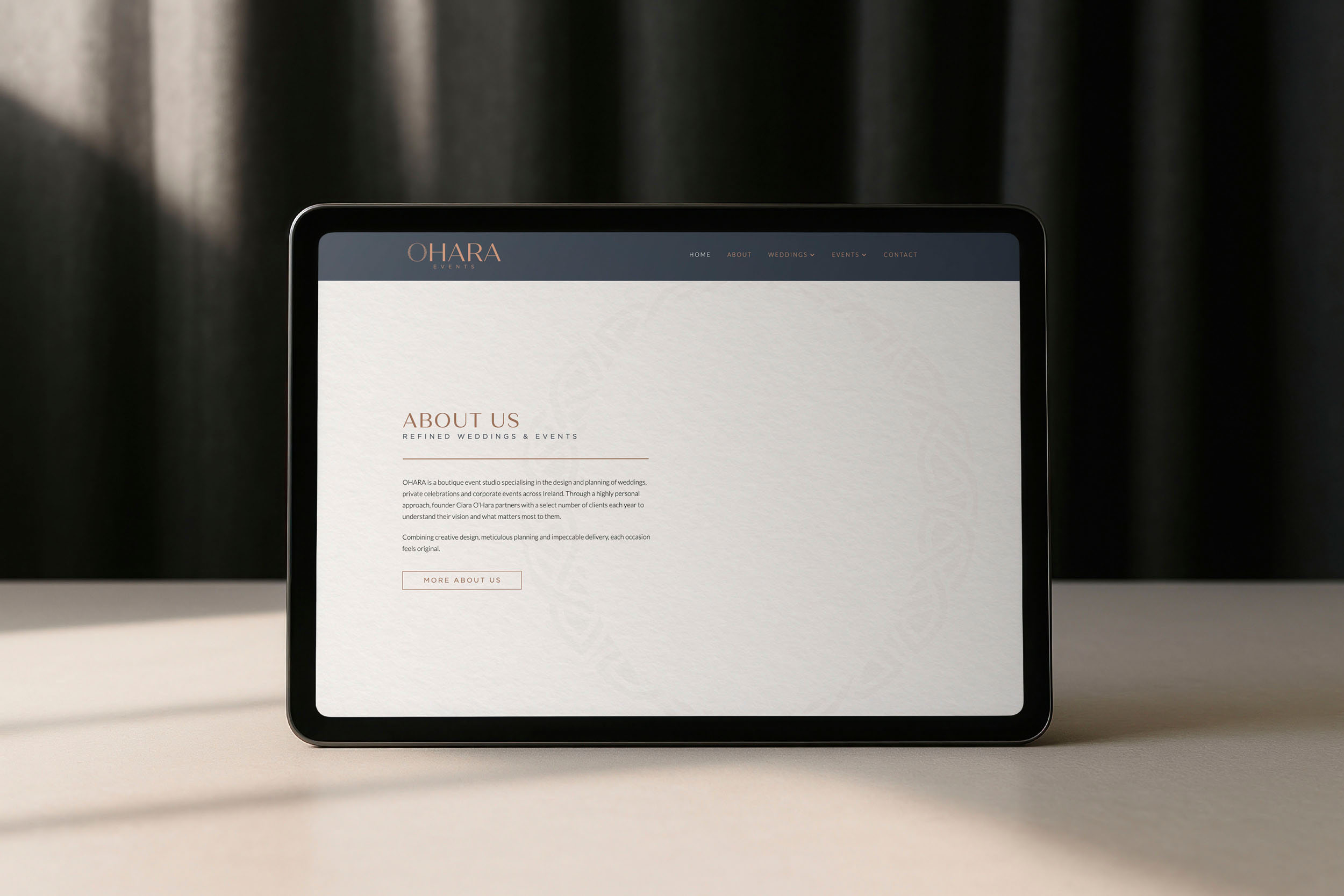
From the outset, this was a design-led build. The aim was visual impact in the truest sense: the brand identity expressed as an experience, with spacious layouts, a calm rhythm, and every page given room to breathe.
That meant resisting the temptation of gimmicky, over-the-top animation, which so often feels dated within a year or two. Instead, movement is subtle and gentle, there to add a quiet sense of polish to the experience rather than to distract from it. Timeless and beautiful was the brief; and restraint was the way to get there.
Letting the imagery shine
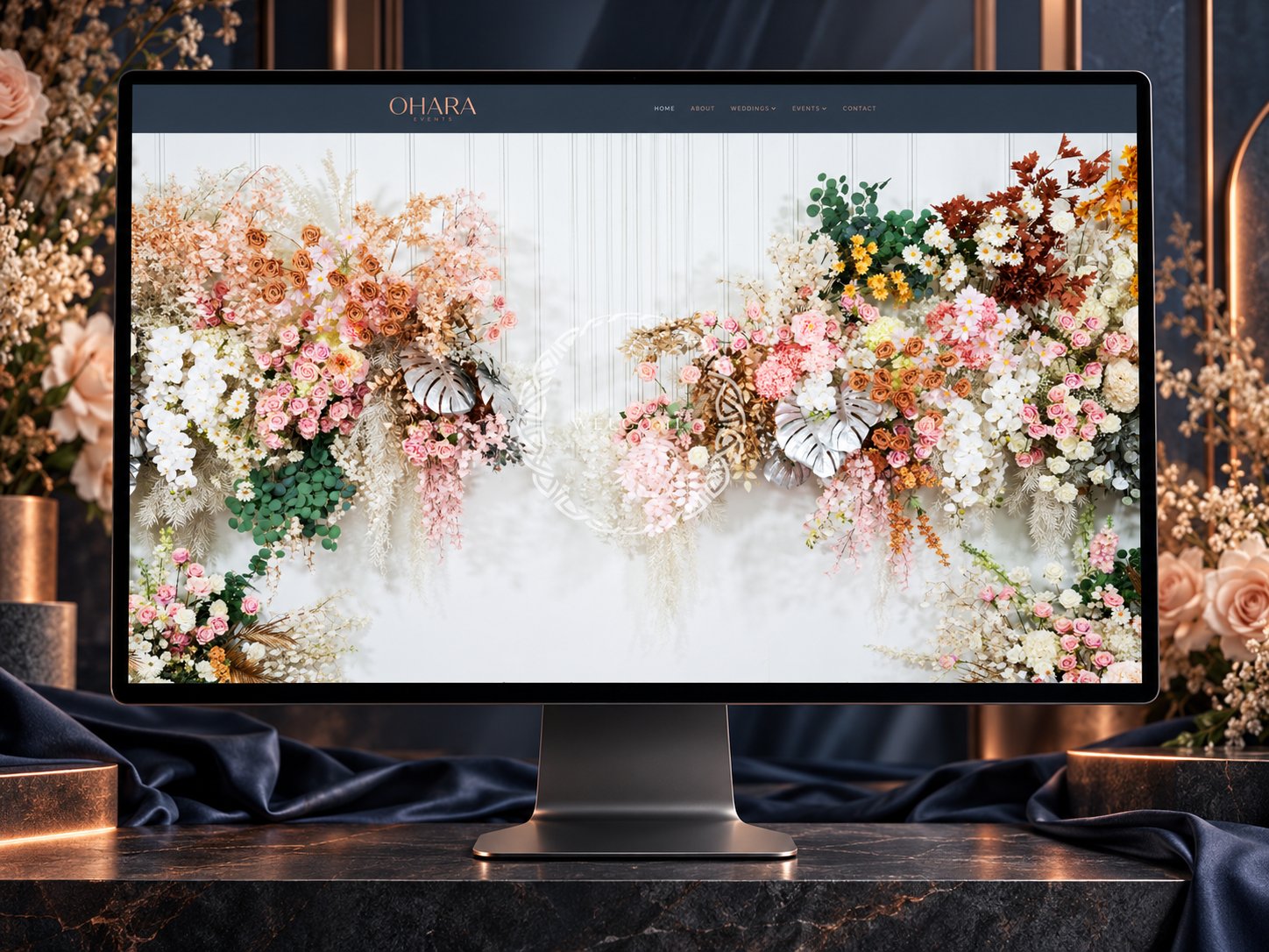
On certain pages, the imagery takes centre stage, and rightly so. Ciara’s taste and style are what her clients are buying into, so the photography needed to be presented with confidence, given space and scale rather than crowded into grids.
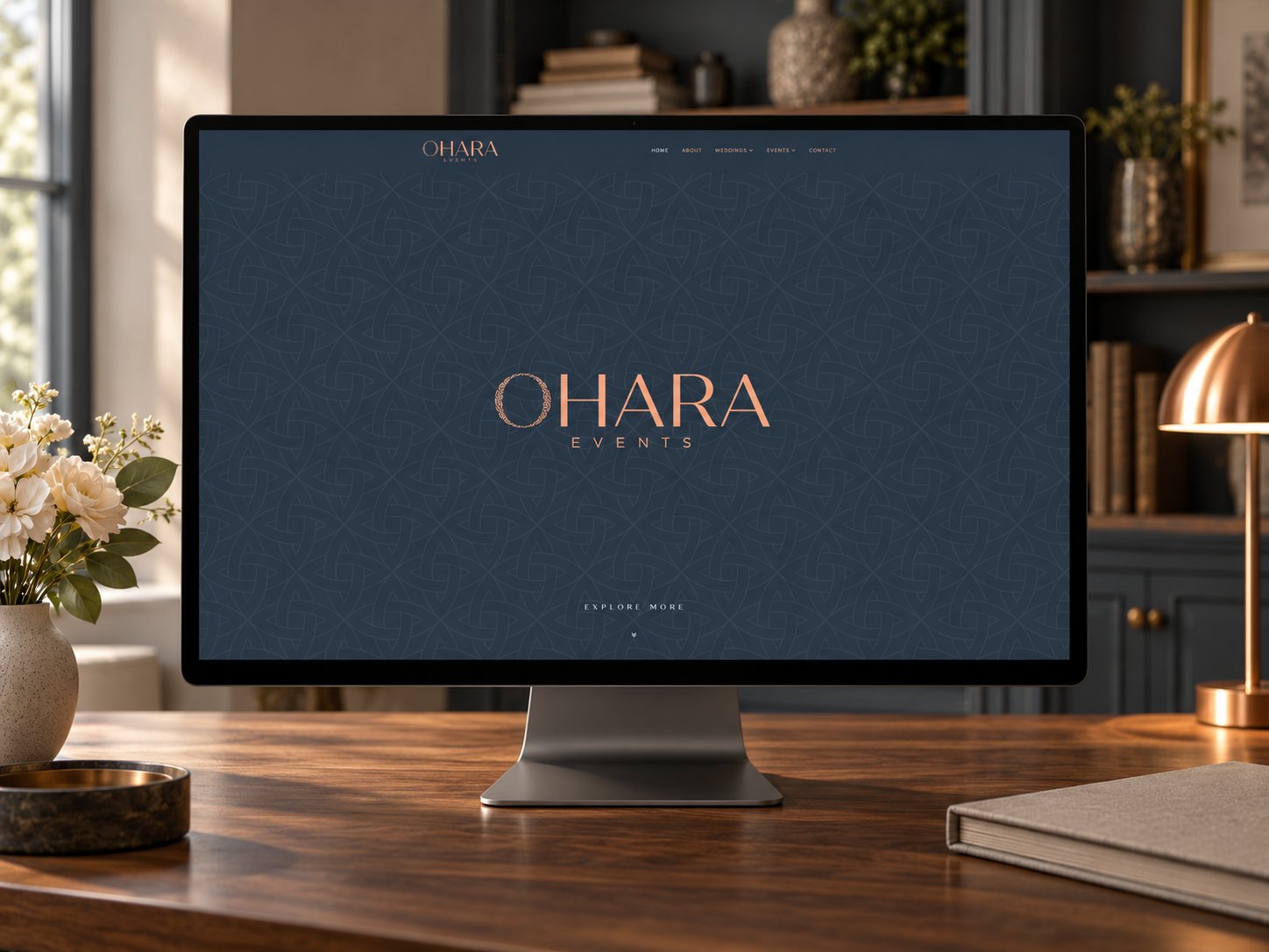
This is where the identity proves its worth. The branding is discreet enough to frame the imagery rather than clash or compete with it. The Deep Slate, Limestone and Sea Mist tones, the Celtic flourishes and the subtle woven pattern all sit around the photography like a well-chosen mount, while the copper accents bring warmth without ever pulling focus.
A playful detail
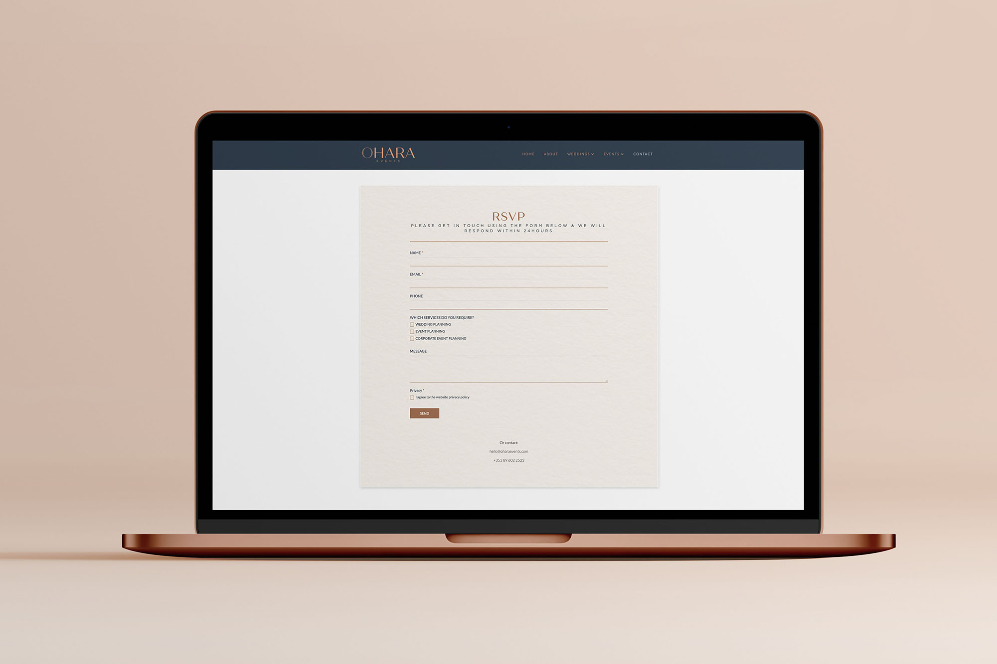
One touch I am particularly fond of lives on the contact page. Rather than a standard enquiry form, it is designed to look like an RSVP card, so a visitor fills it in to get in touch, exactly as a guest would reply to an invitation. A small, slightly playful detail, but a telling one: it signals the level of attention and experience a client can expect long before the first conversation.
Recognisable at a glance
The overall result is rich, layered and distinct, and the real value of that becomes clear across every touchpoint. Look at the website alongside the socials, the stationery or the signage, and there is a wonderfully uniform feel: one strong identity, instantly recognisable.
That matters more than it might seem. It often takes two or even three interactions with a brand before someone reaches out and gets in touch, so every one of those moments counts, even if it lasts only a second or two. The branding needs to be memorable enough that a visitor realises it is the same brand they encountered before, and builds a little more trust each time.
Built on WordPress
The site is built on WordPress, giving Ciara a robust, flexible platform to grow with the business. The same principles run throughout: clean, beautiful and considered design, with no unnecessary clutter or movement. For a studio whose work is all about experience, the experience starts here.
In Ciara’s words
“I needed full brand design, logo and website and Jason did exactly what I wanted. I took my time on multiple decisions and Jason was extremely patient never putting pressure on me.”
Read Ciara’s full review here.
See the brand identity work behind it here.
Visit the live site here.