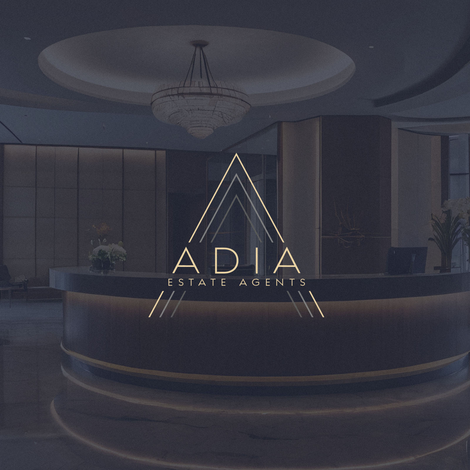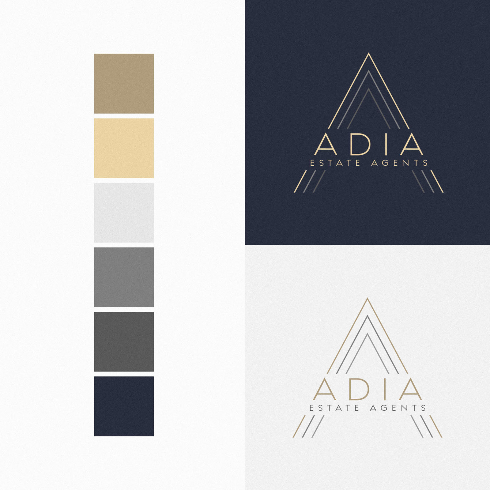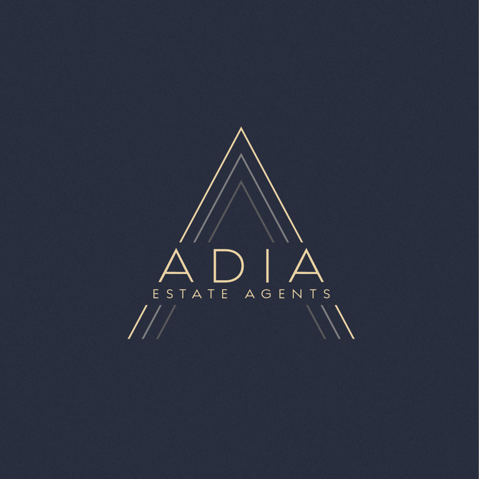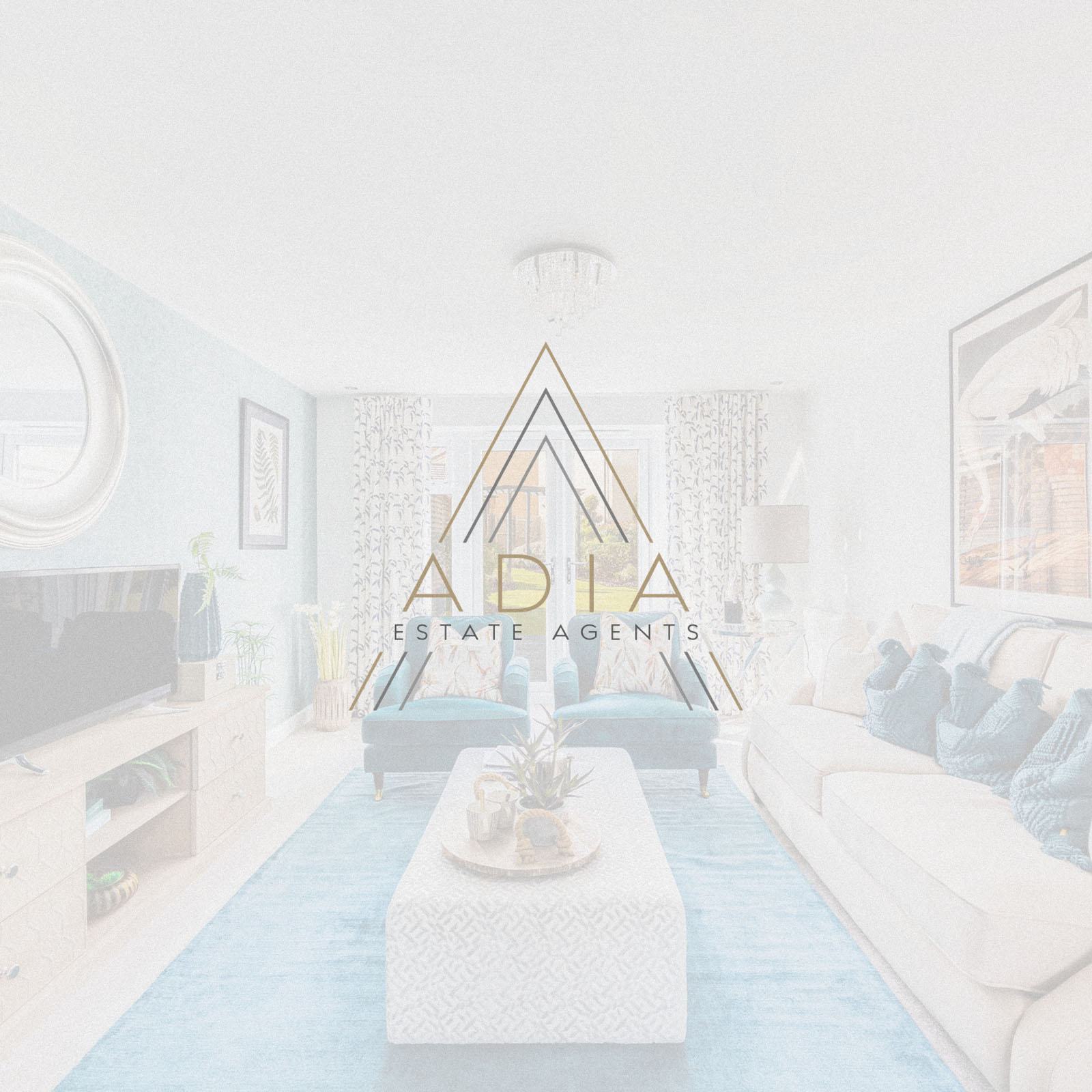
It was a pleasure to work with Adia Estate Agents to create their new brand identity design. The balance and geometry at play within the logo concept is very appealing – the little details such as the angle of the outer A mirroring the ‘A’s within the logotype… The fact the logotype serves as the crossbar for the larger ‘A’. The outer ‘A’ forms a chevron pointing upward, indicating a positive experience, profitable sale, upgrade in living standing… all positive connotations. Simple but very effective, and appropriate in terms of tone and positioning.
The colour palette includes a deep, professional blue; evoking the sense of a safe, reputable and trustworthy brand. The muted gold tones then elevate the positioning to appropriately reflect the high level of service and personal touch clients can expect from Adia Estate Agents.
Be sure to look at the website I created for them following the brand identity design, at; adiaestateagents.co.uk
Case Study
Opportunity
Local estate agency branding often looks templated or generic. ADIA had room to own a mark that reads instantly on everything from boards to browser tabs—communicating trust, upward momentum and a more personal standard of service.
Objectives
-
Create a distinctive, geometry-led logo that remains crystal clear at small sizes.
-
Encode positive “progress” cues appropriate to property sales and upgrades.
-
Establish a premium, trustworthy palette that feels both professional and welcoming.
-
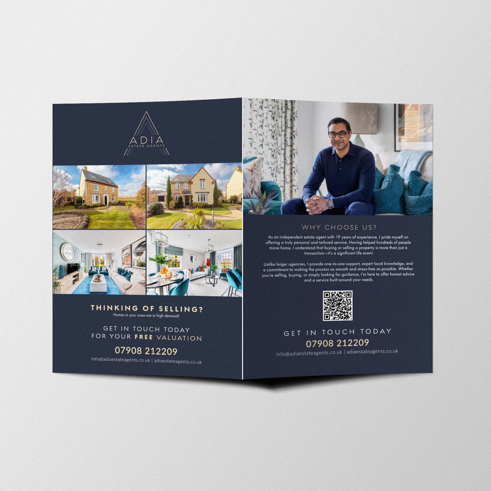
Build a system that extends smoothly into signage, marketing and the website.
Insight & Strategy
Sellers and buyers make trust calls fast. We leaned into a single, clear graphic idea: an outer A that forms a chevron pointing upward—subtly signalling improvement and successful outcomes—integrated with a typographic wordmark so the system feels like one engineered piece, not an icon plus text.
Identity Solution
-
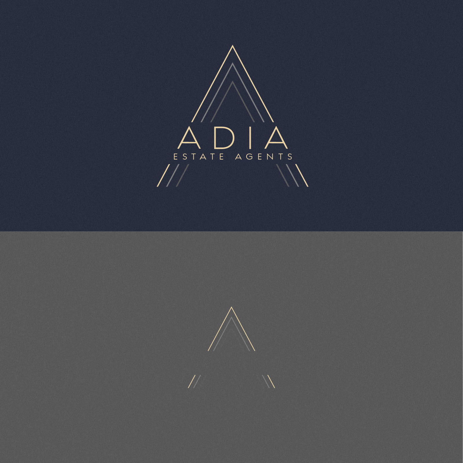
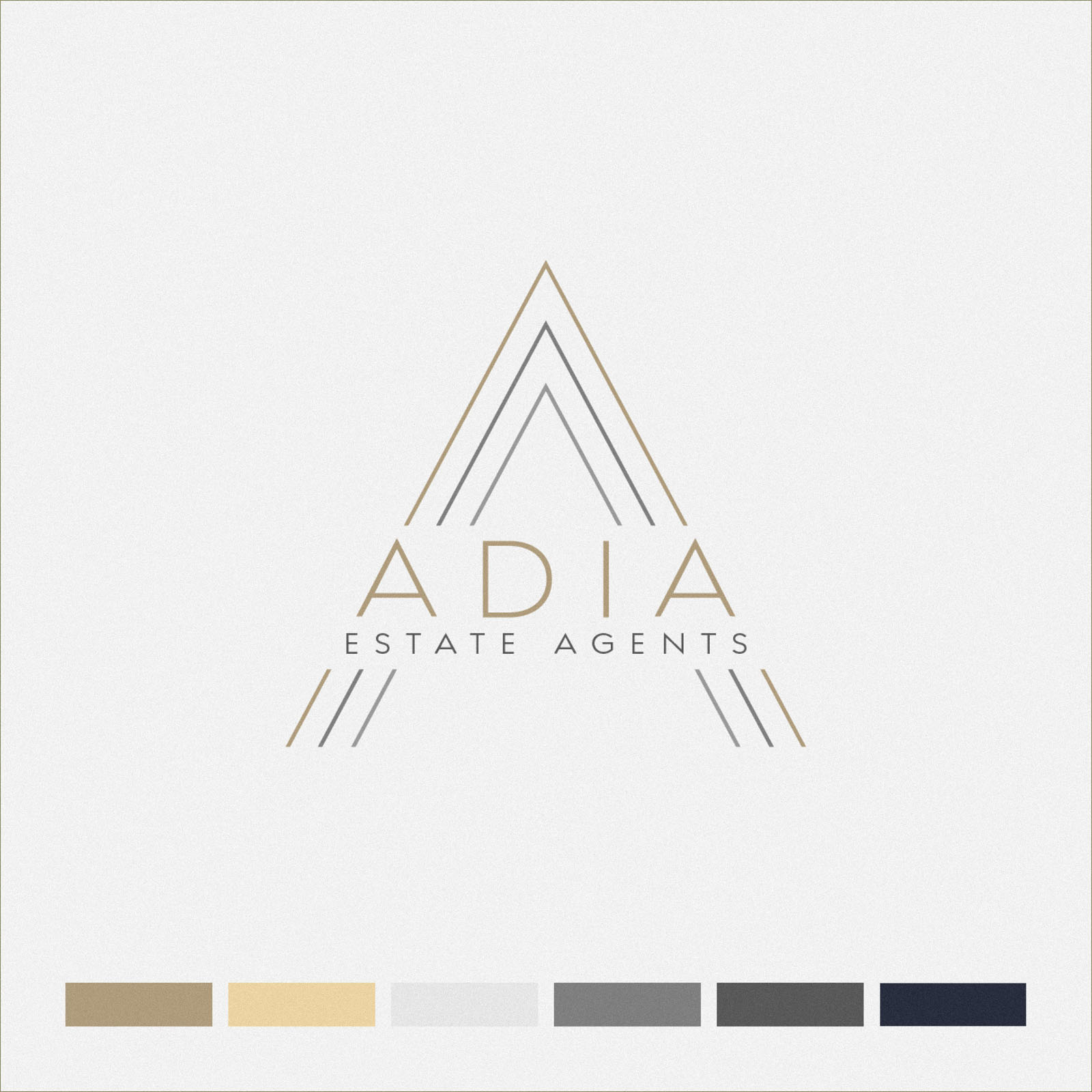
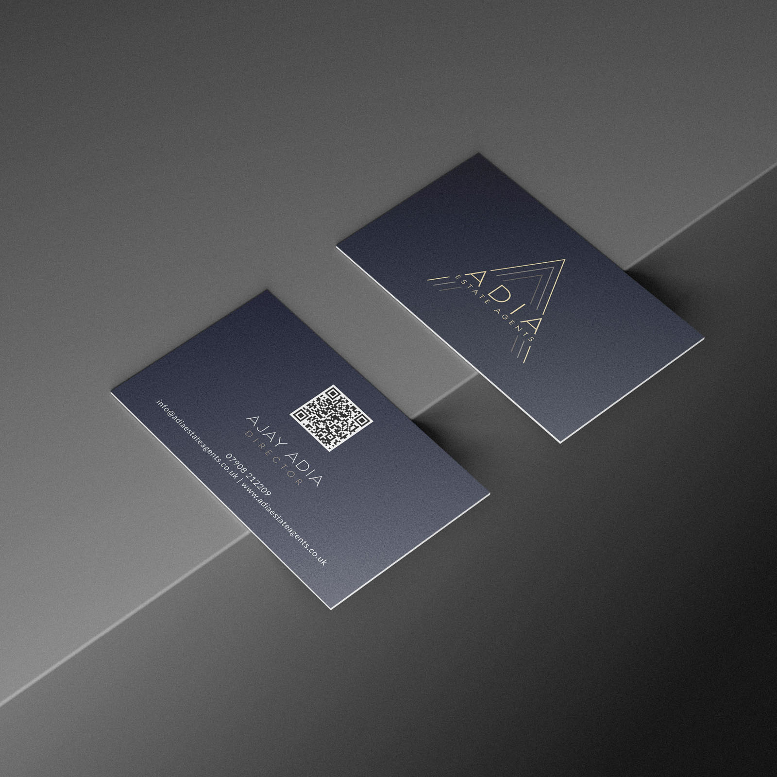
Logo architecture: The outer A mirrors the internal letterforms; the logotype itself becomes the crossbar of the larger A, creating a cohesive silhouette. Angles and spacing were tuned so the “upward” gesture reads instantly without gimmick.
-
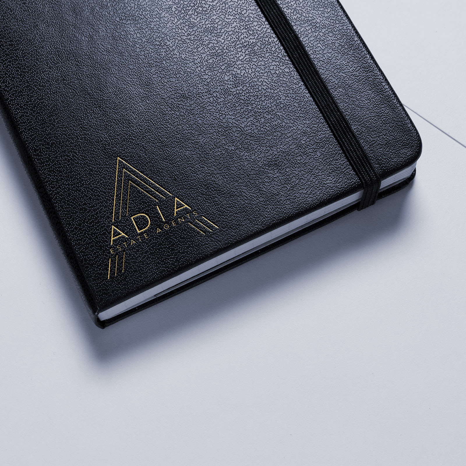
Submark: The framed A extracted for micro uses (favicons, avatars, small badges) where the full lockup would be too fine.
-
Palette: A deep, professional blue anchors trust and reliability; muted gold accents lift the tone to match ADIA’s high-touch service.
-
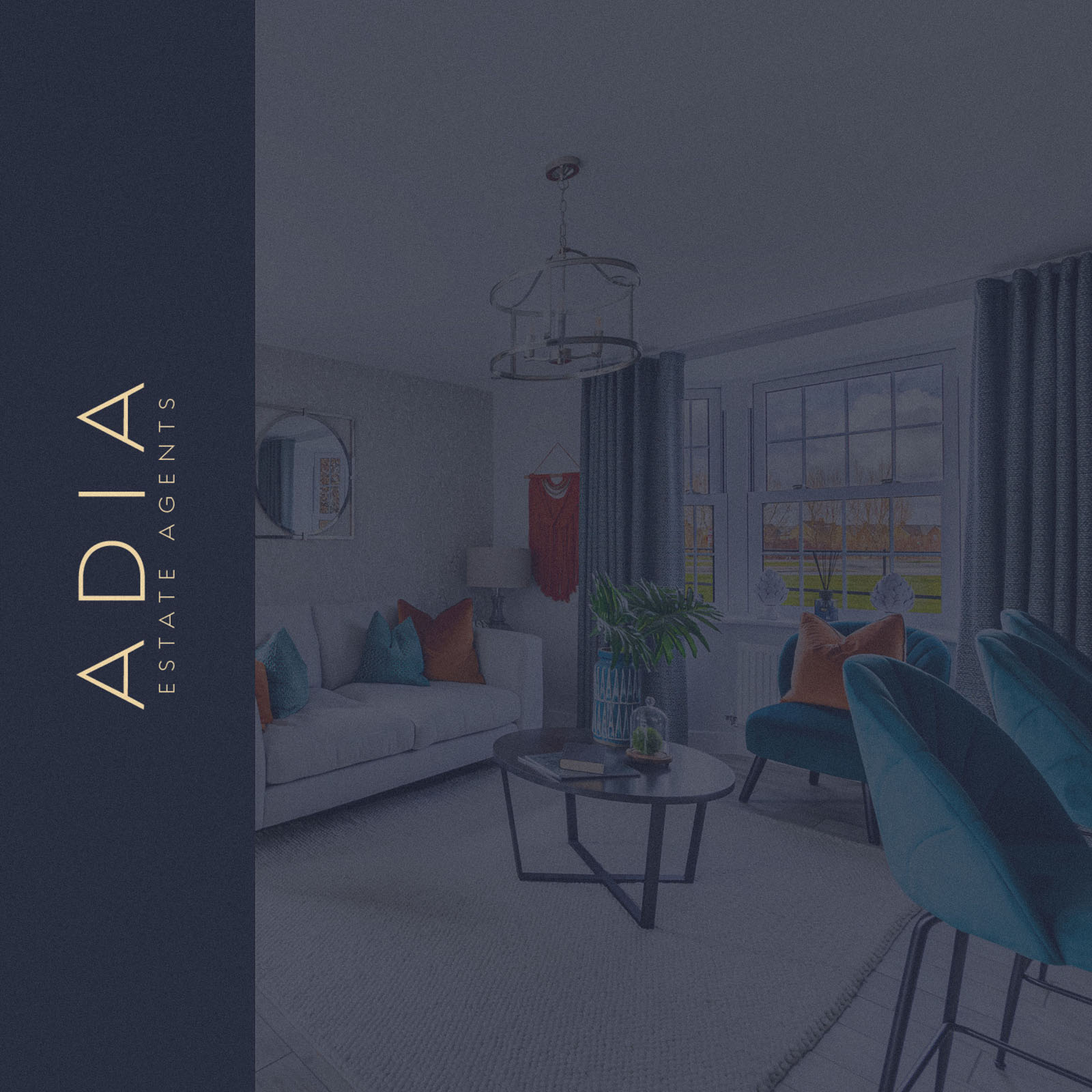
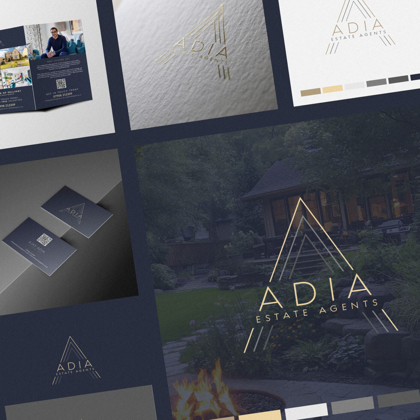
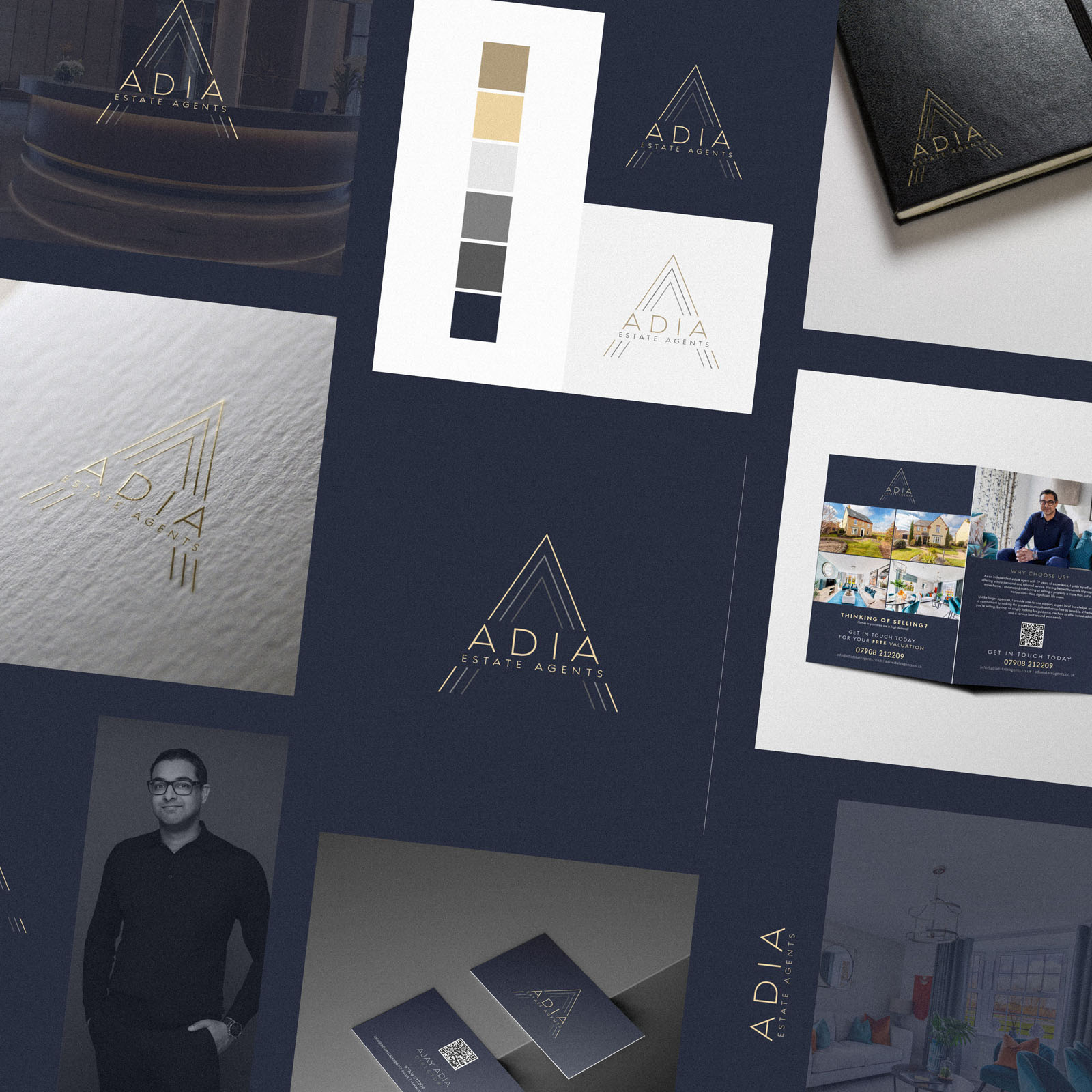
System: Horizontal and compact lockups with clear-space and minimum-size rules; application guidance for boards, listings collateral and digital assets to keep everything consistent day to day.
Competitive Edge Now
The identity pairs a memorable, meaningful shape with a calm, premium palette—standing apart from generic agency marks. It reads at a glance on busy streets, carries authority online, and reinforces the sense of a considered, people-first service.
What This Enables
A coherent presence across boards, brochures and the website; stronger first-impression trust for vendors and buyers; and a scalable visual language that supports future campaigns without losing clarity or the premium feel.