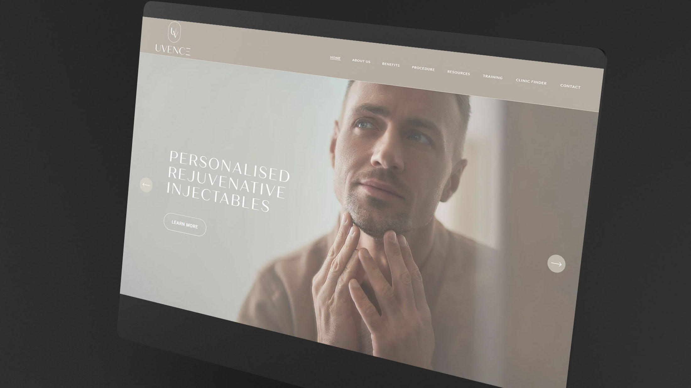
Uvence was an exciting brand to work with; they offer non-surgical, natural skin rejuvenation using Nanofat. Their clients are a mixture of Doctors who wish to offer the treatment, and patients who are interested in the cosmetic benefits.
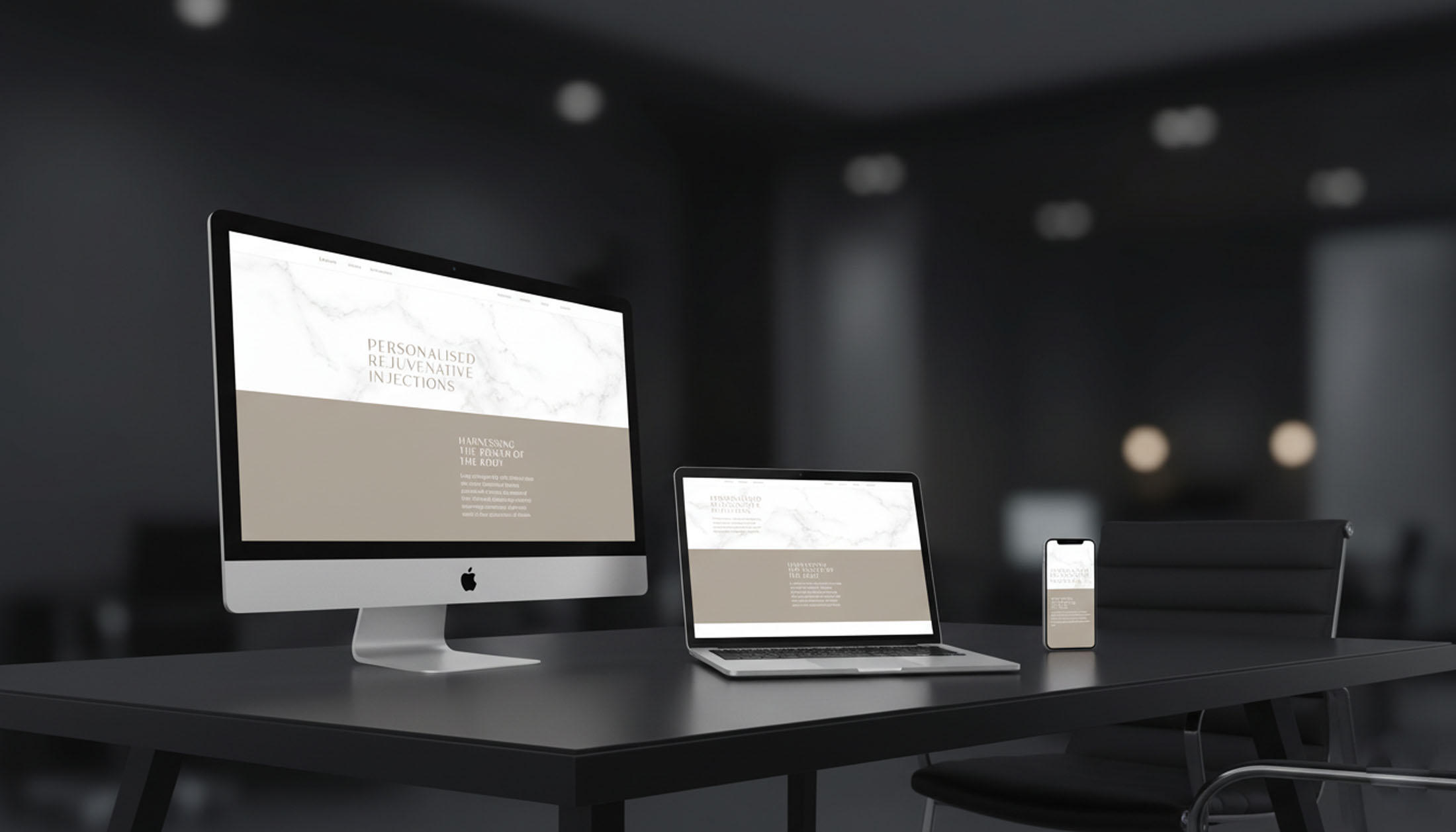
After creating new brand identity (see the branding here), I was commissioned to create a website to showcase Uvence and it’s exciting offerings. Using Squarespace as the platform, we designed a website with appeal to patients looking for the best possible skin treatments, as well as doctors exploring the science behind it.
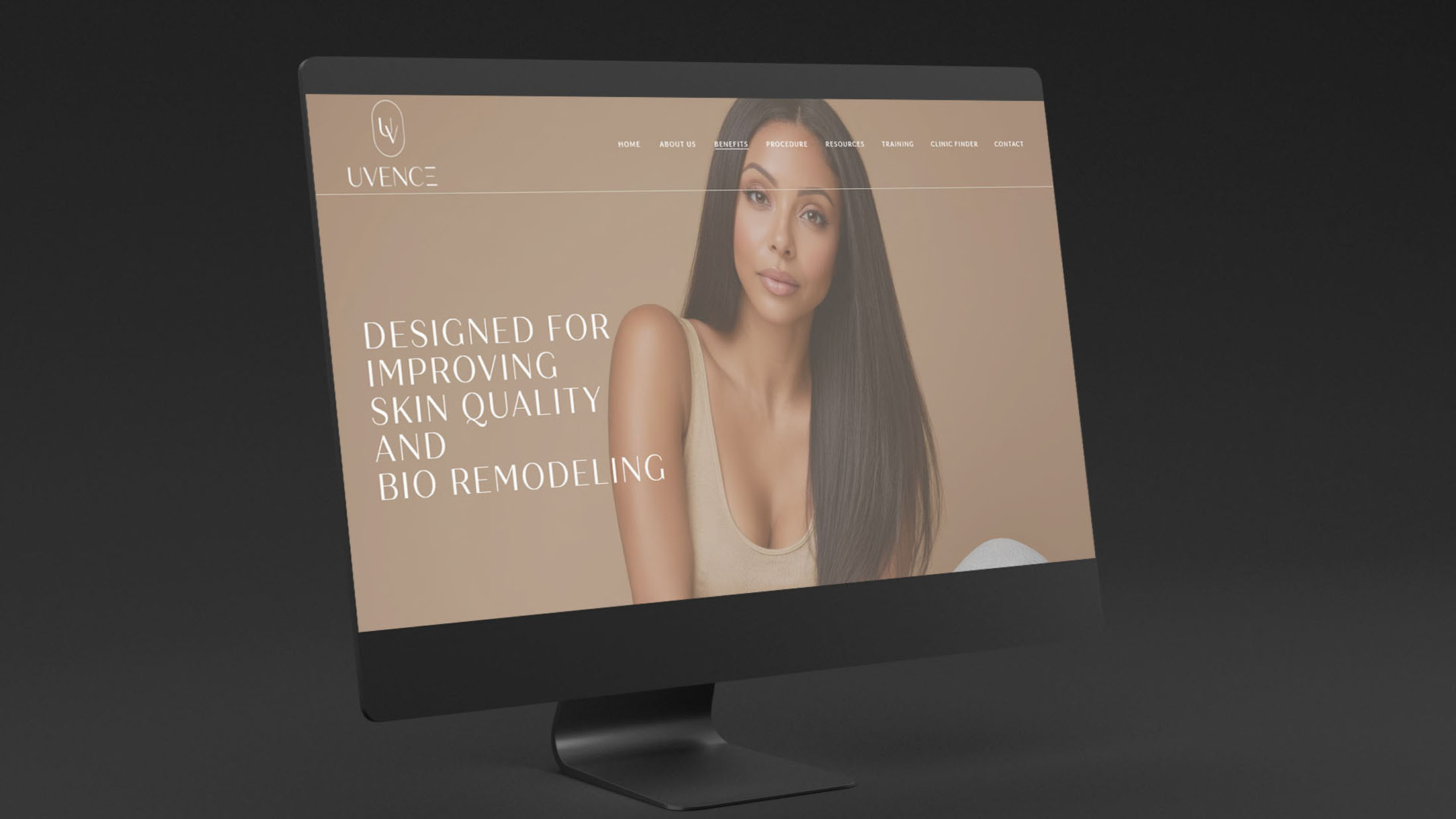
A soft neutral palette along with subtle textures create a gentle, clean aesthetic – while information is presented in a clear and appealing way. The navigation and structure of the website is equally important, ensuring relevant information for each audience can be found with ease, while clear CTAs prompt visitors to take the next steps.
Be sure to view the live website at; uvence.co
Case Study
Opportunity
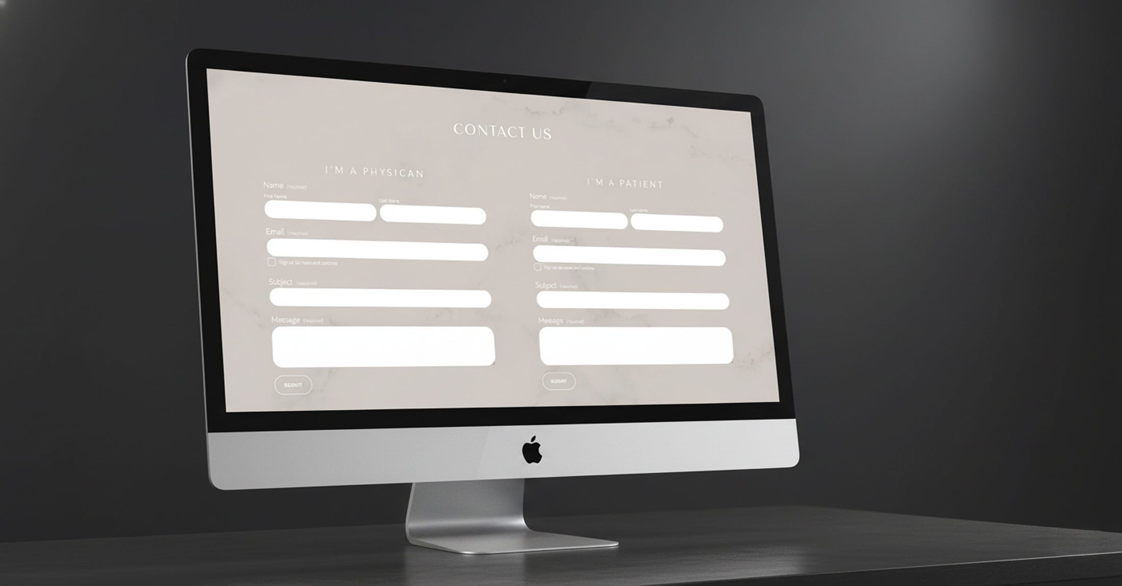
Uvence needed a digital presence that feels scientifically credible and welcoming—clearly explaining the offer, showing proof of expertise, and making next steps effortless for enquiries and consultations.
Objectives
- State a clear value proposition within the first scroll and guide visitors to get in touch.
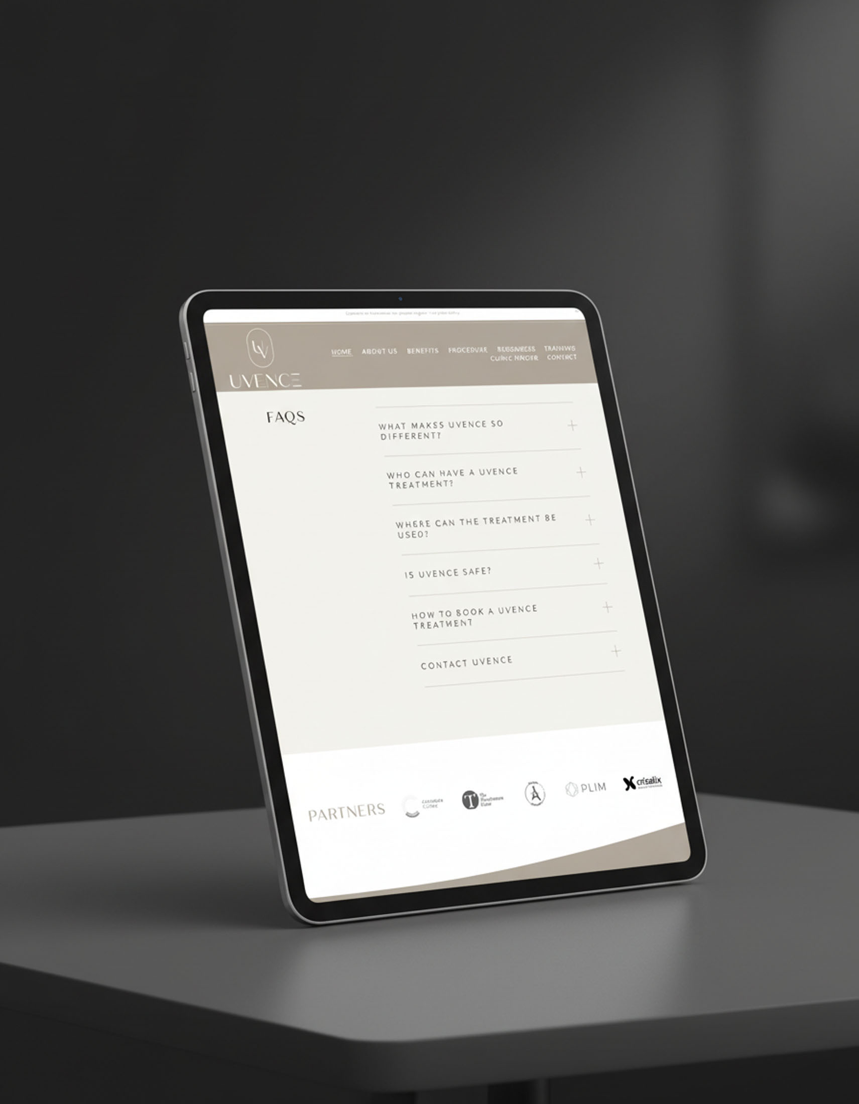
- Present services, outcomes and “what to expect” information in an easy-to-skim structure.
- Show credentials—team, press, testimonials—without overwhelming the page.
- Build on a modular content system so new pages and updates can be added while keeping the design consistent.
UX Insight & Strategy
Visitors look for fast reassurance before they commit time. The experience is designed as a concise narrative: promise, benefits, process, evidence, then a clear invitation to connect. Navigation is grouped by intent so users can move quickly from overview to detail to enquiry with minimal friction.
Design System & Content
- UI & Typography: A refined serif/sans pairing with generous spacing delivers a calm, clinical-but-human tone across devices.
- Palette & Imagery: Clean neutrals with measured accent tones; considered photography and graphics support clarity and trust.
- Components: Modular hero, service/treatment cards, process steps, FAQs, credentials/press band, team profiles and flexible CTAs—reusable across pages to keep presentation coherent.
- Content Framing: Plain-English headings and short paragraphs prioritise comprehension; supportive microcopy answers common questions at the right moment.
Interaction & Performance
- Motion: Subtle micro-interactions to cue hierarchy and polish without distraction.
- Speed & Accessibility: Optimised assets, semantic structure, sensible contrast and keyboard-friendly focus states.
- CMS Practicality: A block-based, modular setup so pages, articles and updates can be published quickly while preserving layout quality.
Competitive Edge Now
The site brings message, credibility and action into a single, well-structured system. Services are easy to understand, proof points are surfaced at the right time, and enquiry paths remain visible—supporting trust from the first interaction.
What This Enables
A scalable platform for new services, thought-leadership content and targeted landing pages—ready to grow the brand’s digital footprint while maintaining a consistent, high-calibre presentation.