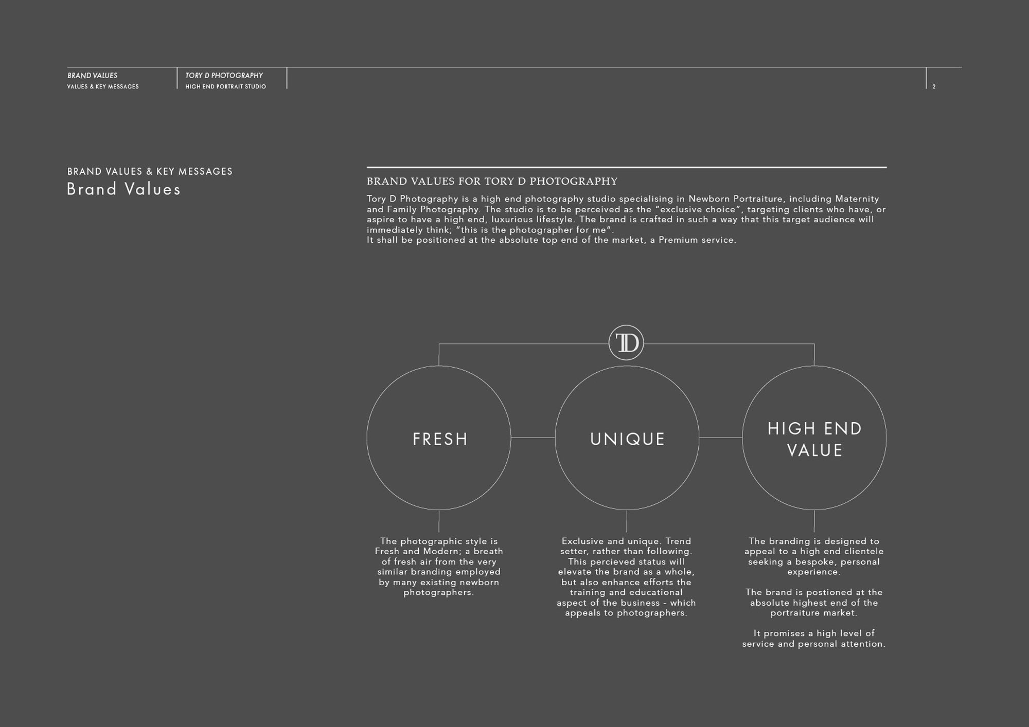
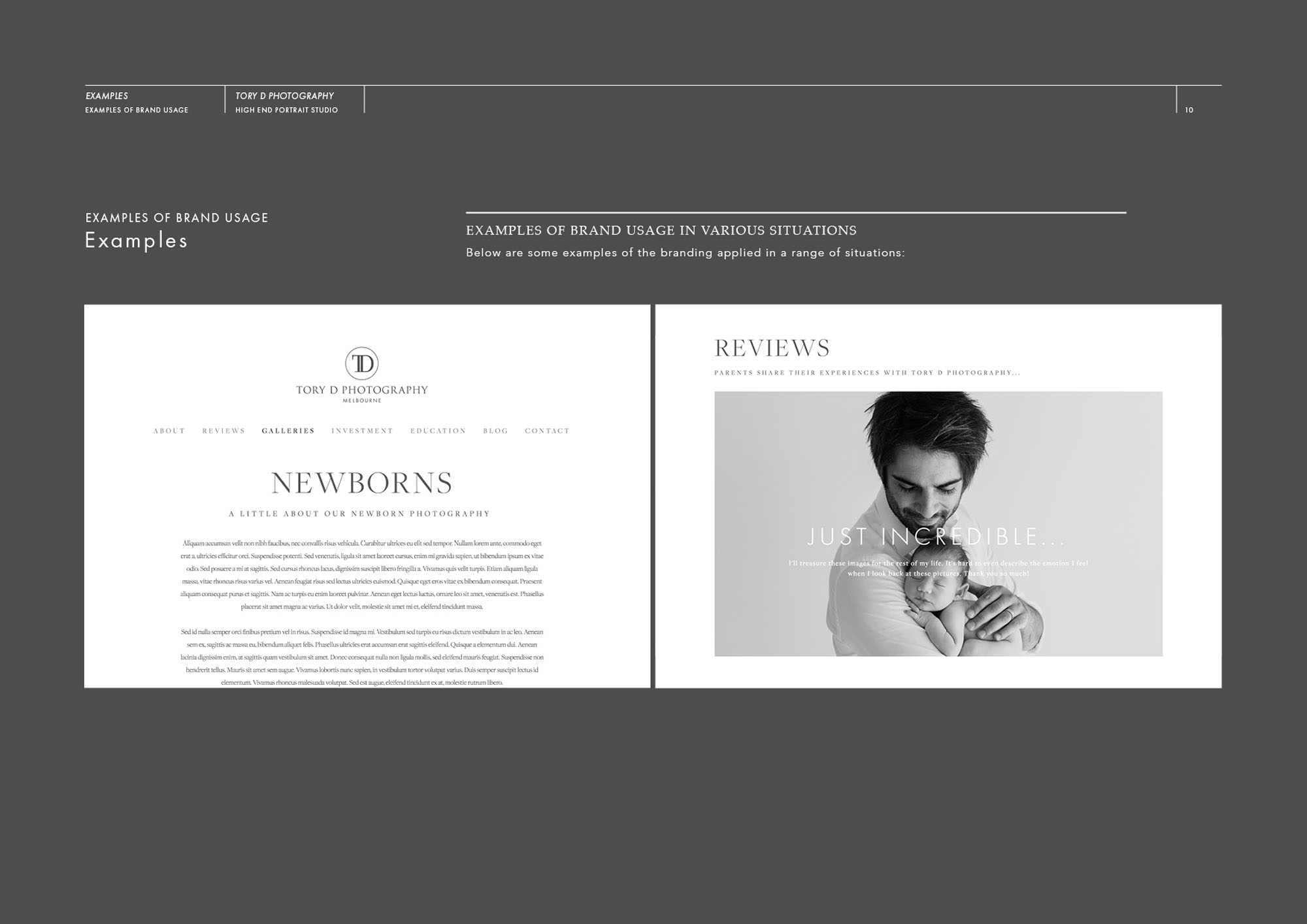
Tory D is one of the most talented newborn photographers in Australia – creating beautiful images from his popular Melbourne based studio. We began with a strategic approach to his new brand identity; looking at target clients, positioning, photographic style – and ultimately searching for a concept that would link these things together. Realising that the level of service Tory provides is tailored to a discerning clientele, we set out to create a brand that would reassure these potential clients he was the perfect fit for them. The branding holds the promise of an exclusive, rather than ‘high street’ approach to photography; for those who truly value a unique, fresh and modern approach to newborn photography.
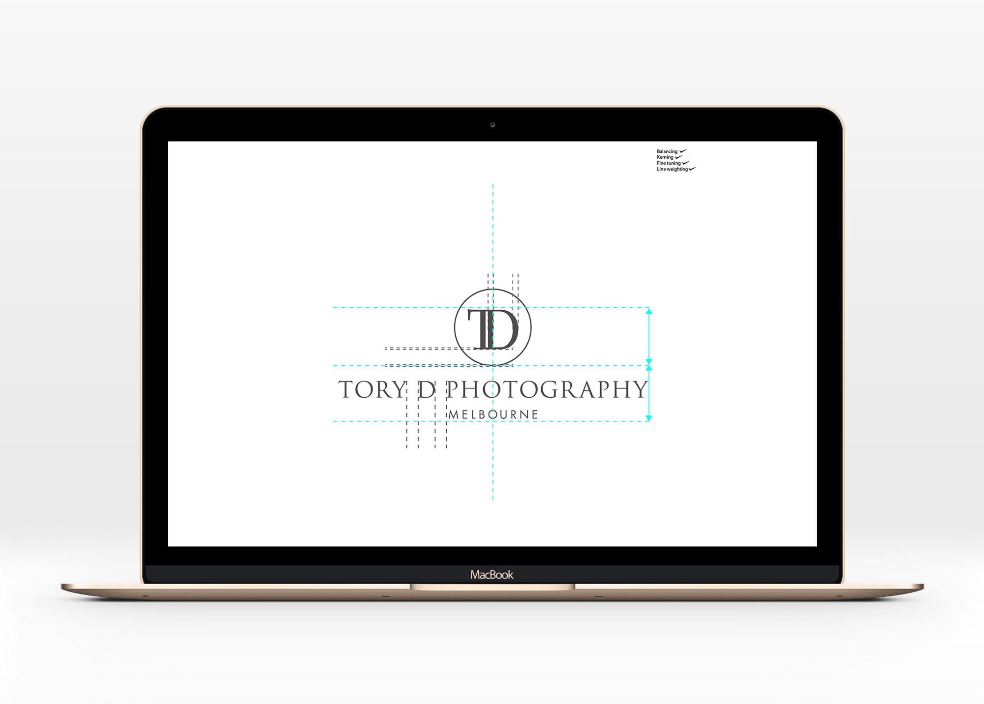
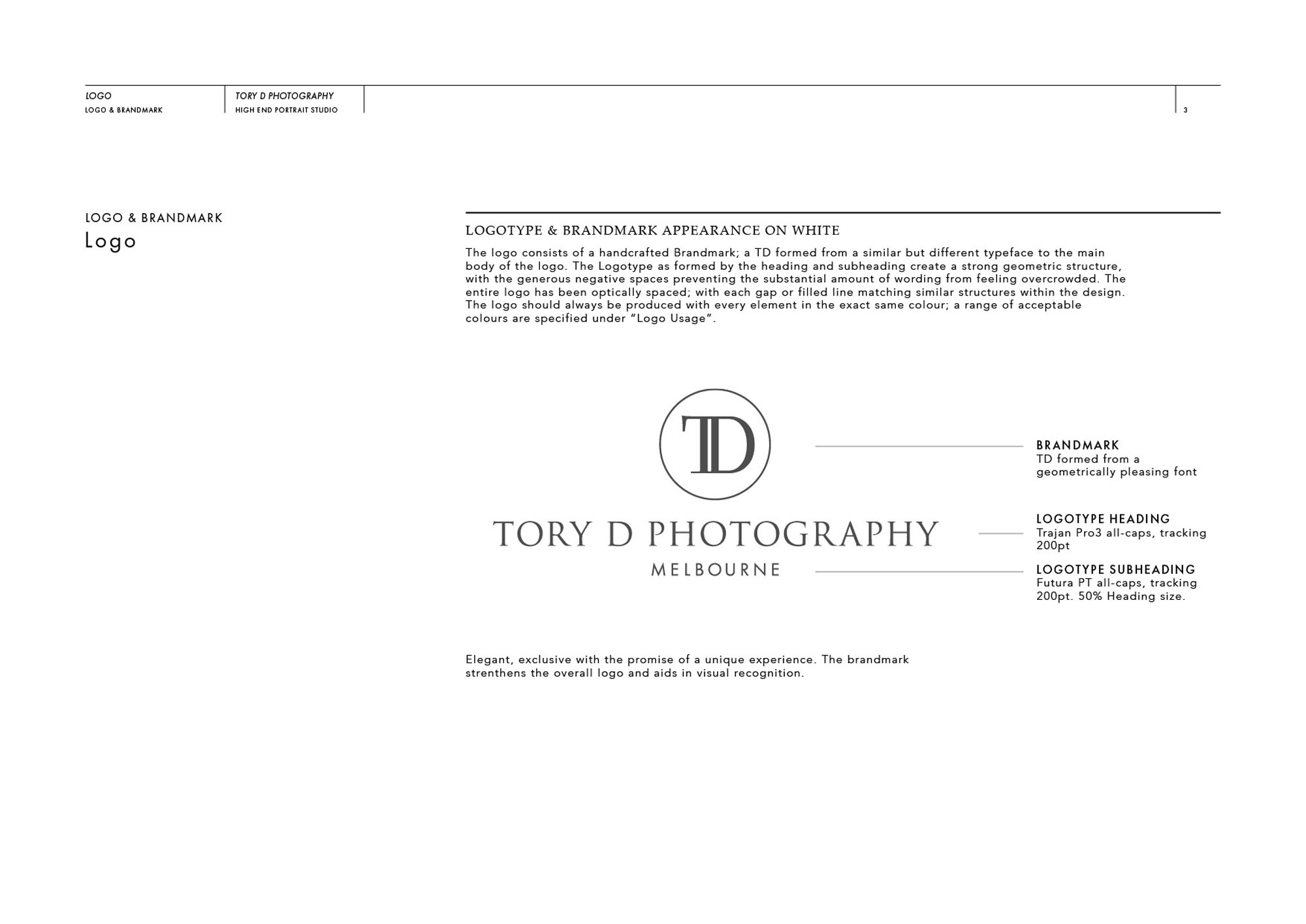
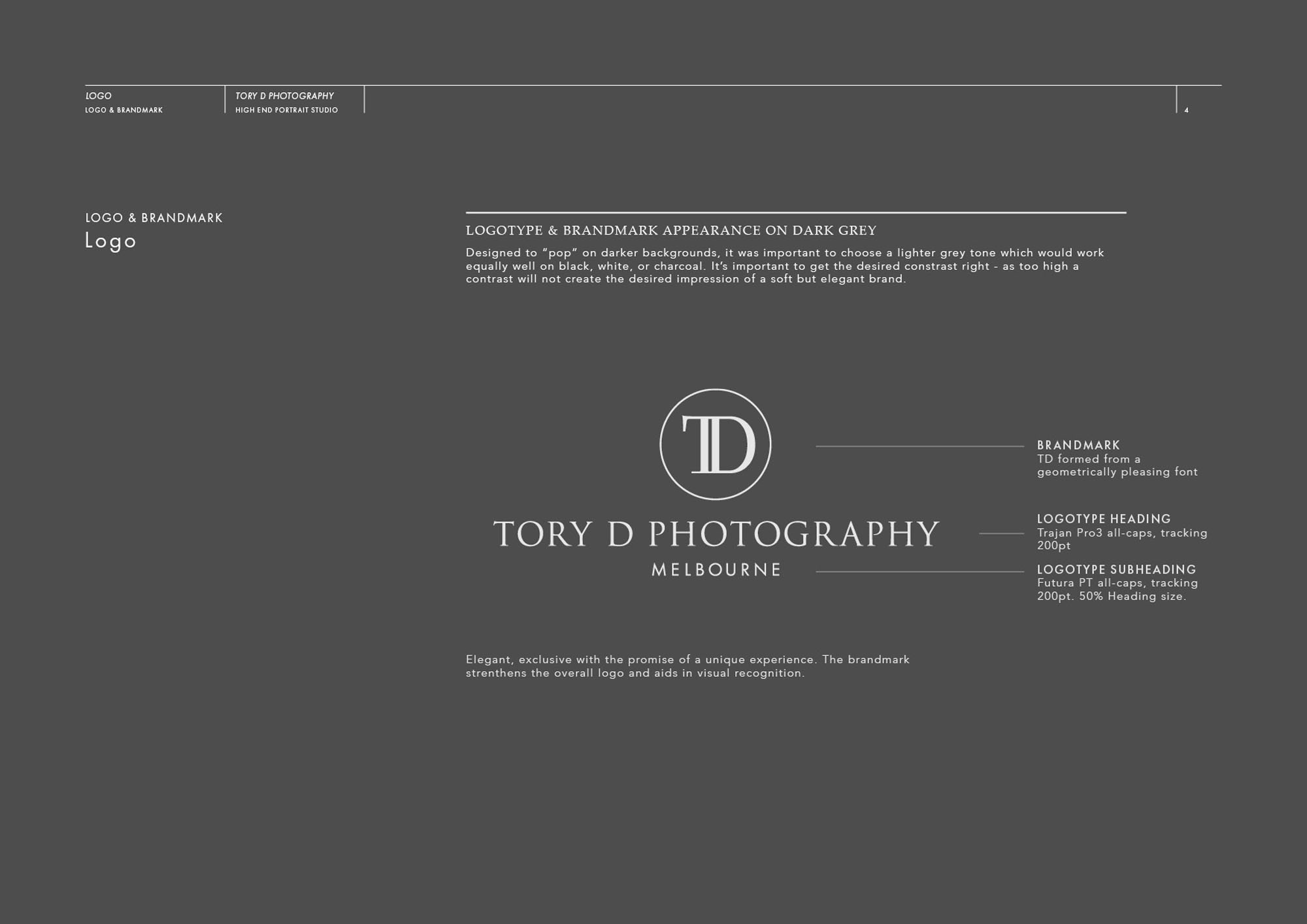
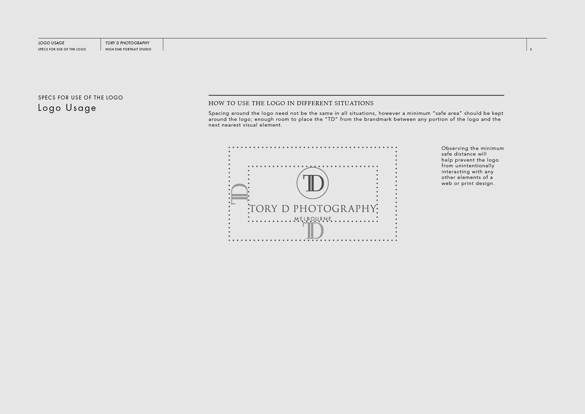
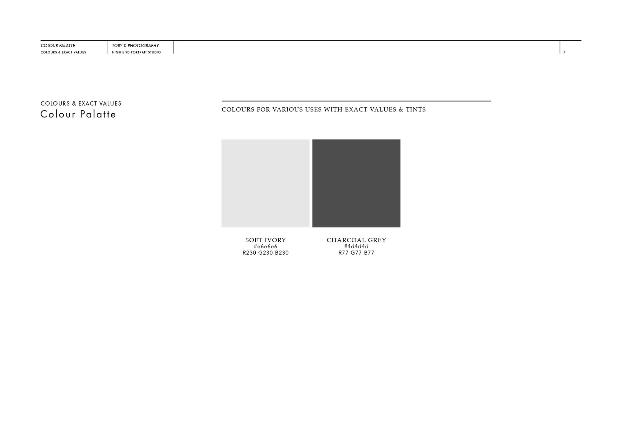
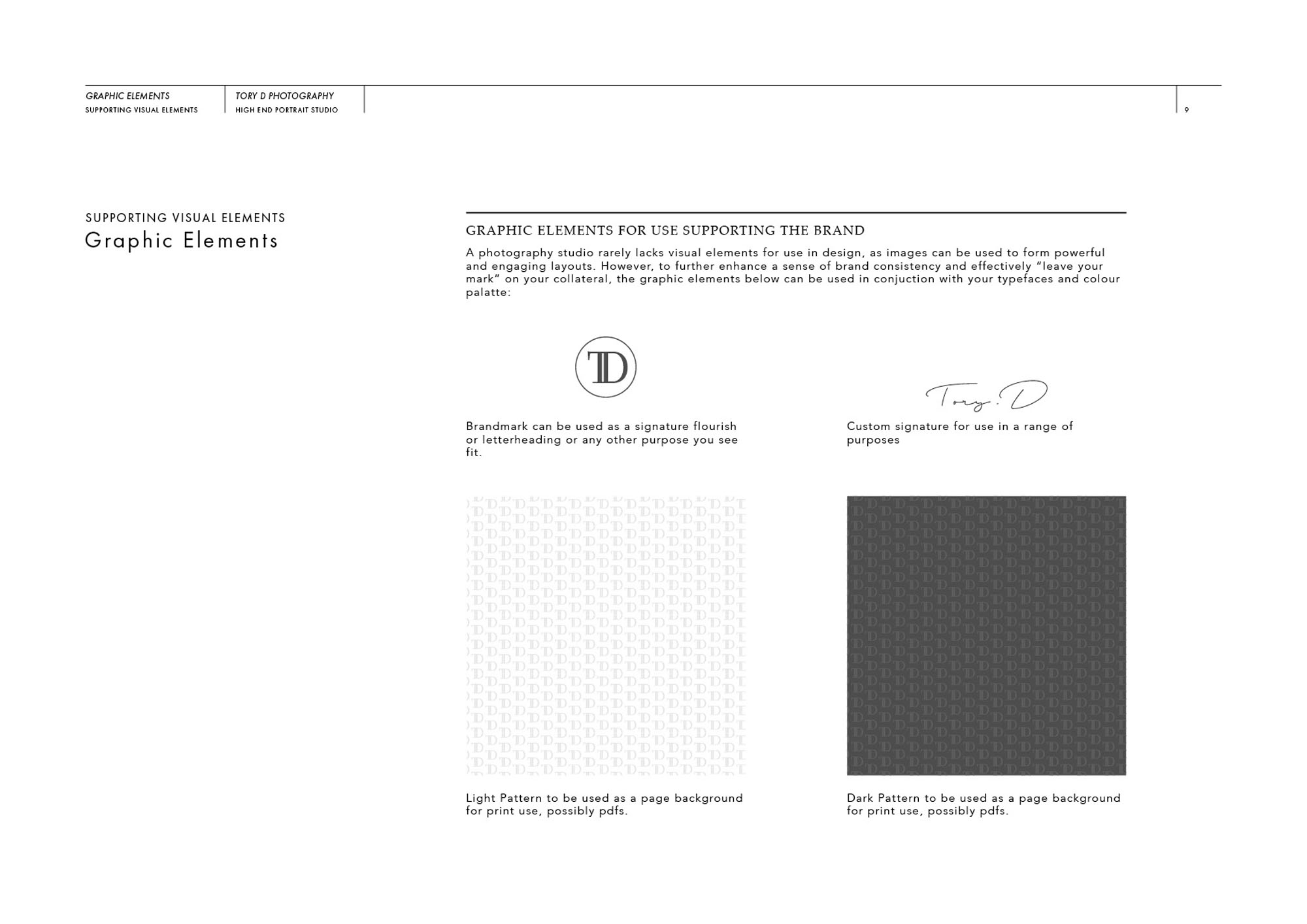
Every detail of the branding, from the colour palette to the careful combination of traditional & modern typefaces; is designed to look and feel ultra high end. The brand-mark itself is simple, elegant and easily recognisable. It’s also versatile enough to work well as a watermark over images, or as a strong focal point and icon. Increasing the perceived value of Tory D Photography was the objective, and the new brand identity has certainly had the desired effect.
It’s worth mentioning, the UK and Australia couldn’t be further apart geographically – and yet the project was a pleasure to work on. (Thanks in part to Skype!) Don’t be afraid to get in touch, wherever you may be based 🙂
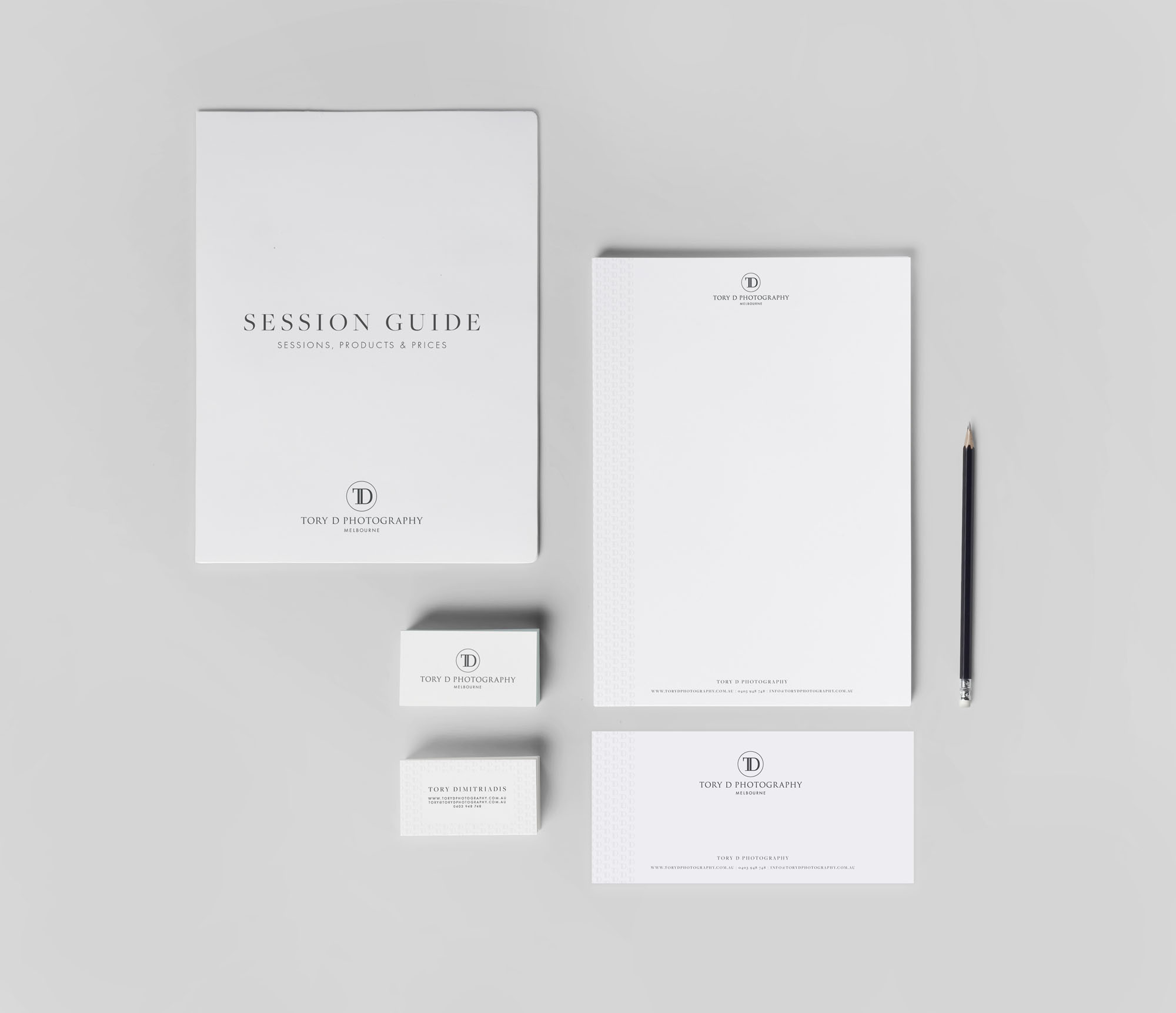
I hope you enjoy an overview of the new brand identity below:
Case Study
Opportunity
Tory D set out to present a refined, editorial identity that frames the photography with confidence—equally at home as a subtle watermark, on printed materials, and across social profiles.
Objectives
- Establish a name-led signature that reads premium at a glance and remains unobtrusive beside imagery.
- Create adaptable assets for watermarks, social avatars, portfolio spreads, and stationery.
- Guarantee clarity at small sizes and on varied substrates (fine-art papers, packaging, signage).
- Provide simple rules so the system stays consistent as new series and channels are added.
Insight & Strategy
Clients respond to quiet precision—typography and spacing that signal judgment before a word is read. The brand centres on a typographic signature with generous breathing room and a compact secondary mark for tight spaces, forming a responsive system that supports the work rather than competing with it.
Identity Solution
- Wordmark: A carefully tuned logotype with measured letterspacing and optical kerning for a composed, gallery-ready feel.
- Monogram/Submark: A distilled mark derived from the core letterforms for watermarks, seals, and social icons.
- Palette & Tone: Neutral, softly premium shades (ink, ivory, slate) that preserve photographic contrast in screen and print.
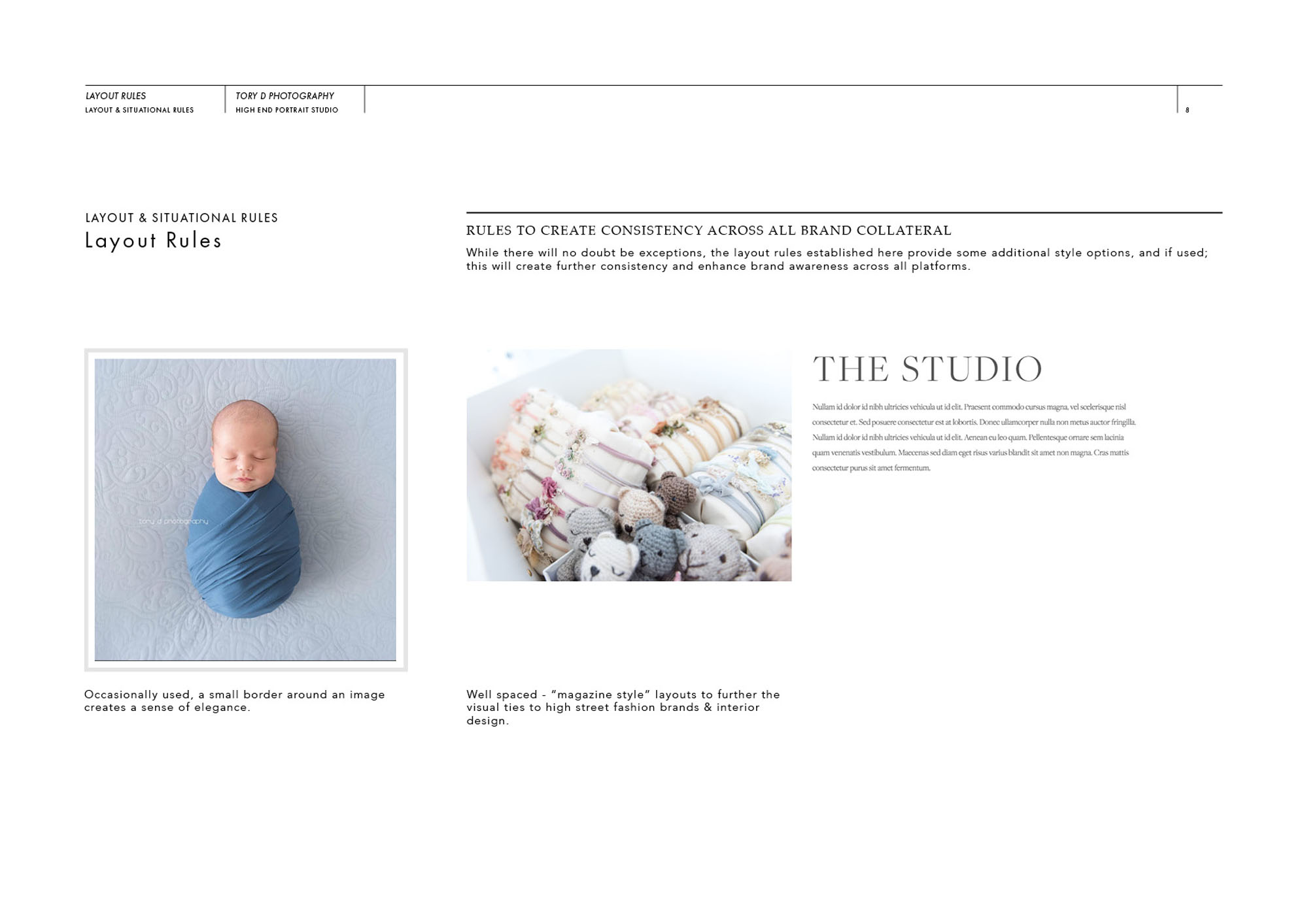
- System Rules: Guidance for clear space, minimum sizes, watermark opacity/placement, and layout rhythm for captions, certificates, and portfolio pages.
Competitive Edge Now
The identity delivers a cohesive, recognisable presence around the imagery. Typographic discipline improves readability on small formats, while the submark provides instant recognition where space is limited—strengthening recall across print, packaging, and digital touchpoints.
What This Enables (forward-looking, no invented metrics)
A robust platform for exhibitions, limited editions, client presentations, and an expanding online portfolio—positioning Tory D to present new bodies of work consistently, partner with venues and collaborators, and grow into productised print sales without losing visual integrity.
I specialise in branding, logo and web design for photographers – see some other projects I’ve worked on in the Photography industry here.

