I was commissioned to refresh Rivka Singer’s brand identity. Rivka is a celebrated newborn photography with a popular studio based in New York City. We wanted to create something that felt premium and high end, but ensure a hint of something bespoke, tailor-made was included.
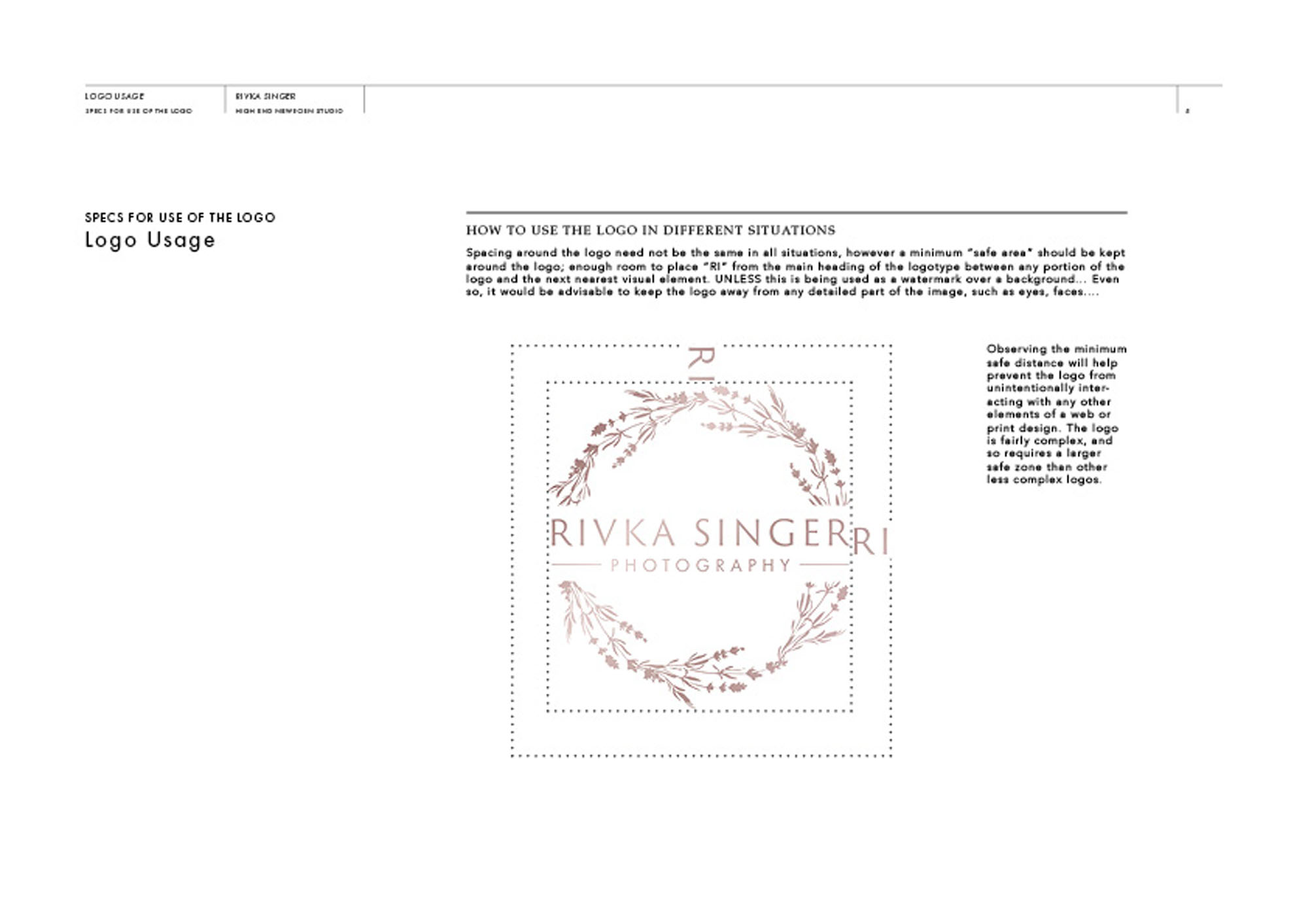
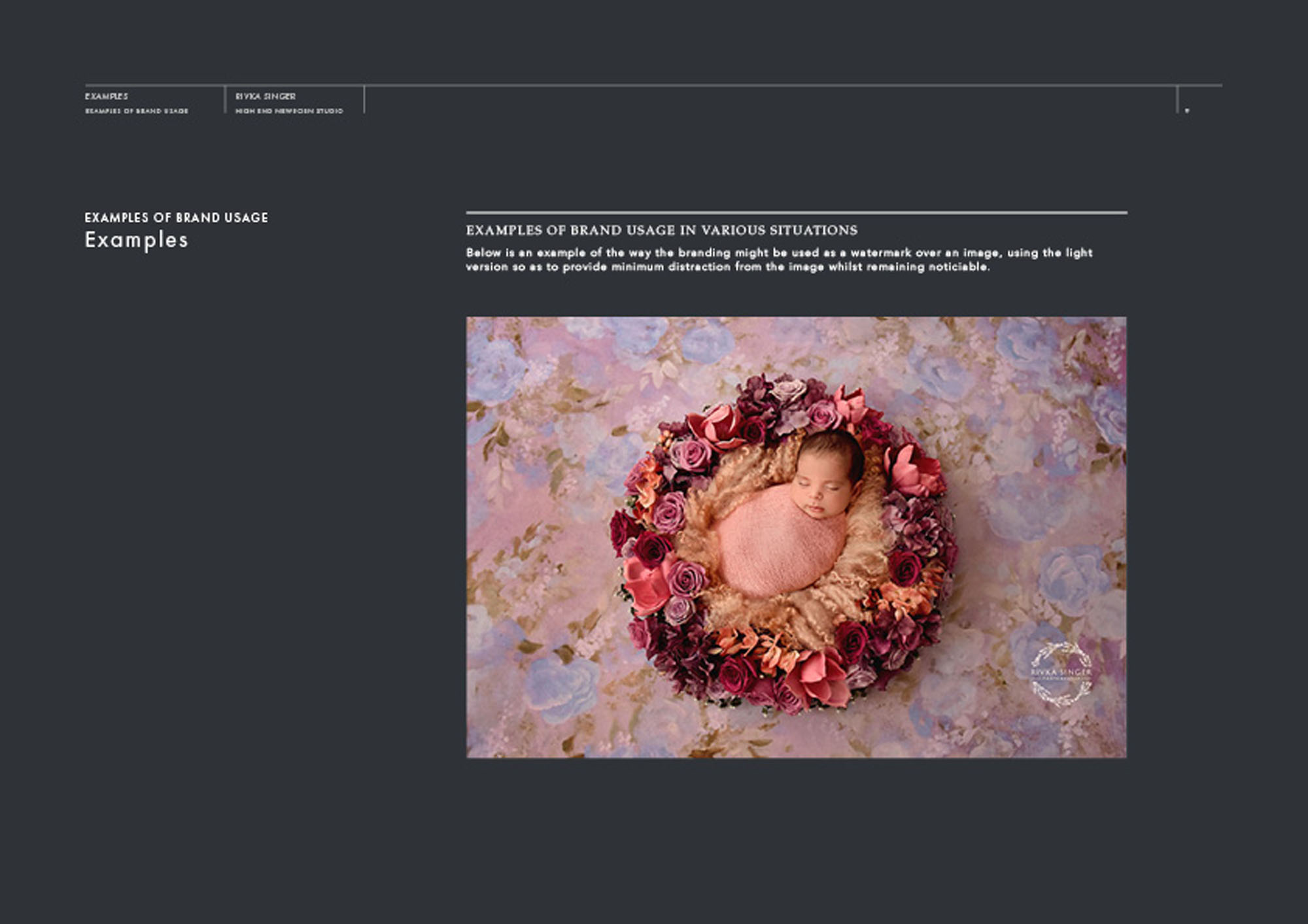
Rivka often uses beautifully colourful, ornate floral backgrounds for her images – something that differentiates her from other newborn photographers. She also noted the lavender holds a special place in nature, and its violet flowers are often considered the most delicate and precious (very much indicative of a newborn baby). After a significant number of concepts were explored, we arrived at the idea of a lavender wreath wrapped around the logotype – a concept we both fell in love with!
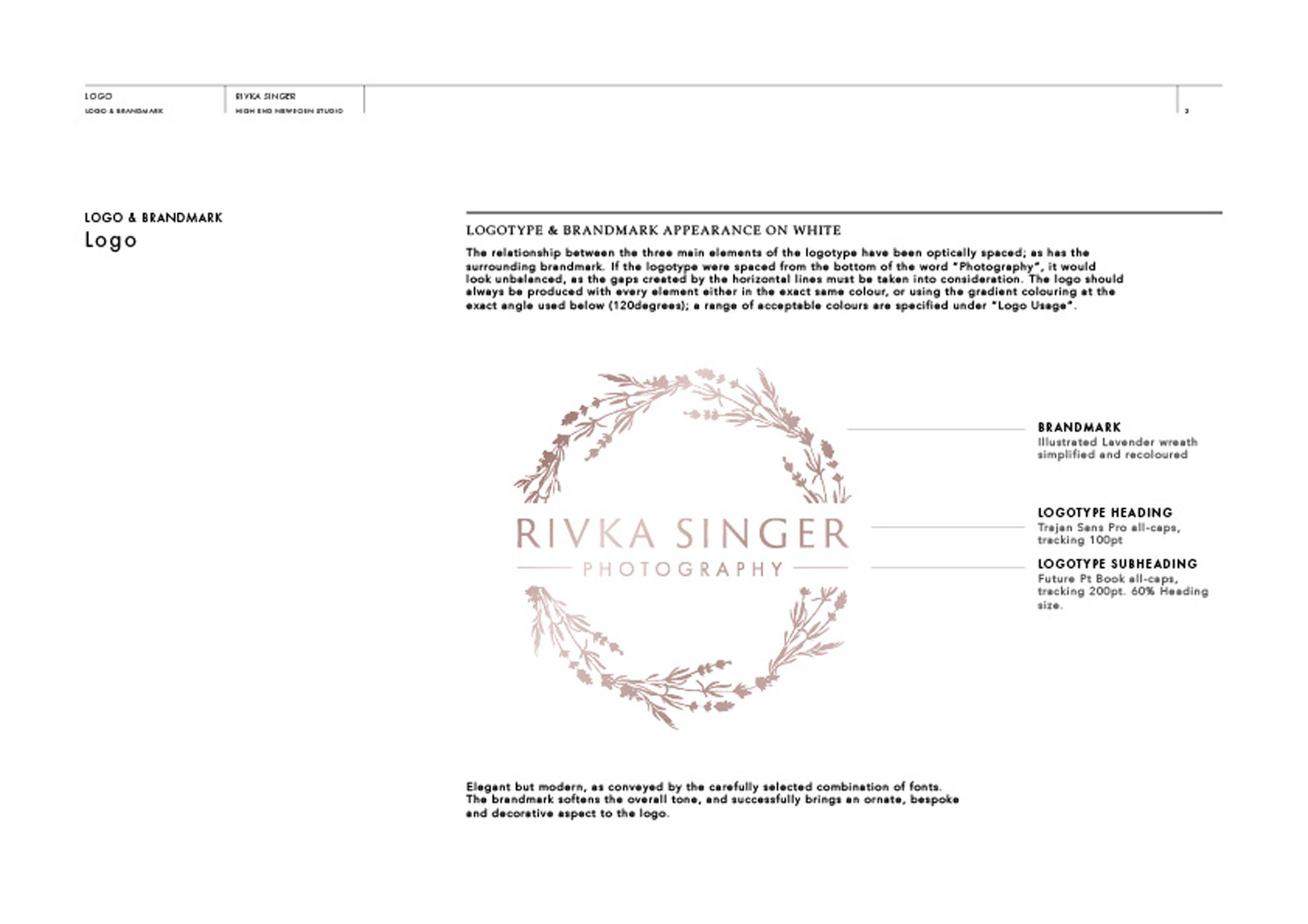
We also explored a range of fonts, but found we really wanted something with the strengths of a classic serif typeface – yet it needed to feel more modern. Trajan Sans Pro was the perfect solution – a modern twist on a proven classic.
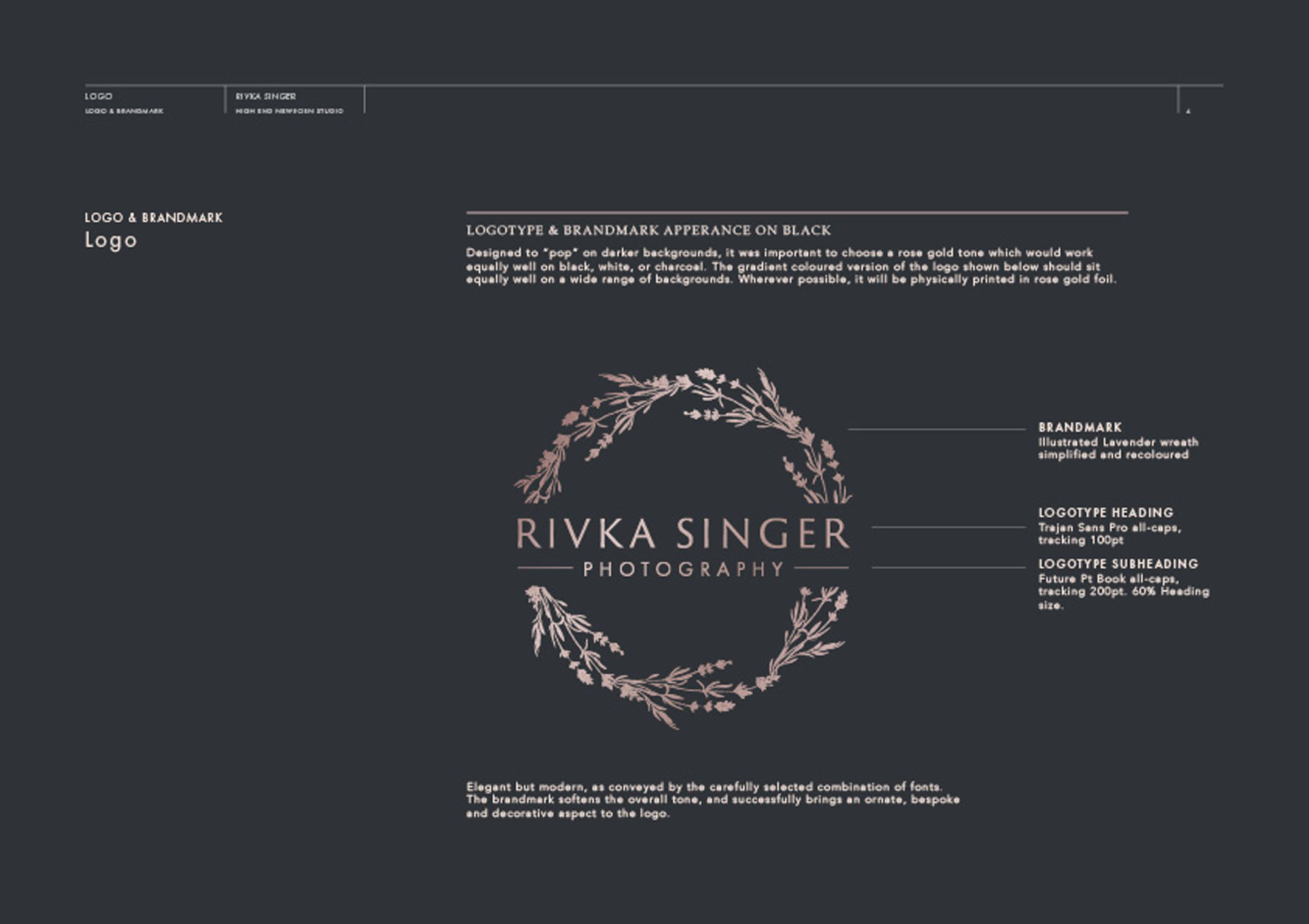
The finished logo works beautifully on thunder grey or white alike. It hints at the very high standard of bespoke photography you can expect to find at Rivka’s New York studio – with the decorative element of the logo a nod to the ornate, stunning scenes Rivka creates.
It was a real pleasure working with Rivka to create this.
Case Study
Opportunity
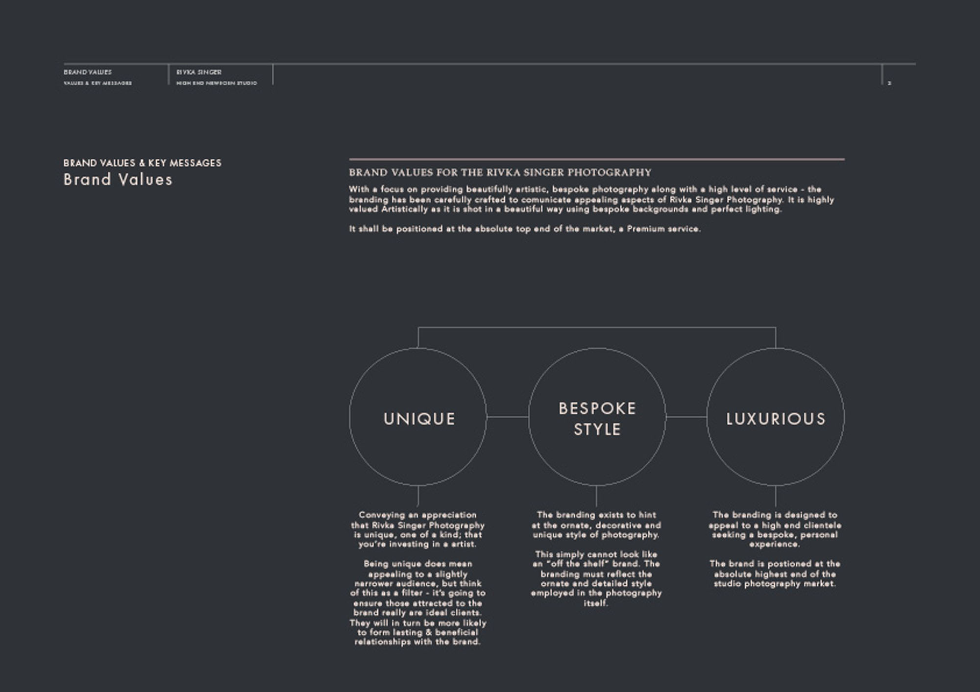
Rivka Singer—an acclaimed newborn photographer with a thriving New York studio—commissioned a brand refresh that feels premium and bespoke, reflecting her signature, richly ornamented floral settings while remaining timeless and clear.
Objectives
- Craft a high-end signature with a distinct, tailor-made character.
- Echo Rivka’s colourful, ornate floral backdrops in a way that complements (not competes with) her imagery.
- Select typography with classic gravitas, refined for a modern presentation.
- Ensure the logo performs crisply on both thunder grey and white applications across print and digital.
Insight & Strategy
Lavender holds special meaning for Rivka—its delicate, violet flowers naturally mirror the preciousness of newborn life. We centred the identity on that symbolism: a lavender wreath entwined with the logotype, uniting “bespoke care” with “quiet luxury.” To achieve the right voice, we explored multiple font directions before choosing Trajan Sans Pro—a modern interpretation that brings the dignity of a classic serif tradition into a cleaner, contemporary form.
Identity Solution
- Logotype: Trajan Sans Pro, finely letterspaced and optically balanced to convey poise and permanence.
- Lavender Wreath: A custom botanical motif wrapped around the wordmark, designed to signal craftsmanship and to nod to Rivka’s ornate, floral scene-building.
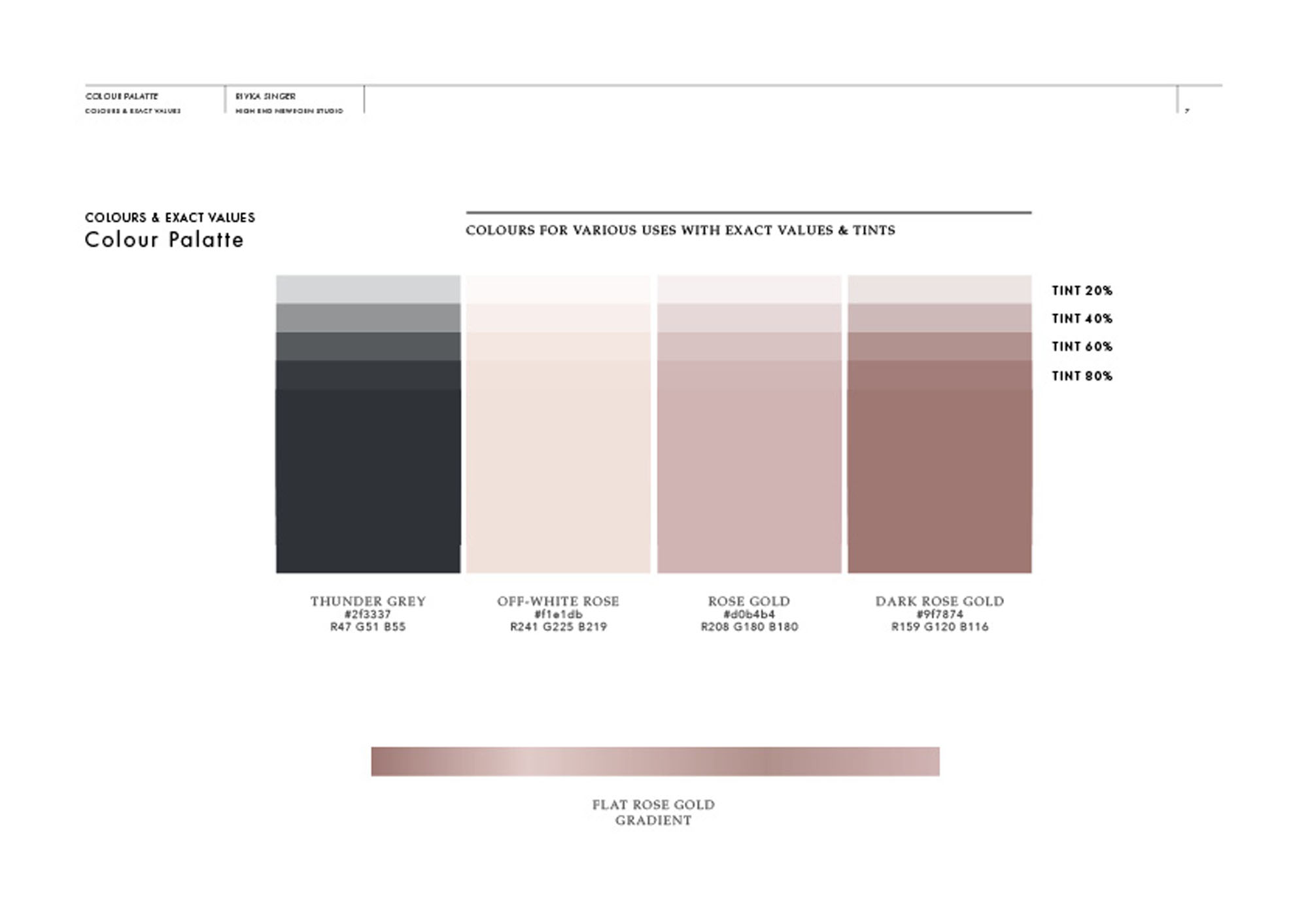
- Colourways: Primary executions on thunder grey and on white; the mark retains clarity and elegance in both settings.
- Application Guidance: Clear-space, minimum sizes and placement rules ensure consistent presentation across studio materials, packaging and digital headers.
Competitive Edge Now
The wreath-and-wordmark lockup delivers an instantly recognisable signature that is both luxurious and personal. The botanical detail connects directly to Rivka’s visual world, while the refined typography keeps the overall impression calm, confident and enduring.
What This Enables
A cohesive, premium presence that can extend seamlessly across studio touchpoints—website headers, certificates, packaging and communications—positioning the brand to emphasise bespoke service and elevate perceived value without sacrificing clarity.

