Love of a Queen manufacturer high end luxury fragrances ranging from candles & bath salts to perfumes. I was approached to develop a strong brand identity for Love of a Queen as they prepared to launch their flagship product, a luxury scented candle to exclusive retailers initially in central London.
The project included packaging design, so we performed extensive research to ensure the product would be well positioned within the market. Consistency from overall Brand Strategy right through to the packaging of the candle and marketing strategy was vital. This had to look, feel and smell high end and luxurious. The associated website had to feel indulgent and sophisticated. It was a huge advantage to be able to work with this startup from research and strategy all the way through concept design right to the final product.
Case Study
Opportunity
As Love of a Queen prepared to debut its flagship luxury candle in select central London retailers, the brand required a distinctive identity and packaging system that instantly communicates regal luxury and sets the stage for a wider fragrance range.
Objectives
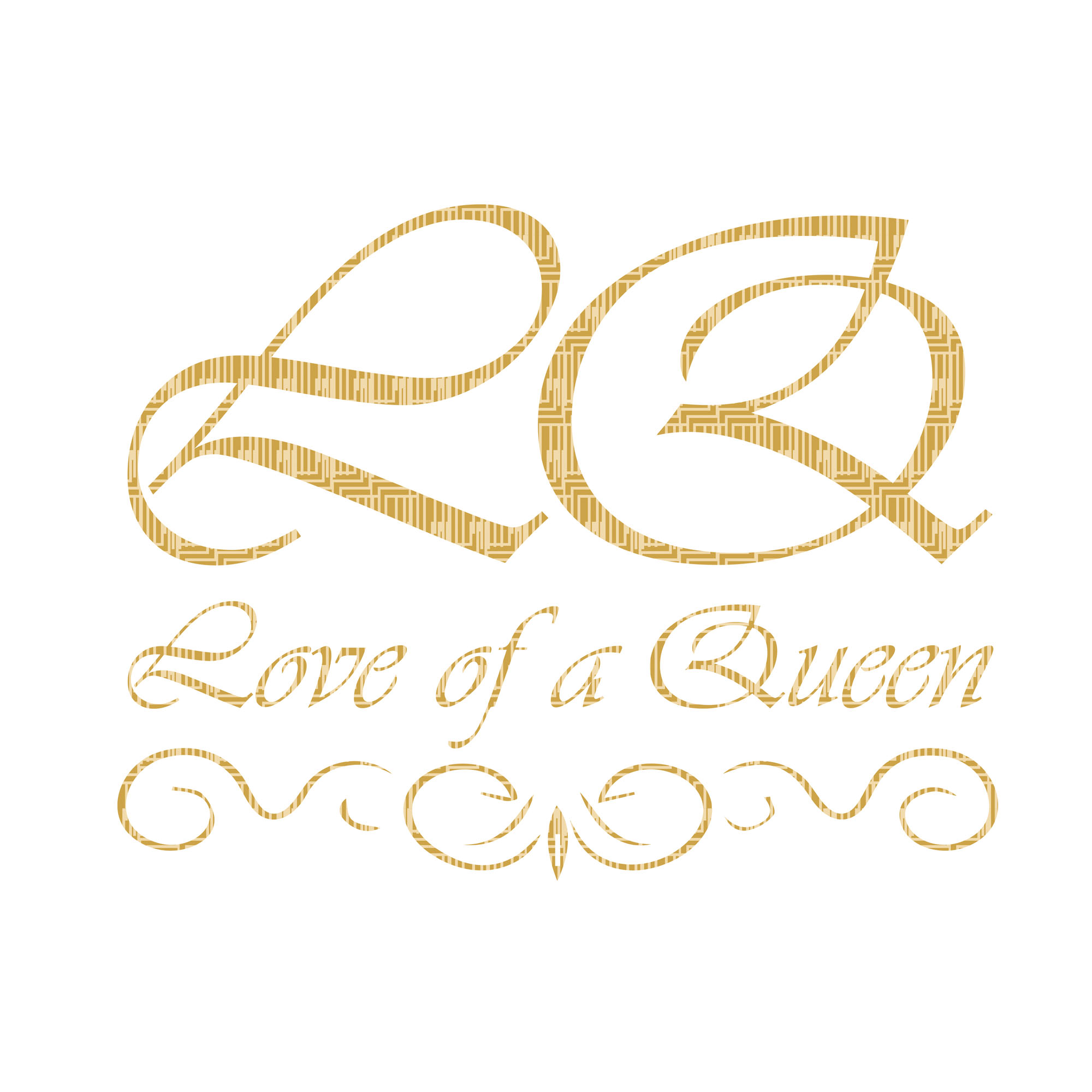
- Establish a premium, memorable identity aligned to the name’s regal character.
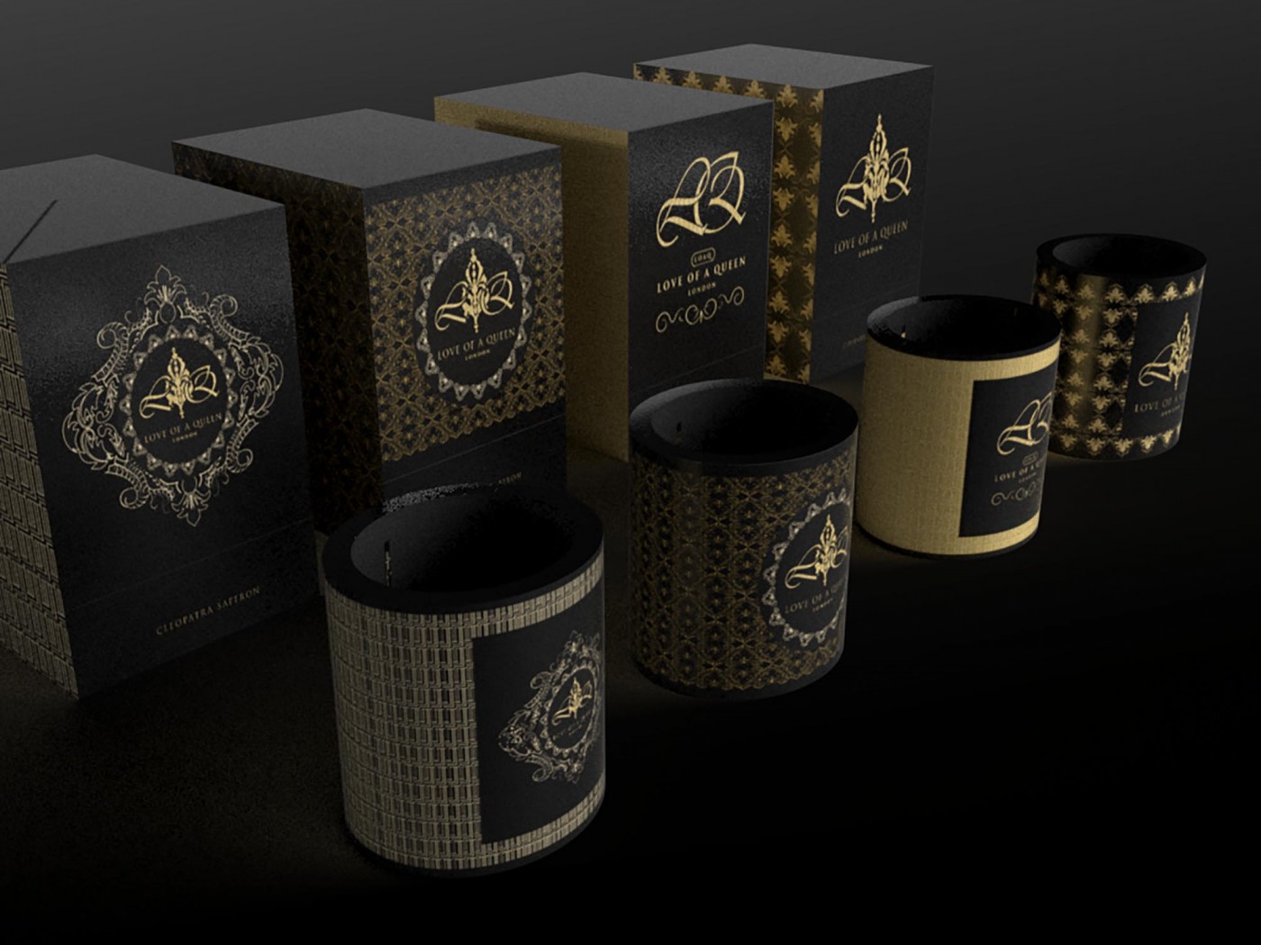
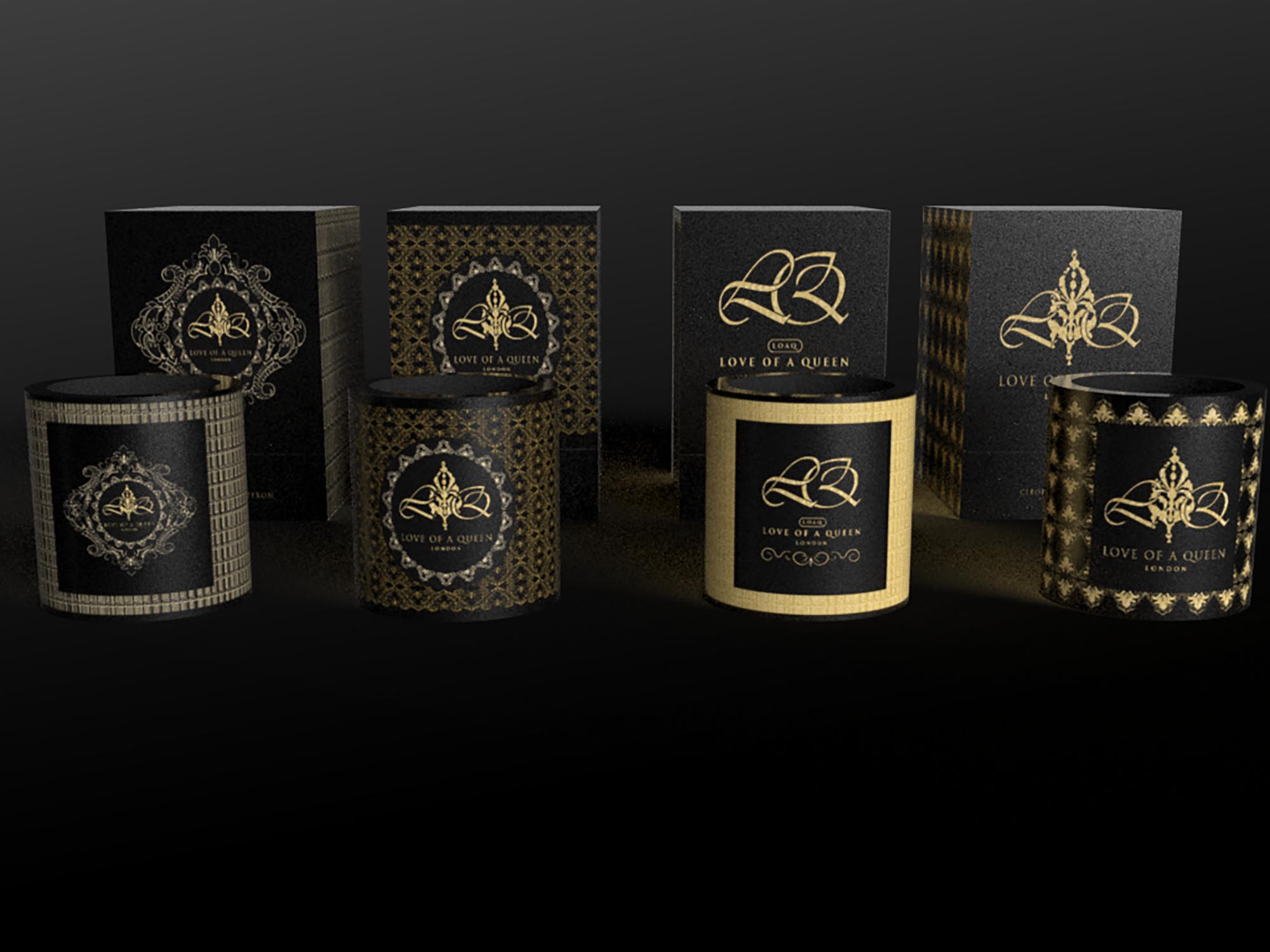
- Deliver packaging for the launch candle that feels luxurious in hand and striking on display.
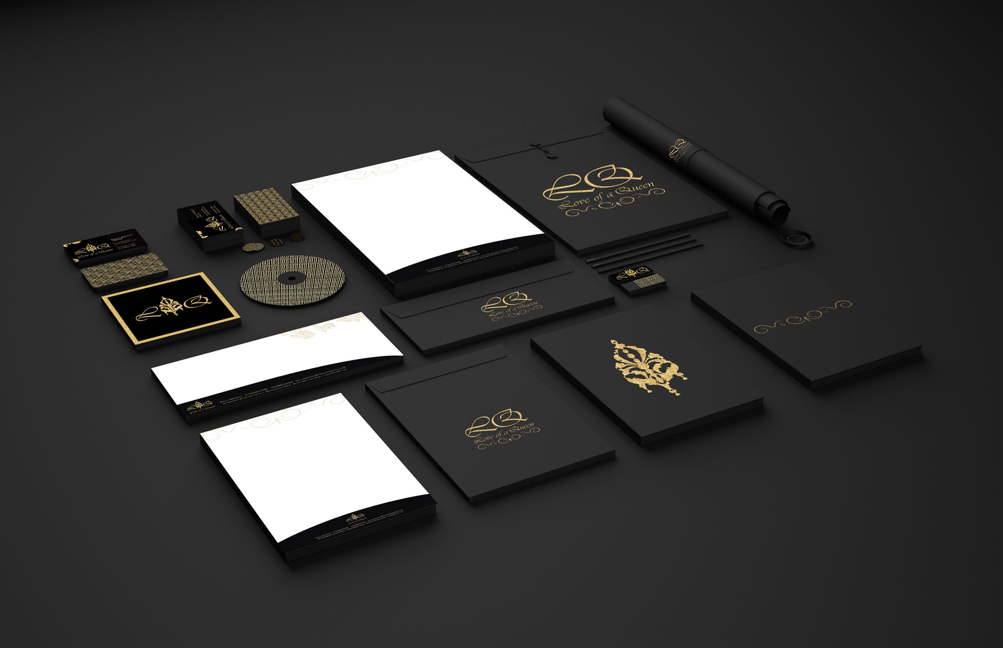
- Create a coherent system that can extend to perfumes, bath salts and future products.
- Provide production-ready artwork and guidance to ensure consistent results across runs.
Insight & Strategy
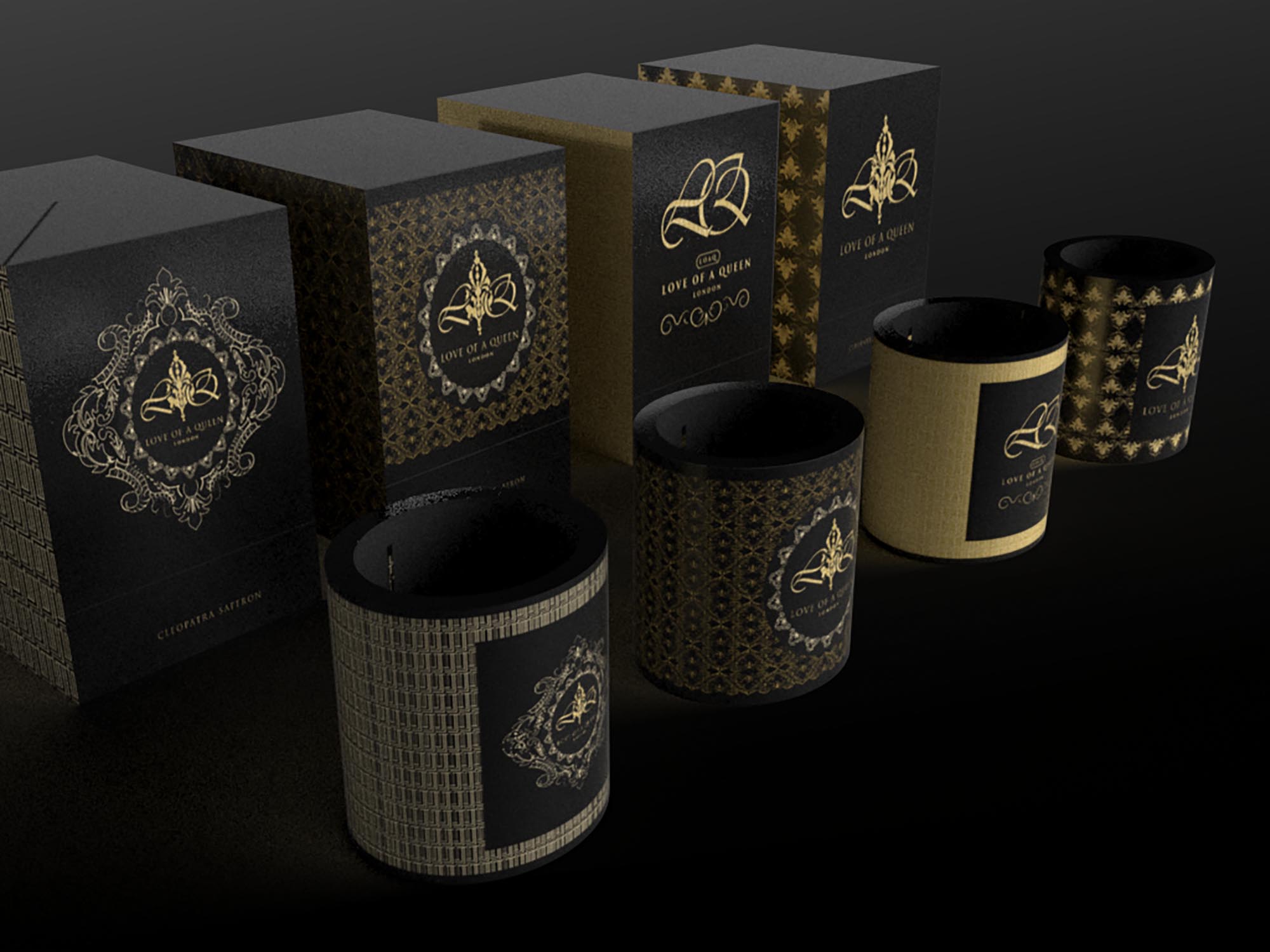
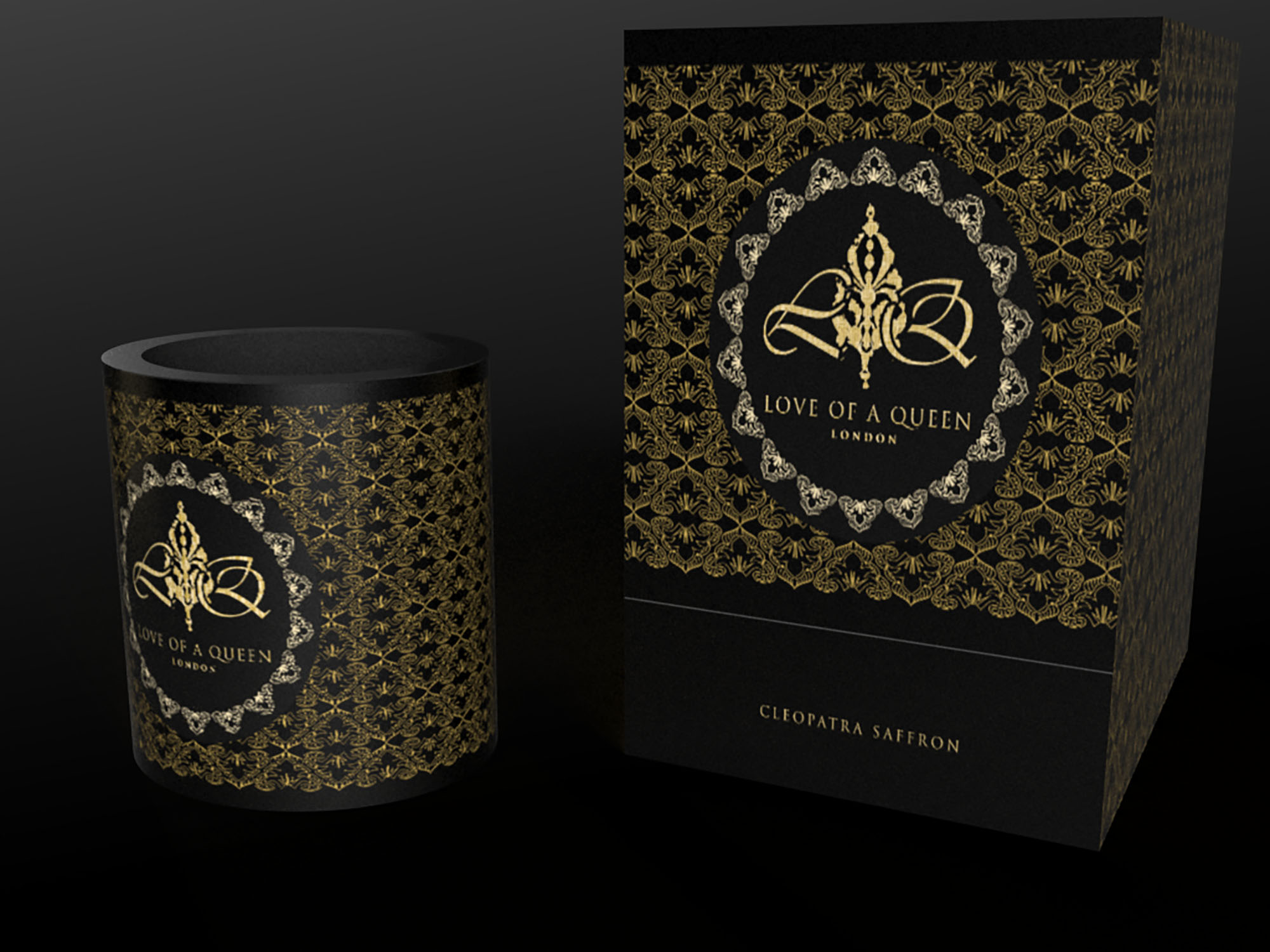
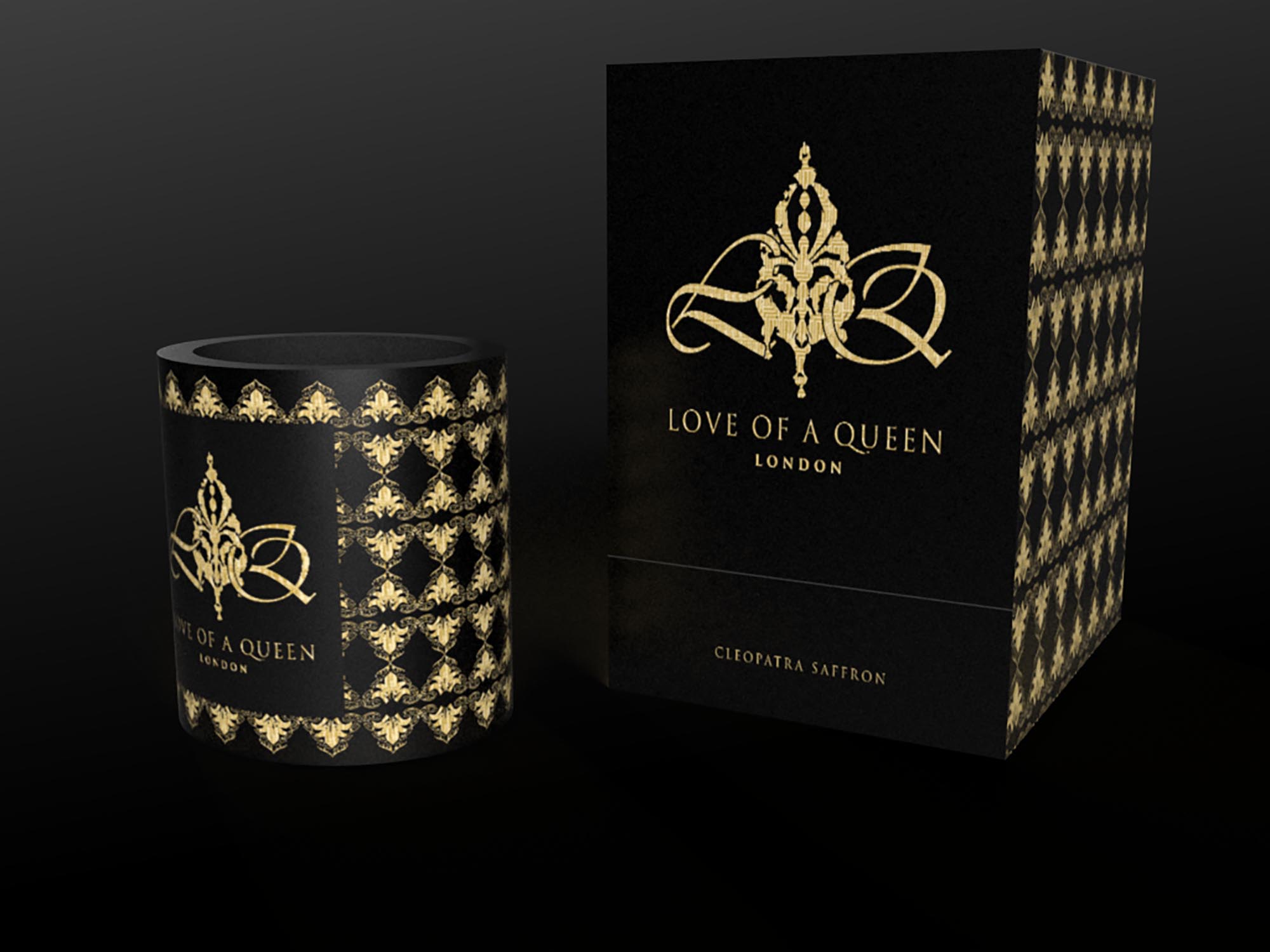
Luxury fragrance buyers respond to signals of craft and ceremony from the first glance. We shaped a brand world that pairs a detailed emblem with disciplined typography and a high-contrast palette—presenting indulgence with modern control. The packaging strategy emphasised clarity on the hero panels and refined detailing up close, so the product reads as luxurious from shelf to unboxing.
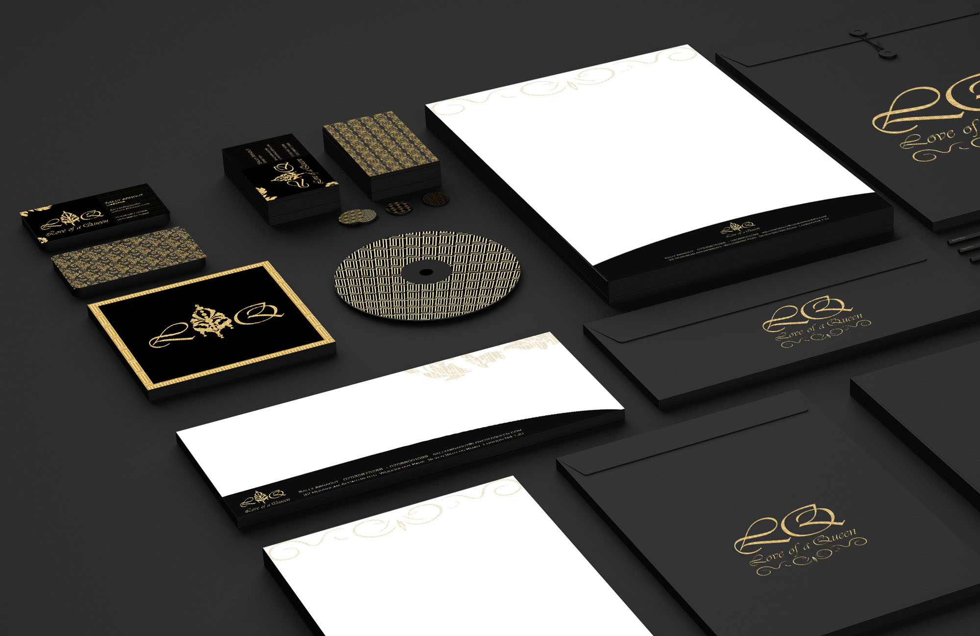
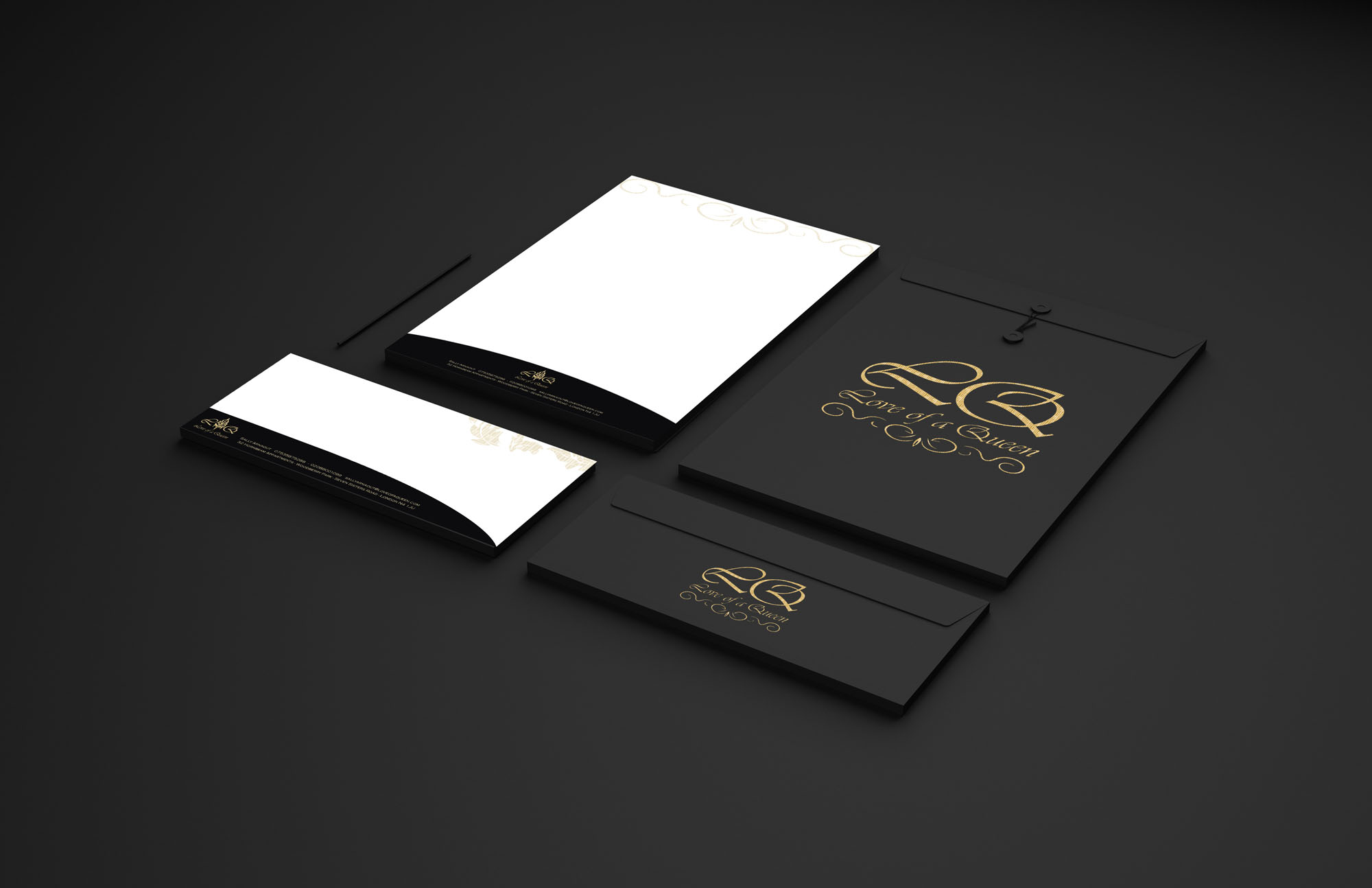
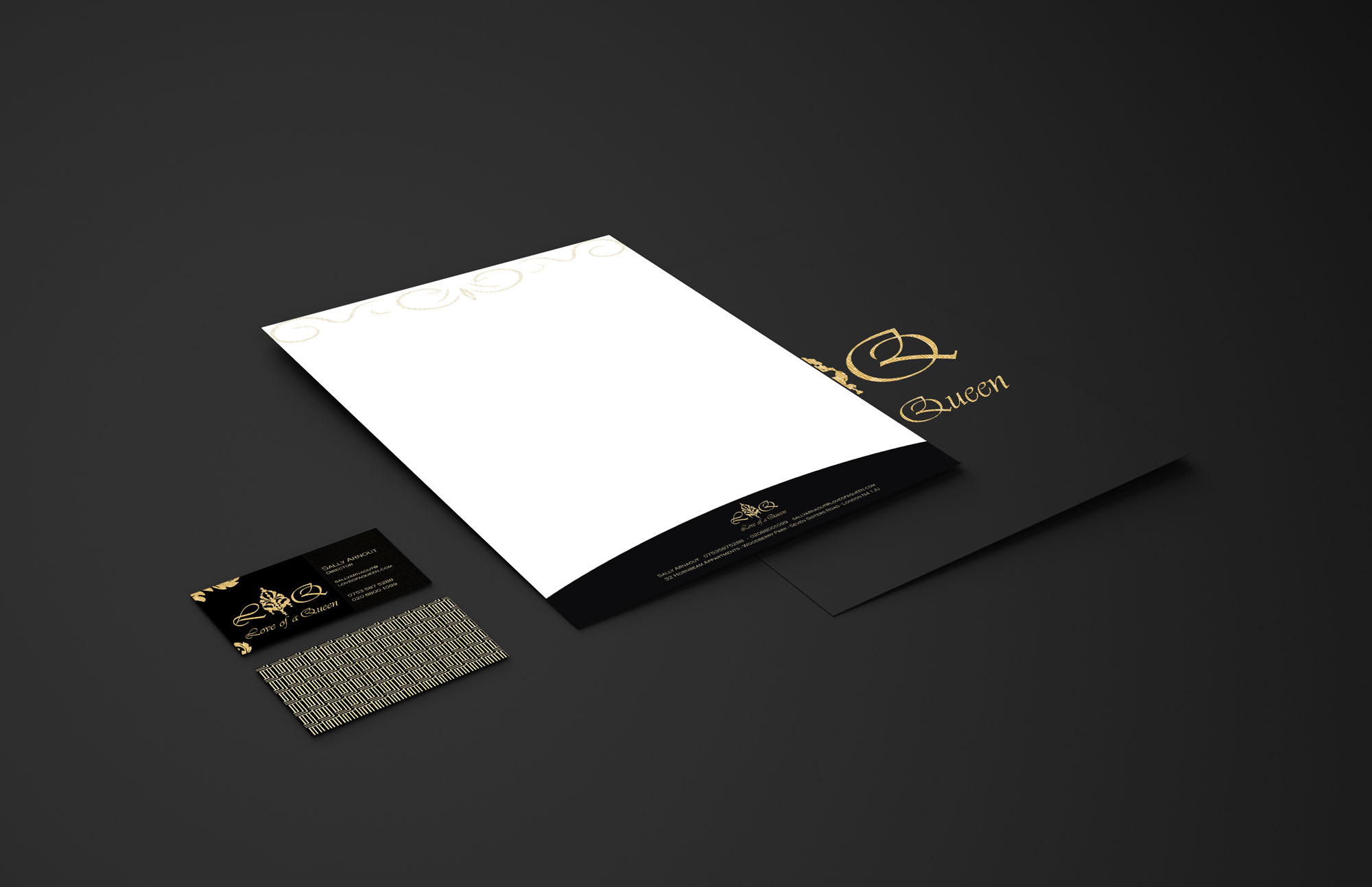
Identity Solution
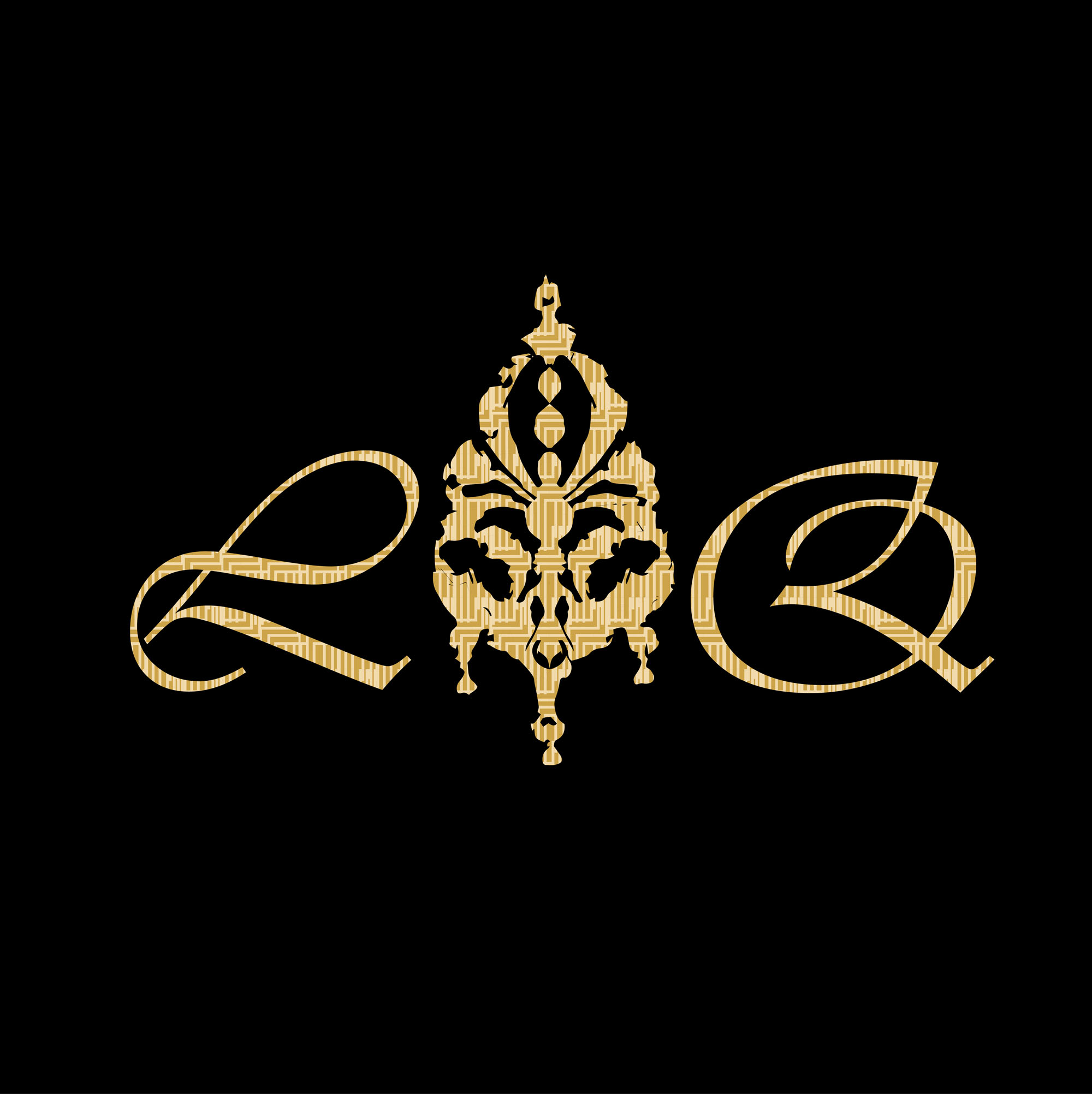
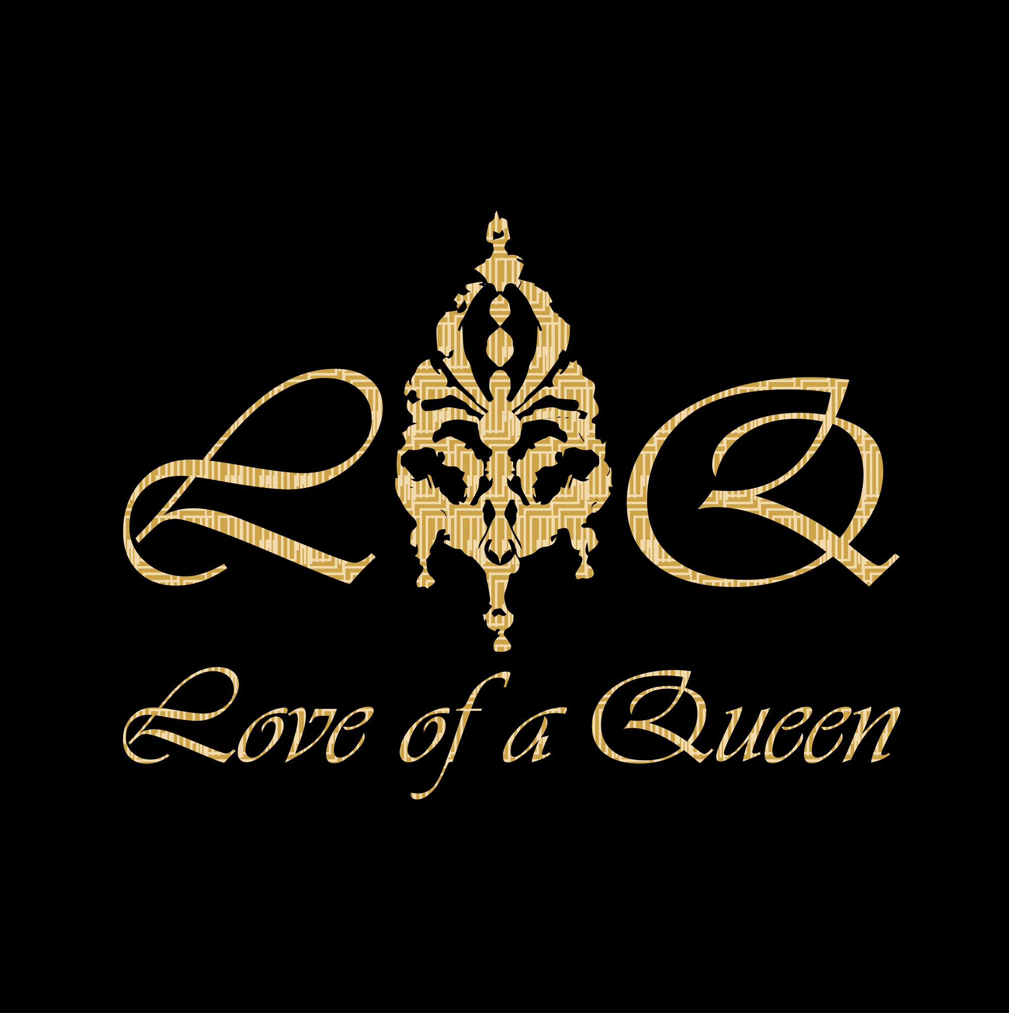
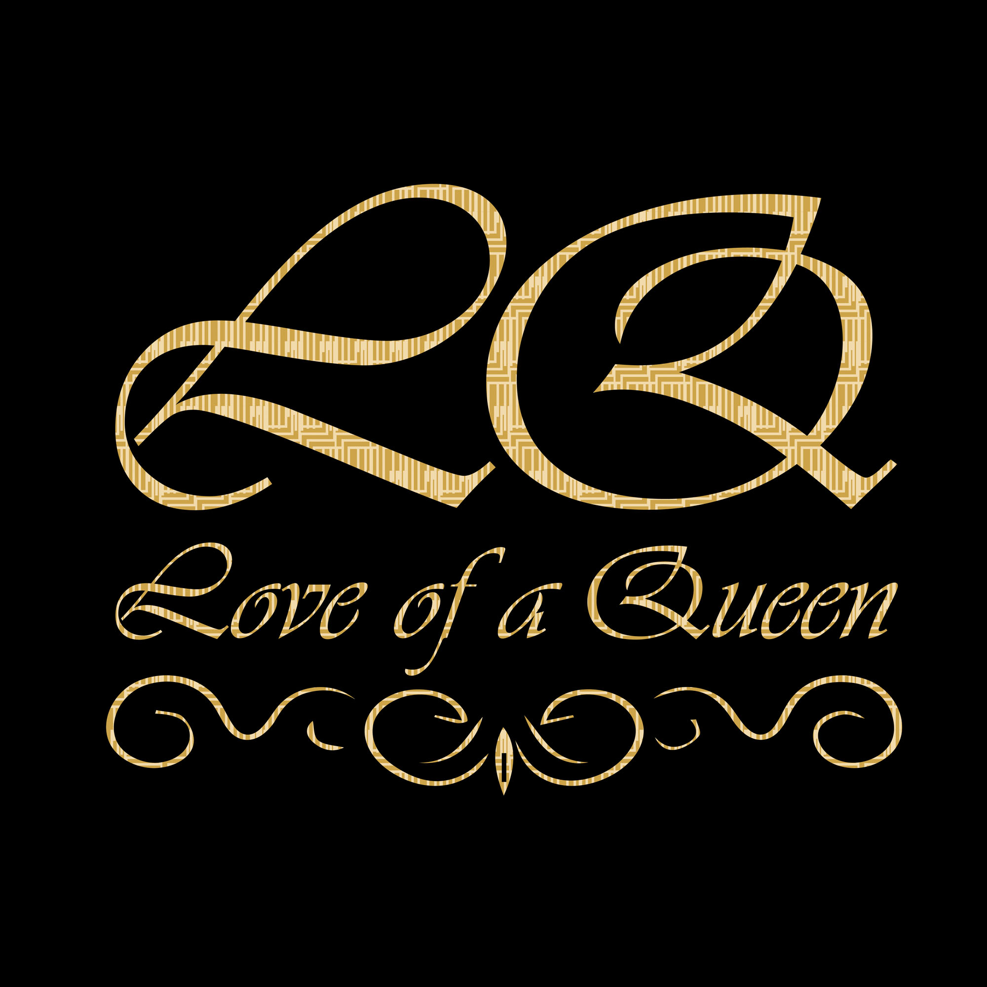
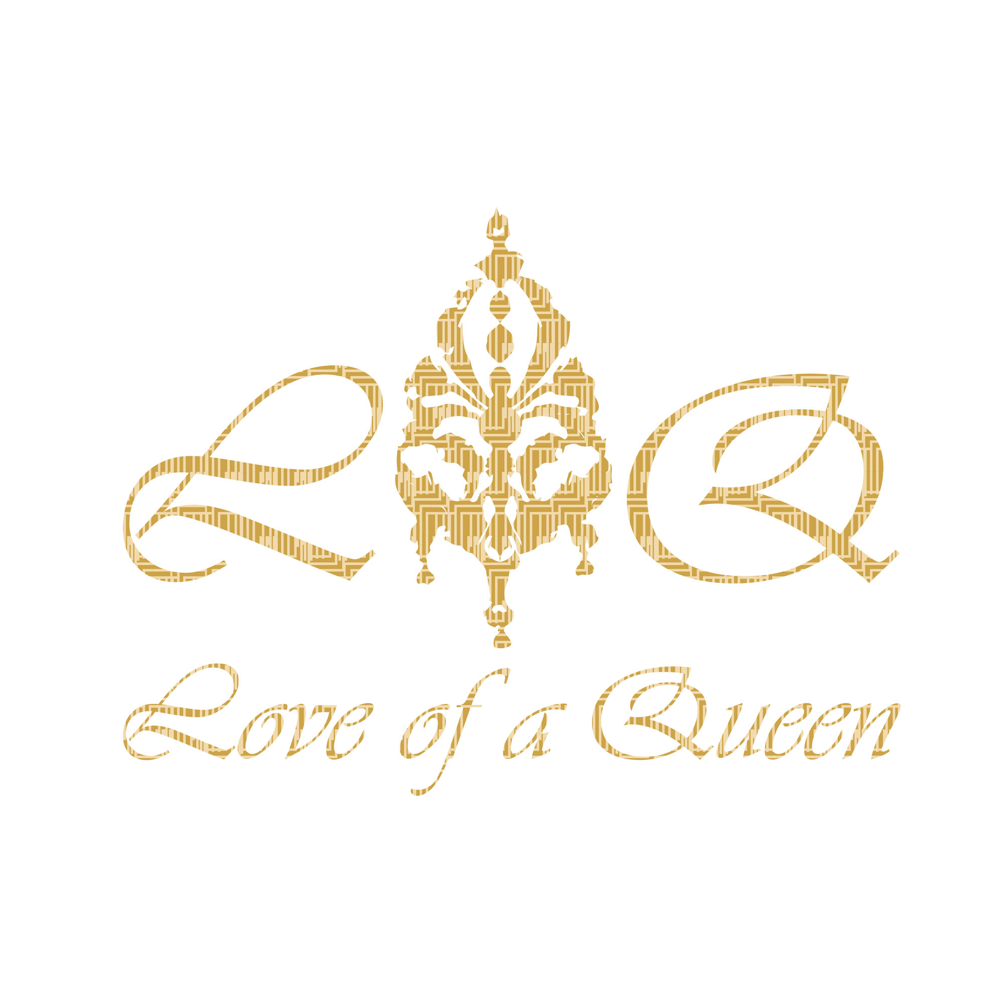
- Emblem & Wordmark: An intricate, queen-inspired mark supported by a poised typographic signature—distinctive enough for hero use, precise enough for small applications.
- Palette: A black-and-gold scheme that communicates opulence while retaining excellent legibility across labels and outer packs.
- Typography: Refined type choices with measured spacing to balance the ornate emblem and keep information effortlessly readable.
- Packaging System: Structured front hierarchy for name and notes, with coordinated side/back panels for ingredients and care; dielines and print specs prepared for reliable production.
Competitive Edge Now
The unified emblem, typography and colour create an unmistakable premium presence. The packaging presents with confidence at retail and retains its elegance in close-up handling, giving the brand a consistent, luxurious signature across every touchpoint.
What This Enables
A ready-to-scale identity and packaging platform for additional SKUs and special editions, strong photography for marketing and e-commerce, and a coherent visual language that supports premium positioning online, in-store and at launch events.