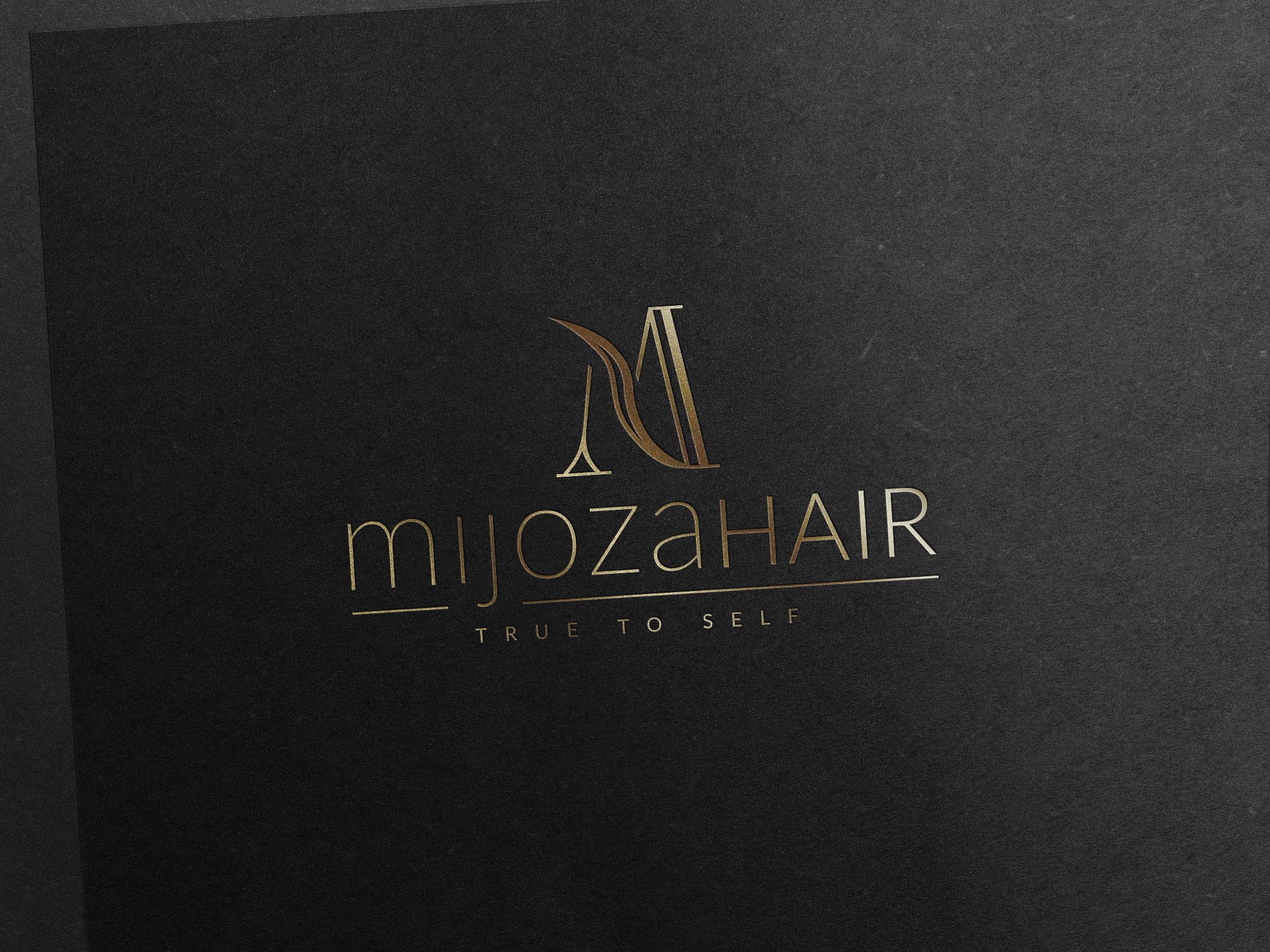
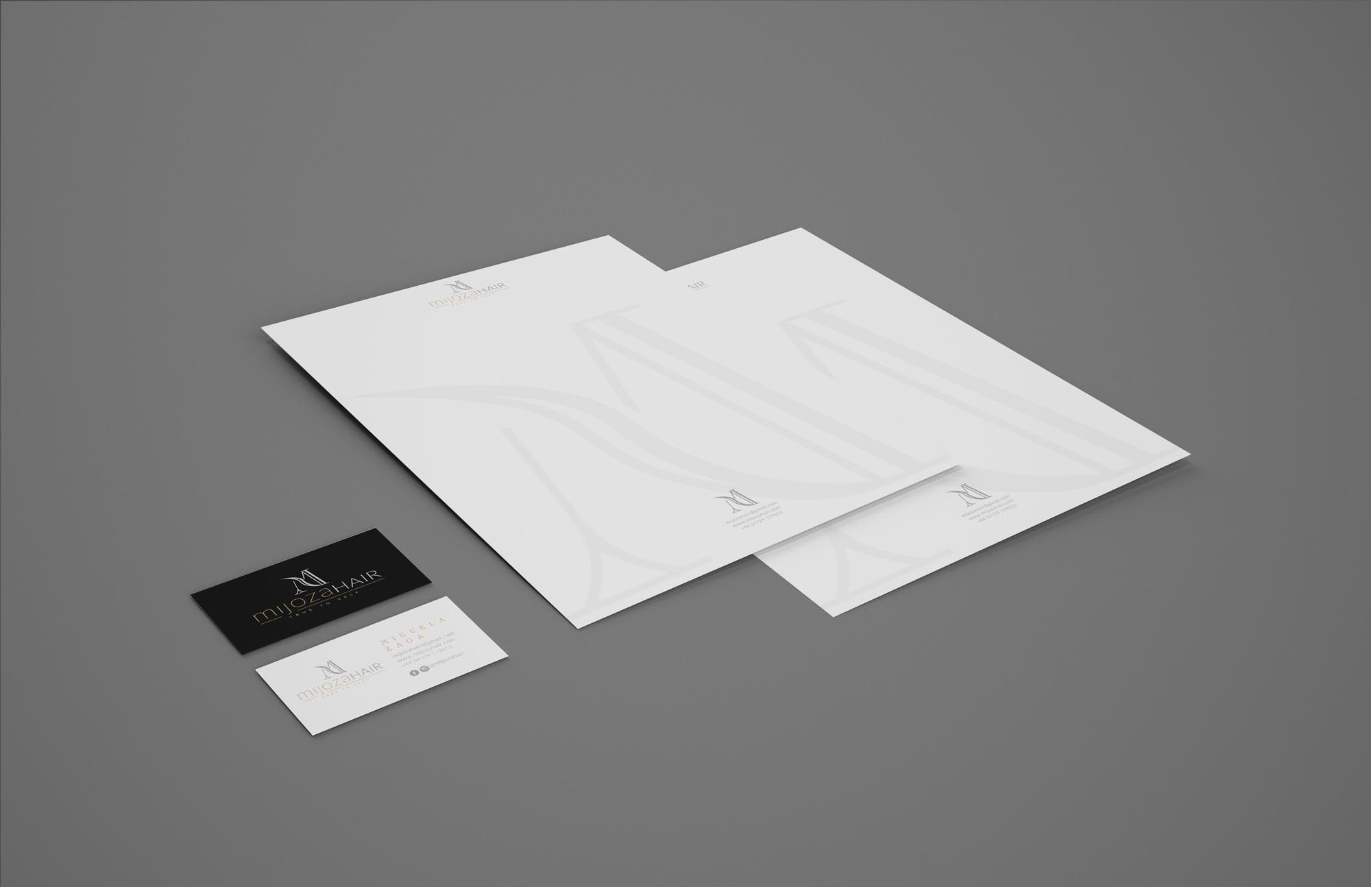
I was commissioned to create the new brand identity for Mijoza Hair, Specialist Premium Wigs & Hair Extensions. The new branding positions Mijoza Hair at the high end of the market, creating an expectation of quality, luxury products.
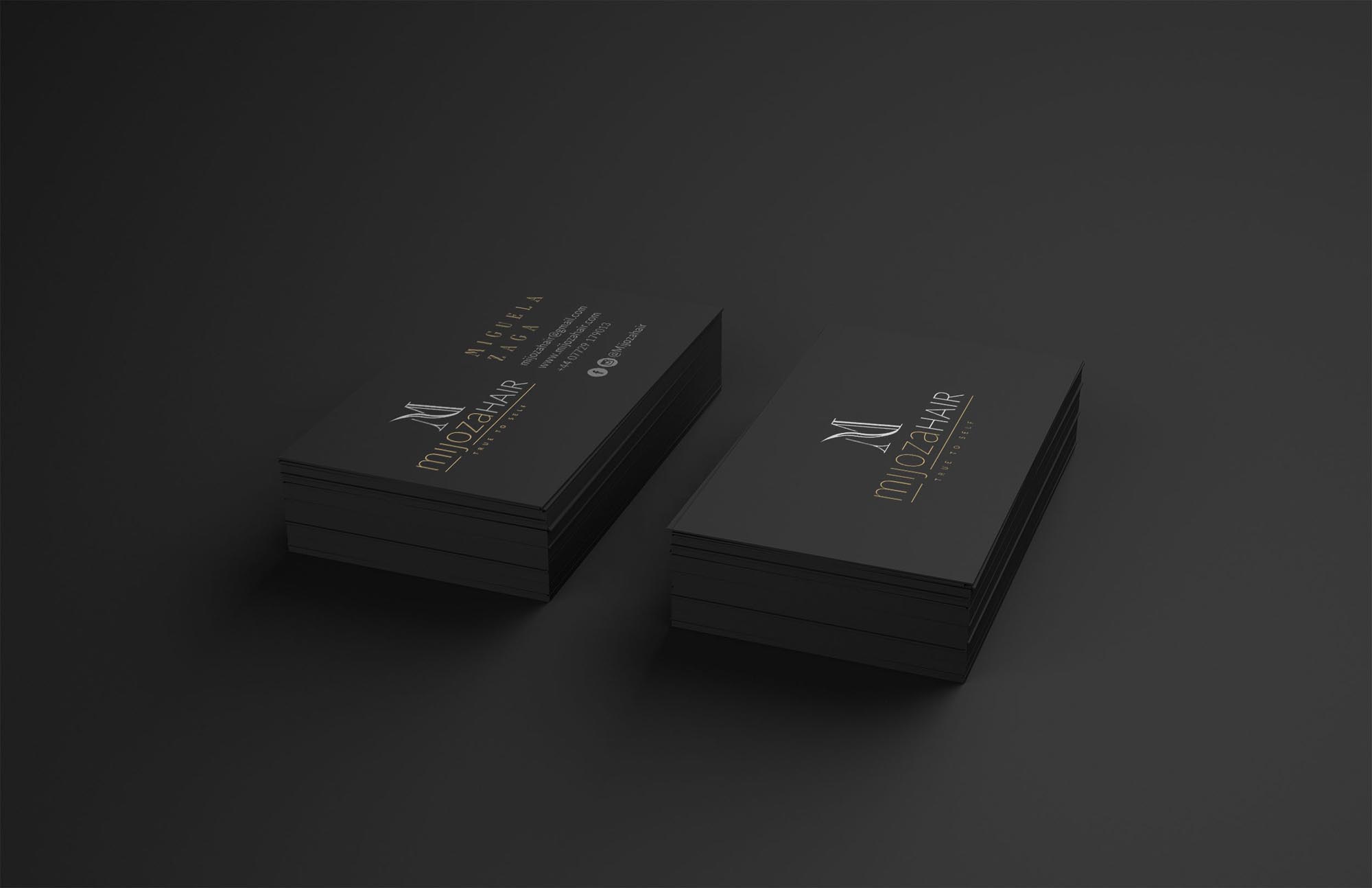
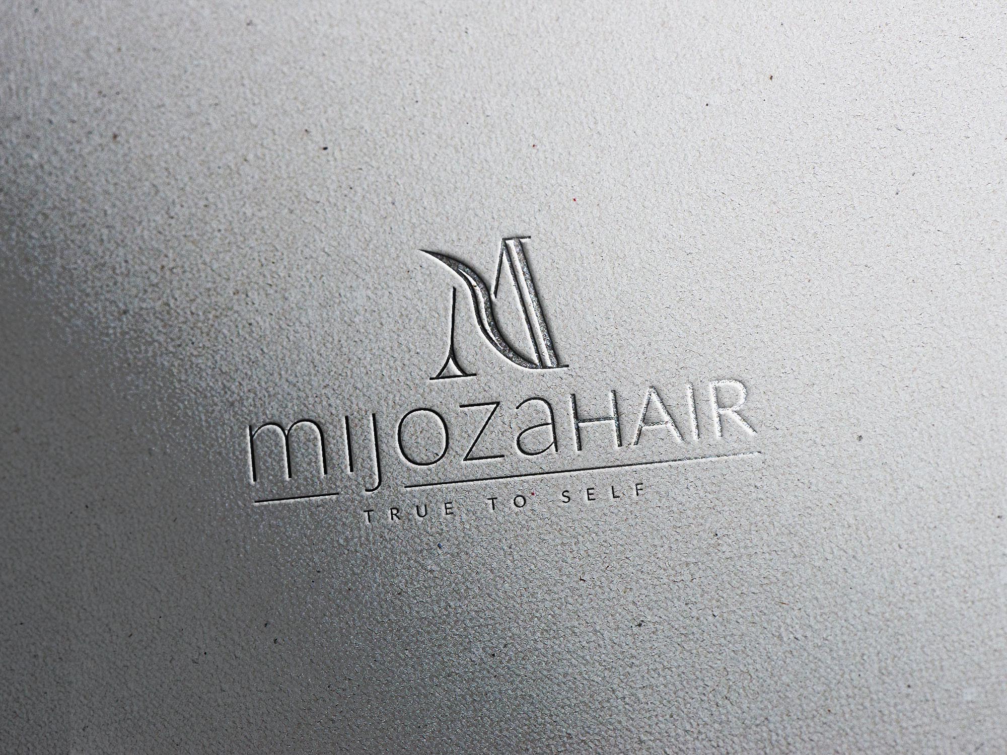
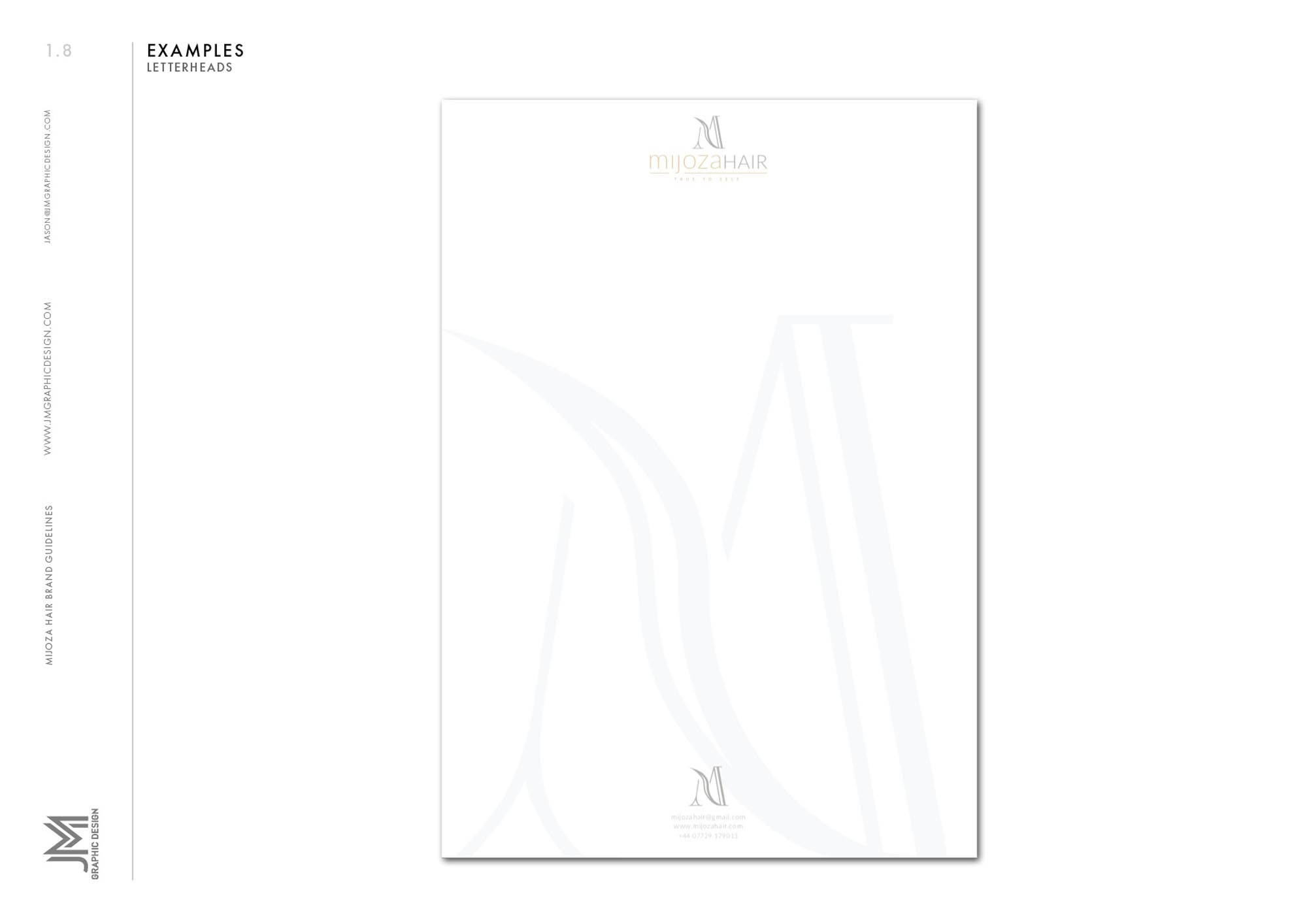
We explored a range of concepts, before arriving at the distinct ‘M’ monogram – which features a subtle wave of hair forming part of the letter. This symbol also features as a watermark, applied subtly to create a unique effect across the stationary.
Case Study
Opportunity
Many hair brands lean on fast-moving trends that age quickly. Mijoza Hair needed an identity with staying power—elevated enough for premium services and potential retail, but calm and confident in everyday use across salon and digital touchpoints.
Objectives
- Create a recognisable, typographic-led mark that communicates craft and care at first glance.
- Deliver assets that work from signage and price lists to social avatars, packaging and appointment cards.
- Maintain clarity at small sizes and on textured substrates common to salon environments (labels, bags, receipts).
- Define simple usage rules so the brand remains consistent as services and content expand.
Insight & Strategy
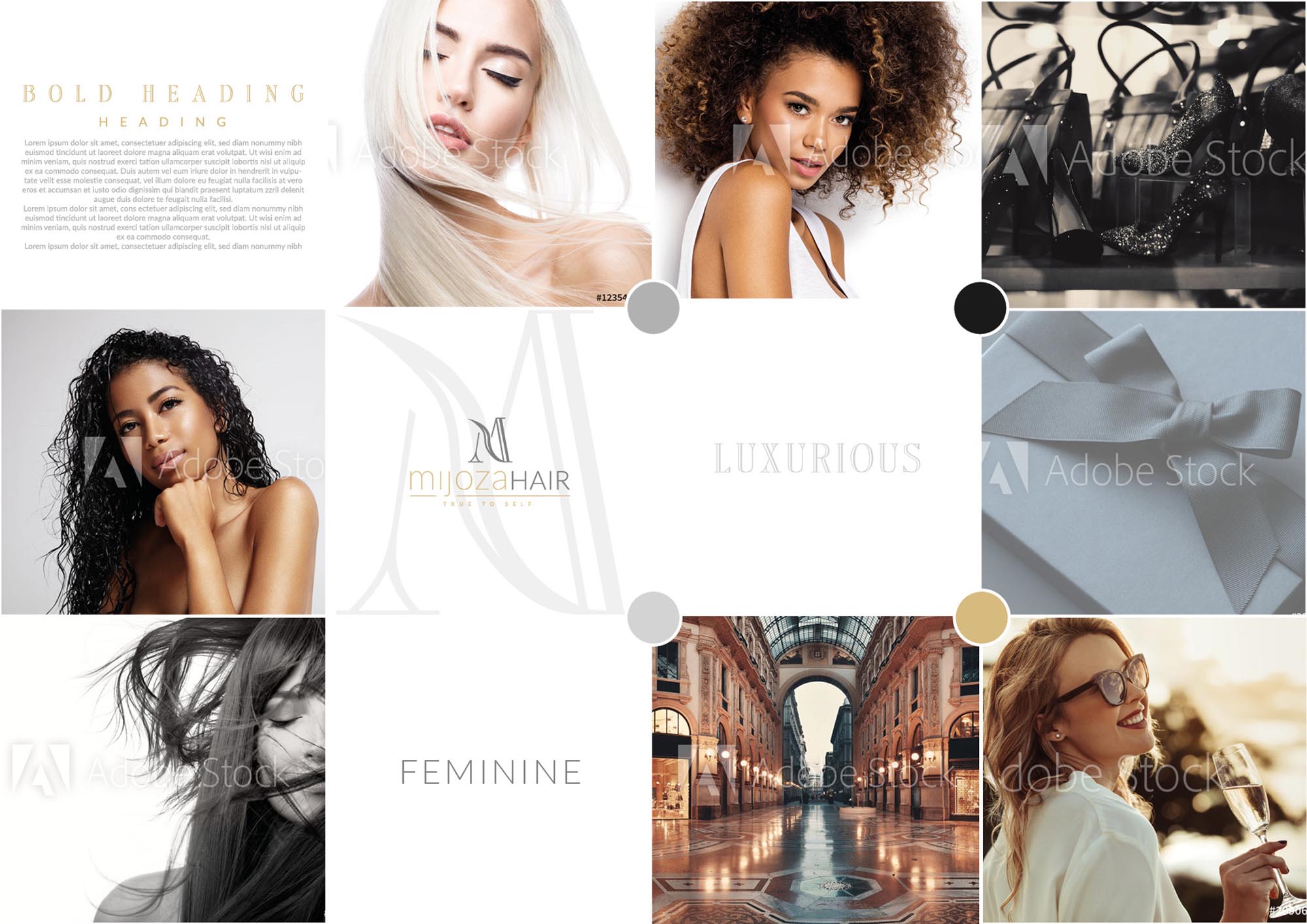
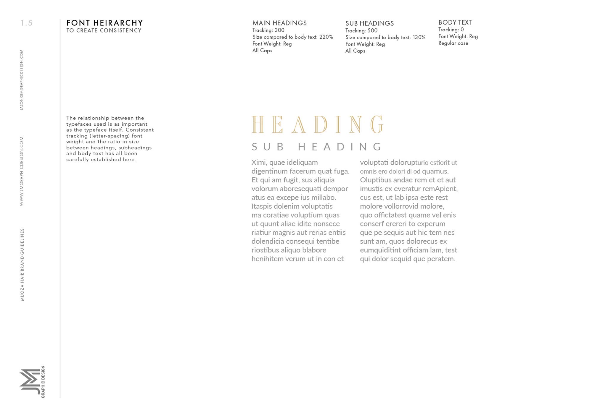
Clients choose salons that signal taste and reliability before a word is read. We positioned Mijoza around “considered refinement”: a restrained typographic voice, generous spacing, and a compact secondary mark for tight spaces—built to support photography and service information without competing with it.
Identity Solution
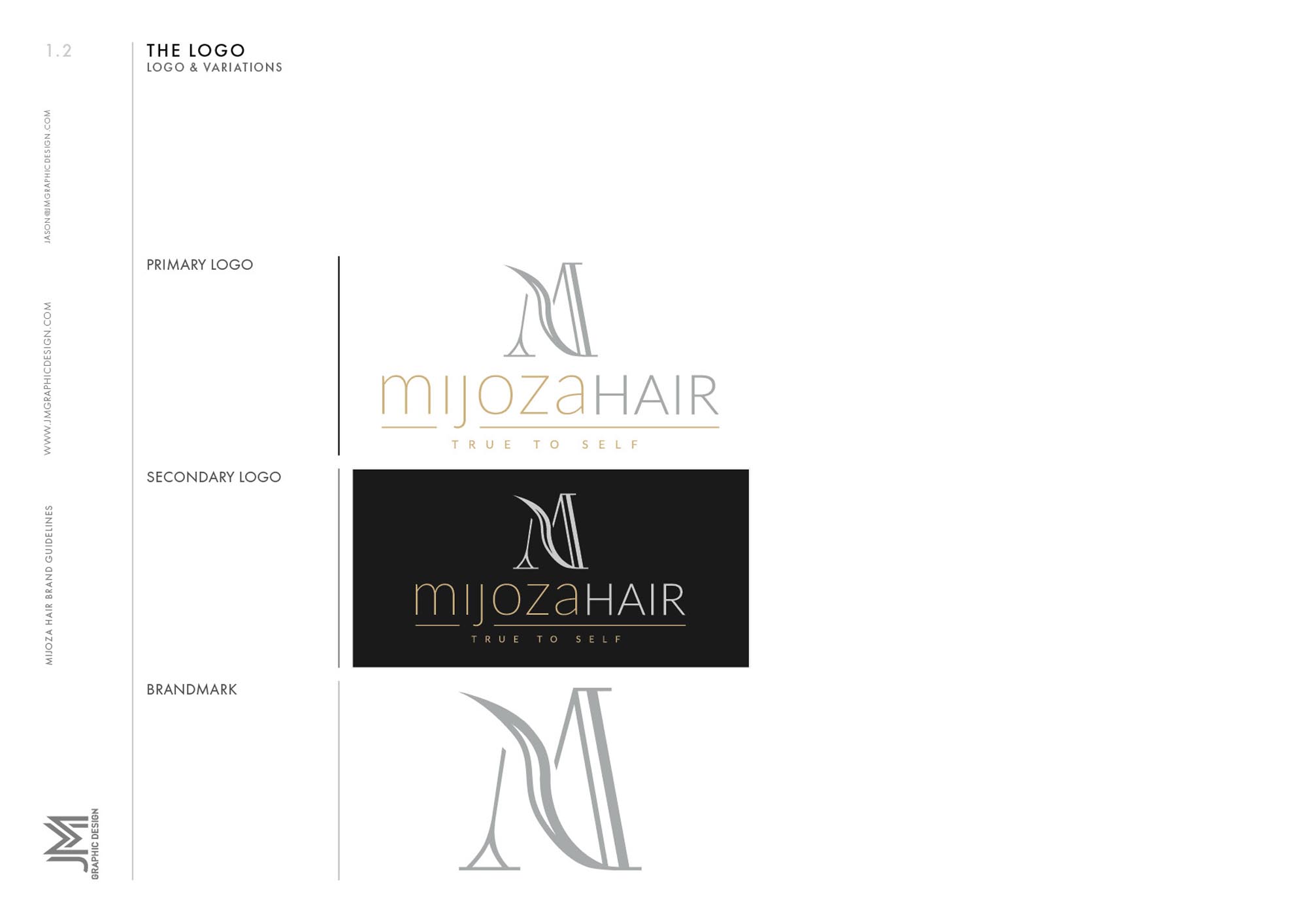
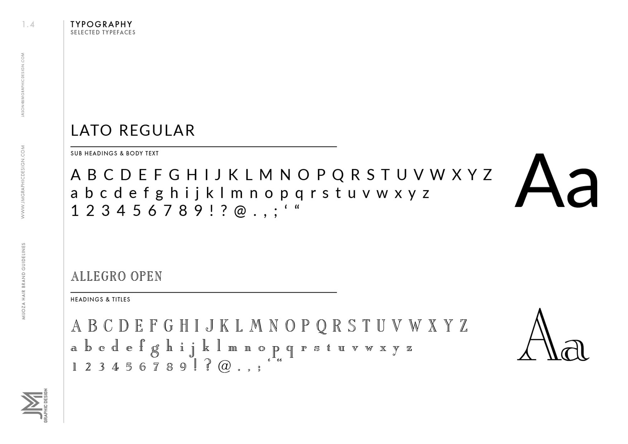
- Wordmark: A balanced, custom-lettered logotype with measured letterspacing for a composed, editorial feel on fascia, menus and digital headers.
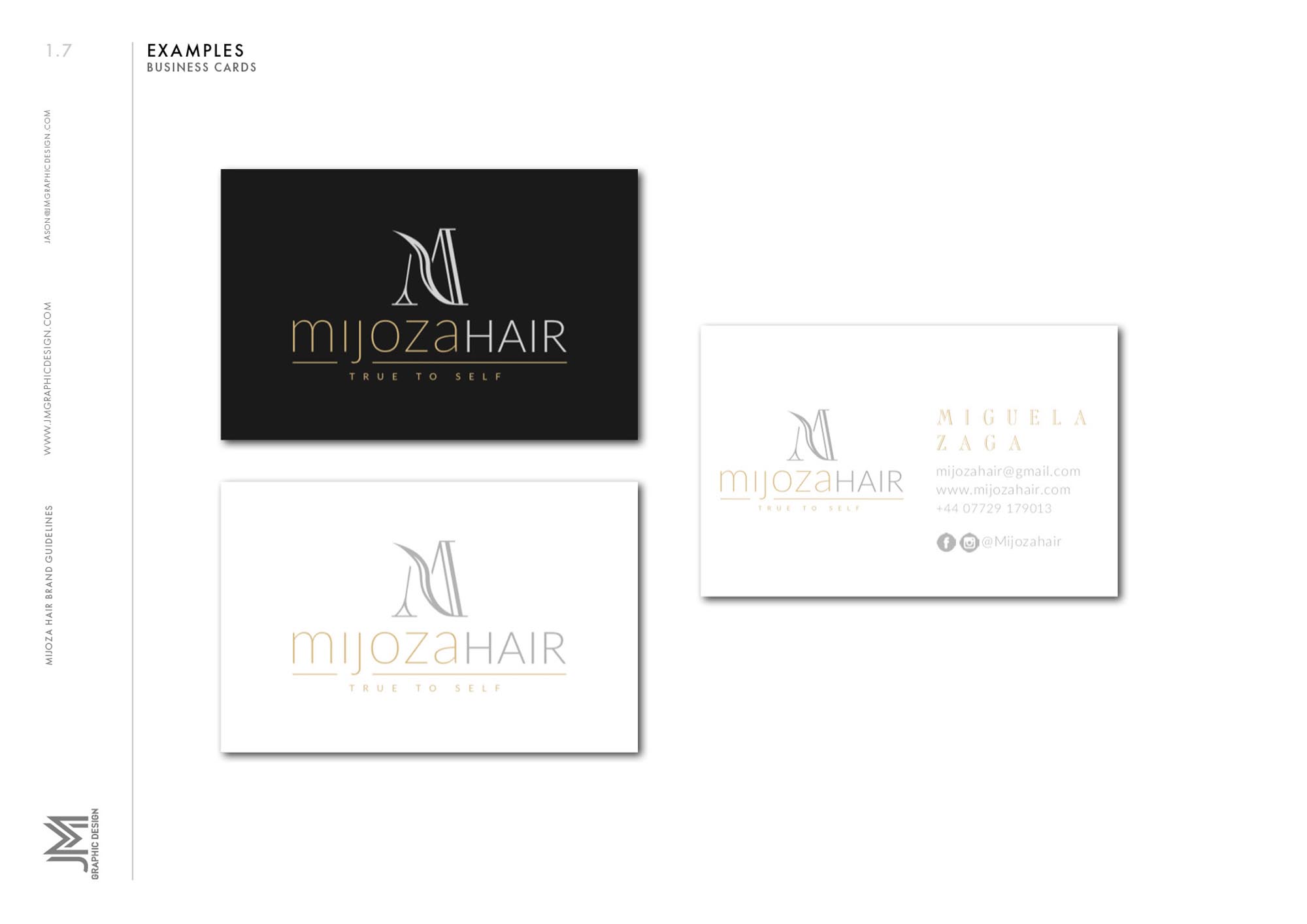
- Monogram/Submark: A simplified emblem derived from the core letterforms for stamps, stickers and social profiles.
- Palette & Tone: A softly premium neutral range that pairs comfortably with both warm and cool imagery, keeping focus on hair results.
- System Rules: Guidance for clear space, minimum sizes, watermark usage on photography, and layout rhythm for menus, aftercare cards and packaging.
Competitive Edge Now
The identity avoids clichéd beauty cues, presenting Mijoza as polished and trustworthy. The typographic discipline improves readability on small formats, while the submark ensures instant recognition across social and packaging—helping the brand feel cohesive online and in-salon.
What This Enables (forward-looking, no invented metrics)
A versatile foundation for premium service menus, product labeling, gift cards and campaign content—positioning Mijoza Hair to elevate perceived value, collaborate with partners, and expand into retail or education without losing visual coherence.


