I was commissioned to create the new brand identity for Studio Perissos, led by multi award winning artist & silversmith Theresa Theper (previously Theresa Nguyen). Theresa’s work is absolutely breathtaking, so to create brand identity that would do justice in representing such a talented artist was no small task! At the heart of the brand messaging had to be the exceptional quality and creativity the studio pour into all their work. We also wanted the tone to be exclusive and elegant on one hand (owning pieces), yet inclusive as far as the teaching, tutoring and training the studio offer to young people.
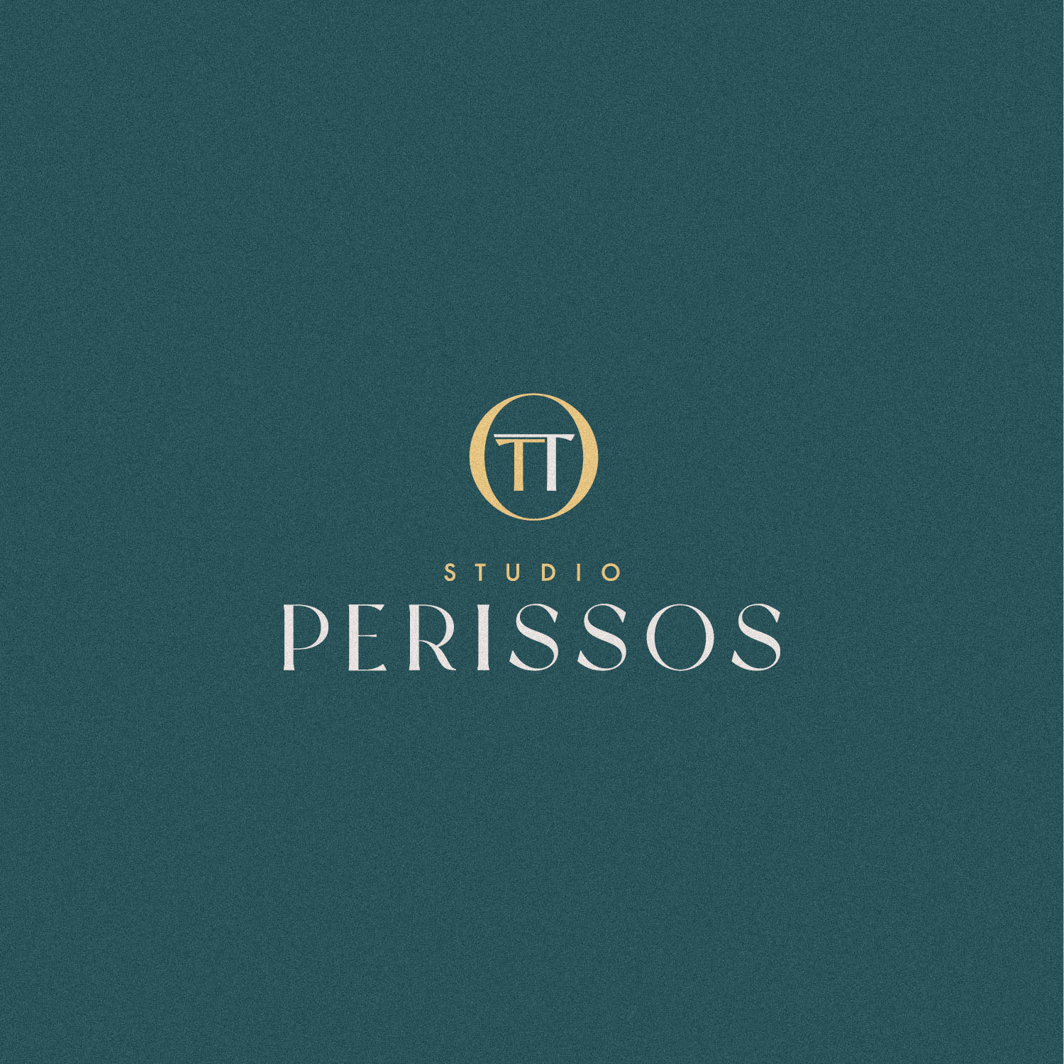
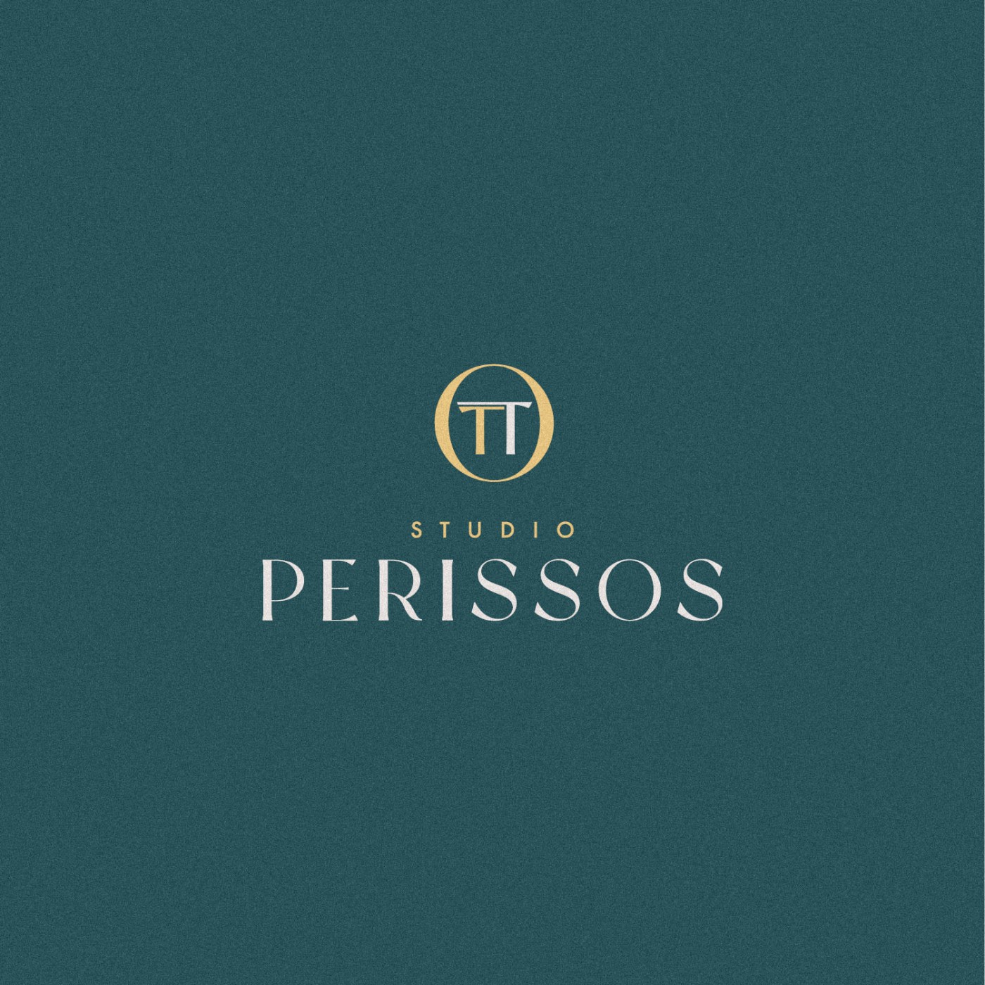
We felt an elegant monogram or lettermark would be perfect, as it could also be stamped on the silverwork – and rather than SP, we opted to use TT, Theresa’s initials. The form of the T has been manipulated to weigh heavy on one side, resembling a hammer used in smithing. Rather than use symetry, one larger T overlaps the other closely, with the two together losely forming a Pi symbol – which is a subtle nod that meant a lot to Theresa, with the geometry found in nature a large part of her work and inspiration. Finally the TT monogram is presented within the ‘O’ from Perissos, it’s oval form framing the monogram beautifully and forming an elegant symbol.
The font for Perisssos was customised by combining two preferred fonts, creating bespoke serifs, and the best portions of each to create something unique. The sweeping leg of the R is a particularly nice touch.
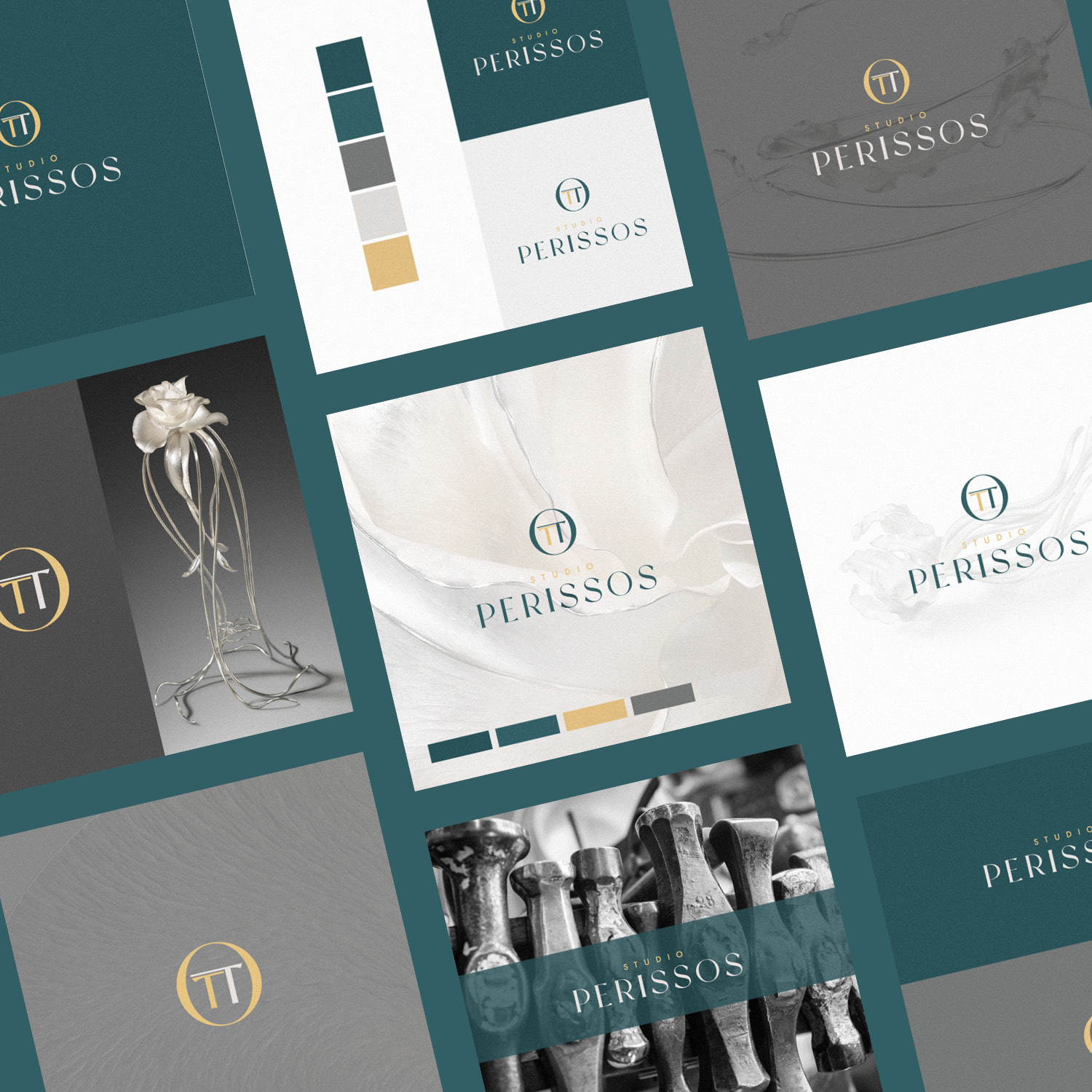
While we wanted to use colours that would compliment the silver and gold artwork often created, it was decided that a blue-green would work well as a core colour to compliment and contrast colours likely to be featured throughout their portfolio.
The results are stunning, and this is definately one of my all-time favourite projects – thanks largely to the close collaboration between the Studio and myself, and some of the subtle meaning we managed to tuck in to every facet of the identity.
Case Study
Opportunity
A multi-award-winning silversmith studio needed an identity that could stand beside museum-grade craft: elegant enough for collectors, practical enough to live on hallmark-style stamps and packaging, and warm enough to support teaching and mentorship.
Objectives
-
Create a mark with real maker’s-mark credibility (emboss, engrave, foil or stamp).
-
Balance exclusivity for owners with inclusivity for education/outreach.
-
Develop a distinctive typographic wordmark to pair with the symbol.
-
Select a palette that complements silver and gold without competing.
Insight & Strategy
Silversmithing is a dialogue between precision and force. The identity leans into that duality: controlled geometry, deliberate asymmetry, and subtle symbolism that rewards close looking. The aim was to feel like a contemporary classic—less ornament, more intention.
Identity Solution
-
Monogram: Two T initials (Theresa Theper) overlapped; one is weighted to one side to suggest the silversmith’s hammer. The overlap creates a quiet reference to π, nodding to the natural geometry that informs the studio’s work.
-
Framing device: The monogram sits within the oval “O” of Perissos—a cameo-like cartouche that functions beautifully as a seal, stamp or foil device.
-
Wordmark: Perissos set from a customised blend of two typefaces, with bespoke serifs and tuned spacing; the swept leg of the “R” gives a graceful signature without sacrificing clarity.
-
Palette: A measured blue-green chosen to flatter both silver and gold finishes, providing calm contrast for portfolio imagery.
-
System notes: Primary horizontal and compact lockups, clear-space and minimum-size rules, plus production guidance for stamping, deboss/emboss, and small-scale digital uses.
Competitive Edge Now
The identity reads as atelier-level: a symbol with genuine craft DNA, a wordmark refined for poise, and a colour world that elevates metalwork photography rather than fighting it. It’s memorable on a business card—and credible on the back of a piece.
What This Enables
Consistent presentation across commissions, exhibitions and packaging; maker’s-mark applications on metal and paper; and a unifying tone that supports both collectable work and the studio’s teaching, tutoring and training programmes.