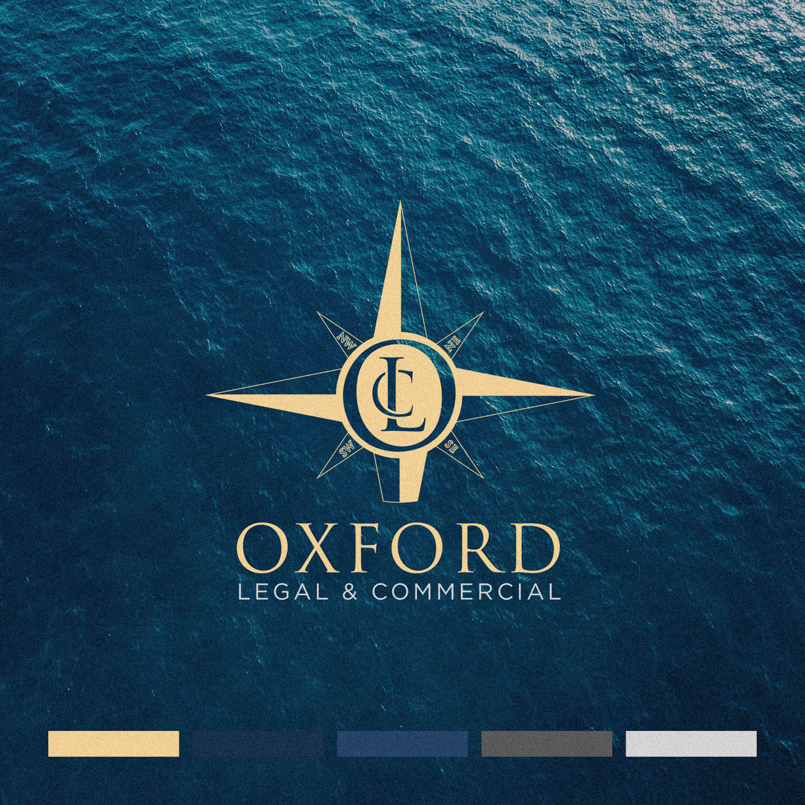
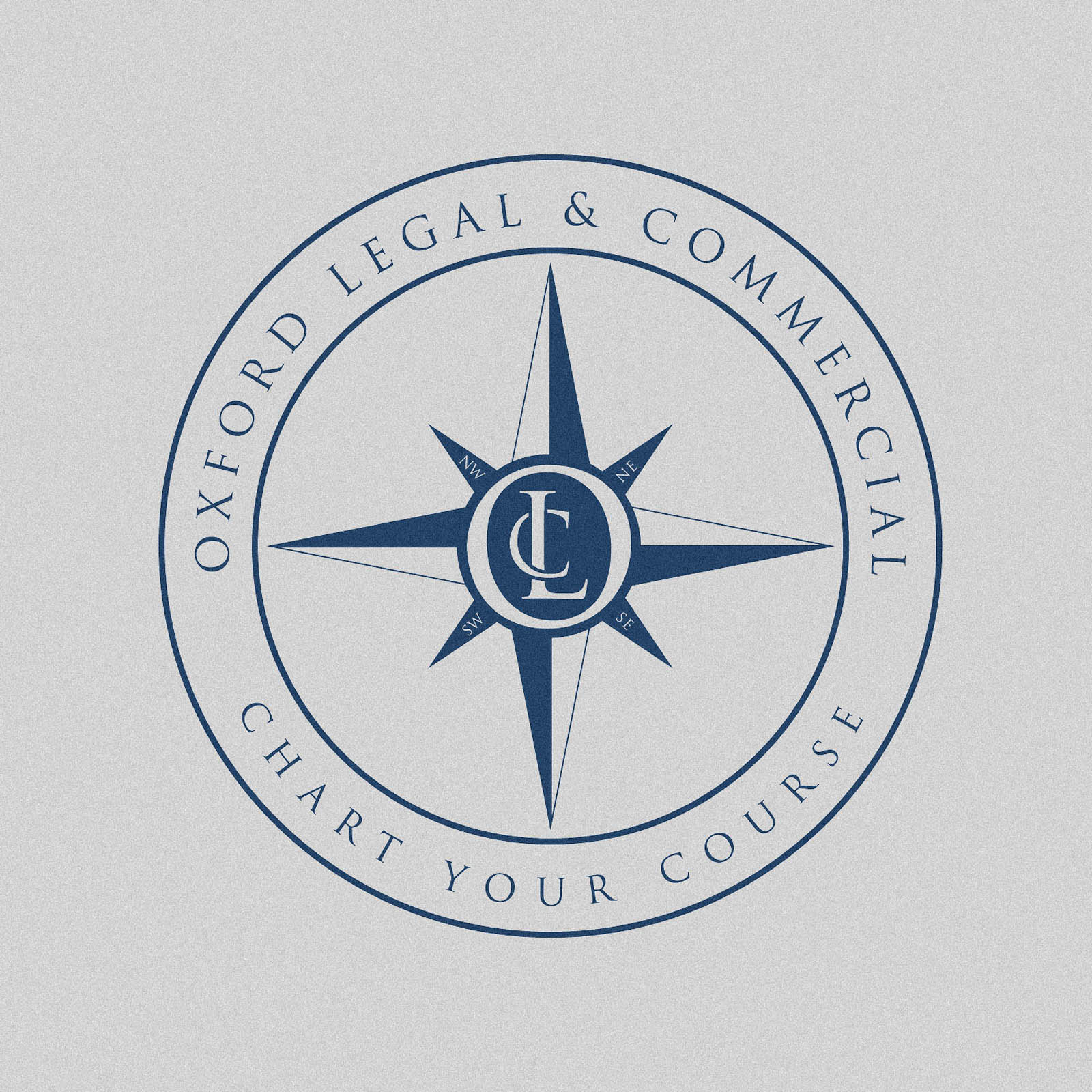
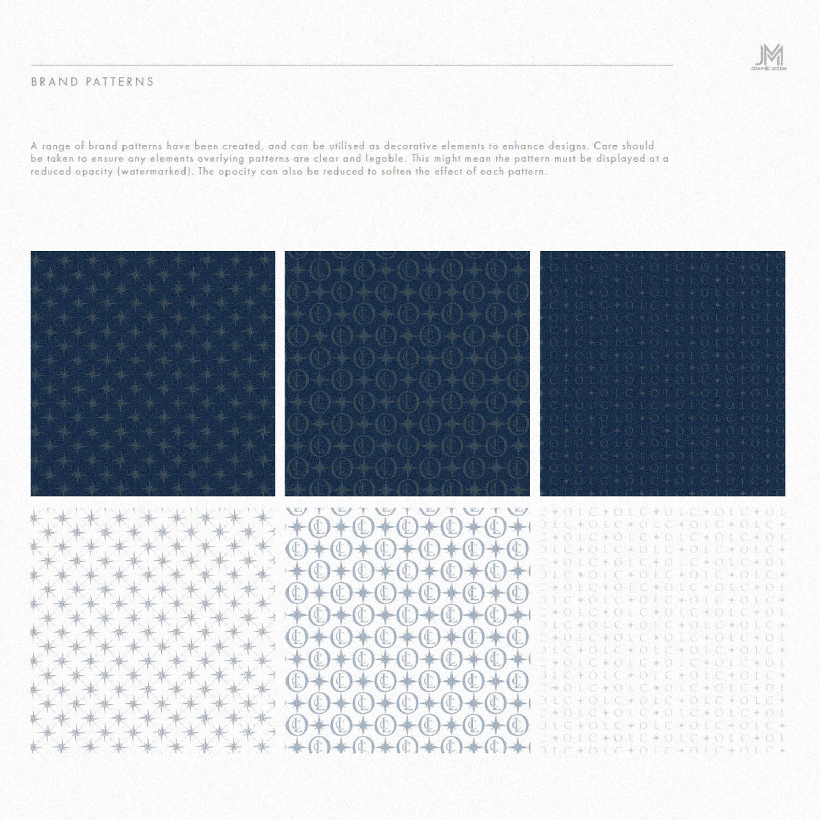
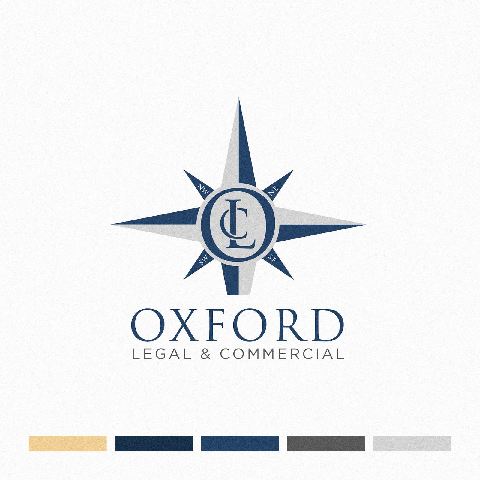
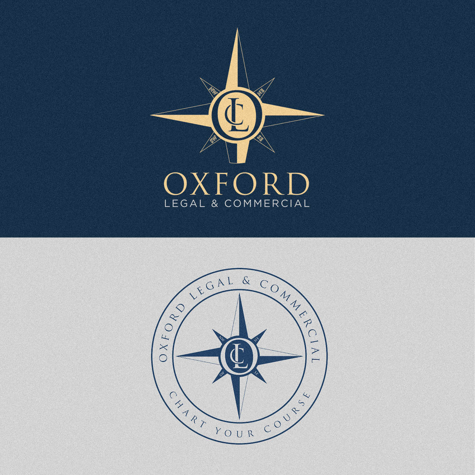
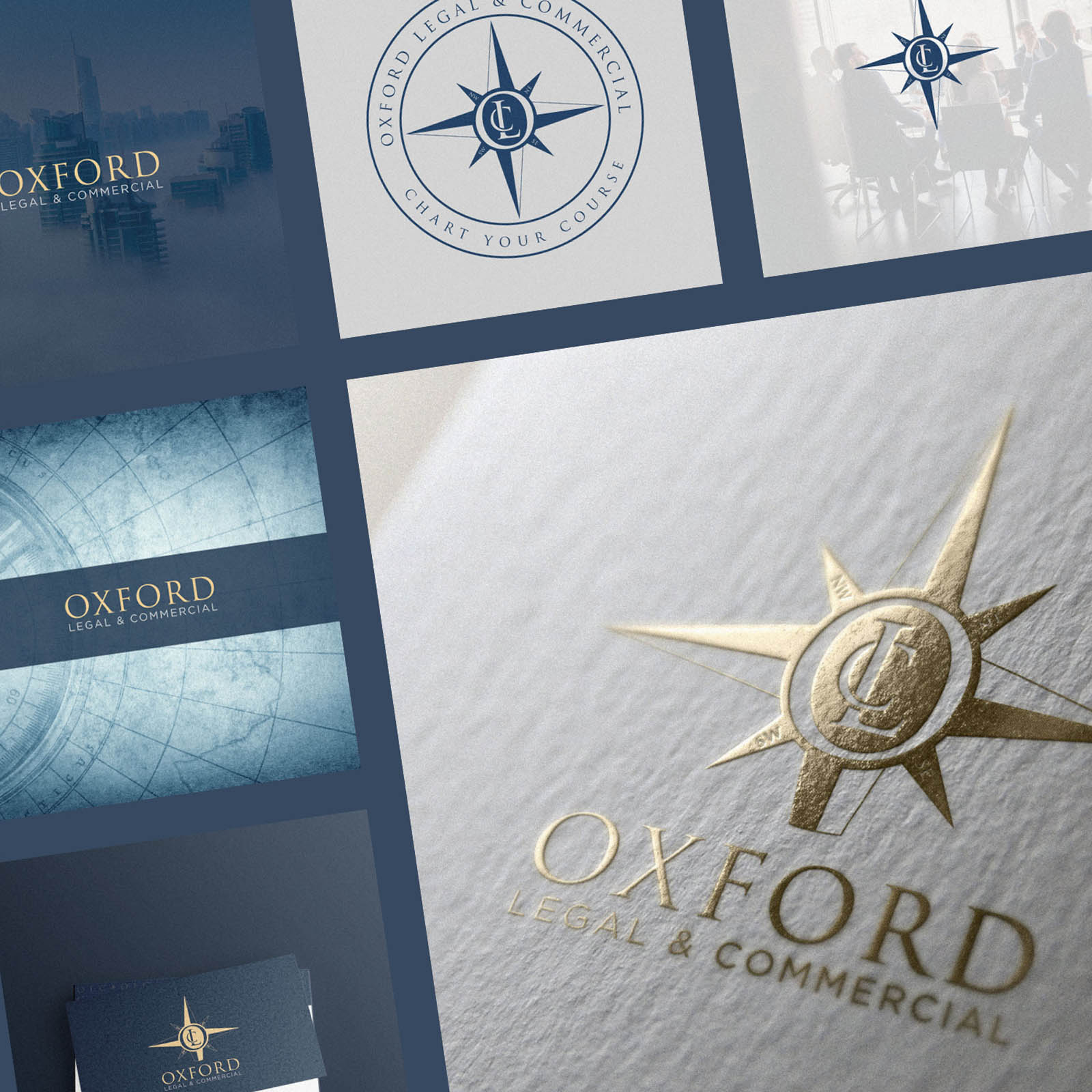
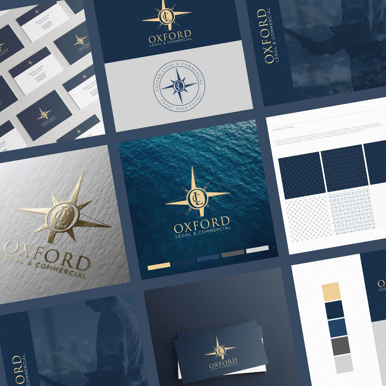
Oxford Legal & Commercial commissioned me to create their new brand identity, to include a logo, submark, logotype, badge mark, monogram and brand patterns; full scope. It was a real pleasure working with their team, who had a clear vision we were able to colaboratively bring to life.
As Oxford LC help their clients navigate various legal and practical matters related to the efficient and successful running of a business, they wanted to a compass as the brand symbol, to play on this analogy. We decided the compass would be the perfect place to house a custom monogram; therefore transforming it from a generic symbol to something ownable with a clear link to the brand. Part of the process included determining how each seperate element would work together, and which situations each is best used in.
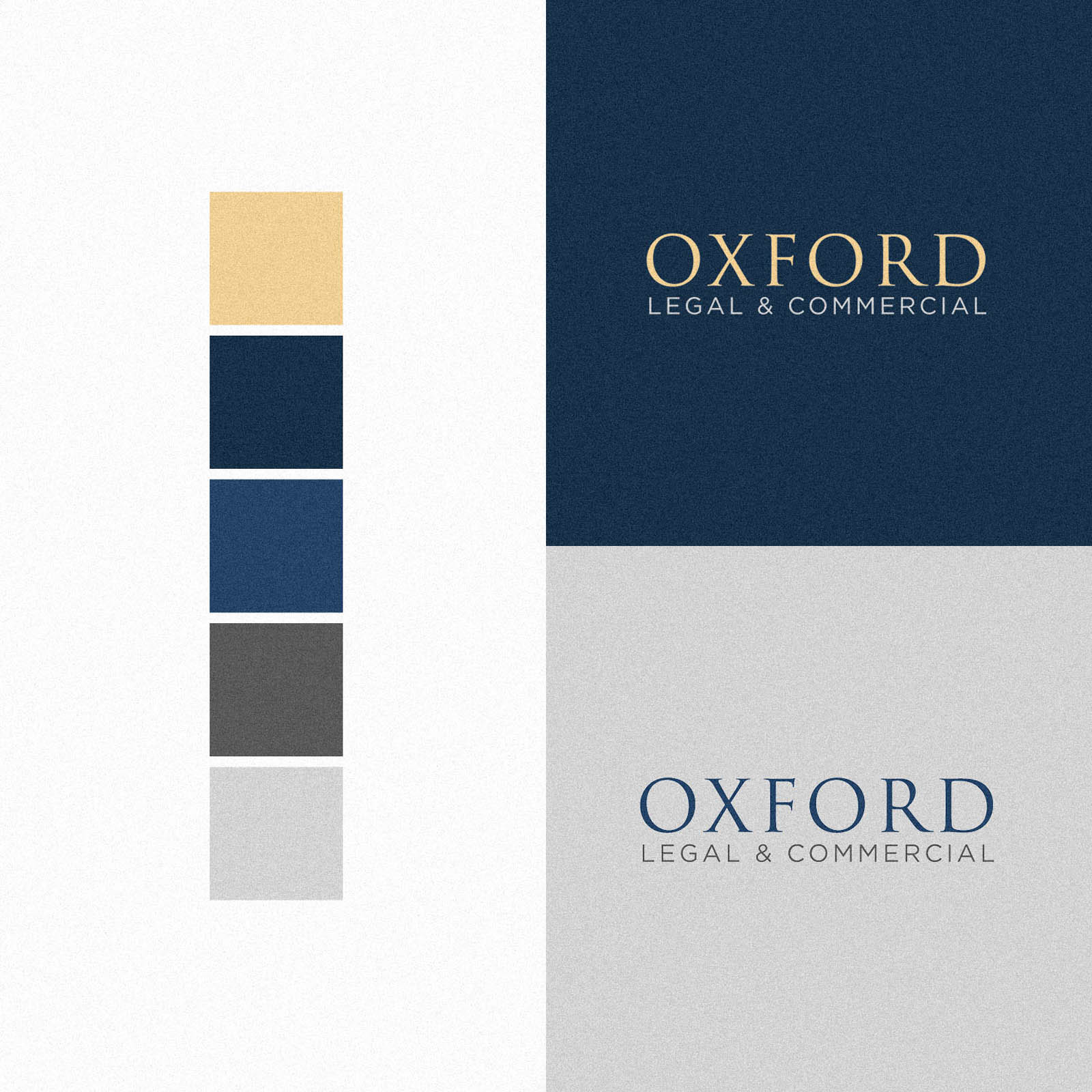
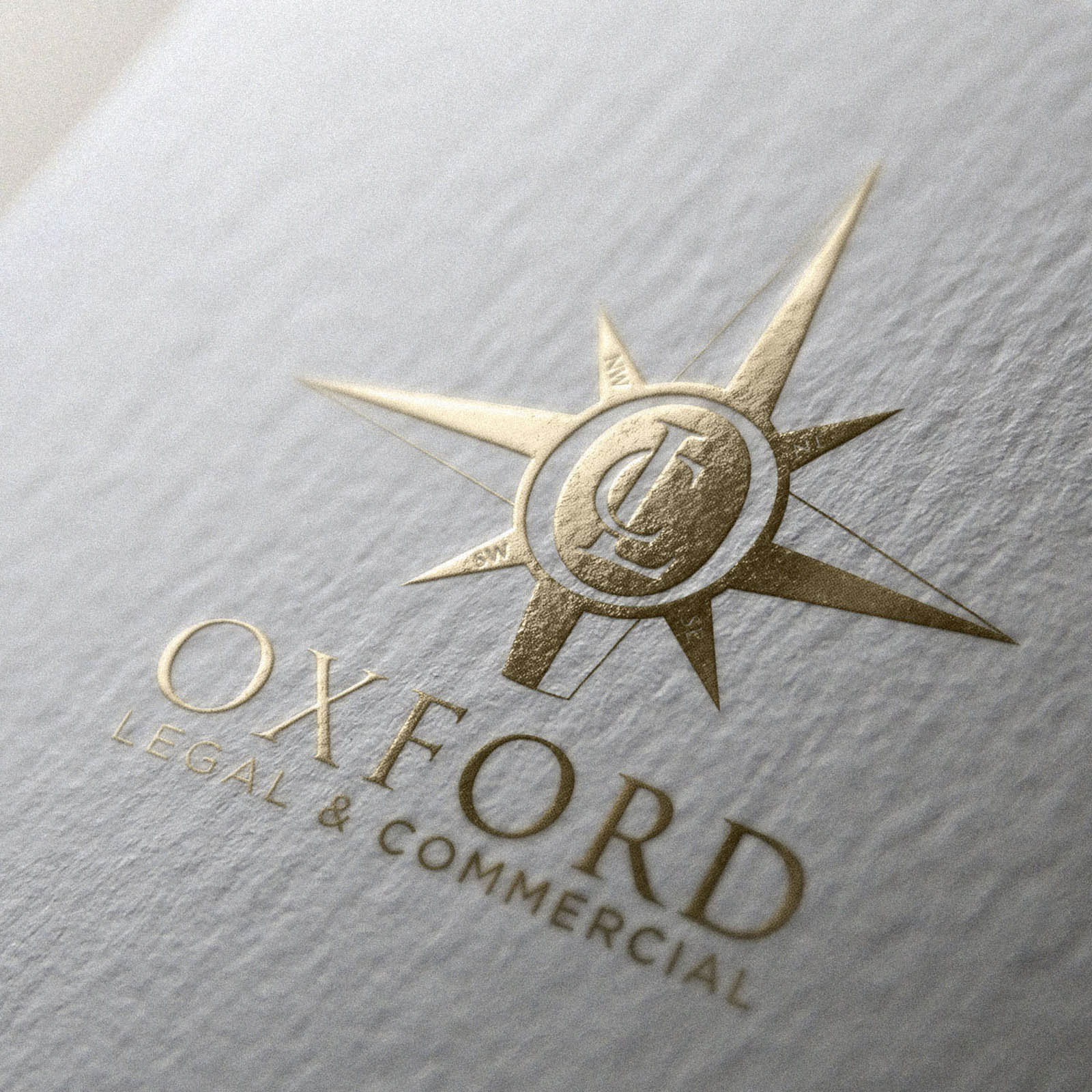
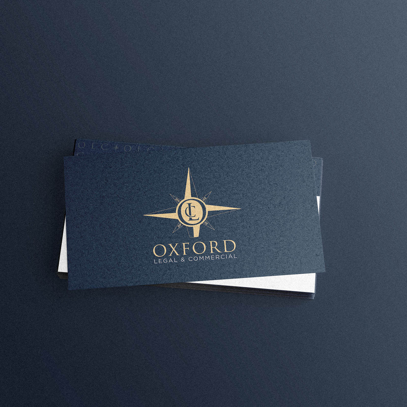
The natical theme evolved as we considered imagery and a complimentary colour palette, with gold used as an accent to ensure the correct positioning as a premium, high end brand.
Be sure to check out the latest generation WordPress Website I design and developed for them using the new brand identity here; Oxford LC Website Design.
Case Study
Opportunity
Professional services brands often default to generic corporate symbols. Oxford LC wanted a mark that truly reflected how they guide clients through complex legal and commercial decisions. The brief created space for a symbolically rich, premium identity with real ownership.
Objectives
-
Deliver a complete identity suite: logo, logotype, submark, badge mark, monogram and brand patterns.
-
Build a flexible system with clear rules for where each element works best (from documents to digital).
-
Establish a premium palette and finish options that read high-end, not ornamental.
Insight & Strategy
“Guidance” was the thematic North Star. We explored the compass as a category-familiar device, then made it distinct by engineering it around a custom monogram—turning a common metaphor into an ownable asset. Nautical cues remain subtle; the tone stays corporate, calm and assured. Gold appears as a controlled accent to reinforce premium positioning without overwhelming the palette.
Identity Solution
-
Core symbol: A compass form housing a bespoke monogram, creating an immediately recognisable, proprietary device.
-
Wordmark & lockups: Refined spacing and proportions across horizontal and compact arrangements; clear minimum sizes protect legibility in small applications.
-
Submark & badge mark: Purpose-built for micro contexts—favicons, social avatars, seals—where the full logo would be too fine.
-
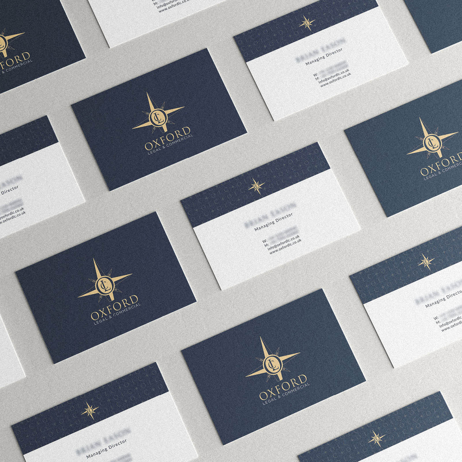
Patterns: A modular set derived from the compass geometry for subtle background texture in presentations and stationery.
-
Colour & finishes: A disciplined, corporate palette with gold as an accent for elevated touchpoints (foil, metallic ink, or digital highlights).
-
System guidance: Practical usage notes indicate which mark to deploy by context (long-form documents, covers, small digital, signage).
Competitive Edge Now
The identity communicates guidance and assurance at a glance while avoiding generic category tropes. The monogrammed compass is both meaningful and memorable; the restrained palette and lockups keep communications clear and premium across every touchpoint.
What This Enables
Stronger recognition across proposals, reports and digital; consistent execution by internal teams; and a scalable foundation carried through to the website—maintaining a composed, high-end presence as the firm evolves.


