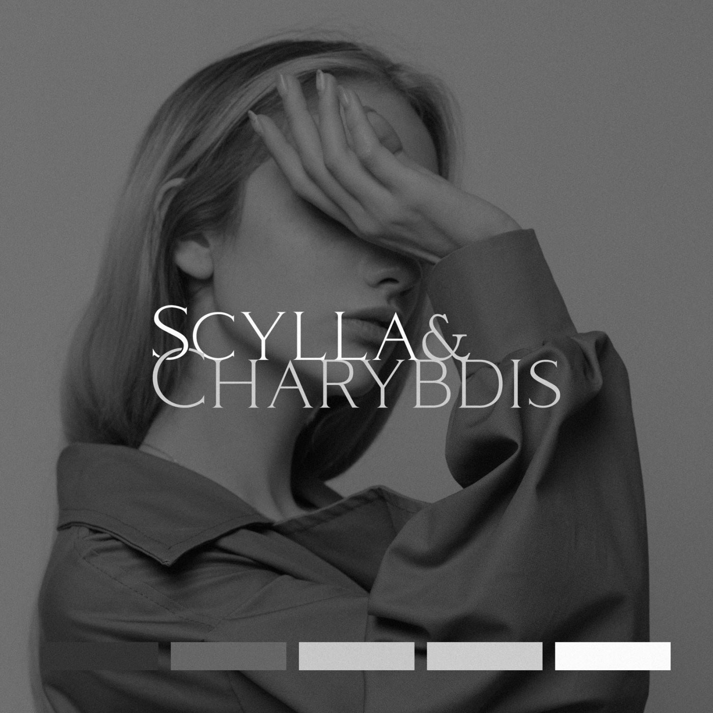
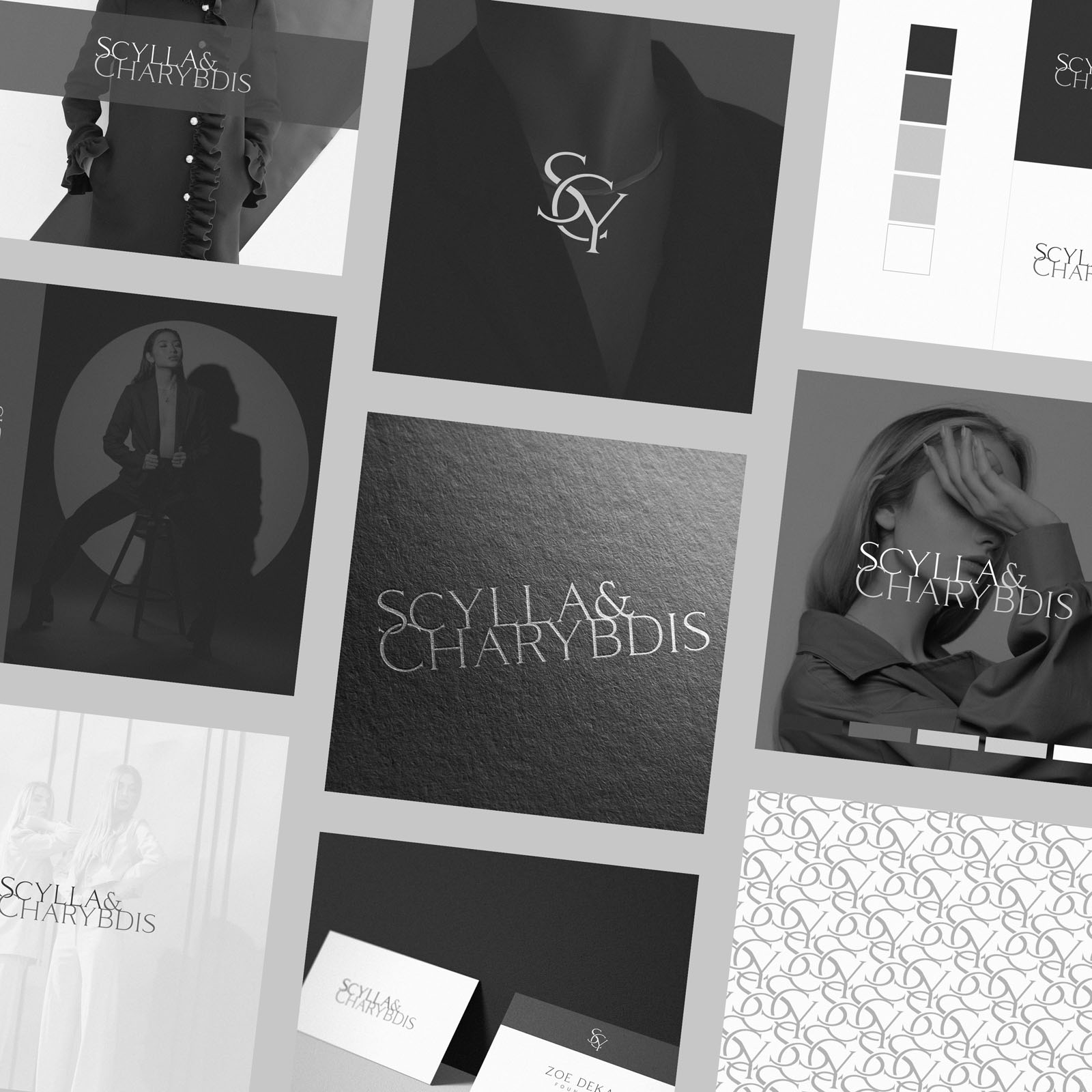
I was commissioned to create new brand identity for Scylla & Charybdis, a contemporary fashion brand aimed at delivering sustainable, affordable luxury. The brand needed to indicate a high quality, individual and modern approach, but with strong ties to the traditional and a rich heritage feel.
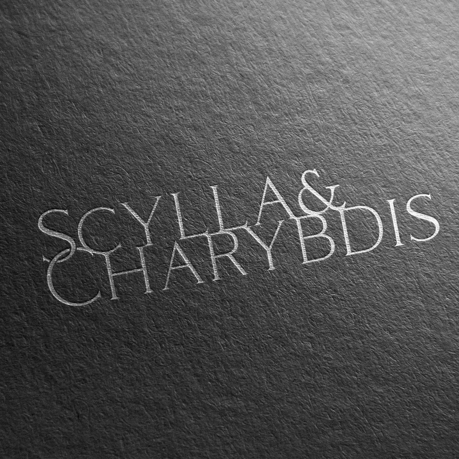
We explored a wide range of options, but decided a typographic approach with a unique monogram symbol was the ideal direction. On finding a beautiful and unique typeface, we experimented with the interaction between characters; arriving at a varation where the two lines of type felt extremely close, intertwined.
The sharp and almost hook-like serifs on the characters are a subtle nod to the origins of the brand name; inspired by mythical sea monsters who would lure in sailors. We considered creating a brandmark depicting these sea monsters, but decided the typographic approach was a more fitting option; instead allowing the brands name-sake to inspire the style of type.
Case Study
Opportunity
A contemporary fashion brand focused on sustainable, affordable luxury needed an identity that feels high-quality and individual, yet anchored to tradition. There was space for a solution that blends modern restraint with a quietly heritage tone—without resorting to literal mythic imagery.
Objectives
-
Express premium craft and individuality while signalling a rich, classical sensibility.
-
Lead with typography and introduce a compact monogram for small-scale uses.
-
Create a lockup that visually suggests closeness/interweave between the two name elements.
-
Keep the system elegant and timeless across labels, packaging and digital.
Insight & Strategy
Rather than draw the namesake sea monsters, we let the story inform the letterforms. The brand’s dual name suggested closeness and tension; sharp, almost hook-like serifs carry a subtle nod to origin while the composition keeps things editorial and wearable. The result feels considered and modern, with heritage cues embedded in the type.
Identity Solution
-
Typographic wordmark: Built around a distinctive typeface, with careful spacing and interline proximity so the two lines read as intertwined—close, poised, and instantly recognisable.
-
Monogram: A minimal, purpose-built symbol derived from the letterforms for tags, hardware, avatars and other micro contexts where the full name would be too fine.
-
System & usage: Primary horizontal/stacked arrangements with clear-space and minimum-size guidance ensure the identity holds together on labels, packaging details and digital applications.
Competitive Edge Now
The mark conveys a story without illustration: contemporary clarity, historic poise, and a memorable silhouette at a glance. It avoids category clichés, reads premium on product and print, and carries through to small formats via the monogram.
What This Enables
A coherent presence from garments to e-commerce; elegant, legible branding at macro and micro scales; and room to extend into future collections while preserving the brand’s sustainable, modern-heritage character.


