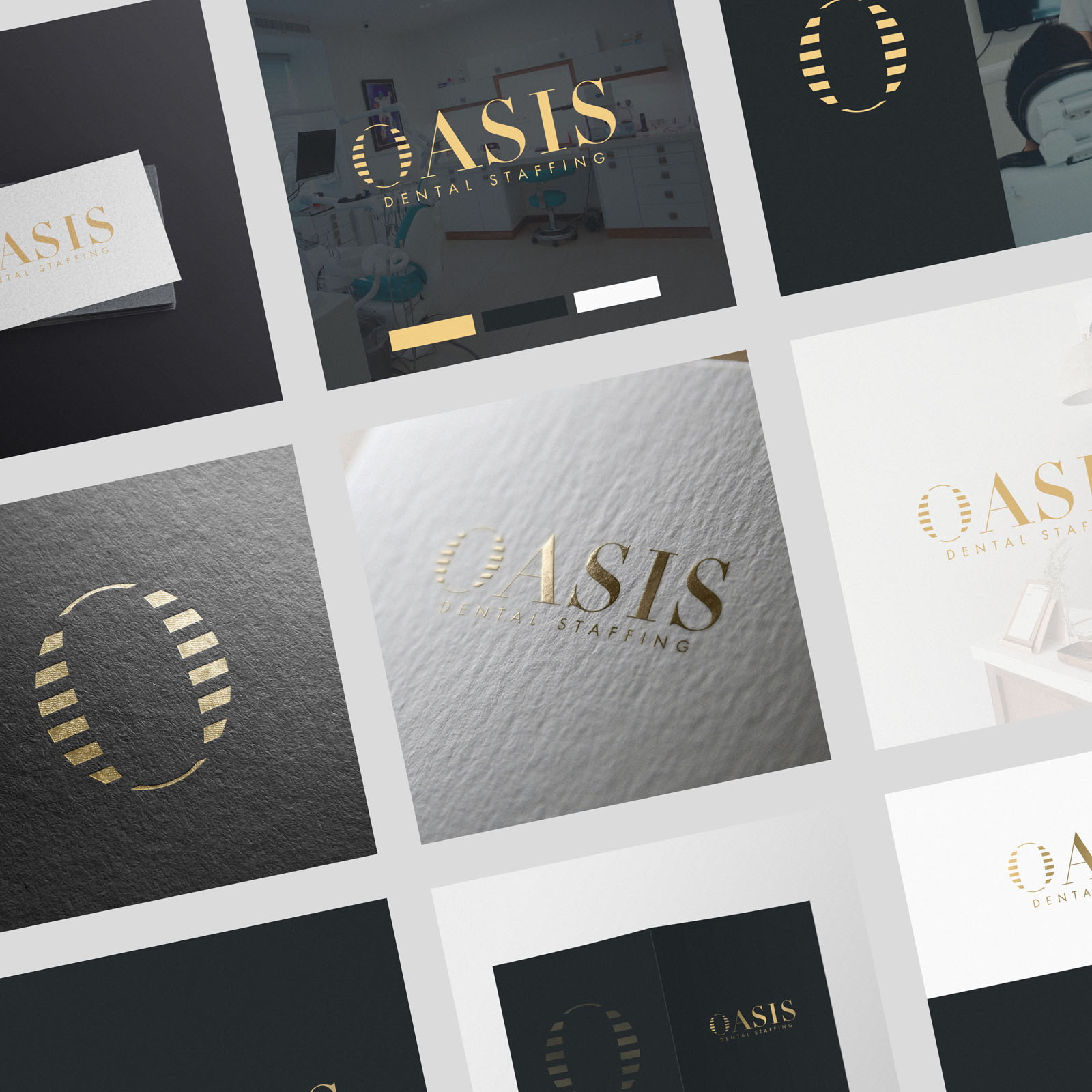
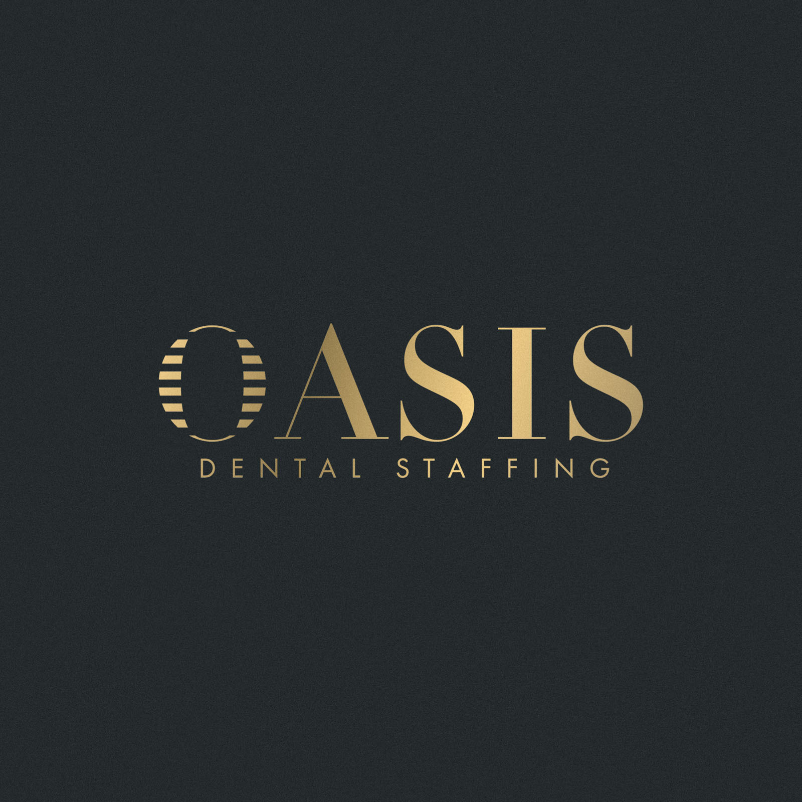
Oasis Dental Staffing are an agency based in Charleston, SC USA, and specialize in temporary placement of dental hygienists, dental assistants and dental admin. The brand identity we developed was to feel high end and even luxurious, aligning with the private dental practices Oasis partner with.
We wanted a simple but unique and memorable logo, with an element which could be used as a brandmark or submark if possible. The selected concept came about as a mixture of inspiration from a play on the word ‘Oasis’, the idea of water shimmering in the dessert, with a unique treatment to the ‘O’ depicting this in an abstract way; but also from the layout of our teeth, as the O losely resembles a dental map of teeth! This concept was developed to look elegant and aesthetically pleasing, finished with a smart gold / black / white colour treatment that feels as luxurious as intended.
Case Study
Opportunity
Private dental practices expect suppliers to look as polished as they do. For a staffing agency placing hygienists, assistants and admin into high-end clinics, a generic “medical” look would undersell the offer. There was room for a luxurious, memorable identity that aligns with private practice standards while feeling distinctly Oasis.
Objectives
-
Signal trust, quality and discretion at a glance.
-
Create a simple mark with enough character to work as a submark/brandmark at small sizes.
-
Establish a refined colour world suitable for premium print and digital use.
Insight & Strategy
We avoided literal teeth icons and leaned into a dual metaphor true to the name and category. The brand’s centrepiece became a crafted “O”: an abstract shimmer referencing an oasis in the desert, and a subtle nod to the dental arch layout. The tone: calm confidence, not clinical sterility.
Identity Solution
-
Core mark & wordmark: A unique “O” integrated into a clean typographic wordmark, engineered for instant recognition and small-scale clarity (badges, social, favicons).
-
Submark: The “O” extracted as a standalone seal for micro contexts and premium accents.
-
Palette: Black / white with gold accents—timeless, luxurious, and production-friendly for foil, metallic ink and digital highlights.
-
System: Defined lockups, clear-space and minimum-size rules ensure the identity stays elegant across website, proposals and recruitment collateral.
Competitive Edge Now
Versus the usual dental clichés, Oasis presents a composed, high-end presence anchored by a distinctive mark. The crafted “O” reads instantly, the palette elevates perceived value, and the system stays usable under day-to-day pressures.
What This Enables
Stronger alignment with premium private practices, more confident partner communications, and a scalable visual language that extends to digital assets, print pieces and hiring campaigns—without losing the poised, luxurious feel.


