I was commissioned to create the new brand identity for Renascentia, who produce high-quality, natural and non-toxic candles made from essential oils and natural waxes. We carefully crafted the identity to feel rich, luxurious and indulgent.
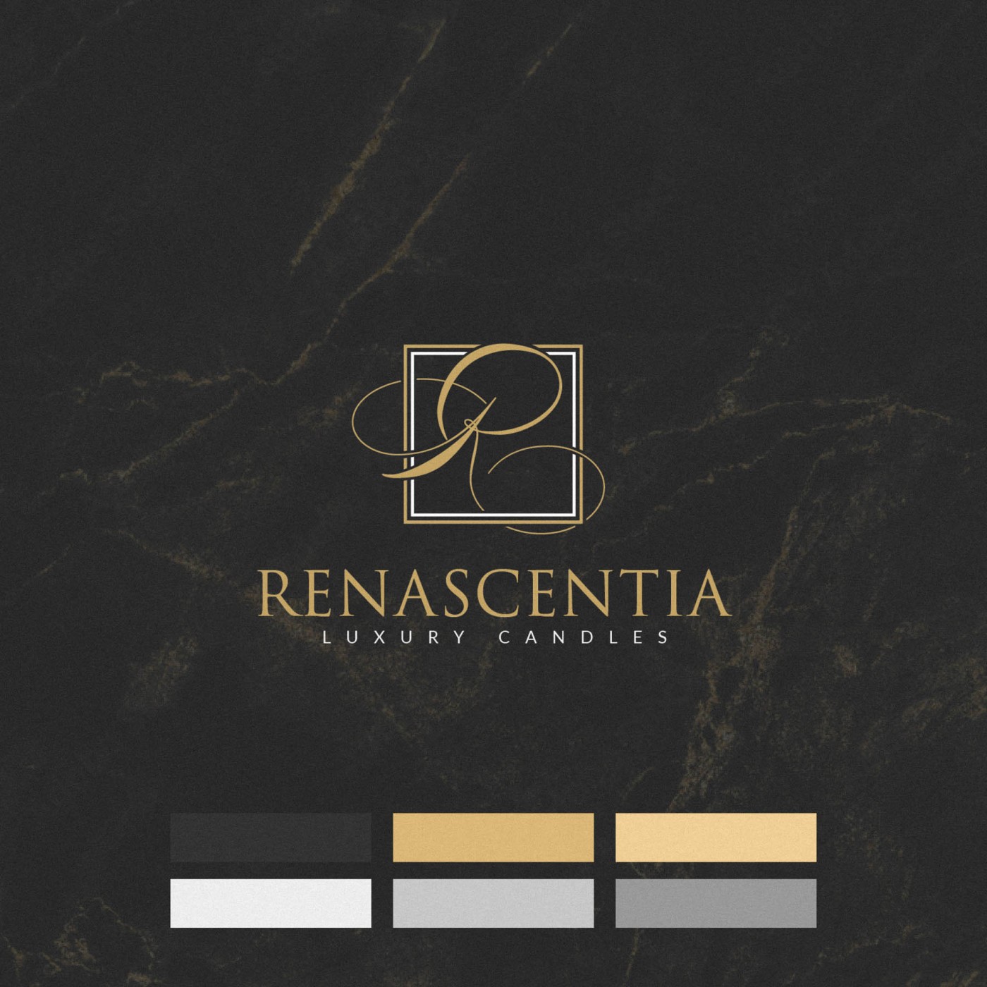
A custom ‘R’ lettermark conveyed the sense of indulgence, with the sweeping letterform almost mirroring the gentle swirls of smoke released as you light the candles – while the main logotype feels classically luxurious and exclusive.
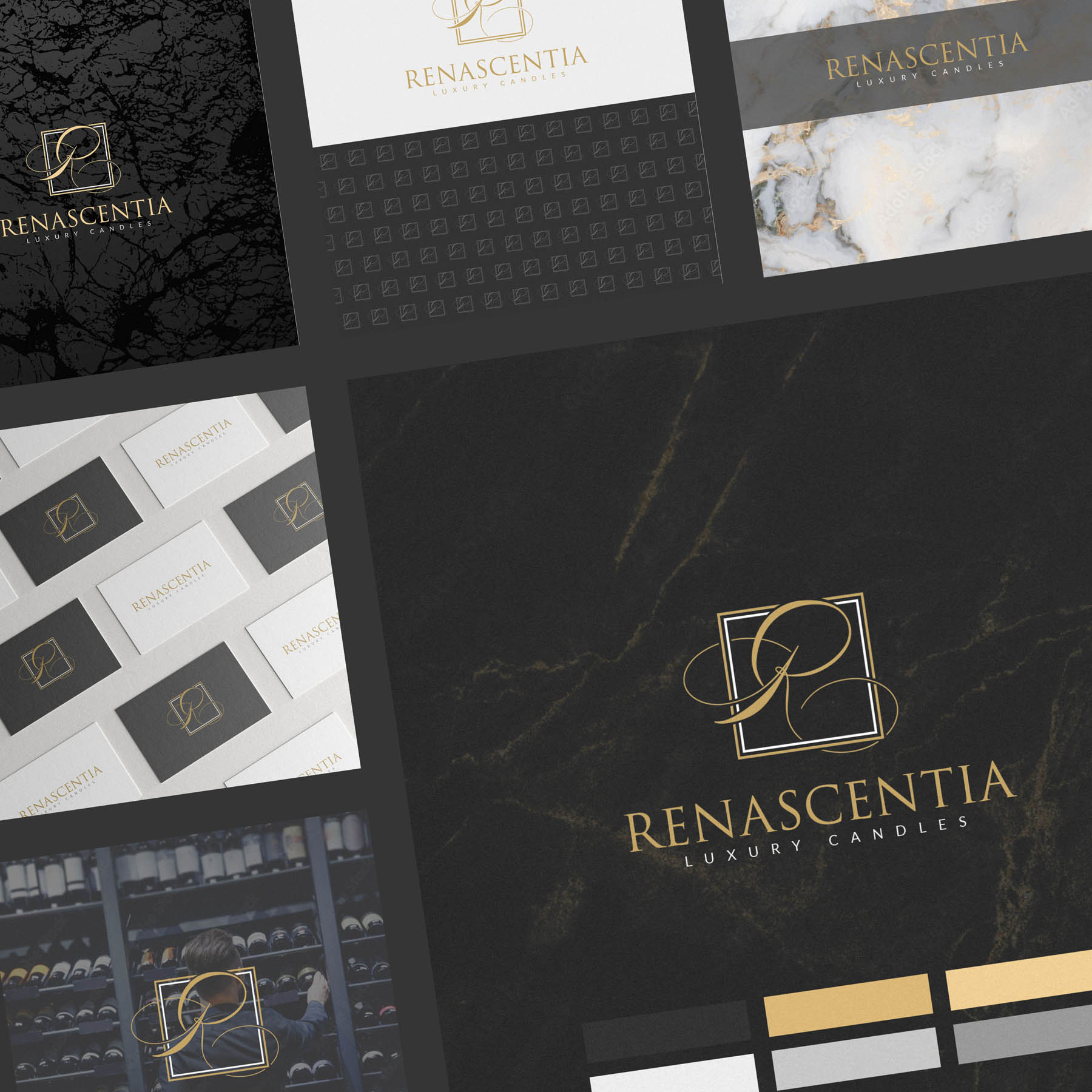
As well as defining a colour palette, fonts, logo and lettermark; other elements of the identity included a repeating brand pattern, watermark and background imagery selection.
Case Study
Opportunity
Premium candle buyers want two assurances at once: natural purity and indulgent luxury. In a category crowded with generic “eco” cues, there was space for a brand that feels sensorial and refined while clearly communicating non-toxic, essential-oil craftsmanship.
Objectives
-
Express a rich, luxurious character that aligns with high-quality, natural candles.
-
Create a distinctive lettermark and wordmark pairing that reads as exclusive and elegant.
-
Build a system beyond the logo: colour world, repeating pattern, watermark and imagery direction.
Insight & Strategy
Ritual is central to the product experience—the moment of lighting, the soft plume of initial smoke, the calm that follows. We translated that sensorial arc into quiet opulence: composed typography, generous spacing and a signature “R” gesture that nods to the candle’s first swirl without resorting to illustration.
Identity Solution
-
Lettermark: A custom “R” with a sweeping stroke that subtly echoes the gentle curl of smoke as a candle is lit—ownable, memorable, and calm.
-
Wordmark: Classically luxurious typography tuned for poise and small-size clarity, creating a timeless counterpoint to the expressive “R”.
-
System elements: A refined palette, supporting type styles, a repeating brand pattern, a watermark for subtle branding, and background imagery selection that favours tactile, atmospheric scenes to reinforce indulgence and purity.
Competitive Edge Now
The brand communicates natural luxury at a glance—distinct from “green” clichés and from shouty prestige packaging. The custom “R” becomes the recall device; the restrained system supports premium storytelling across touchpoints without competing with scent or materials.
What This Enables
A cohesive platform for packaging, product photography, and online retail; room for seasonal editions and gift sets while keeping a consistent, high-end tone; and clearer alignment between the product’s clean formulation and its sensorial, indulgent experience.


