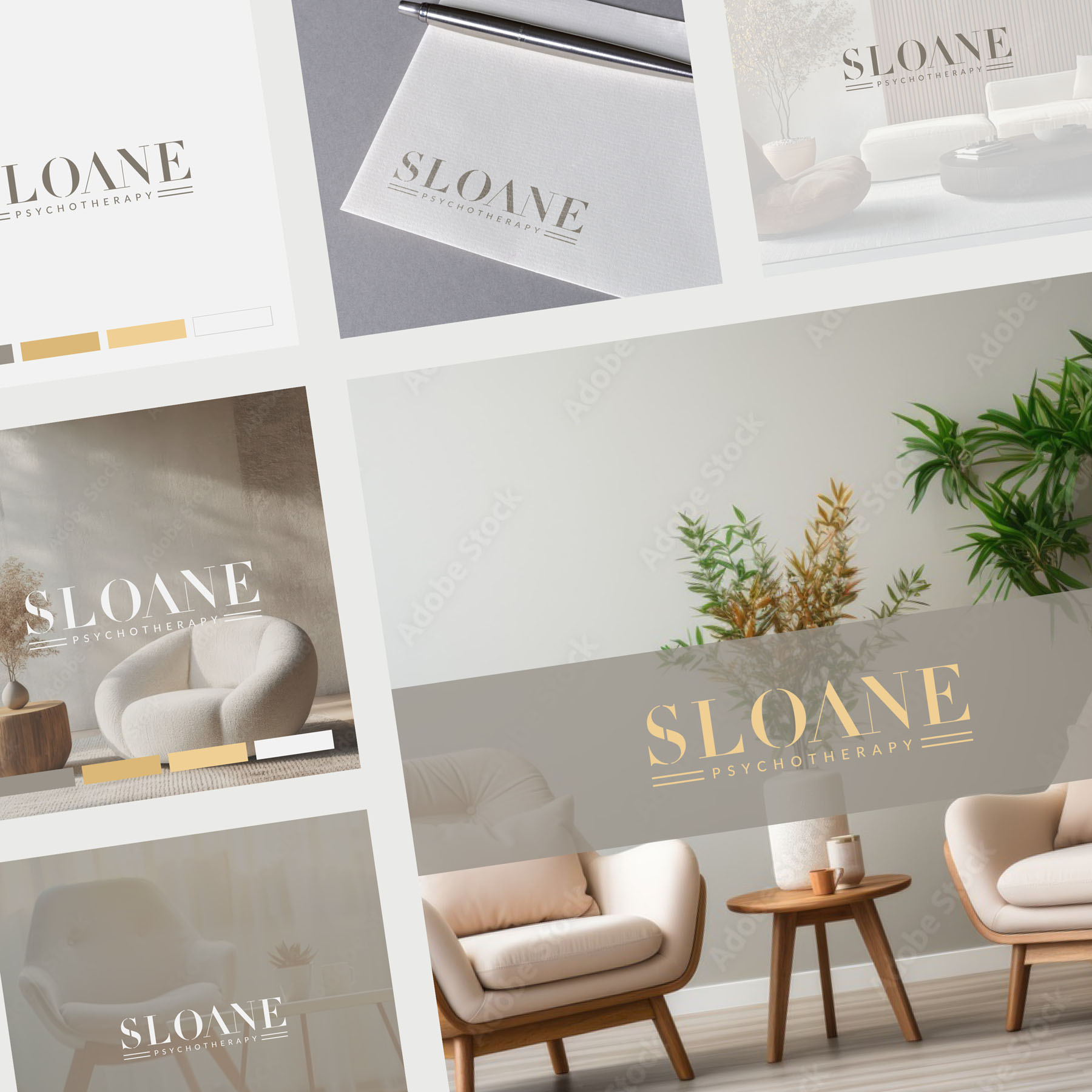
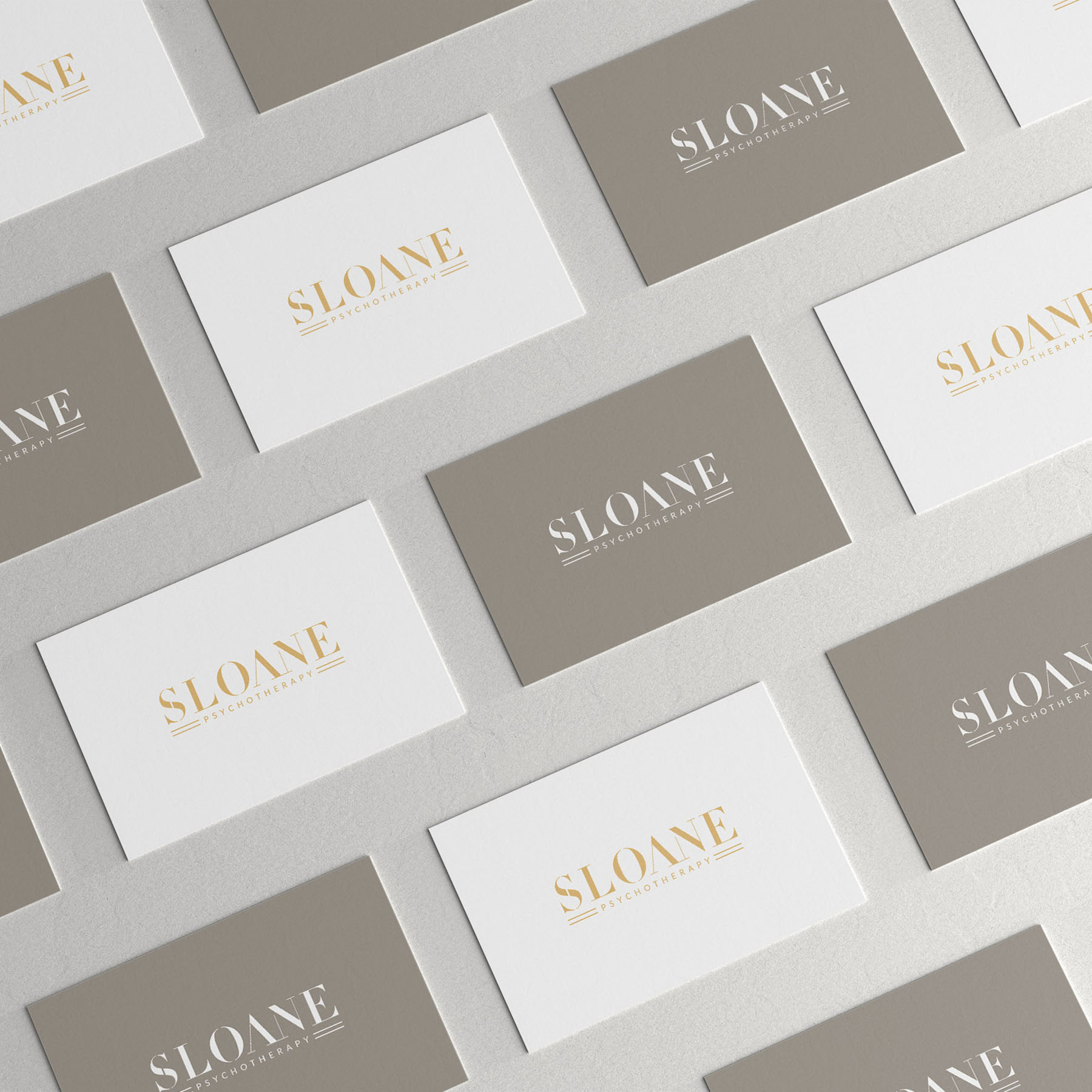
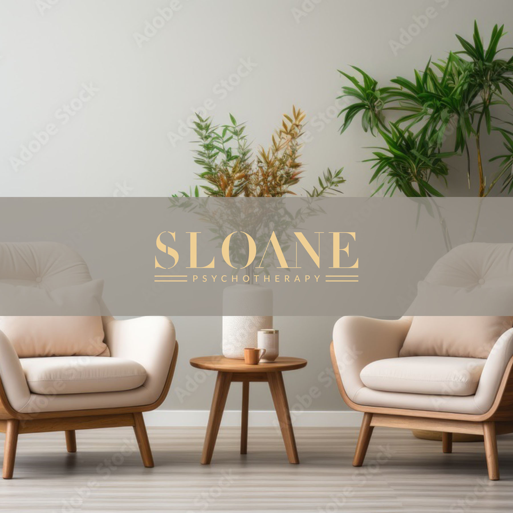
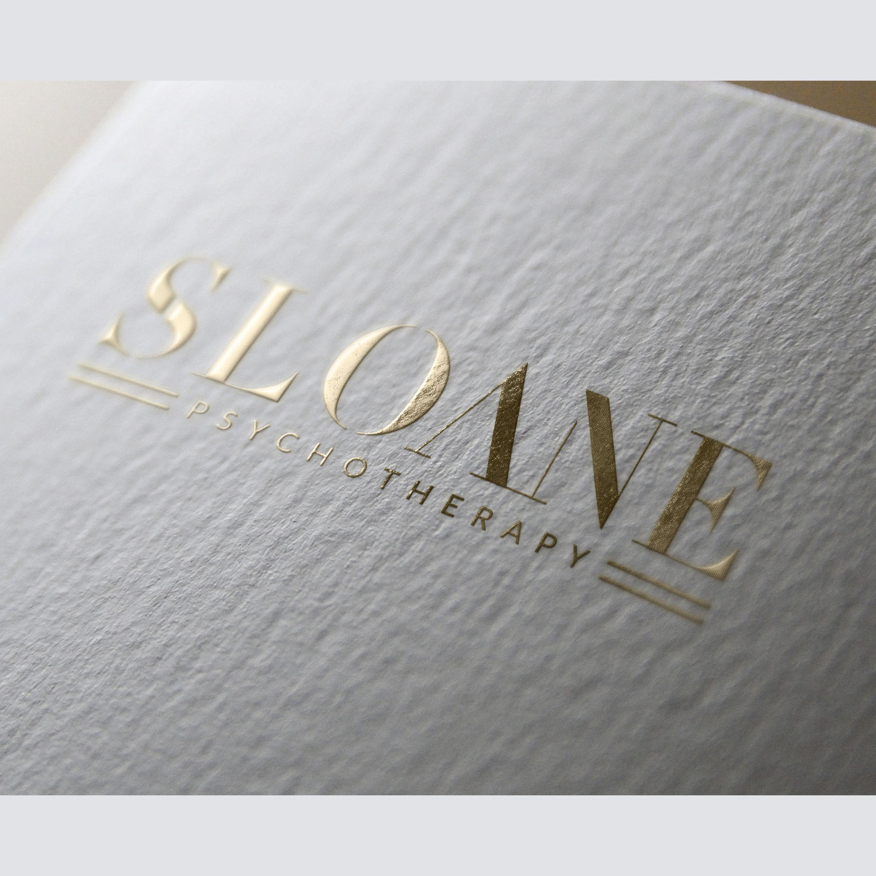
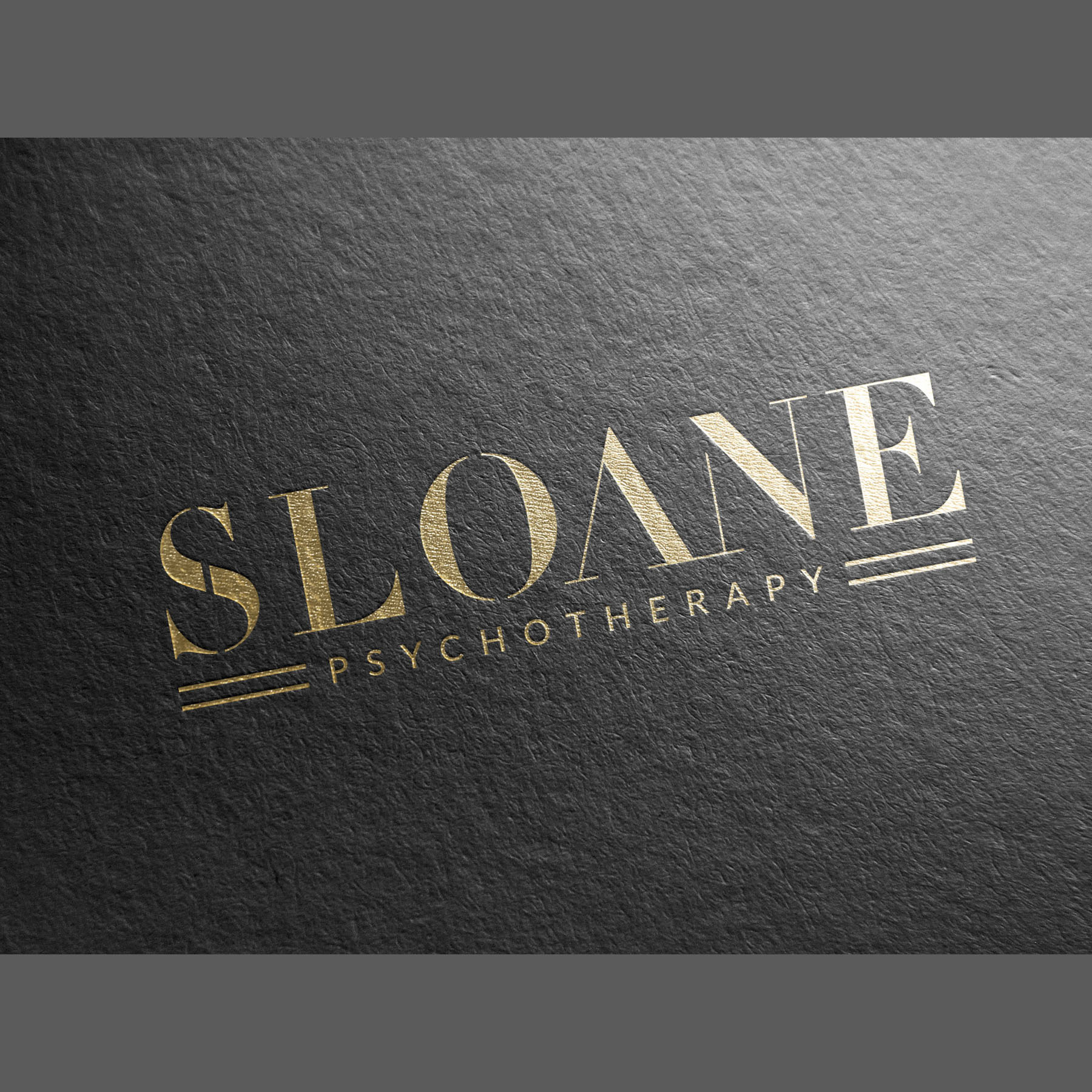
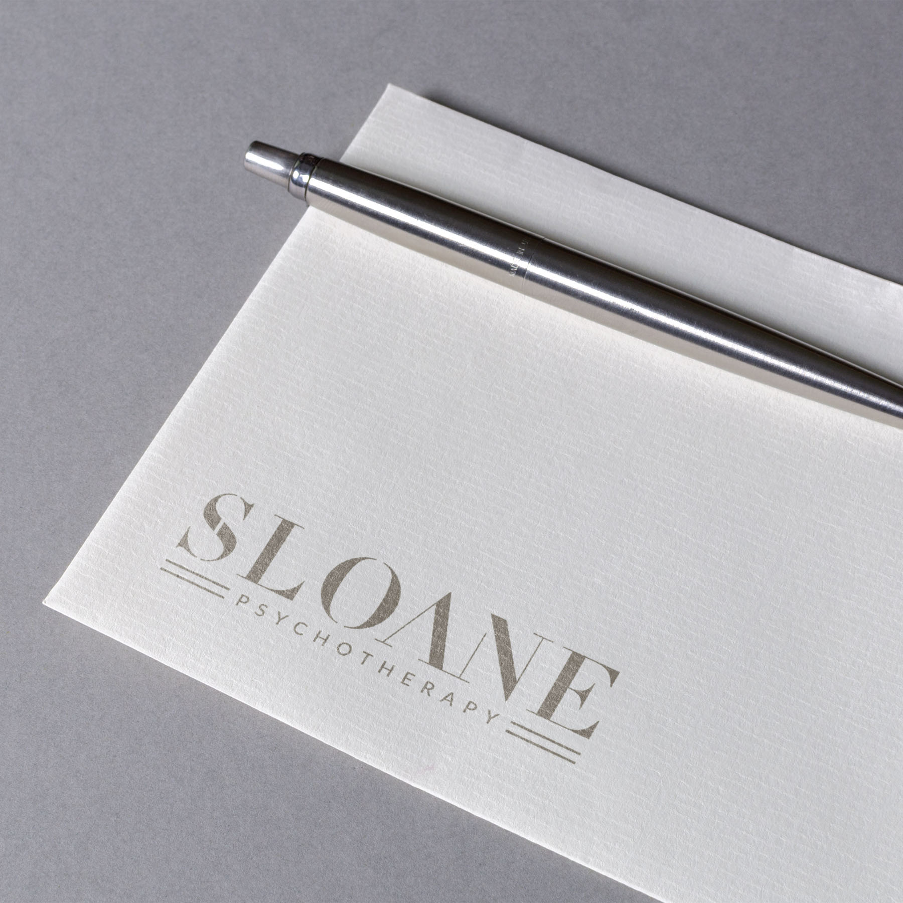
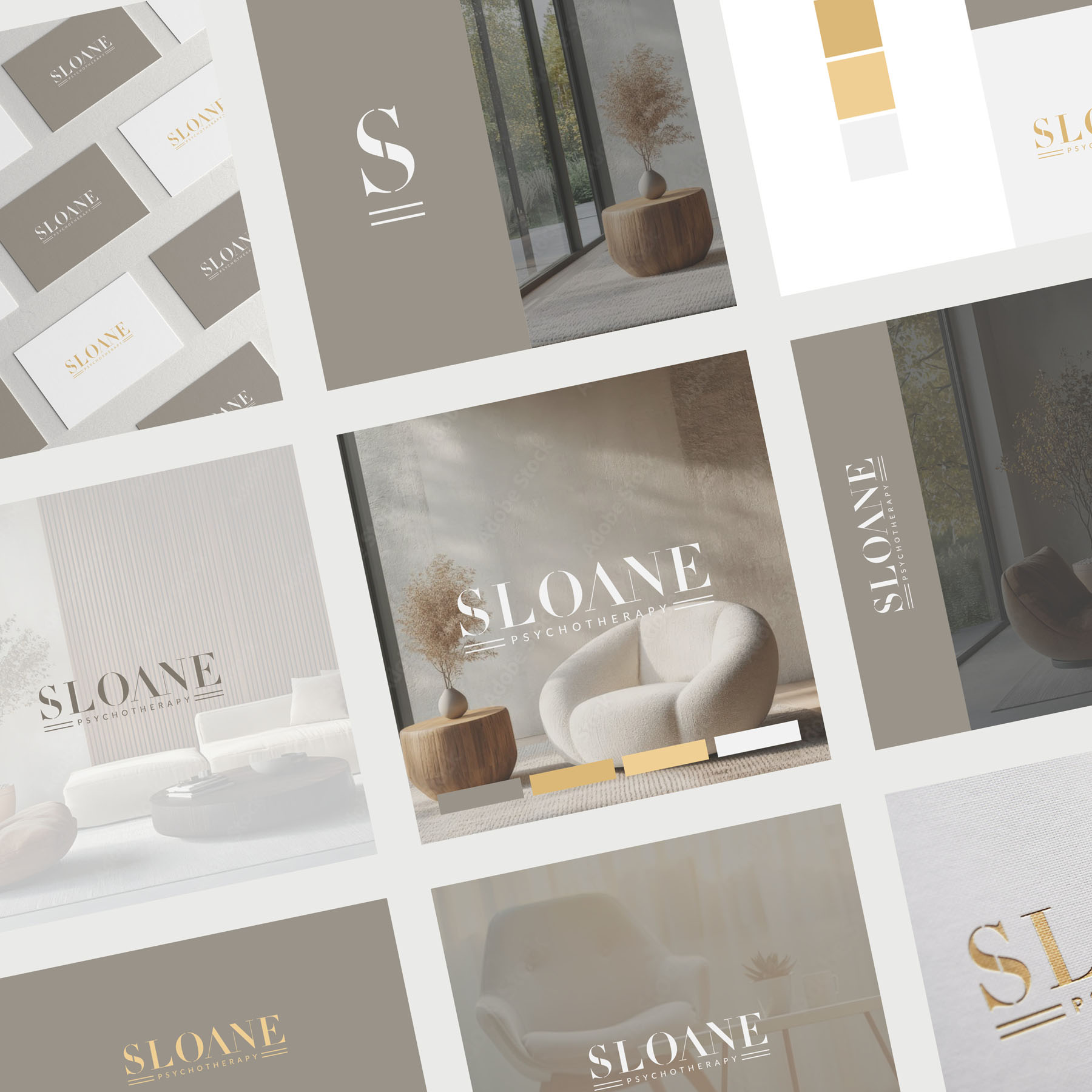
It was a real pleasure to create new brand identity for Sloane Psychotherapy, based in London Chelsea. The branding reflects their high end and luxurious approach to therapy, catering to an exclusive clientele including celebrities, artists and musicians, providing a discrete service from their private practice.
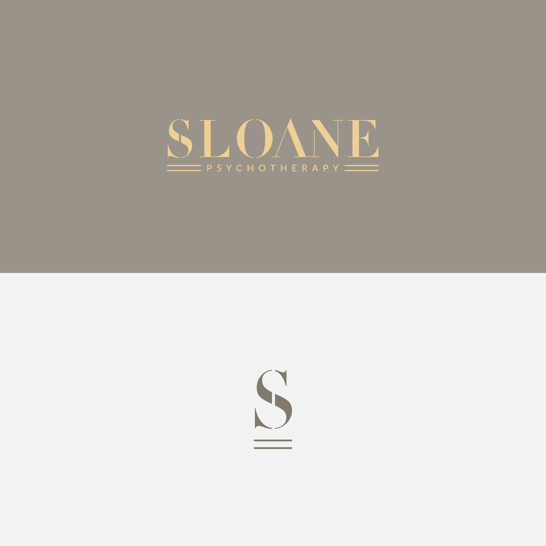
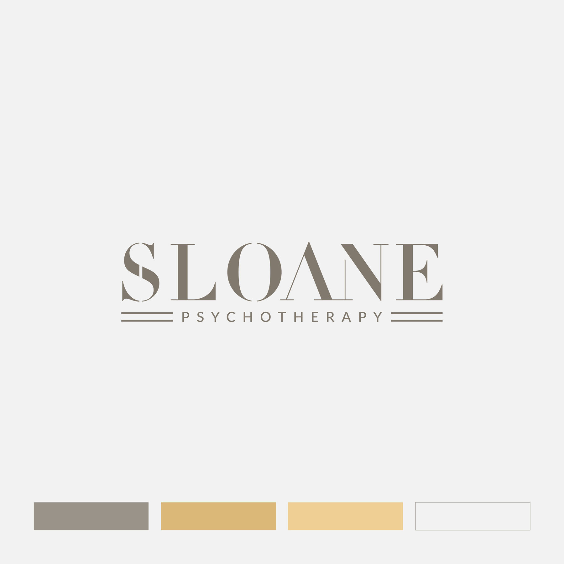
The logo itself contains a clever nod to the famous ‘Albert Bridge’ in Chelsea, just opposite the practice; a well known landmark to those local to the area, formed by positioning a double keyline under the main logotype.
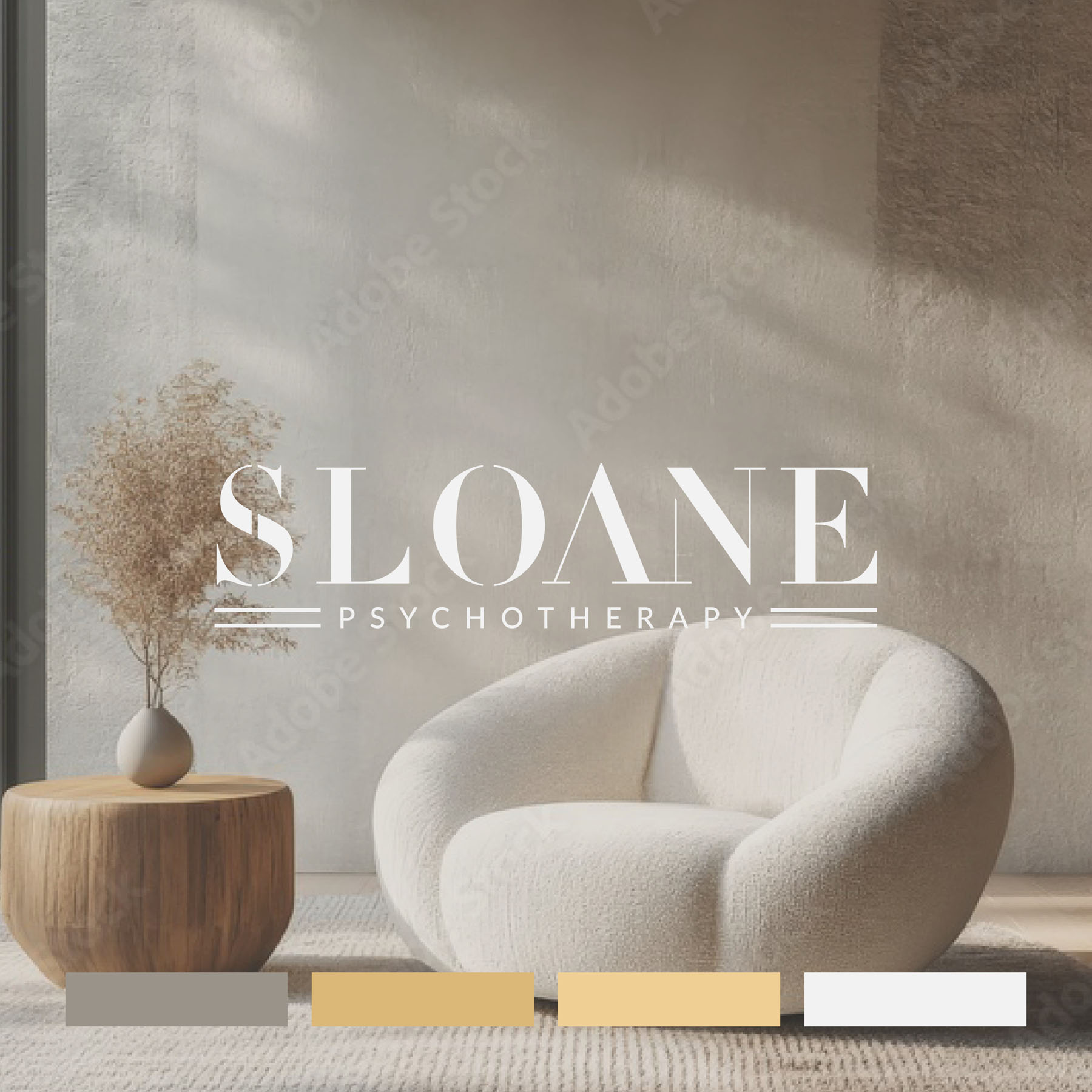
The colour palette is high end, luxurious, but also warm, inviting and soothing – with soft neutral tones and gentle contrast.
Case Study
Opportunity
Prospective clients and referrers make trust judgements in seconds. In a field crowded by generic “wellness” visuals, there was space for a quietly authoritative identity that balances clinical credibility with human warmth and absolute discretion.
Objectives
-
Convey composure, professionalism and empathy from the first glance.
-
Avoid wellness clichés; express calm through typography, spacing and colour.
-
Build a disciplined system that works across referral documents, stationery and web.
Insight & Strategy
Clients seek safety and competence rather than spectacle. We positioned Sloane Psychotherapy around quiet clarity: a restrained visual voice, generous negative space, and language that is supportive without being sentimental. Accessibility (contrast, legibility, type size) was treated as a brand value, not an afterthought.
Identity Solution
-
Wordmark: A refined typographic mark with precise spacing and proportions—engineered to read with calm authority at both headline and small sizes.
-
System: Primary horizontal and compact lockups with clear-space and minimum-size rules to protect legibility across clinical paperwork, email signatures and website UI.
-
Palette & Typography: A restrained, timeless palette (stone, slate, warm ivory with a soft accent) paired with a modern, readable type pairing for long-form copy—supporting extended reading without fatigue.
-
Imagery Direction: Abstract light, texture and material cues (rather than faces) to respect privacy and keep the tone inclusive and non-triggering.
-
Applications: Templates for reports, referral letters and client information sheets; guidance for digital use to ensure consistency day-to-day.
Competitive Edge Now
Compared with typical category executions, the identity presents considered professionalism—calm, confident and respectful. The restraint raises perceived credibility, while the system improves clarity across every touchpoint clients and referrers encounter.
What This Enables
Ideally positioned to attract discerning private clients and clinical referrers; to present information with assured clarity across print and digital; and to extend into future services or resources without losing coherence or the composed, high-trust tone.
