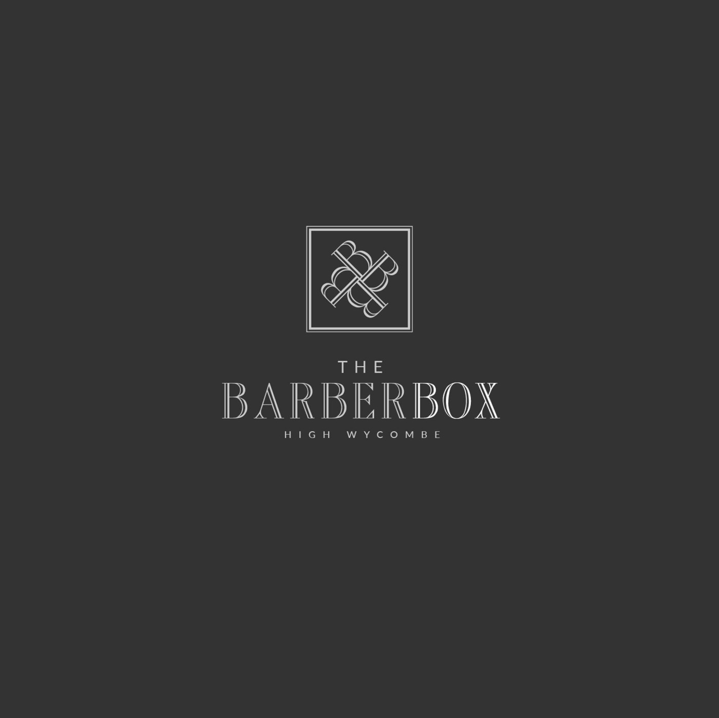
The Barber Box is a new modern barbershop opening in High Wycombe, with an interesting unique selling point; the shop itself is made from shipping containers. The shop theme is minimalist, modern and luxurious – and so we created a logo that reflected that sense of style.
Case Study
Opportunity
A modern barbershop built from shipping containers in High Wycombe called for a mark with presence: contemporary, masculine elegance that fits a minimalist, luxury interior—and a visual idea that quietly acknowledges the “box” concept without clichés.
Objectives
-
Project upscale craft and trust at a glance.
-
Create a compact symbol for signage, social avatars and small prints.
-
Ensure clarity from window vinyls and posters to appointment cards.
-
Keep the palette restrained so the space and photography lead.
Insight & Strategy
Rather than barber-pole tropes, we leaned into edited heritage: refined typography with a touch of vintage poise, paired with a monogram that unifies the B-initials and the “box” idea. The symbol’s intertwined forms suggest craft and precision; the square frame gives a subtle nod to the container architecture.
Identity Solution
-
Wordmark: A high-contrast serif set with measured spacing and fine inline detailing—engineered to read with authority on dark or light backgrounds.
-
Brandmark: Four interlocking B forms arranged within a double-ruled square, creating a distinctive, compact seal. The geometry yields a hint of scissor-handle symmetry while the square references the “box.”
-
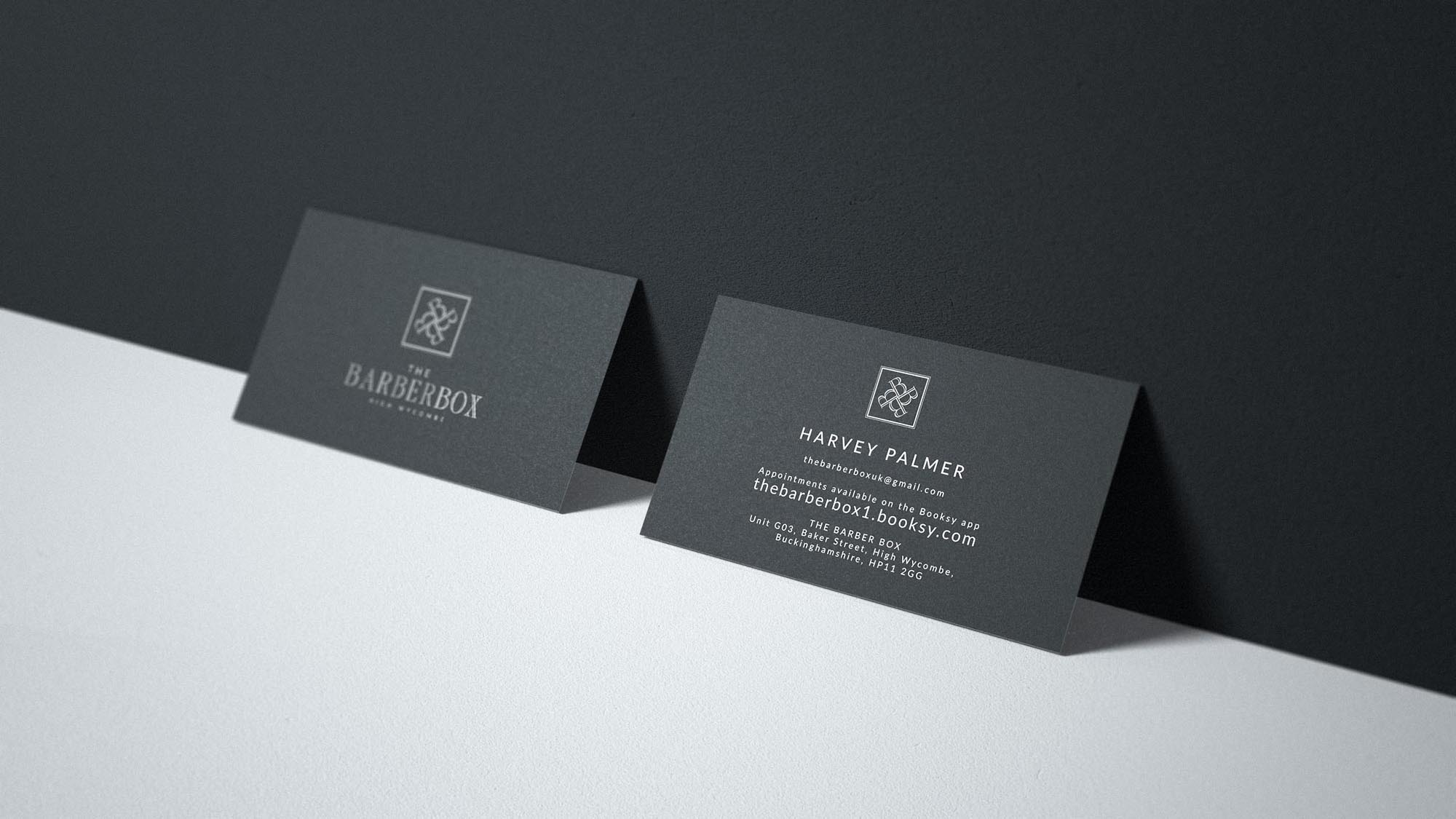
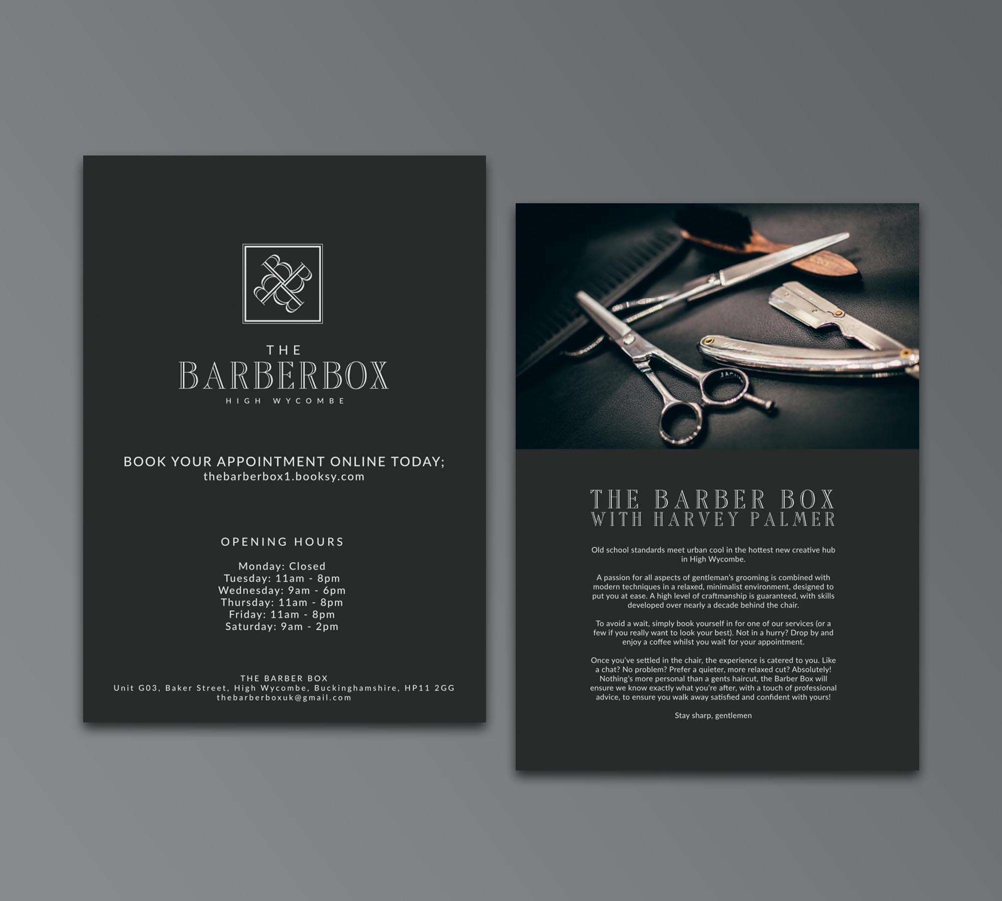
System & Use: Vertical and centred lockups, reversal rules, and minimum-size guidance; a monochrome/soft-silver palette to keep applications crisp across signage, cards and promo pieces.
Competitive Edge Now
Where many barbers lean casual or retro, this identity signals contemporary refinement: a memorable monogram anchored by disciplined typography. It stands out on the high street, scales cleanly to small marks, and supports a premium, minimalist environment.
What This Enables
Consistent, elevated presentation from shopfront to print; confident small-scale branding via the monogram; and a coherent visual language that can extend to menus, merchandise and digital touchpoints while preserving the shop’s luxurious tone.


