
A particular kind of enquiry has been reaching me more and more often. A founder has built their website themselves, or generated a set of logo options with AI, or both. They’ve assembled something that, on the face of it, ‘looks’ perfectly ok. Clean, current, and in theory, suitable. And yet they can’t shake the feeling that it isn’t right. They can’t say why, which is the part that bothers them most. It looks acceptable. It just doesn’t feel like theirs.
They are not alone in the feeling, and it is worth taking seriously, because it points to something real about how brands are built, and the order in which the building has to happen. A useful way to explain this could be to take movies as an example.
You can’t save a poor movie with special effects
You will have seen a movie like this. The special effects are impressive. On the surface, even the trailer, it looks good. And yet you leave the cinema strangely unmoved. Something underneath didn’t land. The story, the characters, the reason to care, whatever it was, it wasn’t there, and no amount of visual polish could stand in for it.
Notice that this is not really a complaint about the effects. The effects might be impressive; that’s what makes the disappointment so peculiar. The failure isn’t one of craft or budget or tooling. It’s one of sequence. The polish arrived, but the thing it was meant to be wrapped around never quite did, or arrived too late to matter. You can feel the absence even when you can’t name it.
That is almost exactly what these founders are describing, and it is one of the most common conditions I see in brands built quickly with modern tools. Real surface polish, sitting on top of a foundation that was never laid, and honest (sometimes negative feedback is the most valuable) which was never provided.
Why a brand looks good but feels wrong: polish arriving first
Here is the real point: polish is meant to be the final layer, not the starting point.
A brand identity, done properly, is built from the ground up. It begins with questions that have nothing to do with how anything looks: who is this brand for, what does it stand for, where does it sit in its market, what should someone feel when they encounter it, and why would they choose it over the alternative. The visual decisions come after, and they come because of those answers. The colour is chosen because of what it needs to say. The typography is chosen because of who it needs to speak to. The mark means something because there was something for it to mean.
When you begin with the polish instead, you invert that order. You produce something that looks resolved before anything underneath it has been resolved. And because the surface is convincing, the missing foundation is easy to overlook, until the brand is out in the world and quietly failing to connect, and nobody can quite say why.
This is not a flaw in AI tools specifically. It’s a flaw in starting at the end. You would get the same result asking a human designer to go ahead with the first idea that popped into their head. The tool isn’t the issue. The sequence is.
“The tool isn’t the issue. The sequence is.”
What actually goes underneath
So what is the thing that’s meant to sit at the centre, the equivalent of the story the effects are wrapped around?
It’s the strategic and creative thinking that gives every later decision a reason to exist. It’s the understanding of the audience precise enough that the brand feels made for them. It’s the point of view, the single idea a brand is built around that makes it recognisably itself and not an average of its category. This is the part that can’t be generated from a prompt, because it doesn’t come from patterns of what already exists. It comes from judgement, from asking the right questions of a specific business, and from the small creative leaps that connect a brief to an idea nobody had quite made before.
It also comes from taste, and taste is the thing current AI models are furthest from. They are improving quickly, and I don’t doubt that gap will continue to narrow, but as things stand they aggregate and average rather than truly judge. They will confidently produce an approach that ticks every box in theory and yet should never have been approved, because ticking boxes is not the same as connecting with a person on a deeper, human level. A trained designer feels that difference immediately. It’s the accumulation of years spent studying, curating references, and sharpening judgement, and it’s precisely what tells you that something technically correct is nonetheless wrong.
When that thinking is in place first, something rather satisfying happens to the polish that follows. The visuals don’t just look good; they feel fitting. They sit correctly on a deeper level, because they’re expressing something real rather than decorating a void. The same logo that would feel arbitrary on its own feels inevitable once you understand what it’s carrying. That sense of rightness, hard to articulate but immediately felt, is precisely what these founders knew was missing.
The same issue occurs with a website that uses an appropriate template and does a fine job of conveying information, but without really connecting to the visitor. Without creatively controlling the sequencing and imagery, it leaves the visitor feeling like they’ve read something polished and efficient, rather than enjoyed a memorable experience.
Where AI genuinely helps
None of this is an argument against using AI as a tool. I use it constantly, and there are many things it does genuinely well, some of them better than anything that came before.
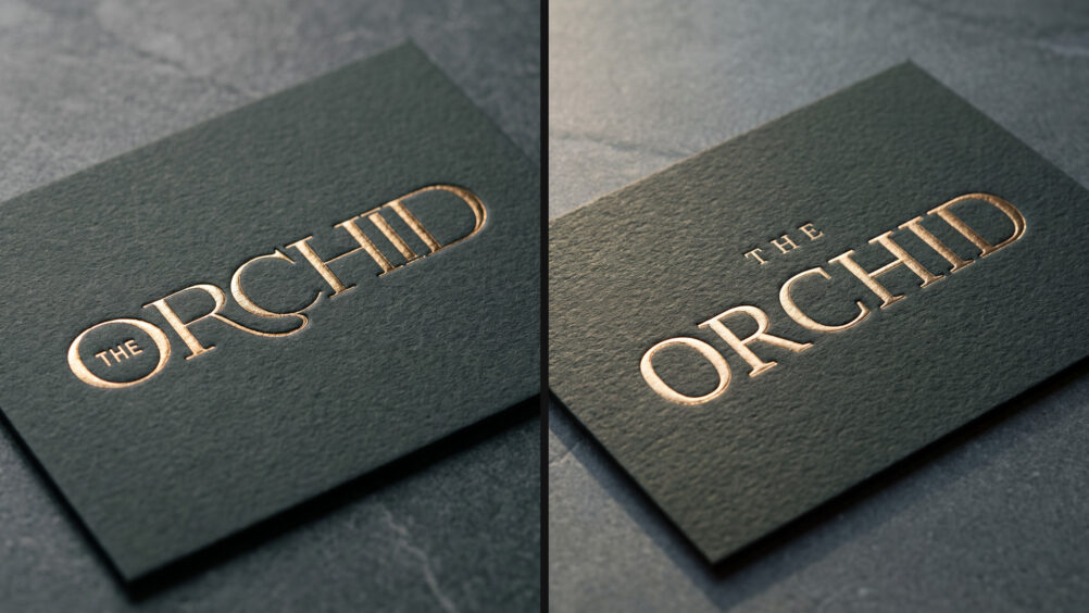
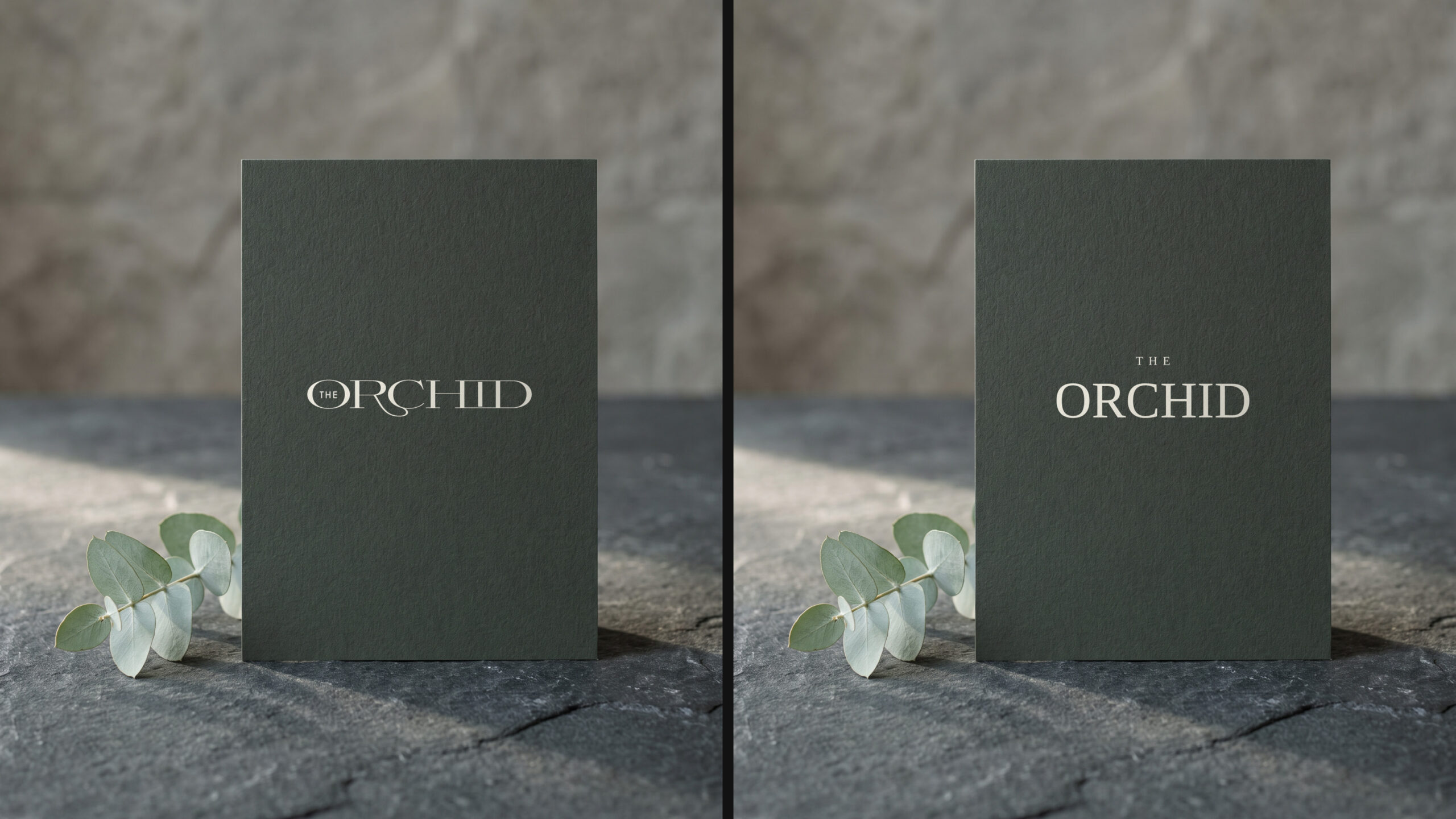
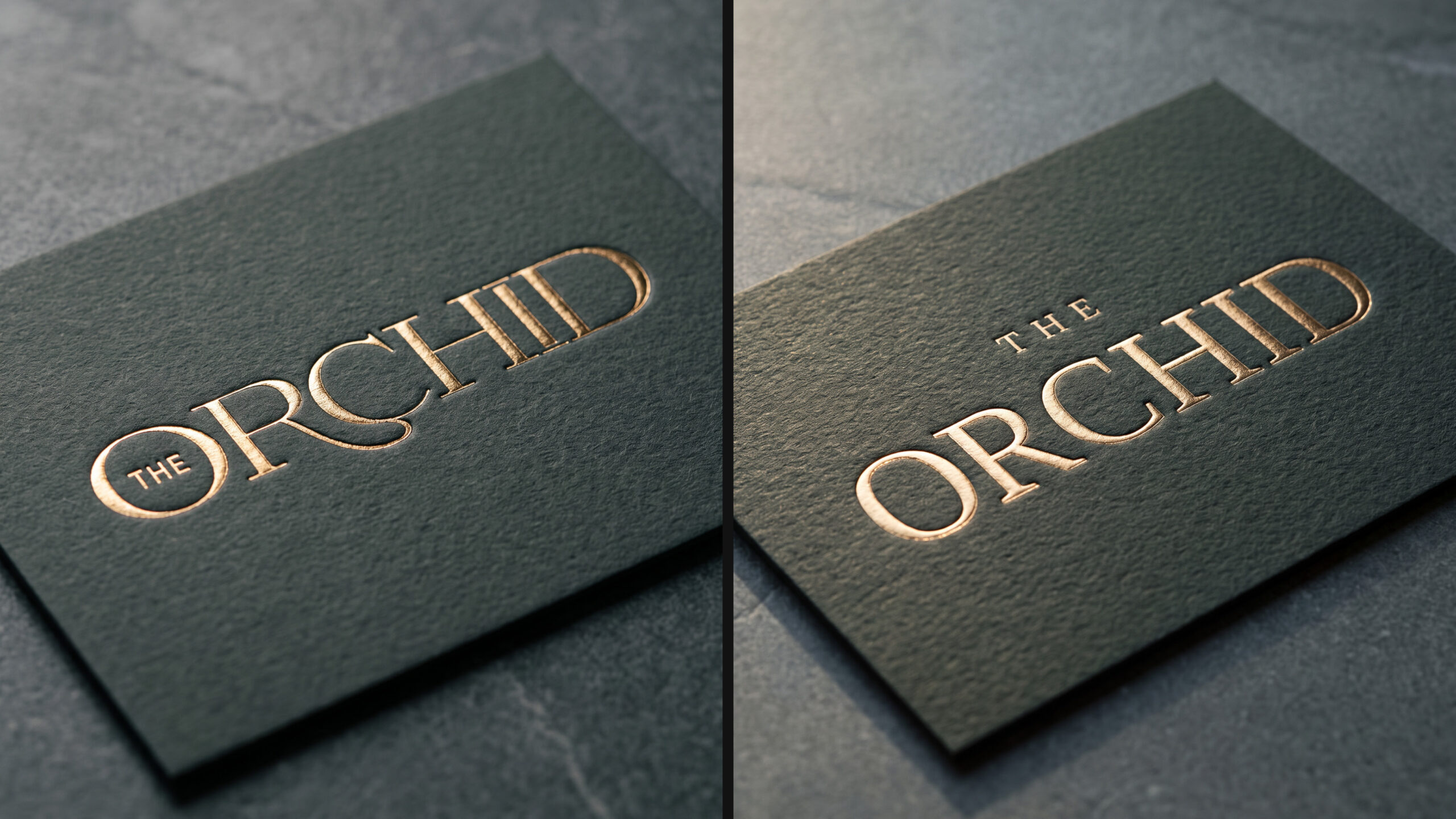
AI generated mockups are a fine example. They are a superb way of showing branding elements in situ: building a photorealistic environment appropriate for the brand and its audience, and presenting not just flat artwork but the textures, materials and layers a piece will really live among. A written brief can only gesture at things like “understated”, “confident”, “quietly expensive”, words that mean different things to different people. A generated mockup or reference scene shows that intent far more precisely, and aligns everyone around a direction before a single real decision is made. As a way of seeing where we’re heading, it’s excellent, and it has genuinely improved the early conversations I have with clients.
What it can’t do is generate the thing sitting at the centre. It can show the feel of the wrapping beautifully. It cannot invent the idea being wrapped, because that idea has to come from a real understanding of a real business, arrived at through a process, not predicted from an average. Used for what it’s good at, which is exploring and communicating direction, AI is a genuine asset. Asked to supply the foundation as well as the finish, it produces exactly the hollow polish we started with.
The tell: nobody can say why, they just move on
Here is the very costly part, and the reason this matters commercially rather than just aesthetically.
When a brand has polish but no foundation, people rarely reject it outright. They don’t wrinkle their noses and declare it bad. It looks fine. What happens instead is far more damaging and much harder to detect: nothing. They don’t stop. They don’t remember it. They don’t mention it to anyone. It fails in the same silent way that the polished, hollow movie fails, not with criticism, but with an absence of enthusiasm.
This is why the problem is so easy to miss. A brand that looked amateurish would at least tell you something was wrong. A brand that looks polished but lacks soul gives you nothing obvious to fix (unless you’re a designer, trained to spot it), while quietly underperforming at the one job that matters most: being noticed, remembered, and talked about. And the tools that built it are unlikely to warn you. Many have a reputation for enthusiastically approving whatever they’re shown and encouraging the user onward, where an experienced designer would gently raise a concern. So the one honest voice that might have caught the problem early is often the voice that was never in the room. Memorability isn’t a bonus layer applied at the end. It’s a property of having had something to say in the first place.
“Memorability isn’t a bonus layer applied at the end. It’s a property of having had something to say in the first place.”
The same thing is happening to websites
It’s worth naming where this is heading next, because the pattern is spreading from logos to whole websites.
I want to be fair to the tools here, because in web work they are genuinely game-changing. Used well, AI has given me some of the best-organised briefs I’ve ever worked from, helping structure and prepare content beautifully, and it has let me execute ideas in code that I could once only have dreamed of technically. That is not a small thing; it has widened what’s possible.
But without human creative direction in the middle, the results still fall flat, and you end up with our movie again: impressive effects deployed to distract from a weak script and cringeworthy dialogue. This is rarely the fault of the tool. It’s usually a lack of input from the person using it, or a lack of the experience and taste needed to direct it well. (Did I mention, designers tend to have spent years quietly accumulating said taste, through study, through curating what they admire, through developing judgement?)
You can see the result across the web already. AI-built sites have become recognisable. Not badly made, often quite the opposite, but recognisable as a look: a certain kind of layout, a certain rhythm of sections, a polish that reads, increasingly, as templated. Audiences are starting to notice, not consciously for the most part, but they feel the same vague sameness that makes them move on. As more of the web is built this way, the distinctive, considered site stands out more, not less.
Getting the order right
Once you see the problem as one of sequence, the answer follows naturally, and it isn’t a matter of choosing between AI and a human designer. It’s a matter of using each for what it does best, in the right order.
Stage one
Early on, AI is an excellent partner, and a designer who uses it well has a real advantage over one who doesn’t. In skilled hands it helps assemble a stronger brief, carry out research at speed, gather and organise references, and pressure-test a strategy or positioning. The judgement about what to ask, what to keep and what to ignore stays human; the tool simply lets that human get further, faster, and perhaps arrive at something more comprehensive, than was ever possible before.
Stage two
Then comes the part that most needs a human to lead. Arriving at something unique, compelling and genuinely tasteful, an idea with a point of view that connects on a human level, is still the work of human creative judgement. AI is working hard to understand human taste, and it is improving at a remarkable rate, but it is not quite there yet. This creative leap is where the difference between a forgettable brand and a memorable one is decided, and it is the one stage a designer should never hand over. It is worth saying plainly, though, that a human is guiding all three stages. The point isn’t that designers are needed only in the middle; it’s that they should be directing from start to finish, with AI assisting throughout rather than replacing them at either end.
Stage three
And then AI comes into its own again, still under a designer’s direction. Once the thinking and the core idea are settled, it is superb for execution: helping deploy a site (in whole, or, as I more often do, for select components), producing polished mockups, and generating photorealistic visuals that show the intended use of the branding at its best. The designer is steering throughout; AI is what makes the steering faster and the results richer.
The danger is doing that final step too early. When the polished mockups arrive before the creative foundation is sound, weak design gets waved through, because a beautiful, photorealistic scene hides the flaws underneath. And in fairness, this is not a trap only founders fall into. I’ve seen plenty of human designers do the same, dressing a weak logo in a fabulous mockup or shoehorning it into a gorgeous scene to win approval. The polish does its job a little too well, and quiets the doubt that should have been listened to.
The reassuring part
If any of this rings true for your own brand, that quiet sense that it looks fine but doesn’t land, the reassuring part is that the answer is rarely more polish. It’s supplying what the polish was meant to sit on: the thinking, the point of view, the understanding of who you’re for and why you’re the right choice. Get that right, and the finish, whether it comes from AI, from a designer’s hands, or from both working together, finally has something worth wrapping.
That foundational thinking is the part of my work I care about most, and it’s the part no tool can shortcut. If you’ve built something that looks the part but you can feel isn’t right, you’re welcome to browse my portfolio to see what considered brand identity looks like, or to get in touch for a conversation about yours. More often than not, the difference between a brand that looks good and one that feels right is simply the order in which it was built.