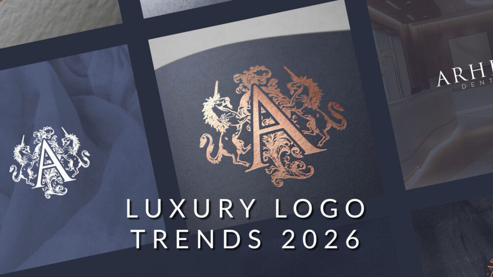
The luxury sector is entering a new aesthetic cycle—one shaped not by minimalism or the flat design movement of the 2010s, but by a renewed appreciation for heritage, craft and detail. As competition intensifies in the high-end market, brands are seeking ways to differentiate themselves visually, and many are rediscovering what made their identities powerful in the first place: rich typography, classical influences and ornate visual storytelling.
Several notable luxury houses have already shifted direction, signalling what may become one of the defining brand identity trends of 2026.
A Return to Heritage: Serif Typography & Detailed Artwork
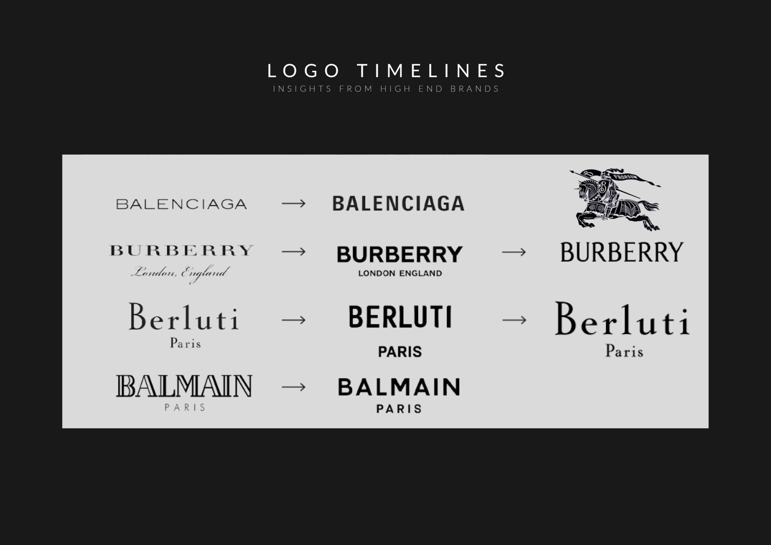
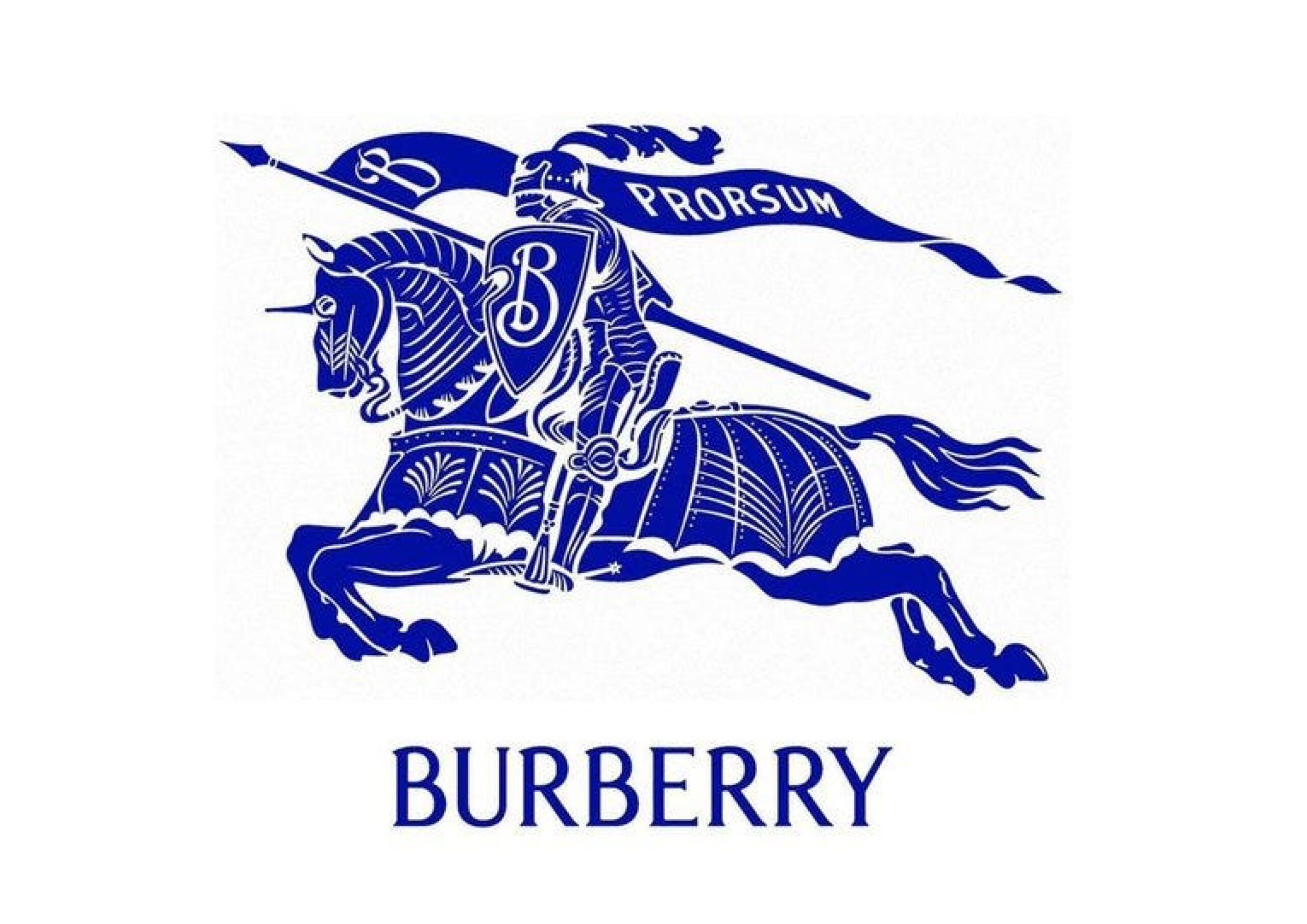
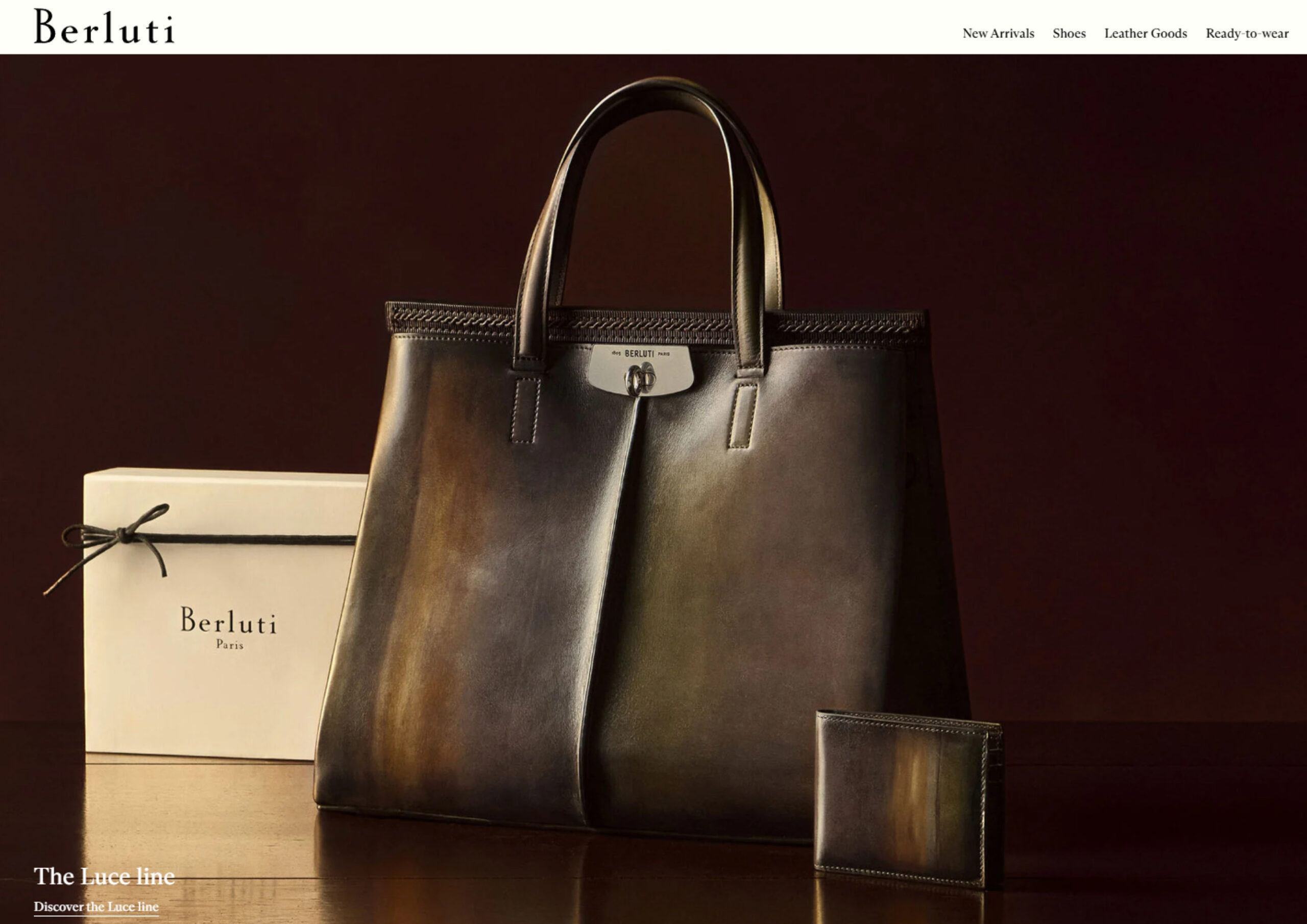
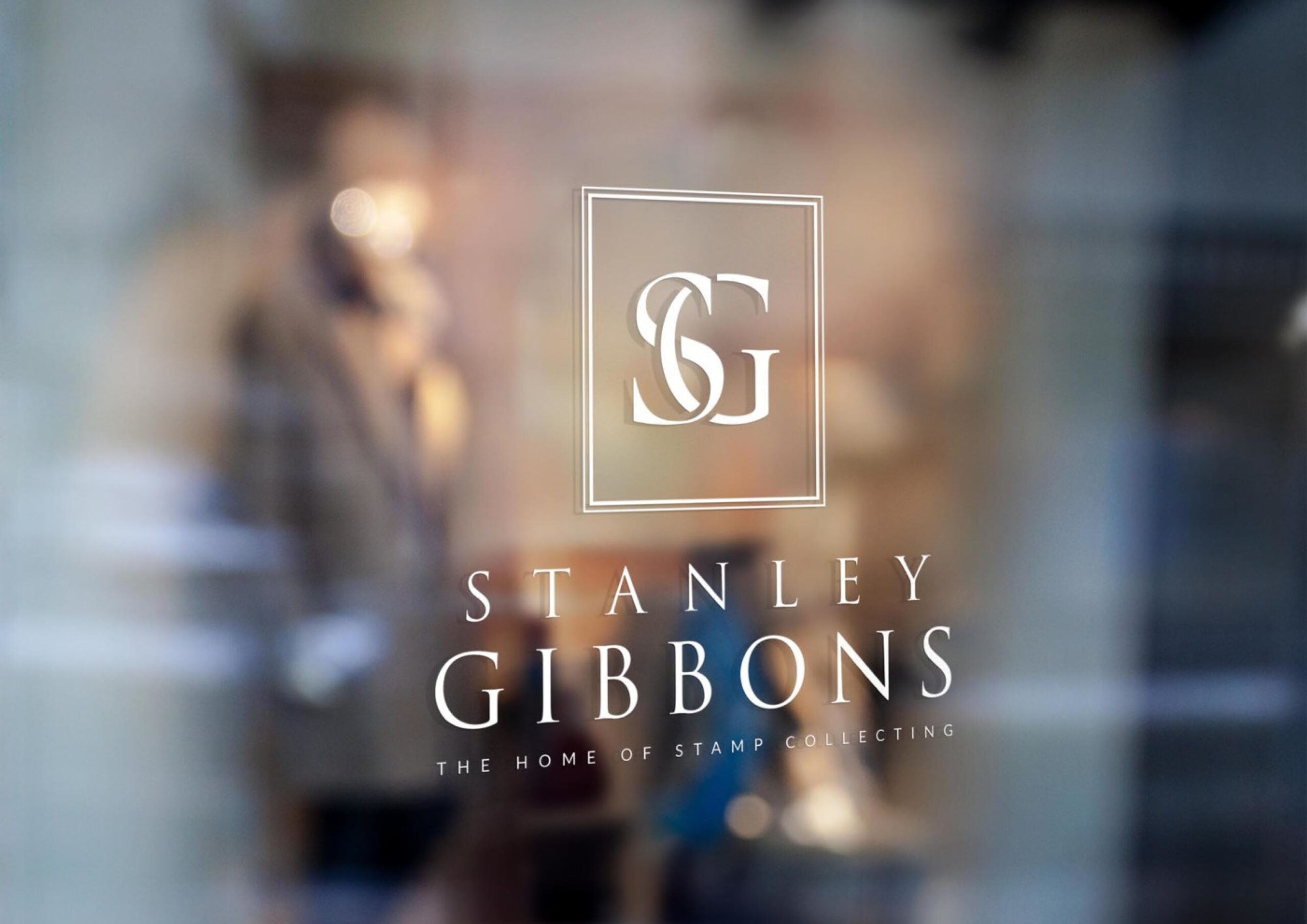
In recent years, brands such as Burberry and Berluti have begun reintroducing classical serif typography and more characterful artwork into their visual systems. This marks a noticeable pivot away from the ultra-clean, hyper-minimalist logos that dominated luxury branding for more than a decade.
For many fashion labels, the move towards sans-serif wordmarks in the late 2010s was an attempt to modernise, streamline and digital-proof their brands. Yet the pushback has been growing, with consumers and luxury enthusiasts increasingly craving:
- A sense of lineage and cultural depth
- Visual richness and craftsmanship
- Distinctiveness and brand personality
This shift suggests a growing appetite for heritage-led design—a counterbalance to the uniformity produced by flat, minimal logos.
How We Got Here: A Look Back at Identity Evolution
To understand the 2026 trend trajectory, it’s worth looking back at the last three decades of brand identity evolution:
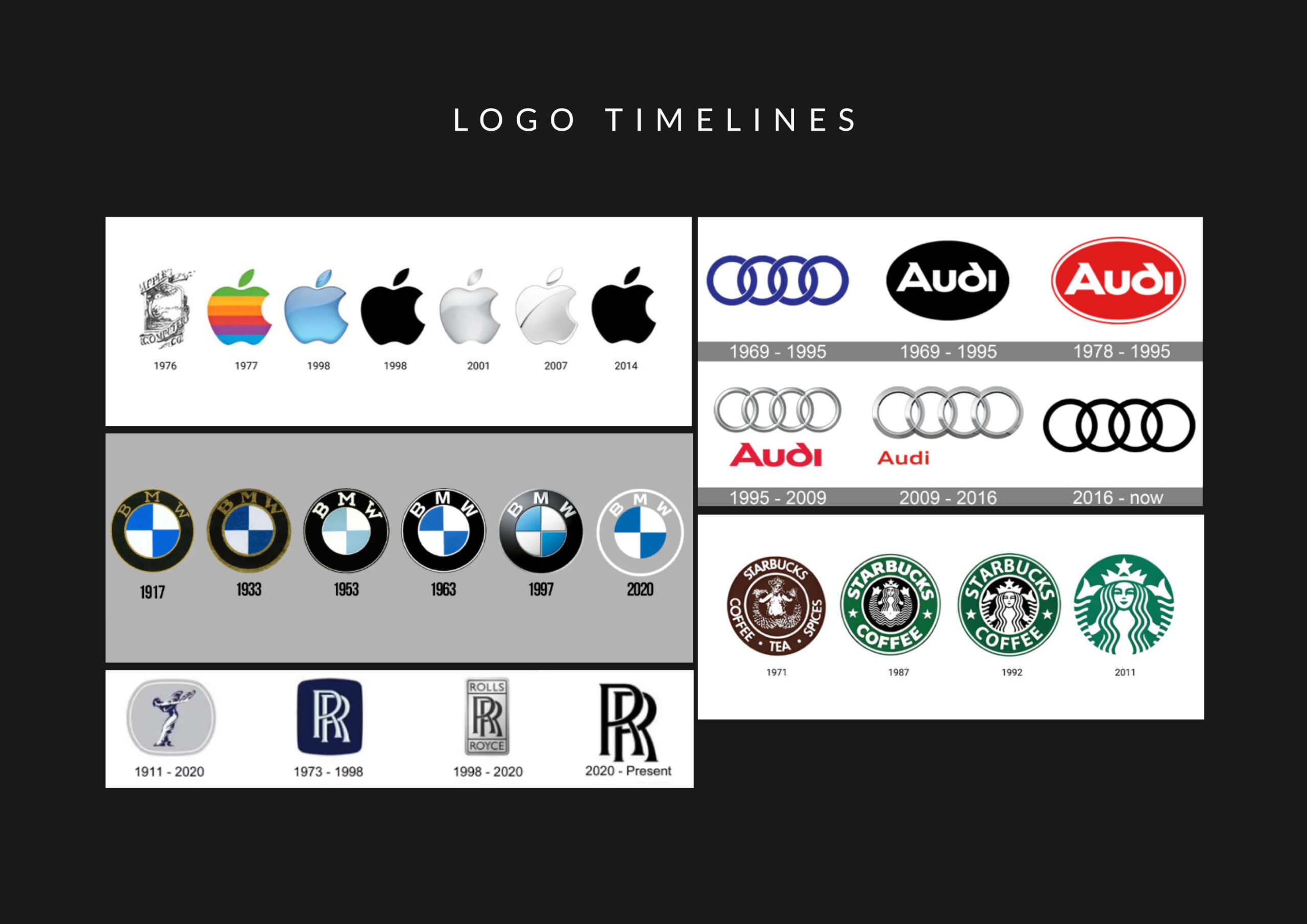
Late 1990s – Early 2000s: The ‘Shiny’ Era
As digital interfaces advanced, brands—particularly in automotive and tech—embraced glossy, bevelled, 3D treatments. Logos became hyper-rendered symbols designed to live within the early digital ecosystem.
2010s Onward: The Rise of Flat Design
Driven by mobile-first interfaces and the need for responsive clarity, flat design swept across industries. Countless brands simplified their marks dramatically, prioritising:
- Scalability
- Digital clarity
- Minimalism
- Universal application
This made sense at the time—screens were small, resolutions were lower, and simplicity ensured usability.
But trends evolve, and minimalism often leads to homogenisation.
So What Comes Next?
Brand identity trends rarely move the same way across all sectors. Tech, automotive, fashion and luxury all respond to different market pressures. But in the luxury space, a clear pattern is emerging:
We are likely entering an era of renewed heritage expression.
Why?
Because luxury brands thrive on storytelling, provenance, craftsmanship and artistry. A purely flat sans-serif mark often fails to communicate these qualities—at least not alone.
We’ve already seen early adopters:
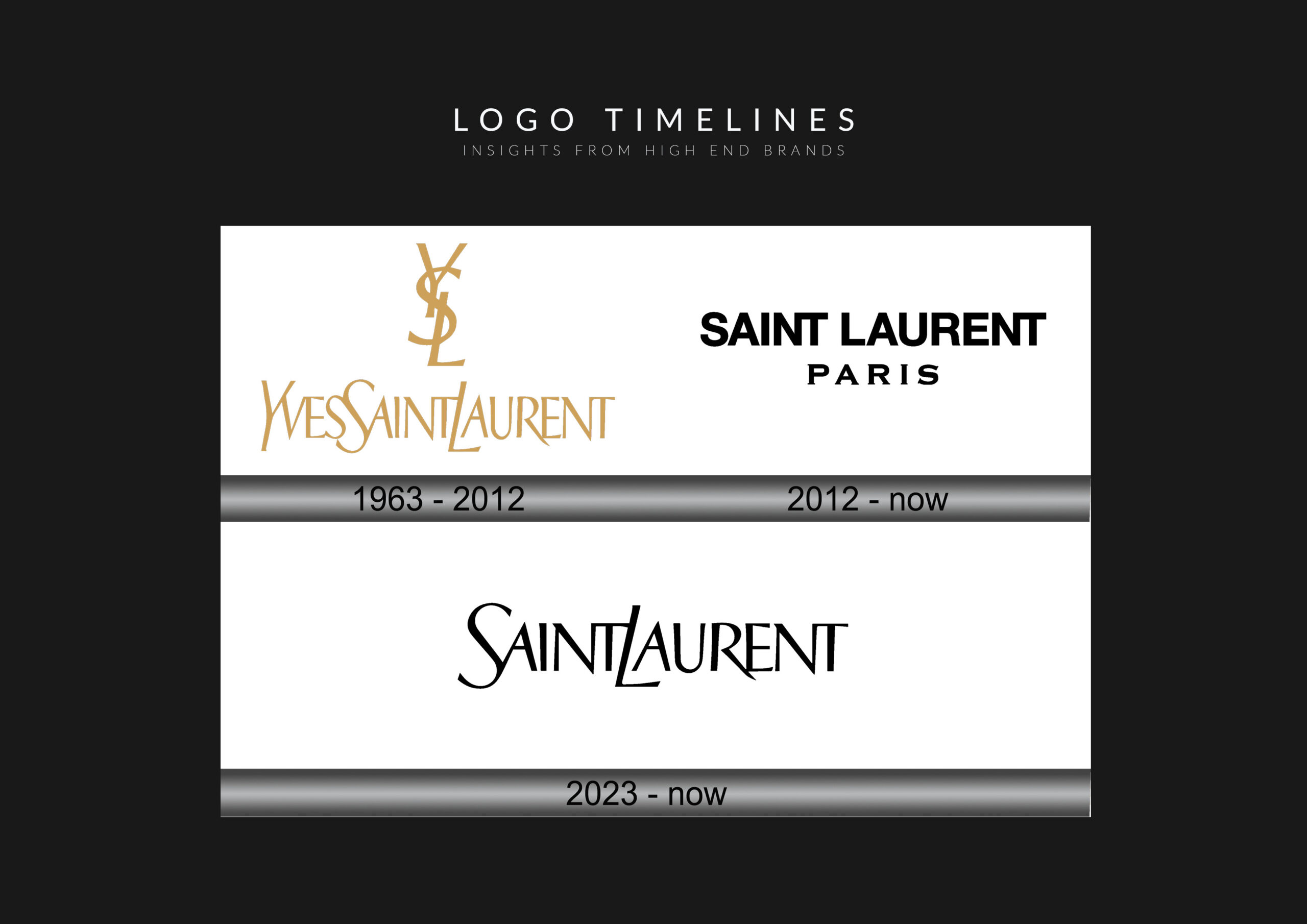
- Saint Laurent reintroducing expressive typography in 2023
- Brands like Versace maintaining ornate, character-rich identity systems rather than chasing minimalism
- Heritage houses whose marks have changed remarkably little across decades
These examples indicate that luxury is ready to embrace more depth, narrative and visual nuance.
Will Rich Detail Make a Full Comeback?
There is growing speculation that more luxury houses will restore traditional typography and explore detailed artwork again—elements they may have abandoned in their pursuit of minimalism.
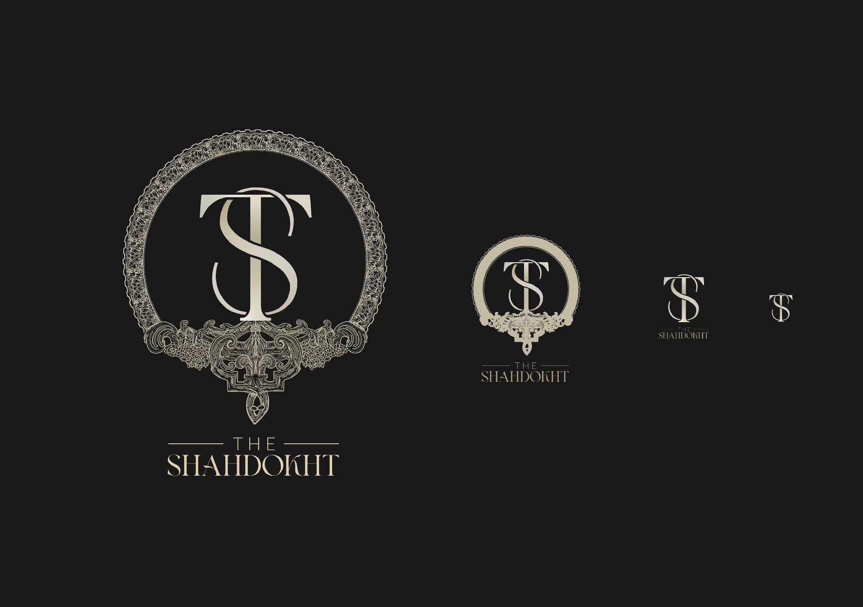
In many cases, the DNA is already there: classical crests, monograms, signatures, illustrated emblems, heritage motifs. These assets are ripe for modern reinterpretation.
My prediction:
2026 will be the year detailed, heritage-inspired identity begins its return across the luxury sector.
Not universally. Not in every execution. But increasingly—and meaningfully—for brands seeking distinction in an oversaturated field.
Why Minimalism Is No Longer Enough
Minimal sans-serif logos solved a problem in the 2010s: they scaled beautifully on small screens, they were clean, and they offered universal ease of use.
But over time, this aesthetic created an unintended consequence:
Too many luxury brands looked the same.
Flat design democratised identity, but it also stripped away character. For established houses with deep histories, this can dilute the emotional impact of their visual world.
Heritage detail provides what minimalism cannot:
- Uniqueness
- Cultural texture
- Symbolic meaning
- Longevity
Encouraging a New Wave of Luxury Identity
In my own work with luxury brands, I’ve increasingly encouraged founders not to shy away from heritage—even from rich detail—when it supports their story. That doesn’t mean abandoning modernity; it means integrating both modern clarity and classical refinement within a well-structured identity system.
Key point:
A detailed mark must be executed correctly.
That requires:
- Multiple logo versions for different sizes
- Responsive design thinking
- A hierarchy of hero marks, simplified marks and minimal symbols
- Intentional balance between artistry and functionality
Done well, this creates a system that is both expressive and practical.
The Future of Luxury Identity: Variety, Depth and Storytelling
My personal hope—and my professional prediction—is that we will see a return to deeper visual storytelling in luxury logo design. After a decade dominated by flat uniformity, the opportunity for richer typographic and illustrative worlds is immense.
Long-established luxury houses, in particular, stand to benefit from re-embracing what made their identities iconic.