
Colour is the first thing a brand says. Before a single word is read, before a logo is understood, the eye has already taken in colour and drawn a conclusion: this feels premium, or playful, or trustworthy, or cheap. It is the fastest-acting element in your entire identity, and the most misunderstood.
Most advice on the subject stops at a chart. Blue means trust. Green means nature. Red means passion. There is some truth in these associations, but treated as rules they produce exactly the kind of obvious, forgettable branding that fills the lower end of every market. The colour itself is rarely the whole point. What matters is how it is chosen, how it is balanced, and the context it lives in. That is the difference between a colour and a considered palette, and it is most of what a brand designer is actually doing when they reach for the swatches.
This piece walks through how colour really works in branding: the mechanics beneath the meaning, the conventions worth knowing, the moments when breaking them pays off, and how all of it comes together in real work.
The three dials: why “blue” is a starting point, not a decision
When someone says they want to use blue in their branding, they have named a hue. They have not yet made a meaningful decision. Hue is only one of three dials a designer turns, and on its own it tells you almost nothing about how the final colour will feel.
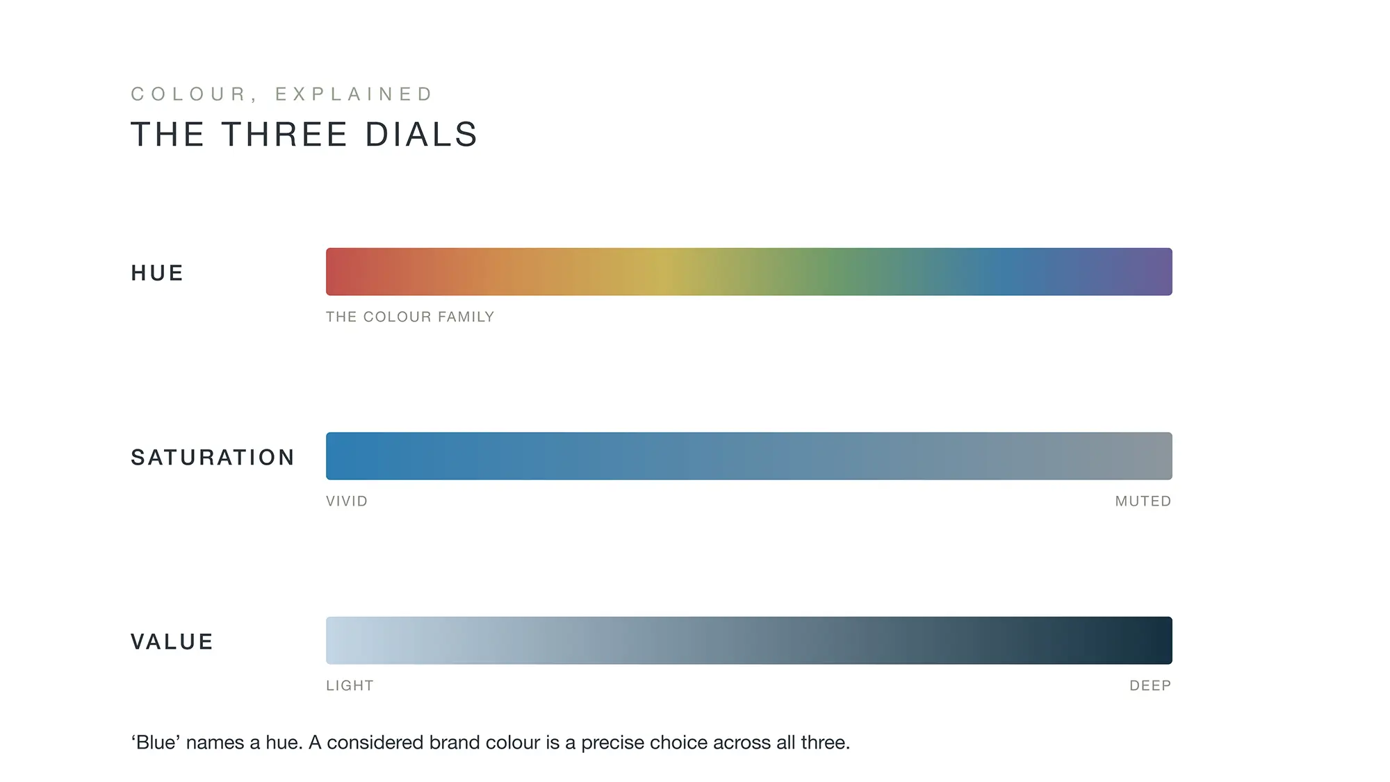
Hue is the colour family: where you sit on the spectrum, from red through to violet. It is the broad choice, and the one most people stop at.
Saturation is intensity: how vivid or how muted the colour is. A fully saturated blue shouts. The same blue, its saturation pulled right back, murmurs. This single dial does an enormous amount of the work in separating a premium brand from a budget one, because restraint reads as confidence.
Value is lightness or darkness: from the palest tint to the deepest shade. Value controls drama, contrast and mood, and it determines how a colour behaves against everything placed near it.
A brand colour is a precise position across all three dials. Two brands can both be “blue” and feel like opposites: one a bright, high-saturation primary that belongs on a children’s toy, the other a deep, desaturated navy that belongs on a private bank’s letterhead. Same hue. Entirely different promise. Once you start seeing colour in three dimensions rather than one, the whole subject opens up, and the lazy chart falls away.
What colour can do: mood and association
If the dials are the mechanics, meaning is the opportunity. Used well, colour does two valuable things at once: it sets a mood, and it taps into associations the viewer already holds.
Mood is the more intuitive of the two. Soft, warm neutrals feel mature, calm and quietly sophisticated, which is why so many considered, mature brands lives in that register. Cool blues and tranquil turquoises feel clean and serene. Deep, low-value palettes feel serious and substantial, often exclusive. None of this requires the viewer to think; the feeling arrives before any conscious interpretation, which is precisely what makes it powerful.
Association is the second opportunity, and it borrows meaning the audience has already learned. Some of these associations are so well established they function almost as visual shorthand. Blue in financial services is the obvious one: bank after bank reaches for it because, over decades, blue has come to stand for stability, security and trust. Black paired with gold reads, almost universally, as exclusive and luxurious, which is why it recurs across premium cards, fashion houses and high-end packaging. These conventions exist because they work, and there is no shame in using a convention well.
The skill is in doing so without becoming a cliché, which brings us to the part the charts never mention.
When breaking the rules is the smartest move
If conventions are so reliable, why do some of the most valuable brands in the world ignore them entirely?
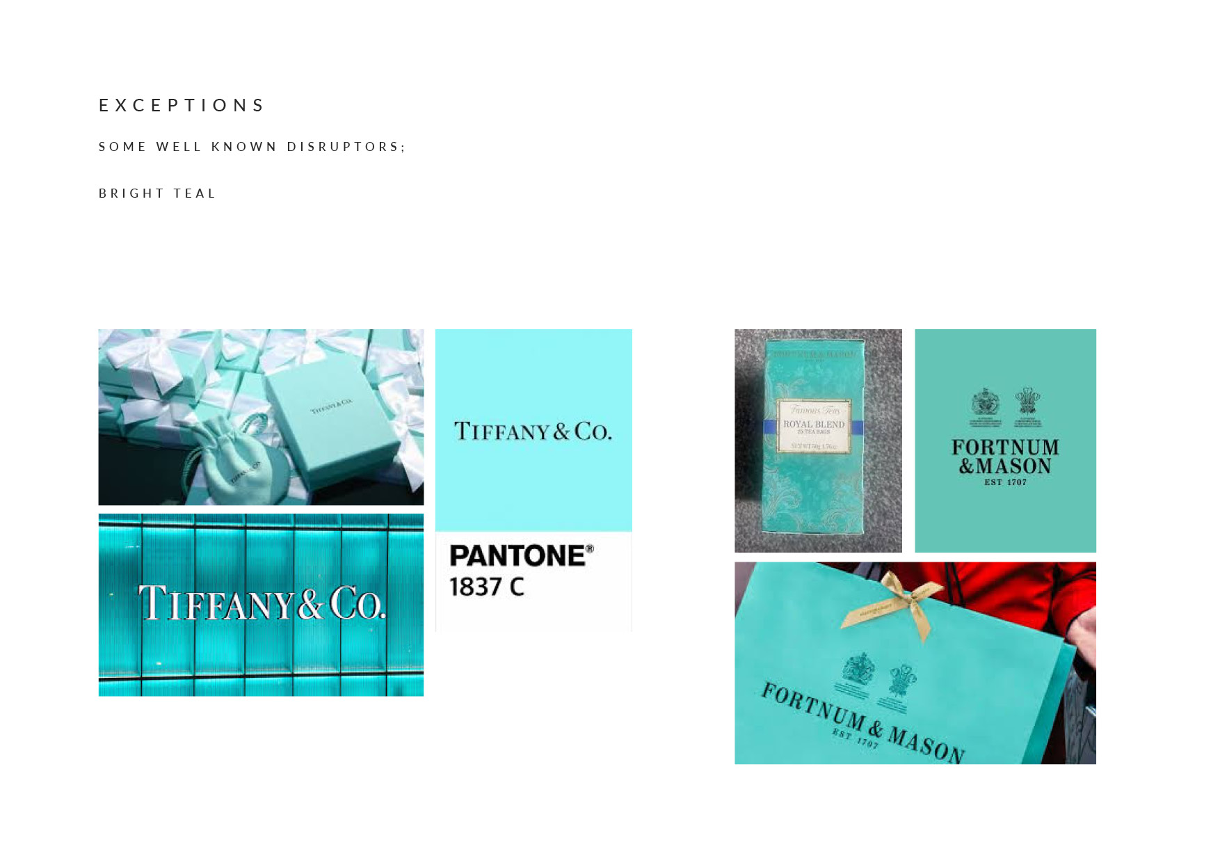
Consider Tiffany and Co., who built an empire of recognition on a single bright robin’s-egg teal, a colour no convention would have recommended for heritage luxury.
Or Hermès, whose vivid orange and black should, by the rule book, feel loud rather than refined, yet has become one of the most instantly recognisable signatures in luxury. These brands broke the convention and won.
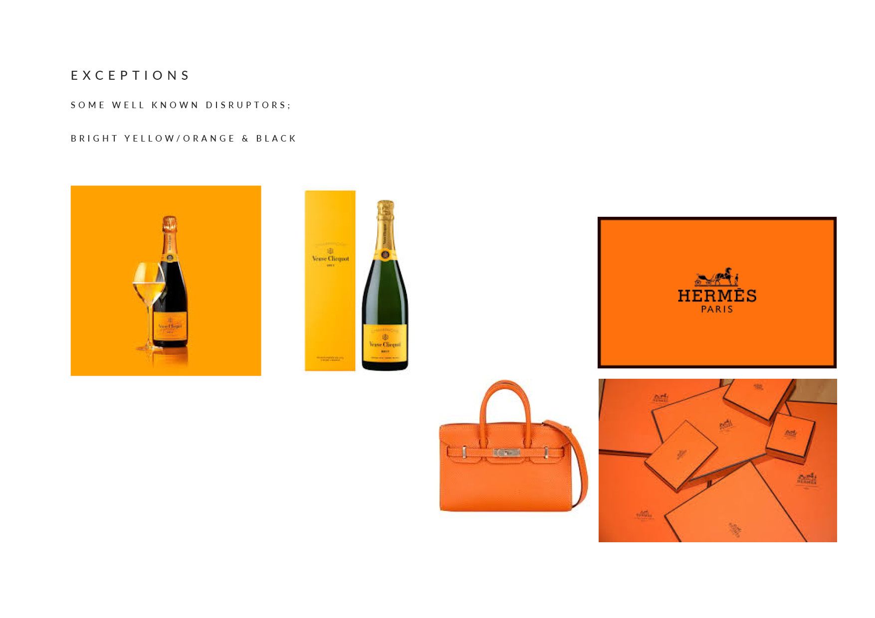
The lesson is not that rules are meaningless. It is that a distinctive, unexpected colour can be enormously powerful precisely because it stands apart, but it asks more of you. When you use an established convention, the association does the work for you, instantly and for free. When you break it, you take on the job of building that association yourself, through consistency, repetition and time. Tiffany’s teal means Tiffany because Tiffany has spent more than a century, and a great deal of money, making it so.
So the disruptive choice is not reckless; when it is right, it is the most considered choice of all. But it suits a brand with the patience and the resources to establish a new meaning, rather than borrow an existing one. For most businesses, the wiser path is to use a convention intelligently, with enough originality in saturation, value, pairing and application to feel like themselves rather than everyone else. Knowing which of those two roads you are on is itself a strategic decision, and one worth making deliberately.
The part the charts get wrong
Here is the uncomfortable truth about “blue means trust”: almost every brand in a crowded category knows it too. When an entire sector reaches for the same hue, the convention stops differentiating you and starts hiding you. You become credible and invisible at the same time.
This is where the three dials earn their keep. Two financial brands can both choose blue and end up worlds apart, because one has thought carefully about saturation, value, pairing and texture, while the other has simply typed “trustworthy blue” into a colour picker. The hue is the same. The execution is everything.
Context matters just as much as the colour. The same green that signals heritage and establishment beside gold and cream signals something quite different beside neon yellow. A colour means nothing in isolation; it takes its meaning from what surrounds it, the typography it sits with, the materials it is printed on, and the market it appears in. A muted sage on heavy, uncoated stock and a near-identical sage on a glossy flyer are, to the viewer, not the same colour at all.
And then there is culture. Colour associations are not universal; they shift across regions and traditions. Red and gold signal celebration and prosperity around the Lunar New Year, while the same red carries warning and danger in a Western safety context. Particular colour pairings belong, often fiercely, to sports teams, nations and flags, and a palette that strays innocently into one of those territories can carry meaning you never intended. For brands that travel, or hope to, this is not a footnote. It is a genuine consideration that has to be checked, not assumed.
This is the real work of colour in branding. Not picking a meaningful hue, but controlling everything around it so the meaning lands the way you intend, for the audience you intend, in the places they will encounter it.
The conventions, made real
Theory is one thing. Here is how these ideas look when they become finished work.
Heritage green and gold
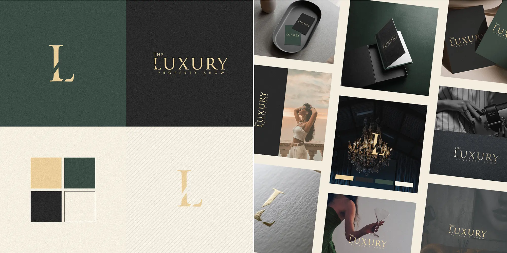
For The Luxury Property Show, the palette leans on one of the most established conventions in British luxury: deep green paired with gold, grounded by near-black and softened with cream. Green of this kind, kept rich and low in saturation, carries associations of heritage, establishment and quiet wealth, the visual language of members’ clubs and estate agents to the landed. The gold supplies warmth and a sense of occasion without tipping into flashiness, because it is used sparingly and against a restrained ground. It is a convention, used confidently, and it works because every dial has been set with care.
Trust, with depth
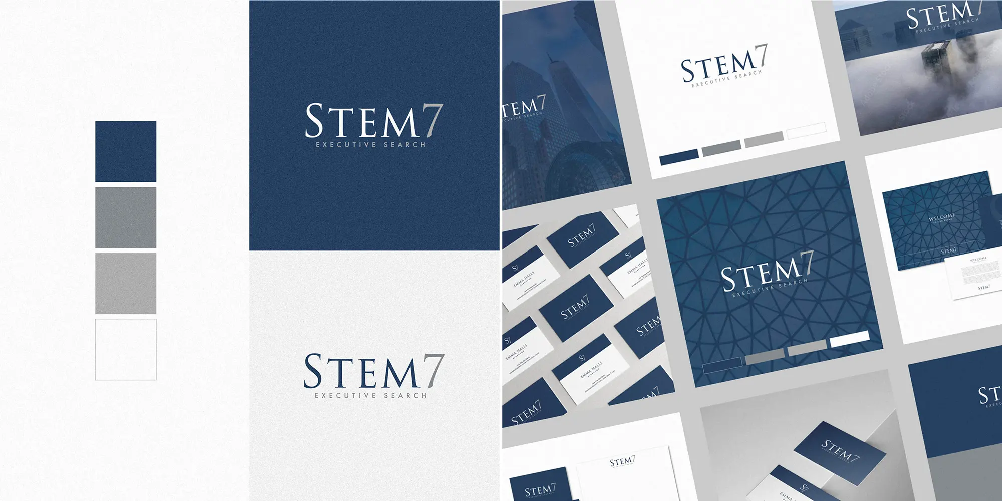
Stem7 sits in the most convention-bound category of all: professional services, where blue is almost a default. The risk was obvious, which was to land on the same forgettable corporate blue as everyone else in executive search. The answer was not to abandon blue, which genuinely does signal the trust and stability the brand needs, but to give it dimension. A considered, restrained blue does the strategic work, while pairing this with cool greys, alongside a geometric texture and tonal layering lift the identity well clear of the flat, lazy corporate blue it could so easily have been. The convention is respected; the execution is what makes it distinctive. This is “blue means trust” done by turning all three dials, rather than just naming the hue.
Muted sophistication
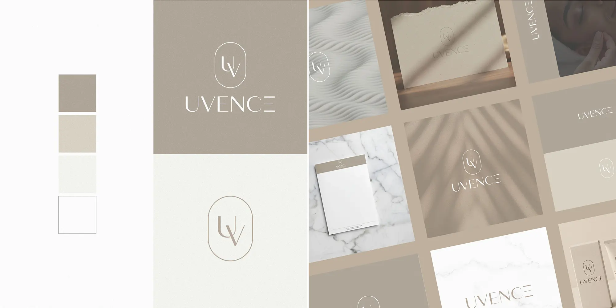
Uvence works almost entirely through saturation and value rather than hue. The palette is a range of soft, warm neutrals, barely-there taupes and greiges, deliberately desaturated so that nothing shouts. This is the quiet-luxury register in its purest form, and it suits a discerning, high-net-worth (HNW) audience who read restraint as a mark of confidence and quality. There is very little “colour” here in the conventional sense, and that is the point. The sophistication comes from the discipline of holding back, which is one of the hardest things to do well and one of the most valuable when it lands.
Working with a designer on colour
You will have noticed a theme. In every one of those examples, the hue was almost the least interesting decision. The value came from everything around it: the saturation held in check, the pairings balanced, the application considered, the cultural and competitive context checked. That is the work, and it is largely invisible when it is done well, which is rather the point of it.
This is why colour is difficult to outsource to a chart, a generator, or a quick guess. A considered palette begins with questions that have little to do with colour at all: who is this brand for, where does it sit in its market, what does it need to promise, and what is everyone around it already doing? Only then does the choosing begin, and the choosing is iterative, tested across real applications and materials rather than admired in isolation on screen. The goal is a palette that is unmistakably yours, that earns the right associations, and that holds up everywhere your brand appears.
If you are weighing up your own brand’s colour, or you suspect it is sending the wrong signal, that considered process is exactly the kind of work I do. You are welcome to browse my portfolio to see how colour shapes the brands above, or to get in touch for a conversation about yours. Colour is too important, and too easy to get subtly wrong, to leave to a chart; or even to AI, which certainly points you in the right direction (and I often use it to check my colour theory is aligned!), but as it doesn’t quite see the world as we do; can lack taste on occasion.