
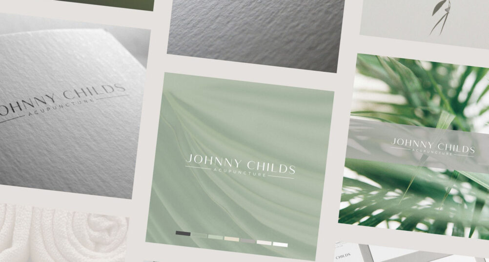
There is a version of the brand identity design process that sounds almost mechanical. Research the business, define the strategy, follow the steps, and a solution appears at the end. In one sense that is true. In another, it misses the part that makes the work worth doing.
This is a look behind the scenes at the brand identity for renowned acupuncturist Johnny Childs, and at the balance between structure and spontaneity that shaped it: a considered process, combined with human craft.
Where the process begins
Johnny’s work has been featured in publications from Tatler to Women’s Health. His existing identity no longer reflected that level of recognition, so the brief was clear from the outset: an identity that felt elevated, editorial and highly considered, positioned alongside high-end medical and lifestyle brands rather than generic wellness.
Thorough research and brand strategy reveal what is needed, and here they narrowed the direction quickly. The identity had to communicate precision, calm and quiet confidence in equal measure. Rather than overstate the therapeutic nature of the work, the strategy settled on restraint: an elegant typographic core, a sophisticated neutral palette, and small, intentional details that reward closer attention.
Follow the process properly and each stage leads to the next. By the time concepts are being developed, there is a degree of inevitability about arriving at a fitting solution.
Inevitable is not the same as obvious
But structure alone does not guarantee a good outcome. It only guarantees a reasonable one.
“Structure alone does not guarantee a good outcome. It only guarantees a reasonable one.”
Creativity, taste and judgement shape the direction just as much, and they are what keep the result from simply being the most predictable answer. Acupuncture branding, for example, tends to reach for the literal: needles, meridian lines, lotus flowers. The obvious route was right there. Instead, a single fine keyline sits within both the logo and the submark, a subtle nod to the tools Johnny uses with precision and care. Those who know the practice see the reference. Everyone else simply sees an elegant detail.
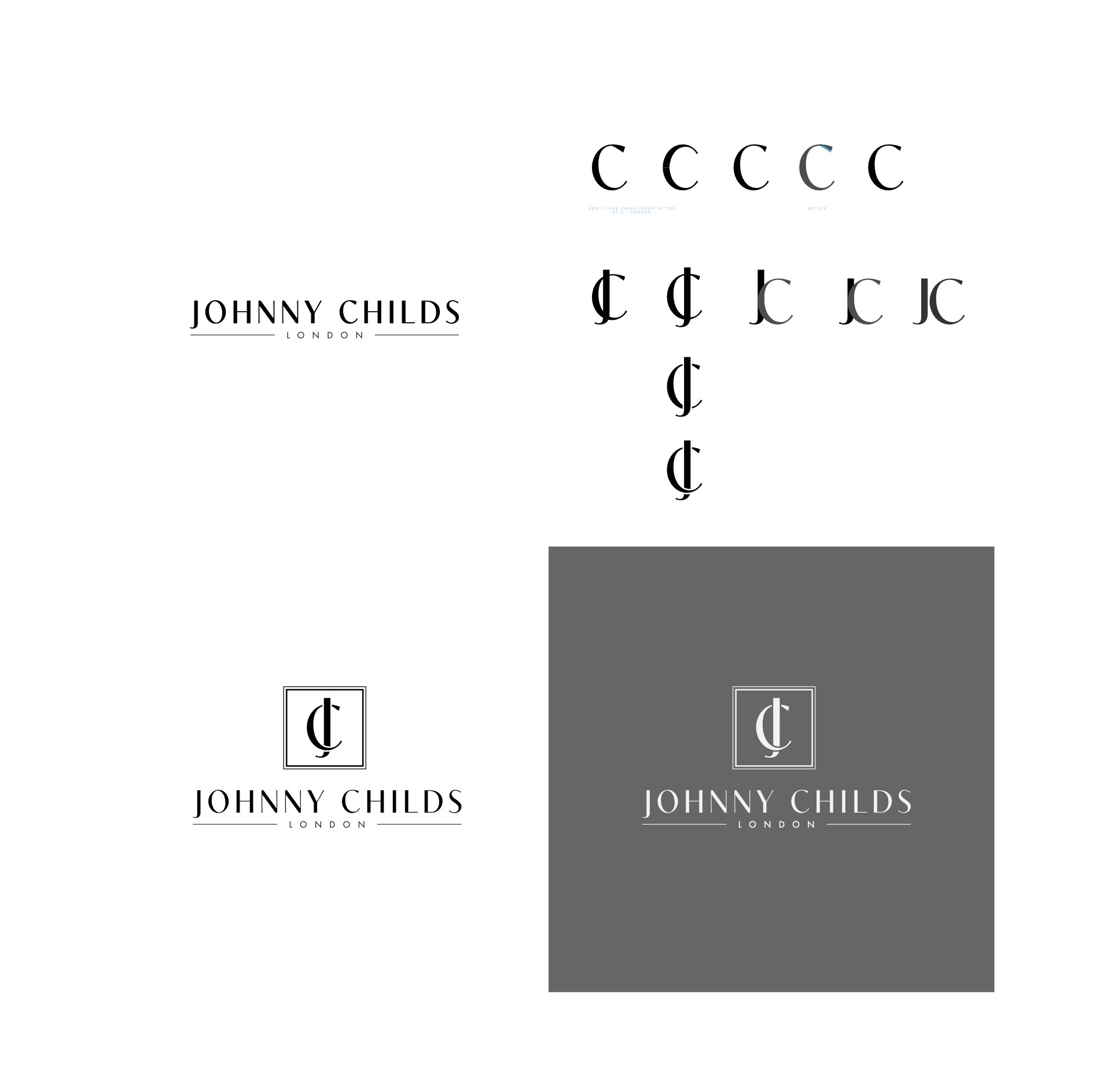
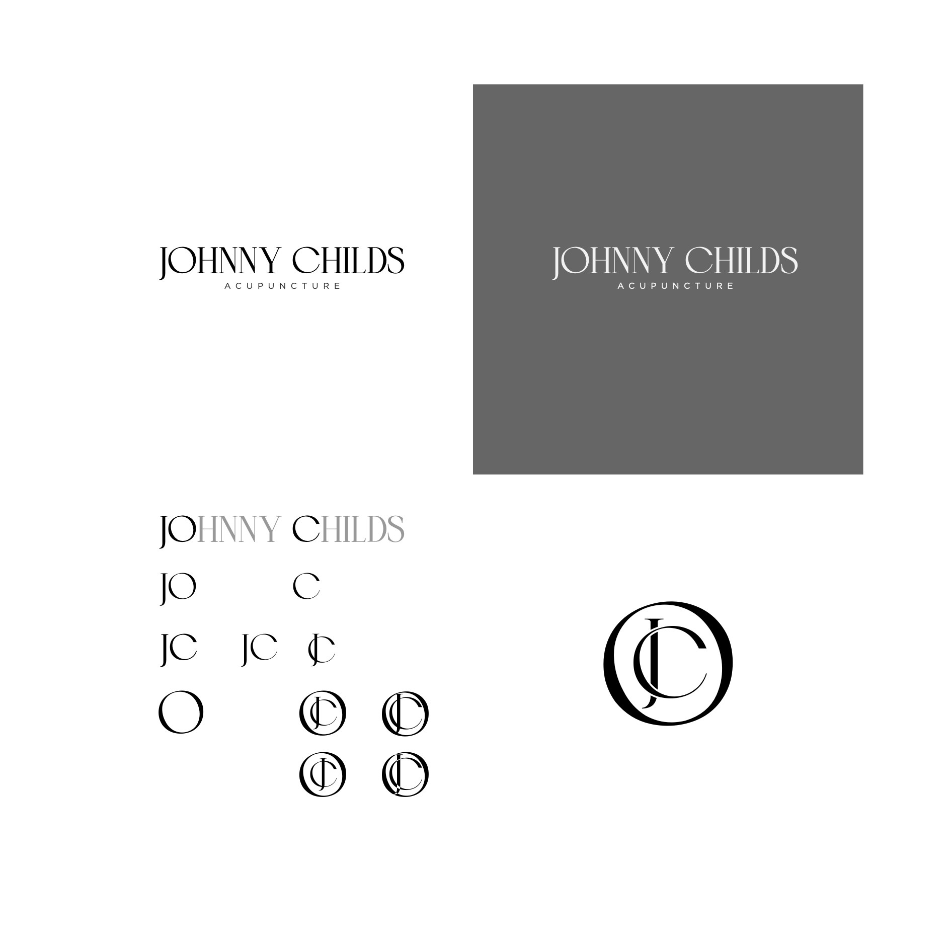
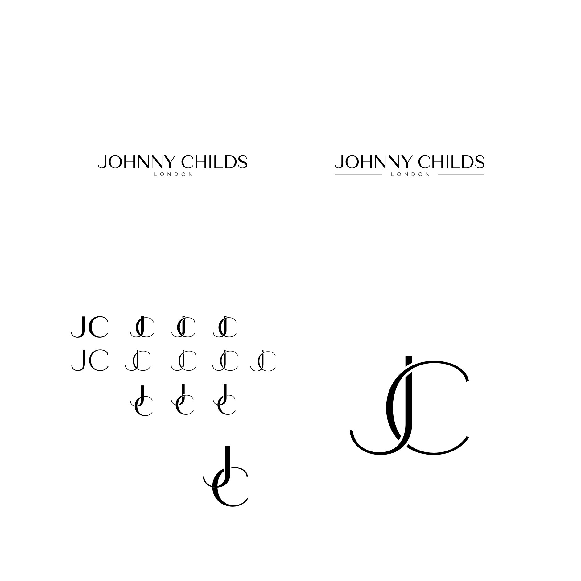
Early concept development: directions explored, and set aside, on the way to the final identity.
Often the most valuable moments in a project are the ones nobody planned. A concept reveals an angle you hadn’t considered at the outset. The supporting elements shift the tone, and combine into something greater than the sum of their parts.
A simple mark, obsessively balanced
The wordmark uses a typeface that blends the contrasting strokes of a traditional Didone with the cleaner structure of a modern sans serif. The result is editorial and understated, elegant without being ornate.
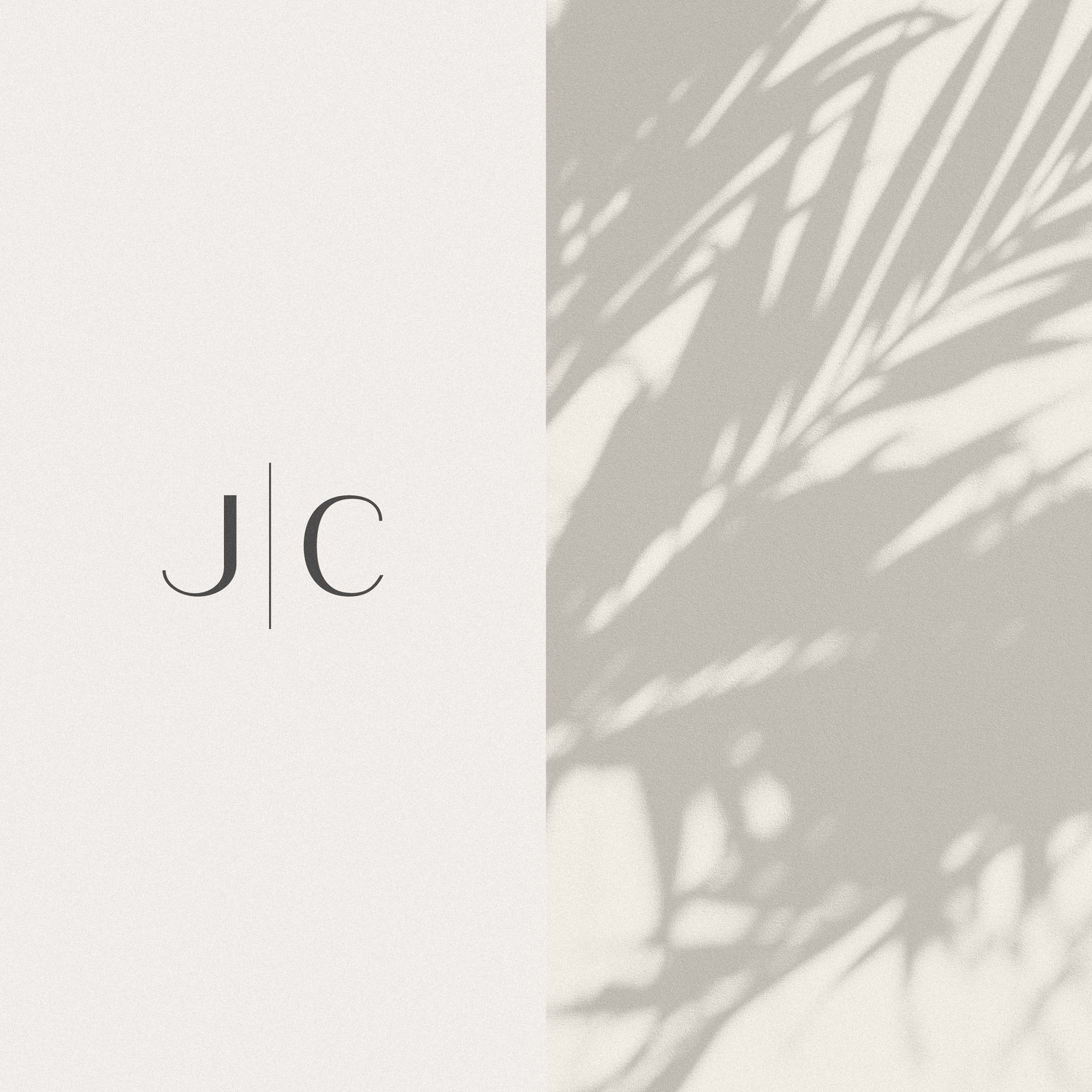
The monogram took the same thinking further. Rather than accept the letterforms as drawn, the base font was outlined and completely customised until the J and C sat at exactly equal widths. In a mark this simple there is nowhere for imbalance to hide. It is the kind of decision almost nobody will consciously notice, which is rather the point. When it works, a mark simply feels settled.
The parts that create the whole
A deliberately simple logo can easily be mistaken for a sparse one. The richness in this identity comes from the system around it.
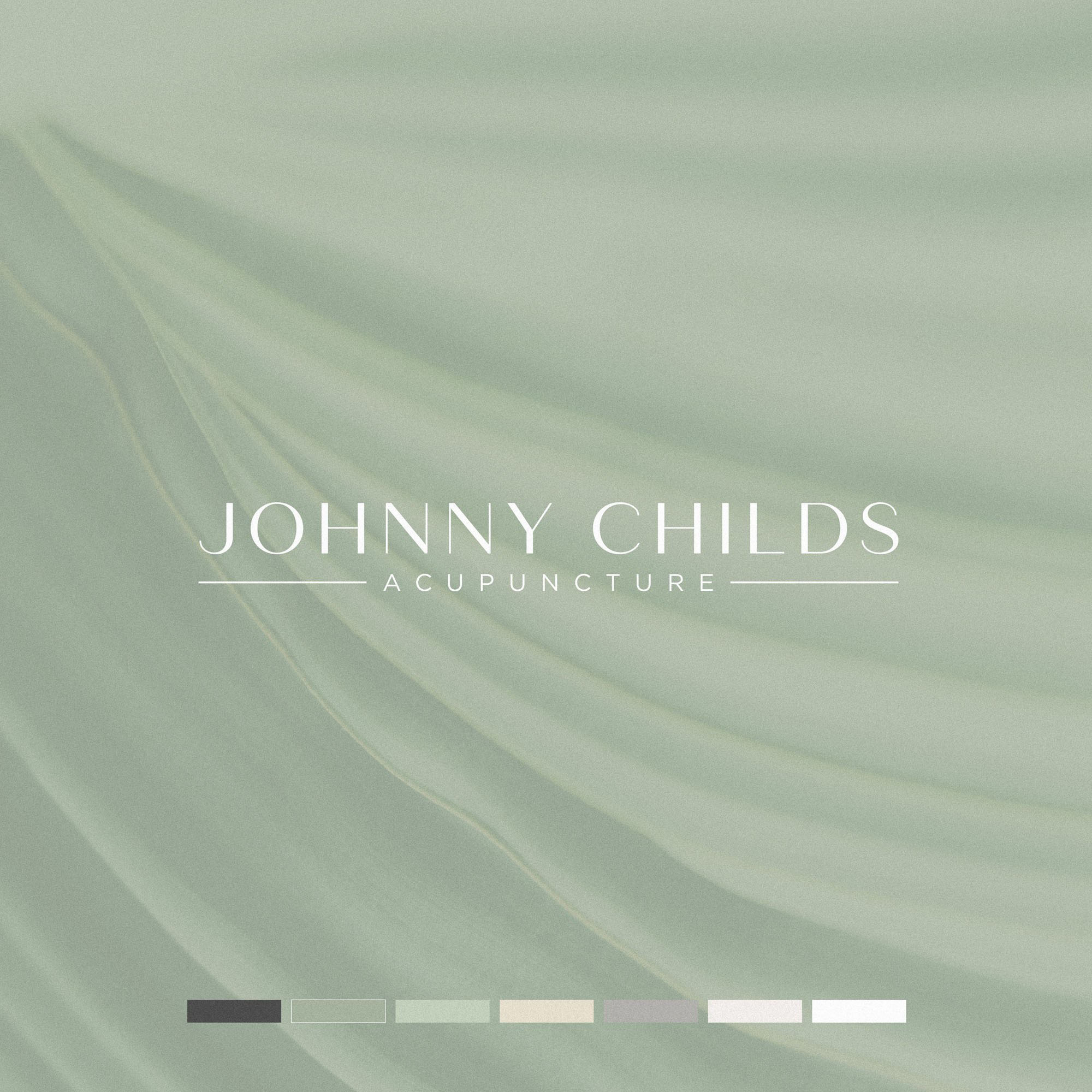
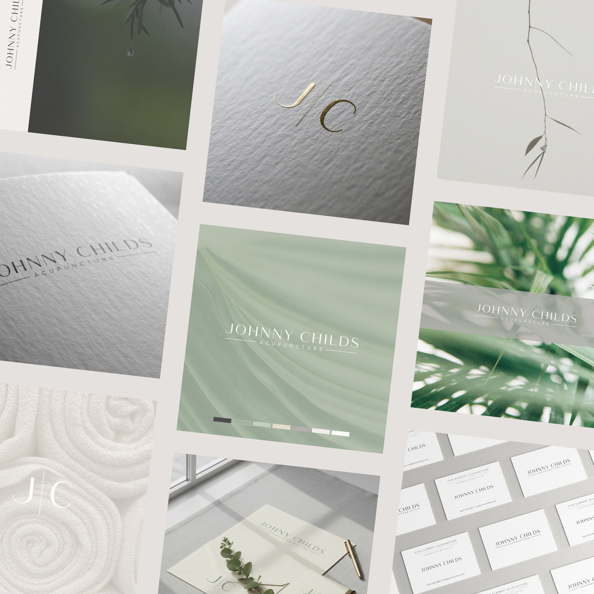
The palette of Sage, Charcoal, Porcelain Bone, Soft Limestone, Silver Ash and Crisp Gallery White uses softer contrasts throughout, chosen to convey calm, trust and quiet authority. (More on how a palette earns trust in Colour in Branding.) Around that sits a supporting system of subtle patterns, textures and background imagery that adds depth and warmth while leaving the mark itself untouched.
None of these elements would carry the brand alone. Together, they give a restrained identity the range it needs across print, digital and the practice itself, without ever raising its voice. It whispers rather than shouts, reflecting the same atmosphere Johnny creates for his clients.
Structure and the unexpected
The more projects I work through, the more I appreciate this combination.
The process
A structured process keeps the work honest. It ensures every decision answers to something real about the business and the people it serves.
The craft
Human creativity is what turns that foundation into something with character, and it often delivers results that are unexpected and pleasantly surprising, even to the person doing the designing.
“Neither works nearly as well without the other.”
The identity went on to shape Johnny’s new website, where the same quiet editorial style carries a substantial library of content without ever overwhelming the visitor.
Behind the scenes
A one-minute look at the process behind the scenes of this project.