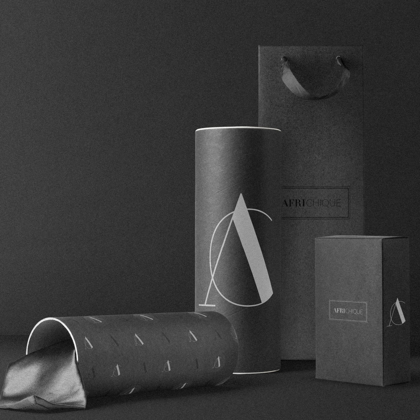
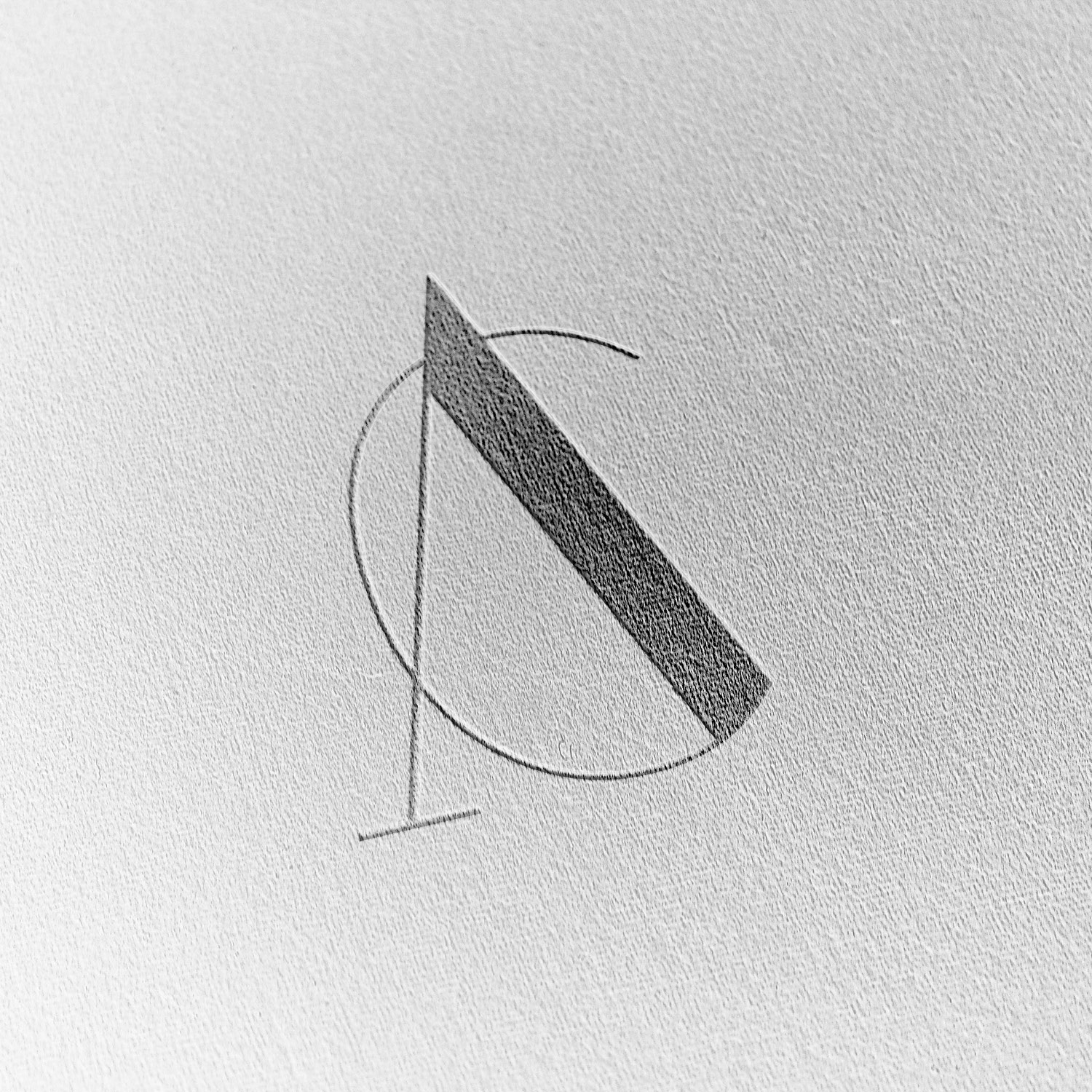
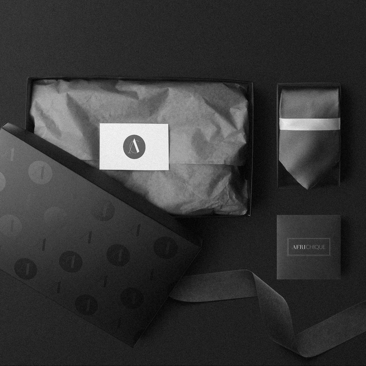
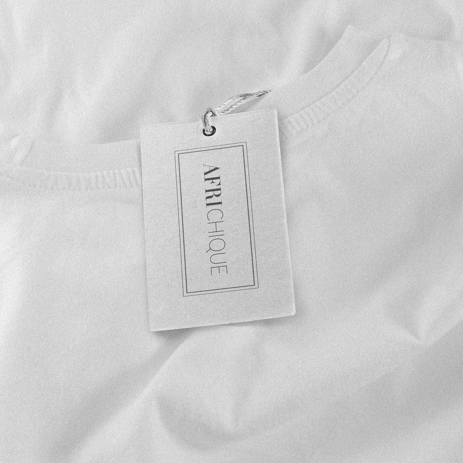
Logo Design for AfriChique – a lifestyle company specialising in home accessories such as; napkins, tablecloth, soft furnishings and tableware. The logo we developed is minimalist, elegant, and the perfect compliment to a range of textures used in the fabrics to be presented.
Case Study
Opportunity
In lifestyle home accessories, richly textured materials can overpower fussy branding. There was space for a minimalist, elegant identity that complements fabric textures rather than competing with them.
Objectives
-
Create a refined logo that reads clearly on labels, tags, packaging and digital.
-
Keep the aesthetic chic and understated to elevate perceived value.
-
Establish a compact system (lockups, colour, pattern) that scales across products.
Insight & Strategy
Buyers are drawn to tactile quality first; the identity should act like a frame, not a distraction. We positioned AfriChique around editorial simplicity: confident spacing, calm forms and a mark that retains character at small sizes on woven labels and packaging.
Identity Solution
-
Core mark: A restrained, monogram-led logo paired with a clean wordmark, engineered for clarity at micro sizes.
-
System: Horizontal and compact lockups with clear-space/min-size rules; a reversed brandmark for use on dark or photographic backgrounds.
-
Pattern: A subtle, repeatable motif derived from the mark for packaging liners, tissue, and digital accents—adding recognisability without visual noise.
-
Applications: Guidance for tags, care cards, e-commerce assets and social, ensuring the identity stays consistent in day-to-day use.
Competitive Edge Now
Compared with busy category visuals, AfriChique presents considered chic: a composed, memorable mark that travels well across materials and scales—supporting a premium, cohesive product experience.
What This Enables
The brand is now ideally positioned to extend across new product lines, packaging formats and online retail touchpoints—maintaining elegance and recognition as the range grows.


