I love the elegance of luxury candles; from the votive to the presentation box, it’s a designers dream to not only conceptualise brand identity, but develop and apply it to such a beautiful packaging application. This was one of those occasions.
Lacey & Lacey is a family business founded in Ohio, United States by Neville and Regina Lacey. They established their luxury fragrance candle company in 2005, and have poured a huge amount of passion into their work. Each candle is an individually hand-poured soy candle, nestled within beautiful, repurposed vessels. Every candle provides an aromatic scent to elevate the atmosphere and is sure to bring luxury and sophistication to set the mood.
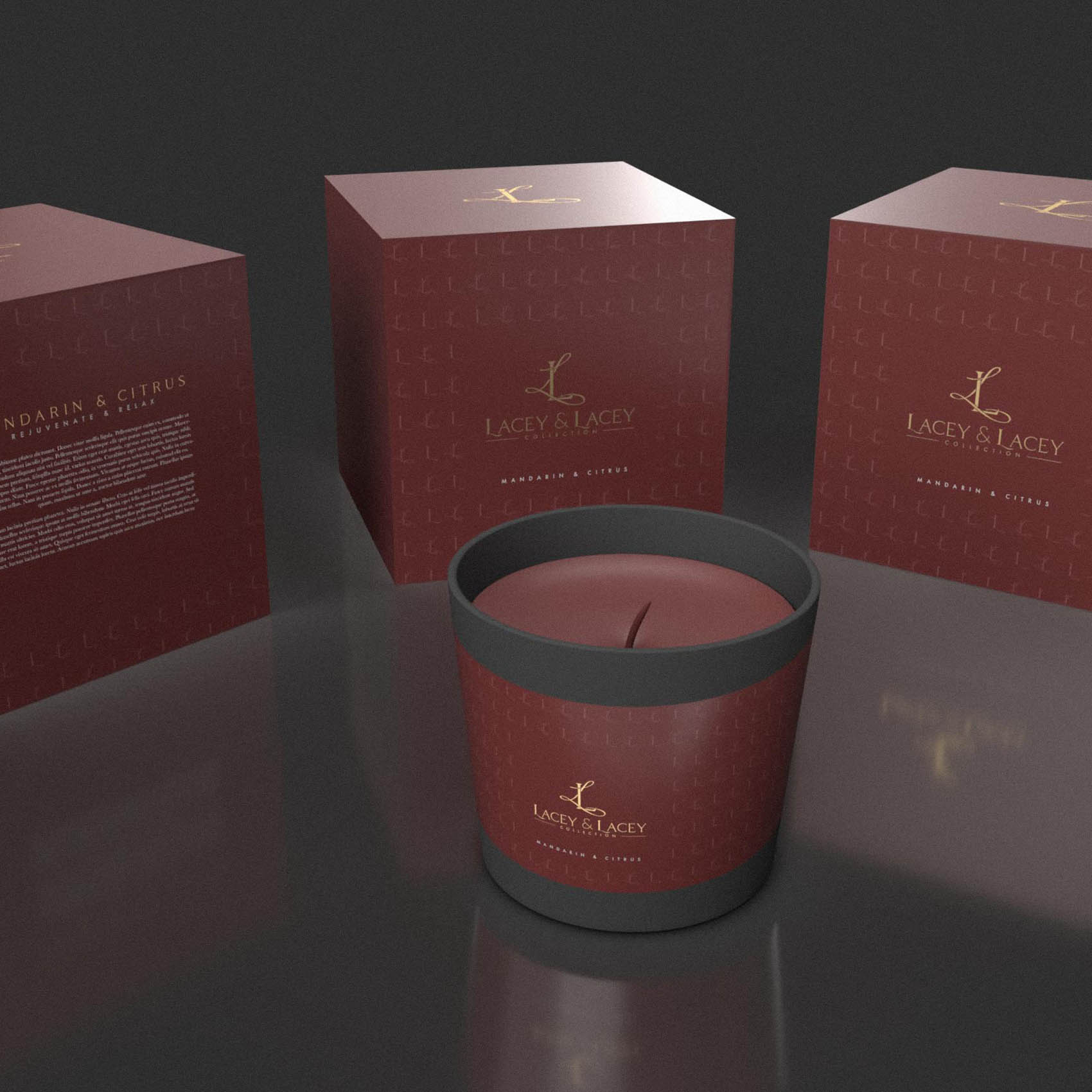
We wanted to convey a sense of passion & romance while also positioning the brand as luxurious and conveying the very high quality of the candles & their eco-friendly, sustainable but stunning luxury presentation.
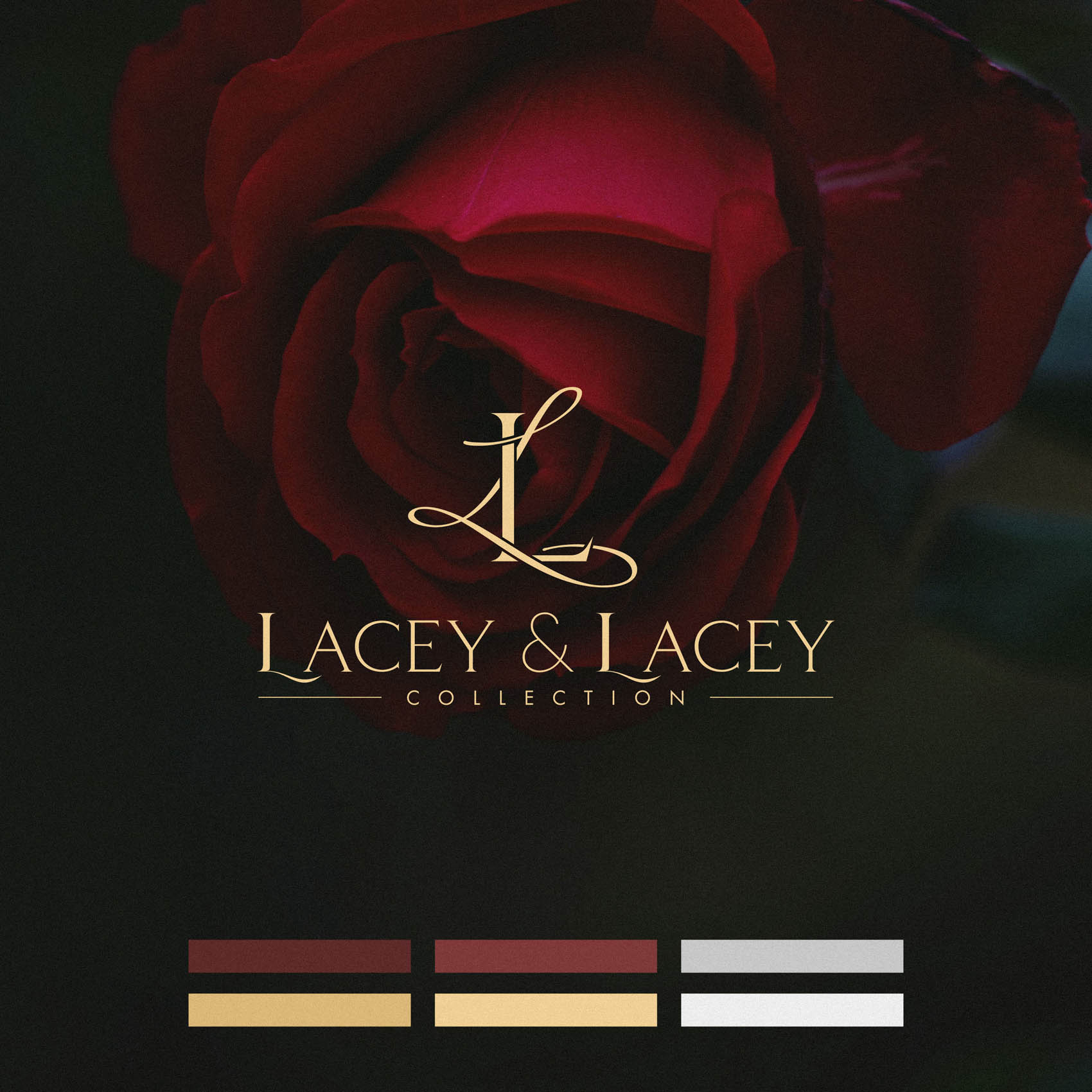
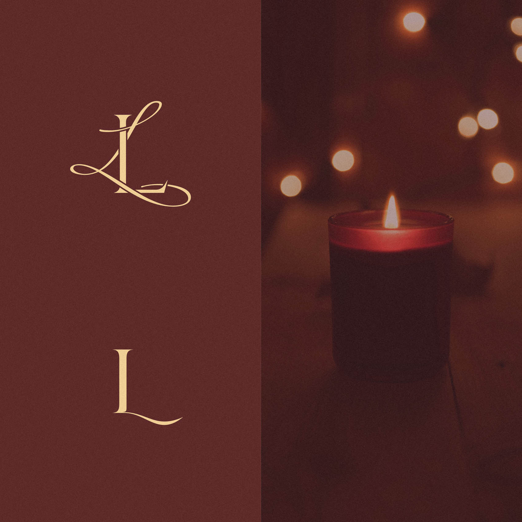
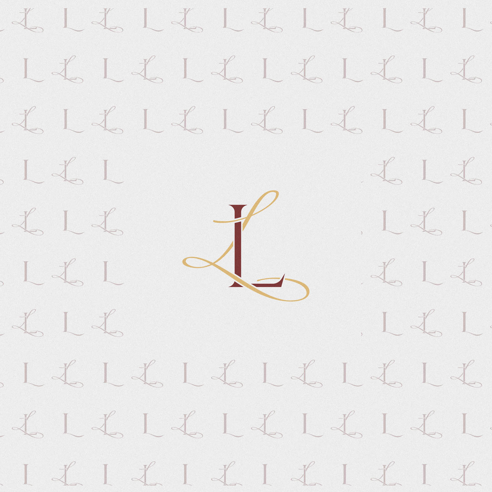
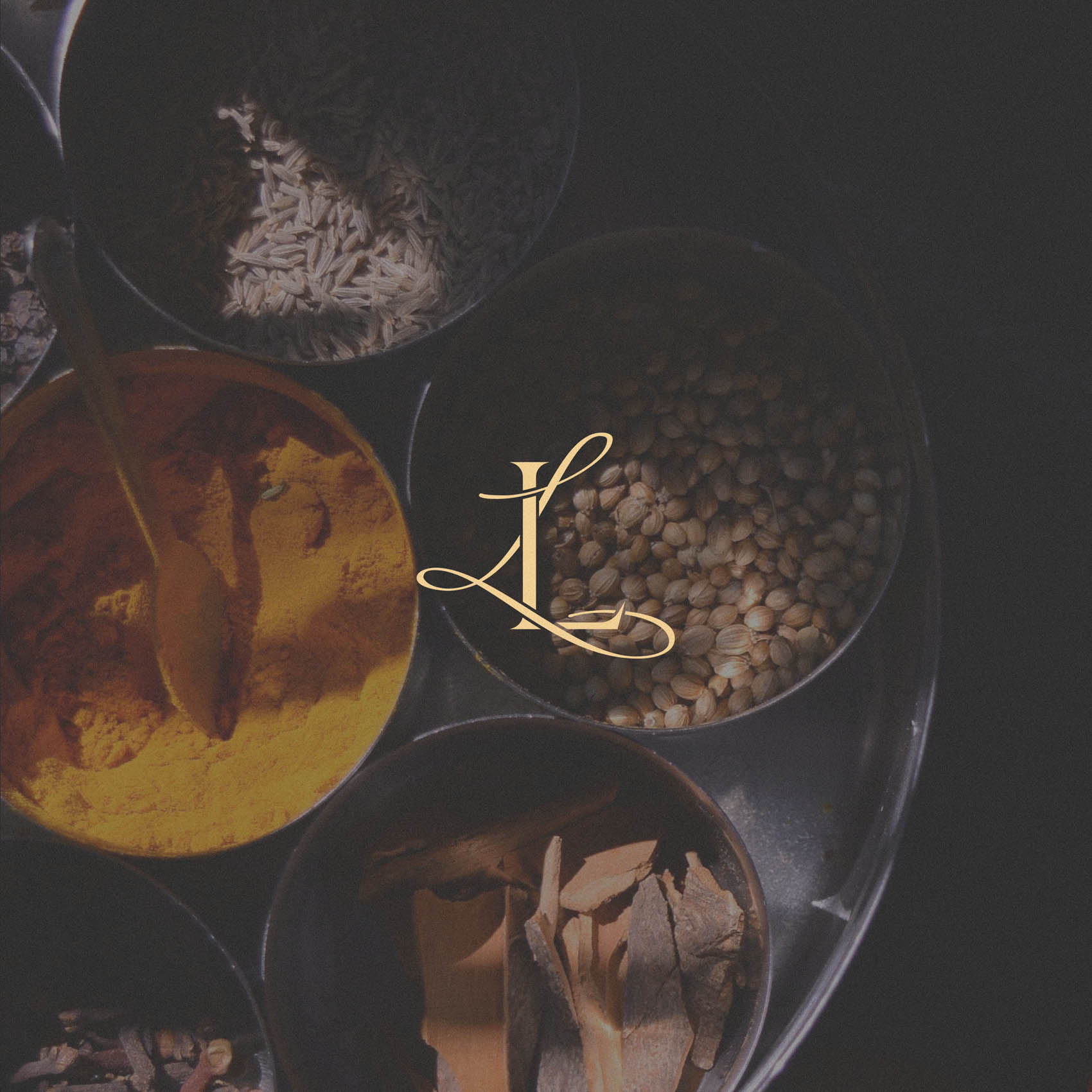
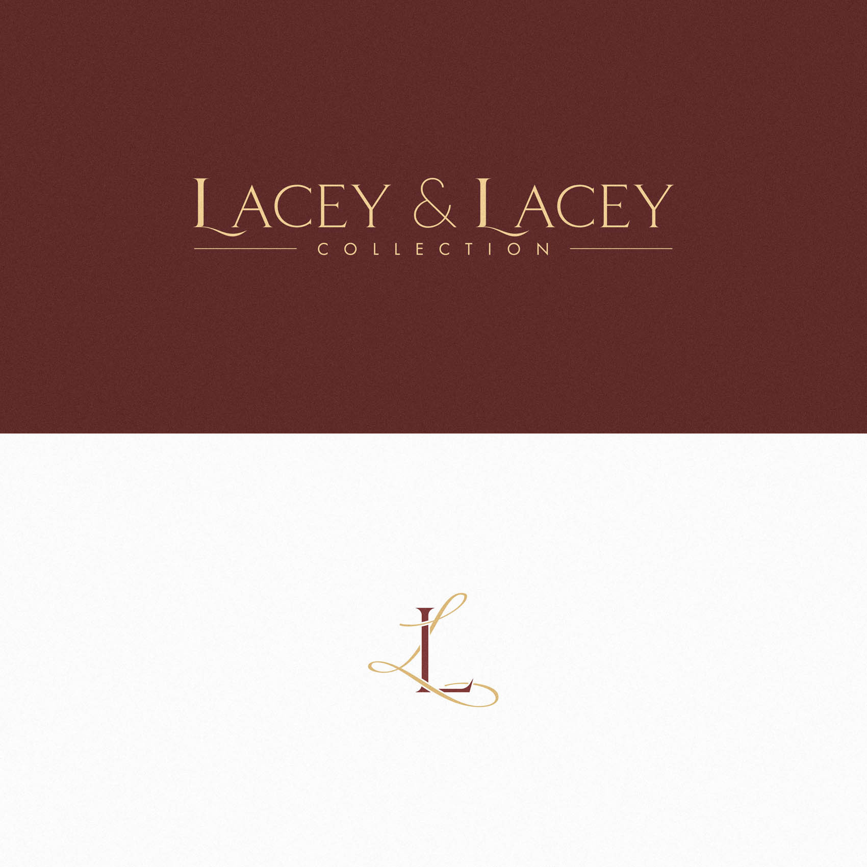
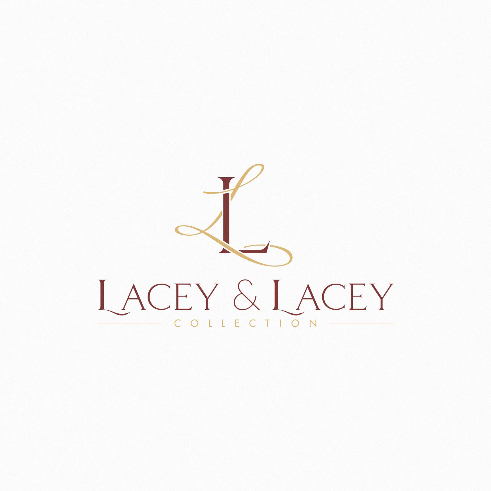
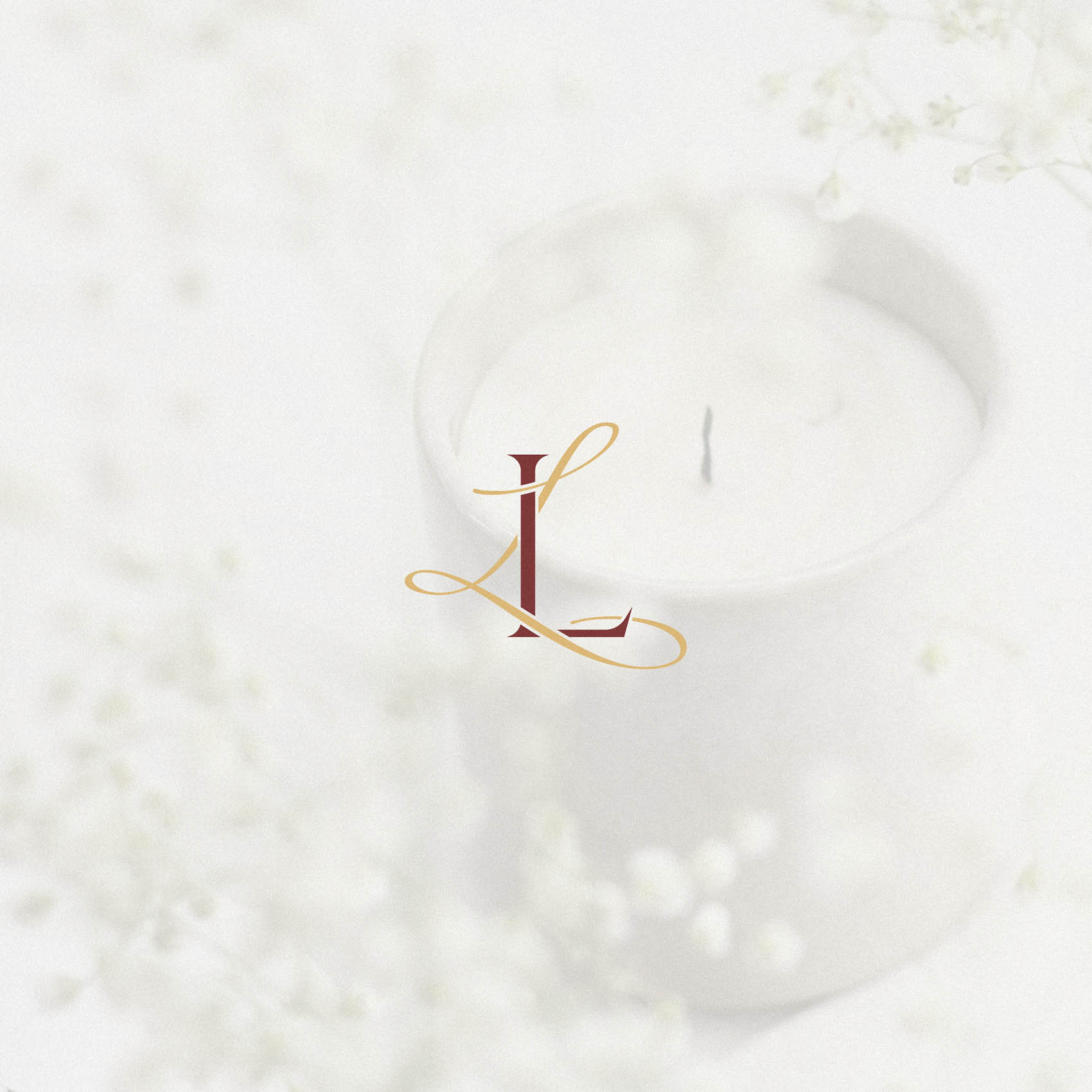
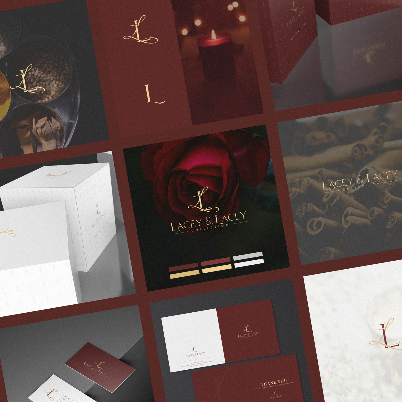
A unique monogram was developed to do just that, featuring a traditional serif L intertwined with a ‘Lacey’ script style ‘L’ – and this evokes an unmistakable sense of luxury, with the lacey ‘L’ hinting at the passionate, romantic nature of the brand.
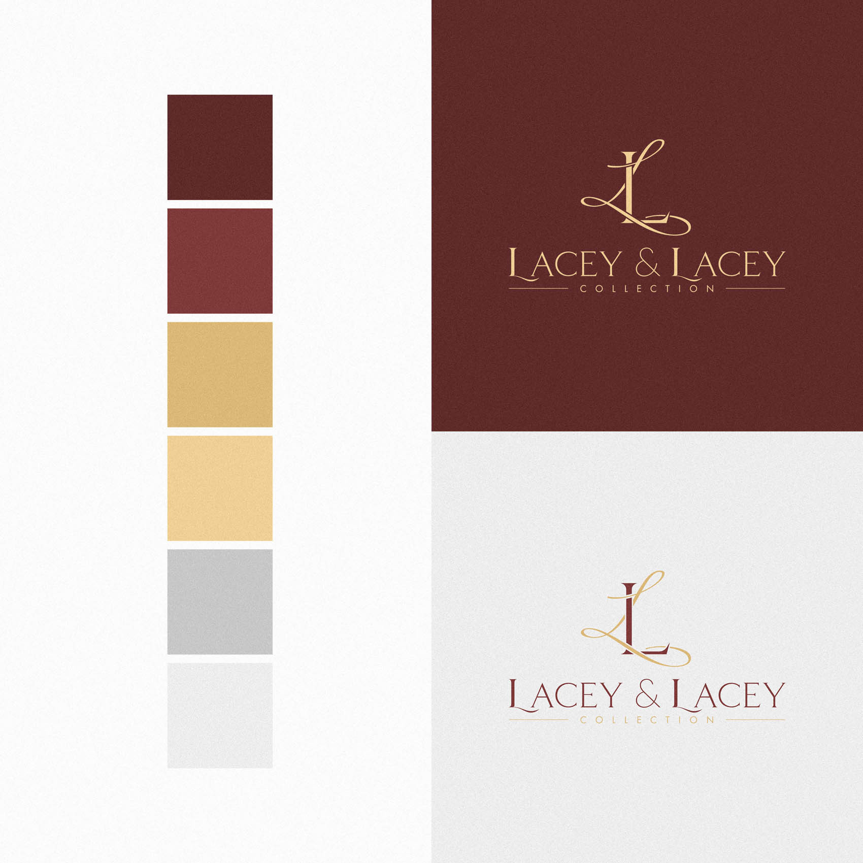
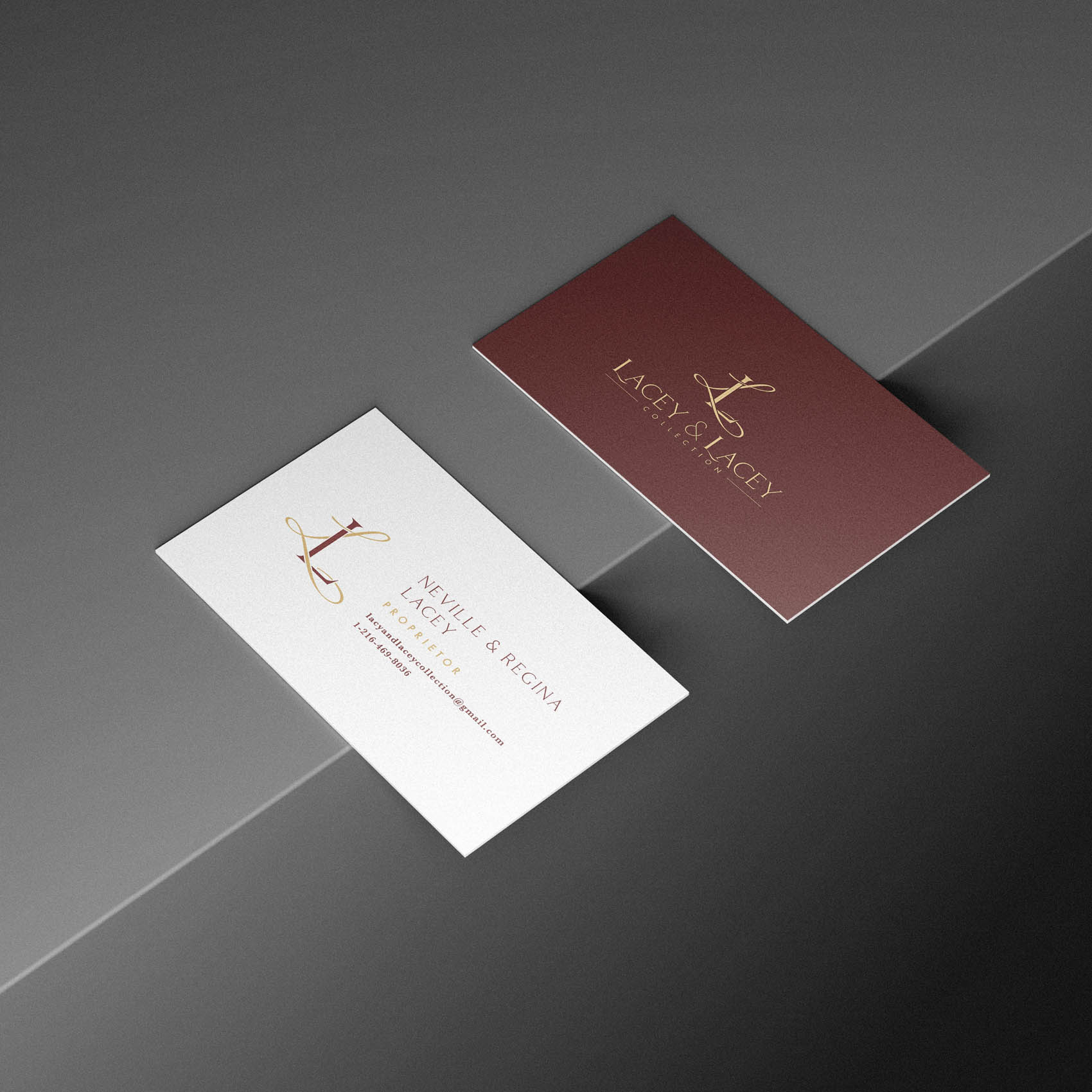
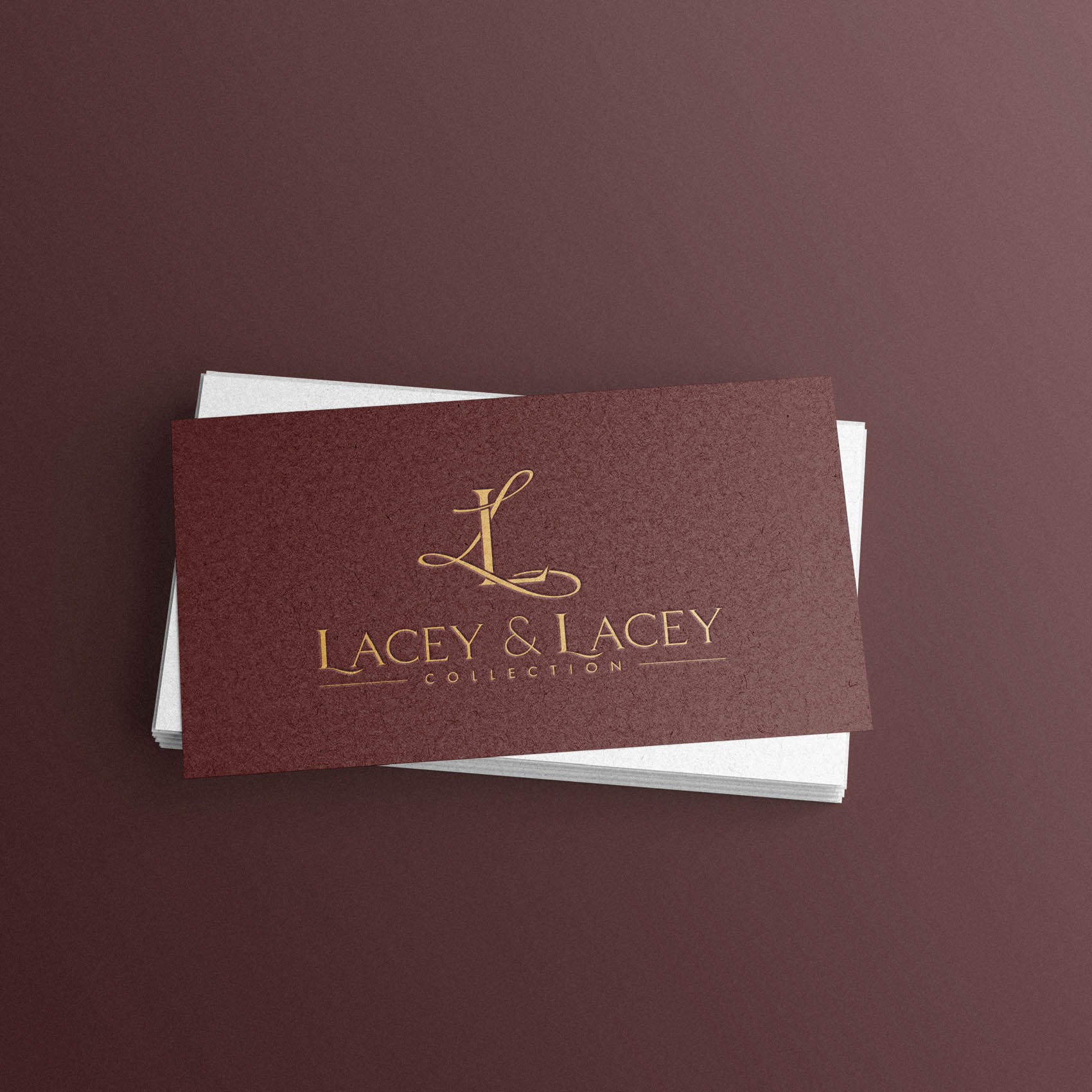
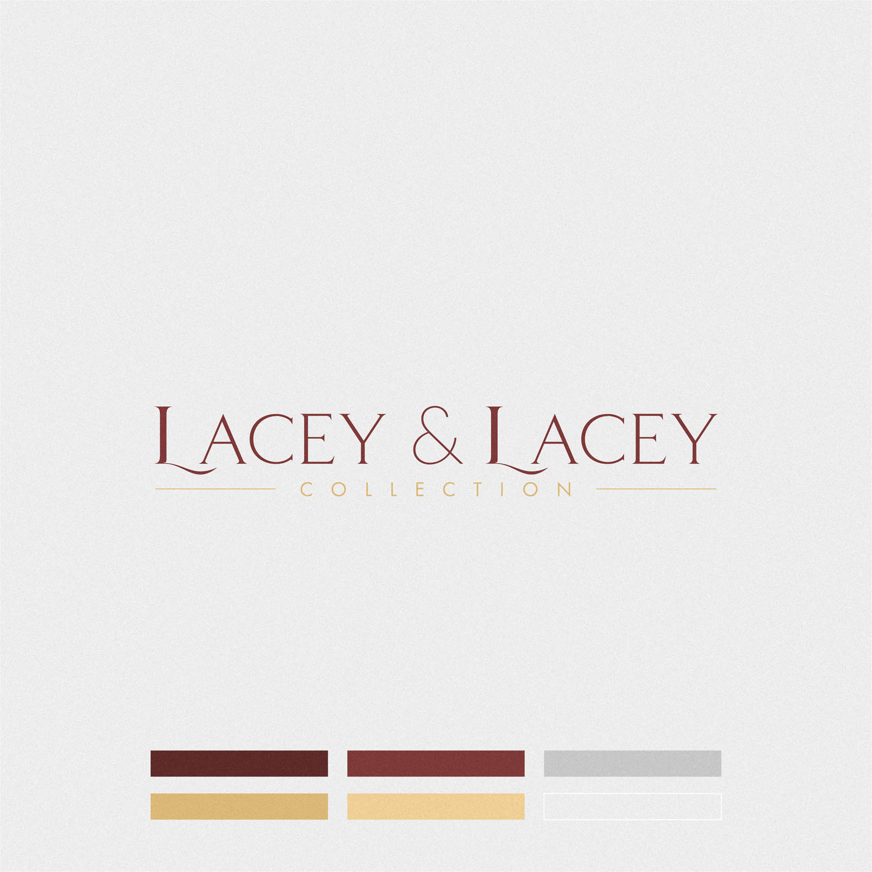
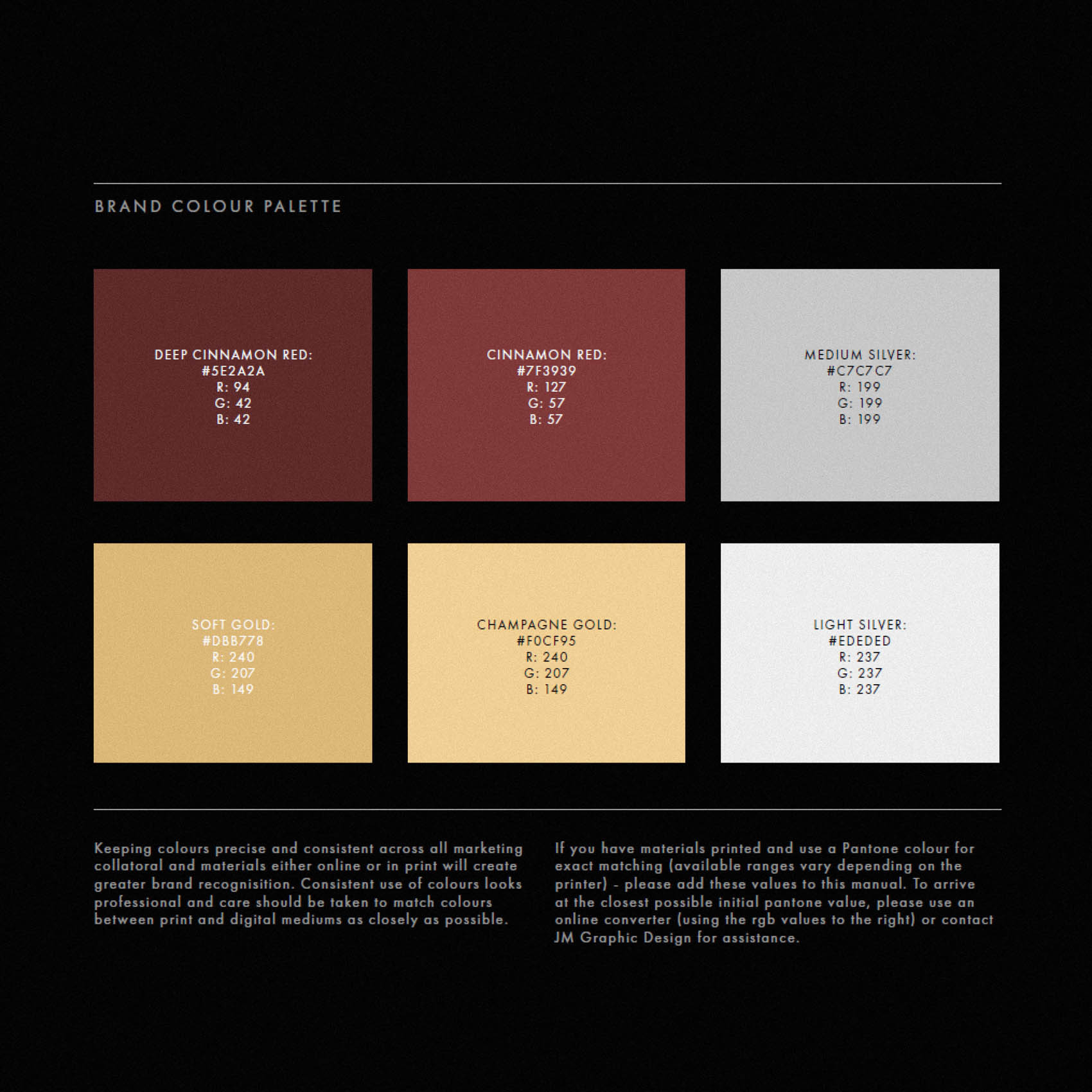
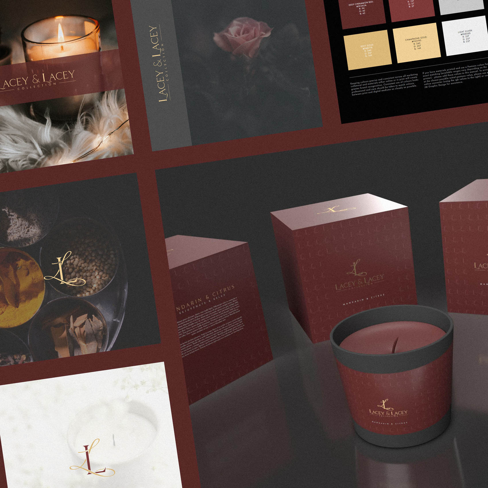
The colour palette brings this home, with a warm, indulgant Cinnamon Red, paired with Soft & Champagne Gold, together with silver.
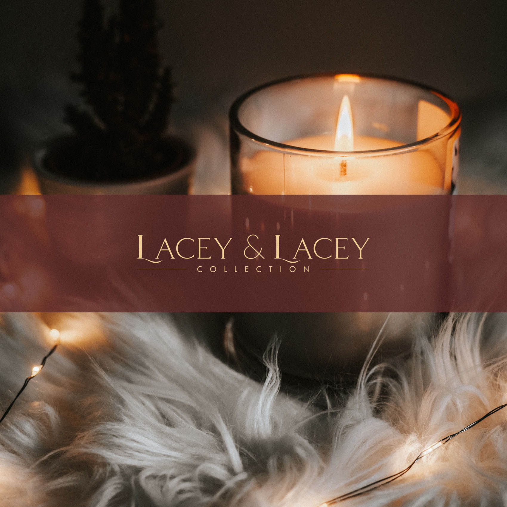
The logotype for ‘Lacey & Lacey’ was customised so that the ‘L’ features a subtle swoosh sweeping under the ‘A’. This ensures the standalone logotype wouldn’t feel detached from the style of the monogram, and conveys a similar aesthetic.
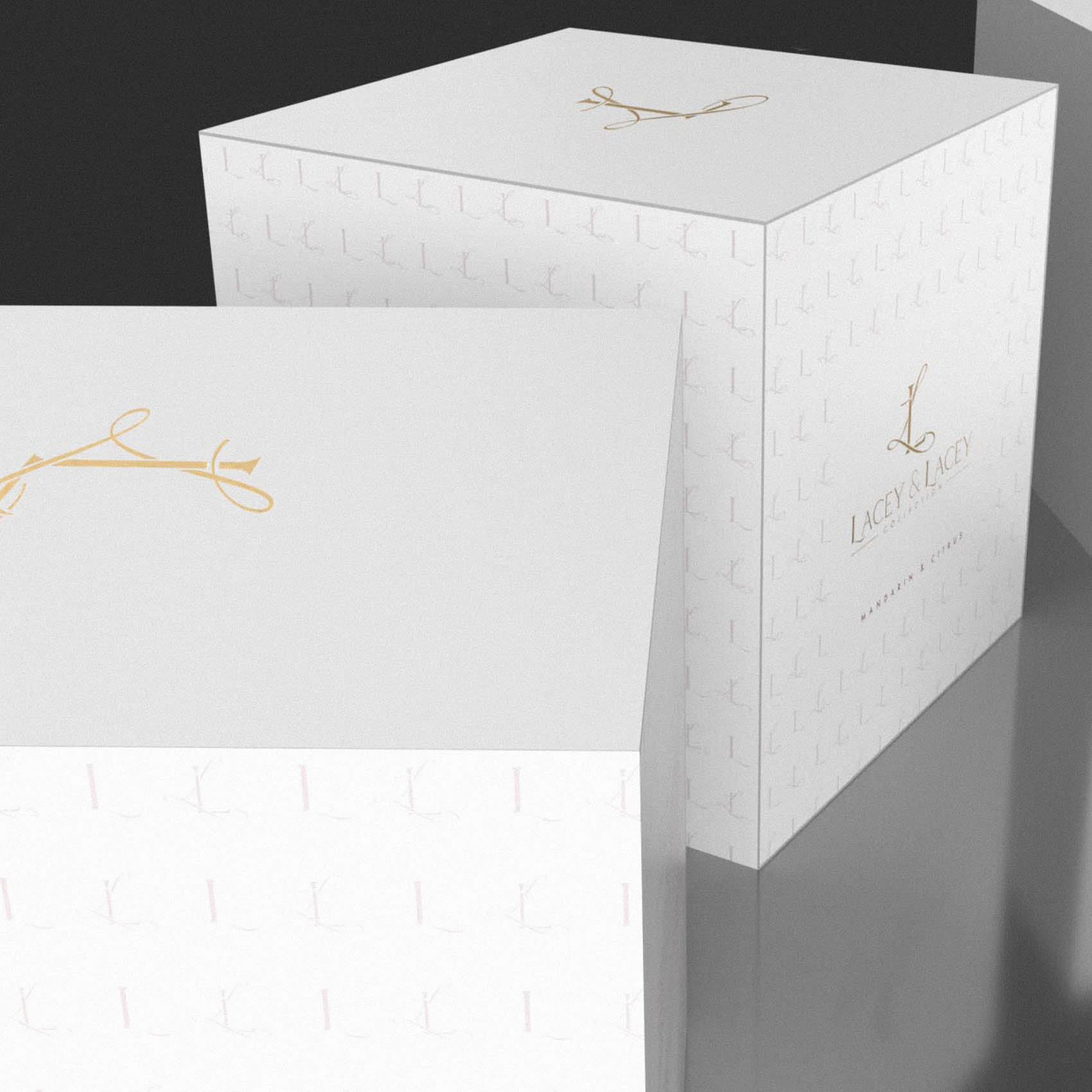
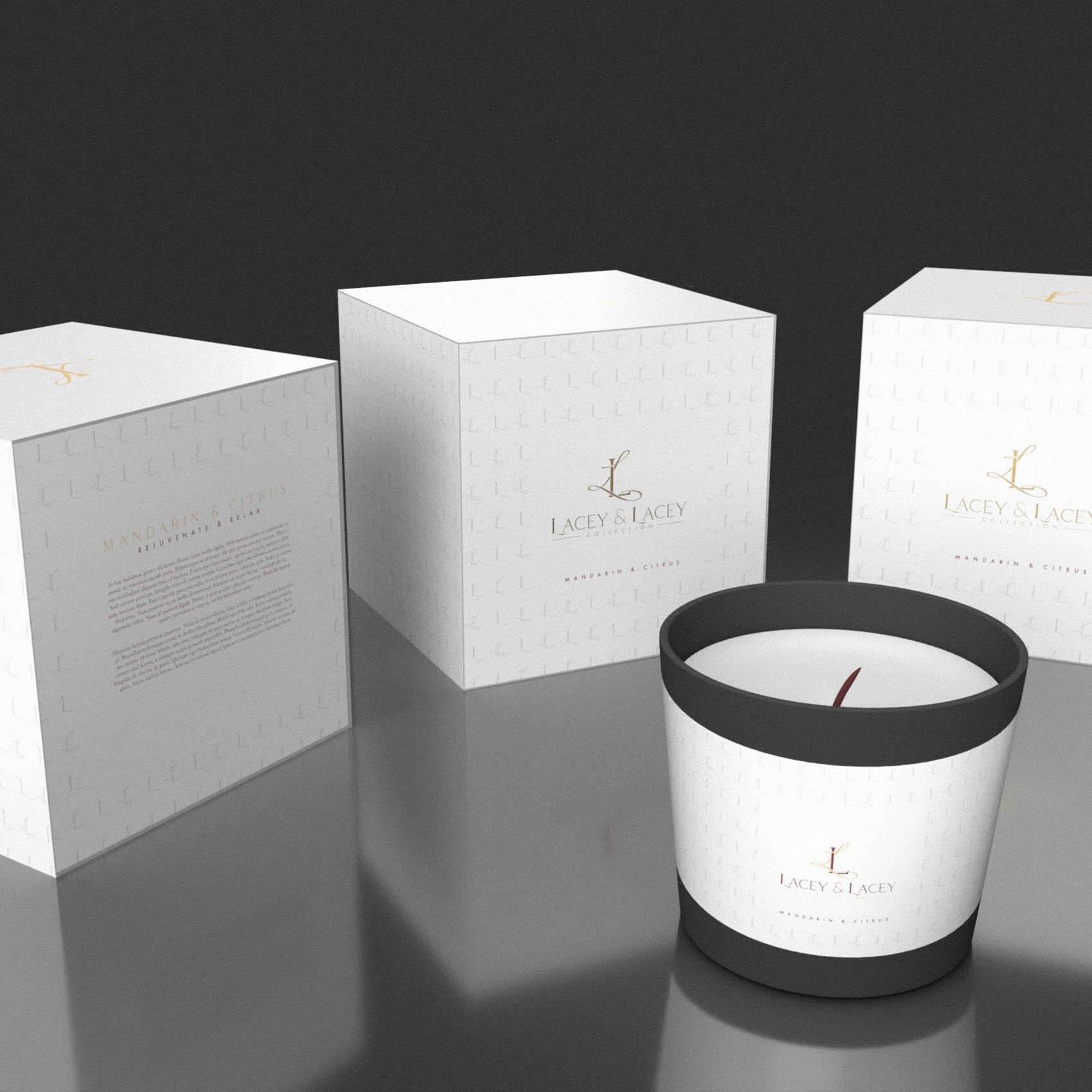
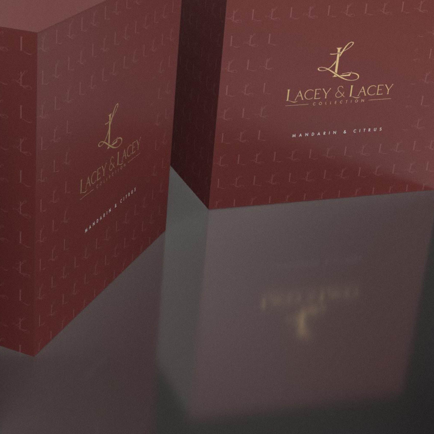
A simple step-and-repeat pattern formed from the ‘L’ in Lacey and the monogram create a very effective design element, which was utilised to great effect on the packaging.
Case Study
Opportunity
A family candle house with hand-poured soy blends and repurposed vessels needed an identity that feels as crafted as the product: romantic, genuinely premium and sensorial—without tipping into cliché.
Objectives
-
Express passion and romance while signalling high-end quality and care.
-
Create an ownable monogram + logotype system that scales from labels to presentation boxes.
-
Develop a warm, indulgent palette and pattern language suited to premium packaging.
-
Keep legibility immaculate at small sizes and on metallic finishes.
Insight & Strategy
The name invites a dual character—heritage and intimacy. We leaned into that through contrasting letterforms: a traditional serif “L” entwined with a flowing script “L,” balancing classic poise with a romantic flourish. The colour world carries the scent story—heat, spice, glow—so the unboxing feels as sensorial as lighting the candle.
Identity & Packaging Solution
-
Monogram: An intertwined serif L with a ‘Lacey’ script L—a single, memorable mark that reads as premium and emotive on caps, lids and seals.
-
Logotype: A customised Lacey & Lacey wordmark with a subtle under-sweep on the opening L to echo the monogram’s rhythm, ensuring visual kinship when the logotype appears alone.
-
Palette: Cinnamon red as the core heat note, lifted by soft/Champagne gold and silver accents—specified for foil, metallic ink and digital highlights.
-
Pattern: A step-and-repeat built from the “L” and the monogram adds a refined texture for wraps, box liners and tissue—recognisable without visual noise.
-
System: Clear lockups, contrast guidelines and minimum sizes protect clarity on small labels and busy materials; print specs document foil weights and paper choices for consistent production.
Competitive Edge Now
The brand reads sensual and considered at a glance: a monogram that tells the romance story, a customised wordmark that feels tailor-made, and a palette that turns packaging into part of the ritual—premium without excess.
What This Enables
Confident retail and direct-to-customer presentation; a distinctive unboxing moment that supports perceived value; and a scalable kit—monogram, logotype, pattern and finishes—that can carry future scents, gift sets and seasonal editions while staying unmistakably Lacey & Lacey.


