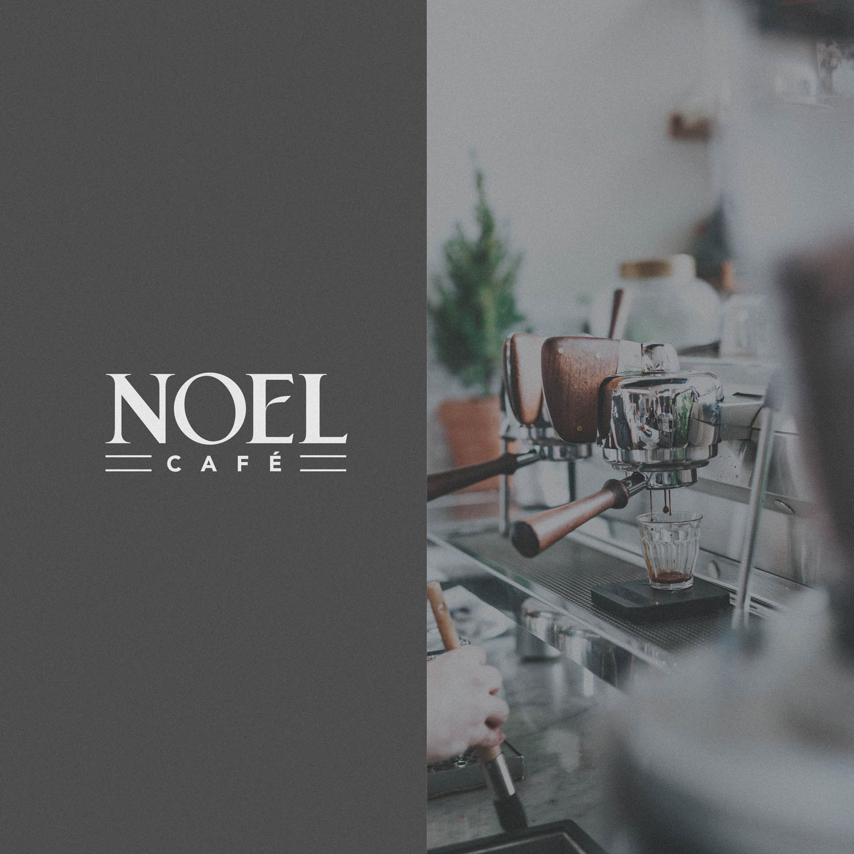
Noel Café is a high end coffee shop located in East Barnet, North London – the town I’ve lived in for over 10 years. It’s always a pleasure to work with local businesses, and I was delighted when Xhoana reached out to me and described her vision for the new coffee shop; a classy, family owned business (the name ‘NOEL’ literally takes initials from family members names!) that could serve as a meeting point for the growing number of professionals working from home, and of course lovers of great coffee.
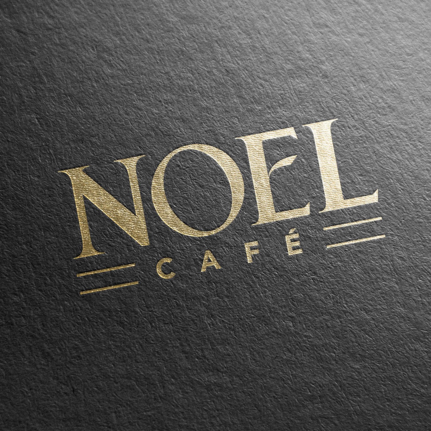
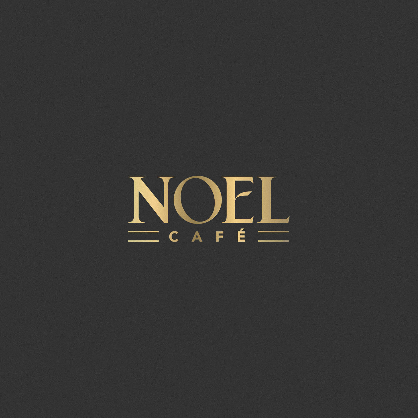
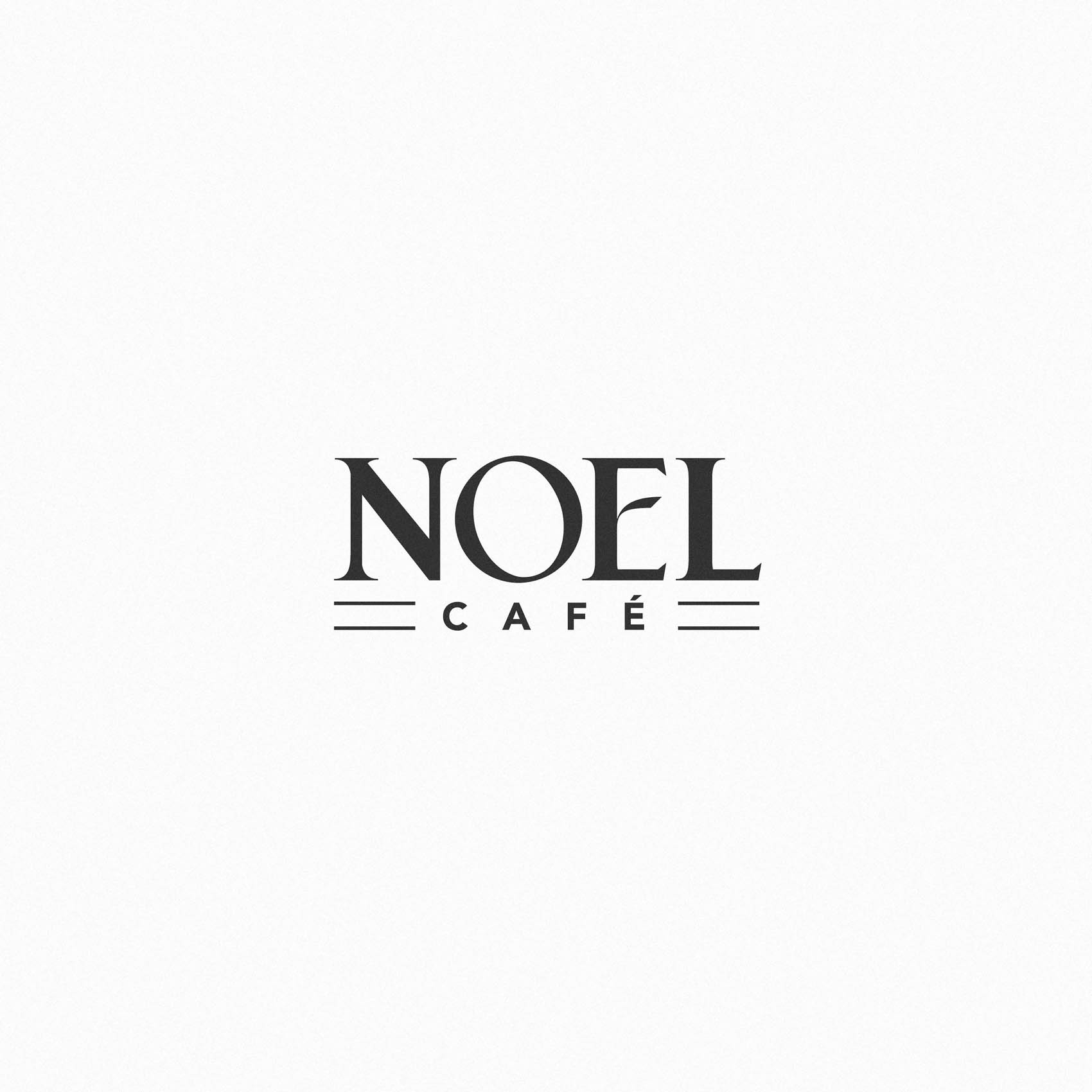
We wanted the logo to have high end, luxurious feel to it – but also a warm, welcoming tone. This was achieved by highly customising type to create a unique typeface for the 4 letters in Noel – much chunkier (and therefore friendly) than a traditional serif font, with a stylised center bar on the ‘E’. ‘Cafe’ has then been treated in a modern, minimalist font to provide a pleasing contrast. To ensure the overall shape of the logo and alignment looked balanced, without forcing us to enlarge the word ‘cafe’, duel keylines have been used on either side.
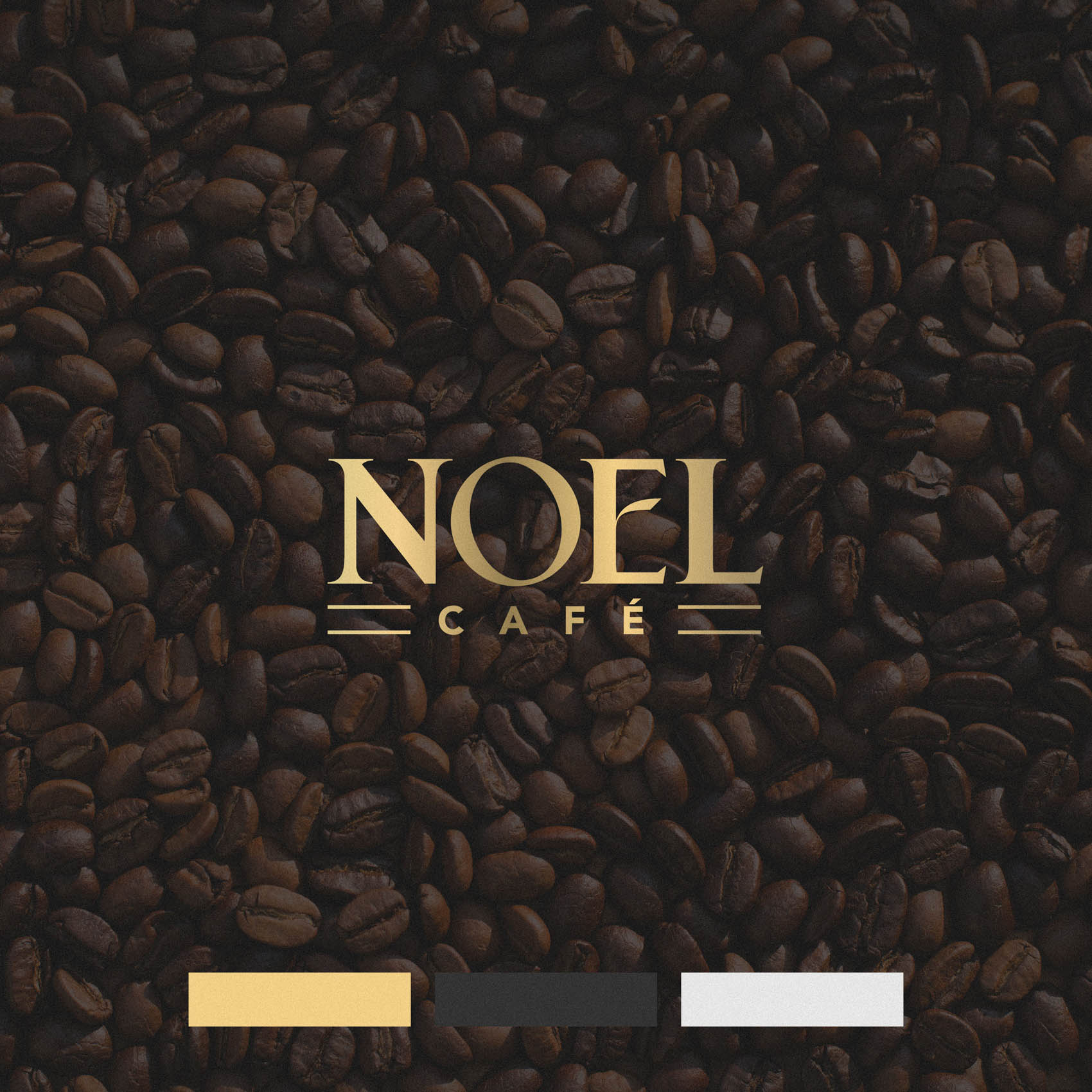
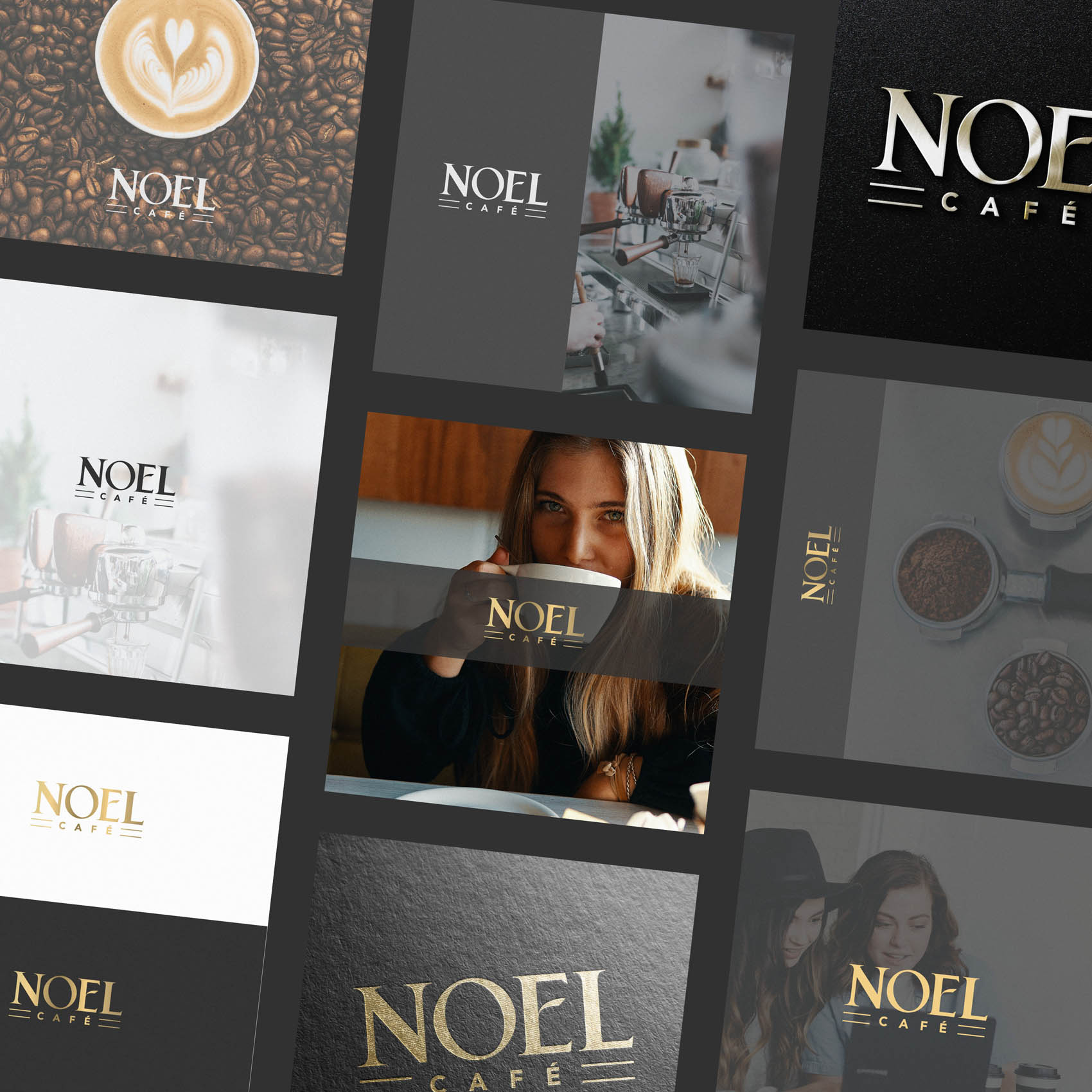
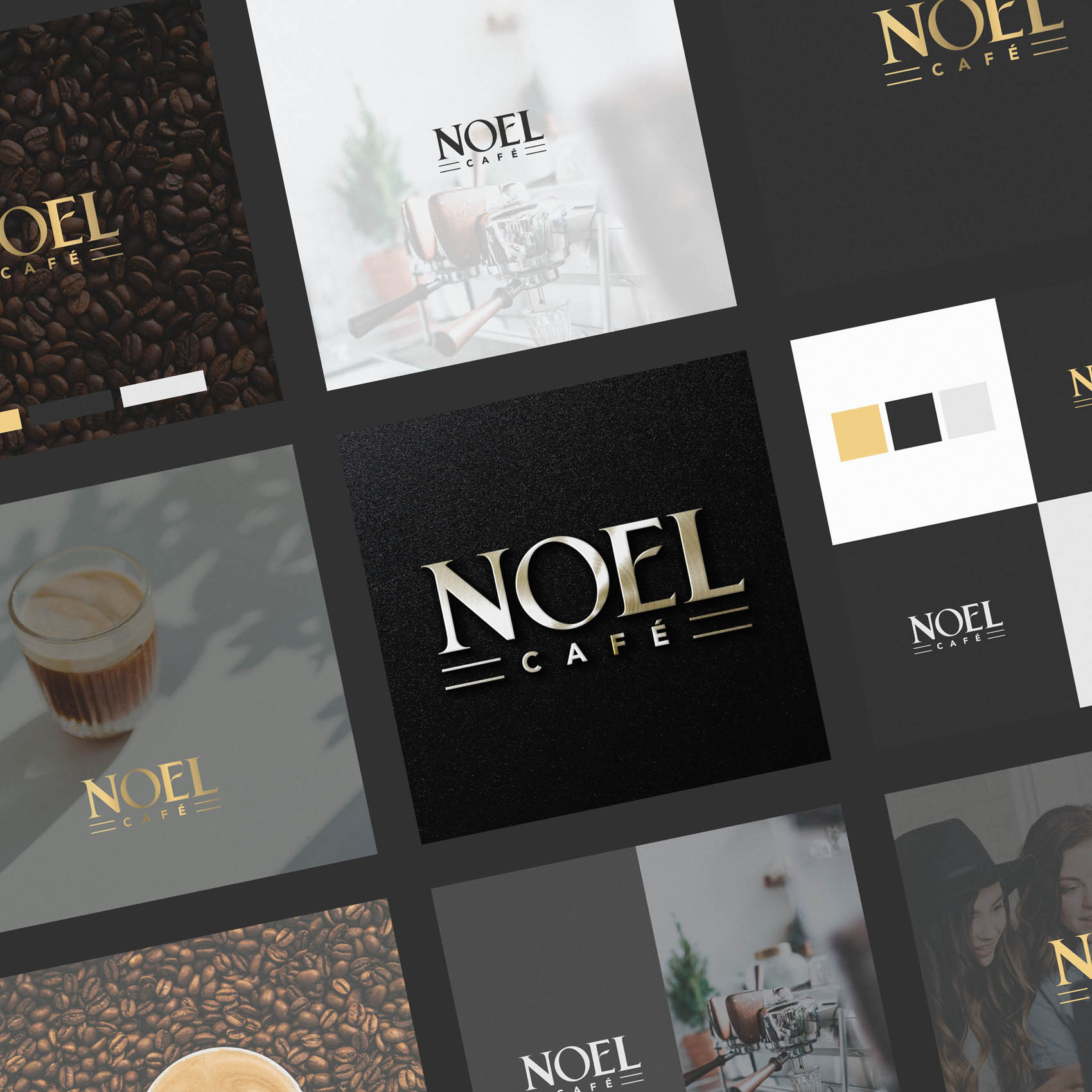
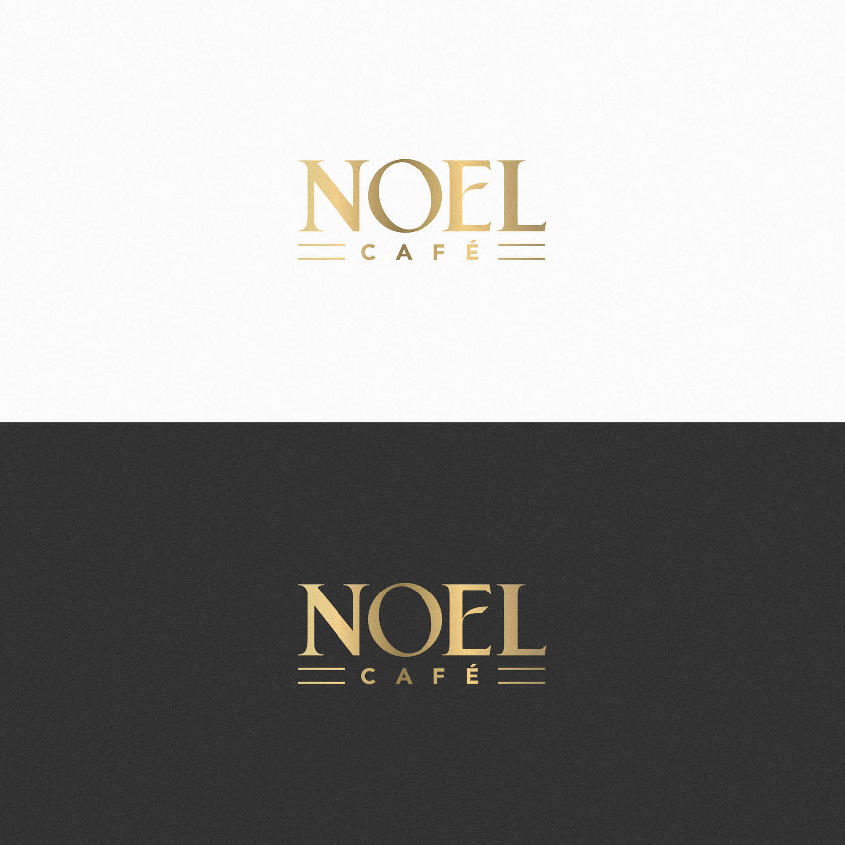
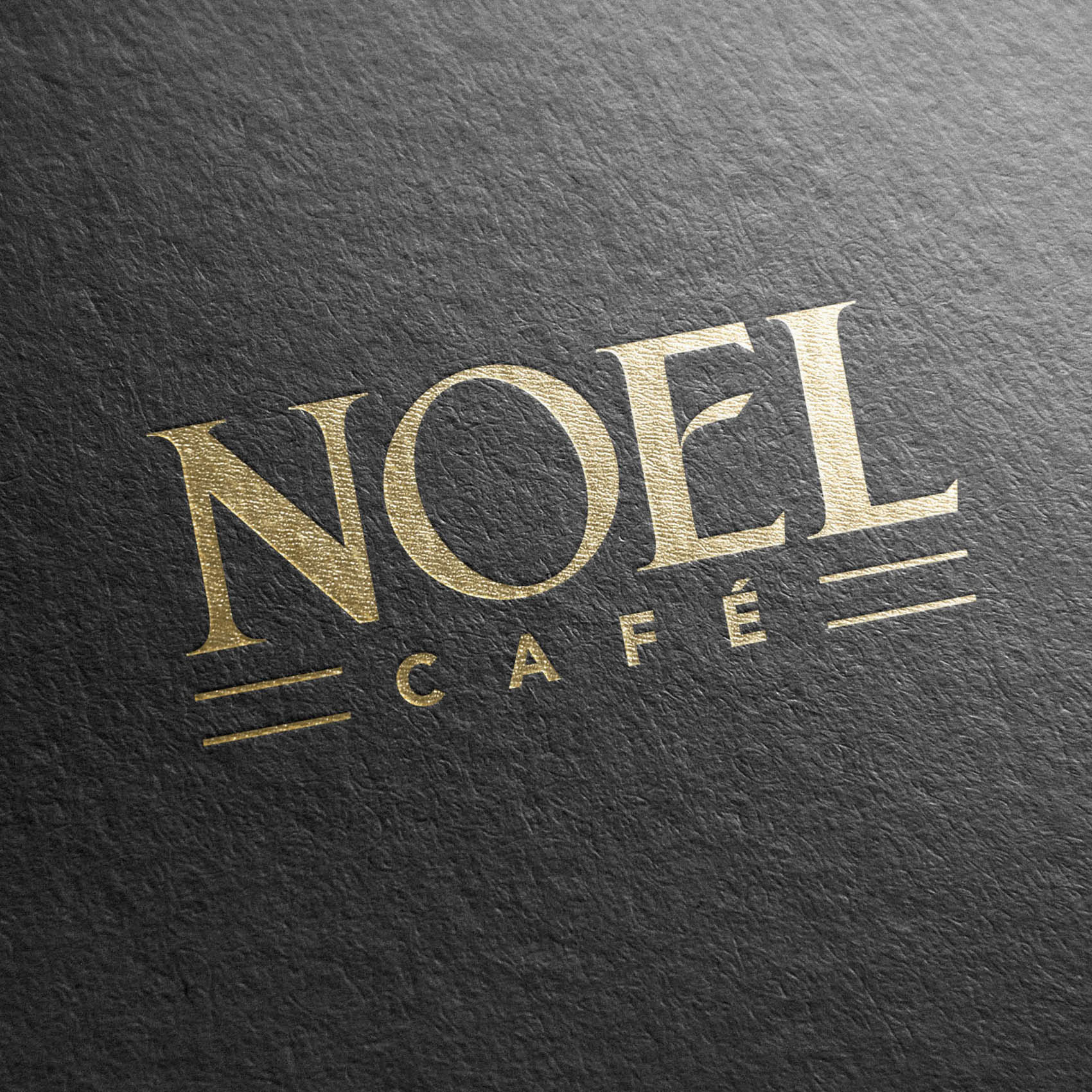
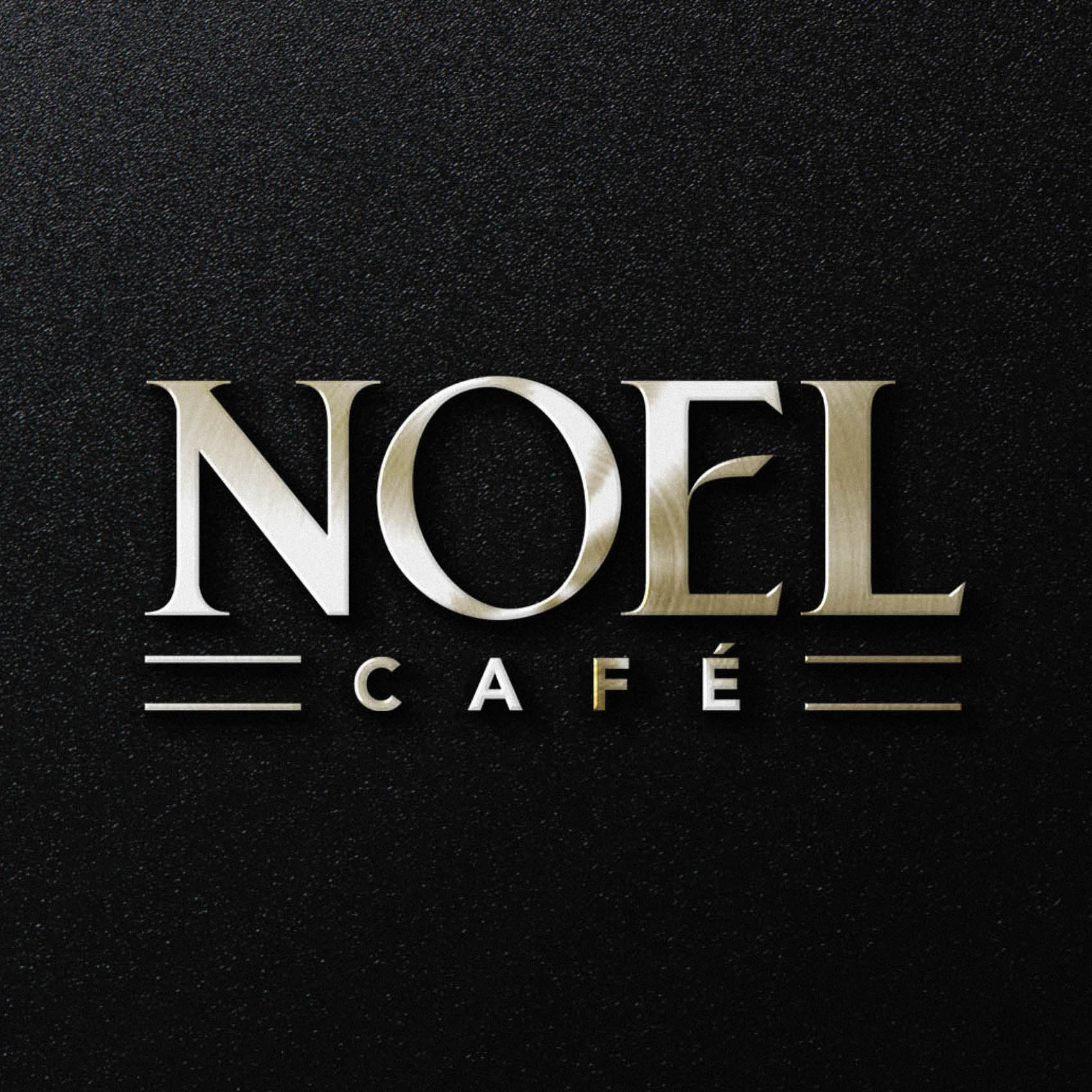
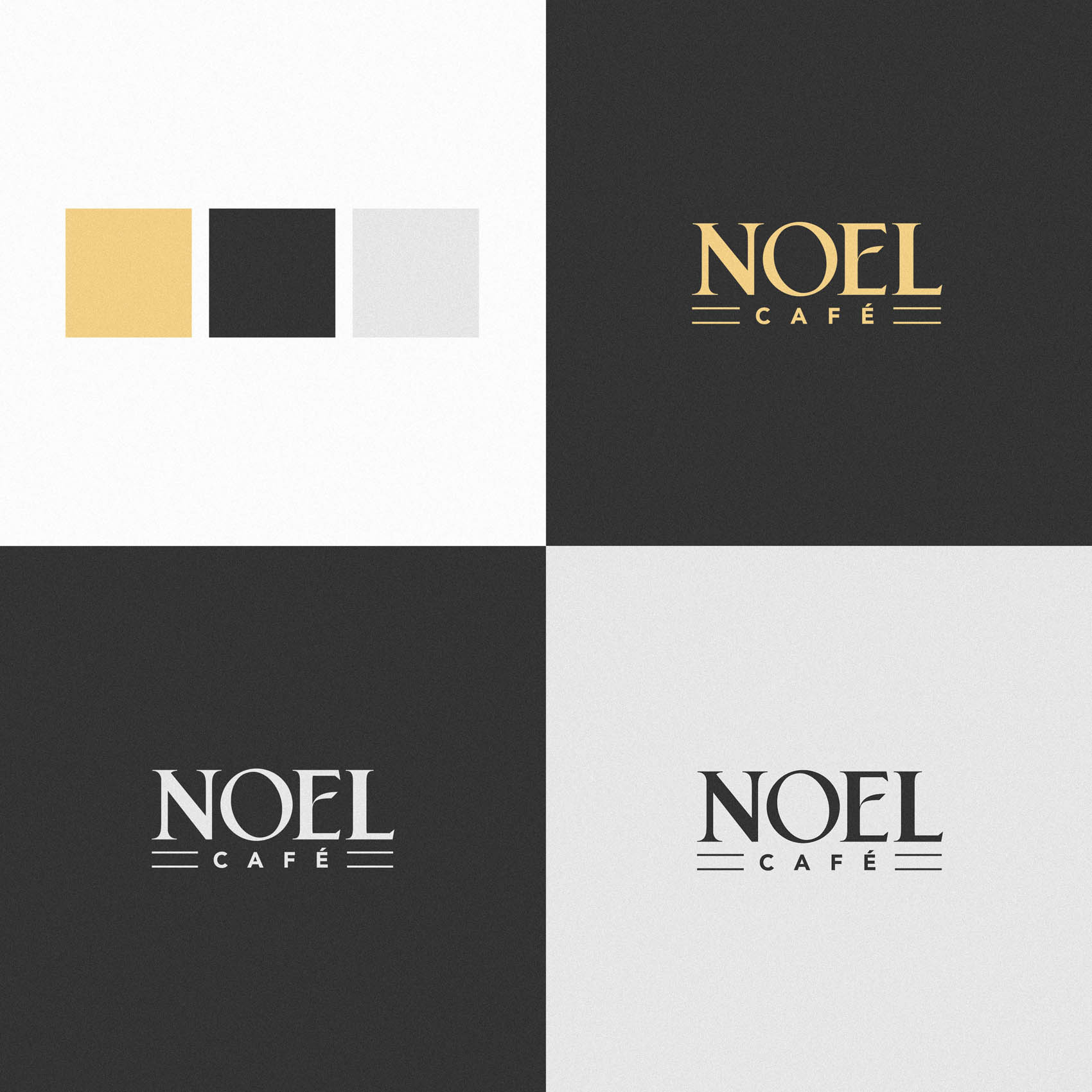
Finally, while the intention was always for the logo to be physically printed in gold on a black background for the shop sign (another reason the chunkier lettering for Noel was essential – as this will make it far easier to laser cut), we wanted to provide a range of colour treatments for various needs and situations. These include a rich, gradient-gold version for full colour printing, a flat gold for more limited printing situations, and a plain black or plain white version which can be subtracted from various backgrounds.
The result is a rich Logo Suite that can be applied to a wide range of situations.
If you live in or around Barnet (EN4) be sure to pop in for a coffee once Noel Cafe opens in the Spring / Summer!
Case Study
Opportunity
A high-end coffee shop needs to feel luxurious without losing warmth. With a new café opening in East Barnet, the brief was to create a mark that reads premium at first glance yet remains welcoming and down-to-earth.
Objectives
-
Express “quiet luxury” with a friendly, approachable tone.
-
Build recognition using custom lettering (not an off-the-shelf font).
-
Create a lockup that holds together on signage, packaging and digital.
-
Keep legibility impeccable at small sizes.
Insight & Strategy
Rather than leaning on coffee icons, we made the lettering do the storytelling. Thicker, sculpted serif forms signal hospitality; modern supporting type brings freshness. The goal: a typographic signature that feels tailored, elegant and genuinely inviting.
Identity Solution
-
Custom wordmark (“NOEL”): All four letters were redrawn to a chunkier, friendlier cut than a traditional serif. A distinctive center bar on the “E” adds a subtle signature without fuss.
-
Contrast line (“Café”): Set in a clean, minimalist style to balance the crafted serif forms and sharpen readability in small contexts.
-
Colour mood: A restrained black with warm metallic accents amplifies the sense of quality while keeping the overall tone calm and welcoming.
-
System notes: Horizontal lockup, reversal/monochrome variants, and spacing/min-size guidance so the mark stays clear on storefronts, menus, cups and social headers.
Competitive Edge Now
Where many café brands look templated, Noel’s identity feels tailor-made. The custom letterforms carry warmth and character; the minimalist counterline and refined palette deliver a premium impression that holds up across real-world applications.
What This Enables
A recognisable storefront and packaging presence, a cohesive look across print and digital, and a scalable foundation for future touchpoints—maintaining Noel Café’s welcoming, high-end character as it grows.

