
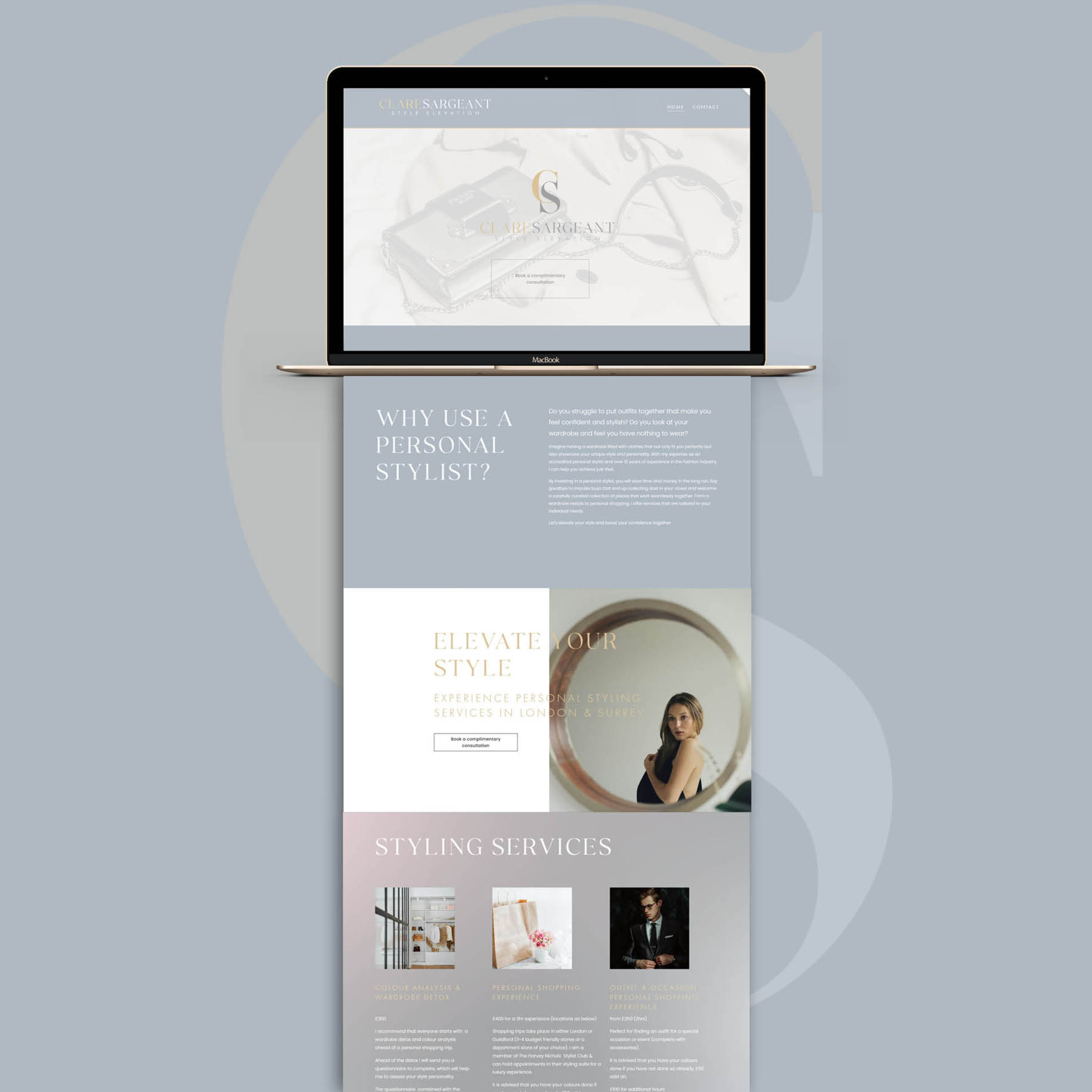
It was a real pleasure to design the new website for the talented Clare Sargeant, a personal stylist offering services in London & Surrey. Website design followed the brand identity process, and so we had a rich array of identity elements to work with; this always leads to superior results.
The website is simple but effective; containing only 5 page sections on a single homepage, with a standalone contact page. However that was more than enough to provide a comprehensive overview of the services Clare provides, her background, approach and even details of prices and packages. This is an excellent example of a website which presents everything a prospective client needs in an attractive, consise way. Visitors on average spend suprisingly little time on a website, and so it’s essential to provide them a memorable, well-structured experience. ‘One page’ websites can be an excellent way for certain brands to do this, minimising fustration and removing the need to ‘hunt through’ a website for the information they need.
A first for me was a subtle background gradient; conceptualised in the identity design at Clare’s request – and when used sparingly – now an element I really like!
Case Study
Opportunity
Prospective styling clients decide on fit quickly. Rather than sending visitors through multiple pages, we created a single-page experience that puts everything in reach—services, approach, background and transparent packages—so the decision to enquire feels effortless.
Objectives (Business + User)
-
Give a clear first impression of a modern personal stylist serving London & Surrey.
-
Present services, process and pricing in a calm, easily scannable flow.
-
Keep the path to enquiry obvious, with a separate contact page for focused conversion.
-
Carry brand identity elements through to the web, including a subtle gradient motif.
UX Insight & Strategy
Visitors skim first, then read detail where interested. The page is structured into five concise sections with clear anchors and logical sequencing: value proposition → services/packages → about/credibility → social proof/imagery → next steps. This reduces hunting and keeps momentum to enquiry.
Design System & Content
A light, modern typographic system and generous spacing create a fresh, editorial feel. The background gradient—developed during identity—appears sparingly, giving the site a distinctive, ownable note without overpowering content. Copy is concise; modules are consistent, making information easy to compare at a glance.
Interaction & Performance
The single-page architecture minimises clicks, while smooth scrolling and restrained micro-interactions keep the experience polished. Images are optimised for speed; layouts are modular so future updates can be made without breaking the look and feel. Accessibility and contrast were considered to protect legibility across devices.
Competitive Edge Now
Compared with template-heavy stylist sites, this experience feels curated and straightforward. Essential details are presented in one pass—services, approach and transparent packages—reducing friction and encouraging confident enquiries.
What This Enables
The site is well positioned to attract time-pressed clients who want clarity before booking, to support referral traffic with a memorable first impression, and to scale with new packages or content while preserving the clean, modern tone.


