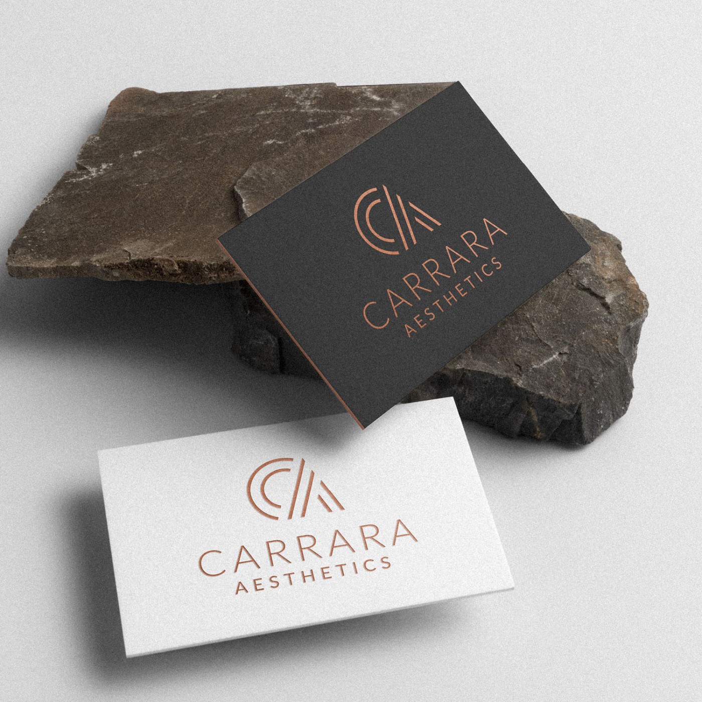
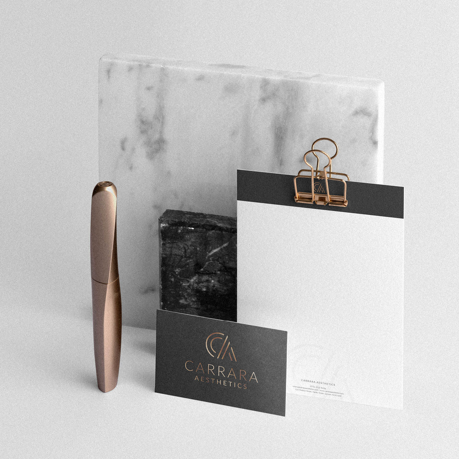
Carrara Aesthetics approached me to create a new brand identity that would embody their brand values and attract their ideal clientele. The logo itself needed to look trustworthy and professional – representing a well established business. It also needed to reflect Carrara Aesthetic’s positioning as a high end clinic, offering a very high level of service and personal attention.
After exploring many potential solutions, we fell in love with the concept conveyed by the simple CA in stylised fashion. The lines convey a sense of shape, form and beauty in a simple, elegant fashion. As many aesthetic treatments focus on altering or enhancing shape and form, we felt there was a strong underlining meaning to the symbol.
Case Study
Opportunity
A high-end aesthetics clinic needs to communicate trust, discretion and meticulous care in an instant. The brief called for a presence that feels established and professional while appealing to clients who value personal attention and refined treatment.
Objectives
-
Signal clinical credibility and a premium service model at first glance.
-
Create a distinctive symbol that carries meaning for aesthetics (shape, form, refinement).
-
Build a disciplined system with clear lockups, sizes and finishes suited to print and digital.
Insight & Strategy
Clients in this space respond to controlled elegance—confidence without showiness. We centred the identity on a stylised CA whose lines suggest contouring and harmonious proportion, echoing the clinic’s focus on enhancing form. The tone is discreet and exacting, with visual calm that reassures.
Identity Solution
-
Monogram: A simple, sculptural CA mark that reads as contour and symmetry—ownable, memorable, and crystal-clear at small sizes.
-
Wordmark & System: Refined typography paired with horizontal and compact lockups; clear-space and minimum-size rules ensure consistency across signage, stationery and social.
-
Colour & Finish: A black and copper palette delivers understated luxury, with guidance for copper foil/metallic accents on key touchpoints to elevate tactility without excess.
Competitive Edge Now
The brand presents understated prestige: a meaningful, minimalist symbol; a calm typographic voice; and production-ready guidance that keeps every application polished—from appointment cards to clinic signage and digital assets.
What This Enables
A coherent, high-trust presence that attracts clients seeking premium care; confident roll-out across print and screen; and room to extend into packaging, aftercare materials and the website while maintaining the same poised, high-end tone.


