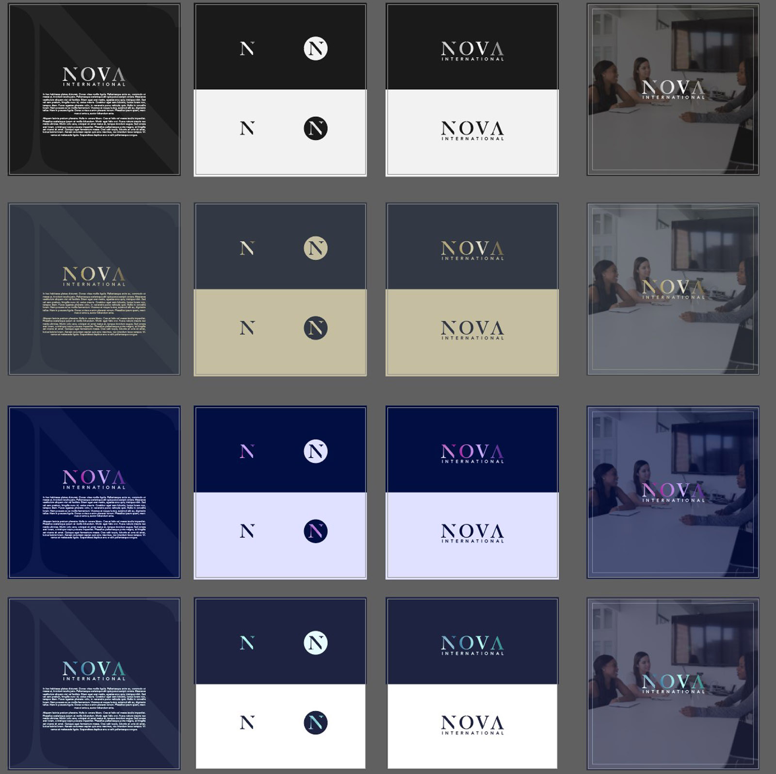
I had the pleasure of creating new brand identity for Nova International, an executive search and recruitment firm based in London, serving clients globally. We wanted to create an identity that reflected the energy and drive behind the company as well as their professionalism. The use of traditional elements with a modern twist, paired with a fresh, bright colour palette helped to convey these values effectively from the logo right through to supporting identity elements. (You can see some of the colour routes explored below, and the difference a vibrant palette can make in aligning the tone correctly).
Case Study
Opportunity
Executive search brands often present as safe but indistinct. Nova International had room to express pace and drive while retaining board-level credibility — a modern identity with classic underpinnings.
Objectives
- Project professionalism and discretion for senior audiences while signalling energy and ambition.
- Create a clear, memorable mark that scales from pitch decks and stationery to social avatars.
- Establish a colour system that feels fresh without sacrificing trust.
- Define simple rules so the identity stays consistent across global touchpoints.
Insight & Strategy
Decision-makers look for confidence, clarity, and a sense of momentum. We positioned Nova as a partner that blends traditional rigour with contemporary agility — expressed through a typographic core and a brighter, optimistic palette to differentiate from corporate sameness.
Identity Solution
- Logotype: A refined wordmark with subtle modern cuts and disciplined spacing — classic proportions with a present-day edge.
- Typography: A serif/sans pairing: one for authority in headings, one for clarity in longer copy and credentials.
- Palette: Fresh, bright accent tones balanced by professional neutrals to convey both energy and trust.
- System: Layout grids, clear-space, and minimum sizes to ensure legibility across stationery, proposals, social, and web headers.
Competitive Edge Now
The identity provides a distinctive yet disciplined look. Strong typographic structure improves readability in credentials and proposals, while the fresh palette provides an immediate memory hook without undermining professionalism.
What This Enables
Nova International is well placed to pitch confidently at senior level, support international outreach with consistent materials, and expand thought-leadership and campaign assets — maintaining a recognisable voice across both digital and print.


