Very proud to have had the opportunity to work with a 160 year old heritage brand; Stanley Gibbons.
(Stanley Gibbons were established in 1856, and have held a royal warrant of appointment from Queen Elizabeth II since 1956.)
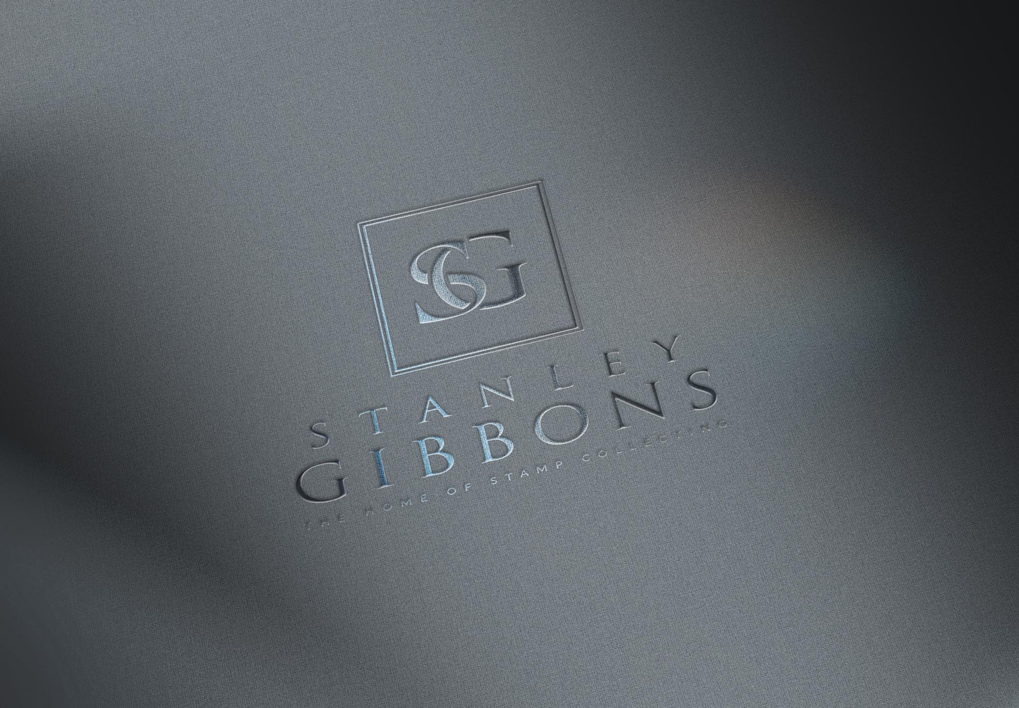
It was with great attention to detail that we set about creating their new logo; starting by looking at a range of potential typefaces.
We also wanted to create a symbol that gave a nod to the widely recognised SG lozenge that has been used for many years – and potential ‘modernised’ concepts were explored.
Having arrived at a concept we felt fit perfectly, I began fine tuning the details; with a particular focus on the font used for the SG symbol. Eventually, we customised these to create the desired effect – adjusting the serif on the Didot S to better fit the Trajan Pro G.
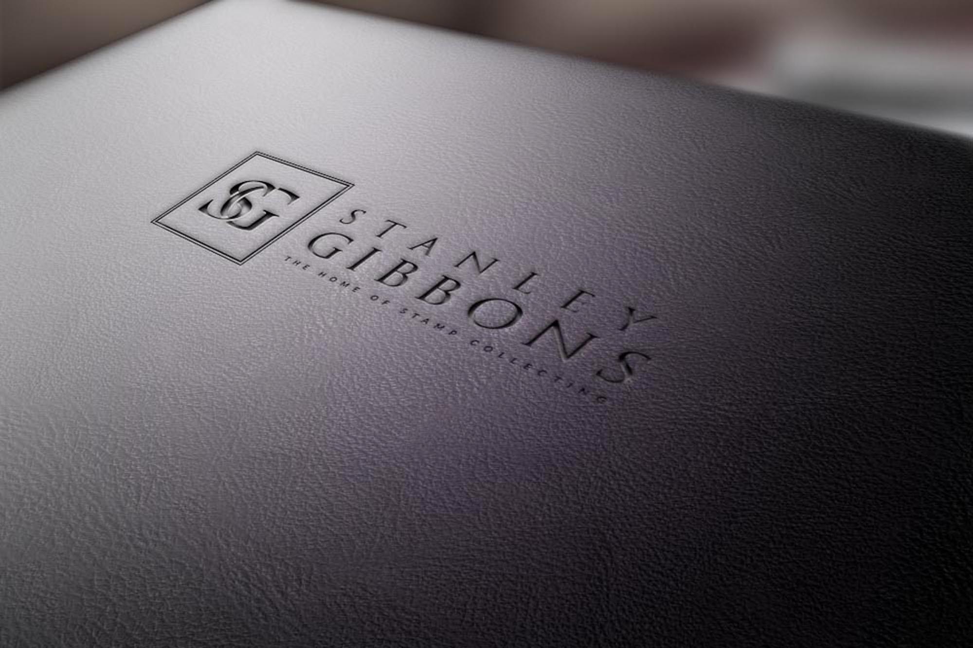
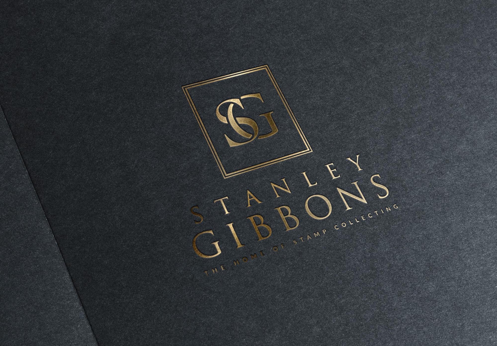
The full logo was created with both tall and landscape arrangements, to afford it greater versatility.

Case Study
Opportunity
Stanley Gibbons, one of the world’s oldest and most prestigious names in philately, required a refreshed logo that honoured their heritage while bringing greater clarity and modern usability. With such a long-established brand, the challenge was to refine, not reinvent—retaining gravitas while preparing the mark for contemporary applications.
Objectives
-
Refresh the logo to feel cleaner and more usable across digital and print.
-
Retain the heritage and authority associated with a globally recognised name.
-
Improve clarity and legibility at small sizes, particularly online.
-
Provide clear usage rules to maintain consistency across diverse materials.
Insight & Strategy
For heritage brands, equity lies in continuity. Our approach was evolutionary rather than revolutionary: carefully refining letterforms and structure to sharpen readability while preserving recognition. The aim was to balance modern precision with historical weight.
Identity Solution
-
Refined Wordmark: Adjusted proportions, spacing and letterforms to improve legibility and balance without departing from the original character.
-
Symbol Integration: Simplified and redrawn elements where necessary for digital clarity, ensuring the logo reproduces well at all sizes.
-
Palette: Retained the authoritative red heritage tone, supported by neutral monochromes to ensure flexibility and brand continuity.
-
System: Defined lockups, clear-space rules and reversal options for consistent use across stationery, packaging, digital platforms and signage.
Competitive Edge Now
The updated logo preserves 150 years of brand equity while making the identity far more functional in the modern age. It feels authoritative and timeless, yet is finally optimised for the realities of digital-first communication.
What This Enables
Stanley Gibbons can now present a consistent, credible image across global touchpoints—from auction catalogues to websites—reinforcing their position as a trusted leader in rare stamps and collectibles.

![]()
![]()