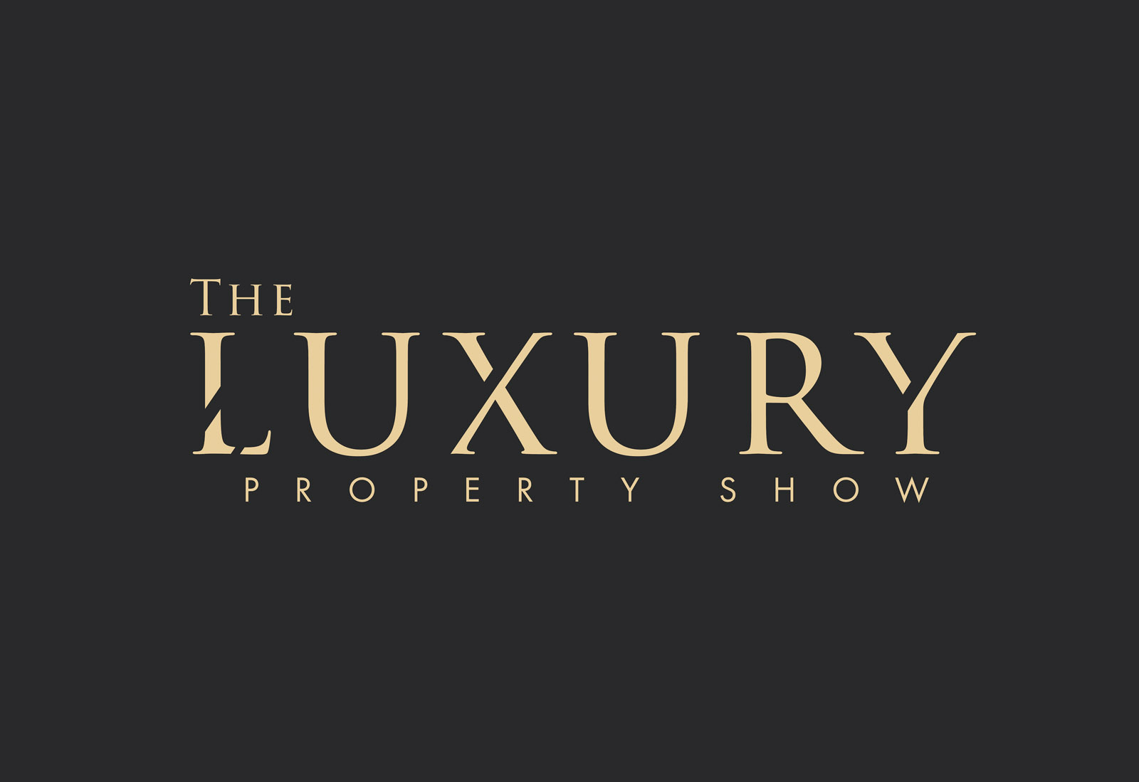
Brand Identity Design for The Luxury Property Show; one of Europe’s leading luxury property events. The Logo features a classically elegant font with a modern twist, while the colour palette of british racing green, soft gold and charcoal / matt black feel rich and indulgant.
Of course, we wanted the branding to epitopise luxury, something to immediately resonate with the intended audience of the property show – in a way that acknowledged the traditional, classical approach to luxury – while also appearing progressive, modern.
The ‘hero typeface’ for the word ‘Luxury’ is very classical indeed, but by subtracting a few diagonal spaces every 2nd then 3rd letter, the overall effect is a traditional font with a modern, bespoke treatment. Bespoking a typeface is often a very effective, powerful way of creating a unique identity where perhaps a brandmark, symbol, monogram or other iconography would serve no practical purpose. A customised font can be recognisable, and an excellent choice where simplicity and elegance is the goal, as was the case for the Luxury Property Show.
![]()
Case Study
Opportunity
As one of Europe’s leading luxury property events, the show needed an identity that communicates immediate, high-end credibility to discerning buyers and exhibitors.
Objectives
-
Epitomise luxury in a way that resonates with a traditional, classical understanding of prestige while still feeling contemporary and progressive.
-
Lead with a simple, memorable typographic solution that can carry the brand across large and small formats.
-
Establish a rich, indulgent palette that reads “premium” across print, digital, and environmental graphics.
Insight & Strategy
In property, type equals tone. A bespoke typographic treatment can be as distinctive as a logo symbol while preserving restraint. We positioned the word “Luxury” as the hero — classical in spirit but customised to signal modernity and exclusivity at a glance. Alongside the wordmark, we introduced a purpose-built submark to ensure clarity and brand recall at micro sizes.
Identity Solution
-
Wordmark: Classically elegant typography with a modern twist; diagonal subtractions applied rhythmically (every second, then third letter) create a bespoke, recognisable treatment without sacrificing legibility.
-
Submark (“L” with cutaway): Designed as a secondary mark for situations where the full wordmark would be too small or where a compact symbol is stylistically stronger (e.g., favicons, social avatars, event passes, small merchandise, corner badges). It mirrors the typographic cutaway logic to maintain continuity with the primary mark.
-
Colour Palette: British racing green, soft gold, and charcoal/matt black deliver a rich, indulgent feel appropriate to the audience and venue contexts.
-
System Rationale: The wordmark remains the primary identifier for headline applications, while the submark provides functional versatility at small scale — together forming a cohesive, scalable system.
Competitive Edge Now
The identity balances heritage cues with a contemporary, crafted detail — standing out from generic “gold-and-script” executions common in the category. The bespoke typography becomes the memory trigger at larger touchpoints, while the submark secures recognition and polish where space is limited.
What This Enables
The brand is ideally positioned to extend across event collateral (wayfinding, passes, digital banners, stage screens, merchandise) with consistent impact. The typographic core scales cleanly, and the submark safeguards legibility in micro contexts — supporting a premium, cohesive show experience end-to-end.
![]()
![]()
![]()
![]()
![]()
![]()
![]()
![]()
![]()
![]()
![]()
![]()
![]()
![]()
![]()