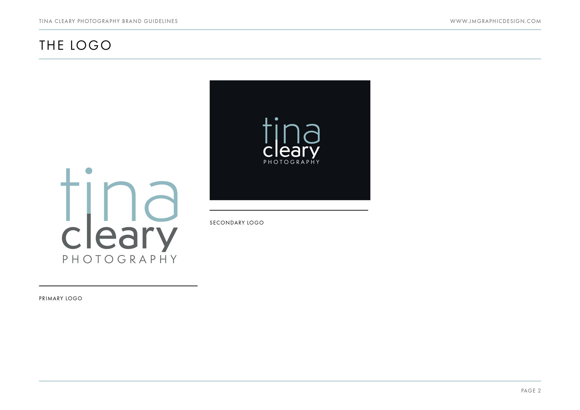
I was commissioned to create the brand identity for Tina Cleary’s new business venture. Although already an established and talented newborn and event photographer, Tina’s new venture offers much needed personal branding photography to business professionals.
The new branding needed to feel serious and professional to appeal to working professionals, while also appealing to individuals looking for self improvement, empowerment and an uplifting, confidence building experience. We decided the popularity of social media quotes, inspirational sayings and posters made them a good place to find the style and tone we wanted to convey.
The brand identity successfully conveys a vibrant, positive tone – while remaining professional and feeling trustworthy.
It was an absolute pleasure working with Tina to create her new branding!
Case Study
Opportunity
Many photography brands lean on generic scripts or trendy marks that compete with the images themselves. Tina Cleary needed an identity that signalled discernment and quality while staying elegantly in the background.
Objectives
- Project a premium, taste-led brand that complements—rather than distracts from—photography.
- Create recognisable assets for watermarking, social avatars, and print collateral.
- Ensure clarity and legibility at small sizes across digital and packaging touchpoints.
- Establish simple rules so the identity remains consistent as the portfolio grows.
Insight & Strategy
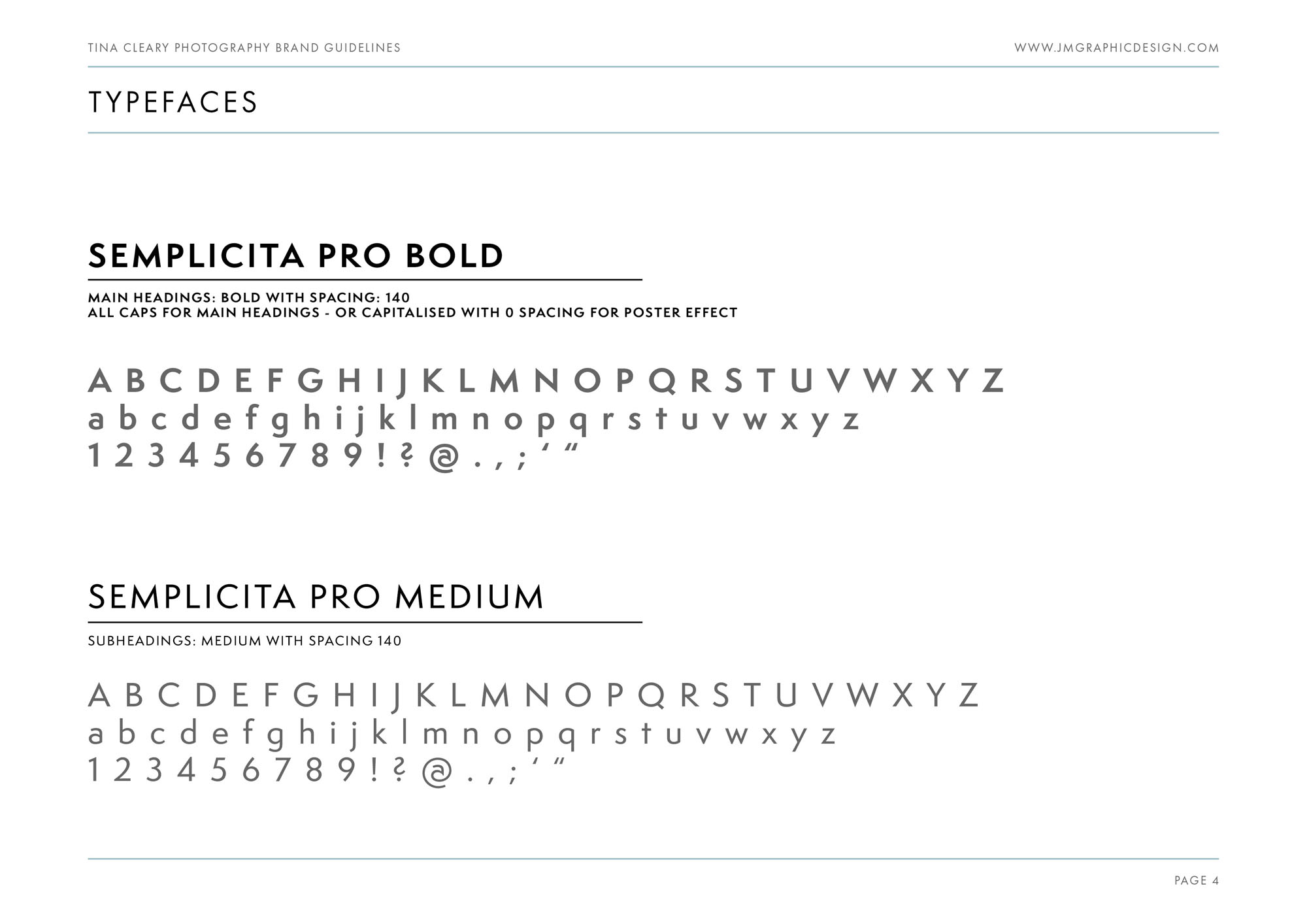
Clients buy a photographer’s eye and judgment before they buy a session. The brand should communicate quiet confidence and editorial restraint. We positioned the identity around “refined minimalism”: typography-led, generous spacing, and flexible lockups that adapt to different image formats.
Identity Solution
- Wordmark: A carefully letterspaced logotype with subtle geometry for a poised, modern feel.
- Monogram/Submark: A compact mark designed for watermarks, seals, and social profiles where space is tight.
- Palette: A restrained black–ivory–soft grey range that supports contrast without colour noise.
- System Rules: Guidance for clear space, minimum sizes, watermark opacity, and placement on light/dark imagery.
Competitive Edge Now
The identity reads as considered and professional at a glance, distinguishing Tina from template-style photographer brands. The unobtrusive mark enhances image presentation, while consistent typographic cues improve recognition across website, proposals, and packaging.
What This Enables (forward-looking, no invented metrics)
A cohesive, understated brand foundation that supports premium pricing conversations, smoother collaborations with venues and stylists, and easy extension into printed products (albums, fine-art prints) without sacrificing coherence.

