Another look at the brand identity and logo design process behind the scenes – this time for Old Bank Coffee House.
One of the primary functions of a logo is to identify – and in a world saturated with brands, this is increasingly challenging. That’s why I love logo’s which tie into a brands unique story, and that was certainly the case with the brand identity and logo I developed for Old Bank Coffee House; a high end coffee shop located in East Barnet Village, North London.
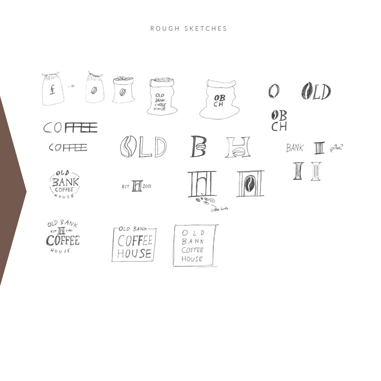
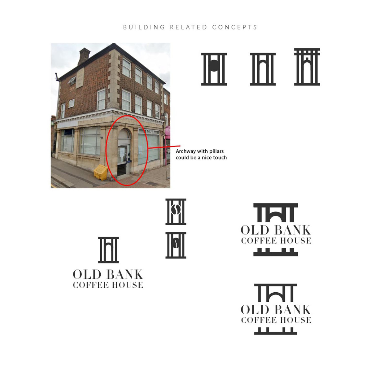
The brand story? For many years the building famously positioned on the corner of a busy shopping parade has been a Bank; now closed, as many have been, due to banks cutting down the number of branches and encouraging online banking. The building has classic architecture, stone pillars and a noticable classic arch over the doorway. I loved the brand name, which my client had already created – and so I thought of ways to really play on this concept – the idea of an old bank transformed into a coffee shop. They have some amazing ideas for the interiors too, and plan to leave many of the classic features in place.
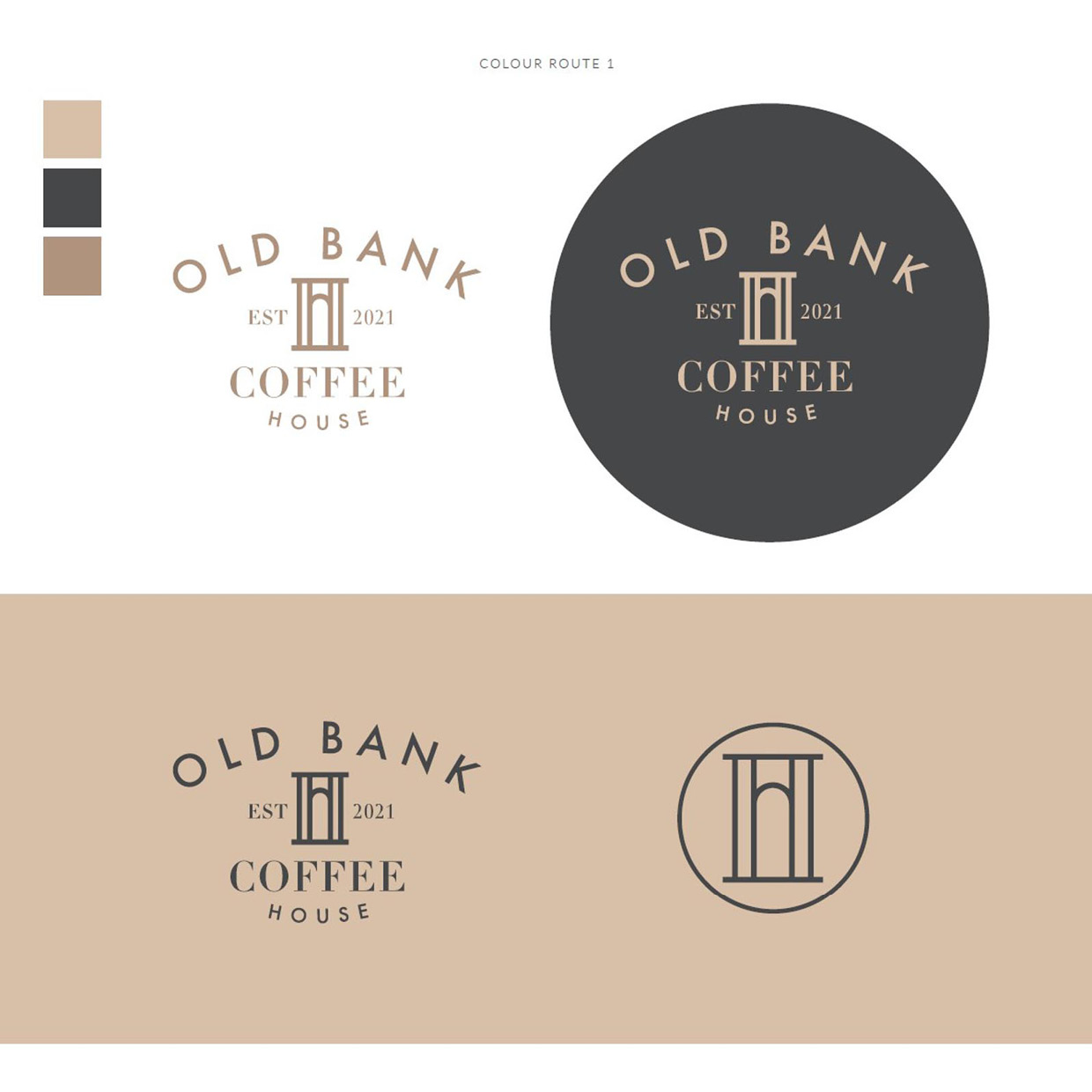
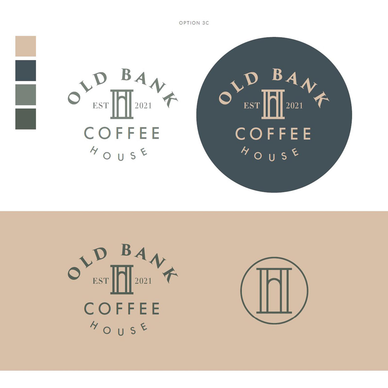
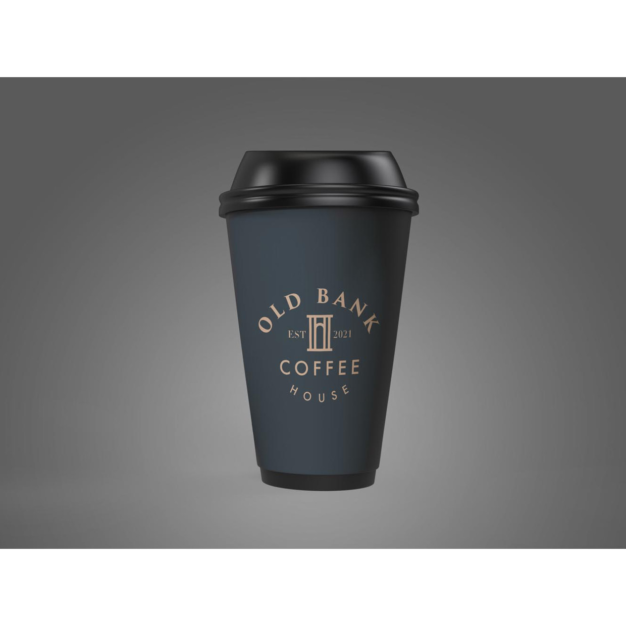
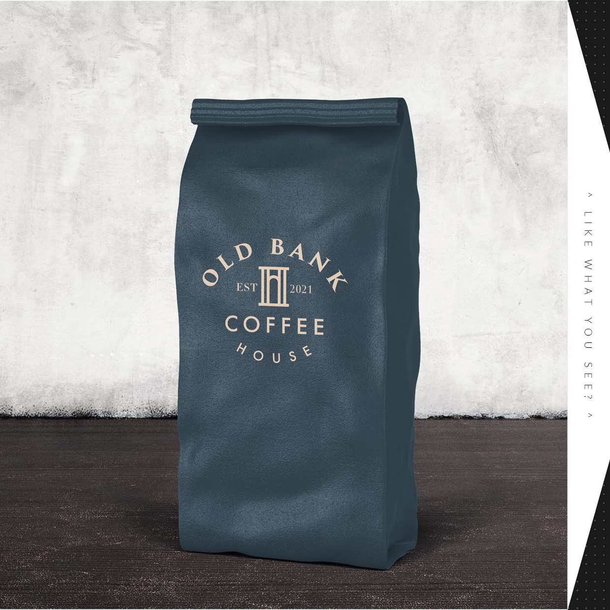
The concept we all fell in love with drew on the structure of the entryway; with a stylish brandmark created to depict the pillars and archway, refined and expressed in the simpliest possible form.
As I’ve so often said, starting a project getting to know a brand, it’s story, it’s strengthes – and translating this into a sound strategy – is a crucial phase of the brand identity process. Great ideas and concepts naturally develop when you’re able to spend a reasonable amount of time on the research and strategy beforehand.
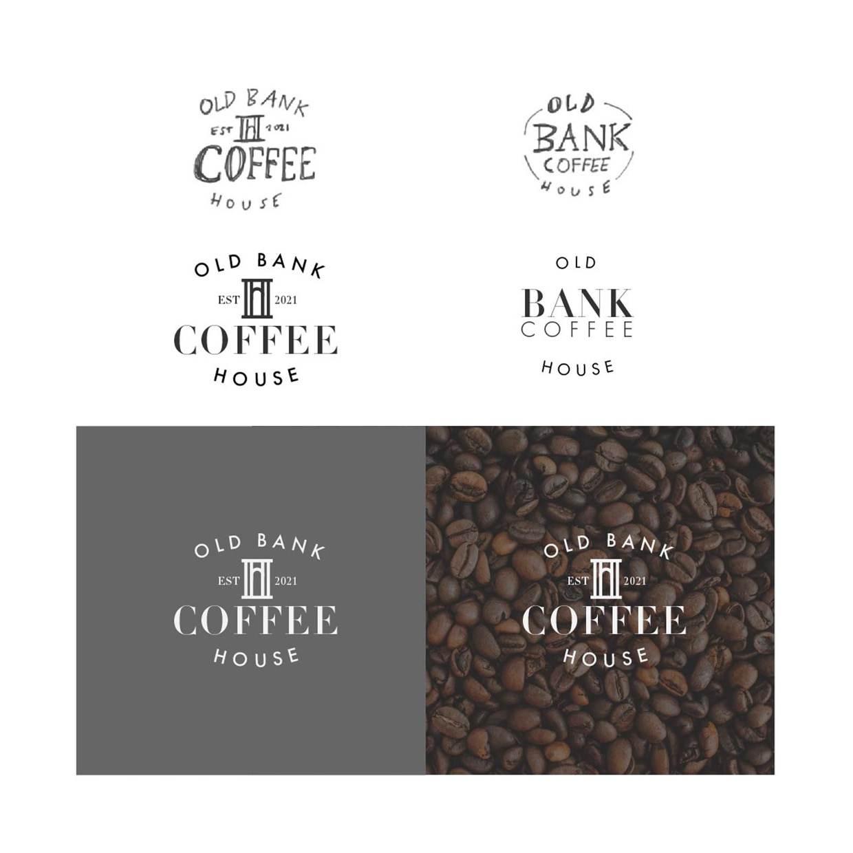
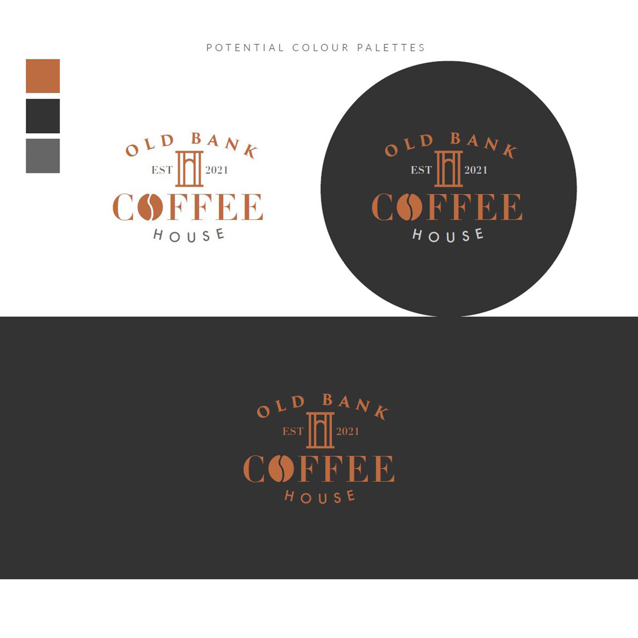
We also explored various combinations of type styles, wanting to create a logo that looked modern, but played on classic elements, particularly treating the word ‘Old’ in ‘Old Bank’ in a fitting font. Finally, colour palettes were explored, with the goal of softening the brand a little (as we felt it needed this to align correctly with the target audience), and this worked very nicely indeed; a grey-blue and pale olive combination with cappuccino accents.
I’ve included some of the development work, because ultimately it’s the process which is responsible for the end results. Also included at the very end are some of the runner-up concepts, which we opted not to develop – but had their own merits. Again, I think it’s important to note that in order to create one great logo, you may have to explore and disgard four or five good ideas. Had we settled for the very first idea, we may never have arrived at the selected concept.