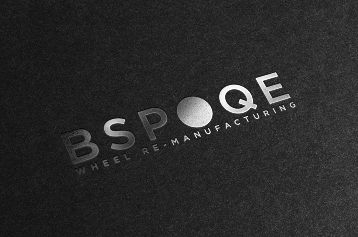
I was commissioned to design and develop the new brand identity for ‘Bspoqe’ (deliberately spelt with a twist on the word in case you were wondering!), a company offering wheel remanufacturing; a term used because the results are so close to a factory fresh condition. How do you create a logo that communicates this ‘good as new’ USP? The logo itself has been designed to look as clean, polished and shiny as the remanufactured alloy wheels serviced – with a metallic finish and filled treatment of the ‘O’, so that it resembles an abstract alloy wheel. Placing emphasis on the ‘O’, together with a clear ‘statement’ tagline, leaves no doubt as to what the company specialises in, and a strong indication as to the level of service they provide.
Case Study
Opportunity
In a price-driven “wheel repair” market, Bspoqe could own a higher standard: remanufacturing results that read as “factory fresh” at a glance.
Objectives
- Elevate perceived value to support premium positioning.
- Make the speciality (remanufacturing, not generic repair) unmistakably clear.
- Create a cohesive system that scales across vans, signage, uniforms, paperwork, and digital.
- Ensure strong recognition and legibility at small sizes.
Insight & Strategy
Owners of high-value vehicles don’t want a cheap fix; they want “as-new” confidence. Position Bspoqe as the precision standard—engineering-led, meticulous—and communicate that with a straight-talking statement line and an immediate visual cue of what the company does and the level it works to.
Identity Solution
- Logo & Mark: A clean, polished wordmark with the “O” rendered as an abstract alloy wheel to telegraph category and craft instantly.
- Finish & Palette: Metallic/graphite tonality and controlled highlights echo the “good-as-new” outcome.
- Typography: Modern, high-legibility forms and disciplined spacing to signal precision and reliability.
- System Rules: Clear-space, minimum sizes, and grid-based layouts maintain clarity across livery, site headers, invoices, and social.
Competitive Edge Now
The identity draws a clear line between remanufacturing and commodity “repairs,” signalling expertise before any conversation. The distinctive “O” device aids recall at speed (vehicles, signage), while restrained typography improves readability and trust across touchpoints.
What This Enables (forward-looking, no invented metrics)
Bspoqe is well positioned to attract quality-focused owners and trade partners, support premium pricing discussions with confidence, and scale into new services or locations without diluting recognition or coherence.


