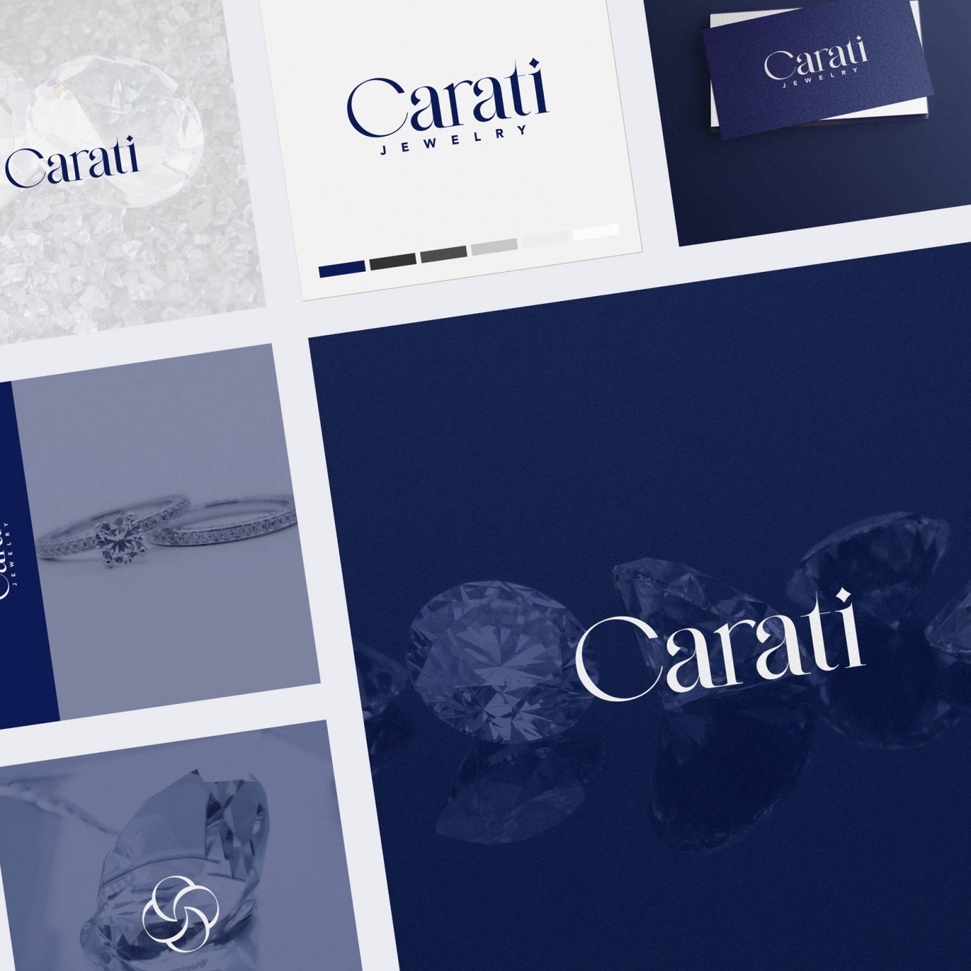
Brand Identity Design for Carati Jewelry, based in Montreal Canada, who design and produce exclusive collections of fine jewelry. Their diamonds and gemstones are set in house with the highest care and attention to detail.
We wanted to create custom lettering for the logo, and I suggested a technique I often use, where we use an existing font as a starting point, then modify it to our specifications. This provides completely bespoke lettering as the outcome, but without the high cost of designing a new font completely from scratch.
The results are a beautiful, elegant logo accompanied by a simple submark. The colour palette works particularly well, with a rich blue complimenting and setting off bright platinum and silver tones.
Case Study
Opportunity
For a Montreal fine-jewelry house producing exclusive collections and setting diamonds and gemstones in-house, there was room for an identity that expresses atelier-level craft and editorial polish—without feeling ornamental or trend-led.
Objectives
-
Create a bespoke wordmark via custom-modified lettering (ownable, not off-the-shelf).
-
Pair it with a simple submark for small-scale uses.
-
Establish a refined palette where a rich blue complements bright platinum and silver tones.
-
Keep legibility impeccable from hero applications to micro contexts.
Insight & Strategy
Luxury clients read precision as quality. Rather than inventing a typeface from scratch, we started with a suitable base font and redrew/modified letterforms to Carati’s proportions and rhythm—achieving truly bespoke lettering with smart efficiency. Spacing and contrast were tuned to feel quiet, exacting and timeless.
Identity Solution
-
Custom wordmark: Tailored stems, terminals and counters; adjusted proportions and kerning to produce a hallmark-worthy signature that reproduces cleanly in print and on screen.
-
Submark: A minimal companion symbol for compact placements (social avatars, tags, micro labels) where the full wordmark would be too fine.
-
Palette: Deep, saturated blue chosen to sit beautifully alongside platinum/silver—elevated yet restrained.
-
System notes: Primary/secondary lockups and scale guidance to protect clarity at small sizes.
Competitive Edge Now
Compared with generic jewelry marks, Carati presents crafted exclusivity—a distinctive, custom letterform signature supported by a rich, modern palette. The identity reads as considered and premium at a glance, while the submark safeguards recognition in tight spaces.
What This Enables
Clear, ownable presentation of collections; a consistent look across print and digital; and a foundation that can extend into packaging, certificates and editorial assets—preserving the house’s refined, high-luxury tone as it grows.


