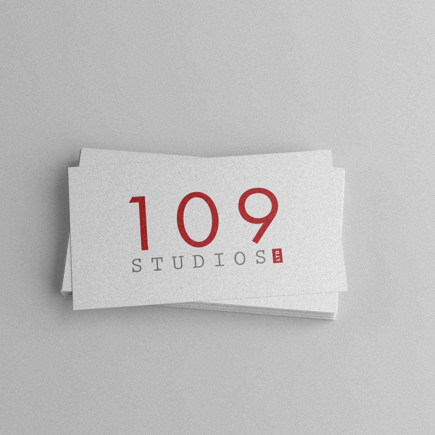
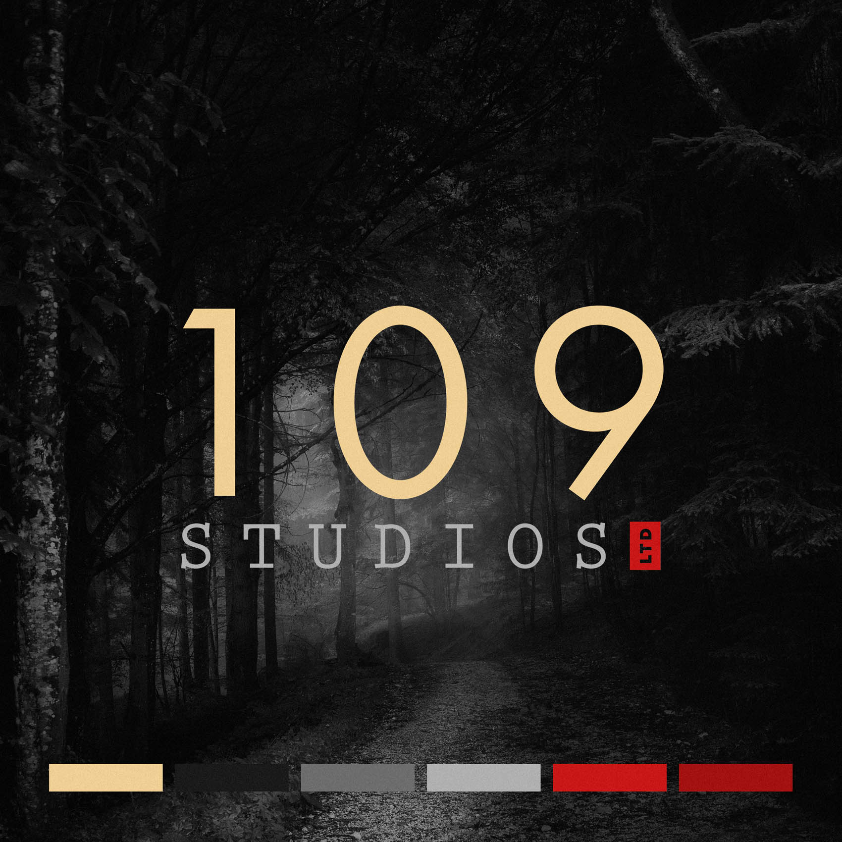
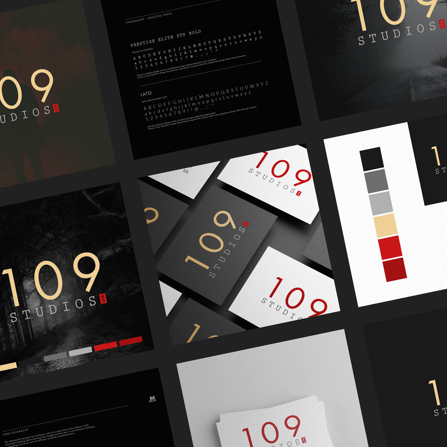
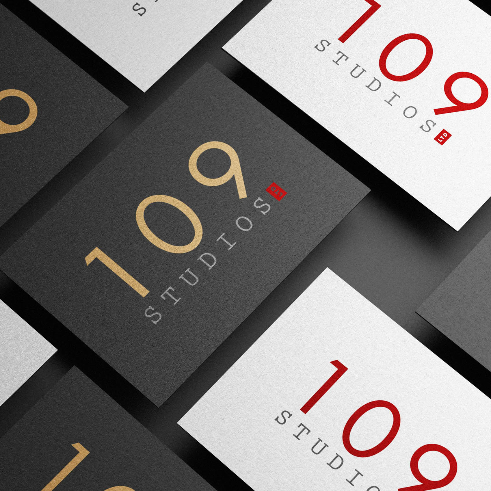
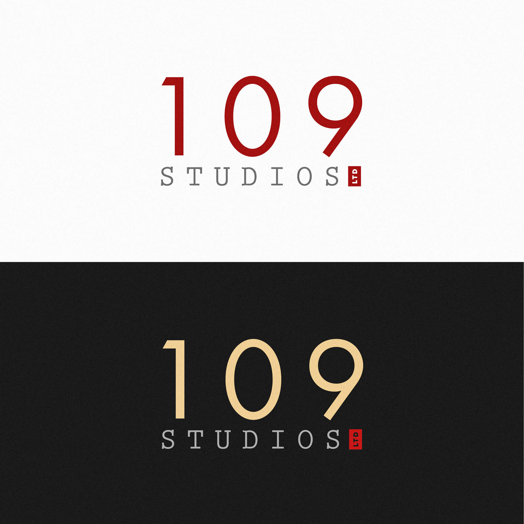
I was commissioned to create brand identity (including a new logo) for 109 Studios, the professional brand of Screenwriter and Novelist Francesca Lin; based in Hong Kong and London. While we wanted the brand to feel versatile enough to suit a broad range of projects, 109 Studios tend to specialise in certain genres; psychological thrillers, suspense and non-gory horror.
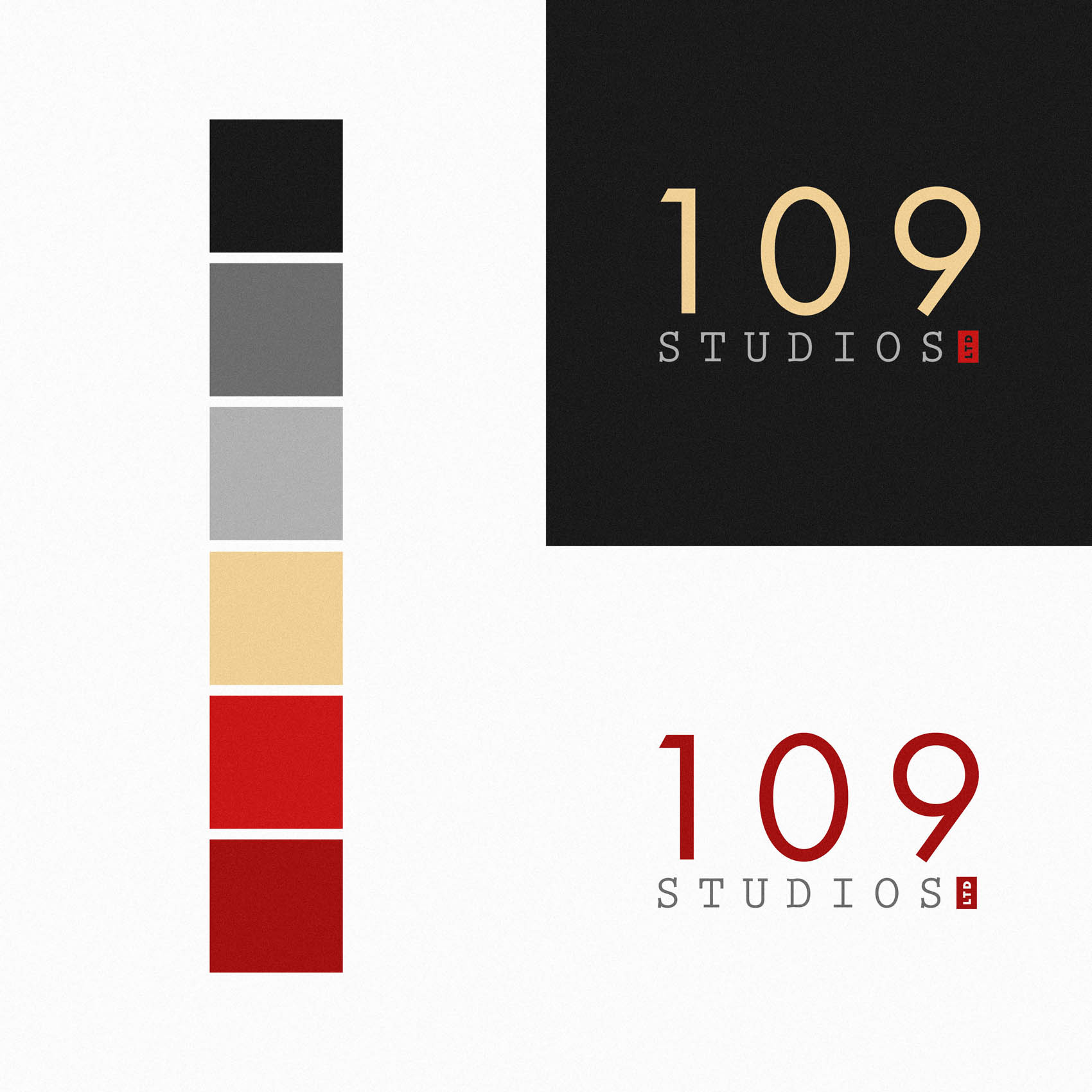
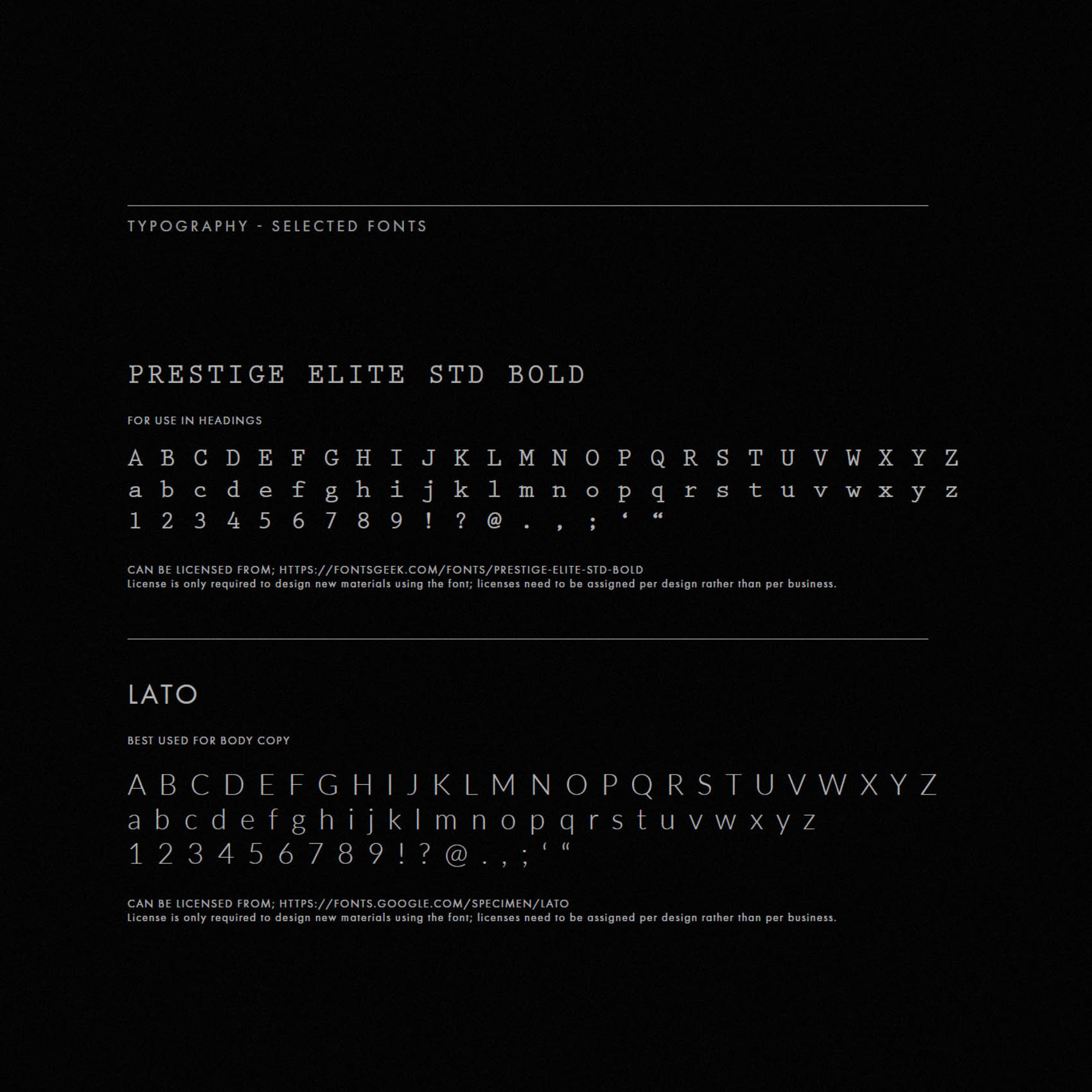
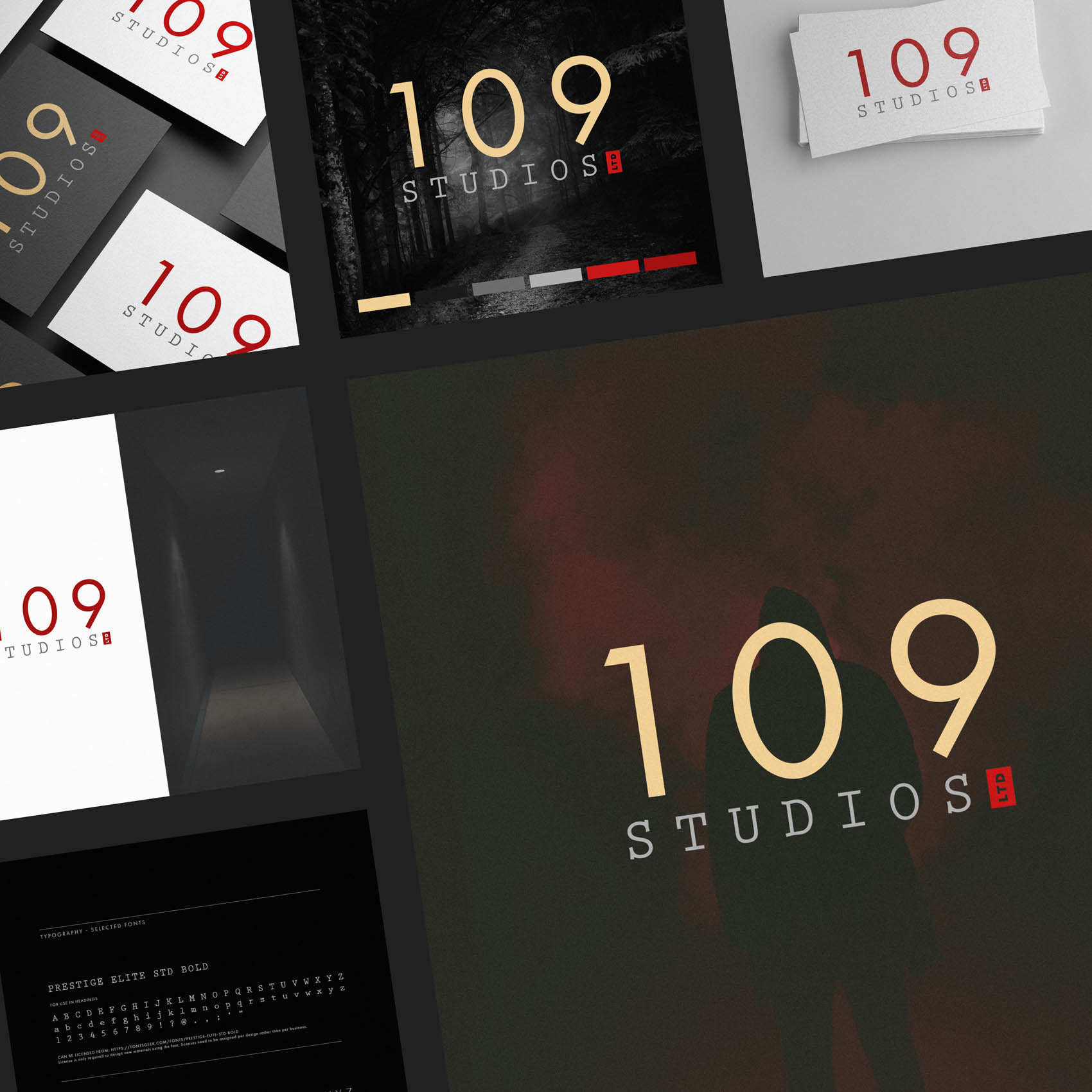
We explored a range of options before falling love with the simple but distinct typographic treatments for the logo. Initially considered treating ‘109’ in a way that evoked a sense of ‘horror’, with distressed lettering, or red paint running – but these all felt too cliché, also potentially limiting the versatility of the brand. Instead, ‘109’ is crisp, modern and professional, with ‘studios’ treated in a font that pays tribute to classic typewriters; and the ‘ltd’ mark is rendered within a red block, a nod to early word processors where a square block would blink to indicate cursor position. (This has since evolved into a thin vertical line, but it started as quite a bold block).
We loved the hidden meaning behind these simple elements – for those in the industry – while aesthetically the tight logo lockup and bold red block both look distinct and draw the eye.
The colour palette includes moody greys and erie reds, while a touch of gold assists in correctly positioning the brand as a boutique, high end studio.
Case Study
Opportunity
109 Studios, a creative production house, needed an identity that would establish them as a credible, high-end partner in a competitive sector. The brand had to balance modern creativity with professional polish, appealing to clients who expect both artistry and reliability.
Objectives
-
Create a logo system that is simple, modern and instantly memorable.
-
Convey a sense of creativity without overcomplication—minimalism with edge.
-
Provide a flexible visual kit suitable for use across digital platforms, print materials and motion graphics.
-
Establish a scalable design system that grows with the studio’s portfolio.
Insight & Strategy
Studios often fall into either over-styled “trendy” visuals or bland corporate marks. The opportunity was to craft an identity that feels timeless: grounded in strong typography, underpinned by restraint, and easily adaptable to varied contexts from pitch decks to video credits.
Identity Solution
-
Wordmark: A bold, sans-serif logotype customised for balance and visual strength, designed to hold its form both in static and animated contexts.
-
Submark: A compact monogram derived from the numbers “109,” ideal for small-space applications such as favicons, watermarks or social media avatars.
-
Palette: Monochrome as the foundation—black, white and shades of grey—for maximum versatility, with space to introduce accent colours when needed for specific projects.
-
System: Clear lockup rules, spacing and reversal guidelines ensure the mark reproduces cleanly across digital and print.
Competitive Edge Now
The result is a modern, minimal and credible identity that sets 109 Studios apart. It carries the creative confidence of a production house while keeping the aesthetic disciplined and professional.
What This Enables
A versatile system that can scale across diverse outputs—websites, presentations, social campaigns, video credits—giving 109 Studios a consistent, confident visual presence that reinforces trust with existing clients and attracts new ones.

