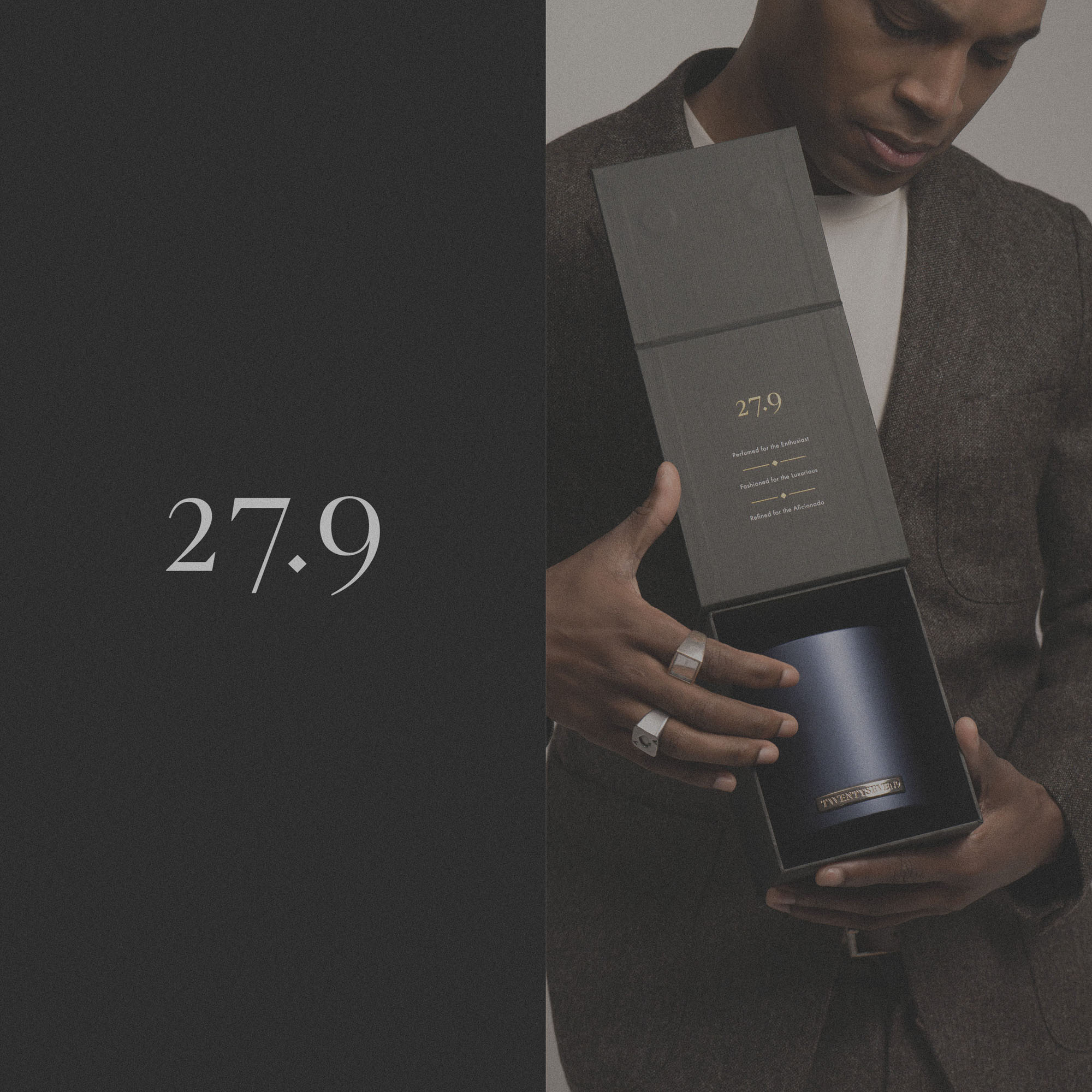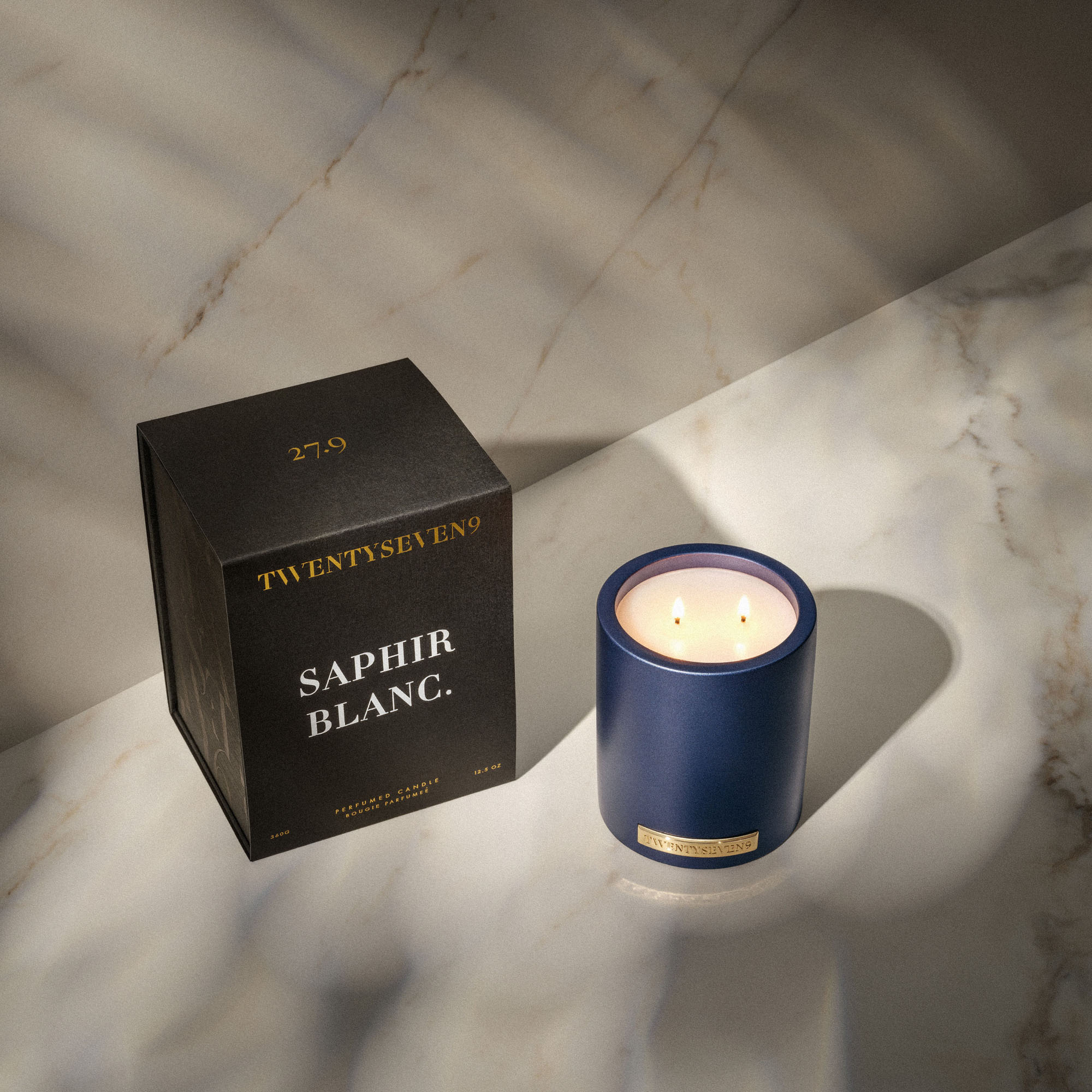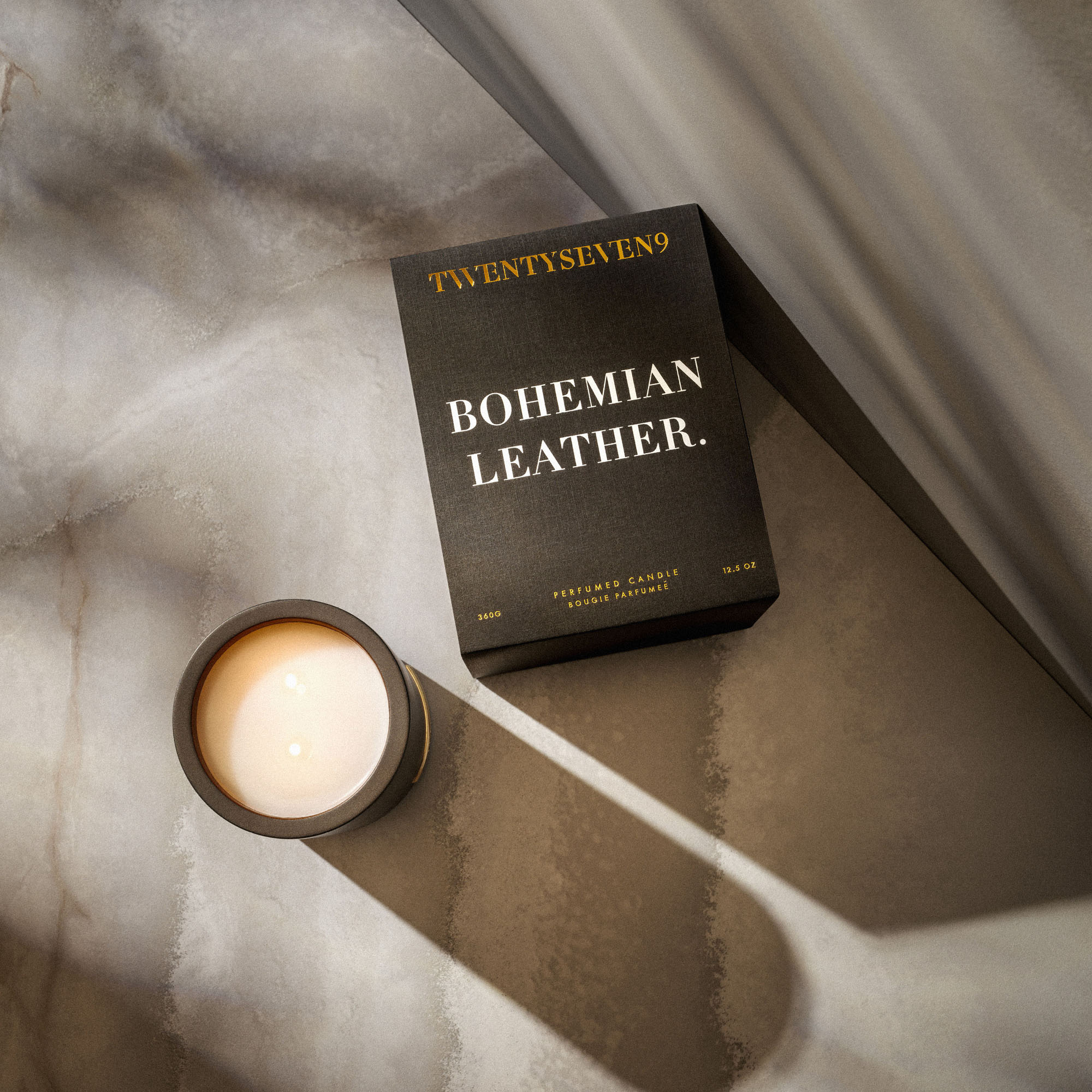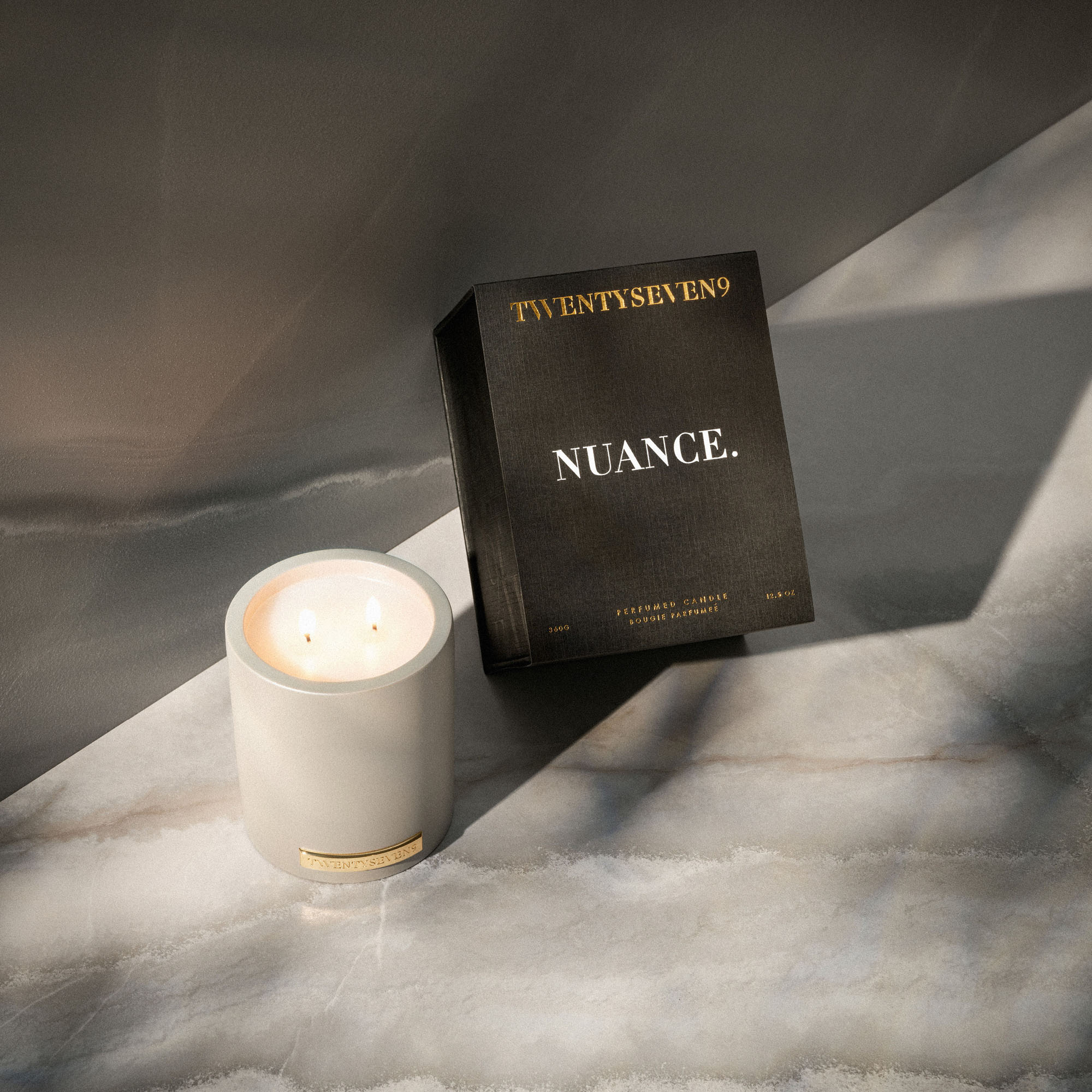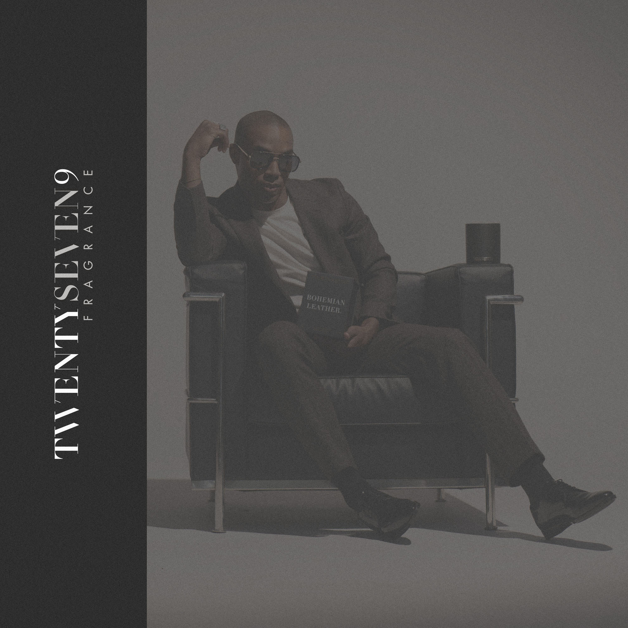
It was a pleasure to partner with 27.9 Fragrance to develop their brand identity and the packaging design for their flagship range of luxury candles. Founded in 2018 in Nashville, TN, the brand is positioned as a highly indulgent, sensorial fragrance experience — one defined by craftsmanship, intention and elevated detail.
To frame the creative direction, it is worth quoting the Founder’s original brief, which encapsulated the ambition for the brand and its packaging:
“From a packaging standpoint, we not only want to stand out, but within that we want to visually portray that there were no shortcuts and every decision was approached with intentionality… I want to dial in on every nuance so that people can feel from the packaging alone that we’ve done the same with our product.”
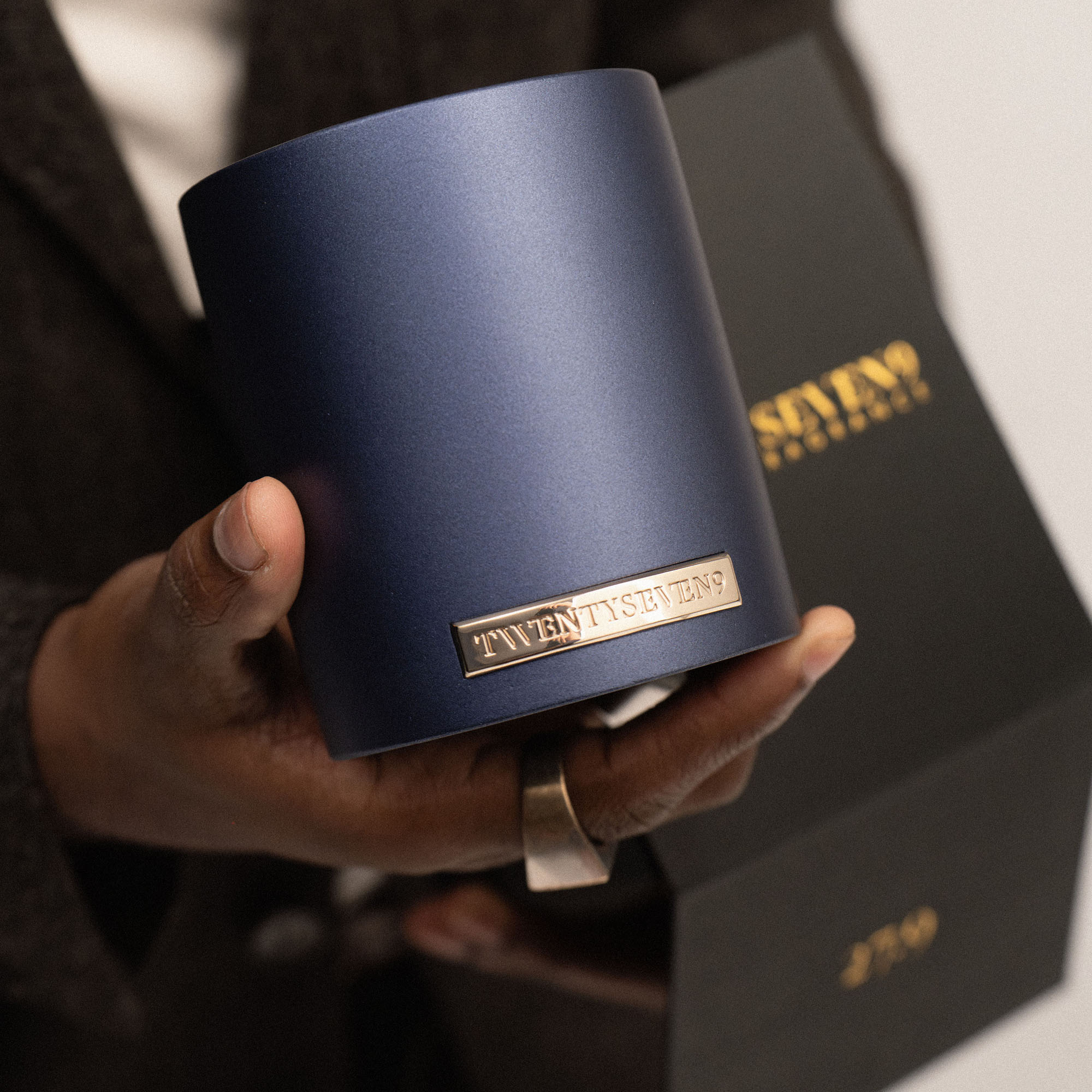
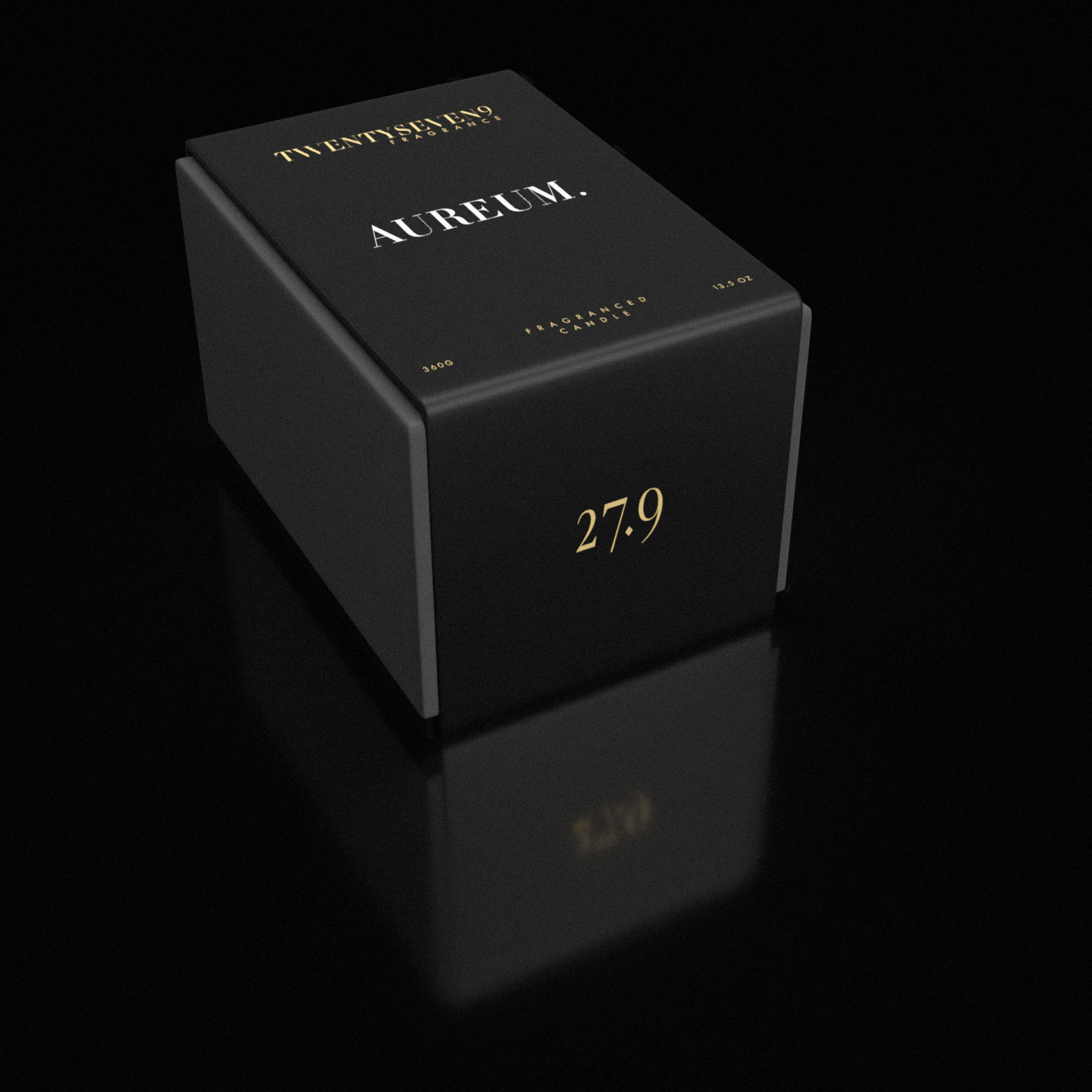
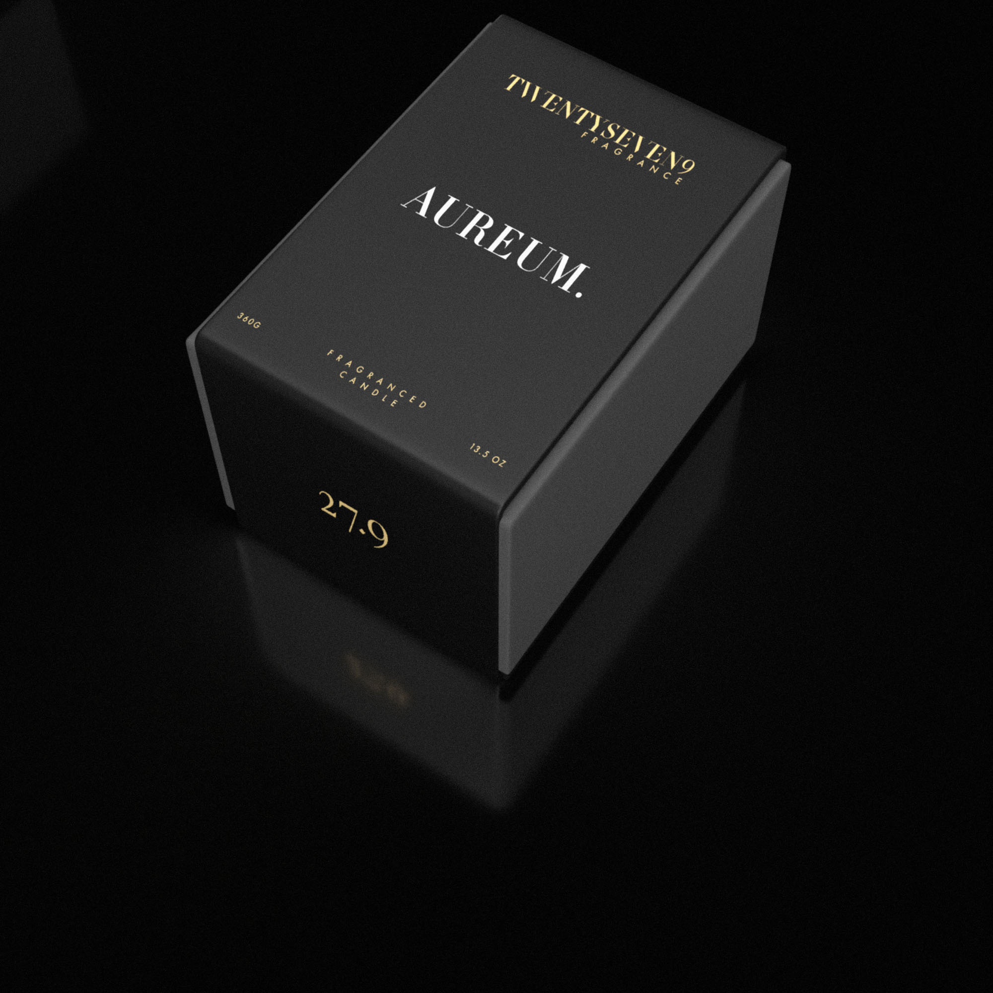
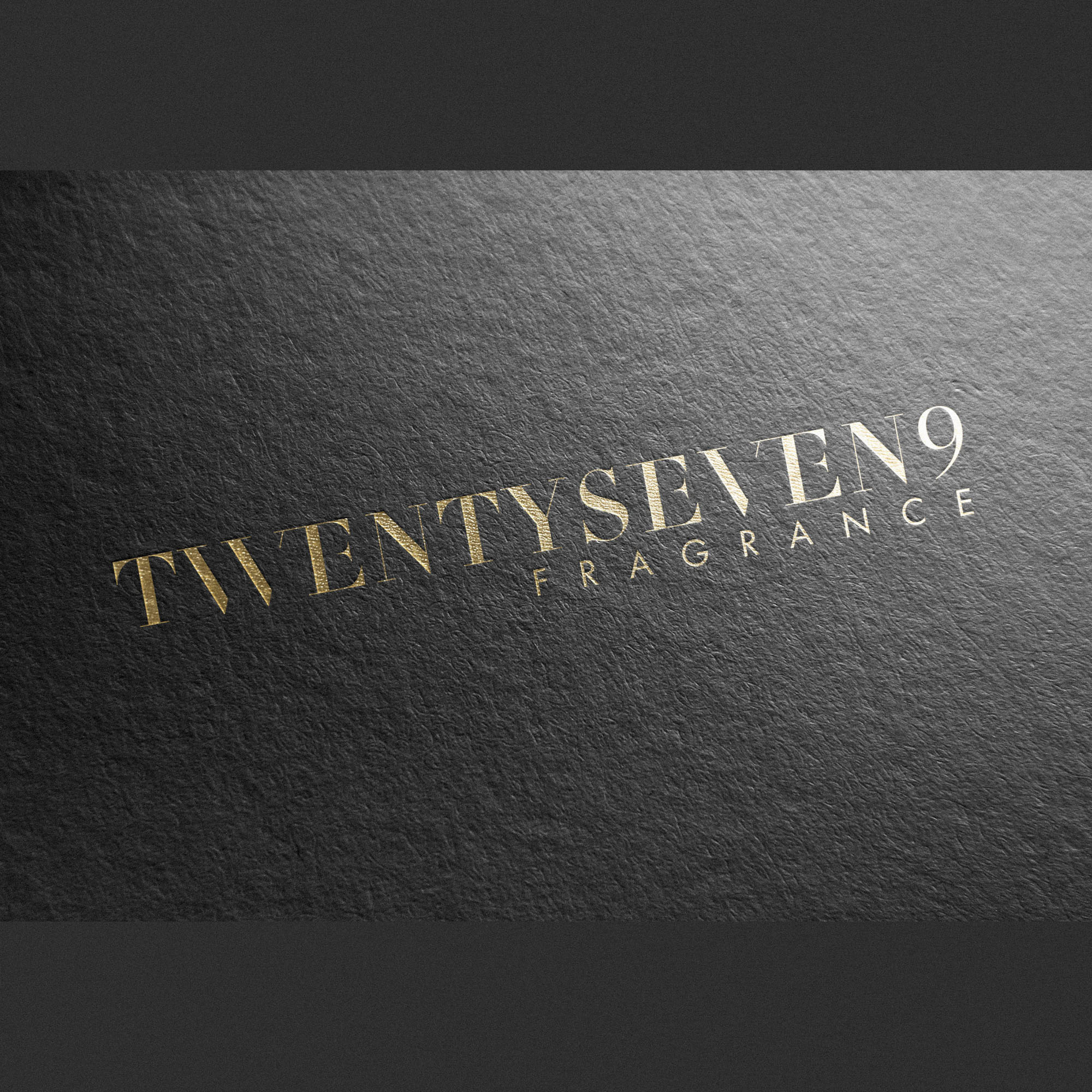
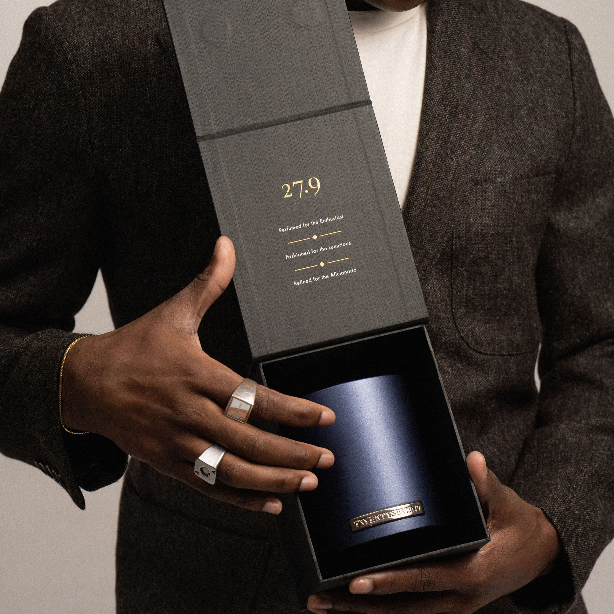
The scope included a refined brand refresh, where the existing logo was carefully honoured while being thoughtfully elevated to a more contemporary, luxurious standard. A central component of the project involved developing packaging concepts for the flagship candle collection, drawing on the updated visual identity to create a cohesive, premium system.
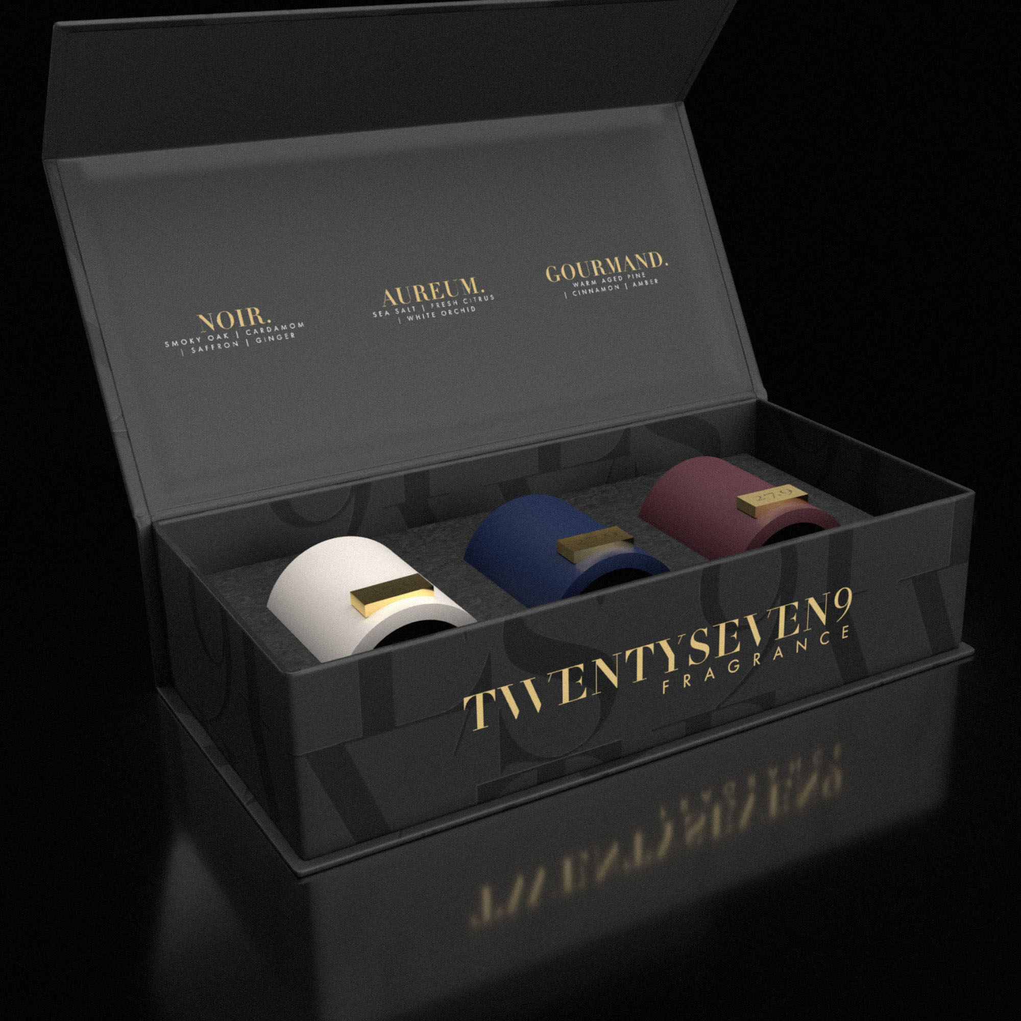
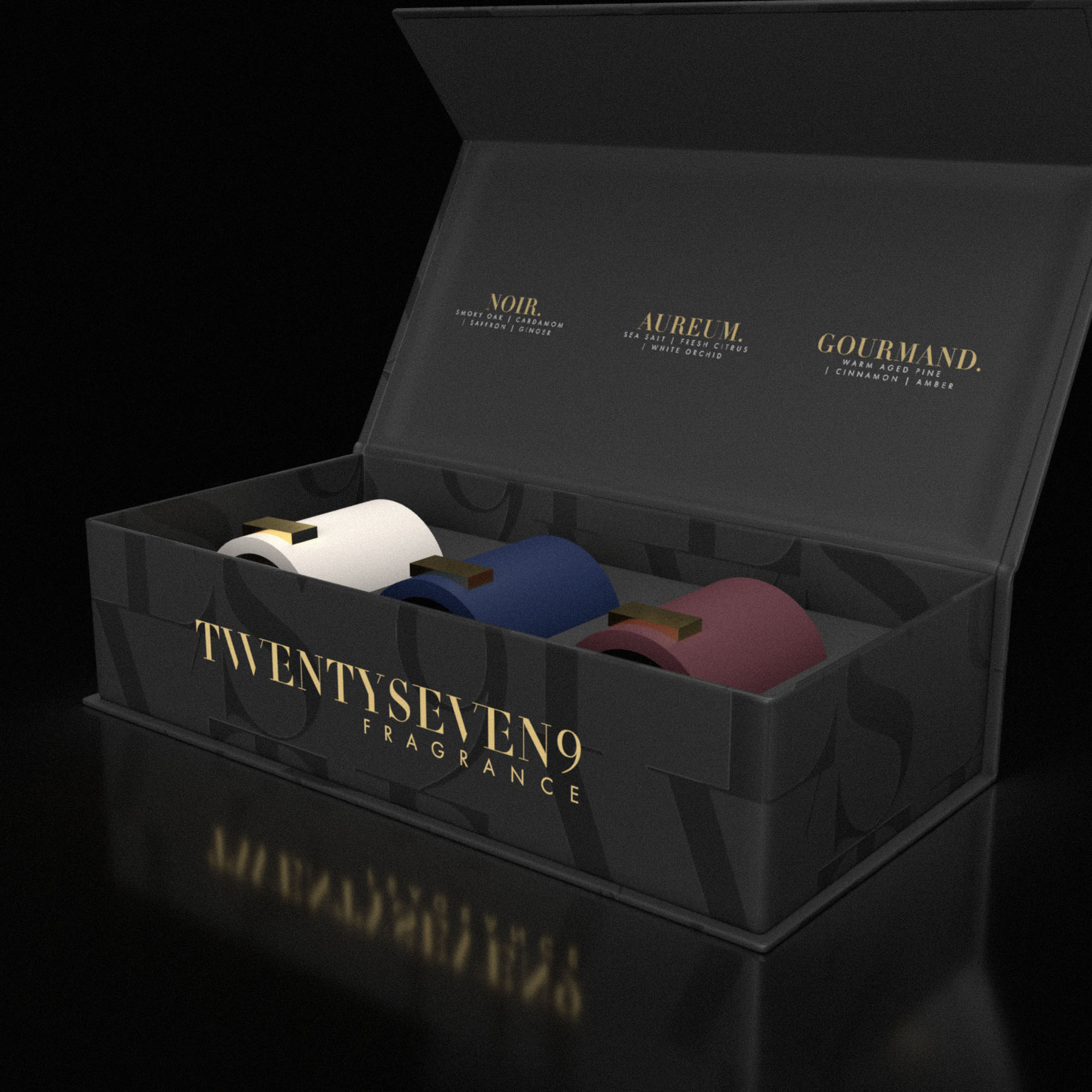
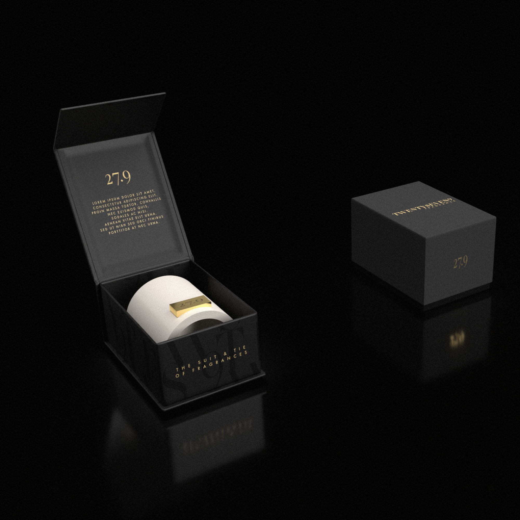
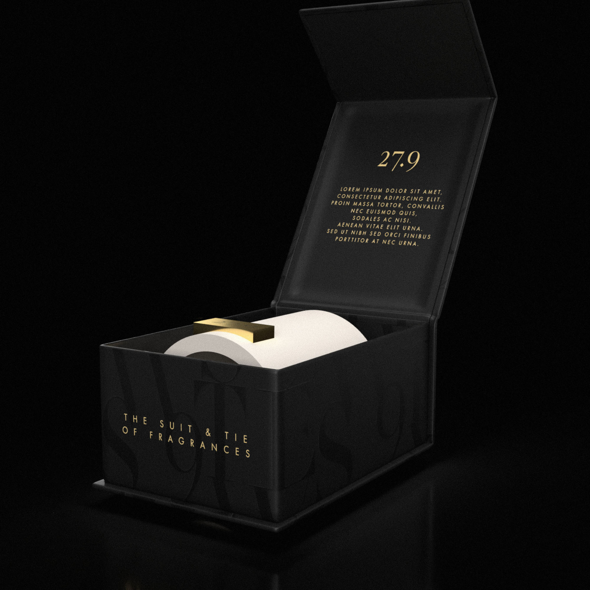
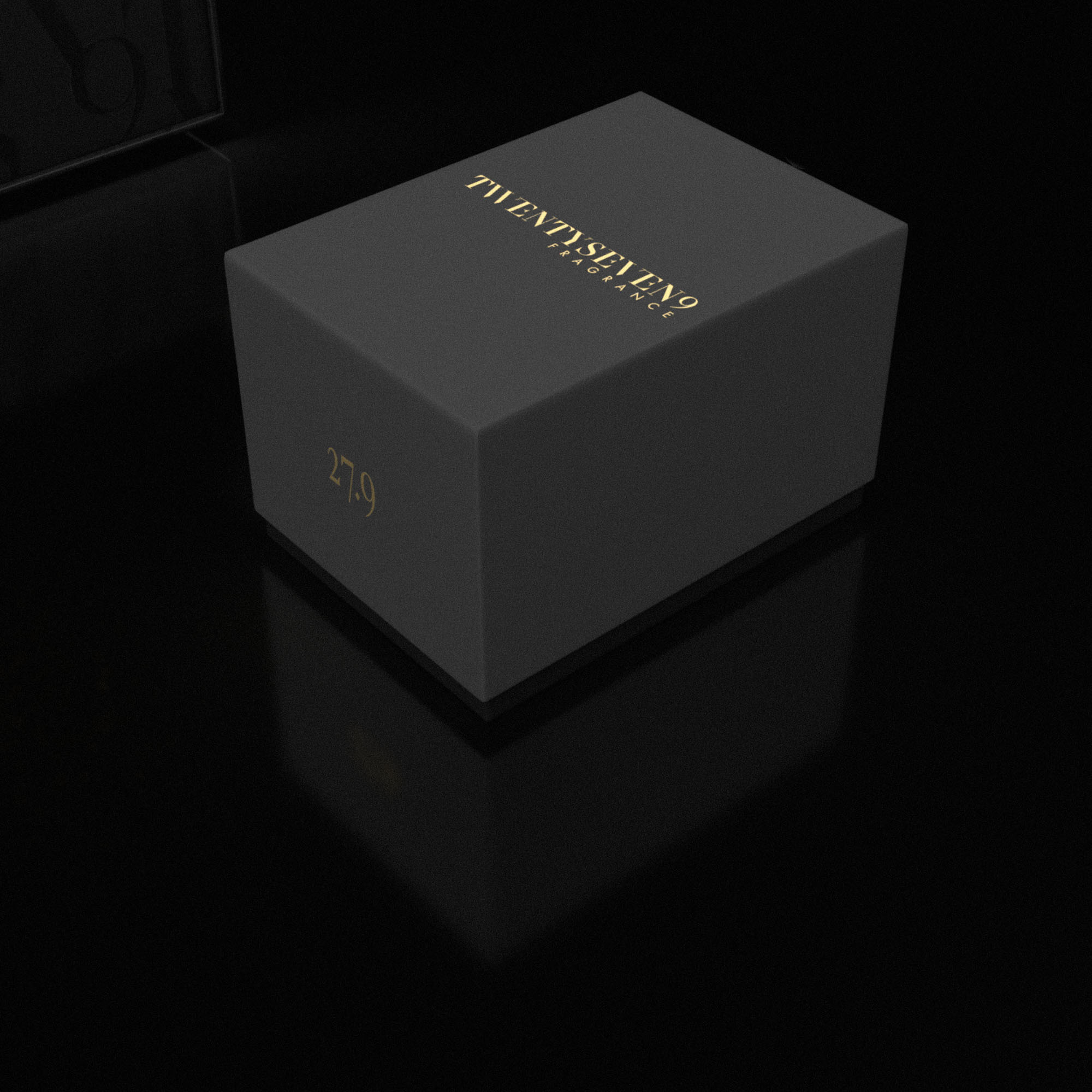
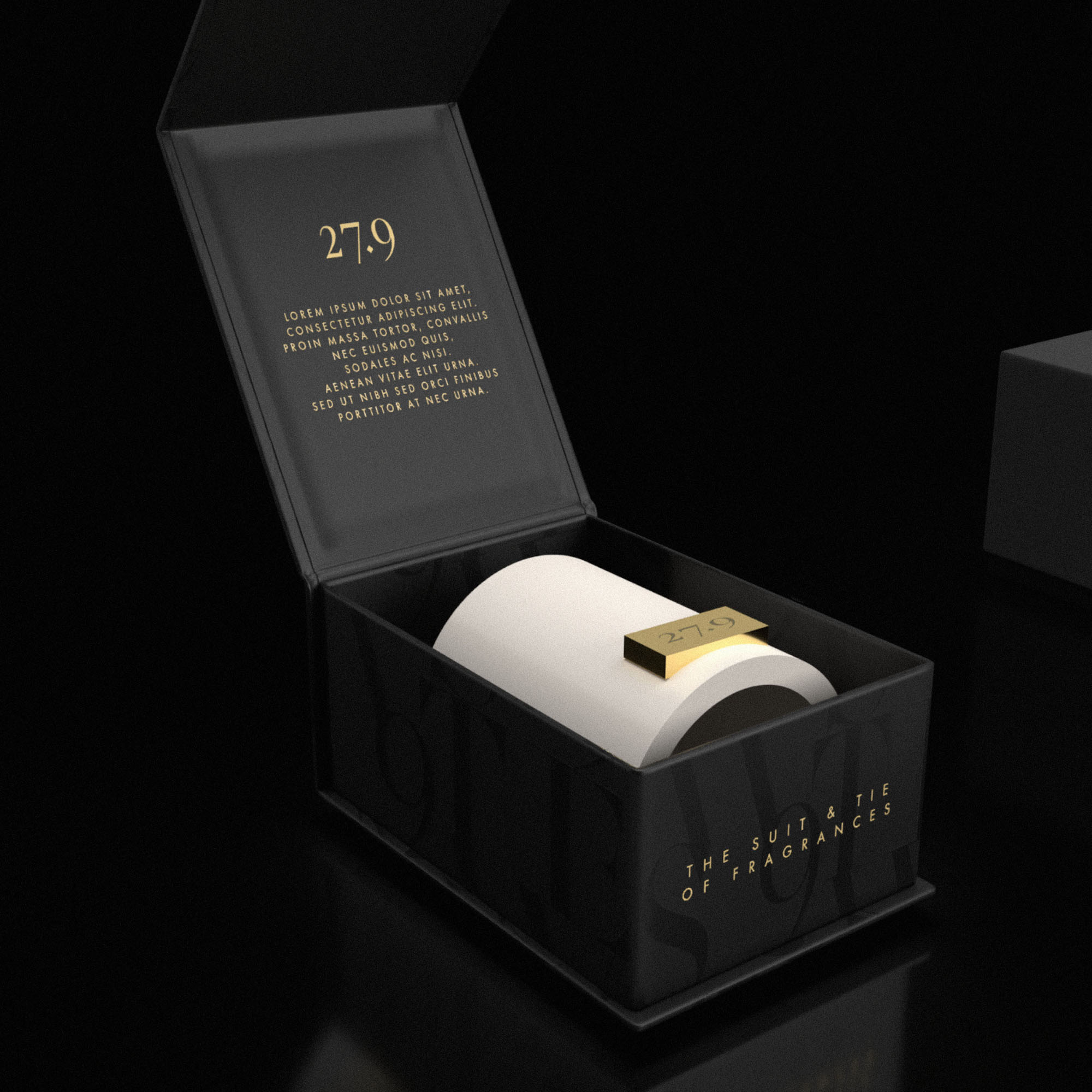
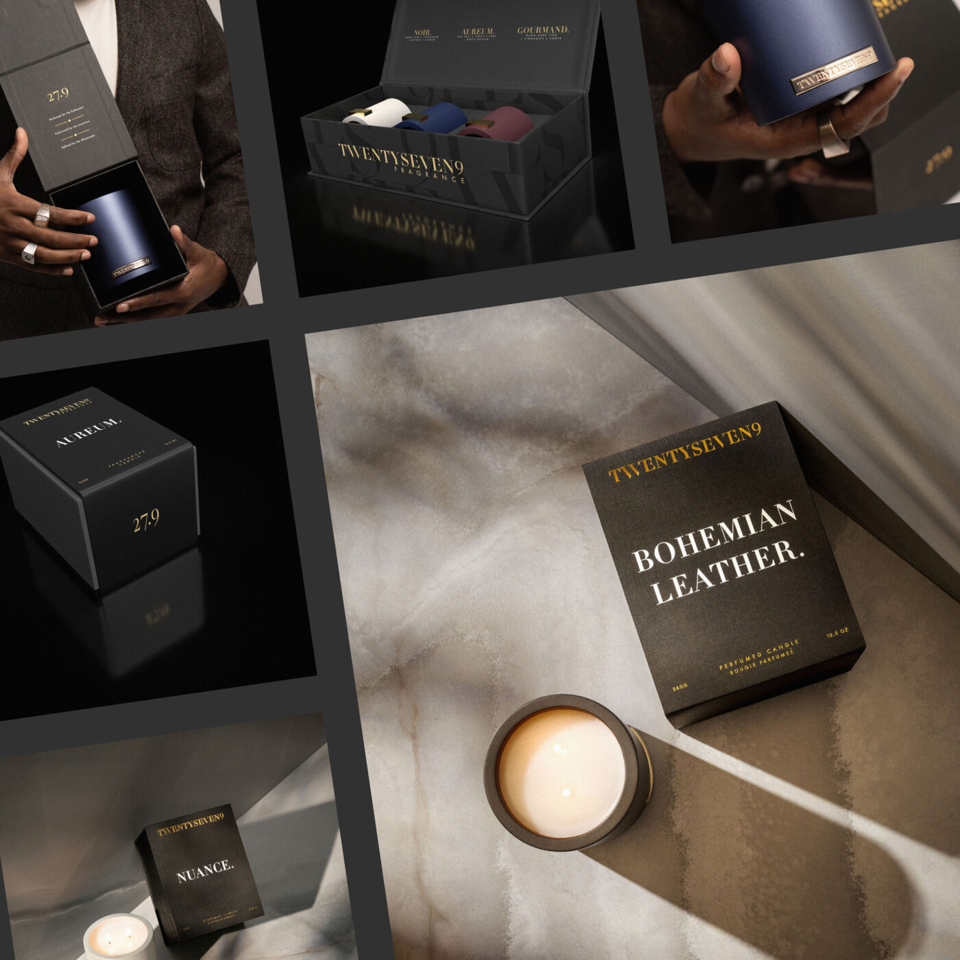
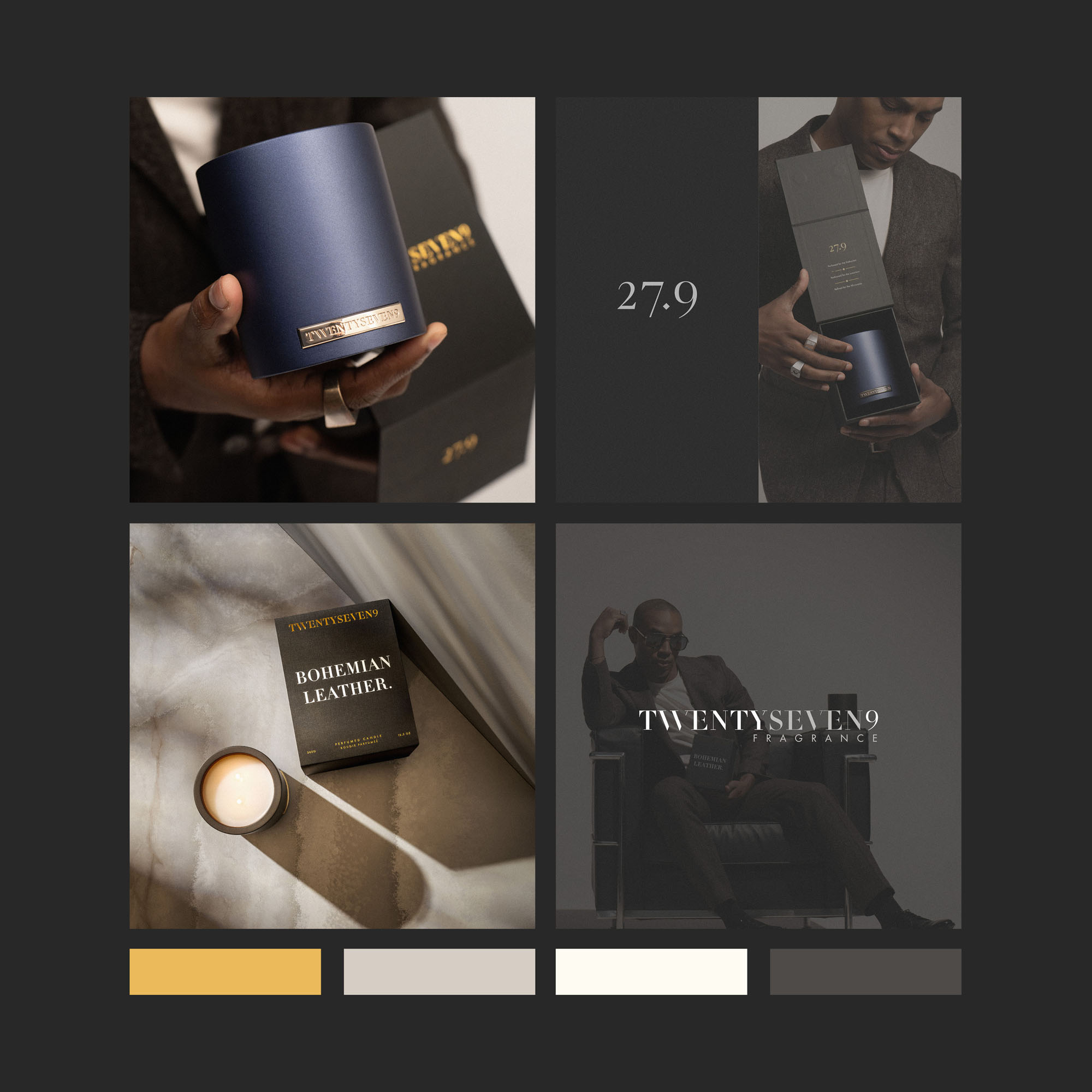
As shown in the examples below, detailed 3D renders were created for the trio case, individual votives and single-unit boxes. These initial concepts—after selective refinement—formed the foundation for the final packaging seen in the marketing images. The use of 3D mock-ups served two strategic purposes: first, to provide contextual insight into scale, materials and finishes long before physical prototyping; and second, to eliminate unnecessary cost by allowing key decisions to be made early, ensuring clarity and direction prior to entering production.
Together with 3D mockups, editable (.ai and .eps) dielines were provided so the in-house design team could make final adjustments before going into production.
Be sure to check out their latest range at 279fragrance.com
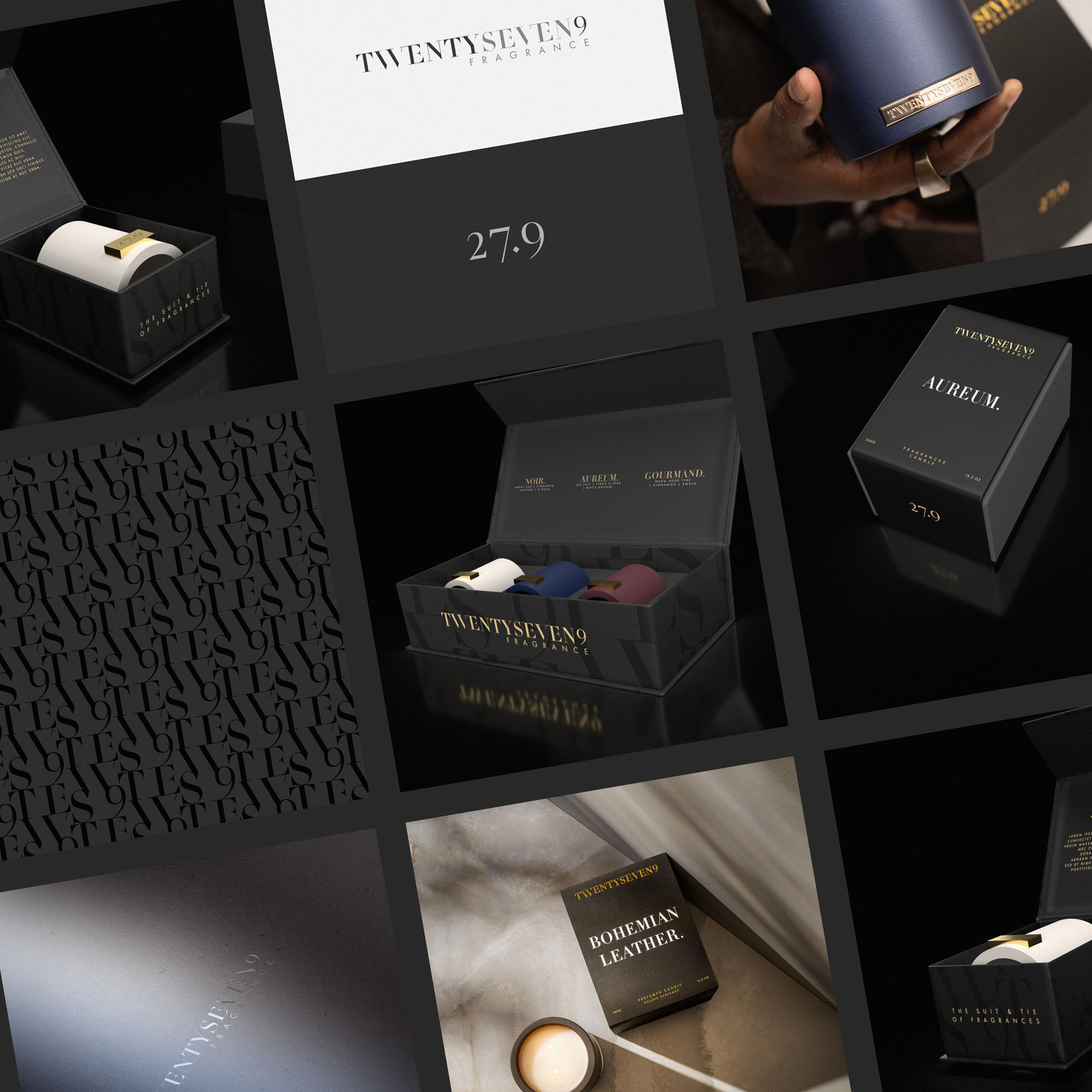
Case Study
Opportunity
27.9 Fragrance—founded in 2018 in Nashville—commissioned a refined identity and candle packaging that feel distinctly indulgent and meticulously crafted, matching a sensorial brand defined by intention and elevated detail.
Objectives
- Honor the existing logo while elevating it to a more contemporary, luxurious standard.
- Design packaging that “shows no shortcuts” and communicates craftsmanship at first touch.
- Create a cohesive system spanning trio cases, individual votives and single-unit boxes.
- Use 3D visualization to clarify scale, materials and finishes before prototyping and production.
Insight & Strategy
The Founder’s brief set a clear bar: every decision should feel intentional so the packaging itself signals the same care as the product. We shaped a “quiet luxury” language—precise typography, controlled spacing and considered material/finish options—and adopted a 3D-first workflow to validate form, hierarchy and tactile cues early, reducing ambiguity and cost.
Identity Solution
- Brand Refresh: Careful adjustments to spacing, proportions and hierarchy preserved brand equity while conveying a more modern, premium voice.
- Packaging Architecture: Modular dielines and layout logic for trio cases, votives and singles ensure each SKU feels part of one family.
- Detail & Craft: Clear information hierarchy and refined typographic treatments support an indulgent unboxing experience without visual noise.
- 3D Renders: High-fidelity visuals informed decisions on form and finishing, guiding selective refinements that carried through to the final production seen in marketing imagery.
Competitive Edge Now
The refreshed identity and packaging system express intentional craftsmanship at a glance. Cohesive structures across formats, paired with disciplined typography and spacing, create an unmistakably premium presence from shelf to unboxing.
What This Enables
A production-ready foundation for the flagship collection and future lines—streamlined decision-making, consistent presentation across SKUs and assets that translate seamlessly into marketing, e-commerce and retail environments.