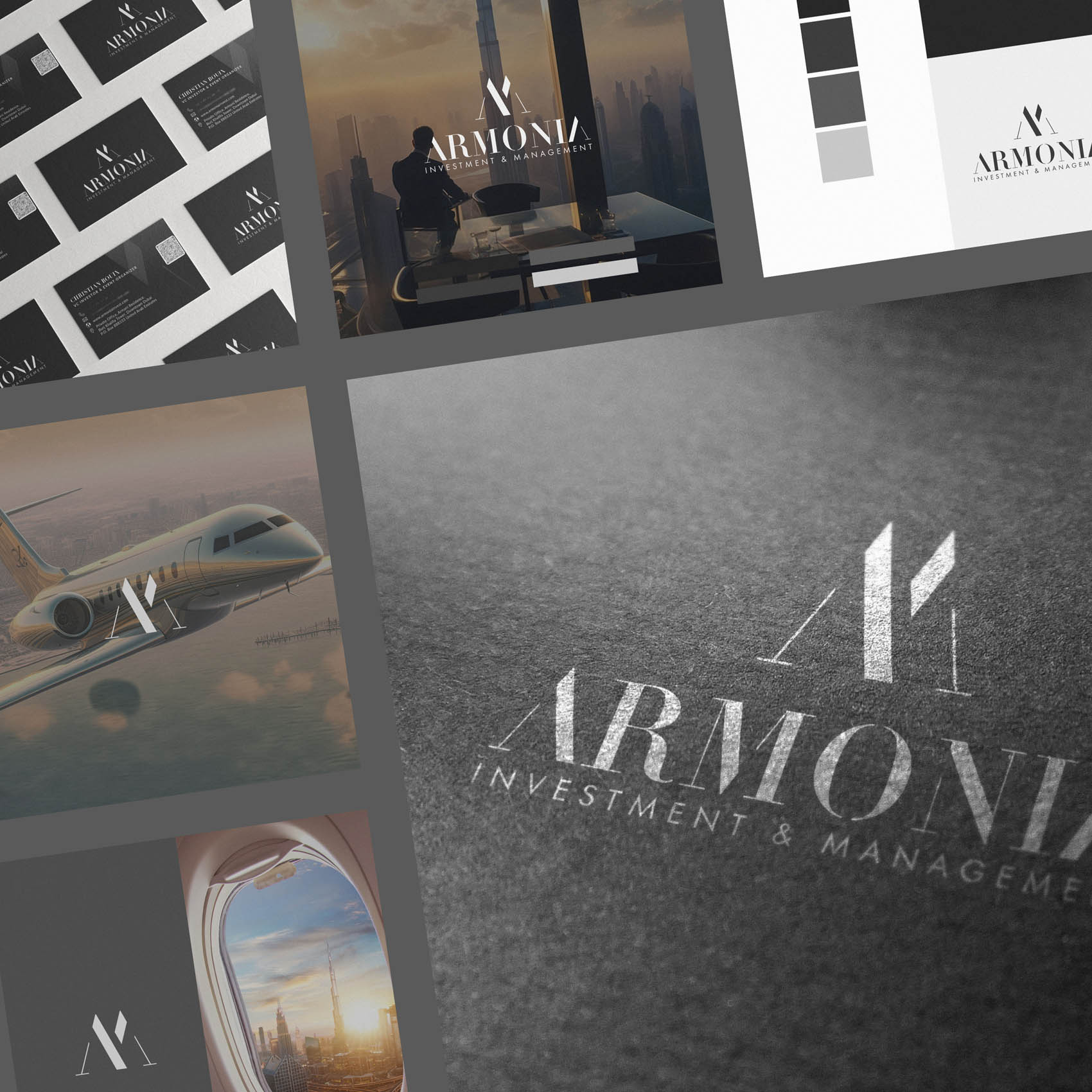
It was a real pleasure to create the new brand identity for Armonia Investment & Management – based in Dubai, which is the perfect location to provide their bespoke services to thriving businesses in the region.
Armonia believe in combining the very highest levels of financial and business expertise with unparalleled care and attention to detail. We wanted to reflect this with brand identity that feels very high end, professional and dependable, with a real touch of class.
Case Study
Opportunity
In a finance category crowded with templated visuals, there was clear space for an identity that signals true high-end exclusivity—quiet luxury, absolute discretion, and senior-level credibility from the first glance.
Objectives
-
Project a rarefied, invitation-only feel while remaining impeccably professional.
-
Communicate trust, gravitas and composure at every size and touchpoint.
-
Create a disciplined system for investor decks, proposals and a design-led website—without diluting the premium aura.
Insight & Strategy
Ultra-discerning audiences decide in seconds. We positioned Armonia as a boutique partner where less says more: restrained typography, generous breathing room, and design decisions that read as intentional rather than ornamental. The voice is confident and understated—luxury expressed through clarity, not flourish.
Identity Solution
-
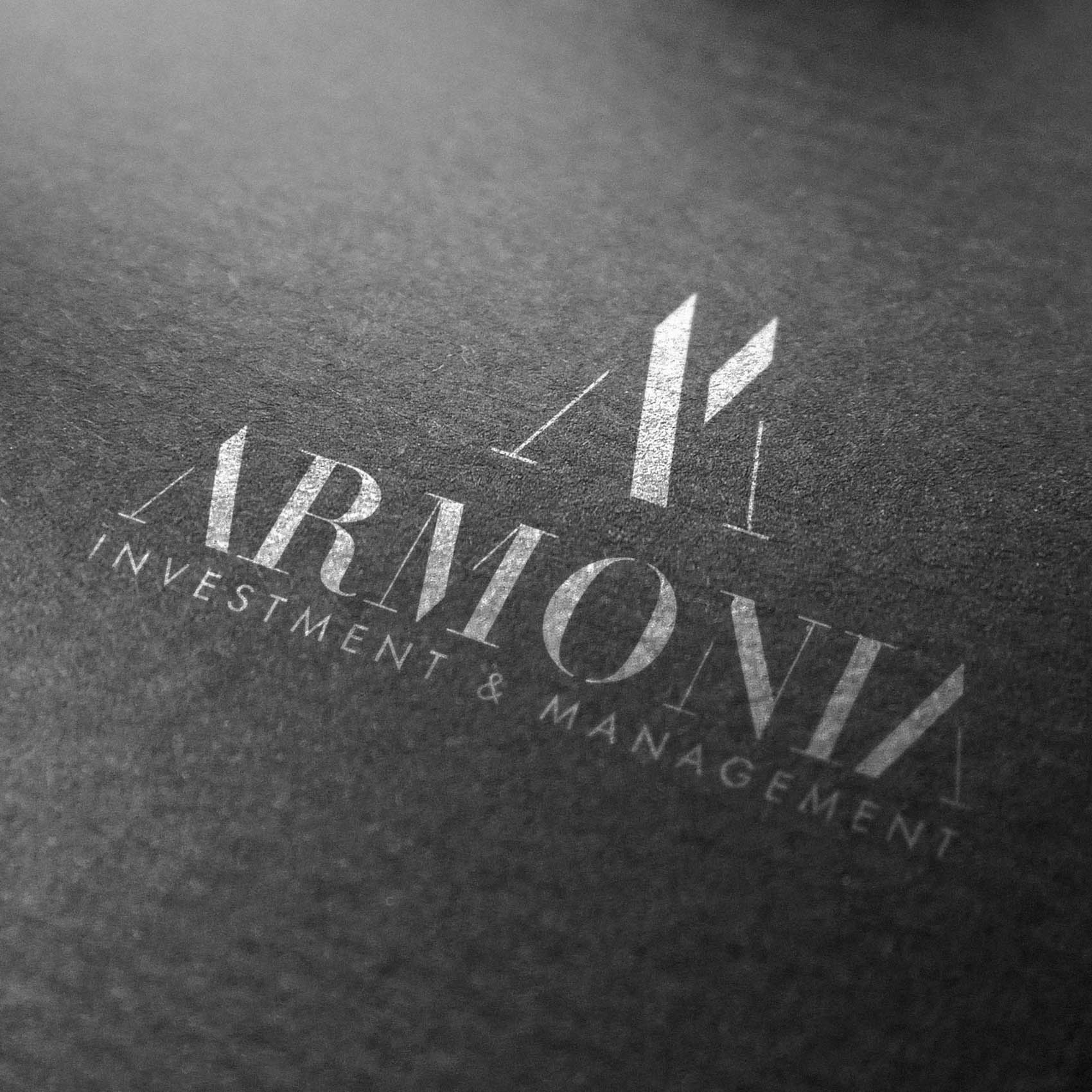
Wordmark: A meticulously spaced typographic mark engineered for poise and legibility, conveying authority without shouting.
-
System: Defined lockups (horizontal/stacked), clear-space and minimum-size rules to preserve a gallery-like calm across print and screen.
-
Palette & Typography: A restrained, timeless combination chosen for contrast, editorial elegance and long-form readability—supporting a premium, low-noise presentation style.
-
Applications: Presentation and proposal templates that maintain the high-end tone under real-world use, ensuring consistency from first outreach to due-diligence materials.
Competitive Edge Now
Compared with typical finance branding, Armonia’s identity feels considered, exclusive and deliberately scarce. The restraint reads as confidence; precision typography and composition raise perceived value; the system protects that high-luxury feel across every deliverable.
What This Enables
The brand is now ideally positioned to attract and reassure high-calibre stakeholders, support relationship-led growth, and expand into future touchpoints—sustaining an unmistakably premium, invitation-only presence as the firm evolves.


