I was excited when Fortunis Capital approached me to discuss a rebrand – a full overhaul of their existing brand identity. Everything about the intended direction the new branding would take resonated well with me, exactly the kind of ultra high end, stylishly corporate and elegantly exclusive brand I like to create.
A key part of the brief was to ensure the new identity respected elements of the existing one – particularly the use of a hertigage family crest, from which Fortunis draws it’s name. We analysed the strongest elements of the existing brand, identified areas that could be strengthened or even removed, and then set about the redesign.
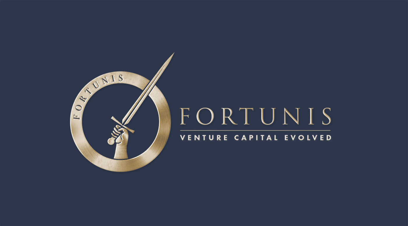
The result is a strong, bold brand ready to champion the ideals of it’s investees and forge ahead a path to a brighter future. Great care was taken to ensure that the sword arm resembled a ‘rallying call to arms’, rather than a hacking action. The blend of traditional, heritage elements, with contemporary modern touches correctly positions Fortunis as a well established brand with a rich history, yet modern in their approaches and futuristic in their techniques.
Case Study
Opportunity
Fortunis Capital commissioned a refined identity that communicates stewardship and modern pace at first glance—an enduring visual language suitable for investor materials, digital touchpoints and everyday communications.
Objectives
- Express confidence and discretion with a name-led signature that feels current yet timeless.
- Create a disciplined system that reads clearly at small sizes across stationery, pitch decks and web headers.
- Establish straightforward rules so day-to-day documents export cleanly and stay on brand.
- Provide production-ready artwork suitable for premium print finishes where required.
Insight & Strategy
Institutional audiences respond to clarity, order and restraint. The identity was built around a typography-first approach, generous spacing and a measured hierarchy—so every component supports the message of considered capital deployment without visual noise.
Identity Solution
- Brandmark: A carefully tuned symbol depicting a rallying call to arms, while maintaining a composed, board-level presence.
- Typography: A refined pairing that delivers authority in headings and effortless readability in body copy and credentials.
- Palette: Professional neutrals with a controlled accent to guide hierarchy across print and digital assets.
- System Rules: Clear-space, minimum sizes and layout grids to maintain consistency on stationery, investor decks and digital banners.
- Applications: Templates for slides, factsheets and correspondence ensure fast, polished outputs without redesigning each time.
Competitive Edge Now
The identity presents Fortunis Capital with bold confidence: typography, spacing and colour work together to deliver an immediate sense of professionalism while keeping information easy to parse across all touchpoints.
What This Enables
A coherent platform for investor communications, thought-leadership and targeted outreach—ready to scale into new materials and channels while preserving a consistent, high-calibre presentation.


