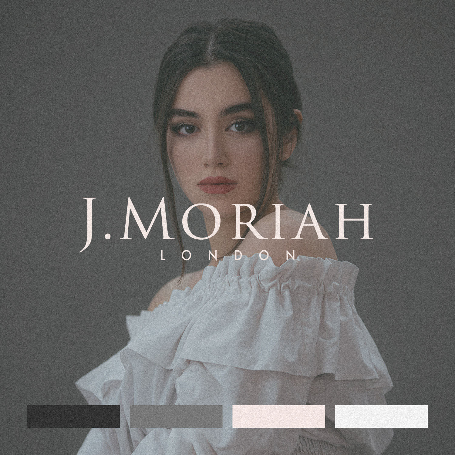
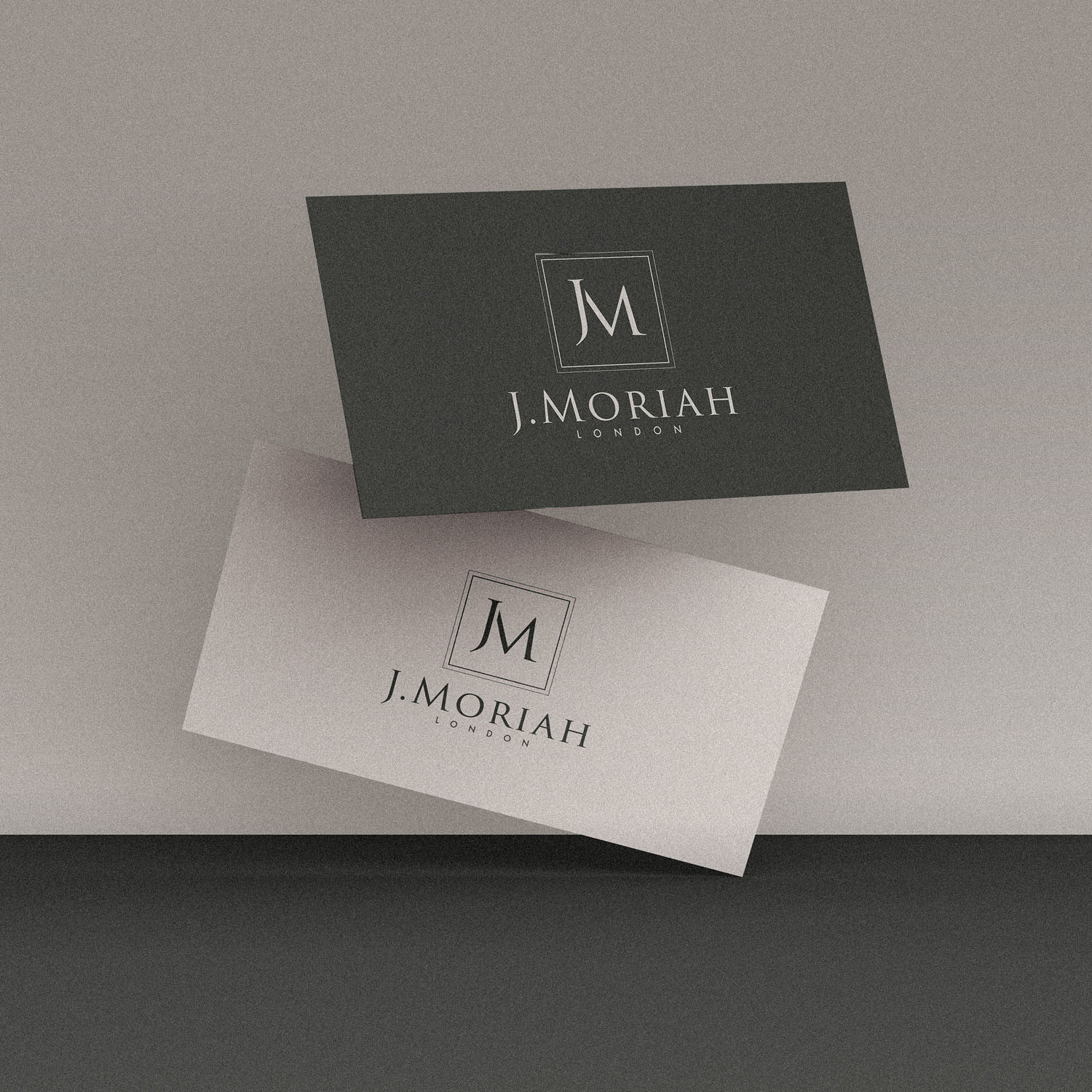
When J Moriah commissioned me to create their new logo and we discussed style, I laughed at how similar our taste was. In fact, J.Moriah shares the same ‘JM’ initials as my own brand! “Let’s create something similar, but even better”, I joked, and we set about the usual identity process, a clear direction in mind.
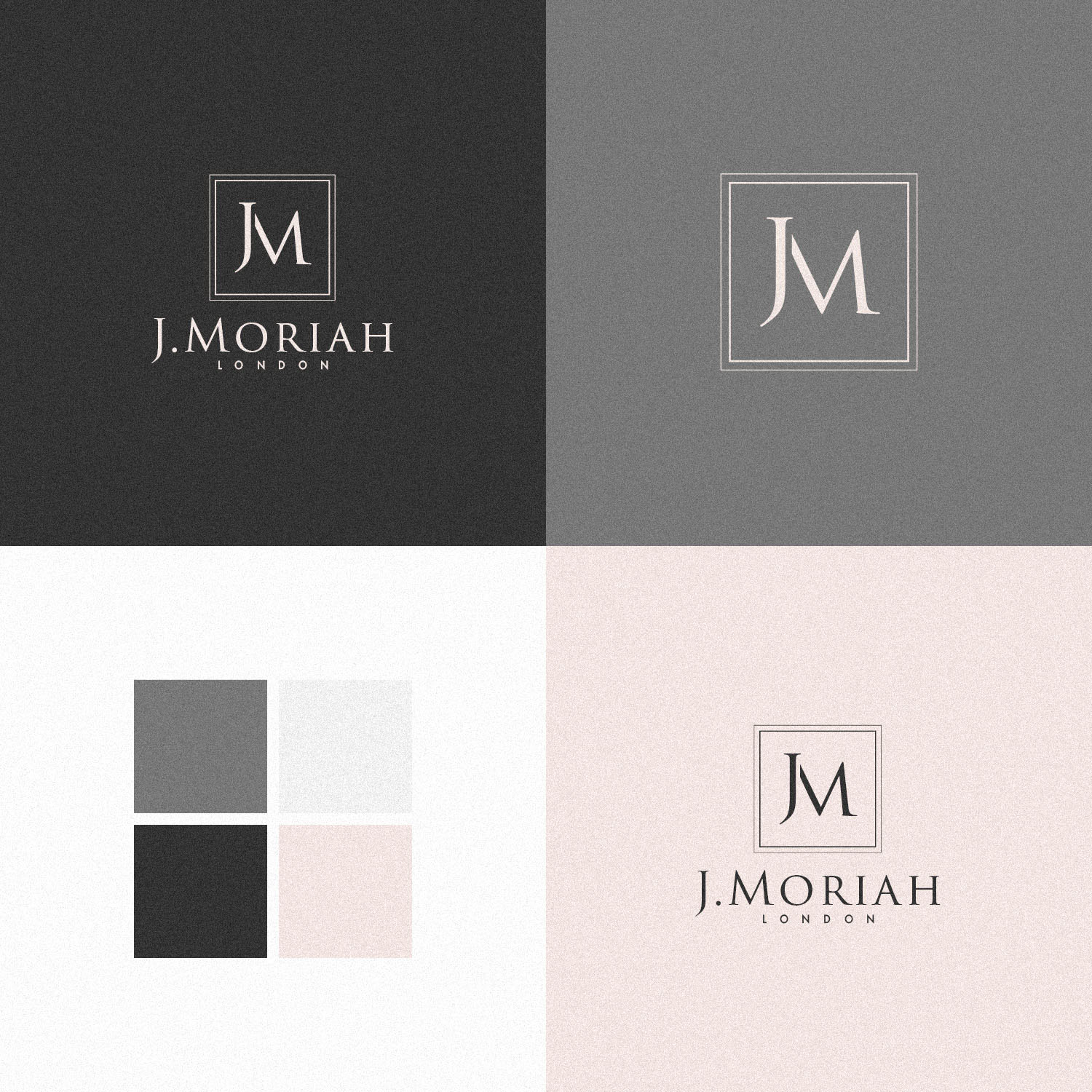
Well, I think we succeeded in creating something even better. Or at least, far better suited than my own brand would have been… Although using a simple monogram, the serifs, the elegant dual keyline, and the timeless classic Trajan Pro 3 font all position the brand perfectly to attract it’s ideal clientele.
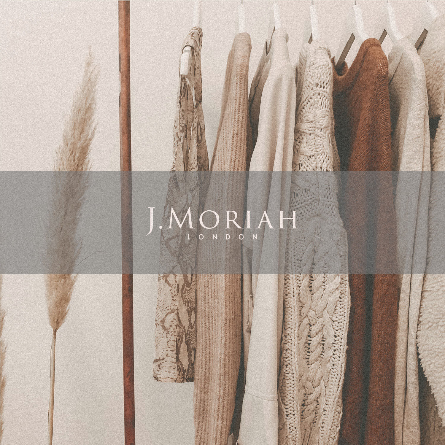
J Moriah are a womenswear brand aimed at young women in their 20s & 30s. The main products are dresses and it’s girlish style with naive and dreamlike mood.
This was the target tone we identified before beginning concept generation;
Feminine or Masculine?: Very feminine
Young or Mature?: Fairly young
Luxurious or Economical?: Fairly luxurious
Modern or Classical?: Fairly classical
Playful or Serious?: Fairly serious
Stylised or Understated?: Very stylised
Simple or Complex?: Fairly complex
Subtle or Obvious?: Fairly subtle
Case Study
Opportunity
Womenswear aimed at style-conscious women in their 20s–30s benefits from branding that feels feminine and dreamy without slipping into cliché. There was room for a timeless, editorial identity that signals refined classicism while supporting a romantic, slightly naïve mood.
Objectives
-
Express distinctly feminine, fairly classical luxury with a serious (not playful) tone.
-
Create a monogram and wordmark that feel related yet stand on their own at small sizes.
-
Keep the styling elegant and subtle so it complements garments rather than competing with them.
Insight & Strategy
The brand’s initials offered a natural focal point. We leaned into modern classicism: Roman-influenced letterforms, generous spacing, and a jewellery-like frame to add a hint of ceremony. The aim was recognisability through restraint—letting proportions and detailing carry the sophistication.
Identity Solution
-
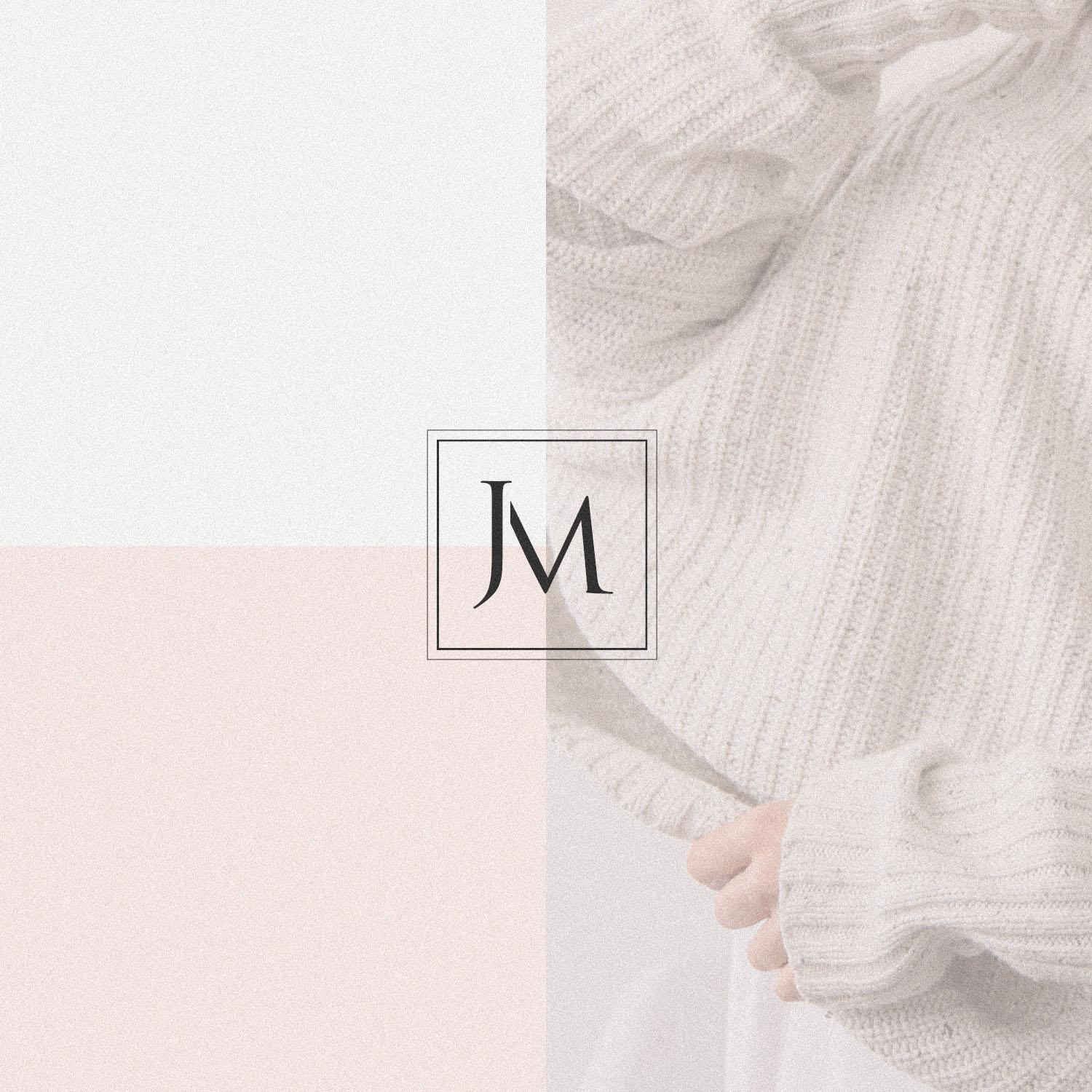
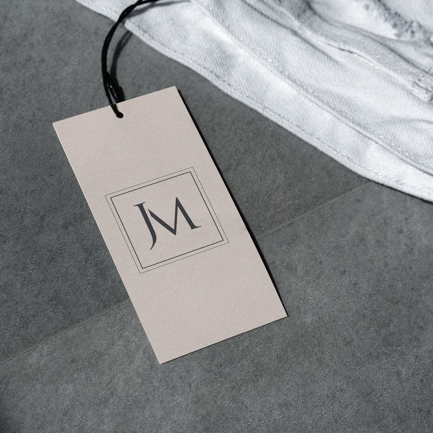
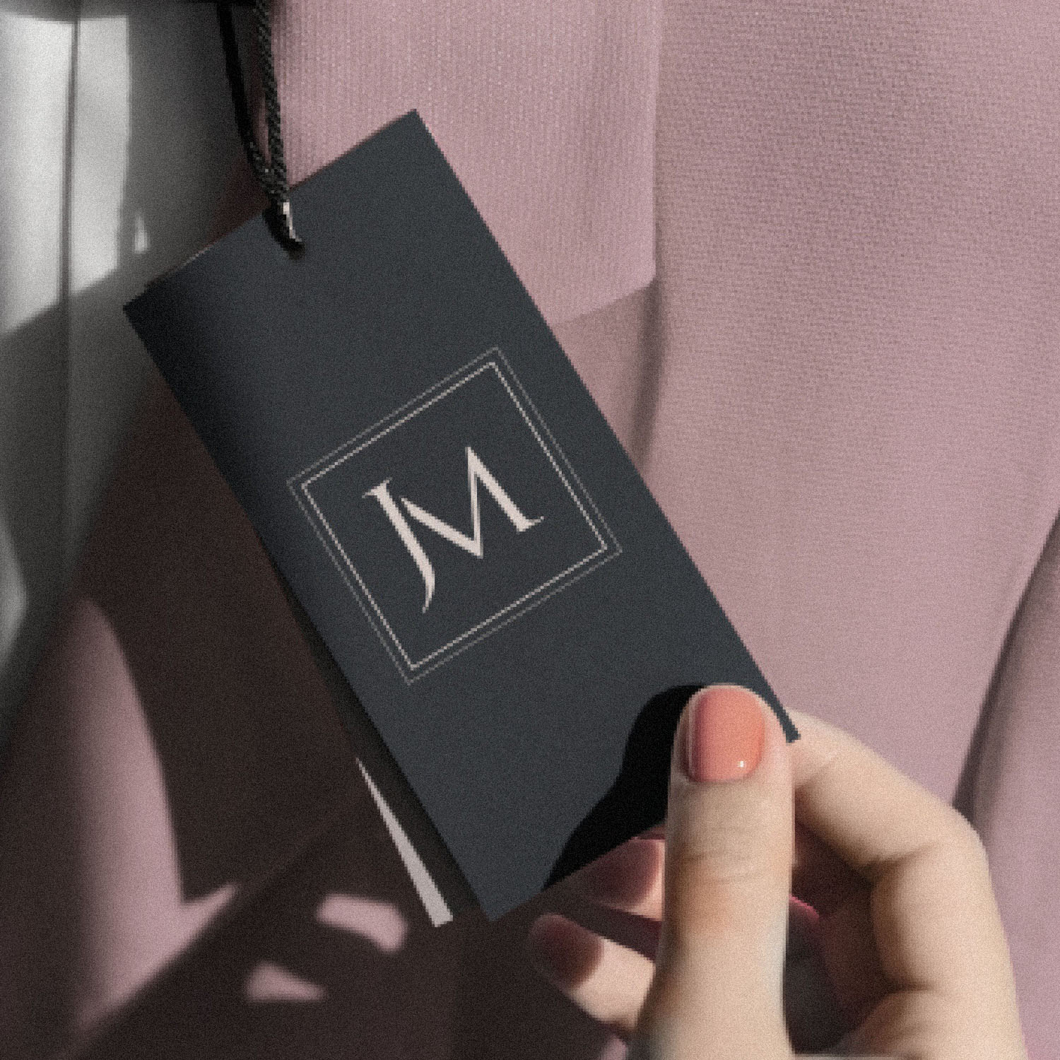
Monogram: A simple, serifed “JM” framed by an elegant dual keyline—adding a collectible, hallmark quality suited to labels and trims.
-
Wordmark: Set in Trajan Pro 3, refined for spacing and balance so it reads with poise from hero applications to small typographic moments.
-
System: Primary horizontal lockup plus compact arrangements; clear-space and minimum-size rules to protect legibility across print and digital.
Competitive Edge Now
Compared with trend-led fashion marks, J Moriah presents editorial poise: a memorable monogram and a classical wordmark whose quiet detailing reads as premium, supporting a youthful yet assured brand tone.
What This Enables
Ideally positioned to extend across garment labels, swing tags, packaging and e-commerce touchpoints—maintaining a refined, romantic presence while remaining unmistakably high-end.


