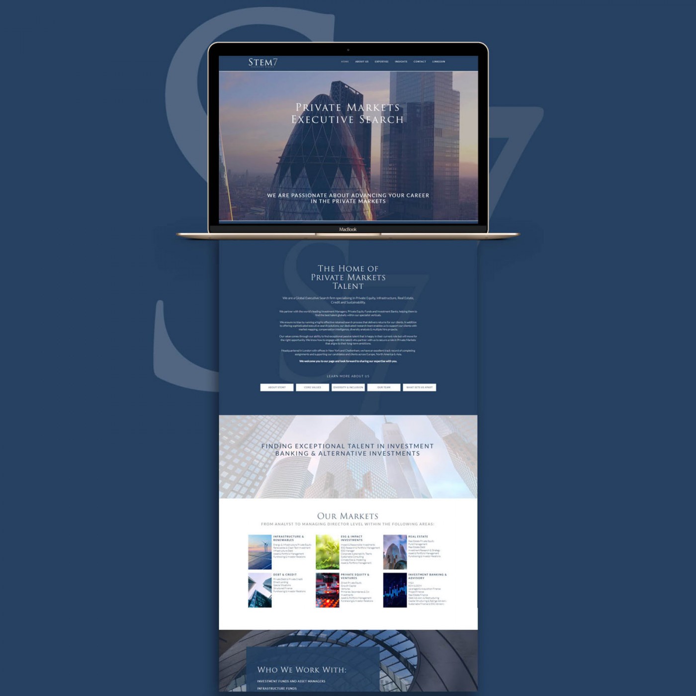
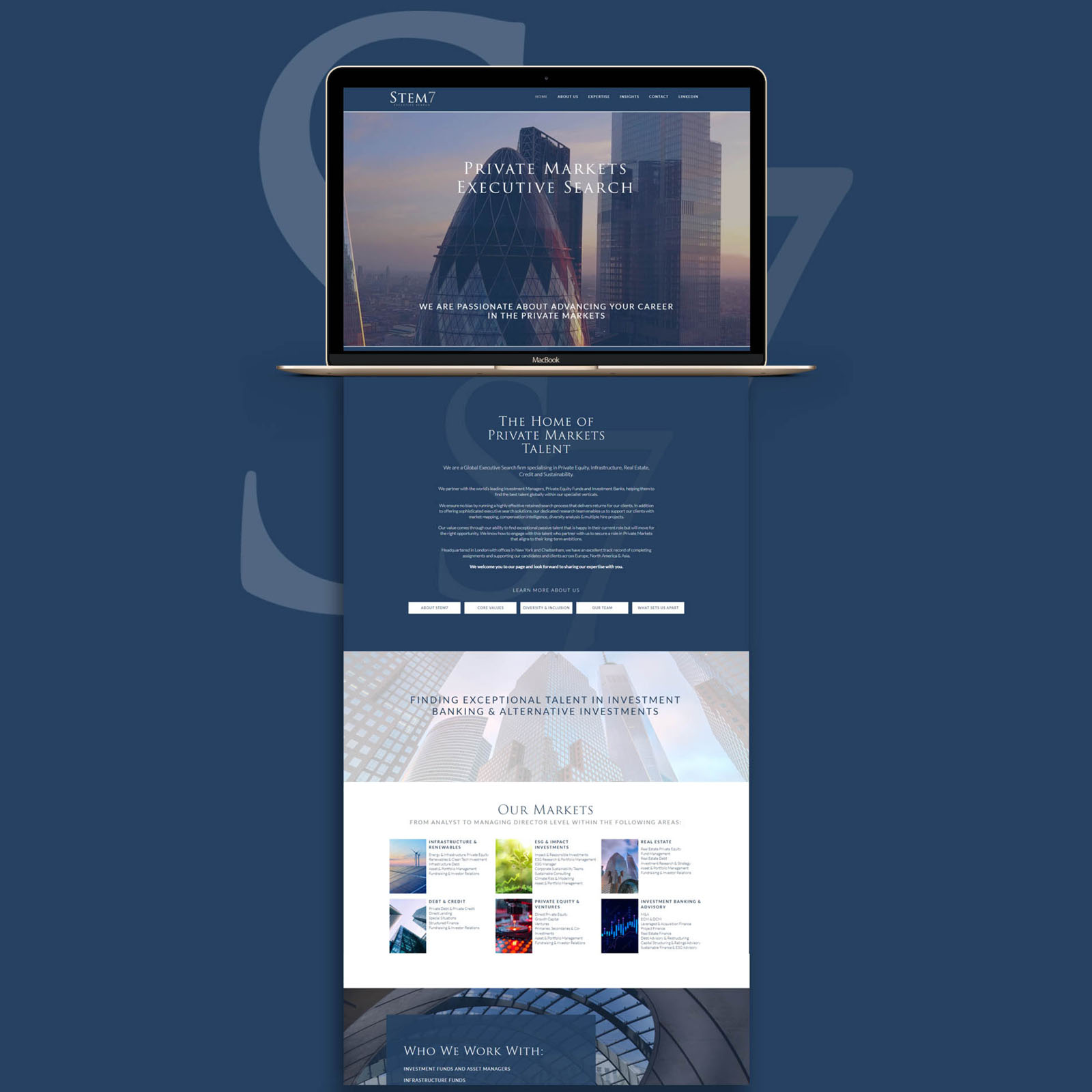
As well as creating new brand identity, I was commissioned to design and develop a WordPress website for uk based Executive Search firm Stem7. We wanted to ensure the website reflected the high end and professional experience Stem 7 extend to clients and candidates alike.
The website features dynamic backgrounds where overlaid text positions itself within the negative space of a gradient-faded image; more challenging to get right than it sounds – no matter which device or screen size you are viewing on.
Be sure to visit the live website at stem-7.com
Case Study
Opportunity
Top-tier clients and senior candidates judge credibility in seconds. After refining the STEM7 identity, we had the chance to translate that boardroom-grade composure into a digital experience—one that feels discreet, exacting and easy to act on.
Objectives (Business + User)
-
Present a confident, senior-level advisory brand online—no noise, high trust.
-
Create clear pathways for two audiences: clients looking to brief a mandate and candidates exploring opportunities.
-
Carry the updated logo, palette and typography across so the site and collateral feel like one system.
UX Insight & Strategy
Decision-makers scan first, then dive deeper. The site structure prioritises rapid comprehension—who STEM7 serves, sector expertise and how to start a conversation—before offering depth via sector pages, team bios and insight content. Microcopy is calm and precise; calls-to-action are unambiguous and low-friction.
Design System & Content
The website extends the identity’s engineered restraint into a modular UI: disciplined typography, generous spacing and components that surface essentials (sector, role level, contact options) without visual clutter. The logo refinements and colour separation inform buttons, dividers and highlight states, keeping the interface cohesive and recognisable.
Interaction & Performance
Motion is minimal and purposeful—subtle cues that guide progress without distracting. Templates are built for maintainability, so new mandates, team updates and insights can be published without breaking the look and feel. Accessibility and contrast standards are observed throughout to protect legibility across devices.
Why sequencing identity → website matters here
By establishing a precise identity system first, the website inherits ready-made rules for spacing, hierarchy and tone. That consistency shortens design cycles, reduces subjective rework and ensures pitch decks, proposals and the site all speak the same visual language.
Competitive Edge Now
Compared with generic recruitment themes, the STEM7 experience feels composed and specialist. The refined identity reads instantly, pathways for briefing a role or making contact are obvious, and sector credibility is communicated with economy rather than ornament.
What This Enables
The site is well positioned to support mandate acquisition and senior-candidate relationships, host thought-leadership that compounds trust, and scale as new sectors or service lines are introduced—without losing coherence or the high-calibre feel established by the brand identity.


